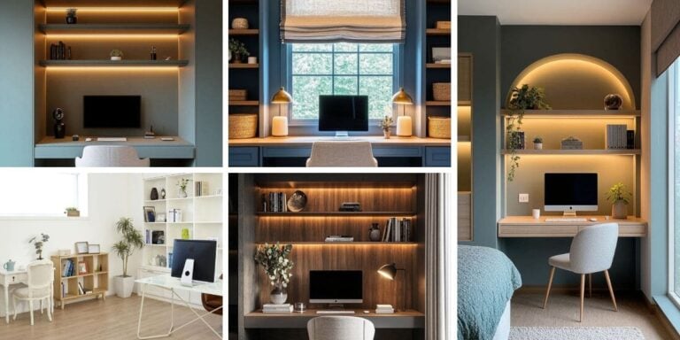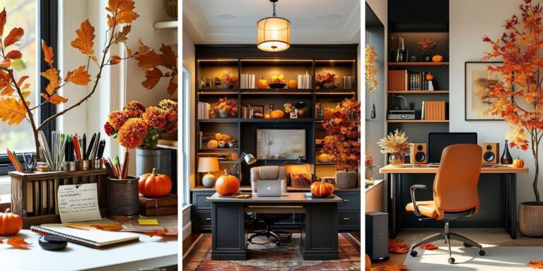
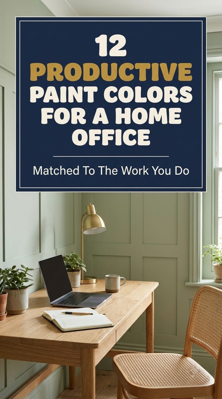
12 Productive Paint Colors for a Home Office, Matched to the Work You Do
The best home office paint color depends on the light in your room and the work you do, so test two colors on your wall before you paint.

Never miss an update — choose FarmFoodFamily as your preferred source on Google.
How it works: Tap the button below to open Google's settings page, then check the box next to FarmFoodFamily.
Tap the checkbox to turn it blue — that's how you know it's set.
The best home office paint color depends on the light in your room and the work you do, so test two colors on your wall before you paint.
Products We Recommend
This post contains affiliate links. We may earn a commission on qualifying purchases at no extra cost to you.

FrogTape Multi-Surface Painter's Tape with PAINTBLOCK, 0.94 in x 60 Yds
Painter's tape for crisp lines on trim and for a two-tone wall. Press the edge flat and pull it while the paint is slightly wet.
Shop Now
LED Desk Lamp with USB Charging Port, 6 Brightness Levels, 6 Color Temperatures
A desk lamp with adjustable brightness and warmth. Use it to see how your wall color looks in lamp light at night.
Shop Now
Mkono Fake Plants in Ceramic Pot, 11 in Potted Artificial Plant
A faux pothos in a white pot for a shelf or desk corner. It adds a touch of green to any wall color with no watering.
Shop NowThe best paint colors for a home office are soft sage green, soft blue, light blue-gray and warm white. Pick by the light in the room and the work you do, not by a color-psychology chart.
A 2018 review of 40 papers found that color influences mood, wellbeing and performance at work. The abstract does not crown one single winning color for every office.
Light matters more than most people expect. Sherwin-Williams says north-facing rooms get the least light and suit warm neutrals with a higher light reflectance value.
This guide gives 12 colors sorted by the job your office does, with a pairing, a watch-out and our verdict on each. It also covers lighting, desk layout, a test plan and the prep steps, so you can paint once and get it right the first time.
Does Paint Color Really Change How You Work?
A little, but not the way most blog posts say. You’ll often read that blue makes you productive and yellow releases feel-good chemicals. We couldn’t find a solid source for those claims, so we left them out.
What the research does say is simpler. Color can affect mood and wellbeing, and mood affects how long you can focus. That’s enough reason to choose a color you enjoy sitting in all day.
Our rule: pick a color you can look at for eight hours, then make sure the light is right. A “productive” color you dislike won’t help.

What Is Different About This Guide?
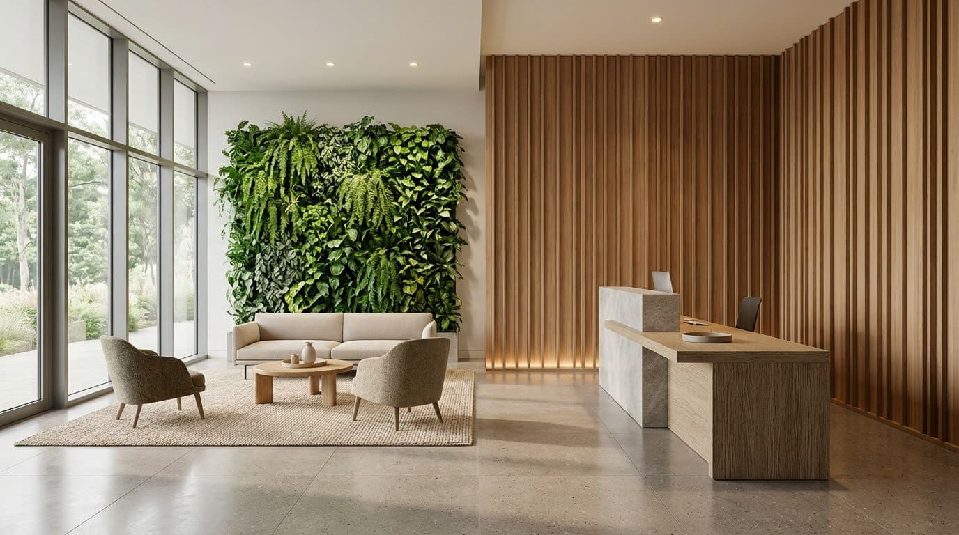
Our other office pages cover small home offices, furniture for small spaces and bedroom offices. This one is only about wall color.
We sorted the colors by the work you do: focus, energy, cozy depth and combinations. Start with the job that sounds like yours.
How Does Your Room’s Light Change the Color?
Light is the biggest reason a color looks wrong on your wall. Use the direction your window faces to narrow your list.
| Window direction | What the light is like | What to look for |
|---|---|---|
| North | The least light all day, cool tone | Warm neutrals, a higher LRV |
| South | Consistent warm light | Cooler, calmer colors, avoid very warm shades |
| East or west | Light that shifts through the day | Pick by the hours you work |
| Little natural light | Mostly lamp light | Choose your bulbs first, then the paint |
LRV, or light reflectance value, is a 0 to 100 scale for how much light a color reflects. Higher numbers help a dim room.
Test samples where you will sit. The paint brand offers up to 10 free 2 x 3 inch samples. We’d also check them in the late afternoon, because that’s when many people are still at their desk.
Calm and Focus
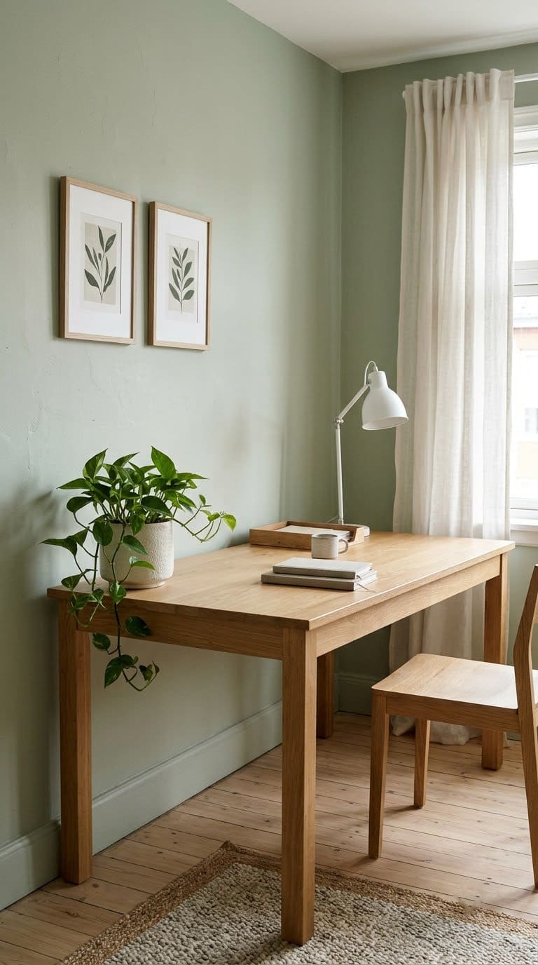
1. Pale Sage Green
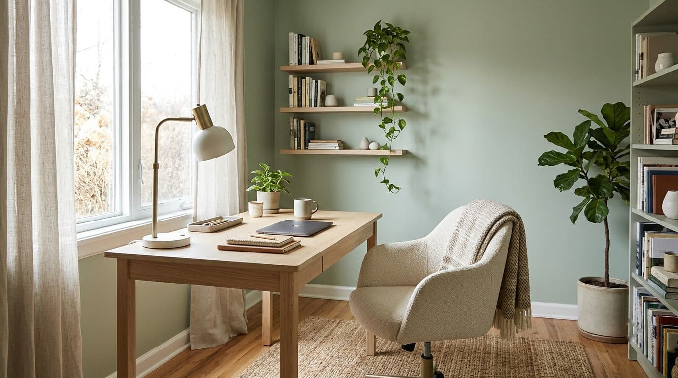
Sage is gentle and natural. It feels calm without feeling sleepy, and it works with wood and plants. A gray-green sage suits most offices.
Pair with: light wood, white trim and a green plant.
But watch out: a sage that is too gray can look dull in a north-facing room. Pick one with a warm base.
Painter's tape for crisp lines on trim and for a two-tone wall. Press the edge flat and pull it while the paint is slightly wet.
Shop NowThis post contains affiliate links. We may earn a commission on qualifying purchases at no extra cost to you.
Our take: our top pick for a general home office. It’s easy to live with at 9 a.m. and at 5 p.m.
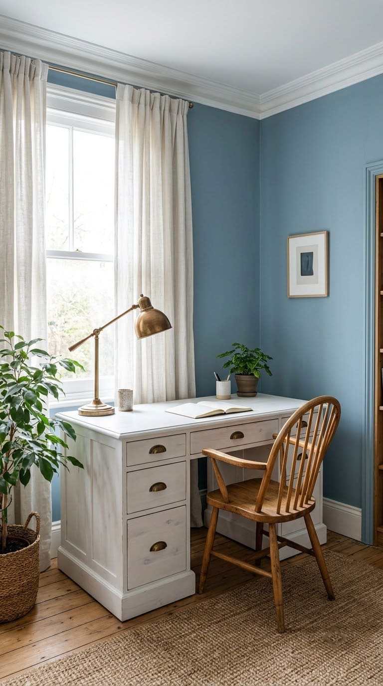
2. Soft Blue
Soft blue is a classic for a reason. It feels open and steady. In a small office it can make the walls feel farther away.
Pair with: white, light wood and brushed brass.
Watch out: a cool blue in a north-facing room can feel cold. Pick a blue with a touch of gray or green.
Our take: a safe choice for people who work on screens all day. Add warm bulbs in winter.
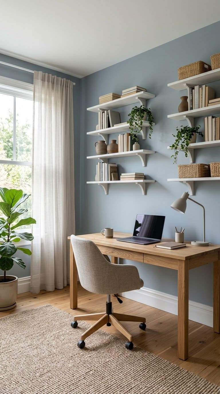
3. Light Blue-Gray
Blue-gray is quieter than blue and warmer than a plain gray. It makes a calm backdrop that doesn’t distract. It also looks neat behind you on video calls.
Pair with: white shelves, black metal and soft wood.
Watch out: a flat gray with no warmth can feel sad on dark days.


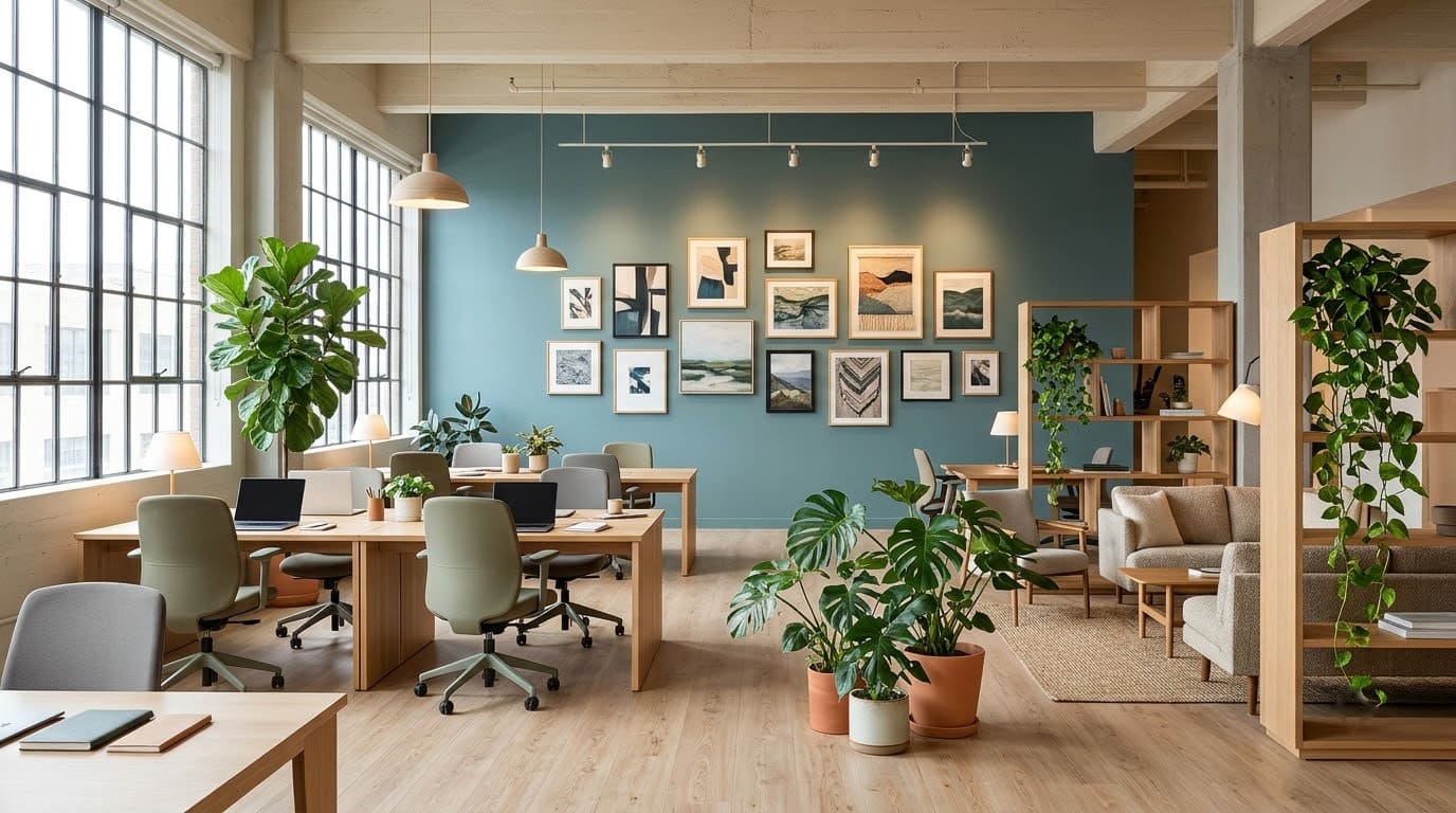
Our take: the best color on this list for video calls. It stays in the background.
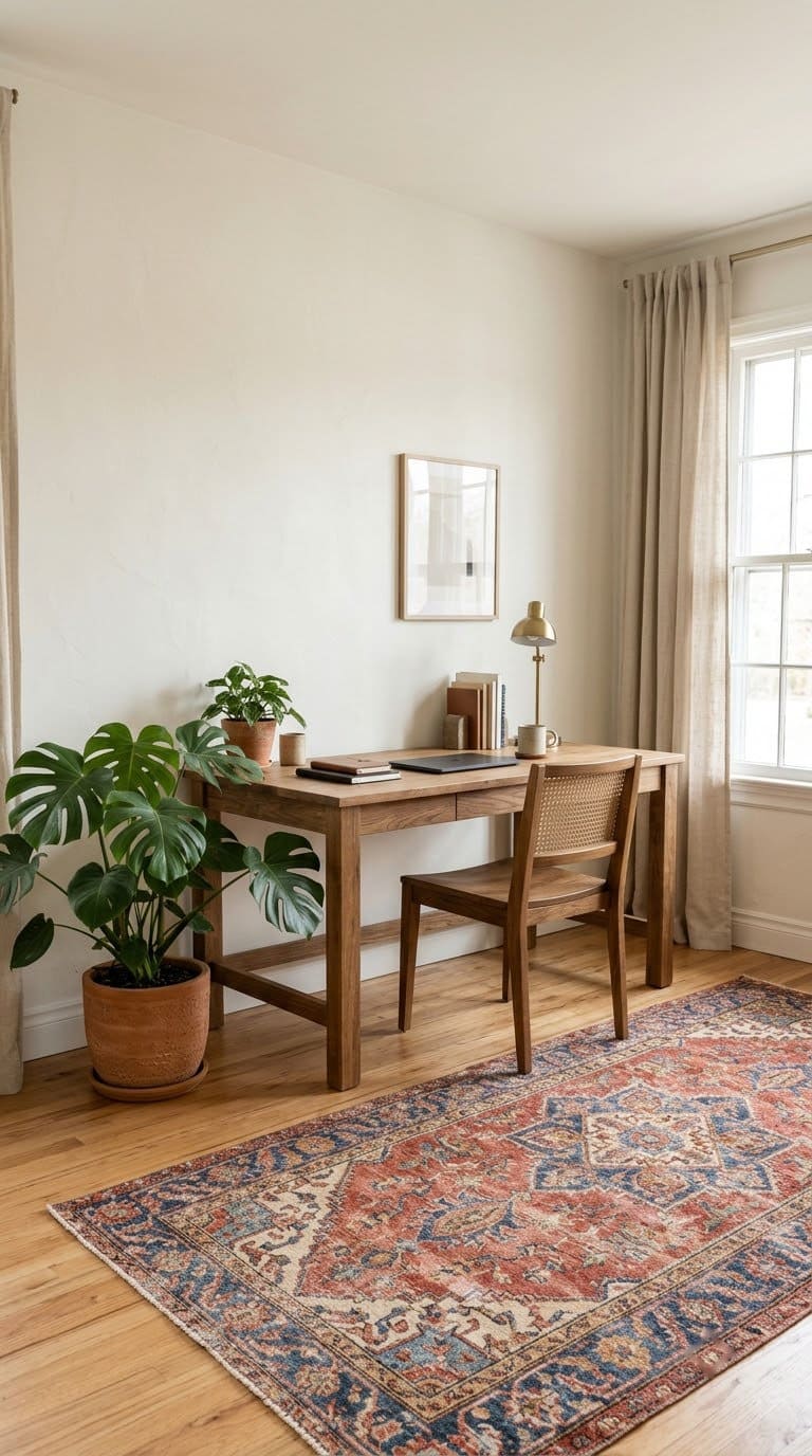
4. Warm White
Warm white is the lowest-risk color. It reflects light, keeps small rooms open and works with any furniture. It’s also easy to repaint.
Pair with: wood, plants and a bold rug.
Watch out: a creamy white can turn yellow in warm light. A stark white can feel clinical.
Our take: a good pick for renters and for very small rooms. Add color with art and a rug.
Cheer and Energy
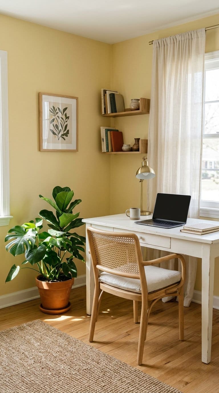
5. Butter Yellow
Butter yellow is soft and sunny. It brightens a dim room and helps a gloomy corner feel friendlier. Keep it pale and warm.
Pair with: white trim, gray furniture and green plants.
Watch out: bright lemon yellow glares on a screen day. Choose a soft shade.
Our take: great for a creative space or a north-facing room. Try it on one wall first.
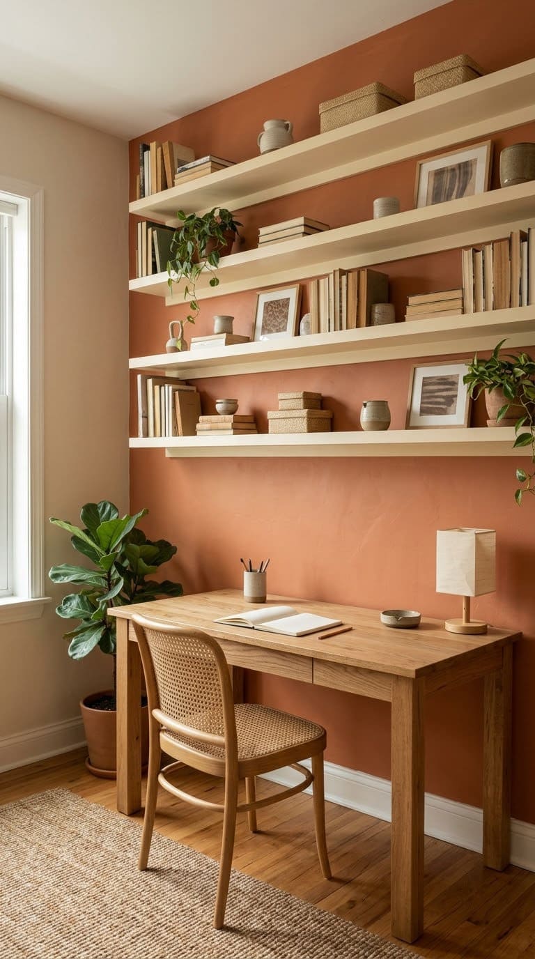
6. Terracotta Orange
Terracotta is warm and grounded. It adds energy without feeling loud. It suits a creative office or a reading corner.
Pair with: cream, wood and black metal.
Watch out: a bright orange is tiring over a long day. Pick a muted clay shade.
Our take: a stylish choice for a smaller area, such as one wall behind the desk. Skip it for the whole room.
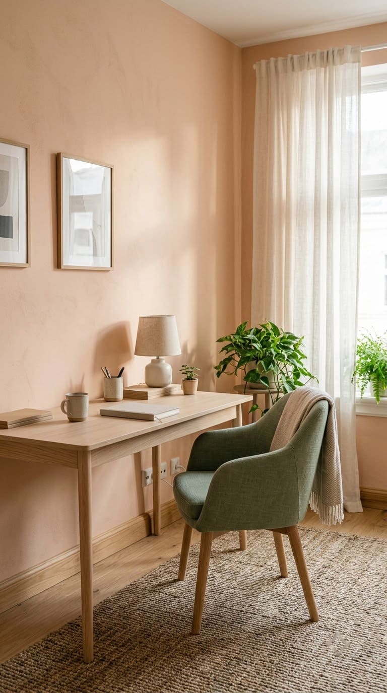
7. Soft Peach
Peach is a friendly, flattering color. It lights up skin on camera and softens a hard room. It also pairs well with deep green.
Pair with: sage, cream and brass.
Watch out: a peach with too much orange looks dated. Pick a muted, creamy shade.
Our take: good for people who spend a lot of time on calls. It’s warm without feeling heavy.
Cozy and Moody
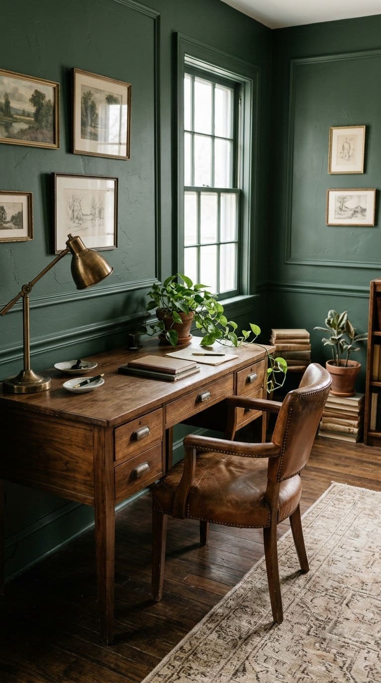
8. Forest Green
Forest green feels like a library. It’s rich, calm and private. It suits a room with good light and dark wood.
Pair with: brass, leather and warm bulbs.
Watch out: dark green in a dim room swallows light. Use it only where there’s a window.
Our take: our favorite for deep-work offices. It makes a small room feel like a retreat.
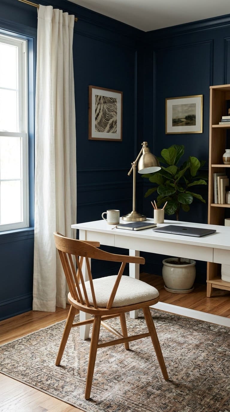
9. Navy Blue
Navy is a bold, steady color. It feels professional and focused. It makes a sunny room feel more grounded.
Pair with: white trim, brass and warm wood.
Watch out: navy on all four walls can feel closed in. Use it on one wall or the lower half.
Our take: a smart pick for a client-facing or video-call office. It looks polished on camera.
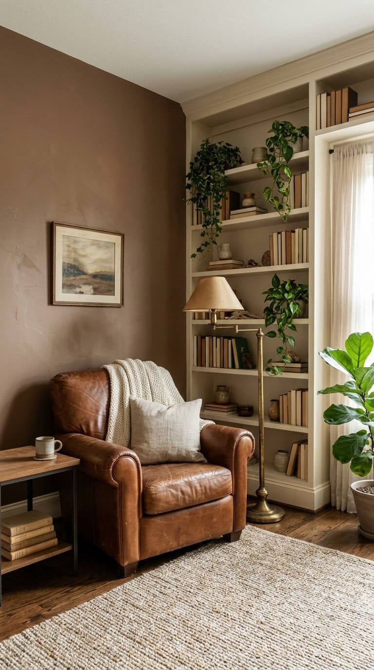
10. Mocha Brown
Mocha brown is warm and grounding. It suits a north-facing or small office and makes it feel like a cozy den. It works well with leather and wood.
Pair with: cream, brass and green plants.
Watch out: a dark brown shows every shadow in a dim room. Use plenty of lamp light.
Our take: great in a snug room that you want to feel wrapped in. Skip it if the room is already small and dark.
Smart Combinations
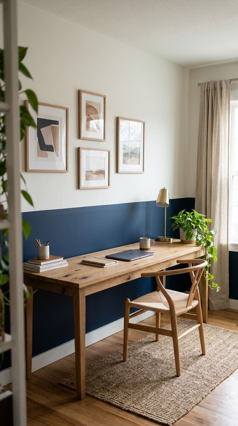
11. A Two-Tone Wall
A two-tone wall paints a deeper color on the lower half and a light color above. It adds depth without a whole dark room. A simple chair rail line splits the colors.
Pair with: navy below and white above, or green below and warm white above.
Watch out: a wobbly line shows. Use painter’s tape and press the edge flat.
Our take: our favorite way to try a bold color safely. If you hate it, you only repaint half.
12. A Blue and Green Combination
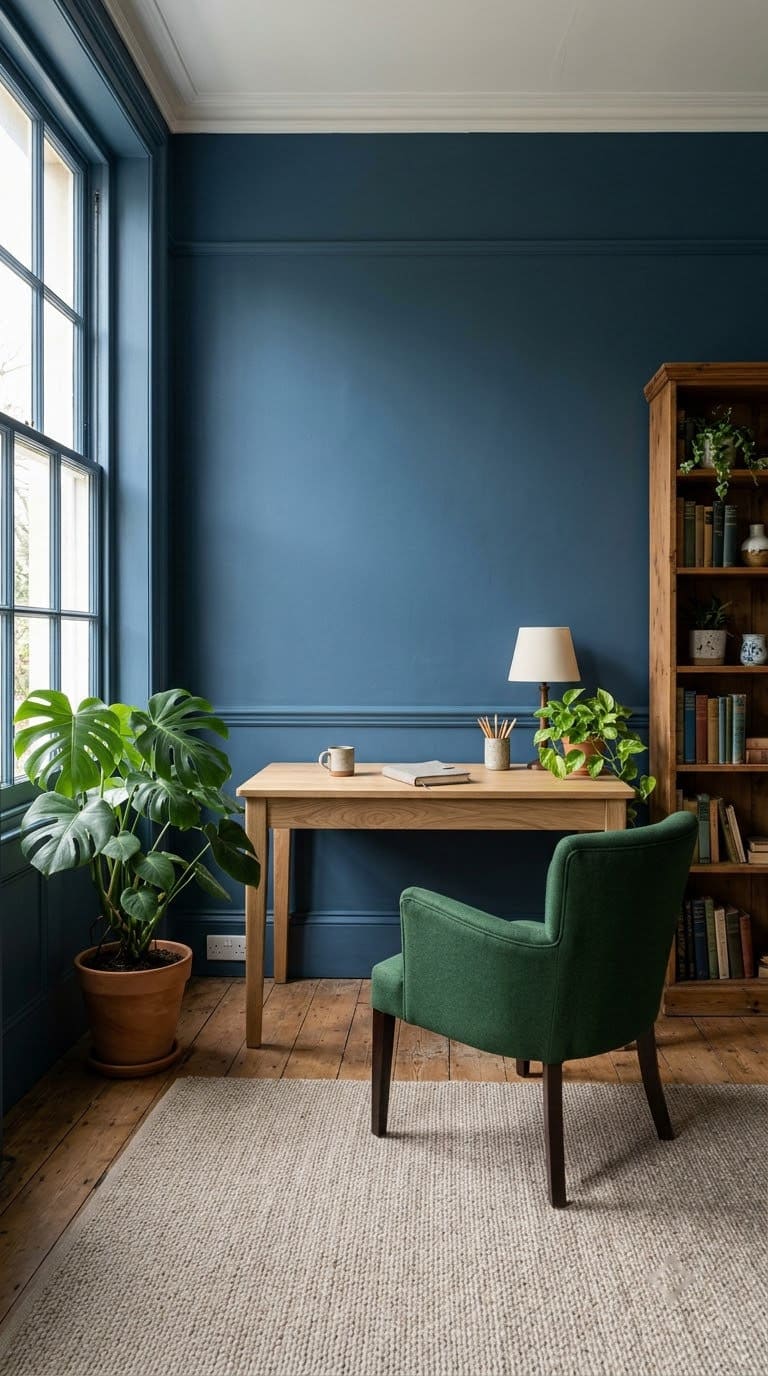
Blue and green sit next to each other on the color wheel, so they blend well. A blue wall with a green plant and a green chair feels fresh and calm. You can also paint one wall each.
Pair with: white, light wood and brass.
Watch out: equal parts of each can look busy. Let one lead and the other support.
Our take: a good option when you can’t pick between blue and green. Pick blue as the base and add green in plants and accessories.
Which Color Fits Your Office?
Match the color to your room and your work. This table sums it up.
| Your office | Start with | Why |
|---|---|---|
| North-facing, small | Warm white, butter yellow, soft peach | Adds light and warmth |
| South-facing, bright | Soft blue, light blue-gray, sage | Calms the warm light |
| Lots of video calls | Blue-gray, navy, peach | Looks tidy and flattering |
| Deep-work, quiet | Forest green, navy, mocha | Feels private and focused |
| Creative work | Butter yellow, terracotta, peach | Adds energy |
| Renter, can’t repaint | Warm white, plus art and a rug | Easy to undo |
This table is our own guide.
How Should You Place the Desk?
Wall color is only half of the job, and where you sit matters too. Anjie Cho recommends the command position, where you can see the door without sitting in line with it. A desk placed diagonally from the door is her ideal.
If you can’t face the door, she suggests a small mirror that lets you see it. She also advises against facing a blank wall, and suggests a mirror, an image with depth or a vision board on it. She says to avoid facing a window, so your energy doesn’t “go out the window.”
Feng shui is a tradition, not science. Still, a desk with the window on your side and a clear view of the room suits most offices. It also cuts glare on your screen.
What About Feng Shui and Color?
Her color guide links blue, green and teal to the Wood element, with hope, new beginnings and growth. She says deep, earthy, pale and neutral tones are generally calming and nurturing.
That fits our top picks. Sage, soft blue, warm white and mocha all sit in that calm family. Try these small moves:
- Pick one wall color and repeat it.
- Add one wood piece and one plant.
- Keep the desktop clear for new projects.
- Use warm bulbs for evening work.
What Paint Finish Works in an Office?
Offices have less splash and grease than kitchens, so you have a choice. Eggshell or matte hides wall flaws and looks soft, and satin wipes clean but shows bumps more.
For a lived-in office with a pet or kids, we’d go with eggshell.
Always use two coats and let each dry fully. Open a window and keep the room ventilated.
How Do You Prep and Paint an Office?
Good prep saves a lot of time. Follow these steps.
Steps:
- Clear the room or pull furniture to the center and cover it.
- Wash the walls and let them dry.
- Fill holes, sand lightly and tape the trim.
- Prime stains and any dark patches.
- Roll two coats, and pull the tape while the paint is slightly wet.
What Should You Check Before You Sand?
If your home was built before 1978, test for lead first. The EPA says about three-quarters of homes built before 1978 still have some lead-based paint. Don’t sand or scrape until you know.
Keep kids and pets out of the room while you paint and sand.
How Do You Test a Color?
Testing saves money and a repaint.
Steps:
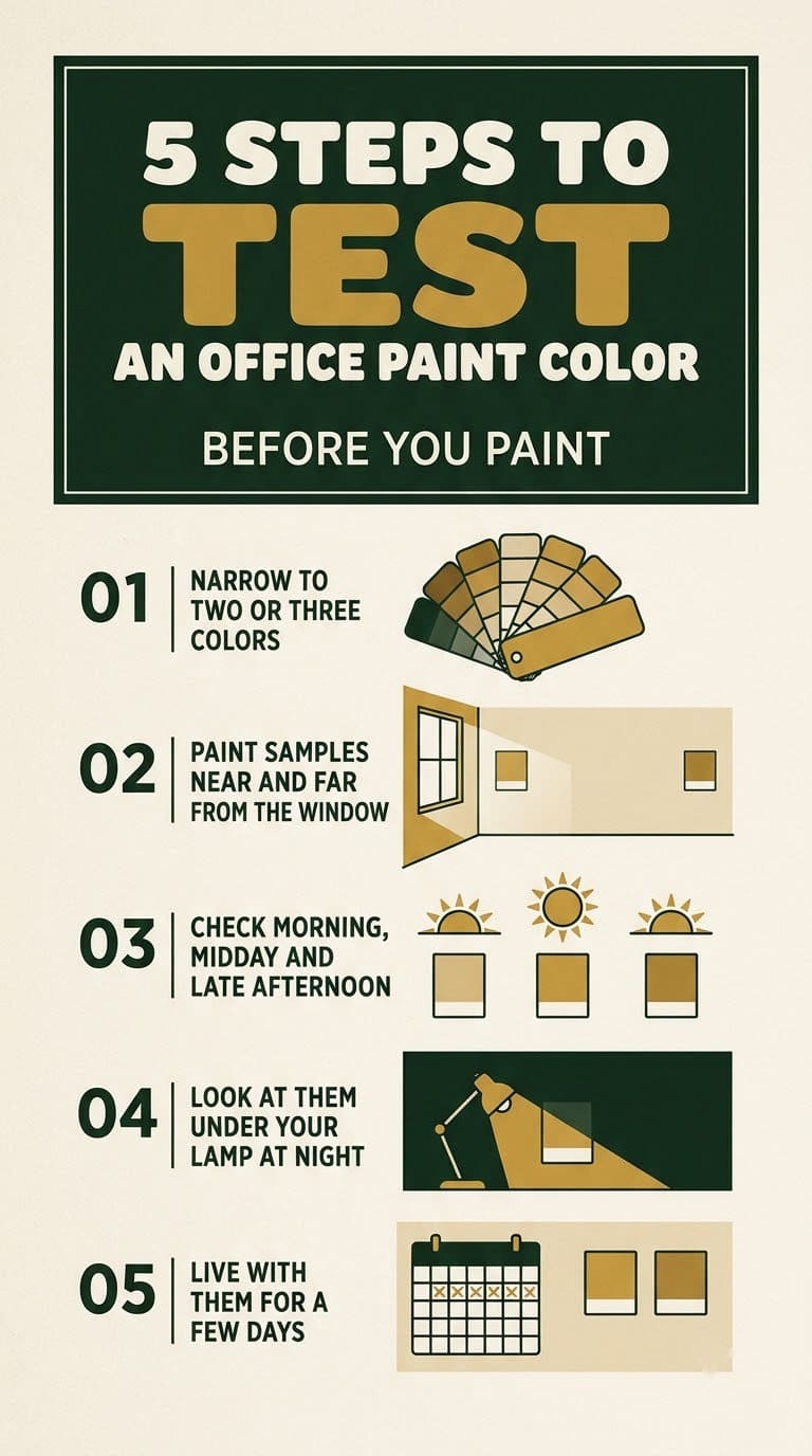
- Narrow your list to two or three colors.
- Paint a large sample on two walls, one near the window and one far from it.
- Check them in the morning, midday and late afternoon.
- Look at them under your lamp at night.
- Live with them for a few days.
What Will It Cost, and How Long Will It Take?
Prices vary by store and region, so use these tiers.
| Tier | What it covers | Typical time |
|---|---|---|
| Free to cheap | Samples, one accent wall, new bulbs | An afternoon |
| One weekend | Painting the whole office | 1 to 2 days |
| Bigger project | New lighting, shelves, flooring and paint | A few weekends |
Start with the cheap tier. If you like the room, you may not need more.
Common Mistakes to Avoid
Picking a color from a chart. The research doesn’t name one best color. Pick one you like and test it in your light.
Skipping the sample. The same color looks different on a north wall and a south wall.
Going too dark in a dim room. Dark walls need good light. Add lamps or choose a mid-tone.
Choosing a glare color. Bright yellow and bright orange are tiring on a screen day.
Sanding old paint without a lead test. Many pre-1978 homes have lead paint. Test first.
FAQ
What is the best paint color for a home office? Soft sage green, soft blue, light blue-gray and warm white are the easiest. Pick one you enjoy and test it in your light.
What color is best for video calls? A calm, low-saturation wall such as blue-gray or navy keeps the background quiet. Test it on camera first.
What color should a small home office be? Warm white, butter yellow or soft peach keeps it light. Add one deeper accent in the furniture.
Does wall color affect productivity? Research suggests color influences mood, wellbeing and performance. It does not name a single best color.
How do I choose between a north-facing and south-facing office color? North-facing rooms suit warm neutrals with a higher LRV. South-facing rooms suit calmer, cooler colors.
Related Posts
Never miss an update — choose FarmFoodFamily as your preferred source on Google.
How it works: Tap the button below to open Google's settings page, then check the box next to FarmFoodFamily.
Tap the checkbox to turn it blue — that's how you know it's set.