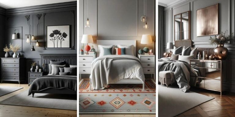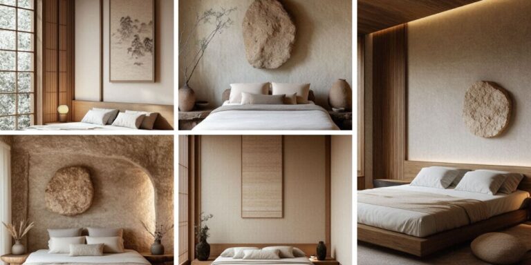
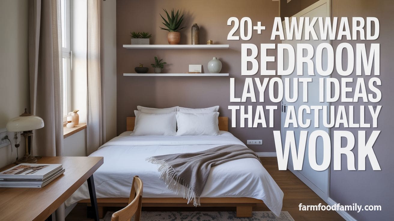
20+ Awkward Bedroom Layout Fixes You’ll Wish You Knew Sooner
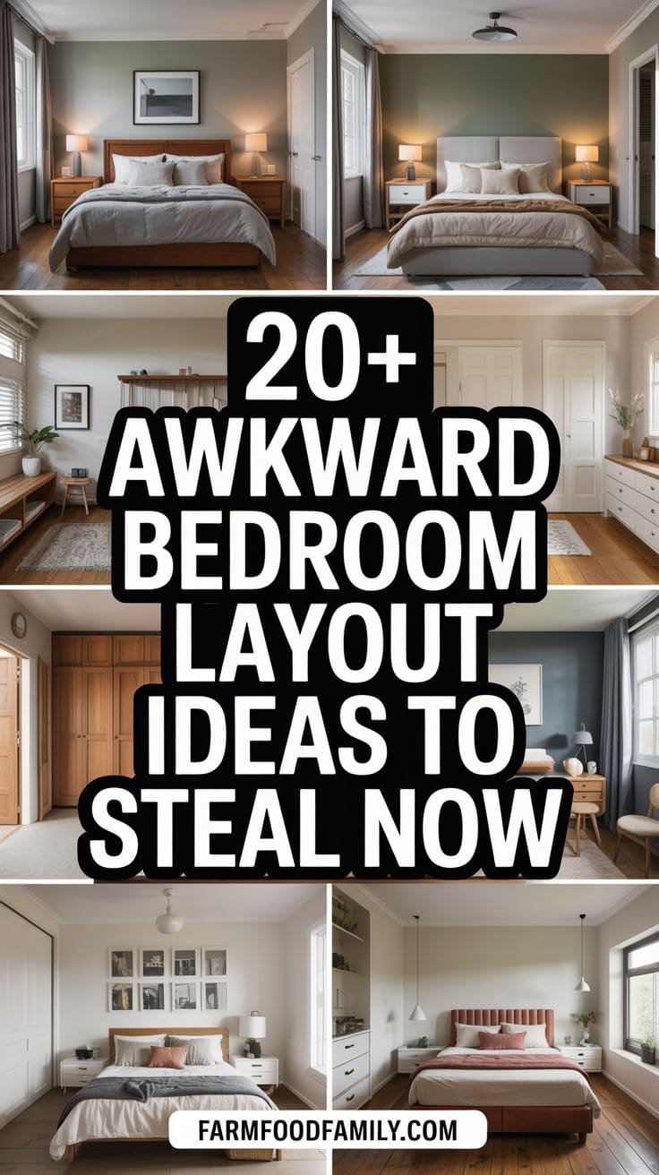
Awkward bedroom layouts are more common than you might think—whether due to oddly placed windows, off-center doors, strange alcoves, or a narrow footprint, many bedrooms pose spatial challenges that require a little creativity to overcome. With thoughtful design, what first appears as a limitation can become an opportunity for charm, character, or function. These awkward…

Never miss an update — choose FarmFoodFamily as your preferred source on Google.
How it works: Tap the button below to open Google’s settings page, then check the box next to FarmFoodFamily.
Tap the checkbox to turn it blue — that’s how you know it’s set.
Awkward bedroom layouts are more common than you might think—whether due to oddly placed windows, off-center doors, strange alcoves, or a narrow footprint, many bedrooms pose spatial challenges that require a little creativity to overcome.
With thoughtful design, what first appears as a limitation can become an opportunity for charm, character, or function. These awkward nooks and layouts can be transformed into cozy corners, smart storage, or visually balanced sanctuaries with clever organization and intentional styling.
The goal is always to make the room feel functional, harmonious, and personal. Below are awkward bedroom layout ideas tailored to make the most out of unconventional bedroom spaces, helping you reimagine the design of your resting retreat without needing a full remodel.
1. Floating Bed Centered on a Window Wall
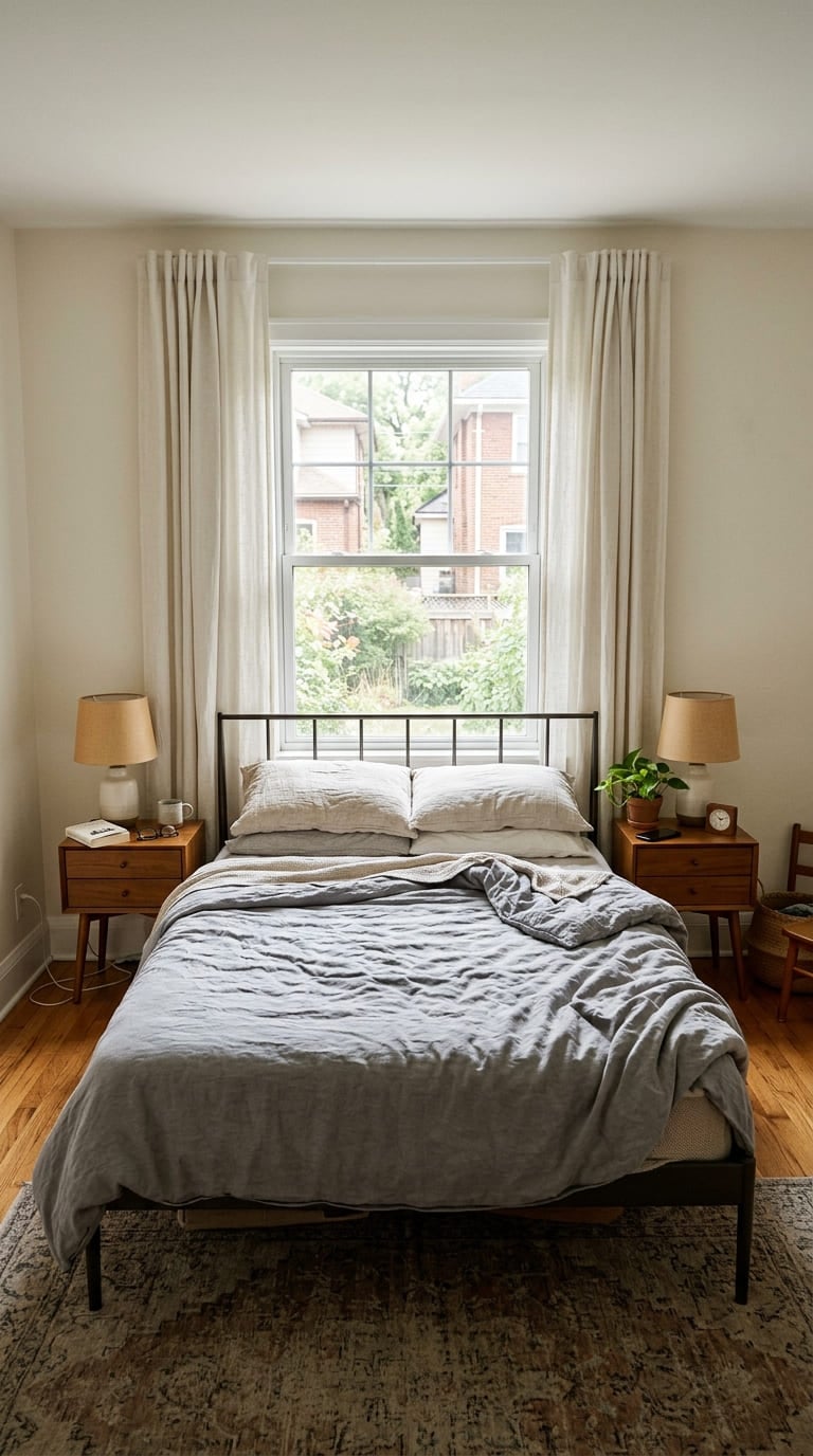
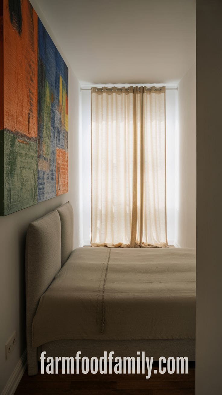
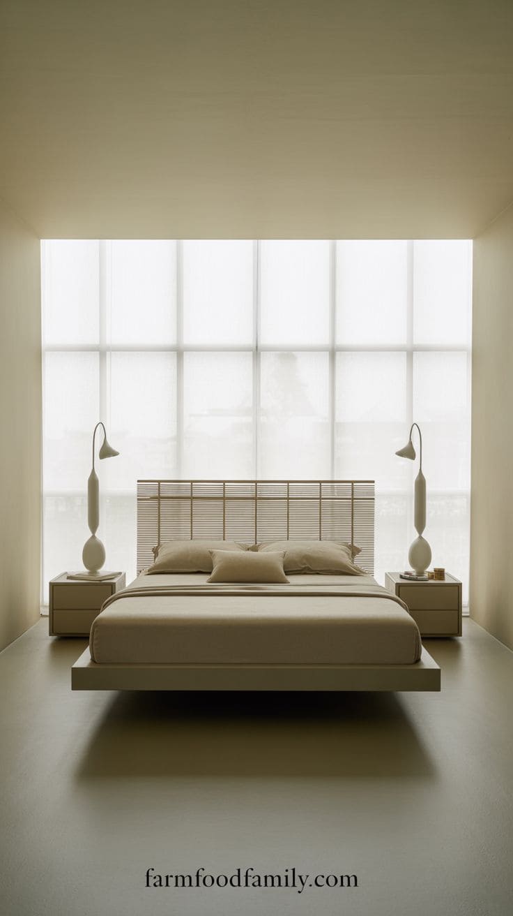
When a room has no solid wall free of a window or door, stop looking for one. Center the bed on the window wall instead and let the window itself act as the headboard.
Long drapes on either side create the illusion of symmetry, and a low or open headboard, metal rods or slats rather than solid upholstery, keeps the window from being blocked entirely.

Matching nightstands and sconces on both sides do a lot of the visual work here. They turn what could read as an accident into something that looks deliberate.
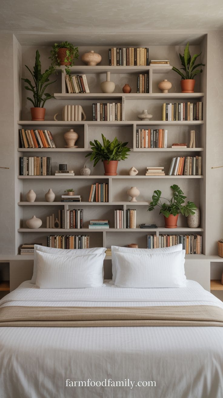
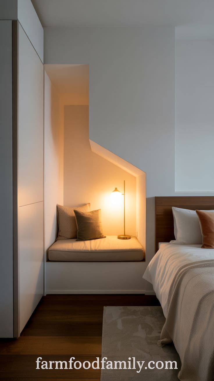
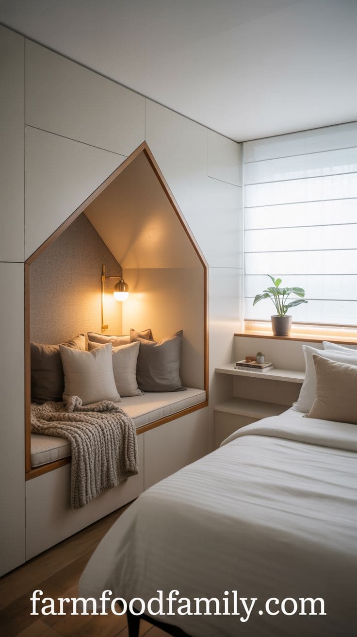
2. Use Alcoves as Built-In Storage or Reading Nooks
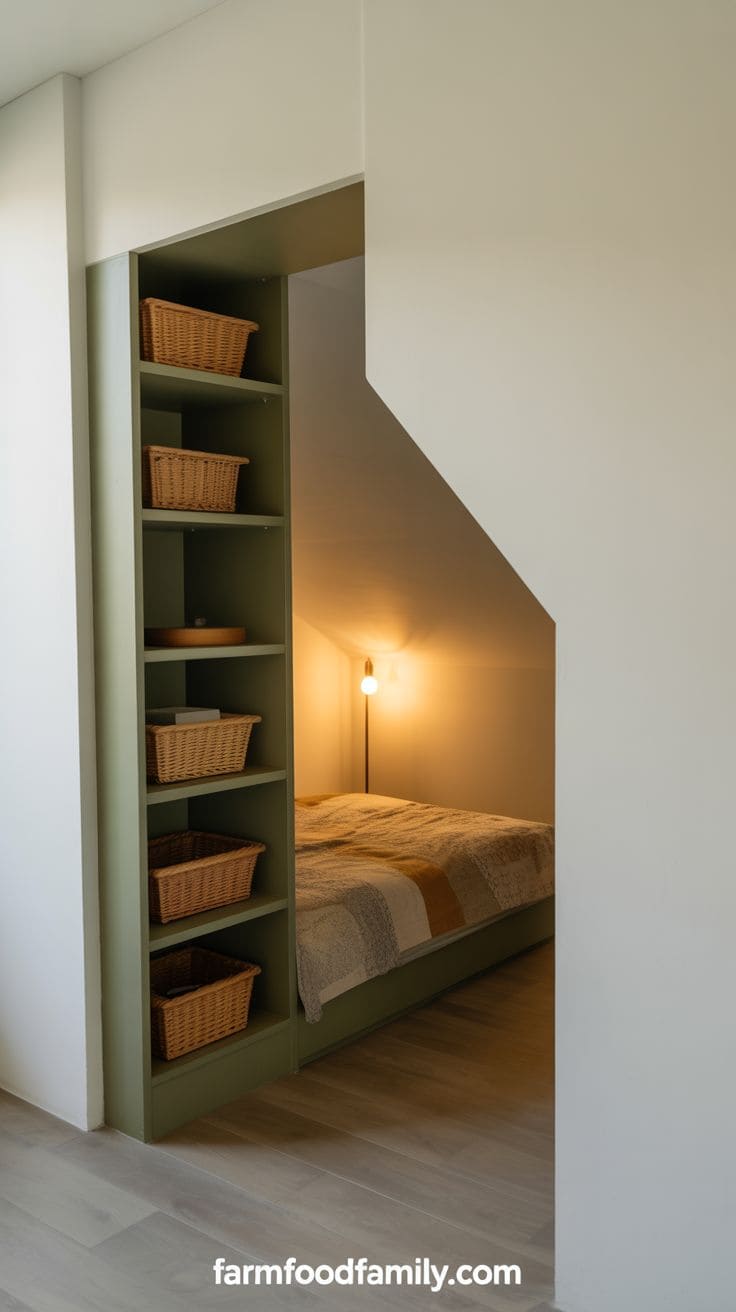
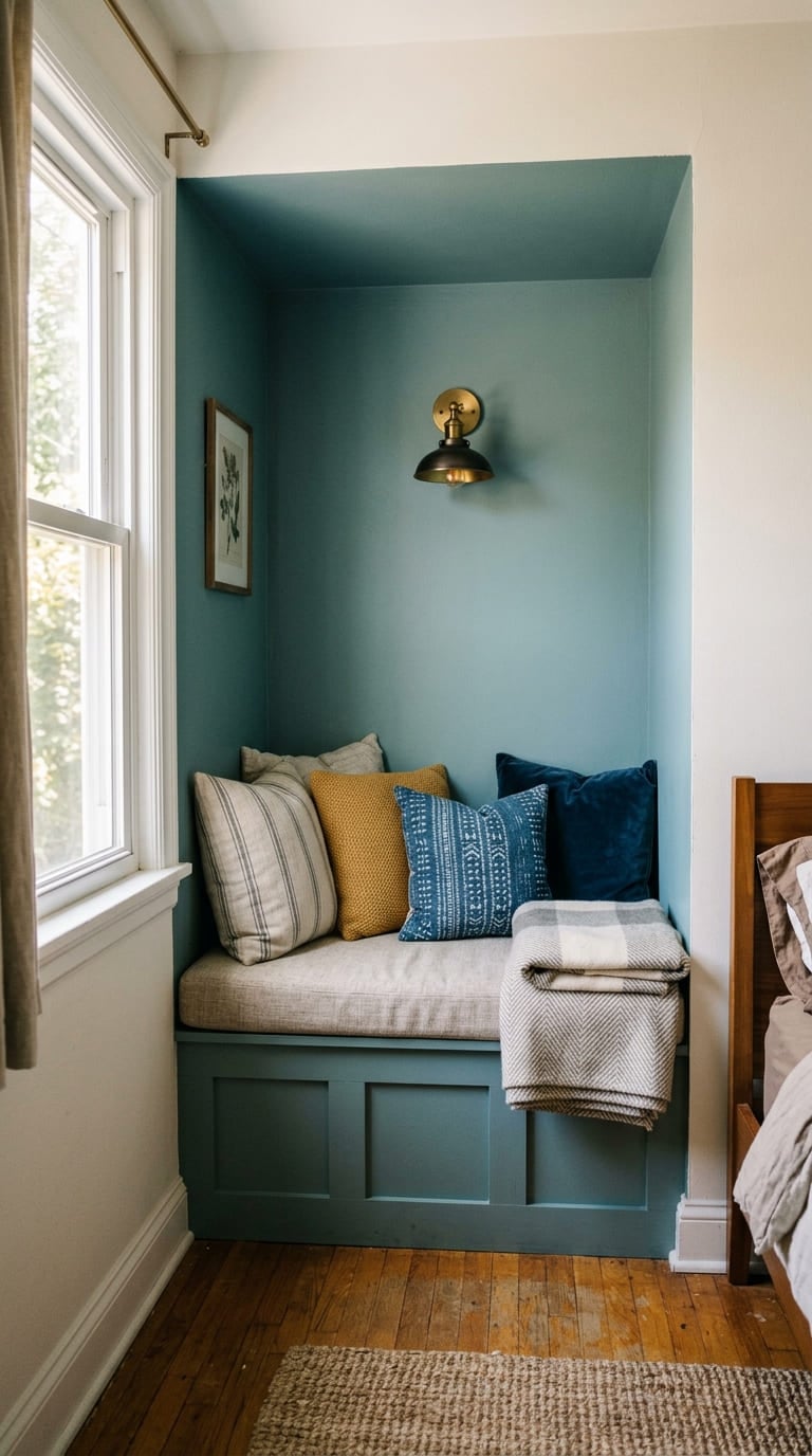
A bump-out or shallow alcove is easy to ignore, or worse, fill with a single awkward piece of furniture that doesn’t belong there. Valeria Fervorari of Studio Ocra makes the case for treating it as an asset instead: “Unexpected architectural corners and in-between spaces are almost inevitable when you are decorating an existing space.”
Her point about built-in solutions applies directly here too, a freestanding piece dropped into an odd nook rarely feels integrated the way something built to fit the space does.
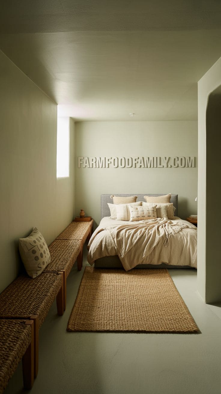
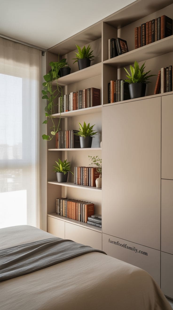
Open shelving, a cushioned reading seat with sconce lighting, or simply a different paint color to define the space visually all work. If the alcove is too shallow for seating, vertical storage, baskets or a slim cabinet, uses the space without forcing function where there isn’t room for it.
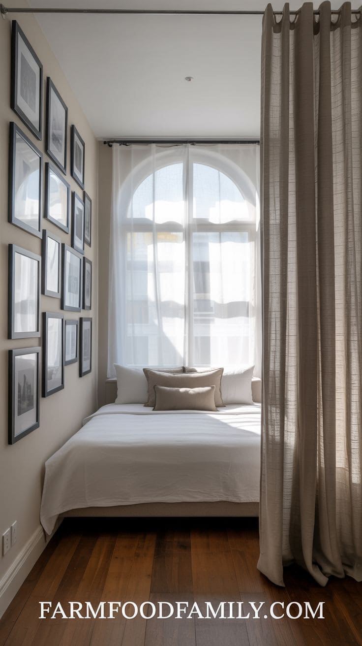
3. Offset Bed Placement with Gallery Wall or Drapery Panel
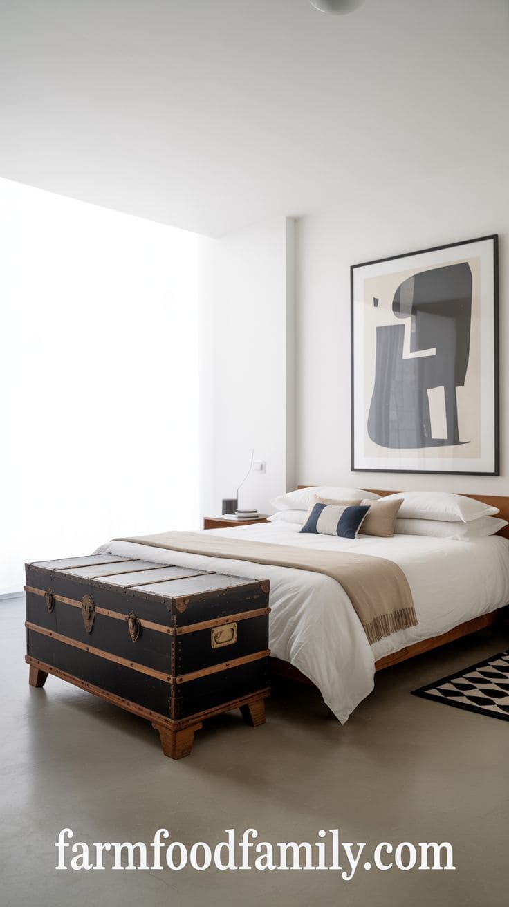
Sometimes there’s no way to center the bed at all, doors and windows eat every wall option. When that happens, an intentionally off-center placement reads better than a forced, awkward centering.
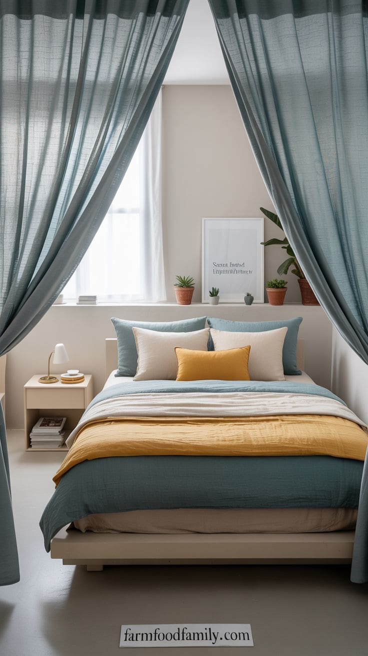
Balance the open side with a gallery wall or a single large piece of art. A floor-to-ceiling curtain panel on the shorter side of the bed does something similar, softening the asymmetry rather than hiding it.
A bench, trunk, or wide rug spanning the width of the wall behind the bed pulls the whole arrangement together. The asymmetry becomes a choice instead of an accident.
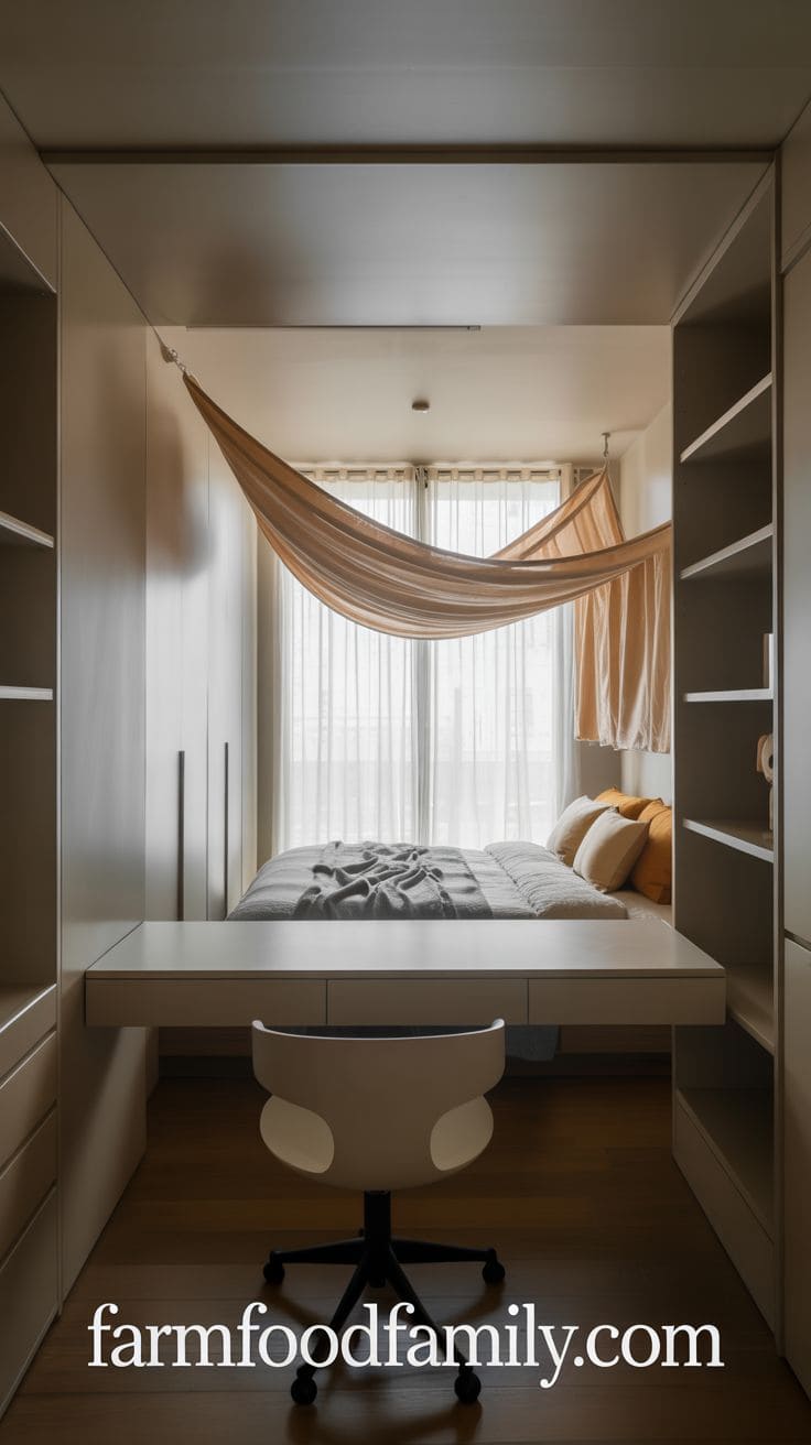
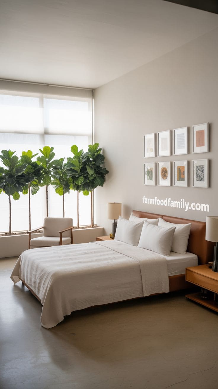
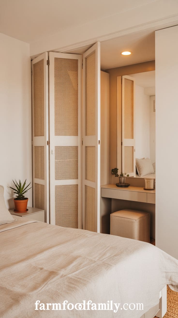
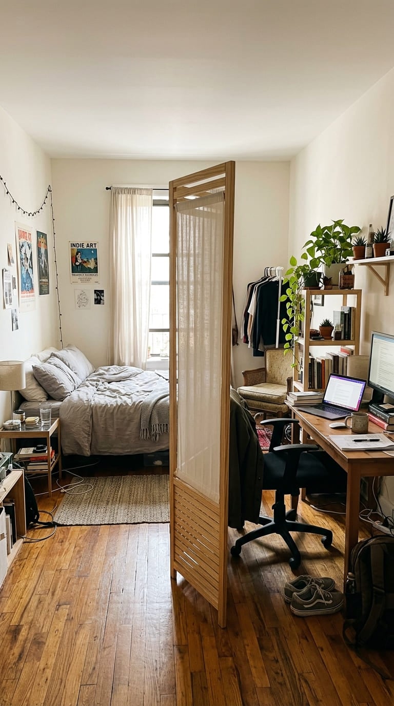
4. Room Divider for Studio-Style or Shared Bedrooms
A bedroom that doubles as a living space, common in studios or shared housing, benefits from a lightweight visual break more than a hard wall.
An open shelf unit, a fabric drape, a folding screen, or a row of tall plants can separate a sleeping zone from a dressing or lounge area without closing either one off completely.
Keep the divider semi-transparent so light still moves through the room. A solid partition in a small space tends to make both halves feel smaller, not more private.
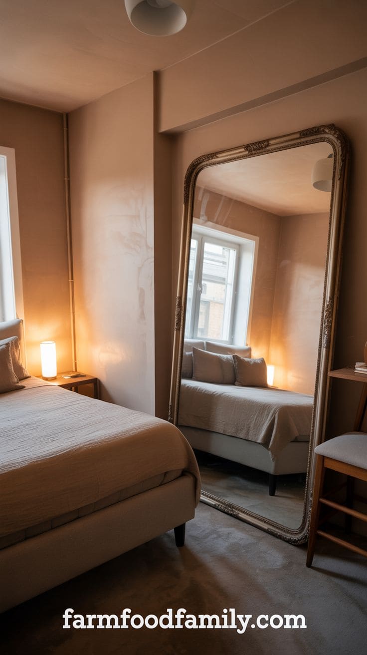
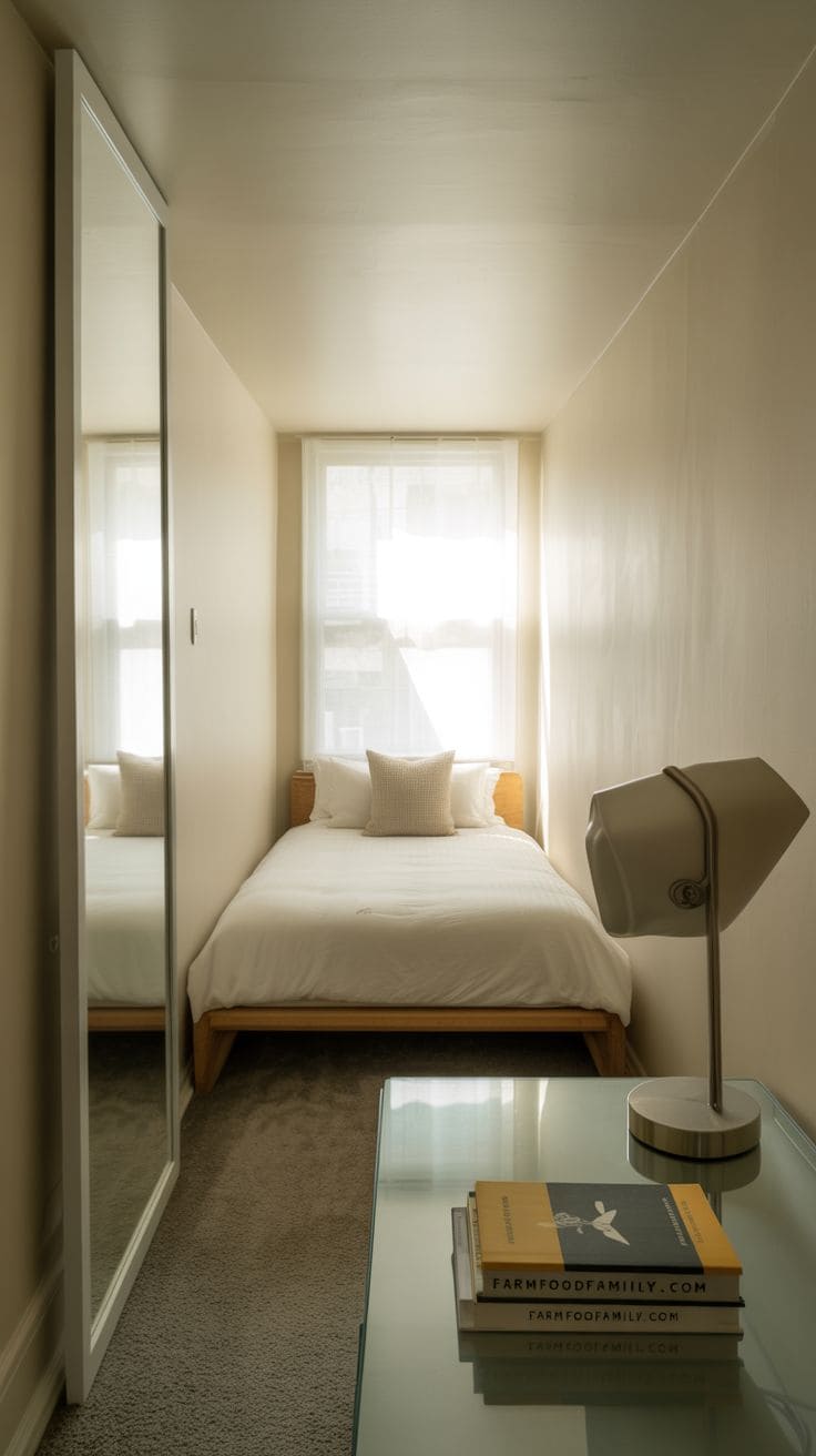
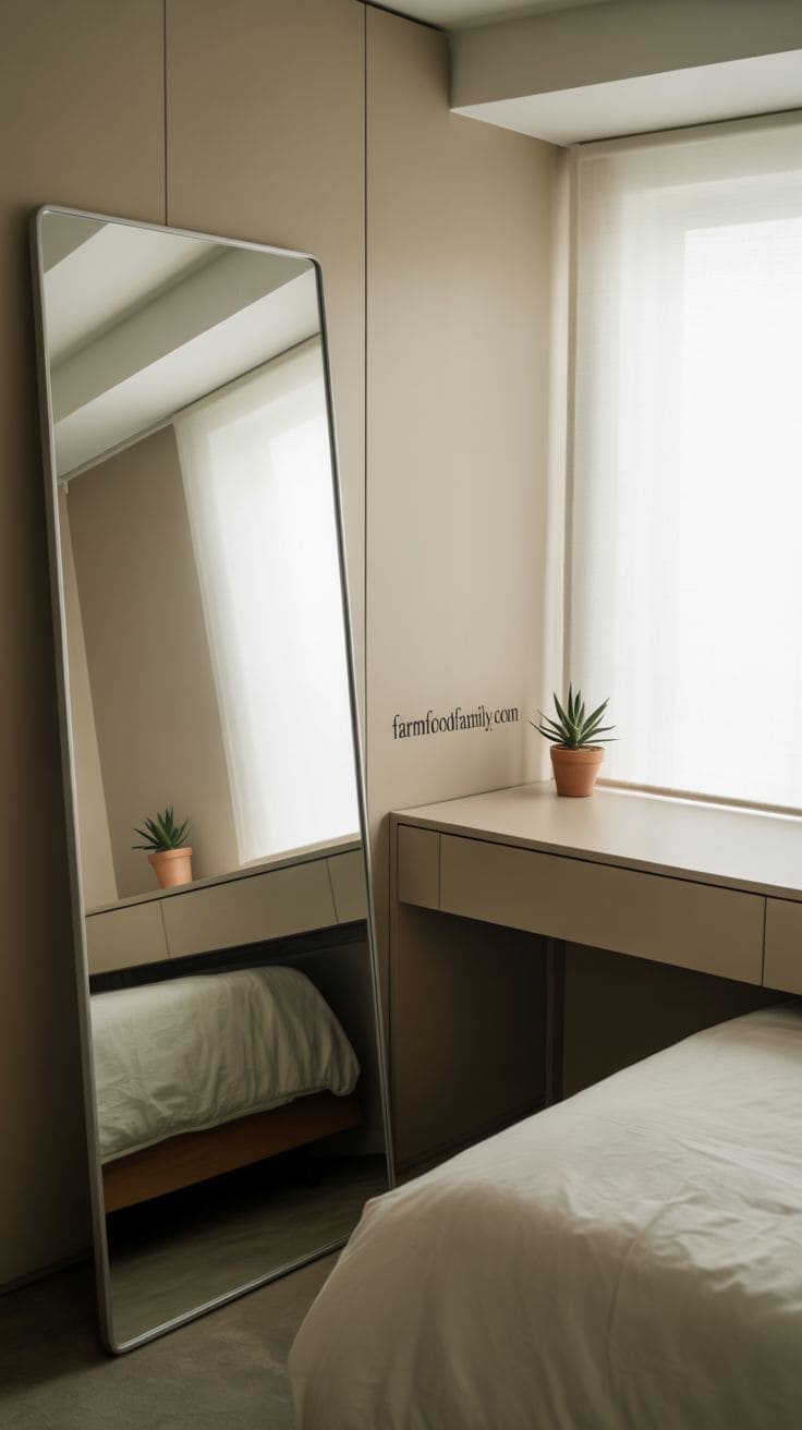
5. Floor Mirror for Visually Expanding Narrow Layouts
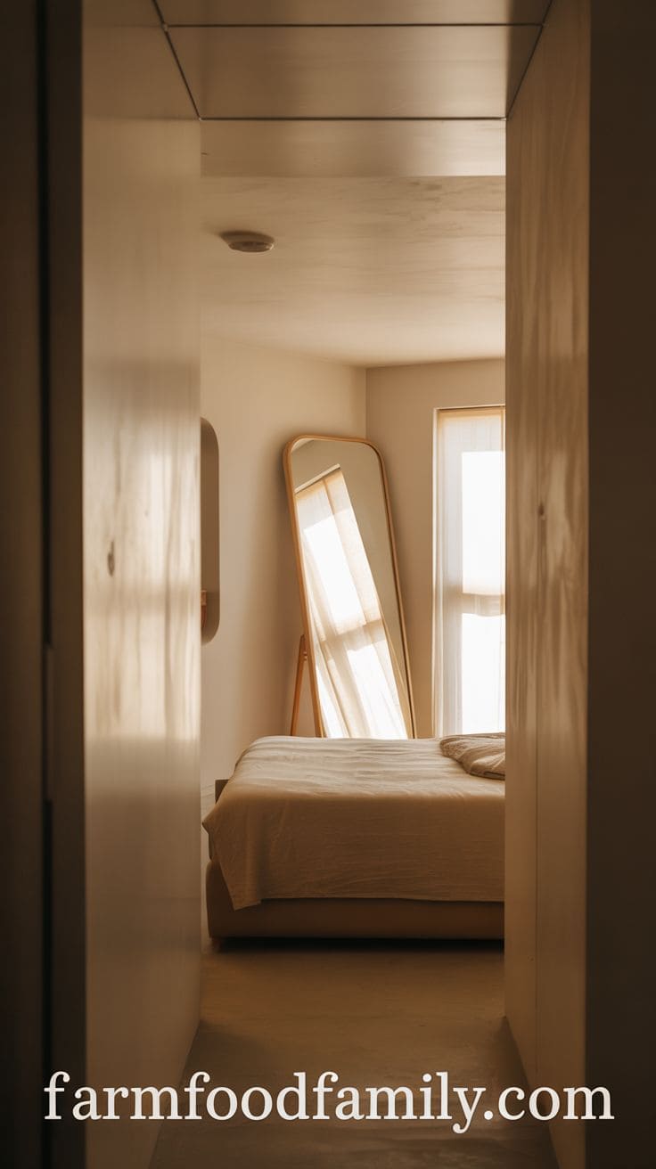
A wide floor mirror does two things at once in a long, cramped bedroom: it doubles the apparent floor area and bounces available light around the room. Position it opposite a window, or at the short end of a narrow layout, for the strongest effect.
In tight rooms, running the bed along one long wall with a slim console or wall-mounted desk on the opposite side, mirror included, creates depth without adding real furniture bulk.
A vintage or industrial frame turns the mirror into a decor piece in its own right, not just a trick.
6. Ground the Bed Against the Sloped Wall Instead of Avoiding It
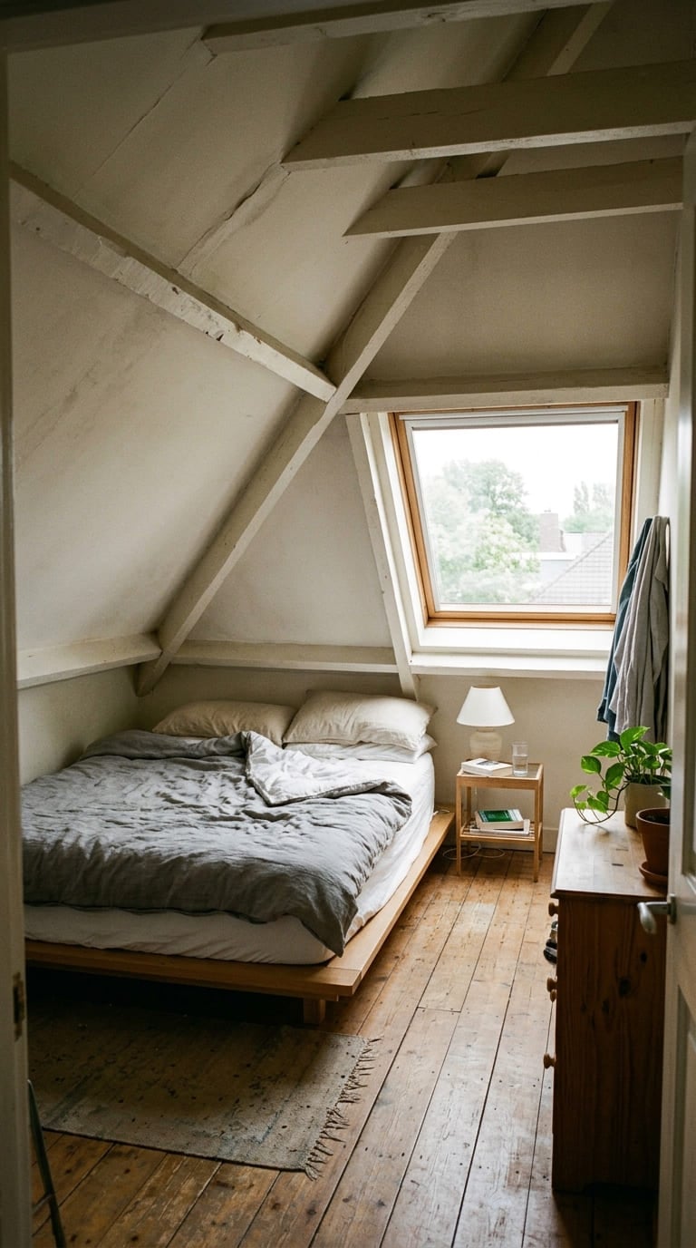
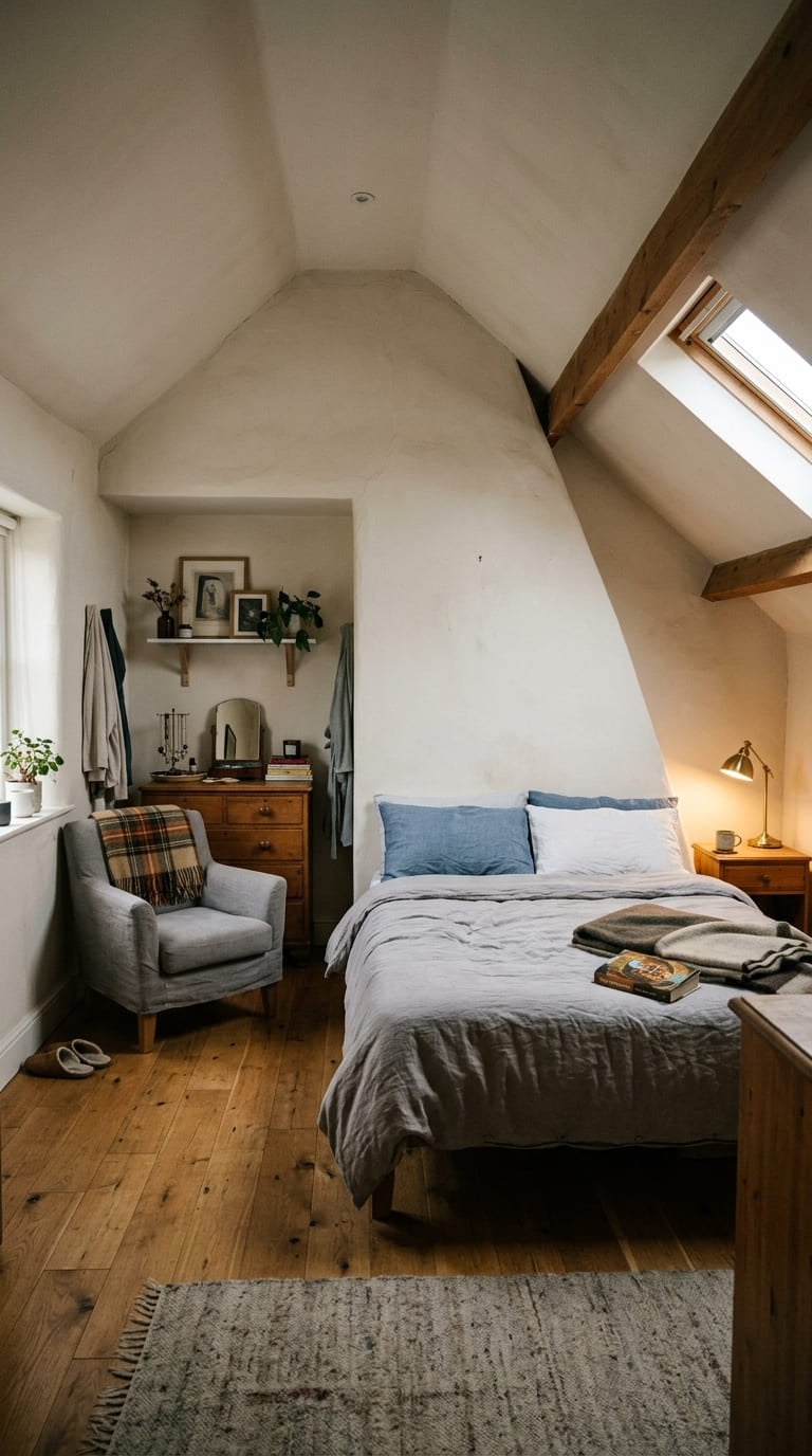
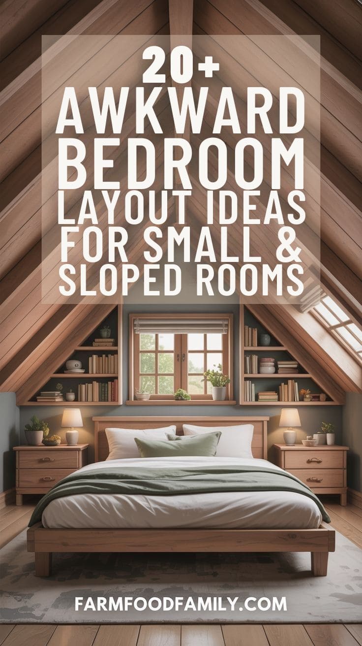
A sloped ceiling gets treated as a problem to design around, when it usually works better as a starting point. Designer Emma Shone-Sanders of Design & That put it plainly about a bedroom with exactly this challenge: “We decided to view the sloped ceiling, slightly awkward shape, and small, tucked-away window as starting points for the whole design rather than as problems to hide.”
Practically, that means placing the bed where the ceiling is highest and letting the lowest point stay clear of foot traffic. A real thread about a sloped-ceiling bedroom, one that pulled 108 upvotes and 81 comments, put the practical version of this bluntly: the layout “needs grounding against the wall on the right, otherwise anyone getting in the left side is going to be navigating that sloping wall.”
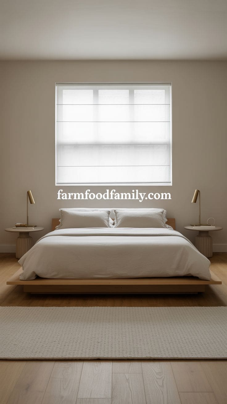
A low-profile platform frame fits under the slope where a tall headboard wouldn’t, and it keeps the whole arrangement from feeling like it’s ducking the architecture.

7. Paint the Ceiling the Same Color as the Walls
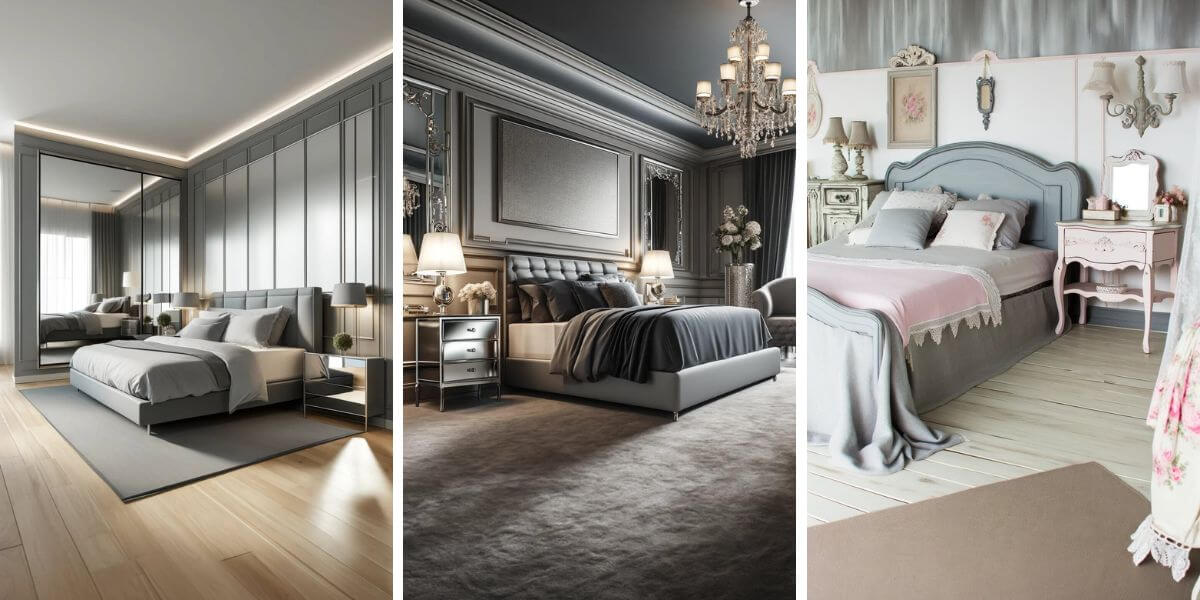
Sloped or angled ceilings create visual seams exactly where a room needs to feel calm, not busier. John Bambick of John Bambick Design, working in a bedroom where the ceiling rises to nearly twenty feet with several opposing angles, used one fix repeatedly: “We painted the ceilings the exact same color as the wall, so everything blended.” His result: “It feels appropriately scaled to the space now.”
This costs nothing beyond paint and works whether the ceiling is dramatically vaulted or just modestly sloped. The junctions stop announcing themselves.
8. Choose Low-Profile, Shallow Furniture for Low-Ceiling Zones
Under a sloped ceiling or in a room with an unusually low section, standard-depth dressers and tall headboards make the constraint worse. Furniture with a shallow footprint and a low back leaves usable clearance where a bulkier piece would force awkward navigation around it.
This matters most exactly where people actually move, getting in and out of bed, walking to a closet. A beautiful dresser that clips someone’s shoulder every morning isn’t solving the layout problem, it’s adding to it.
9. Zone a Studio-Style Room Into Sleep and Work Areas
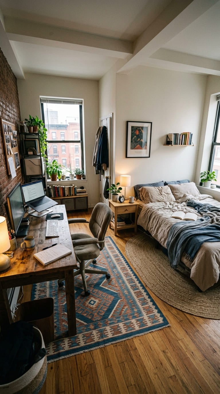
A bedroom that has to double as an office or lounge needs a real boundary between functions, even a soft one, or it starts to feel like neither space works well. One Reddit thread in r/floorplan about exactly this problem, a shared bedroom-and-workspace layout, settled on splitting the room into a distinct sleep zone and work zone rather than blending the two: “it really divides up the room into a distinct ‘work zone’ and a ‘sleep zone.'”
A rug, a low bookshelf, or a change in flooring can mark the boundary without a full room divider. The point isn’t to build a wall, it’s to give each function its own visual footprint.
10. Float Furniture Away From the Walls
The instinct in an oddly shaped room is to push everything to the perimeter, and it usually backfires. Furniture lined up against uneven walls only draws more attention to how uneven they are. Pulling a bed or a seating piece a few inches, or a few feet, off the wall lets the room define its own zones instead of tracing the walls’ irregular shape.
This feels counterintuitive in a small room, where every inch seems too valuable to give up. In practice it’s often the difference between a room that reads as “oddly shaped” and one that reads as “designed.”
11. Multi-Functional Furniture for Tight Footprints
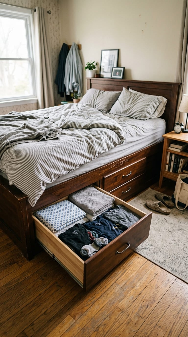
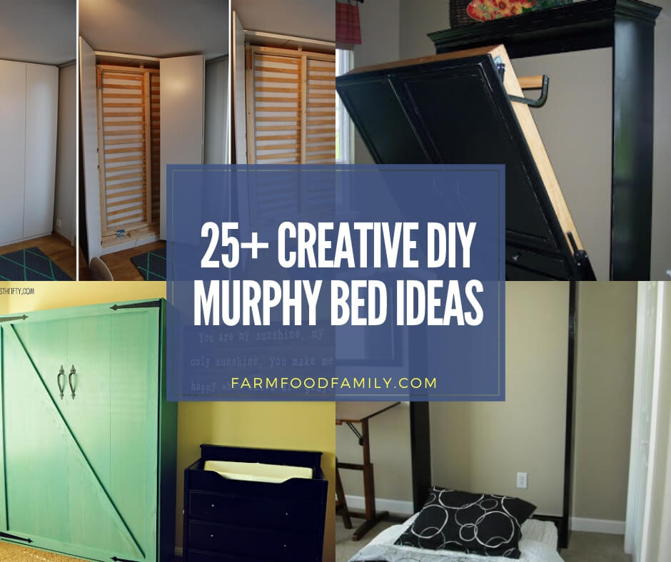
A bed with built-in drawers underneath, or a frame raised just enough to slide storage bins beneath it, recovers square footage that a separate dresser would otherwise eat. In a room too small or too oddly shaped for a full furniture set, this single swap can matter more than any layout trick. For anyone building or buying new, our DIY space-saving bed frame plans cover several versions of exactly this.
A folding or wall-mounted desk works the same way for anyone using the bedroom as a part-time workspace. It exists when needed and disappears when it isn’t.
12. Define Zones With an Area Rug When There’s No Wall to Divide
Not every awkward layout has room for a physical divider. A rug placed under just the bed, rather than the whole floor, visually marks a sleeping zone even in a fully open room. A second, smaller rug under a chair or reading spot does the same for a secondary zone.
It’s the cheapest and most reversible idea on this list. Renters in particular can define real zones without touching a wall or a lease clause.
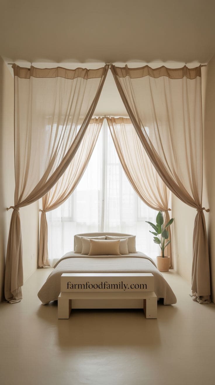
13. Mount Curtains at the Ceiling Line
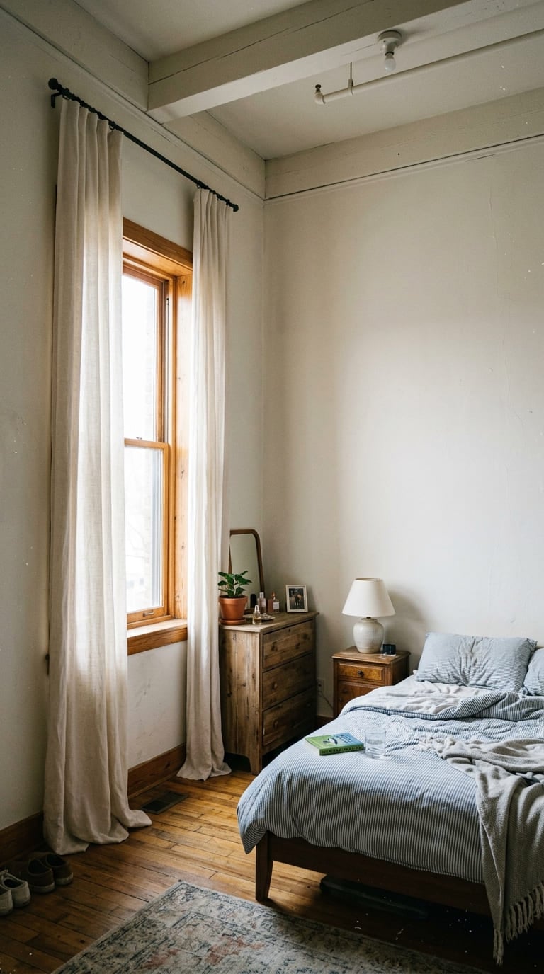
In rooms with high ceilings but an otherwise awkward footprint, hanging curtains at standard window height wastes the one advantage the room actually has. Mounting the curtain rod at the ceiling line instead, well above the window frame, pulls the eye upward and makes the vertical space part of the room’s design rather than dead air above the window.
This works especially well with slider-style windows or glass doors, where the extra curtain length also adds a softness the hardware alone doesn’t provide.
Mistakes to Avoid
The same handful of problems come up over and over in real furniture-placement threads, and none of them are about picking the wrong color.
Buying furniture too bulky for the room’s actual shape.
This is the single most repeated complaint in real layout threads: pieces that would work fine in a standard rectangular room make an already odd-shaped one feel worse. Measure the room’s tightest pinch points, not just its total square footage, before buying anything large.
Lining every piece up against the walls.
It feels like the safe, space-efficient choice. In a room with uneven or angled walls, it does the opposite of what’s intended: it highlights every irregularity instead of hiding it.
Ignoring the lowest point of a sloped ceiling.
A bed or reading chair placed where someone has to duck isn’t a design choice, it’s a hazard waiting to happen. Map the ceiling height before finalizing where the bed goes, not after.
Conclusion
None of this requires a full renovation. Most of it is furniture placement, paint, and a willingness to work with the room’s actual shape instead of pretending it’s rectangular. Pick the anchor point first, keep bulky pieces out of the tightest spots, and the rest of the layout tends to fall into place around it.
If you liked these ideas, leave a comment and share the list with your friends!
Frequently Asked Questions
Where should I start when arranging furniture in an oddly shaped bedroom? Pick one anchor piece, almost always the bed, and place it first. Every other piece should respond to that placement rather than being positioned independently against the nearest wall.
Should furniture go against the walls in a small, awkward bedroom? Not automatically. In rooms with uneven or angled walls, pulling furniture even a little away from the perimeter often reads better than lining everything up against walls that aren’t straight to begin with.
What’s the easiest fix for a bedroom with a sloped ceiling? Painting the ceiling the same color as the walls removes the visual seam where they meet, and it costs nothing beyond paint. Pairing that with a low-profile bed placed at the highest point of the slope handles most of the rest.
How do I fit a workspace into a small bedroom without it feeling cluttered? Define a separate zone with a rug, a low bookshelf, or a change in flooring rather than mixing work and sleep furniture together with no boundary. A folding or wall-mounted desk also helps the workspace disappear when it’s not in use.
Never miss an update — choose FarmFoodFamily as your preferred source on Google.
How it works: Tap the button below to open Google's settings page, then check the box next to FarmFoodFamily.
Tap the checkbox to turn it blue — that's how you know it's set.