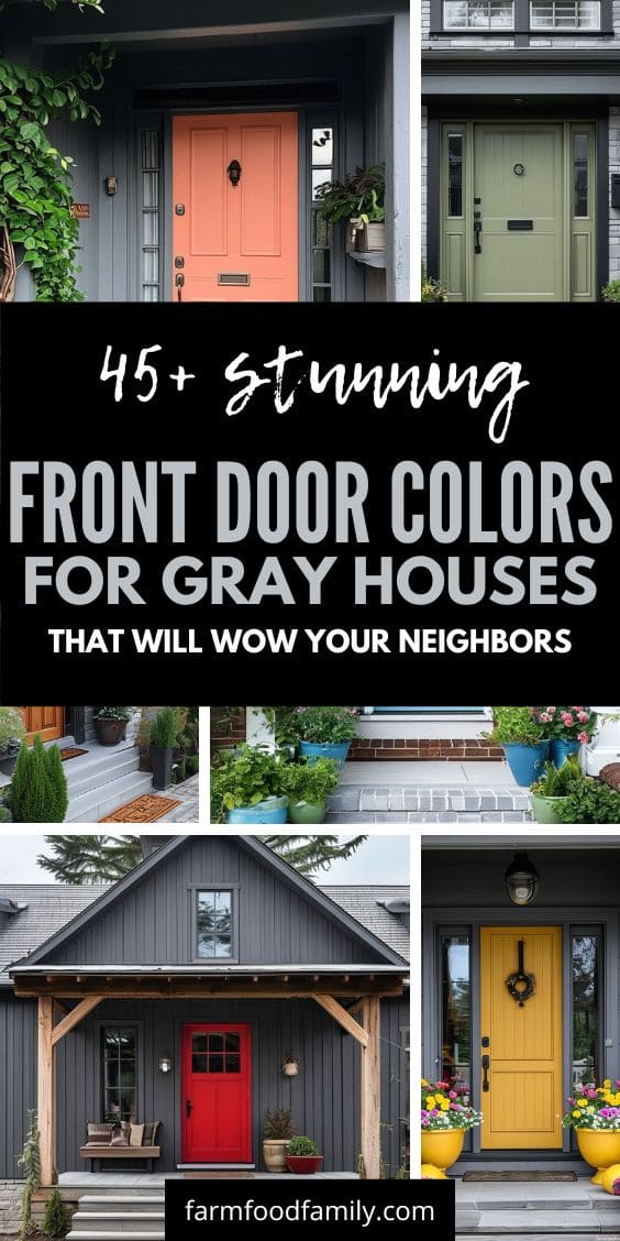
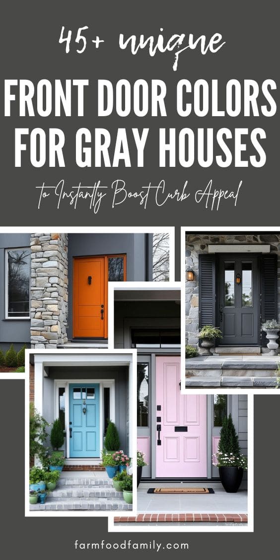
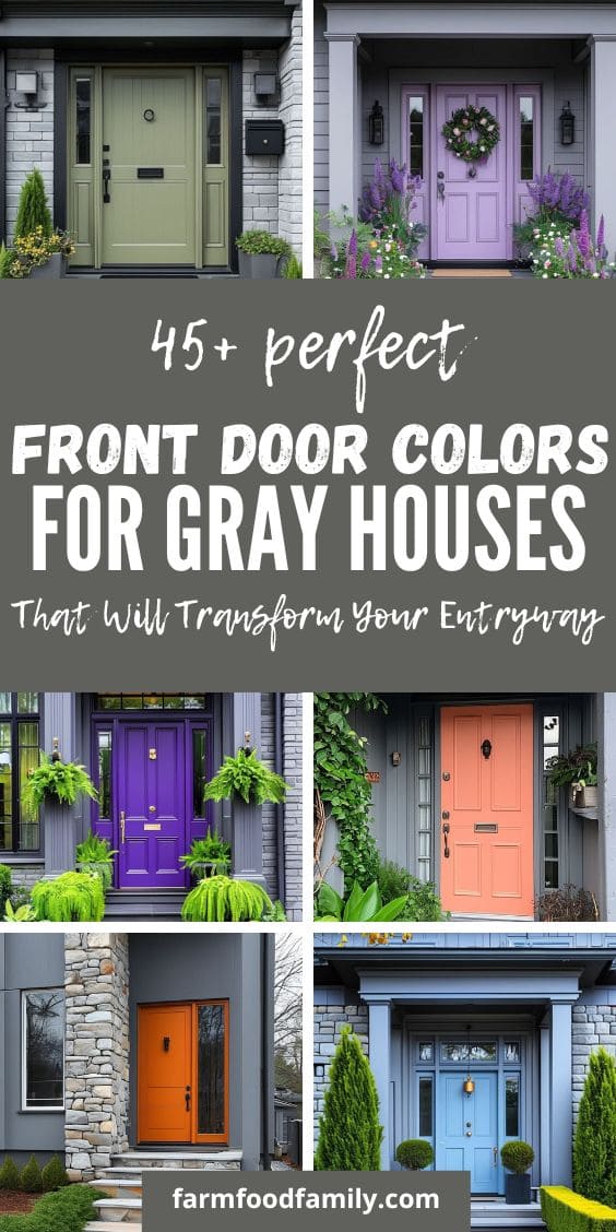
45+ Best Front Door Colors For Gray Houses: What 16,983 Homeowners Actually Chose
Picking a front door color for a gray house isn’t just an aesthetic exercise, it’s usually a genuine decision-paralysis moment. Gray is neutral enough to pair with almost anything, which sounds freeing until you’re actually standing in front of paint chips realizing “almost anything” isn’t much help. This guide is grounded in something most color…

Never miss an update — choose FarmFoodFamily as your preferred source on Google.
How it works: Tap the button below to open Google’s settings page, then check the box next to FarmFoodFamily.
Tap the checkbox to turn it blue — that’s how you know it’s set.
Picking a front door color for a gray house isn’t just an aesthetic exercise, it’s usually a genuine decision-paralysis moment. Gray is neutral enough to pair with almost anything, which sounds freeing until you’re actually standing in front of paint chips realizing “almost anything” isn’t much help.
This guide is grounded in something most color roundups skip: real data on what thousands of actual gray-house owners chose, plus the one principle that consistently comes up when real homeowners crowdsource this exact decision online, match the door to something that’s already there, not to the siding in isolation. Have a tan or beige house instead? See front door colors for a tan house for the equivalent breakdown.
What the Data Actually Shows
Most “front door color” guides work from vibes. FacadeColorizer, an AI facade-visualization tool, has something better: real usage data from 16,983 gray-house door color simulations run between January and May 2026. Seven colors accounted for 91.4% of all selections.
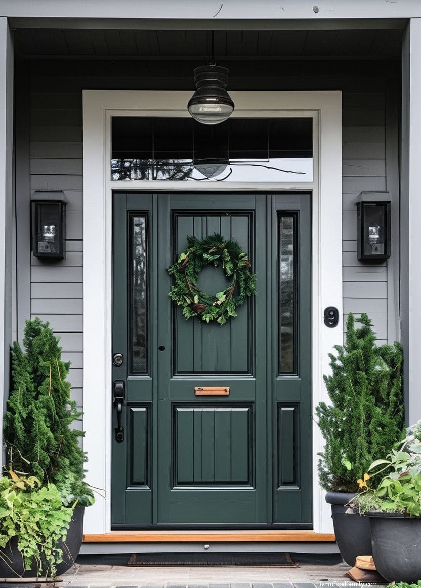
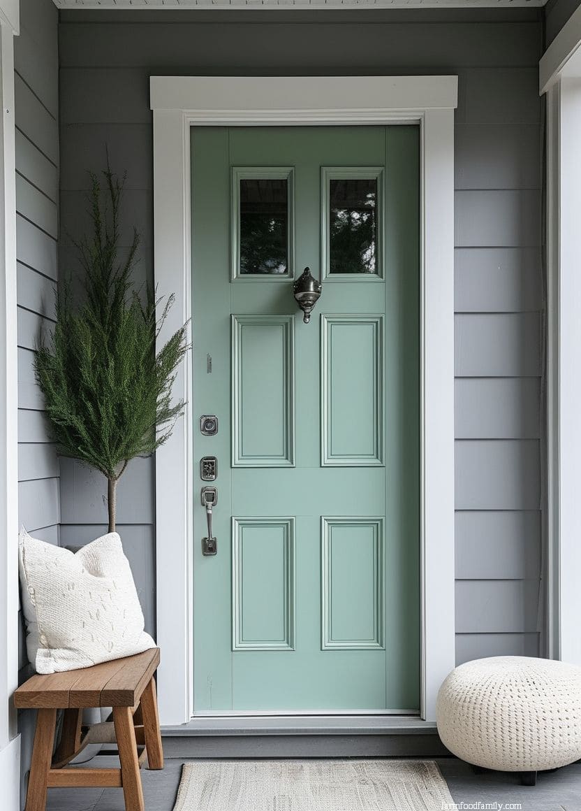
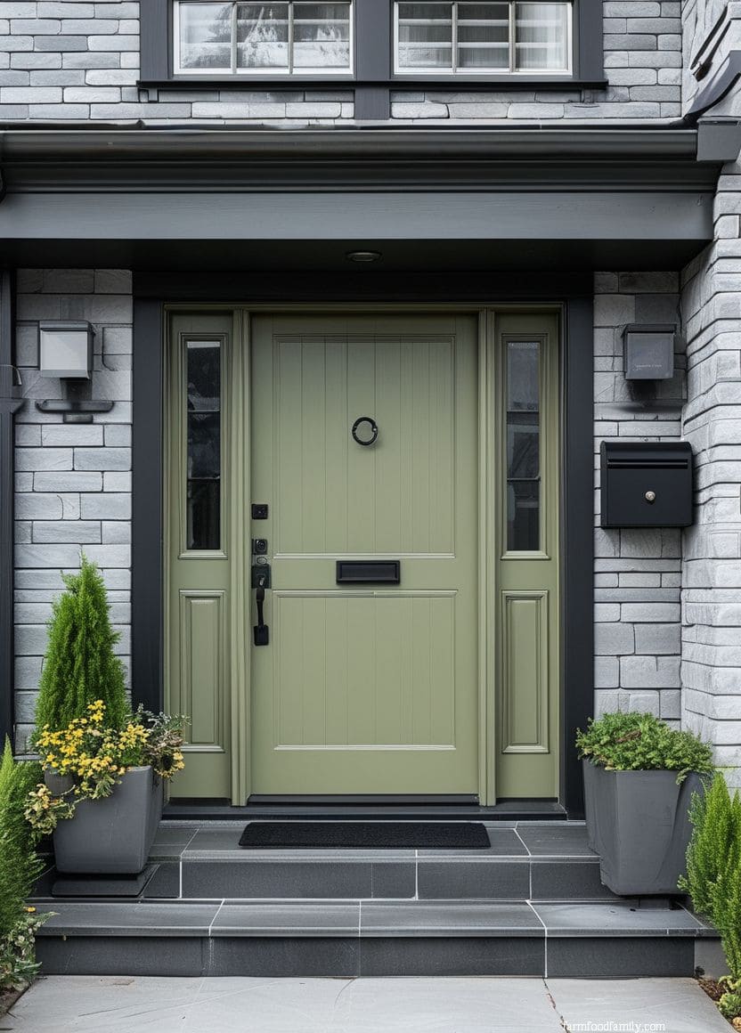
Black led at 27.3%, with Tricorn Black (Sherwin-Williams SW 6258) the single most-requested exact spec. Navy came in second at 22.8% and is the fastest-growing choice among returning users. Sage green is climbing fastest of all, up 38% compared to 2025. Lauren Saab, NCIDQ, founder and principal designer at Saab Studios, points to why the sage shift is happening: “A deep heritage green is one of the easiest ways to give a front door a more established, expensive look… it’s a complex, grayed sage, not a flat green. That depth reads as expensive.”
None of this means black or navy is automatically the right choice for your specific house. It does mean you’re not picking blind, these are the colors other gray-house owners have actually landed on, in real numbers.

25 Front Door Color Ideas For Gray Houses
1. Stained Wood
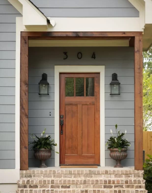
White trim and red brick against light gray wood-shake siding is a combination that hasn’t gone out of style in decades, mostly because real cedar shakes weather to gray on their own, so the whole palette feels inevitable rather than chosen.
Vinyl shake siding now reproduces that aged look convincingly while staying maintenance-free, and a stained wood door on top of it reads as classic without trying too hard.
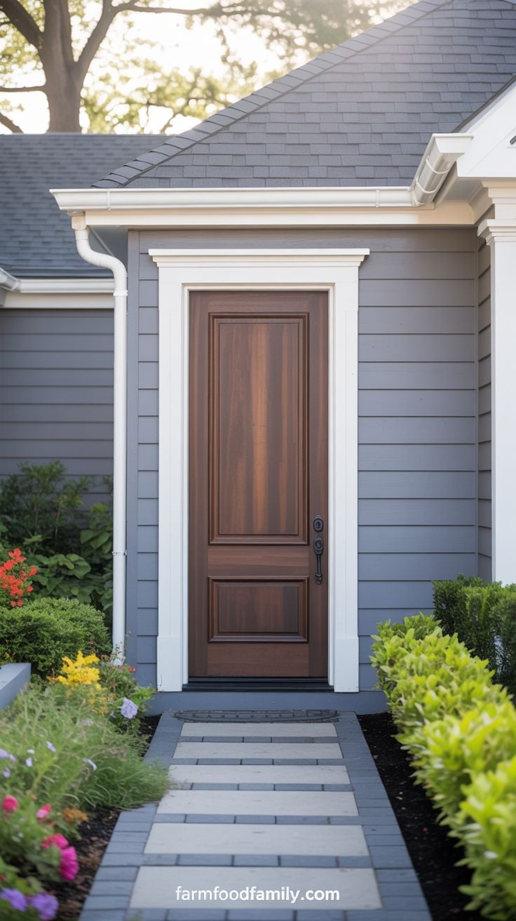
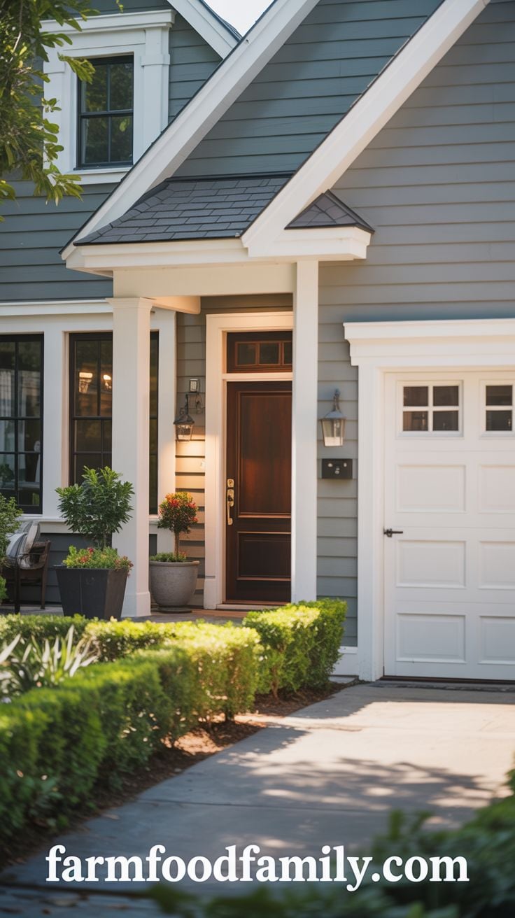
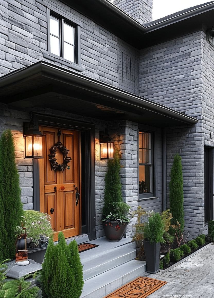
2. Dark Brown

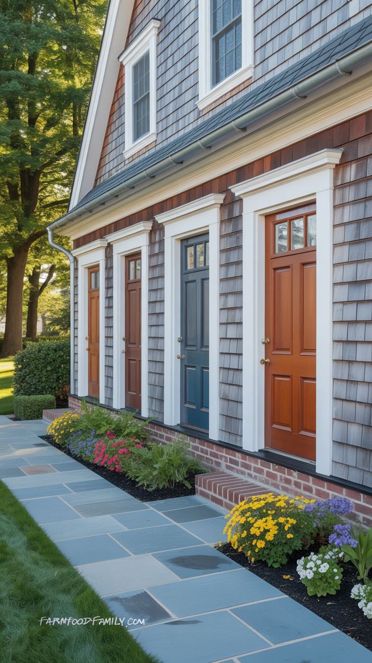
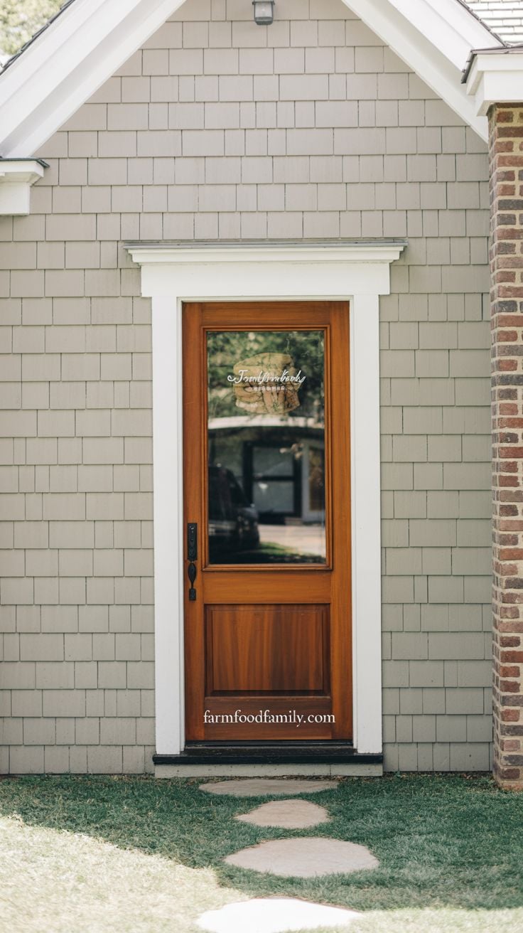
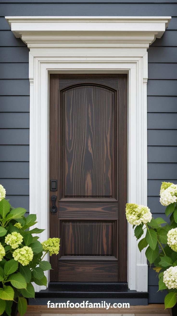
Gray paneling with a brown front door shows up constantly for a reason: it works with nearly any gray undertone, warm or cool, light or charcoal. The exact stain and siding shade can shift, but the underlying pairing holds.
White trim, a deep-toned roof, and simple landscaping around it turn a straightforward color choice into real curb appeal.
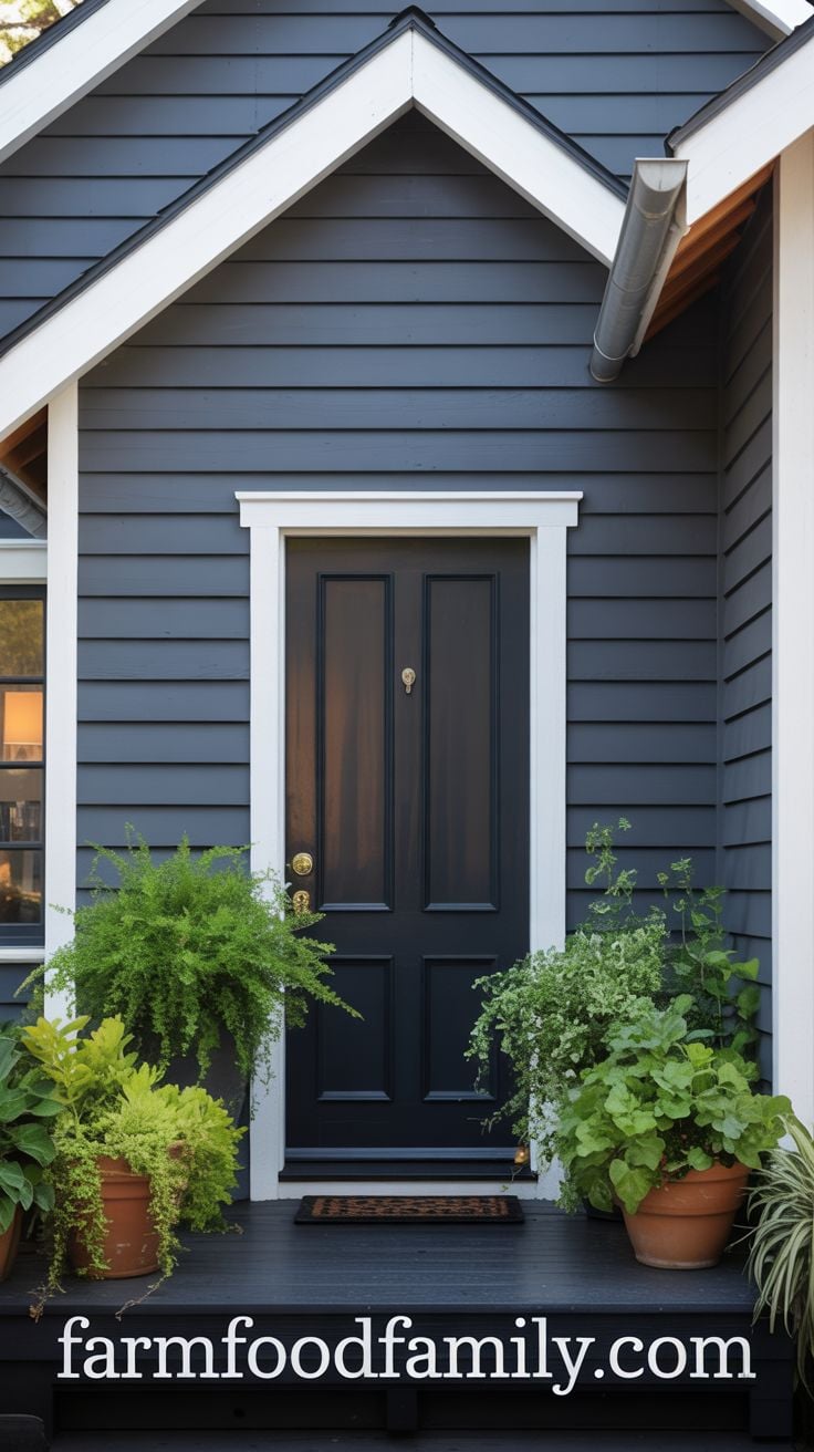
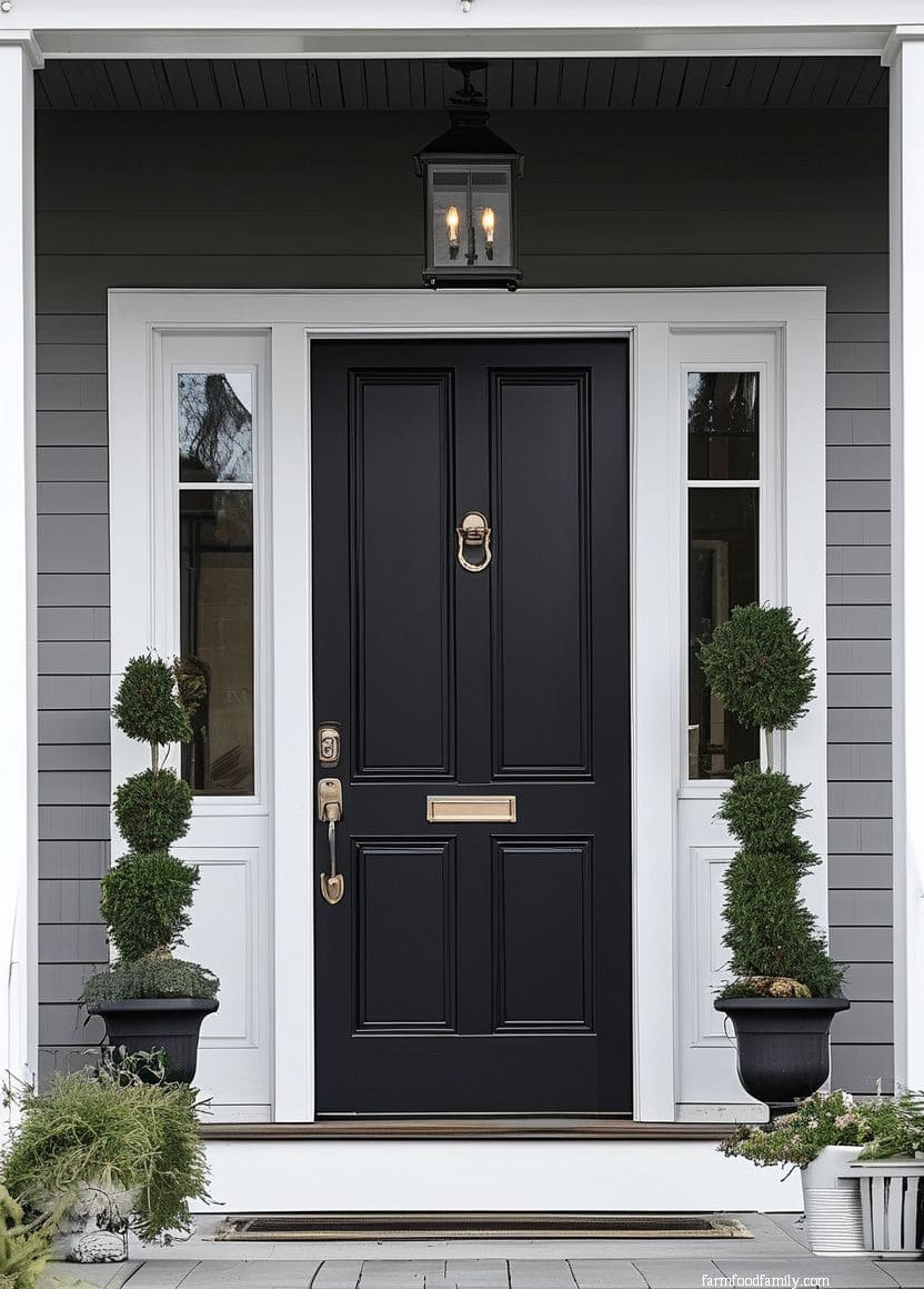
3. Black
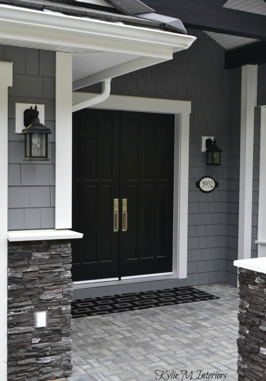
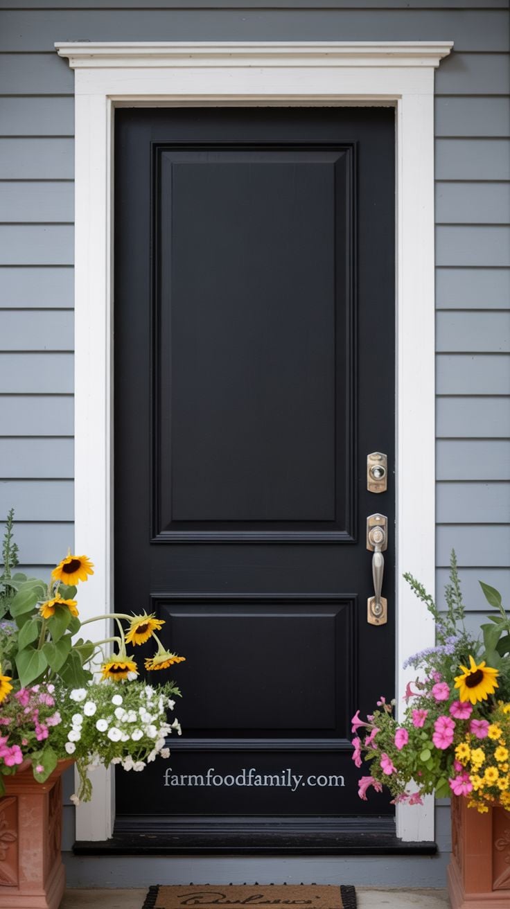
A black door is the highest-usage choice in the real data above, and it earns that spot honestly: it’s a dark, neutral backdrop that makes everything else, seasonal wreaths, planters, house numbers, actually stand out instead of competing with the door itself.
Gray siding with white trim is the classic pairing, since both are neutral enough to let the black door do the visual work.
4. Rich Brown

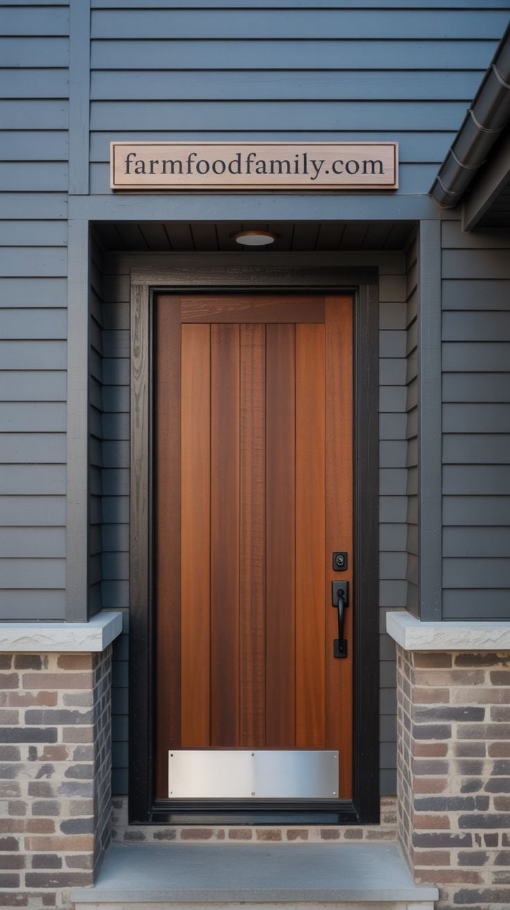
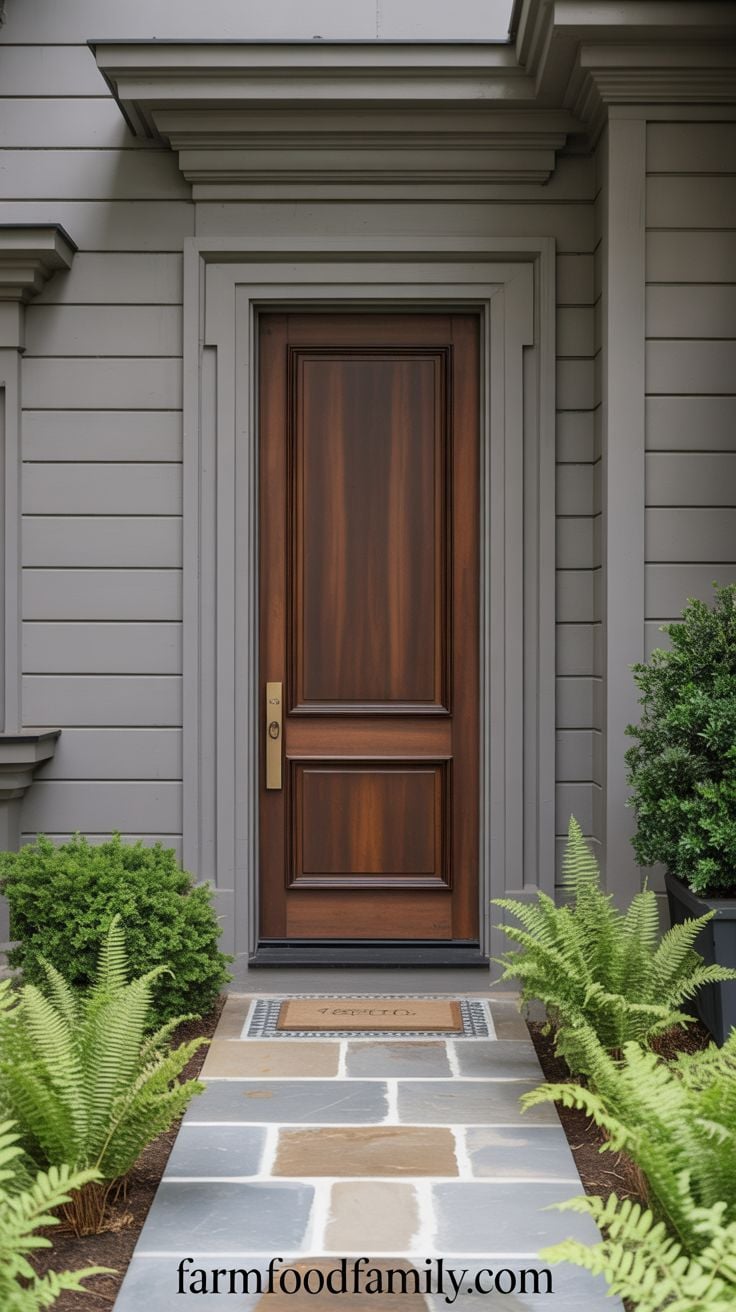
A deep brown works across nearly the full range of gray, light or dark, warm or cool undertone, which makes it one of the more forgiving choices on this list if you’re not confident about your siding’s exact undertone yet.
Real wood grain adds a texture no composite material fully replicates, and that texture reads as intentional rather than default.
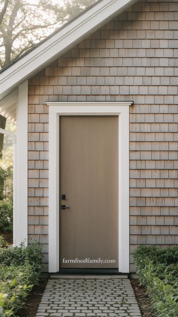
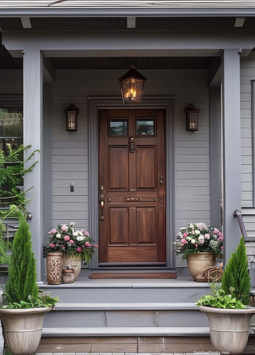
5. Real Wood, Matte Stain
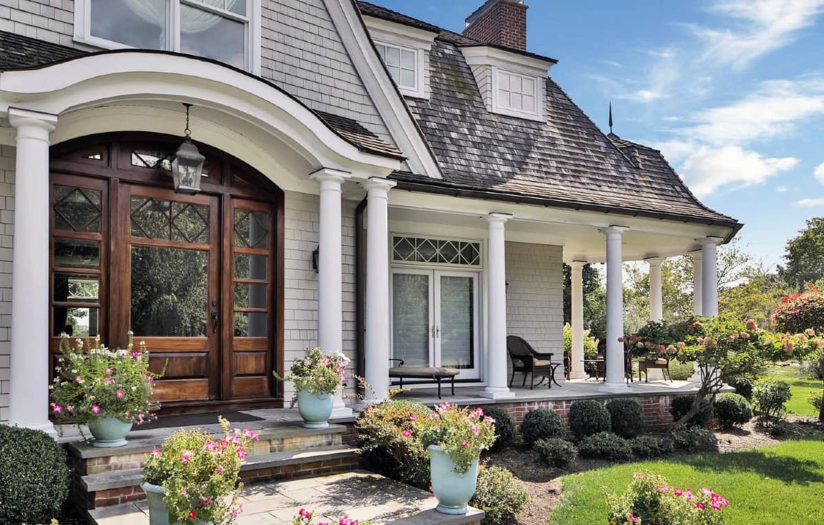
Solid wood with a plain matte stain, paired with white trim, is a specific combination worth calling out separately from painted brown doors: the point isn’t color exactly, it’s material.
A well-finished wood door has a depth that paint can’t fully replicate, and it ages in a way that generally improves rather than degrades the look.
6. White
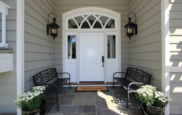
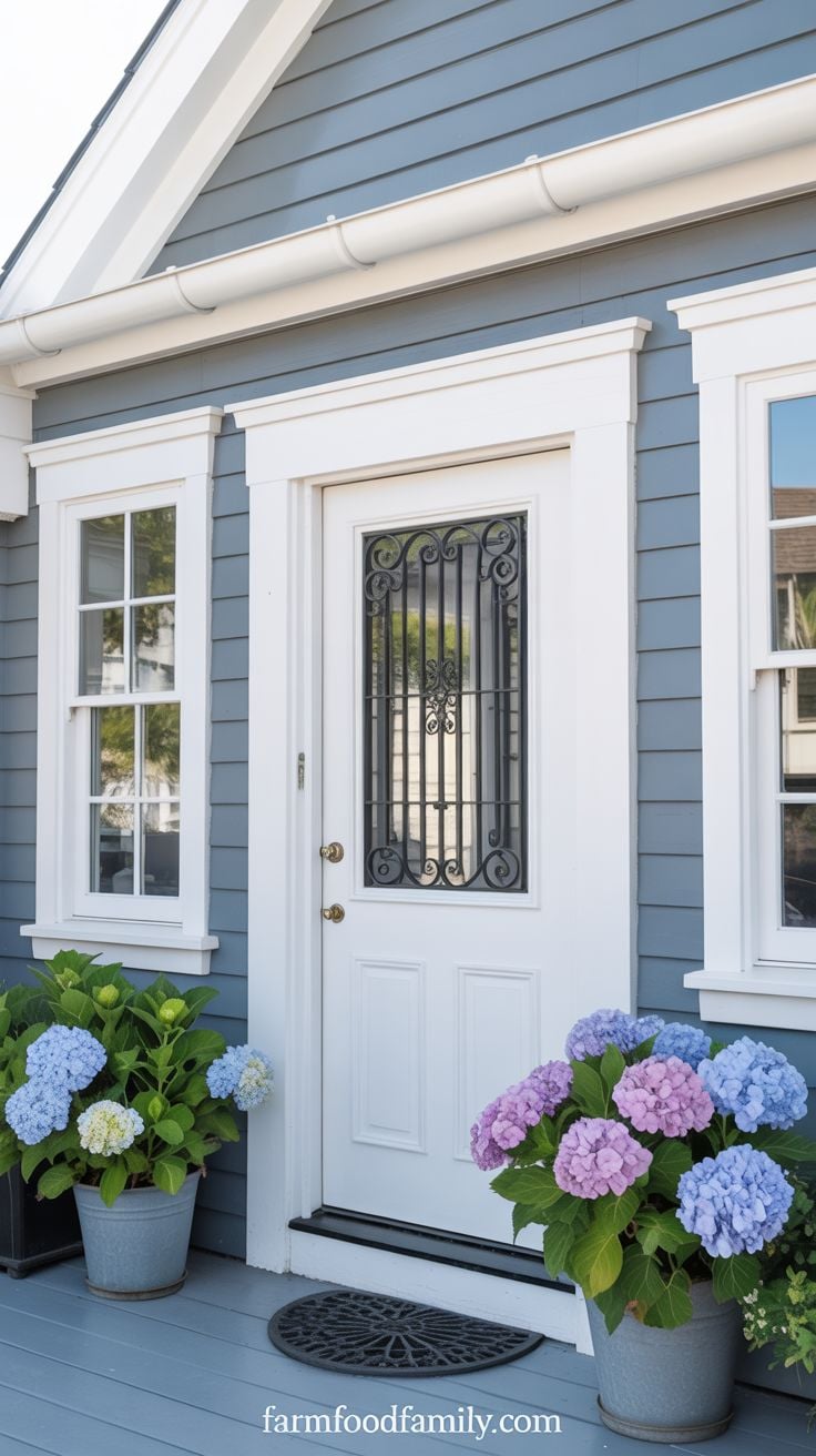
A white door reads as classic because it genuinely is: clean, light, and it works with essentially any gray. Emily Kantz, color marketing manager at Sherwin-Williams, recommends whites like Alabaster (SW 7008) or Greek Villa (SW 7551) specifically because they “feel clean and modern, but also create a timeless backdrop that highlights architectural details and landscaping” rather than competing with them. That’s the real case for white here: it’s a door color that gets out of the way and lets everything else on the facade read clearly.
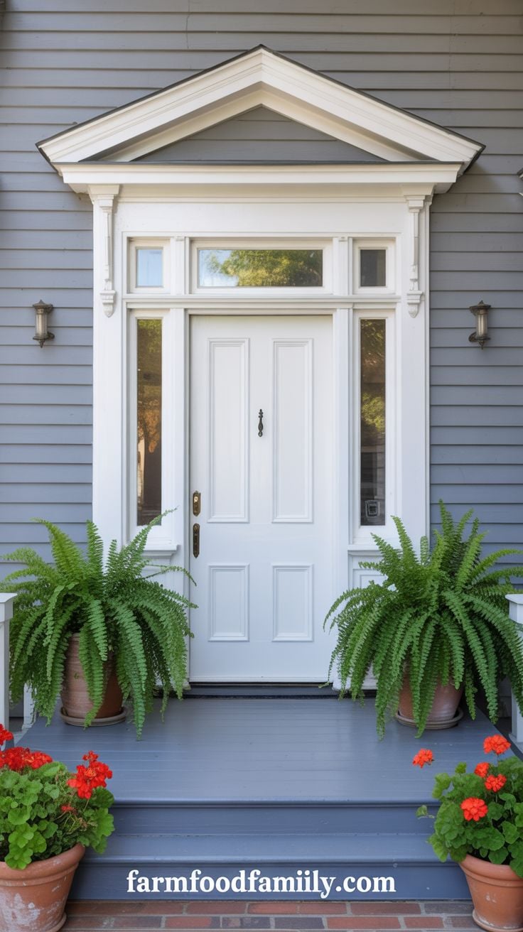
7. Purple (as an Accent, Not a Statement)
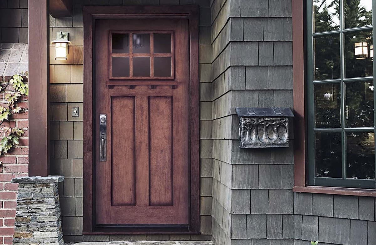
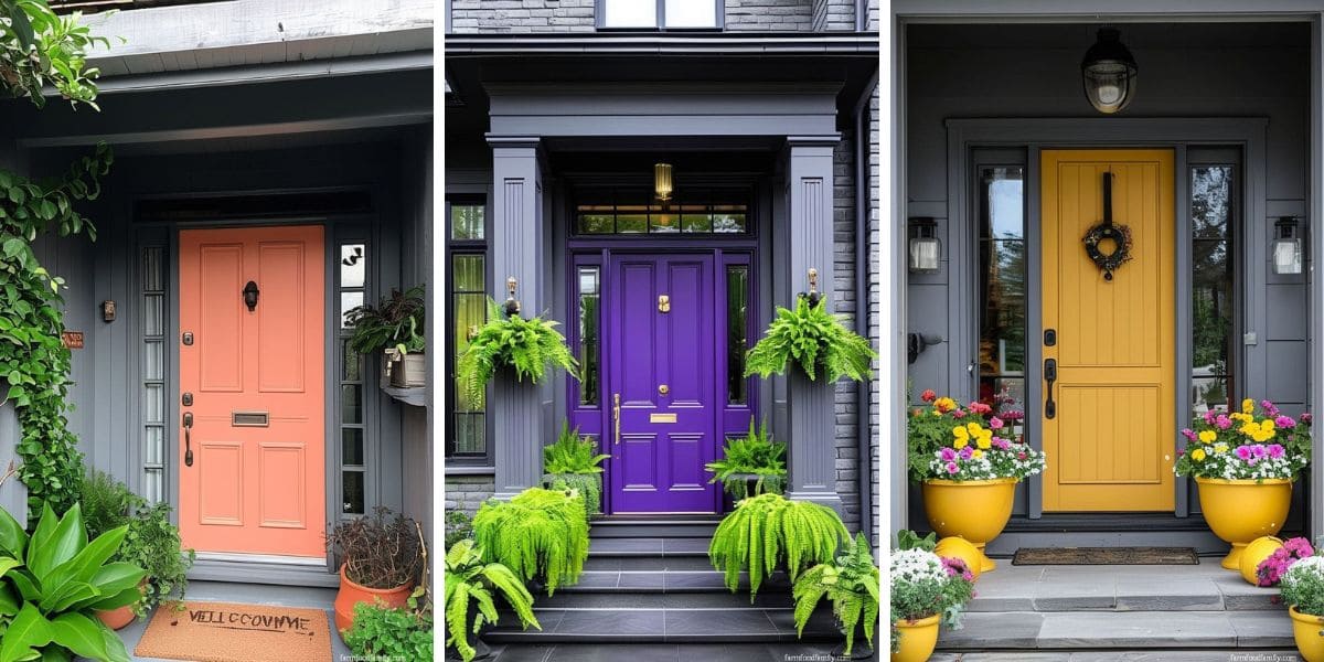
Gray wood paneling, red brick, granite, and a wooden door with a purple undertone is a less obvious combination, and it works specifically because the purple stays subtle, an accent rather than the dominant color.
Purple pairs with gray more often than people expect, but it holds up best used this sparingly rather than as a bold saturated statement door.
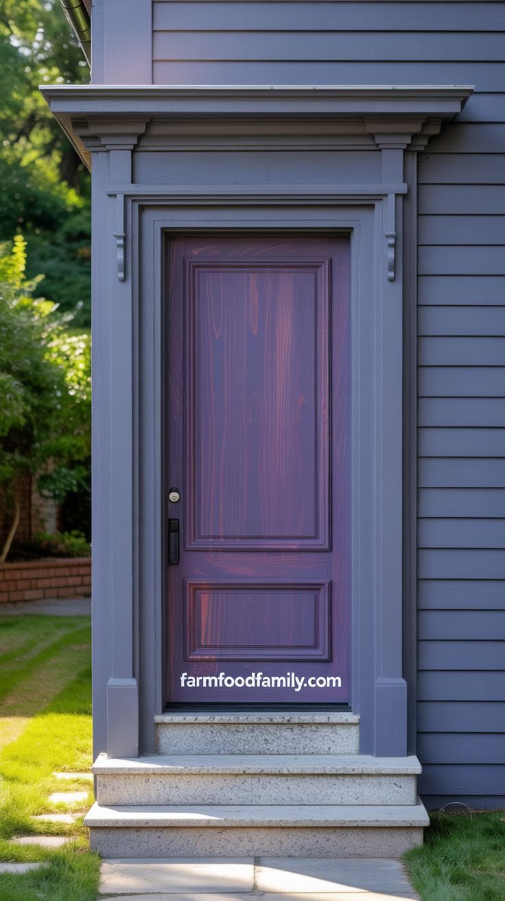
8. Espresso
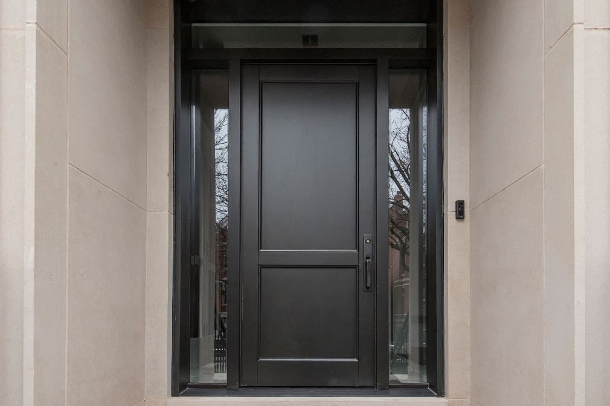
From a distance these read as black, but they’re not, they’re espresso, an extremely dark wood stain that still shows real grain up close. If you want the visual weight of a black door but don’t want to give up the texture of real wood, this is the answer: dark enough to photograph as black, warm enough in person to feel less flat.
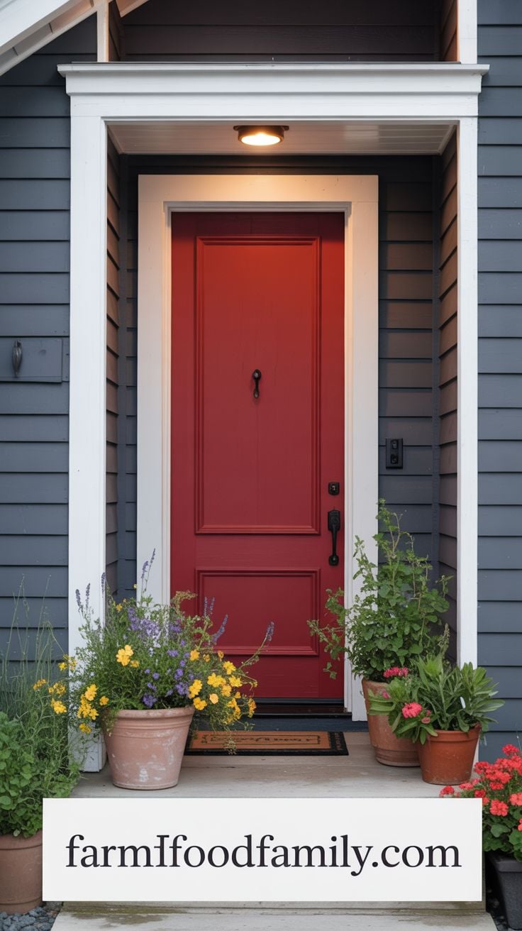
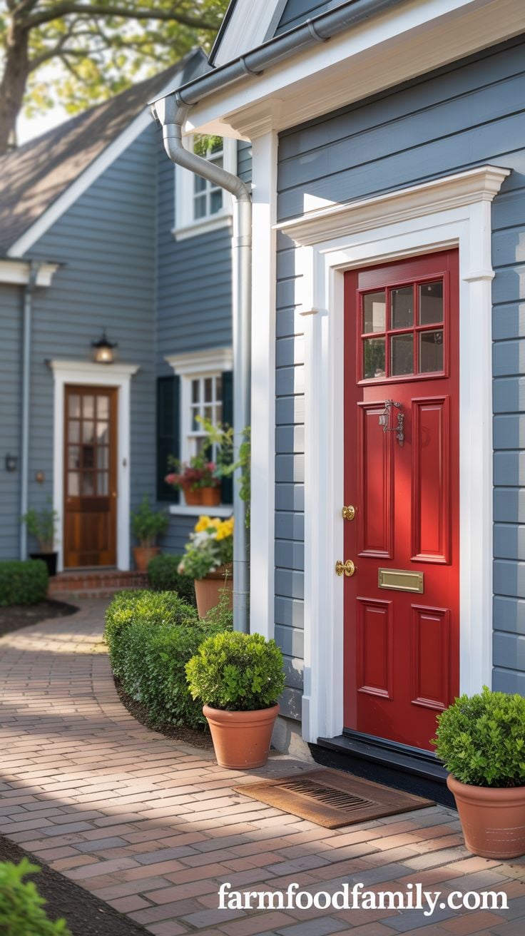
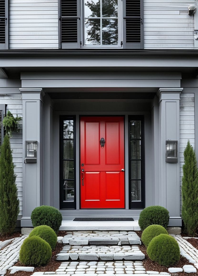
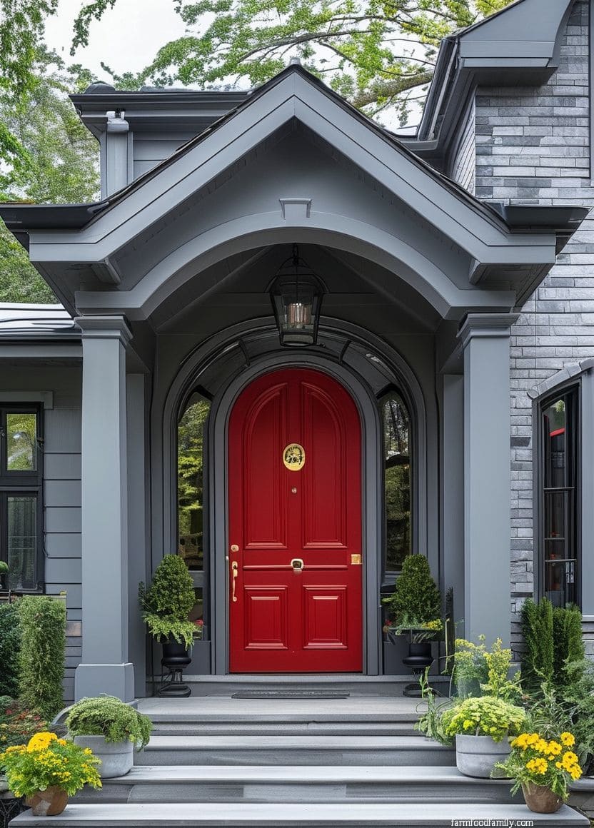
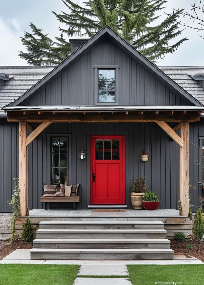
9. Red
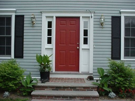
A red front door carries real symbolic weight in two separate traditions: in feng shui, it marks the “mouth of chi,” the point where a home’s vitality enters, and in early American tradition, a red door at a roadside home signaled travelers they were welcome to rest there for the night.
Whether or not either tradition matters to you personally, red against gray reads as warm and welcoming in a way that’s hard to fake with color theory alone.
Related: What Does A Red Front Door Mean?
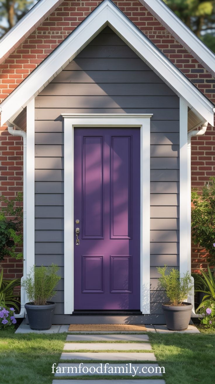
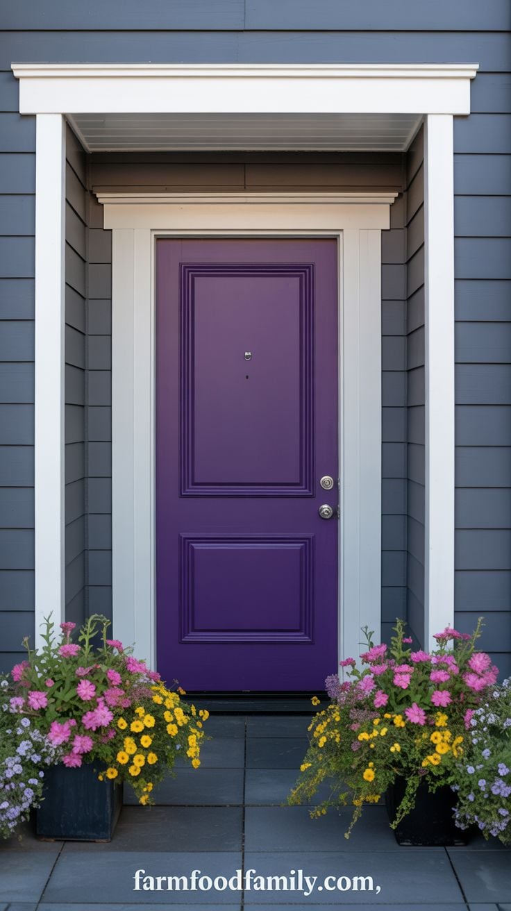
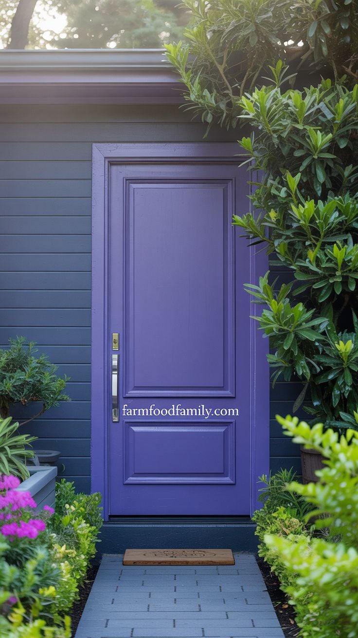
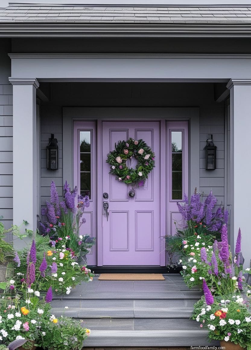
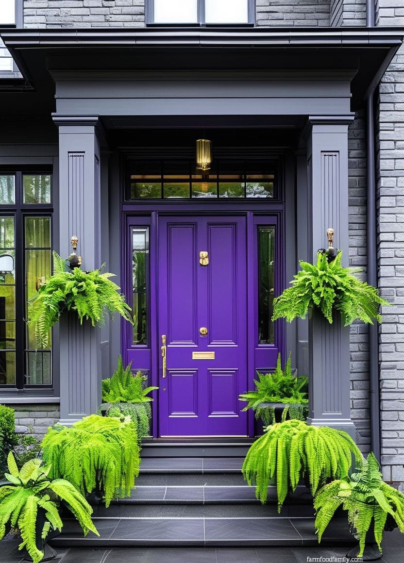
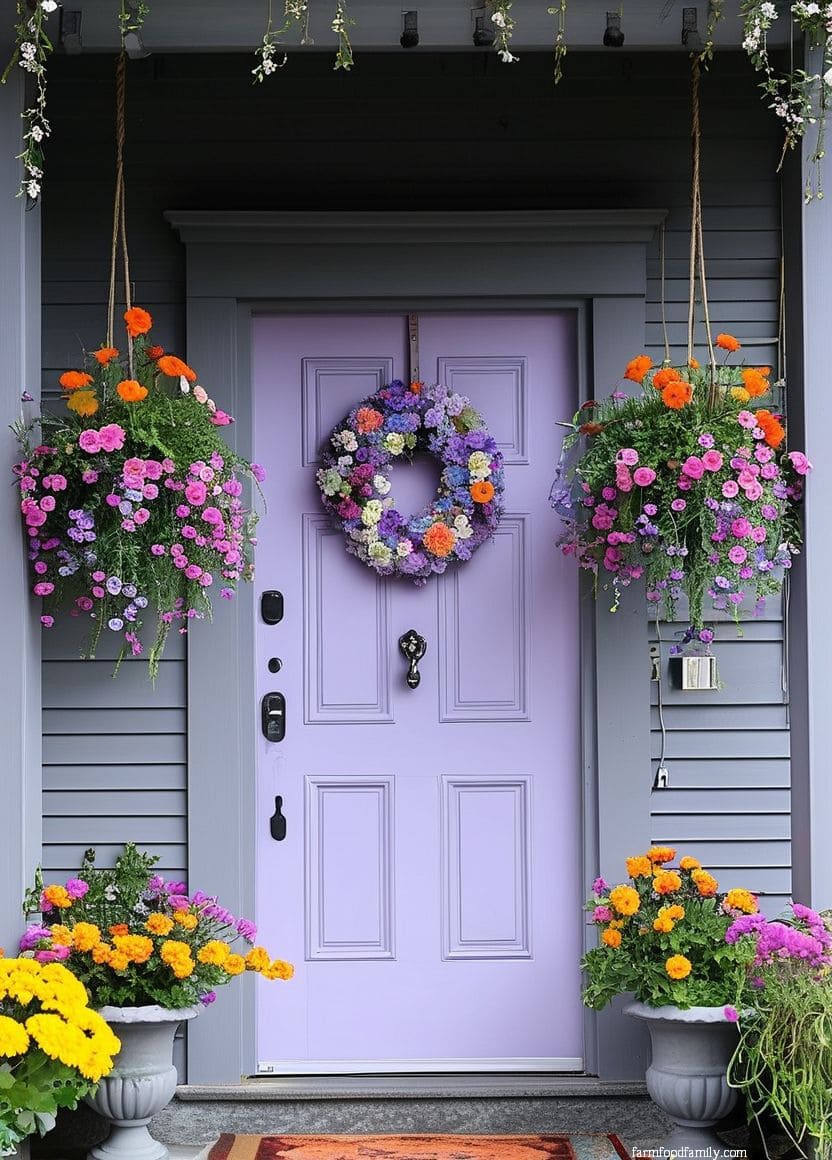
10. Purple, as the Main Color
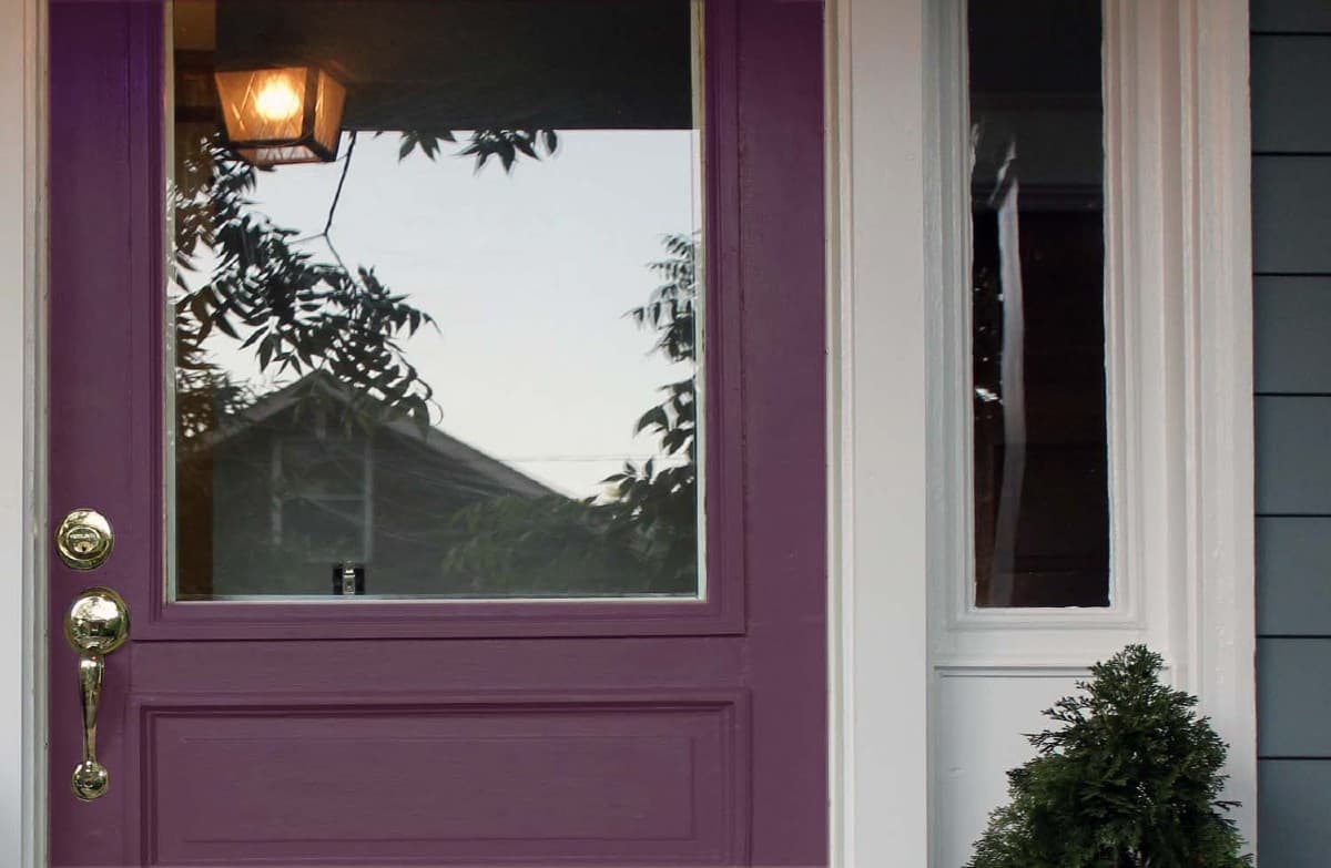
Where idea #7 uses purple sparingly, this is purple as the primary statement, and it earns that boldness honestly: the color has centuries of association with luxury and status, and it’s genuinely more flexible against different gray tones than people assume before trying it. It’s not a safe choice, but it’s a considered one.
11. Gray-on-Gray
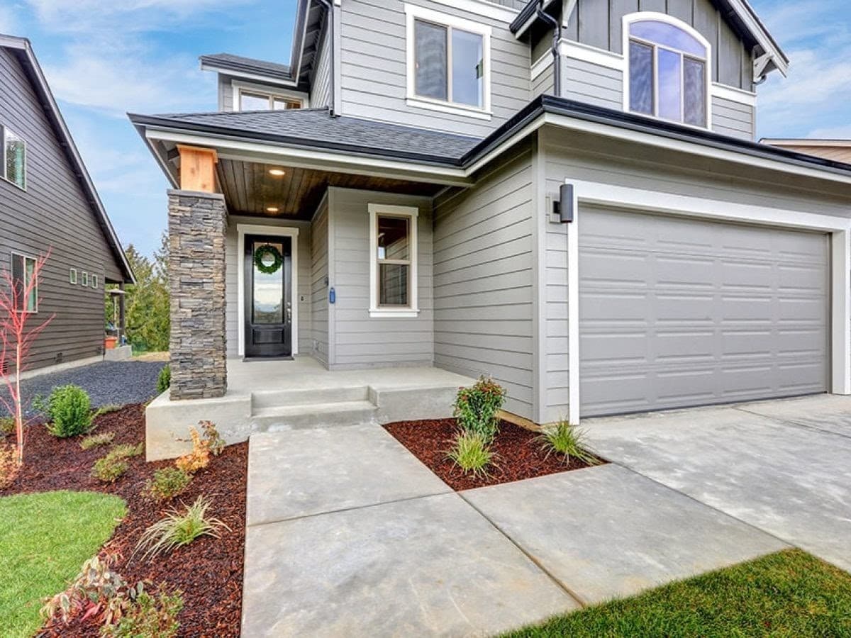
Painting the door the same family of gray as the siding sounds like it should read as flat, but done with any tonal variation, a slightly darker or warmer gray than the siding, it reads as deliberate and cohesive instead.
It’s also one of the most resale-friendly combinations on this list, which matters if curb appeal decisions need to double as investment decisions.
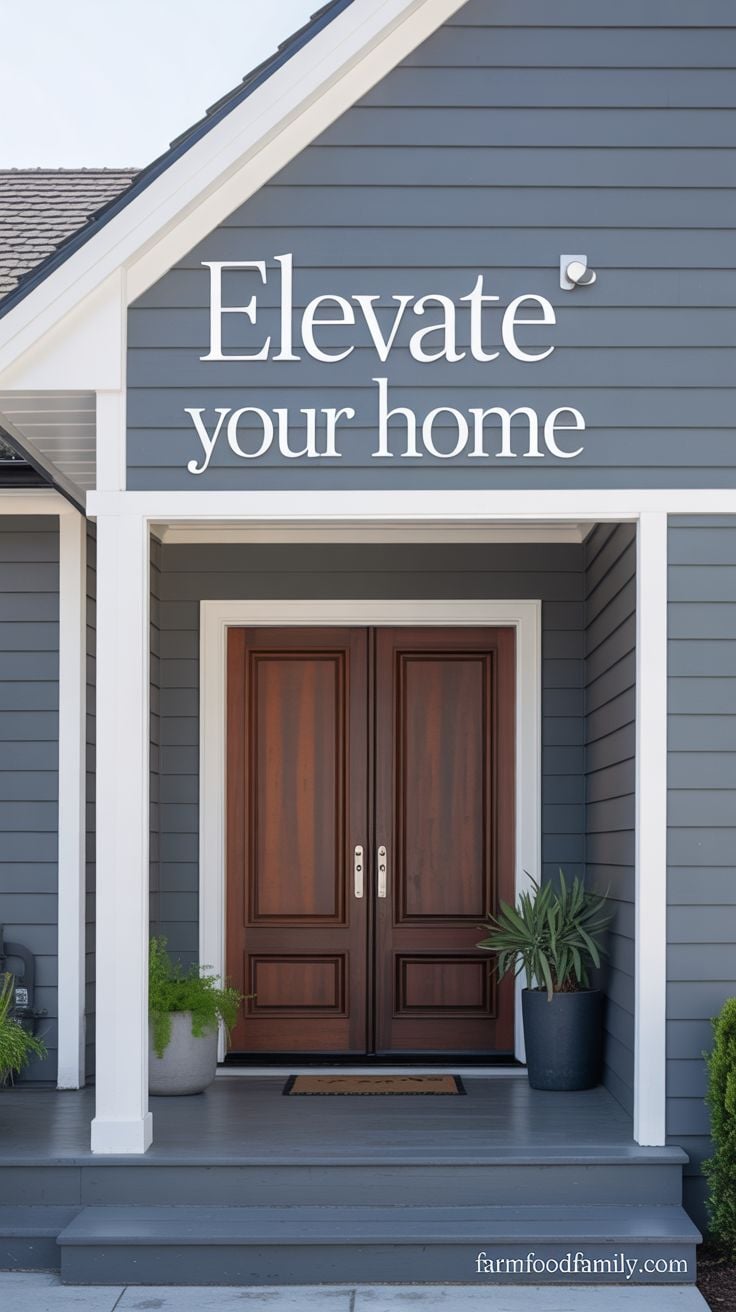
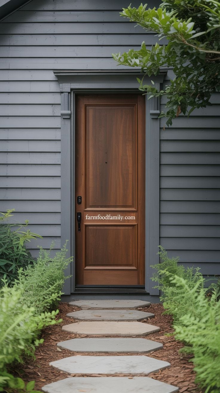
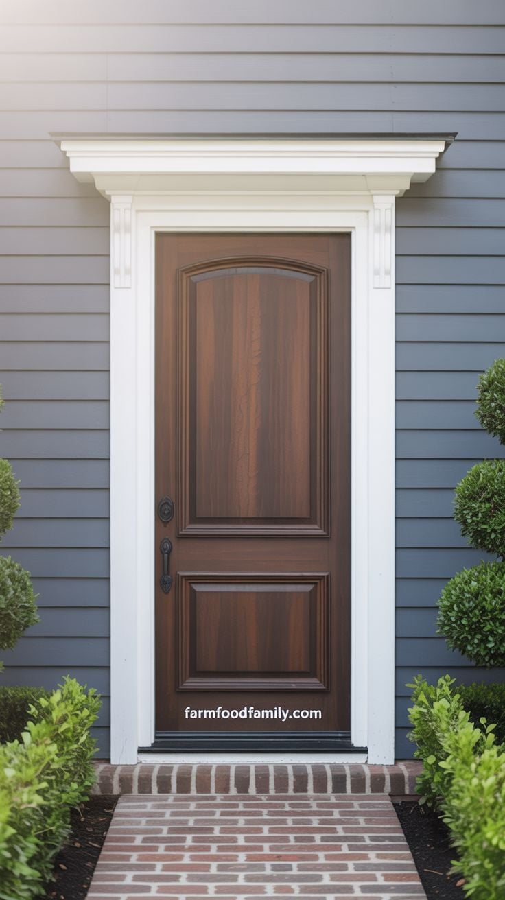
12. Mahogany
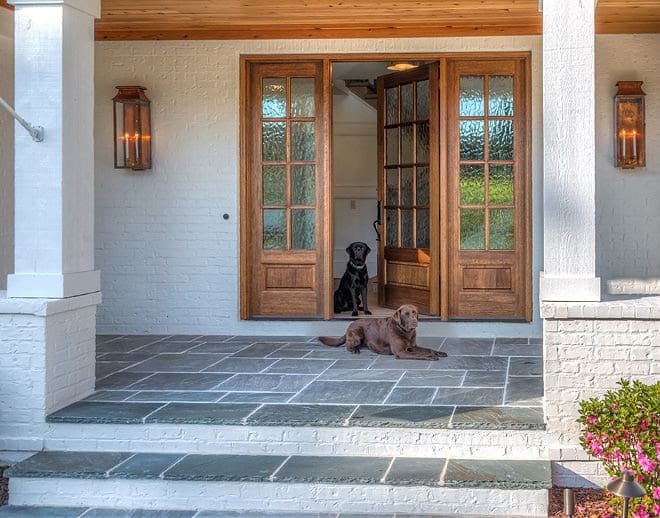
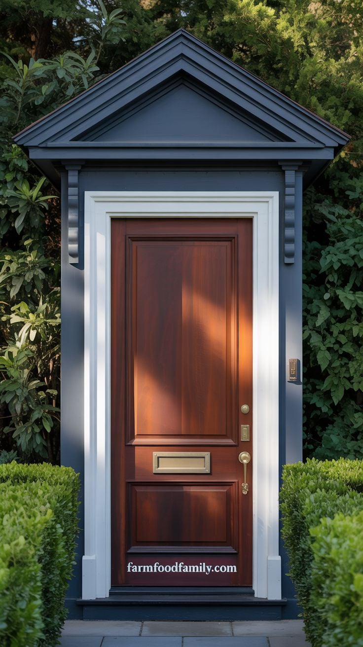
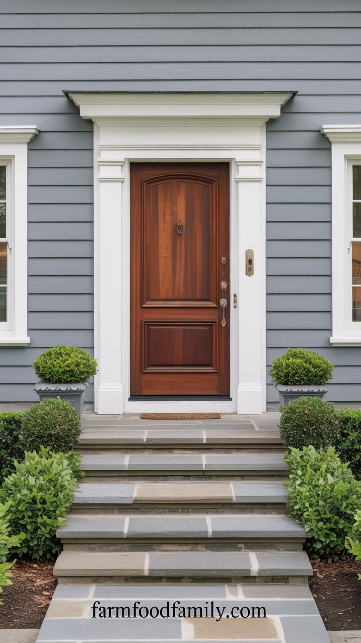
Mahogany spans a genuinely wide range of tones and temperatures, which is exactly why it’s worth sampling in person rather than trusting a photo: what reads as warm mahogany in one lighting condition can look nearly black in another.
Done right, it pairs with gray siding, white trim, dark roofing, and landscaping in a way that feels architecturally intentional rather than just “a brown door.”
13. Coffee Bean Brown
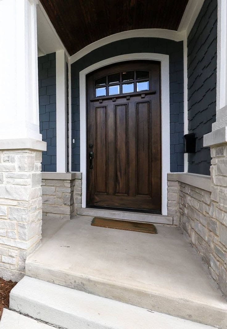
A darker, richer brown than idea #2 or #4, closer to black in dim light but genuinely brown up close, especially against brick or a stone pathway. The appeal is the same reason wood tones keep showing up throughout this list: composite materials can mimic a lot of things, but they haven’t fully replicated the depth of real, well-finished wood grain.
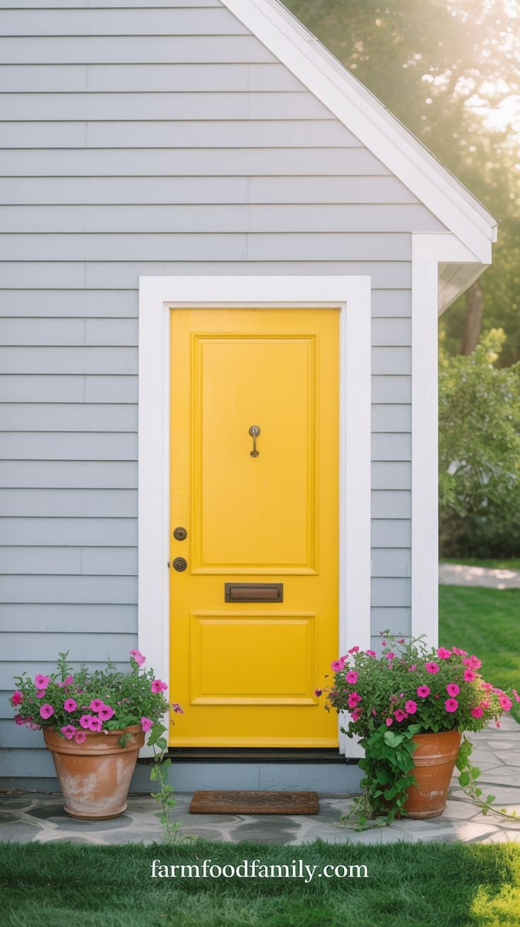
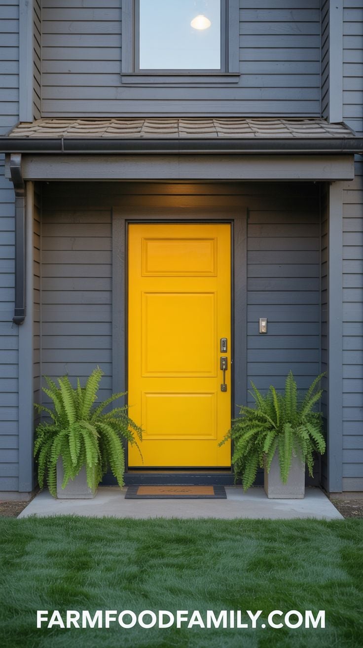
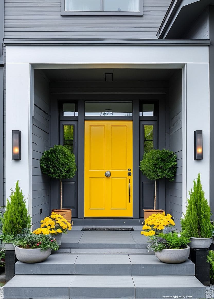
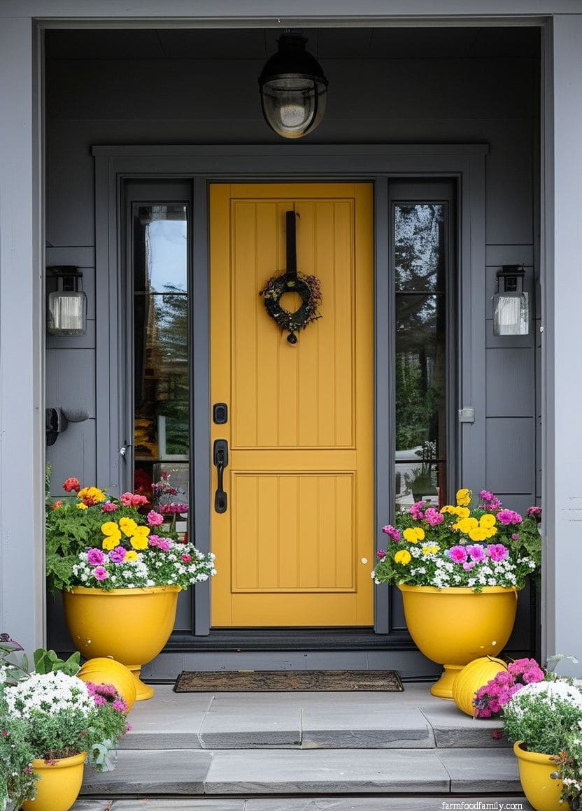
14. Canary Yellow
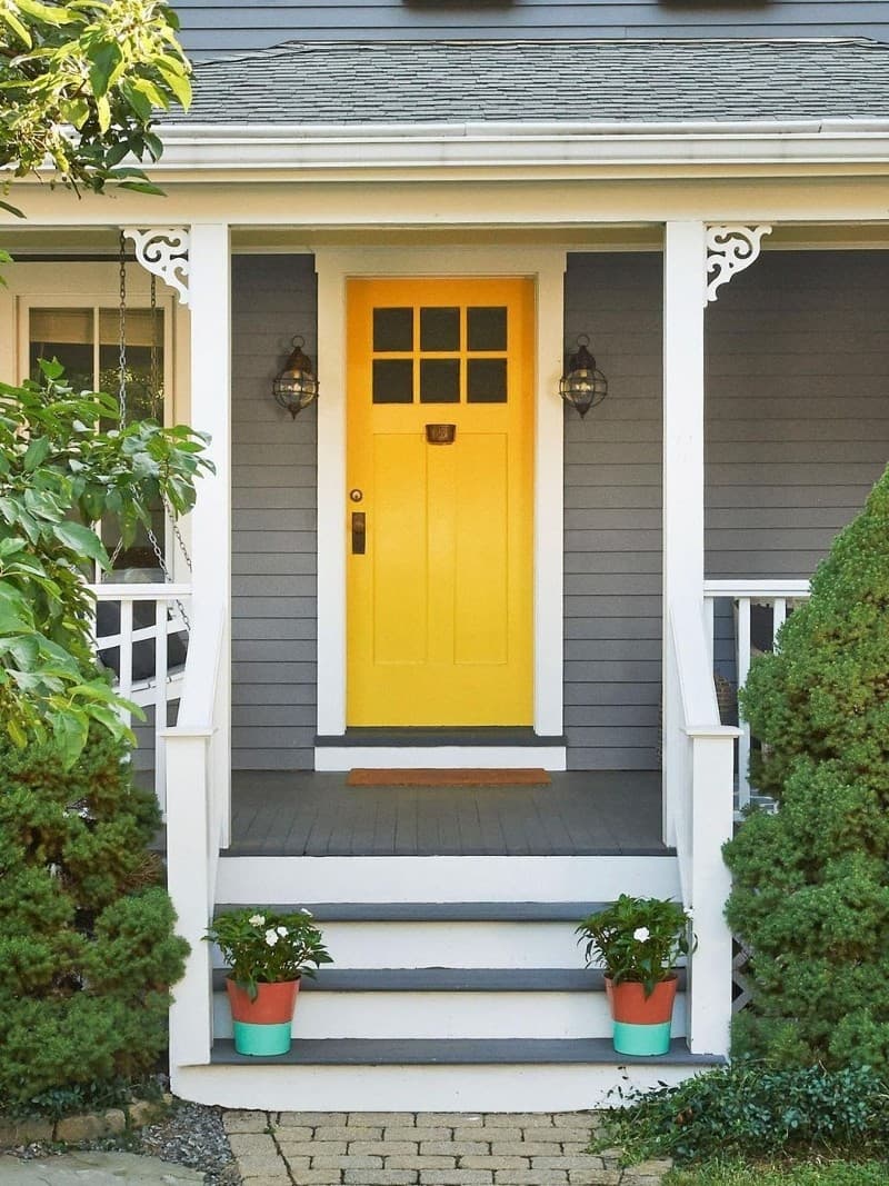
Color genuinely affects mood, and yellow is one of the few door colors that reads as both energizing and calming at once rather than one or the other.
Canary yellow specifically skews bright without tipping into garish, which is part of why it shows up repeatedly in real homeowner photos and Reddit threads asking for gray-house door advice, it’s a color people recommend to each other with real enthusiasm, not just theory.
Related: Decorating Home with Yellow Color: Feng Shui Tips on Bagua Areas and Color Combinations for Yellow
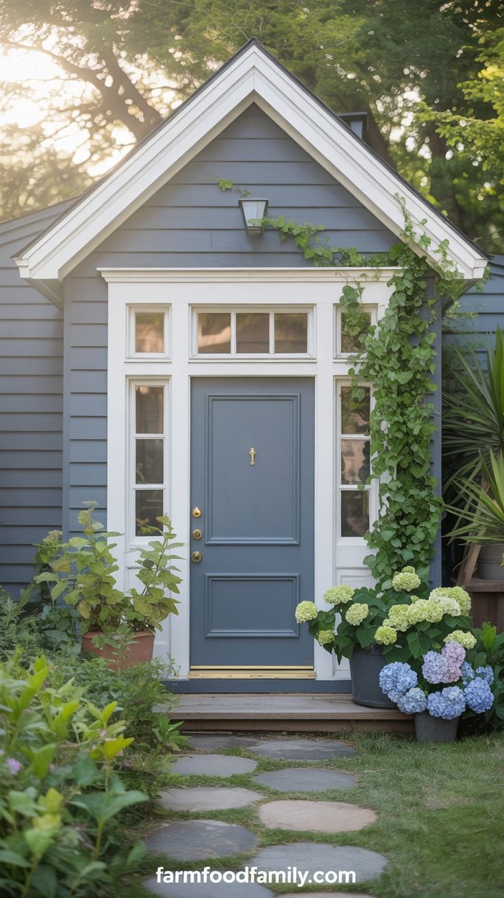
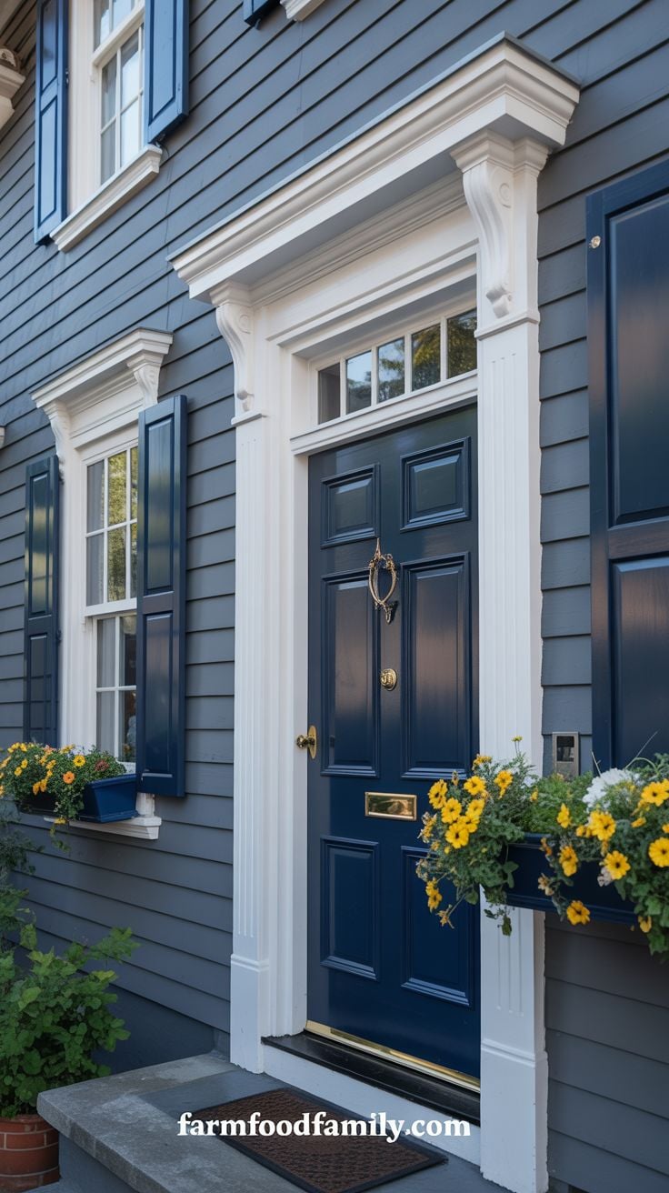
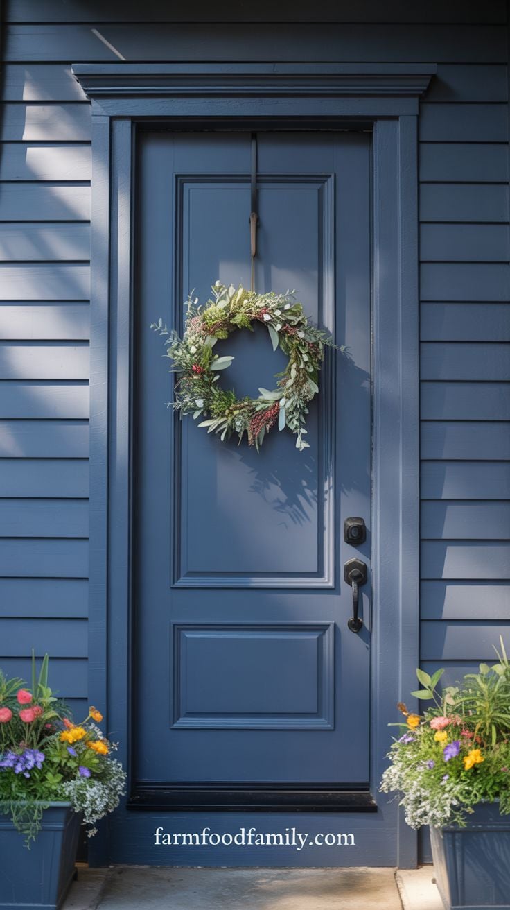
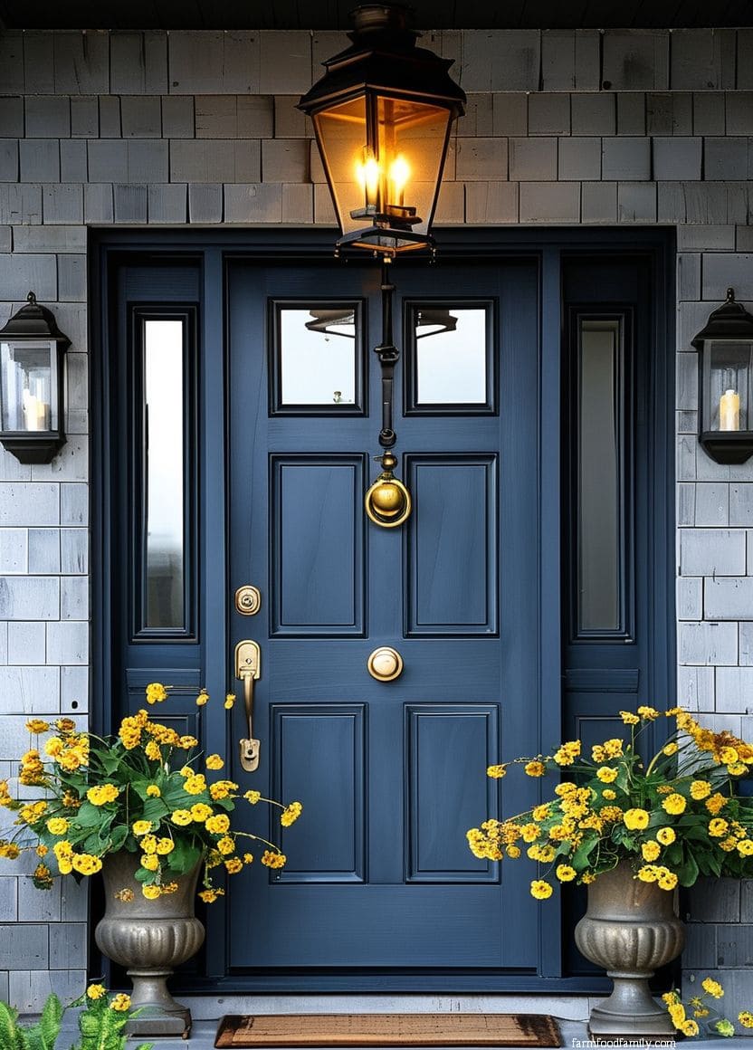
15. Navy Blue
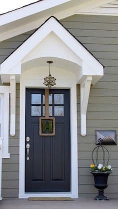
Navy and gray practically read as designed for each other: the depth of the navy pulls out any blue undertone already hiding in the gray siding, which makes the whole facade feel more intentional than either color alone.
Bright white trim sharpens the contrast, and a warm accent color, yellow flower pots, a seasonal wreath, keeps the pairing from reading as cold.
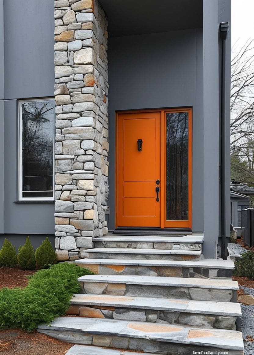
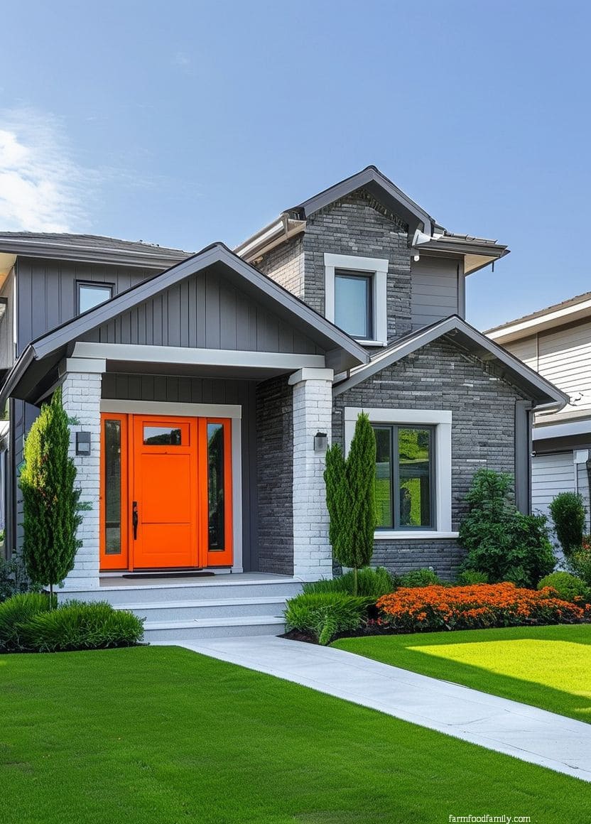
16. Burnt Orange
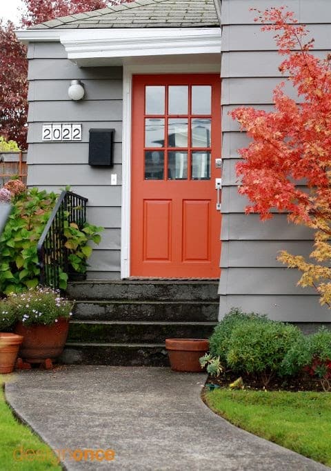
Orange is the color on this list people are most likely to dismiss without trying, but a muted, burnt tone rather than a saturated pumpkin orange gives a gray house real curb appeal without reading as seasonal decor. A softer orange can even pull a faint green undertone out of certain grays, an effect worth testing with a physical sample before committing.
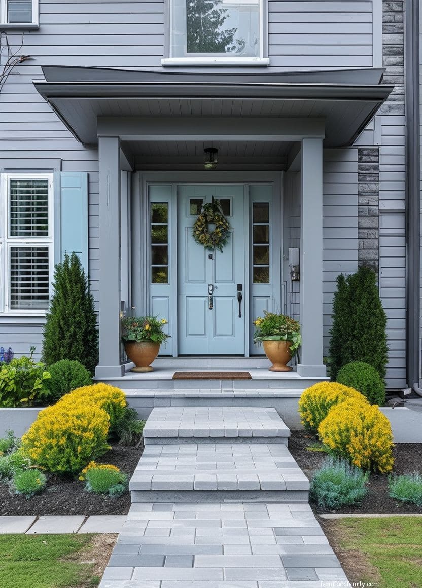
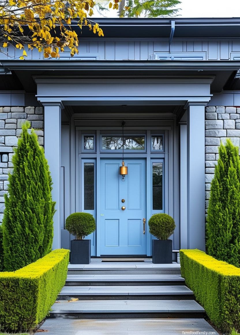
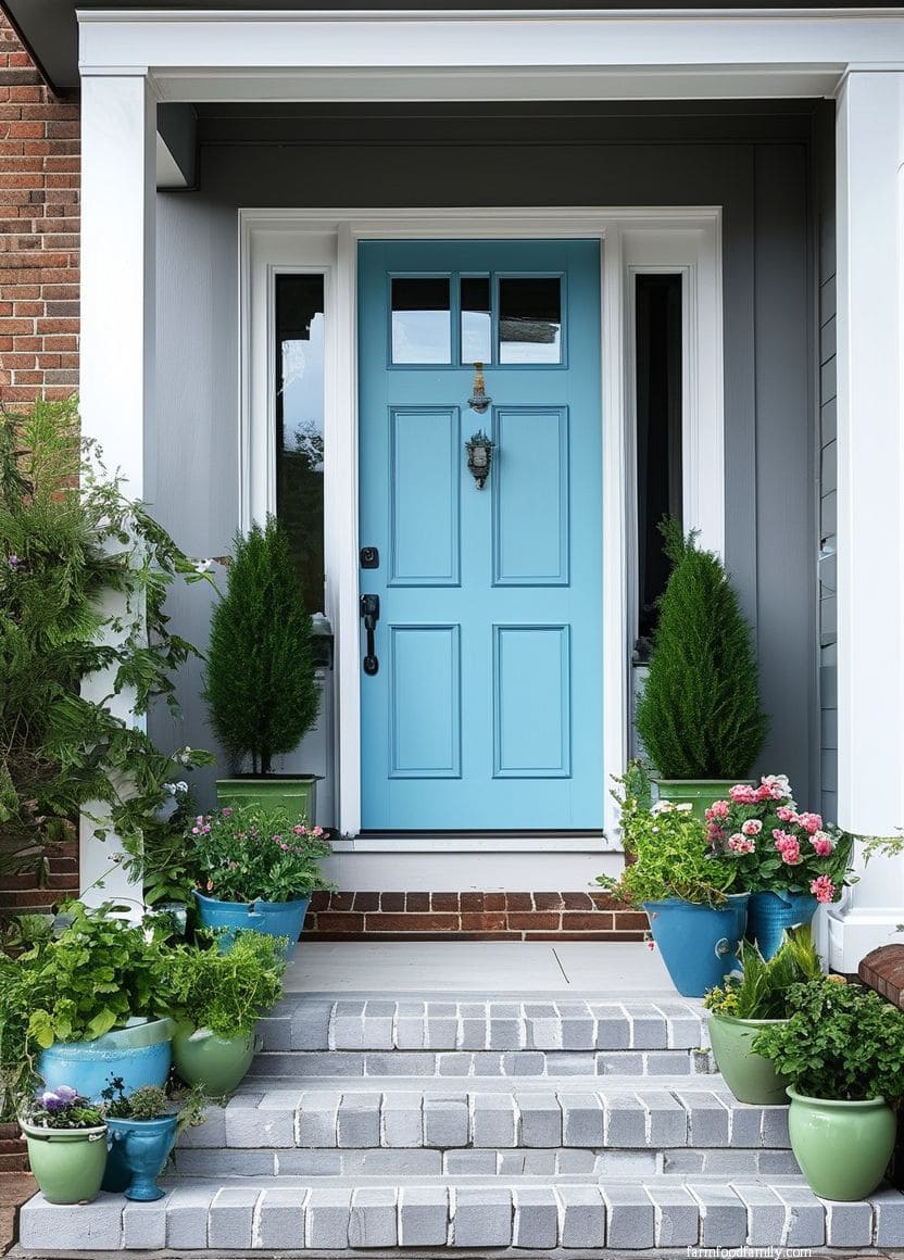
17. Light blue
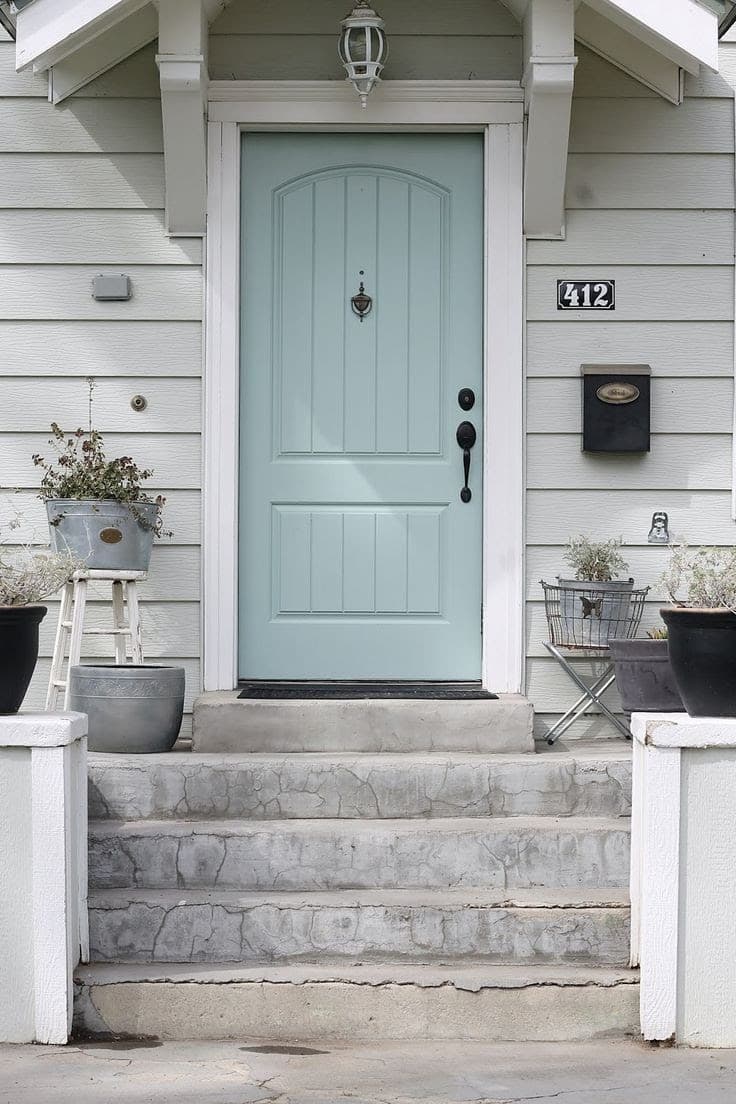
Two soft, easygoing colors together, light gray siding and a pale blue door, read as understated rather than boring, especially with bright white trim to sharpen the edges. The coolness of a pale blue tends to bring out gray’s own subtlety, making the siding itself look more nuanced than it does next to a neutral door.
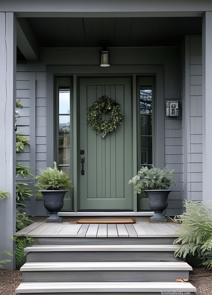
18. Bold Green
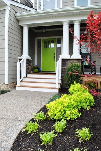
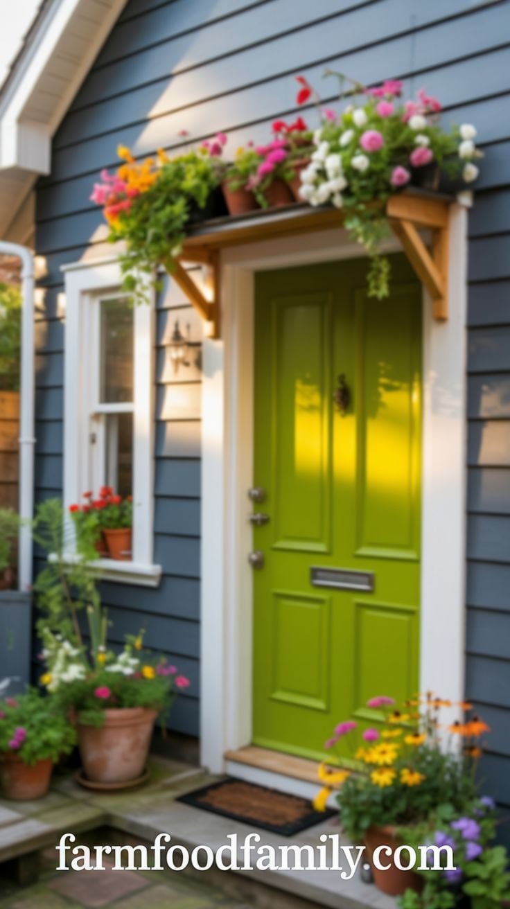
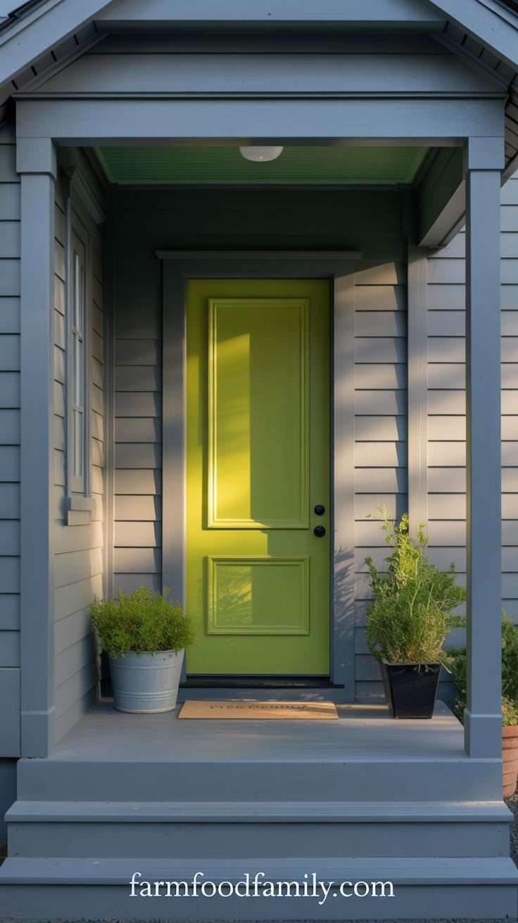
A saturated green front door is a genuine statement choice, more common on beach houses and casual architecture than formal ones, but worth considering on any home confident enough to carry a bright color. It’s a bolder cousin of the sage/heritage green trend covered in the data section above, less restrained, more playful.
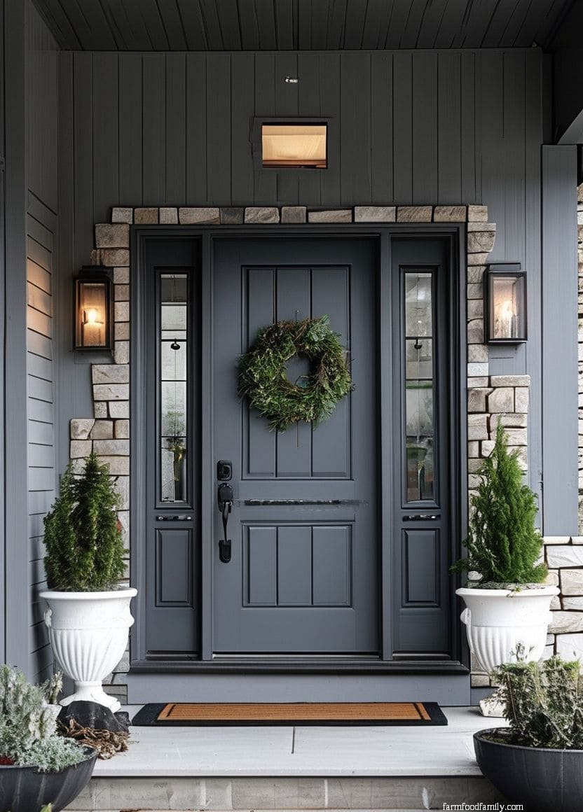
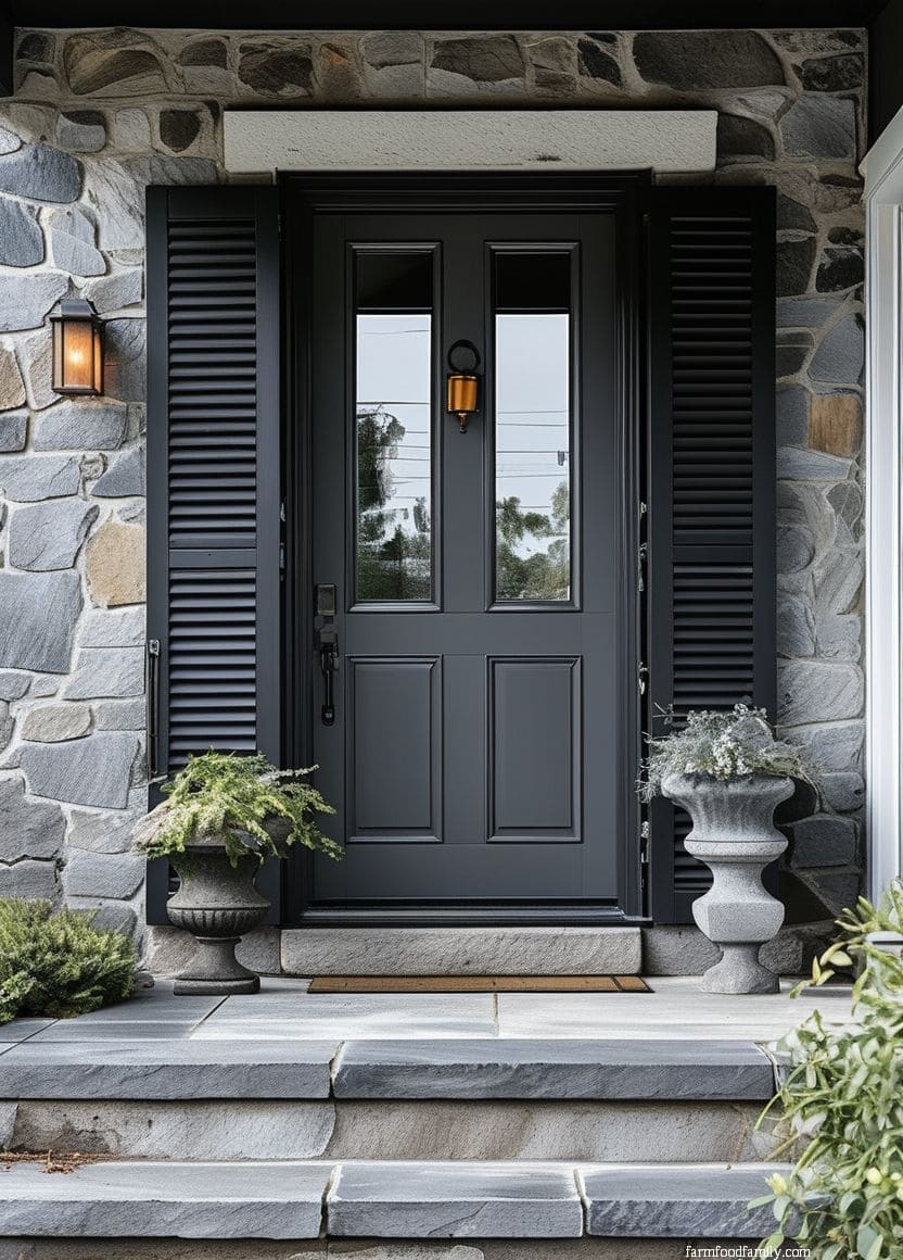
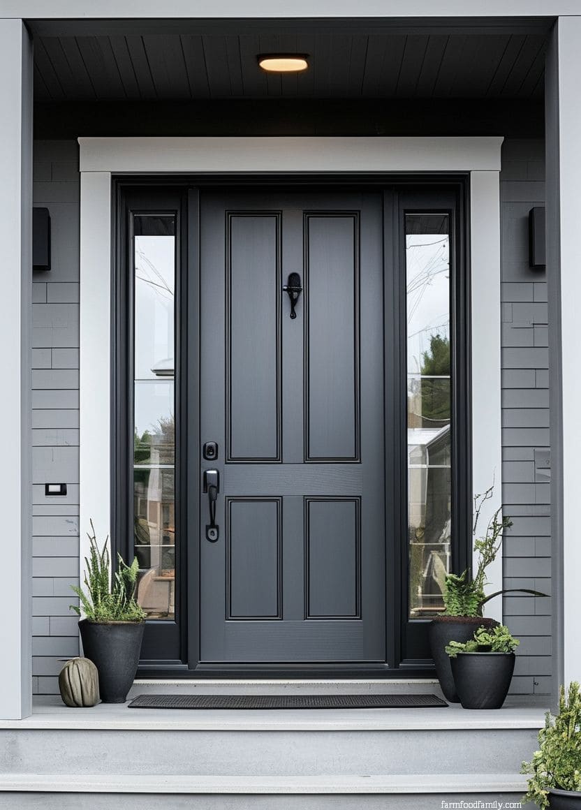
19. Charcoal
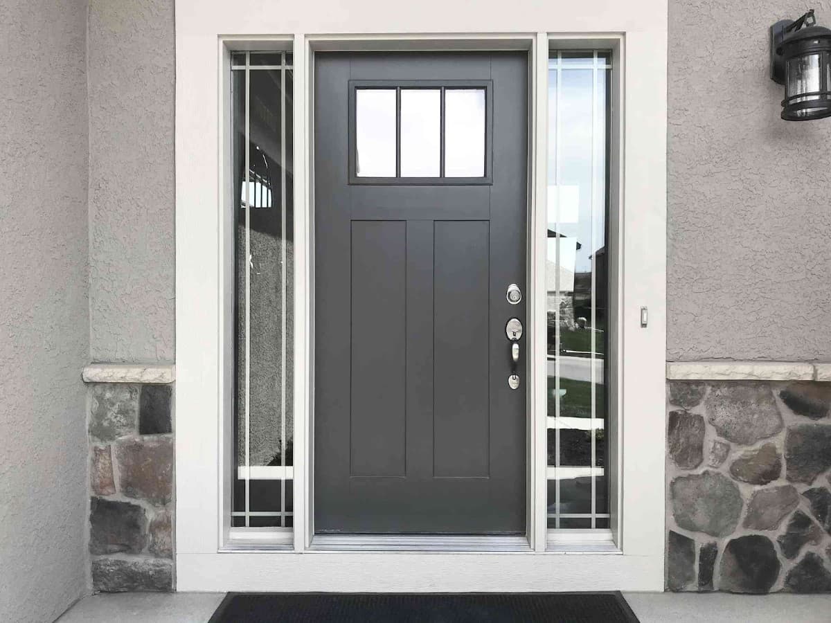
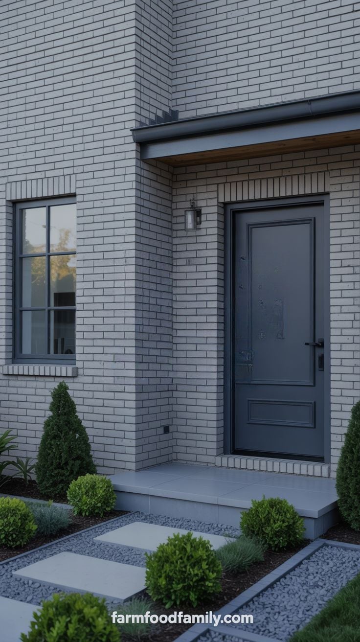
For a gray brick house specifically, staying within the same tonal family (a charcoal door against lighter gray brick) is a far easier decision than it sounds, and it avoids the risk of a door color actively clashing with brick undertones you can’t fully control. The contrast between a deep charcoal and a lighter gray reads as intentional layering rather than a mismatch.
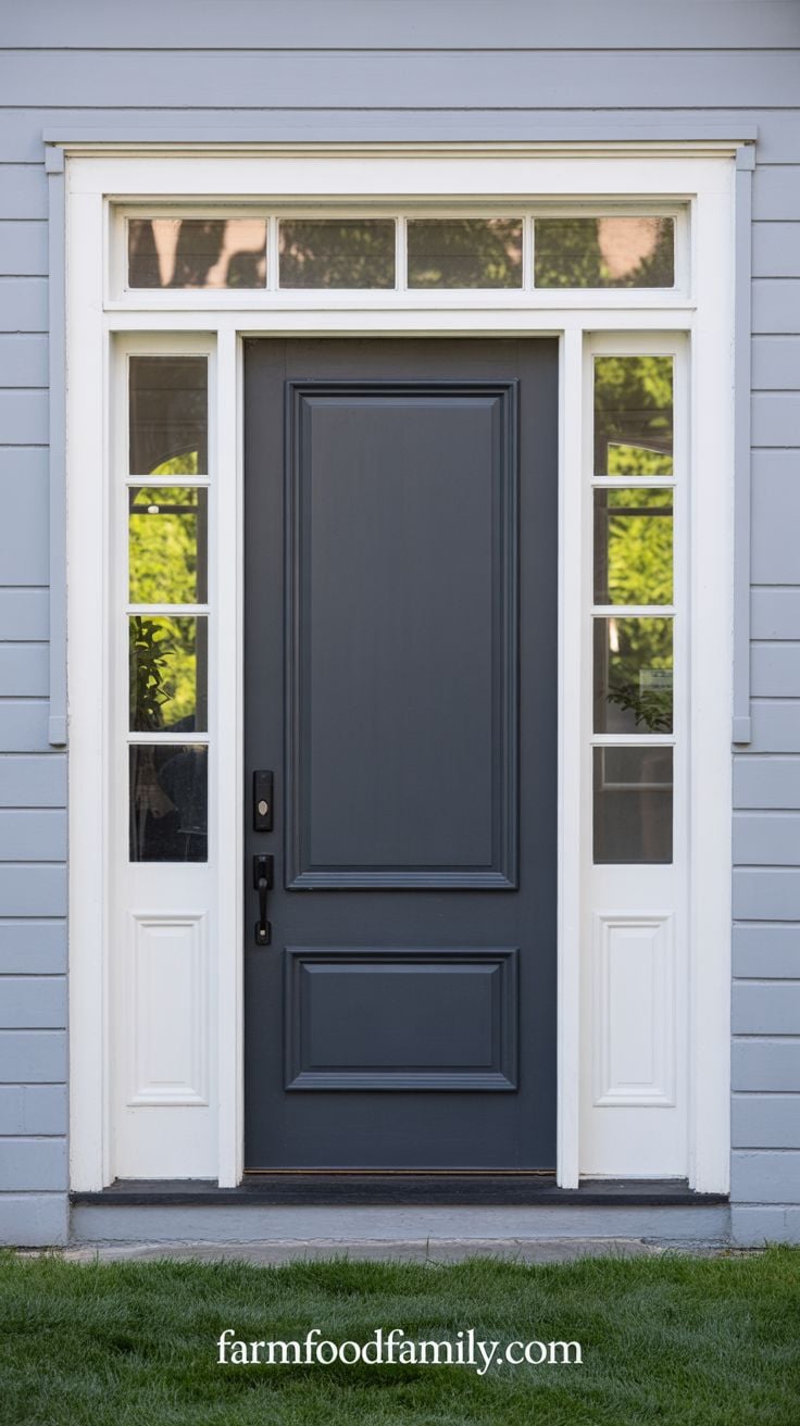
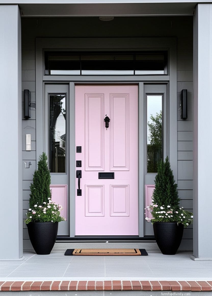
20. Pink
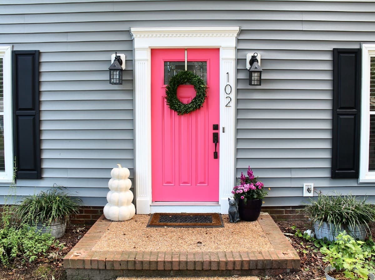
Pink is one of the more attention-grabbing choices on this list, and it works with both lighter and darker grays, though it reads strongest against a siding with visible blue undertones. Paired with greenery, hanging plants or a lime-toned accent, it leans playful rather than precious.
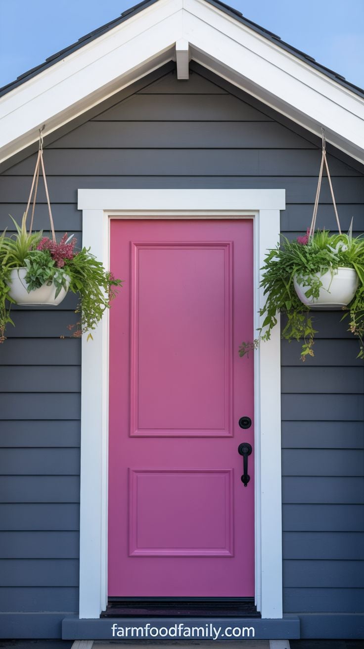
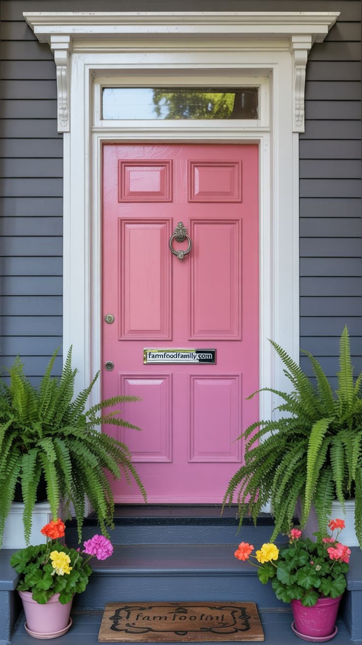
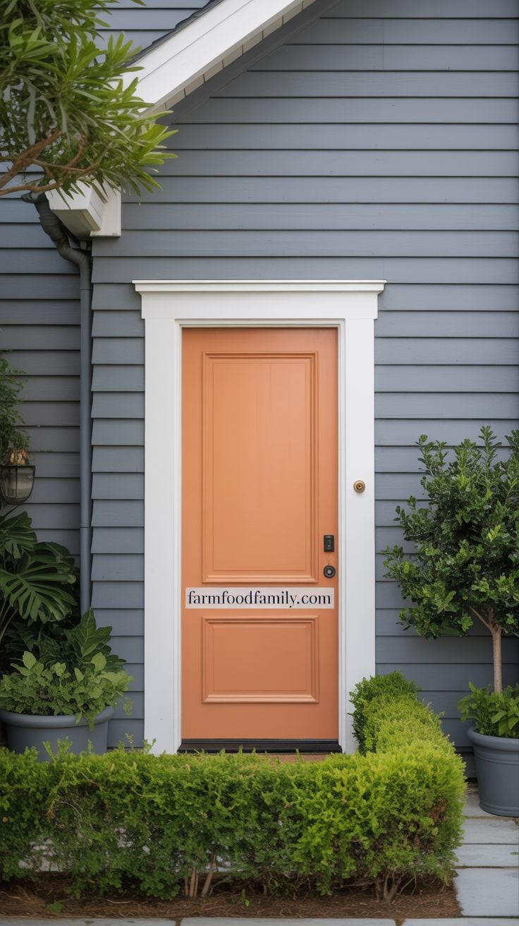
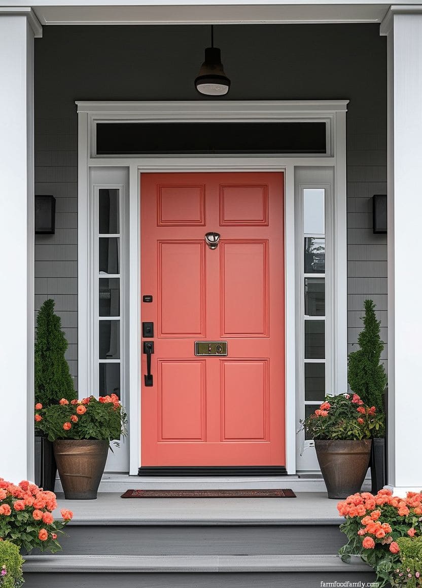
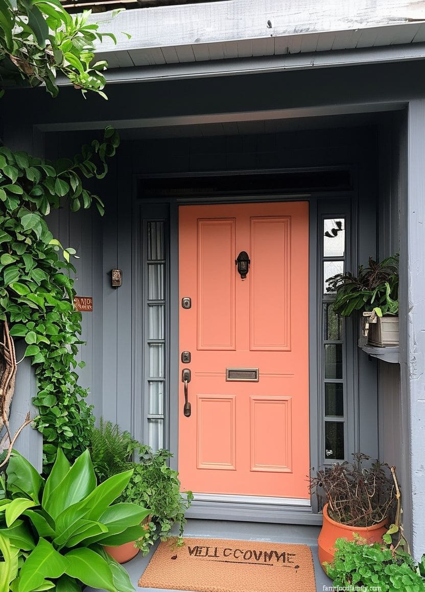
21. Peach
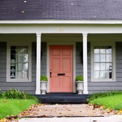
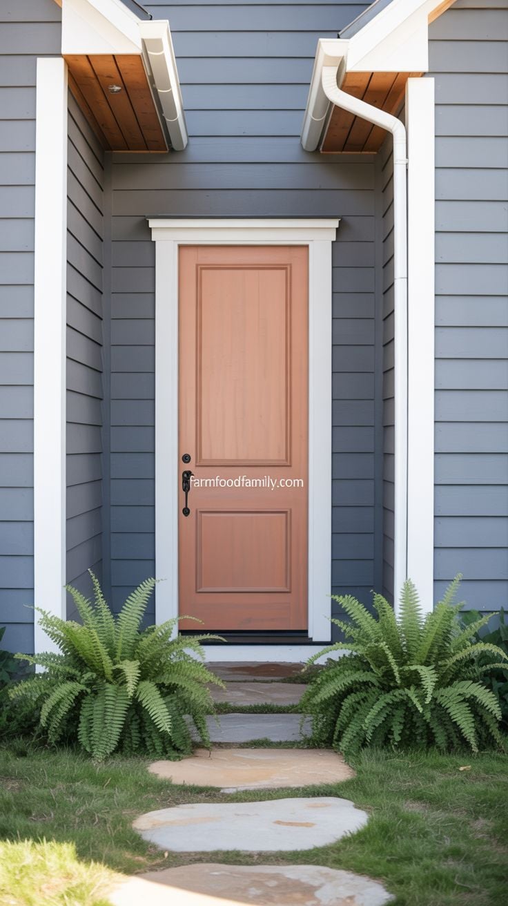
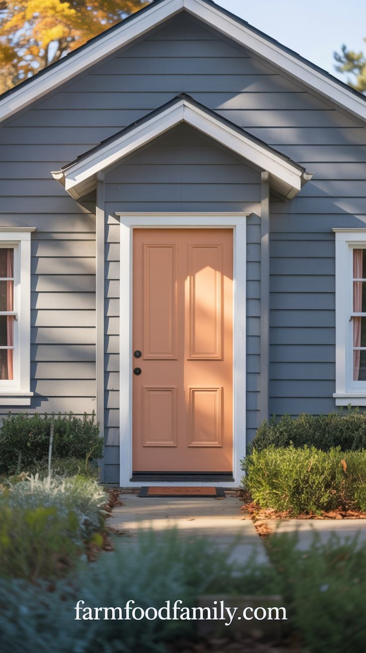
A soft, light orange-peach tone complements light gray siding without the boldness of full orange (see idea #16). It’s a genuinely underused color for front doors, understated enough to still read as neutral-adjacent while giving a plain gray facade real warmth, and it pairs well when the same tone is echoed elsewhere, a garage door frame, trim details, so the color doesn’t feel like an isolated accent.
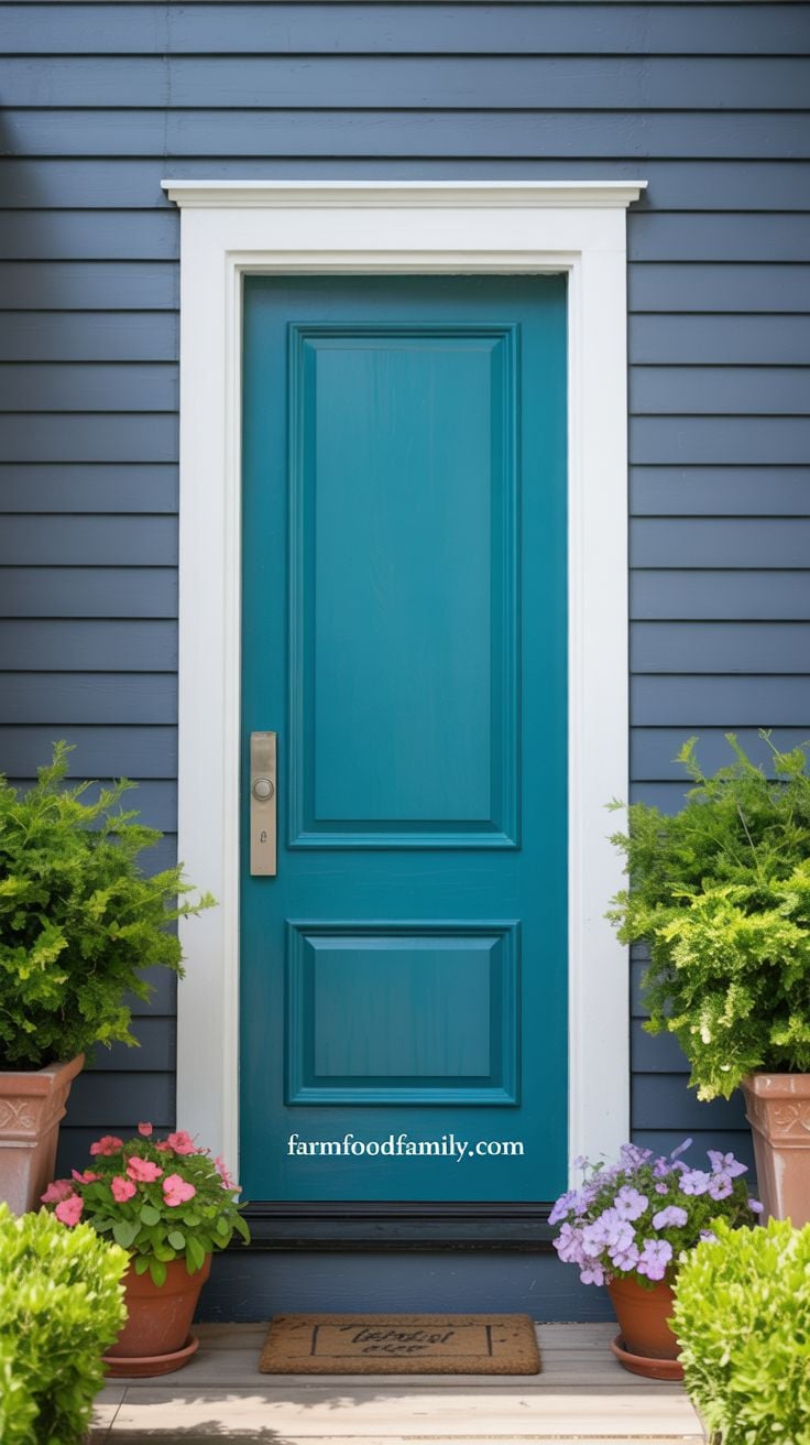
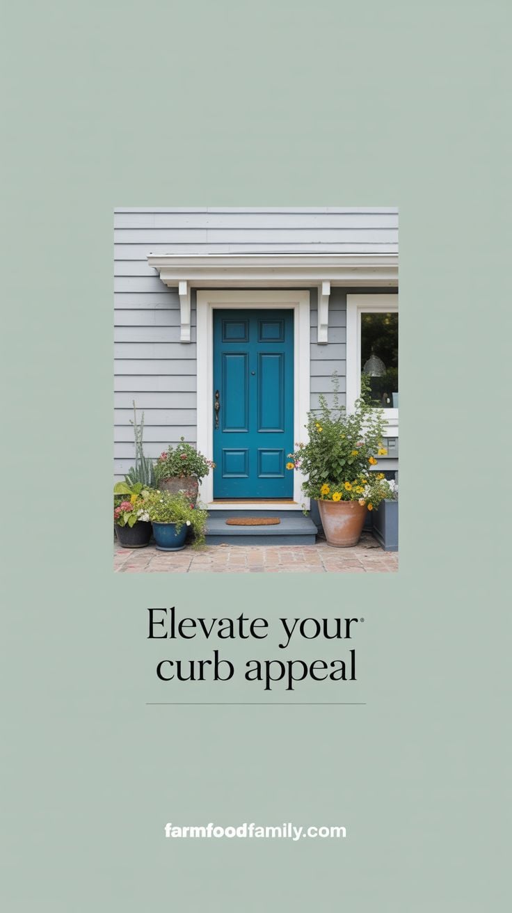
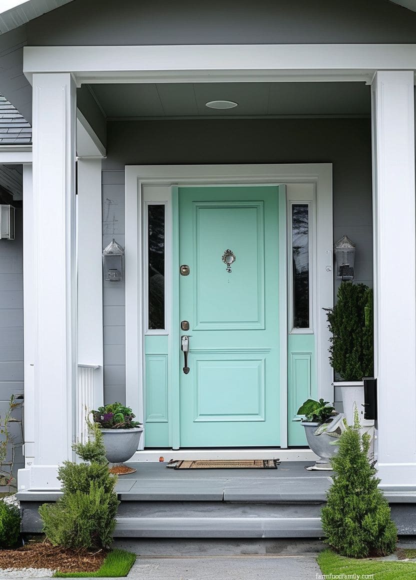
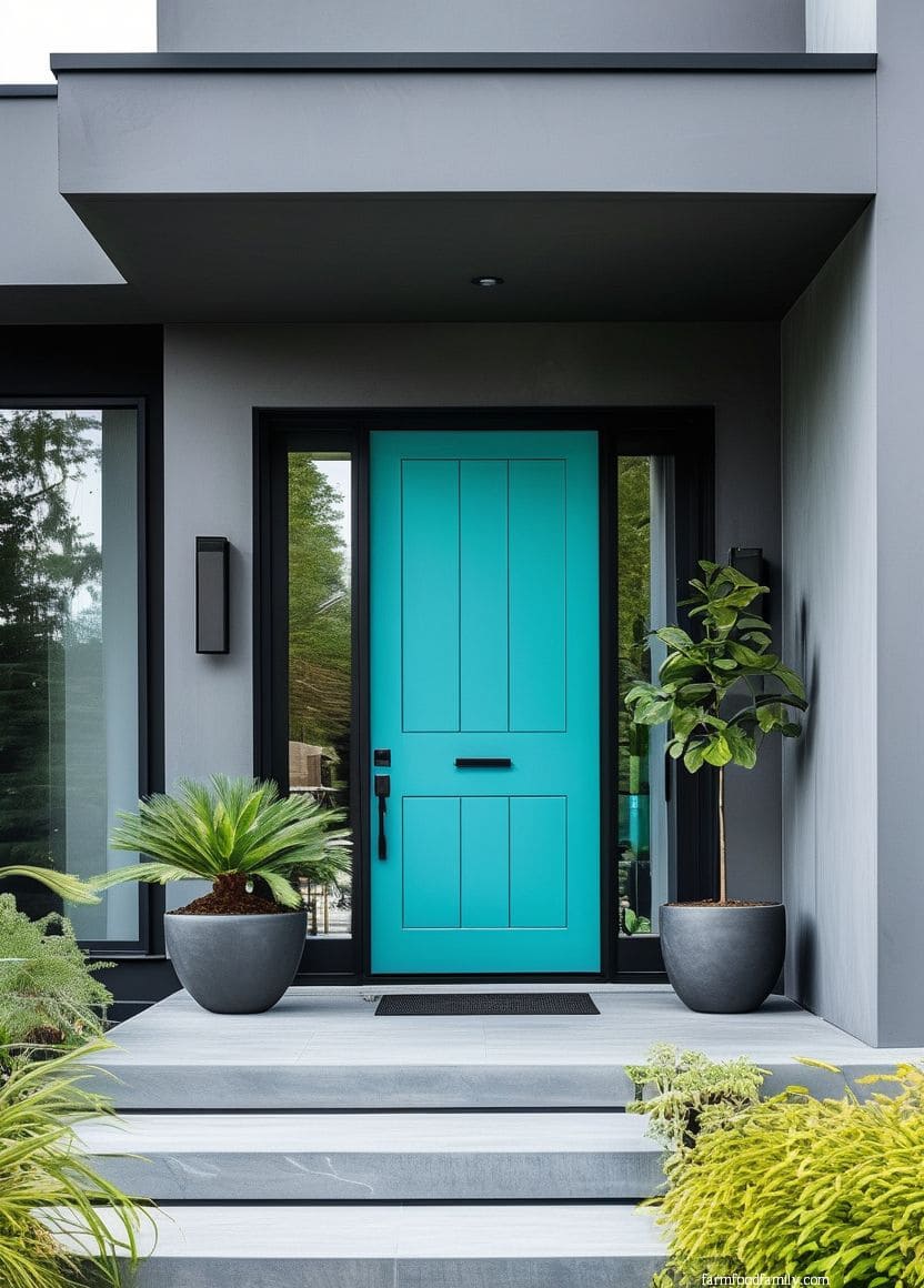
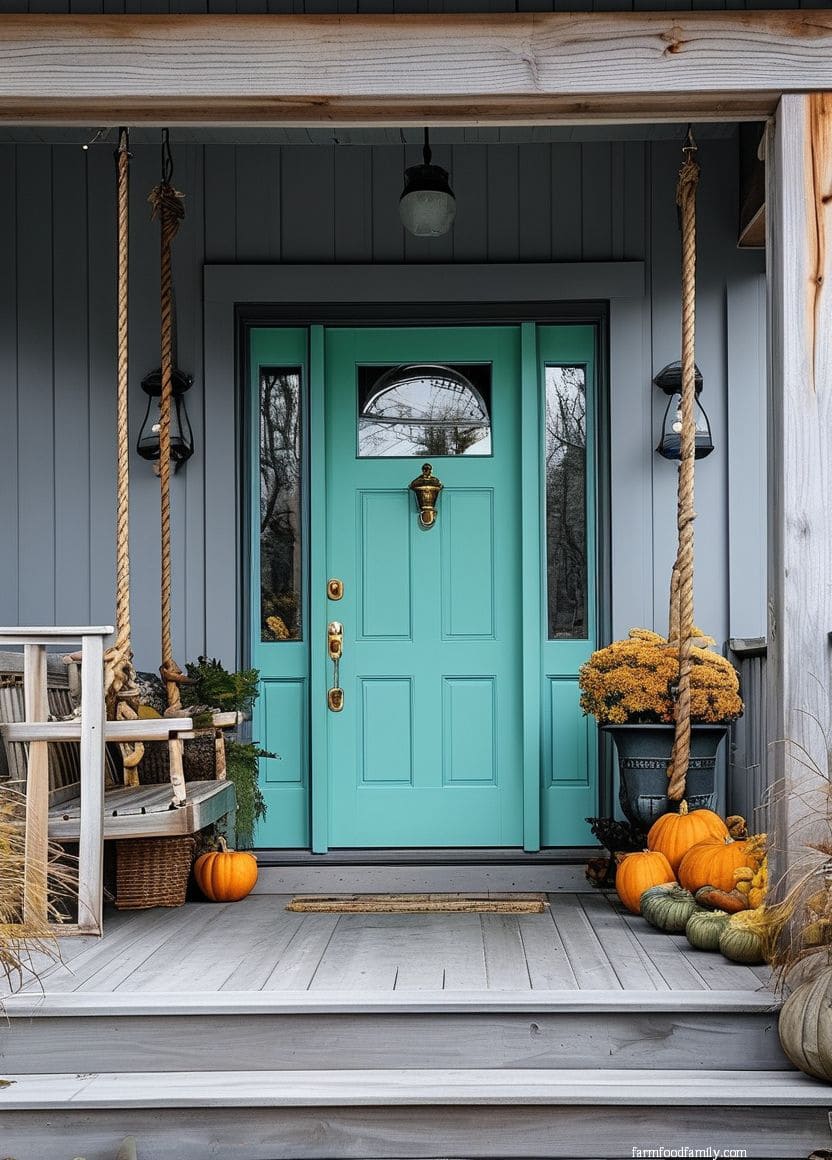
22. Turquoise
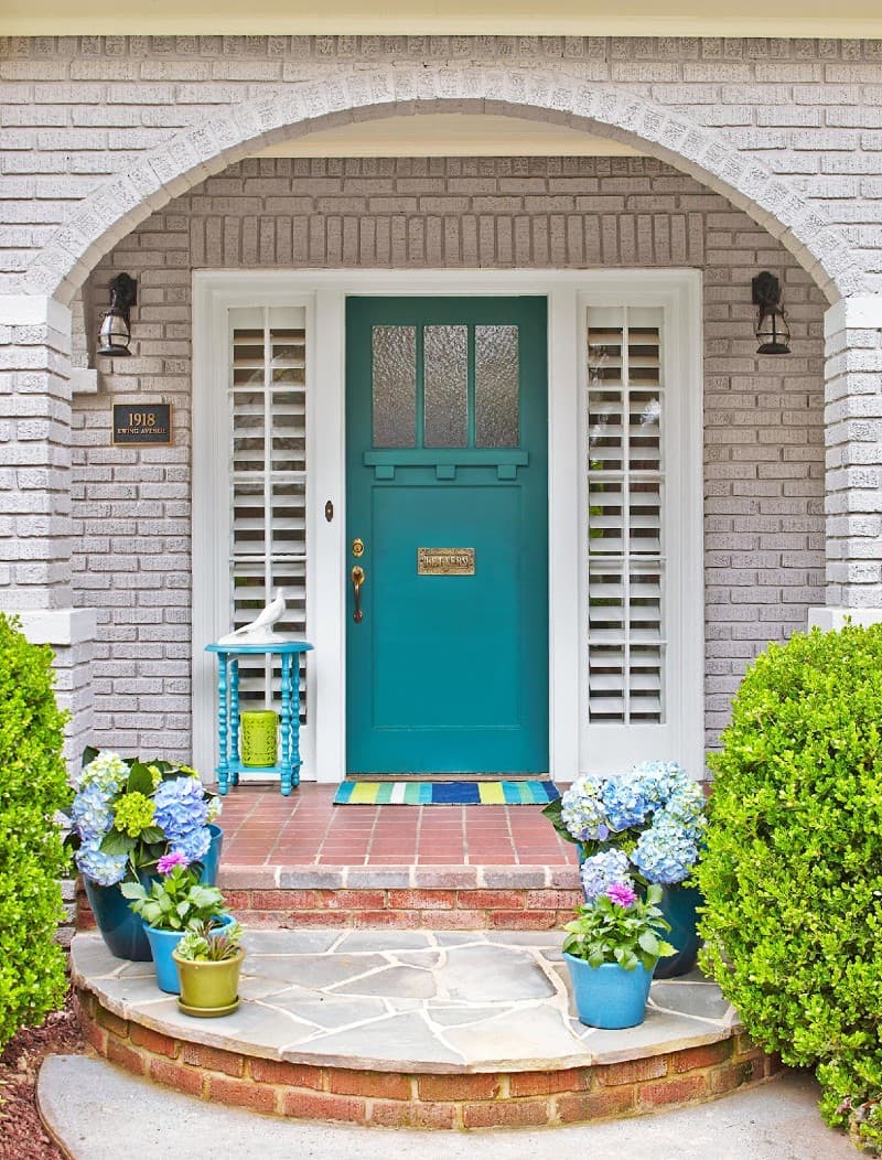
Turquoise shares an underlying flexibility with gray itself, it can lean mostly blue, mostly green, bright and bold, or muted and sophisticated depending on the exact shade. That range makes it worth sampling multiple turquoise variants against your actual siding rather than assuming one version represents the whole color family, especially if your gray has any blue or green undertone to begin with.
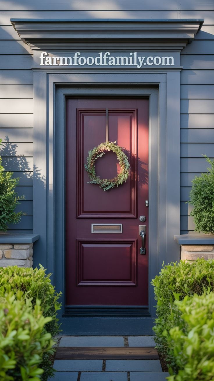
23. Burgundy
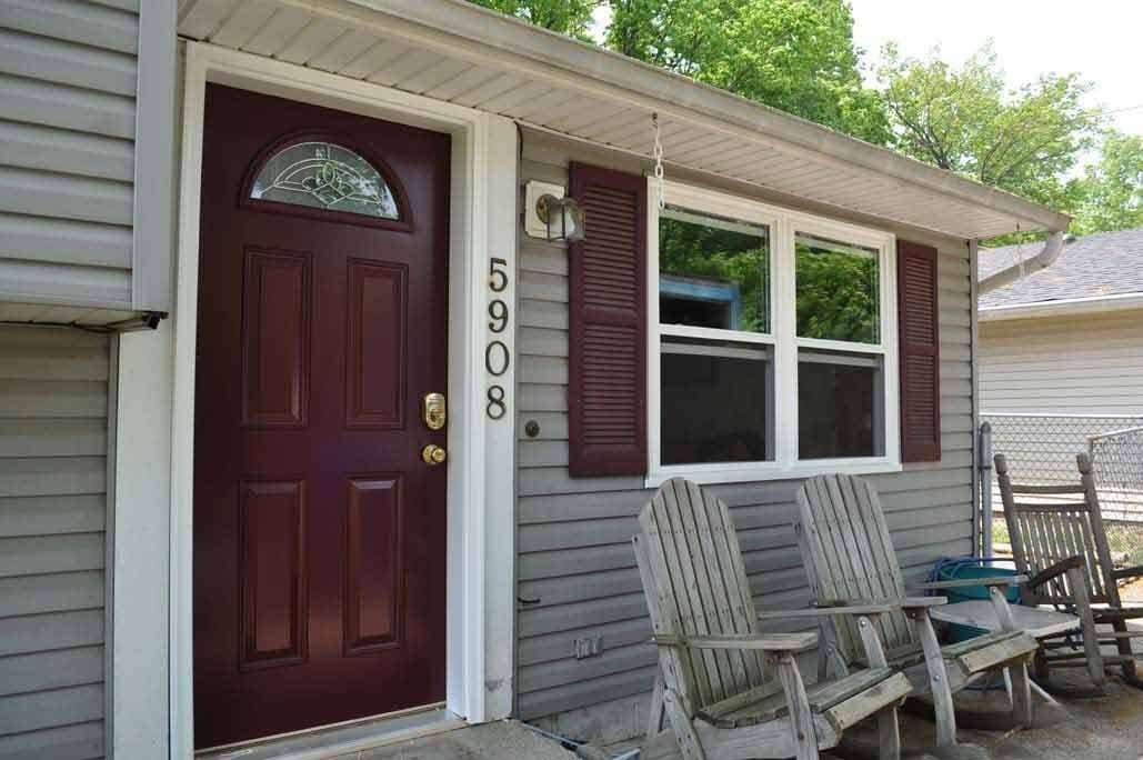
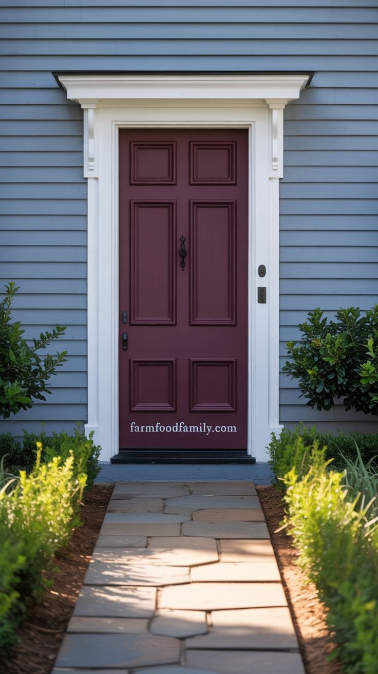
Burgundy’s undertones, some leaning purple, some brown, some straight red, make it easy to match to grays that themselves lean warm or reddish. It’s a genuinely bold statement without tipping into the attention-grabbing territory of a pure red door, timeless in a way that ages better than trend-driven colors.
24. Blue-Gray
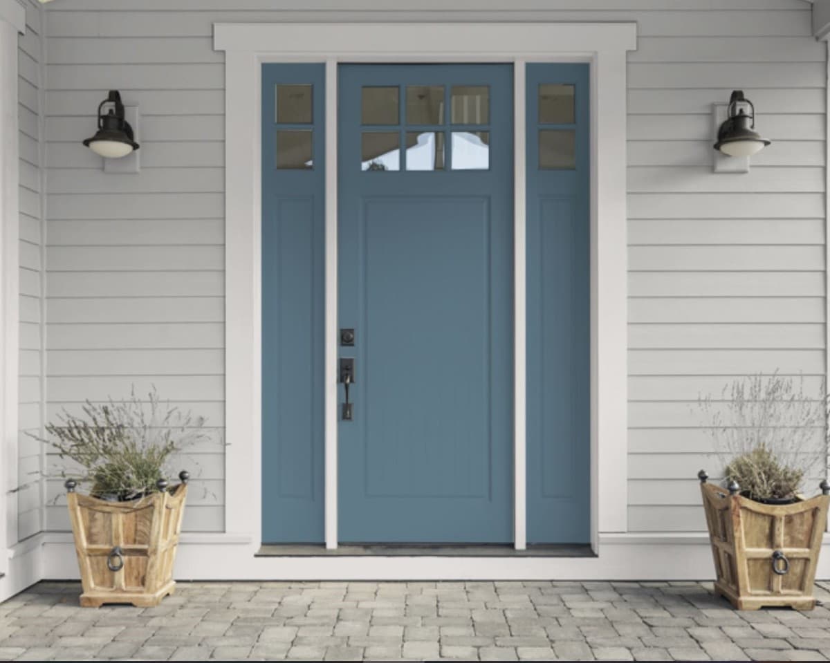
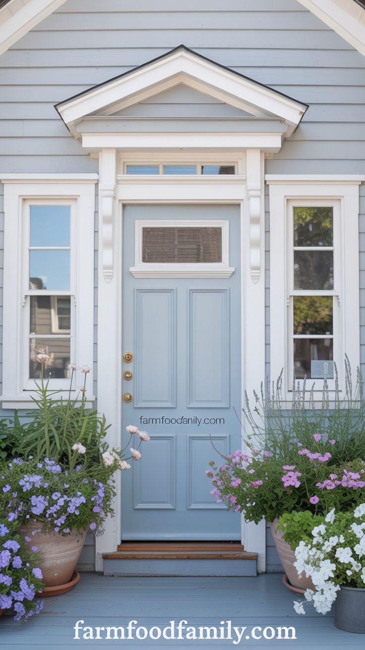
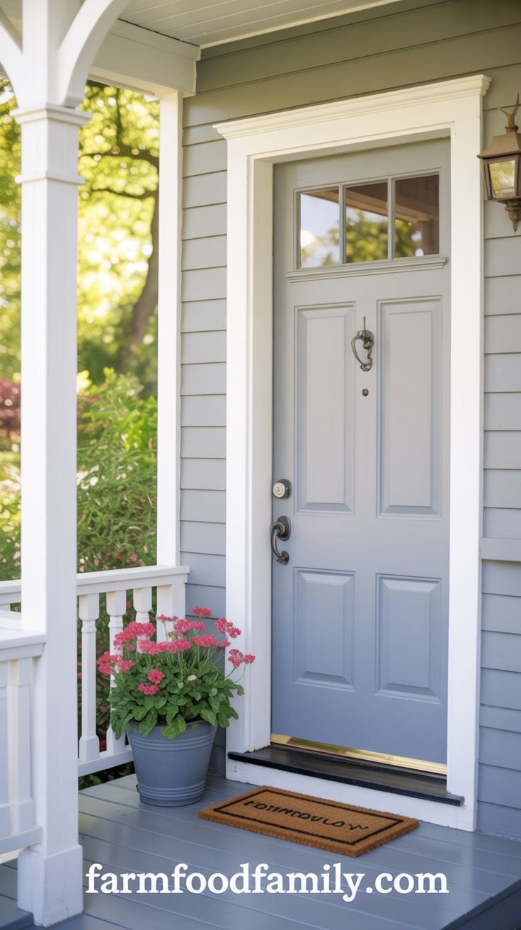
If your siding already leans slightly blue, a blue-gray door doesn’t fight that undertone, it leans into it, creating a subtle, sophisticated contrast rather than a stark one. It also works layered against other gray tones elsewhere on the property, which makes it one of the more versatile choices if your home has multiple gray-toned materials (siding, roofing, stone) to coordinate.
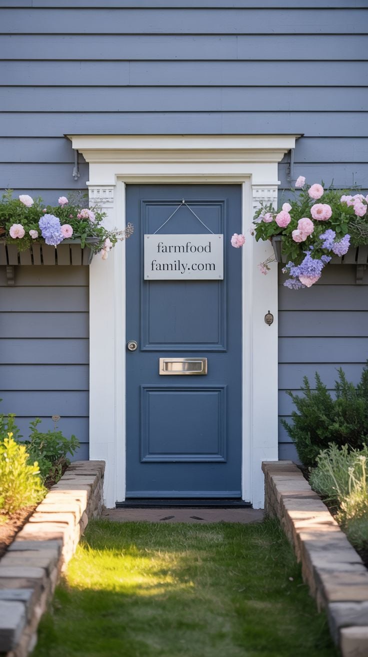

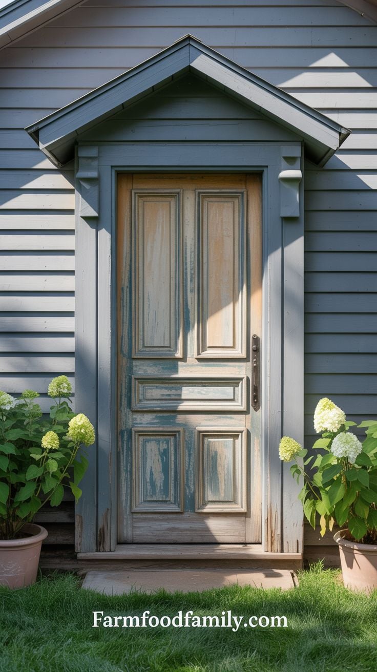
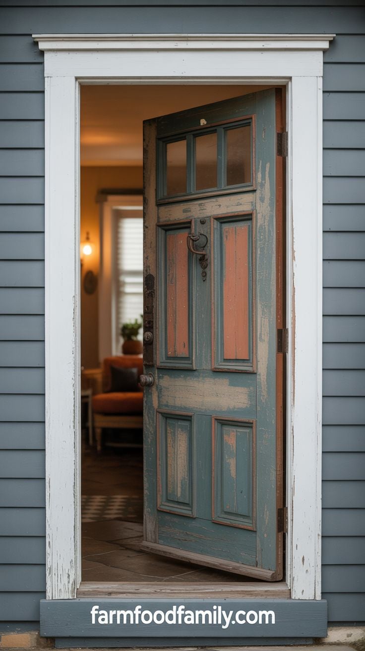
25. Vintage, Weathered Finish
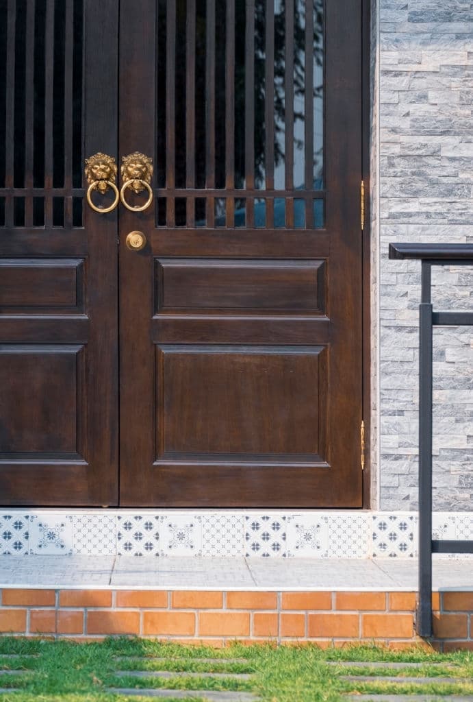
A genuinely worn door, real dents, scratches, and patches where the top color has faded to reveal what’s underneath, isn’t for every house, but it adds a kind of character no fresh paint job can fake. Vintage doors come in essentially any base color or natural wood finish; the weathering itself is the actual design choice here, not the underlying hue.
More front door ideas:
- 20+ Beautiful Farmhouse Front Door Decor Ideas
- 30+ Beautiful Christmas Front Door Decoration Ideas
- 65+ Awesome Halloween Front Door Decoration Ideas
Match Your Door to Something Already There
The single most useful, non-obvious piece of advice in this entire topic doesn’t come from a paint company, it comes from how real homeowners actually solve this problem when they ask for help. On r/HomeDecorating, a 313-upvote thread asking for advice on a blueish-gray house got a specific, useful answer: pick a red door to echo the home’s existing brick chimney, tying the whole facade together instead of treating the door as an isolated decision. On r/midcenturymodern, a 642-upvote, 283-comment thread asking for help choosing got the same underlying advice from a different angle: paint an existing white architectural element to match the new door color, for cohesion, rather than picking the door color in a vacuum and hoping it works.
The pattern across both: don’t just ask “what color goes with gray.” Look at what’s already permanently on the house, brick, stone, an existing trim feature, a roofline, and pick a door color that either matches or deliberately contrasts with that specific element. It’s a more reliable method than matching to siding alone, since siding is usually the most generic, least distinctive part of the facade.
FAQs
What’s the most popular front door color for a gray house?
Black, by a clear margin. Across 16,983 real gray-house door color simulations run in early 2026, black accounted for 27.3% of all choices, with Tricorn Black (SW 6258) the single most-requested exact color. Navy is second at 22.8% and growing fastest among repeat users, and sage green is the fastest-climbing color overall, up 38% year over year.
Does the door color need to match the trim or the siding?
Ideally both stay in mind, but trim temperature matters more than most people expect. A warm cream trim paired with a cool-toned navy door can clash even when the door color itself objectively “goes with” gray siding. Beyond trim and siding, matching the door to another permanent architectural element, brick, stone, an existing trim detail, tends to produce a more cohesive result than optimizing for the siding alone.
What if I can’t decide between two colors?
Get outside opinions before committing to paint. It’s a genuinely common real-world approach: homeowners regularly post their gray house and a shortlist of colors to communities like r/Decor and r/ExteriorDesign and get real, specific feedback within hours, often converging on a color they hadn’t strongly considered themselves. Failing that, buy small sample pots of your top two or three choices and paint a poster-board swatch to hold against the actual door in daylight and evening light before committing to a full gallon.
Conclusion
Gray’s real strength as a siding color is how much room it gives you to work with, which is exactly why “just pick something that goes with gray” isn’t very useful advice on its own. The better approach: know what’s actually popular right now (the data above), know what’s already permanently on your house that the door should relate to, and get a second opinion before you commit to a full can of paint.
More front door ideas:
- Beautiful Farmhouse Front Door Decor Ideas
- Beautiful Christmas Front Door Decoration Ideas
- Awesome Halloween Front Door Decoration Ideas
Never miss an update — choose FarmFoodFamily as your preferred source on Google.
How it works: Tap the button below to open Google's settings page, then check the box next to FarmFoodFamily.
Tap the checkbox to turn it blue — that's how you know it's set.