16+ Beautiful Colors That Pair With Terracotta Floor Tiles Instantly
I repainted a hallway a crisp, cool white once, right next to a terracotta-tiled entryway, and it honestly looked wrong in a way I couldn’t quite explain until a friend who does color consulting pointed out the obvious: the white was fighting the tile’s warmth instead of complementing it. Terracotta isn’t a neutral you can…

Never miss an update — choose FarmFoodFamily as your preferred source on Google.
How it works: Tap the button below to open Google’s settings page, then check the box next to FarmFoodFamily.
Tap the checkbox to turn it blue — that’s how you know it’s set.
I repainted a hallway a crisp, cool white once, right next to a terracotta-tiled entryway, and it honestly looked wrong in a way I couldn’t quite explain until a friend who does color consulting pointed out the obvious: the white was fighting the tile’s warmth instead of complementing it. Terracotta isn’t a neutral you can pair with just any white, gray, or blue and expect it to work. It has a real, specific undertone, and understanding that undertone is the difference between a room that feels intentional and one that feels slightly off.
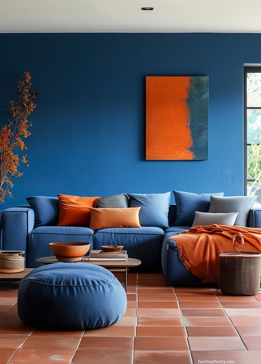
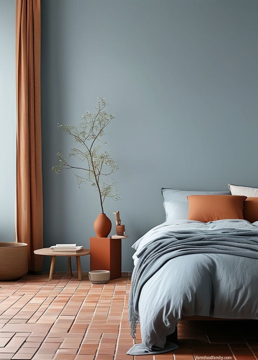
Terracotta’s reddish-orange hue sits on the warm side of the color wheel, nearly opposite blue. That’s the real, checkable reason cool colors like navy and teal create such a strong, deliberate-feeling contrast against it rather than a random pairing. “Terracotta and blue is a natural combo,” says Kristen Fiore, Principal Designer at Kristen Elizabeth Designs.
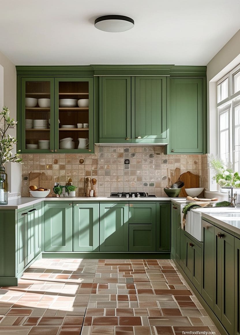
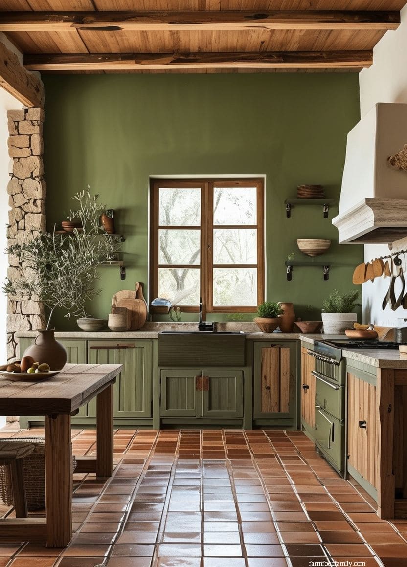
Green works for a related but different reason. “Green is an environmentally harmonious pairing with terracotta,” says Cortney Bishop, a Charleston-based interior designer, since both colors read as pulled from the same natural, earthy palette rather than opposing each other.
One more thing worth knowing before you pick a paint chip: terracotta itself isn’t one fixed shade.
Depending on the clay and firing process, a given tile can lean more orange, more brick-red, or more pink-brown. But look closely at your actual tile in natural daylight before committing to a pairing.
The exact same “navy blue” can read as a perfect complement against one terracotta and slightly off against another.


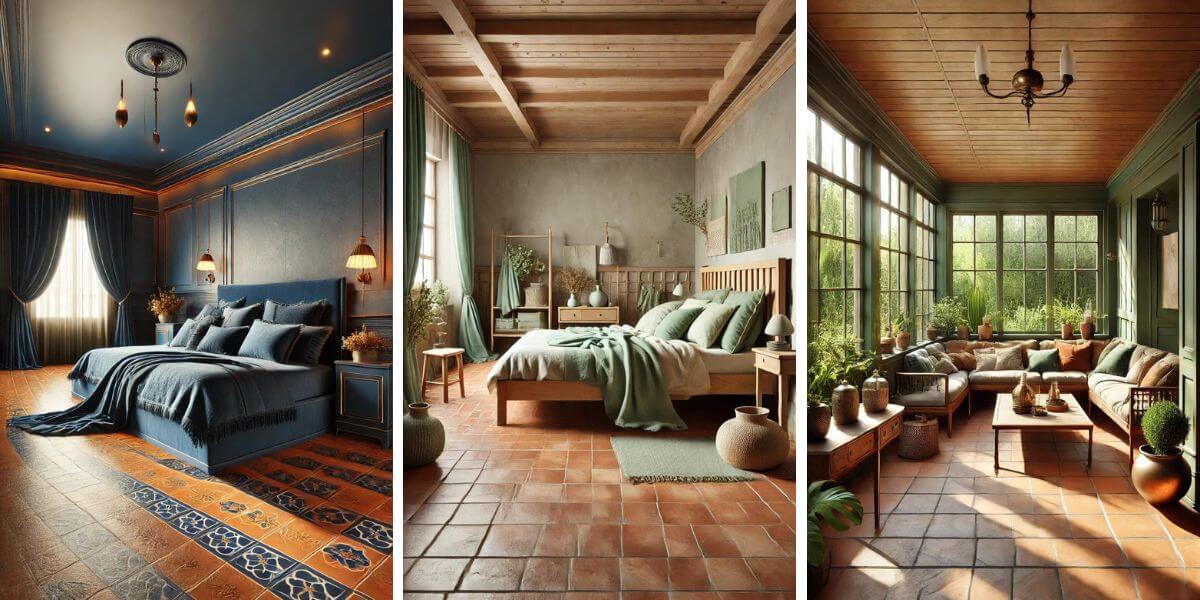
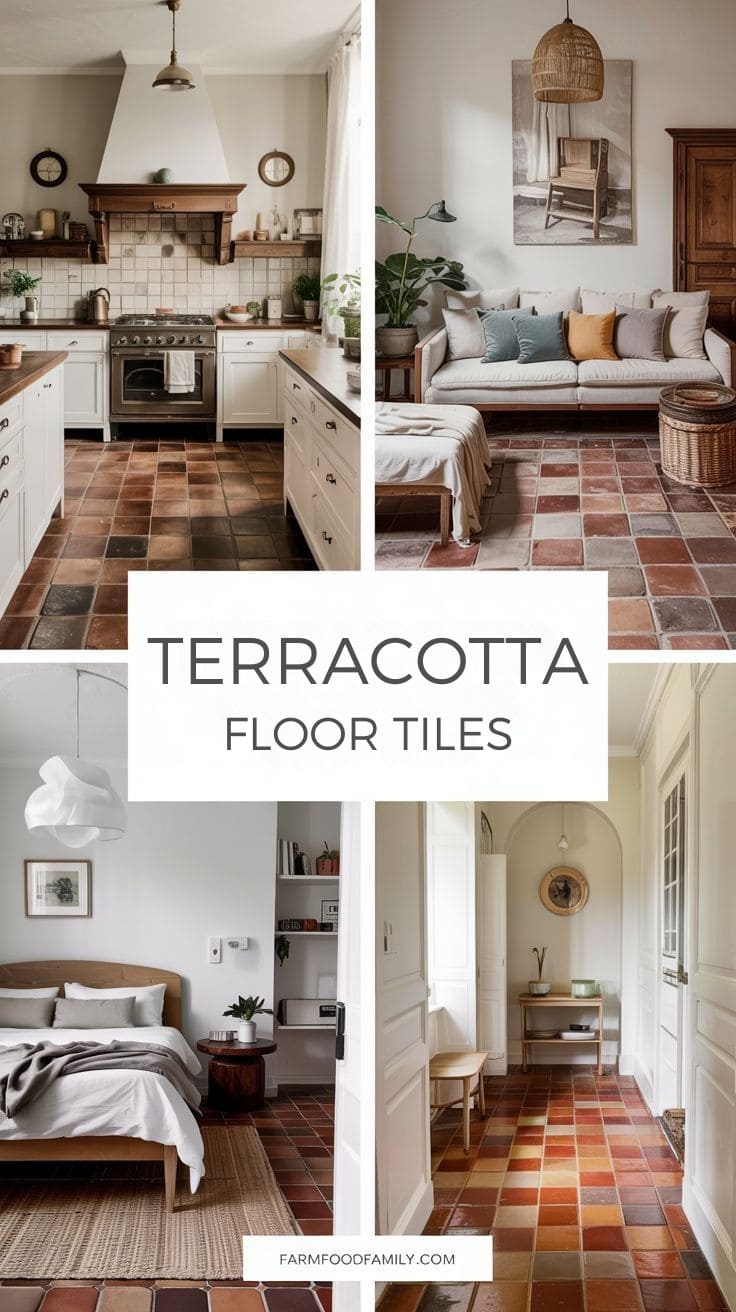
Best Color Options to Pair with Terracotta Floor Tiles
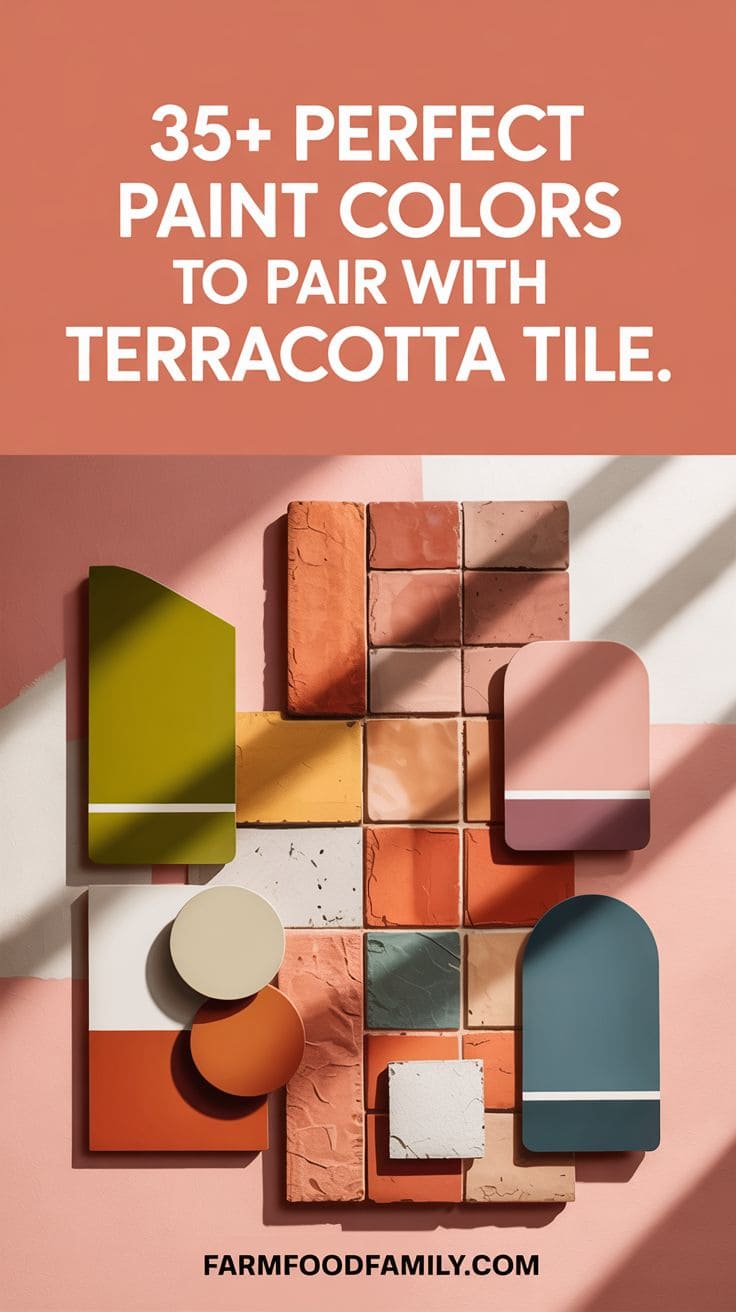
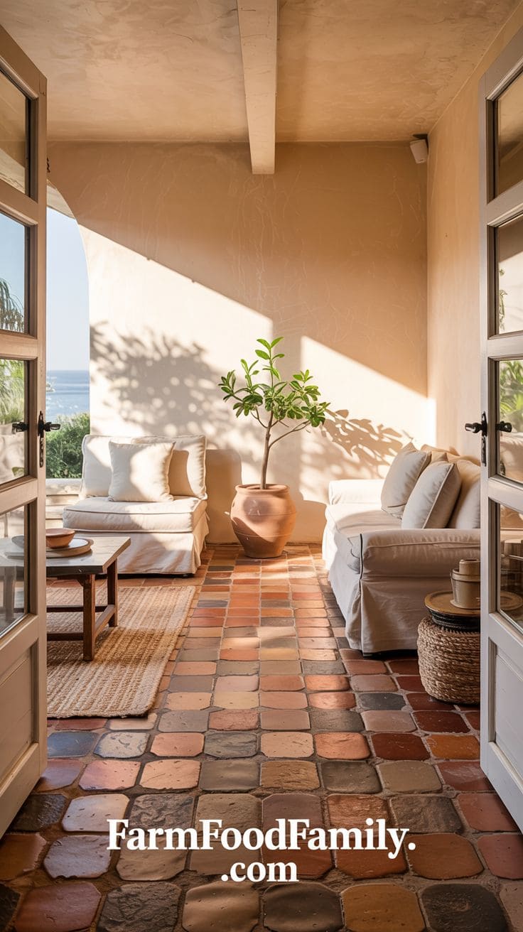
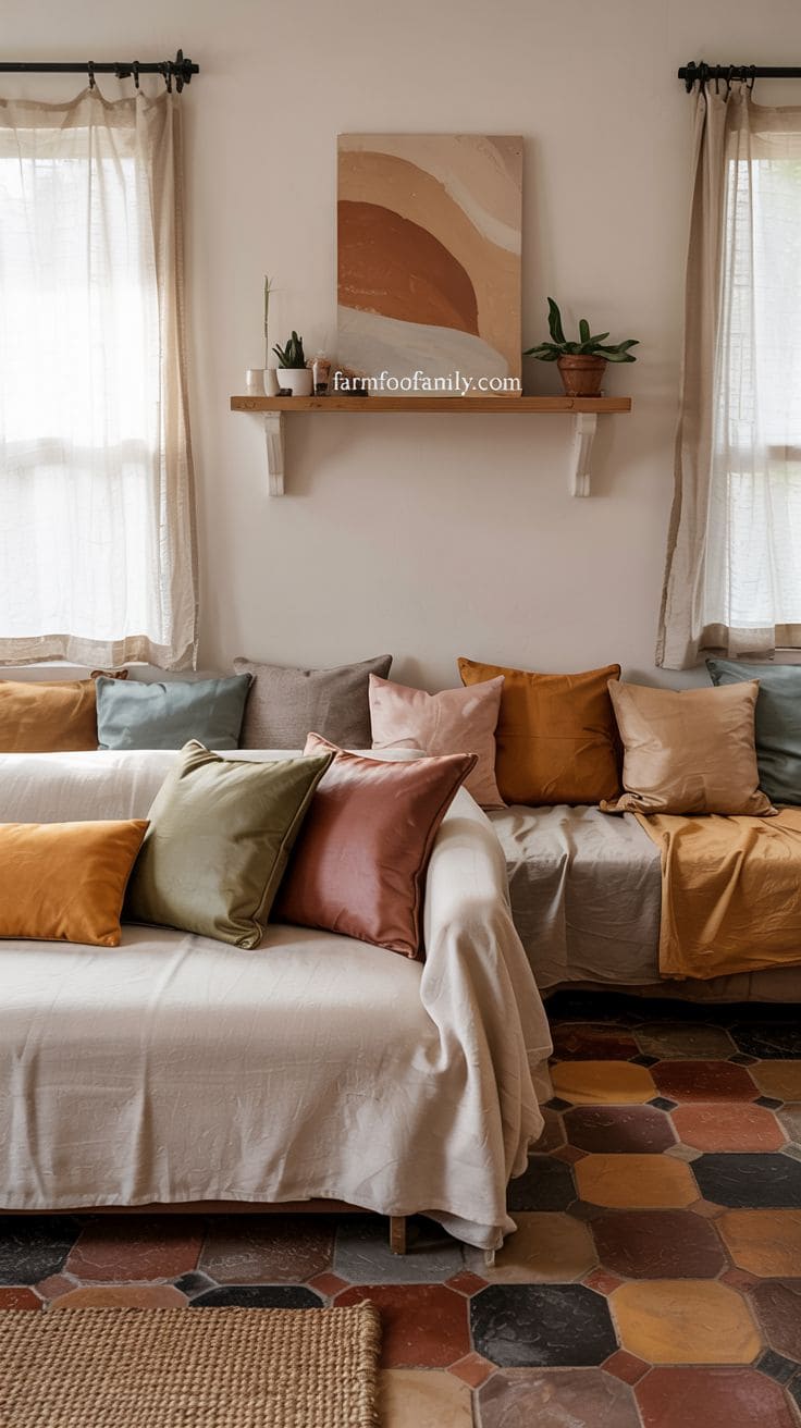
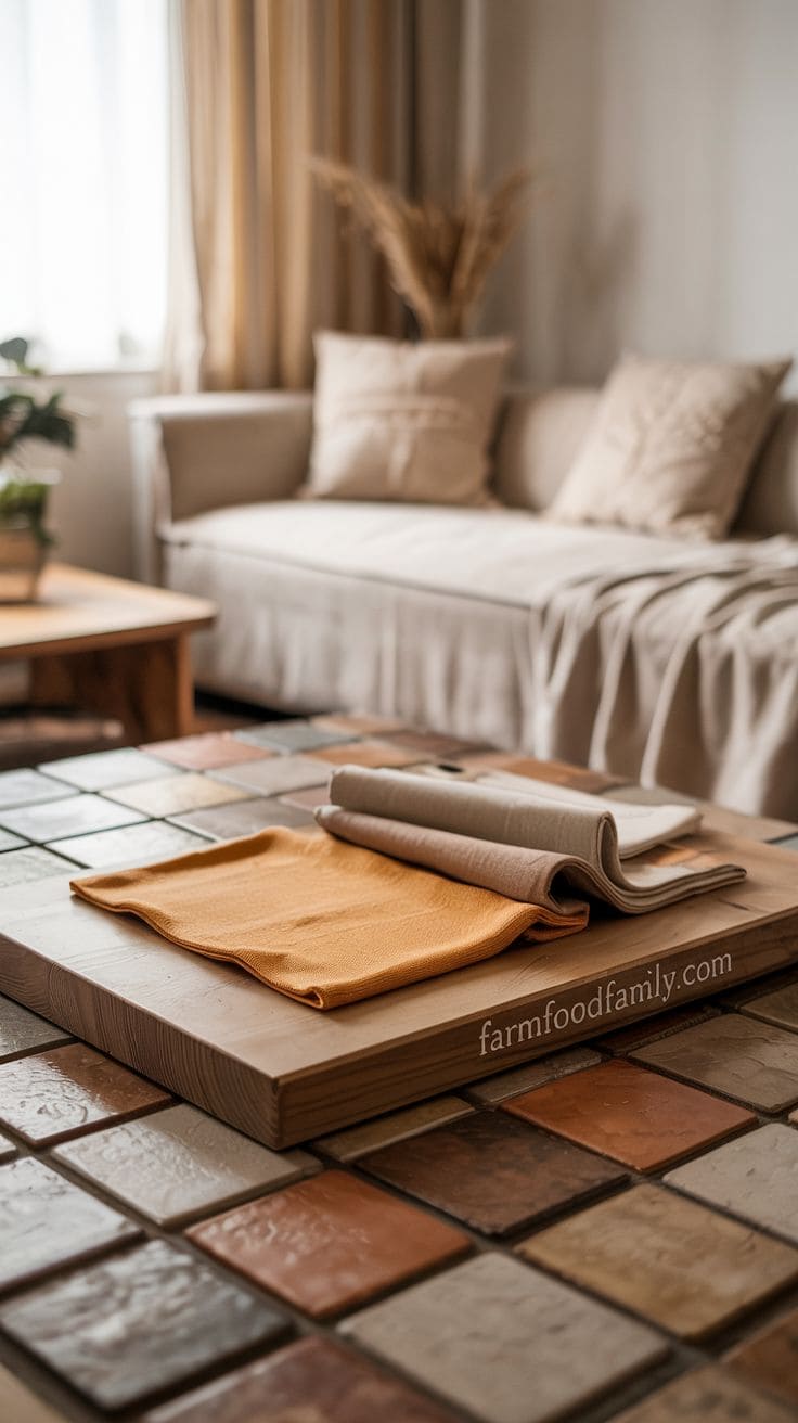
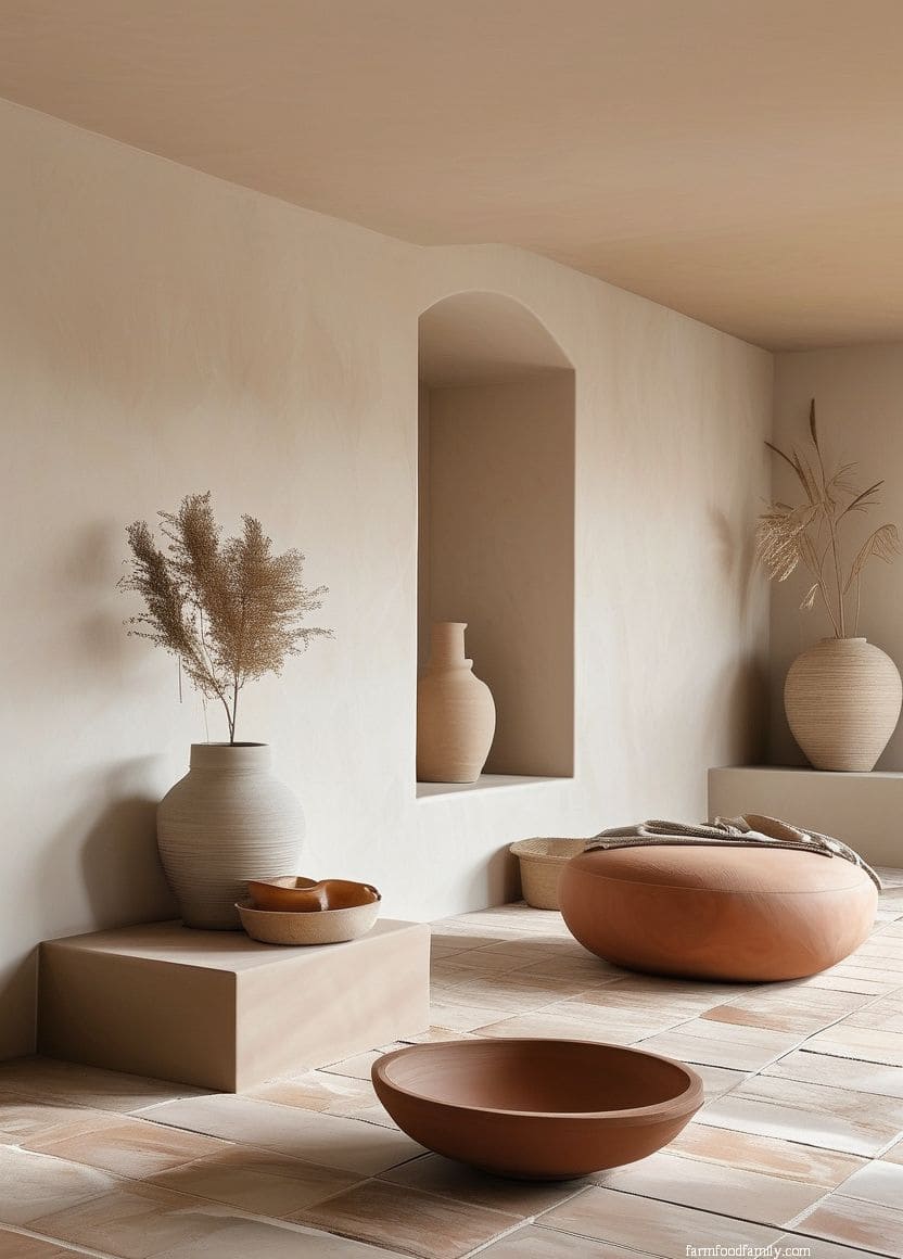
1. Warm Beige or Sand
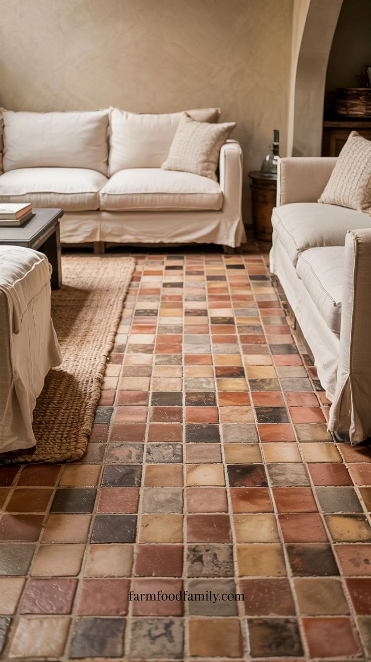
Beige and sandy tones produce a neutral, monochromatic effect that pairs well with terracotta.
The end result is a relaxing, sun-washed color palette suitable for Mediterranean, coastal, or desert-inspired houses.
Use beige for wall paint, woven carpets, upholstered furniture, and even textured plaster finishes.
Layering similar colors adds depth while preserving consistency. To emphasize the warm, natural vibe, use materials such as jute, cane, and raw wood.
This combination is ideal for creating a room that is both relaxed and classy, as well as seamlessly connected to the natural surroundings. Also, it is perfect if you’re going for a seaside or sandy look.
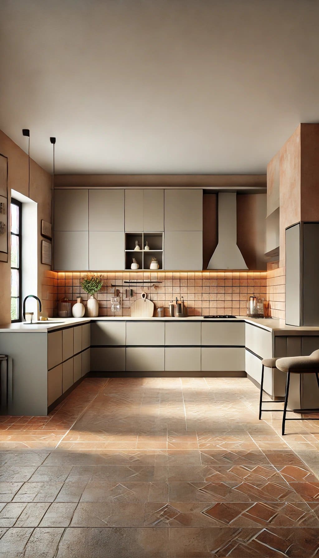
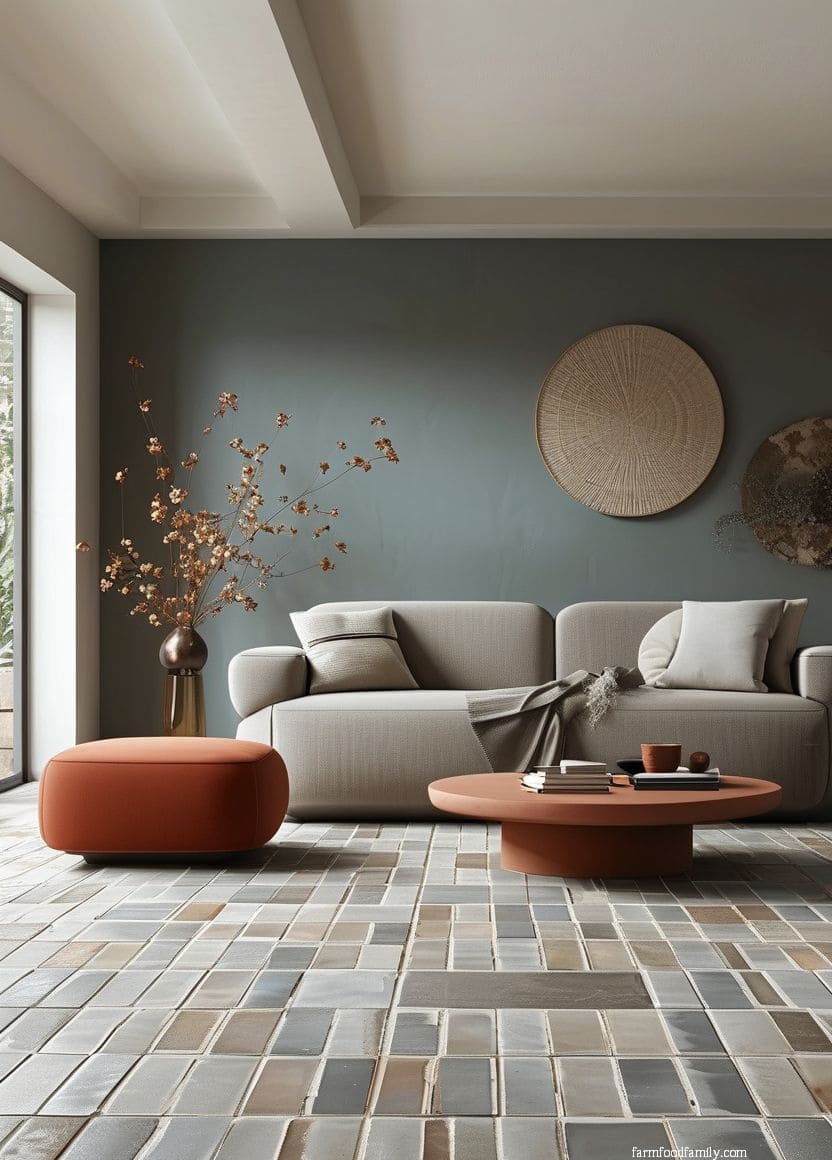
2. Soft Gray
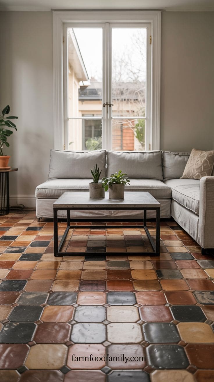
Soft gray tones provide a contemporary and relaxing contrast to terracotta. The coldness of gray counterbalances the tile’s innate warmth, creating a sense of balance.
Pale gray walls or sofas provide a new backdrop for the tile’s assertiveness without drowning it out.
Gray metal or concrete accessories in modern or industrial environments reflect the tile’s tone and texture, producing a combination of old-world charm with sleek minimalism.
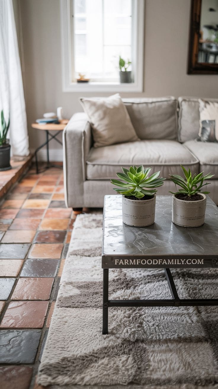
For traditional settings, place a soft gray rug over the tiles to soften the look while still displaying the pattern.
This combination works particularly well in urban flats, transitional decor, or any location that requires a refined contrast.
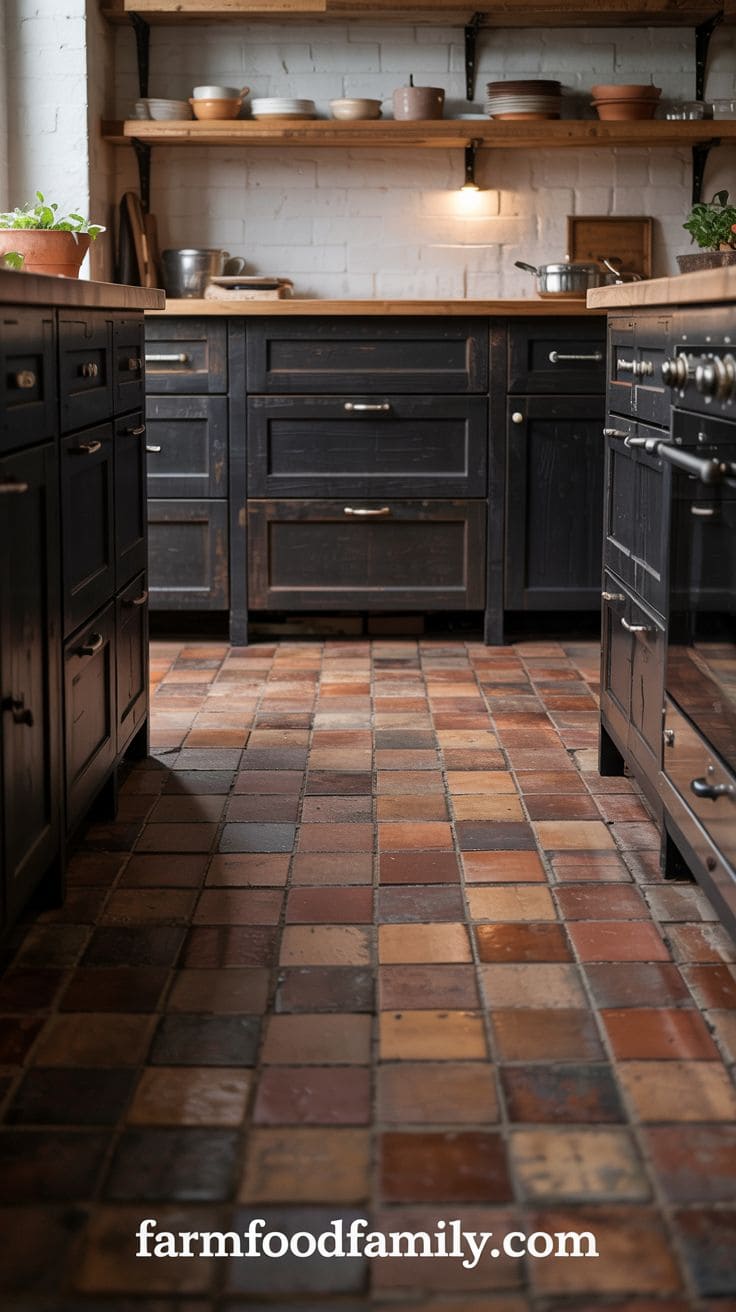
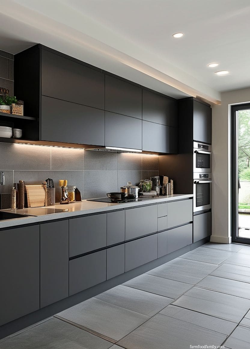
3. Charcoal or Soft Black
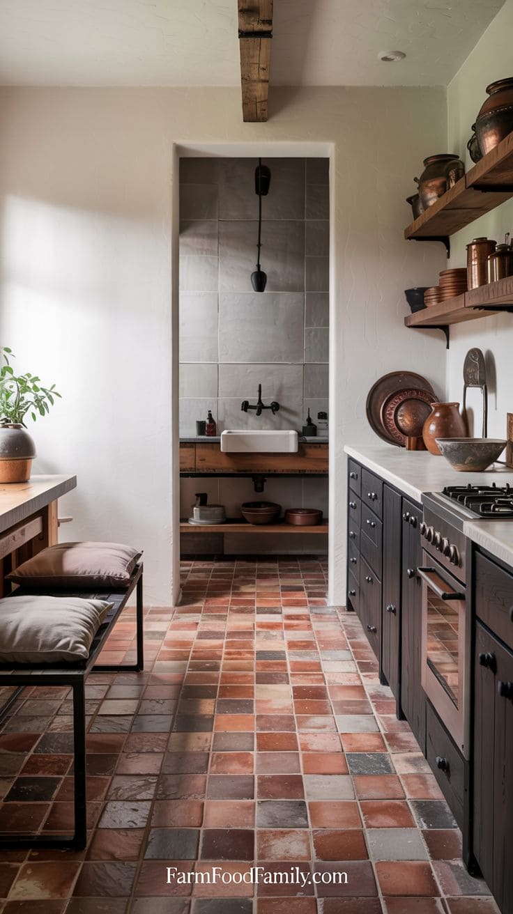
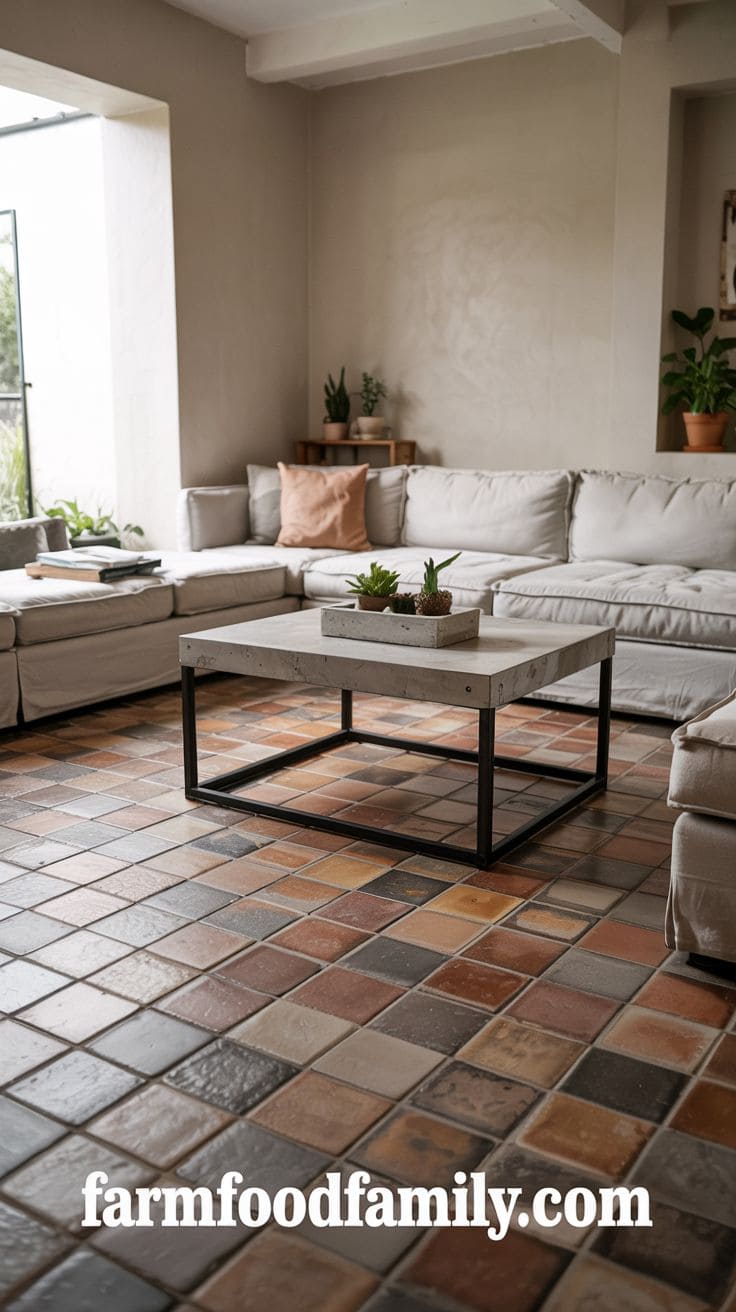
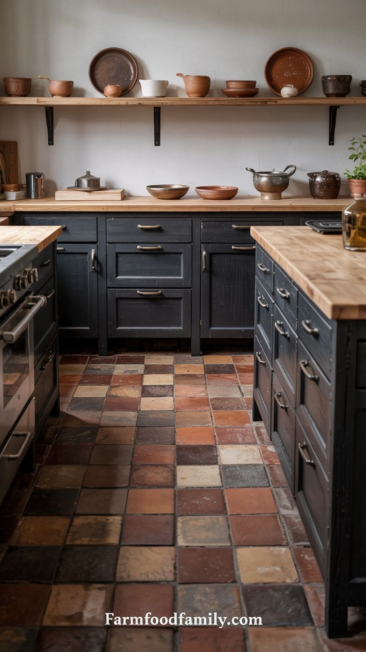
If you want a more modern or industrial look, combine terracotta with charcoal or soft black to create a striking yet grounded look.
Use matte black in lamp fixtures, furniture legs, or statement decor components to add contrast without overpowering the tile’s warmth.
This combination appears extremely sophisticated when used with wood and white tones, which keep it from feeling too weighty.
To preserve equilibrium, use charcoal in accents rather than big sections.
In bathrooms or kitchens, black faucets or cabinet hardware against terracotta floors provide a dramatic, curated look.


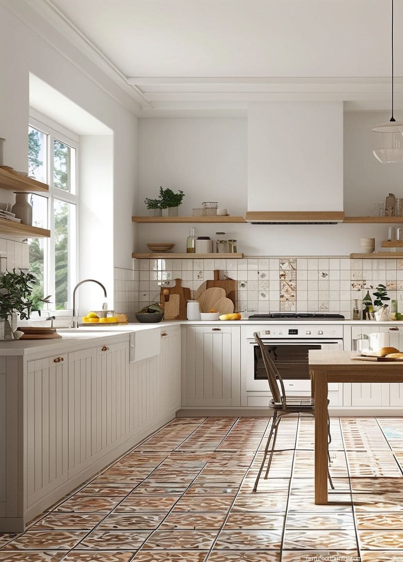
4. Creamy White
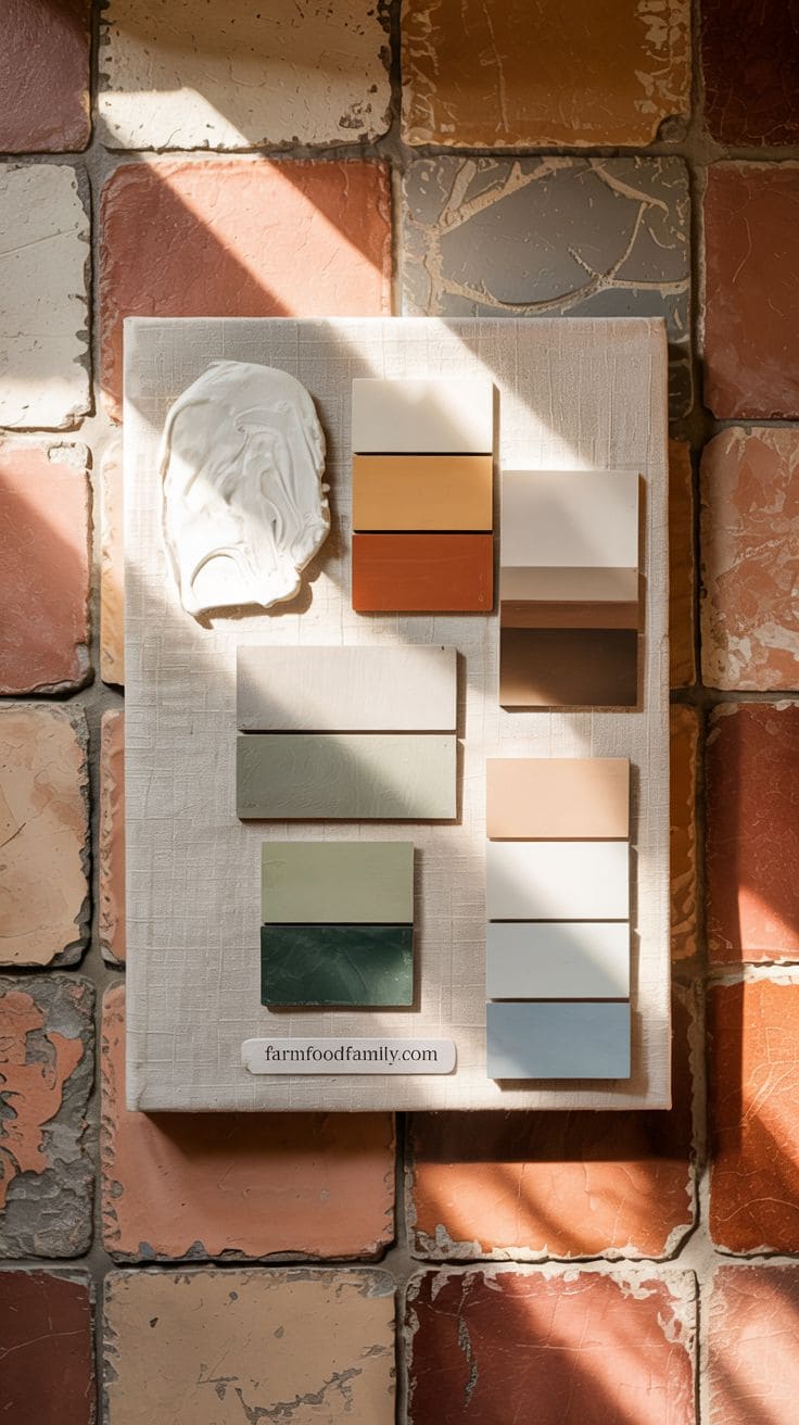
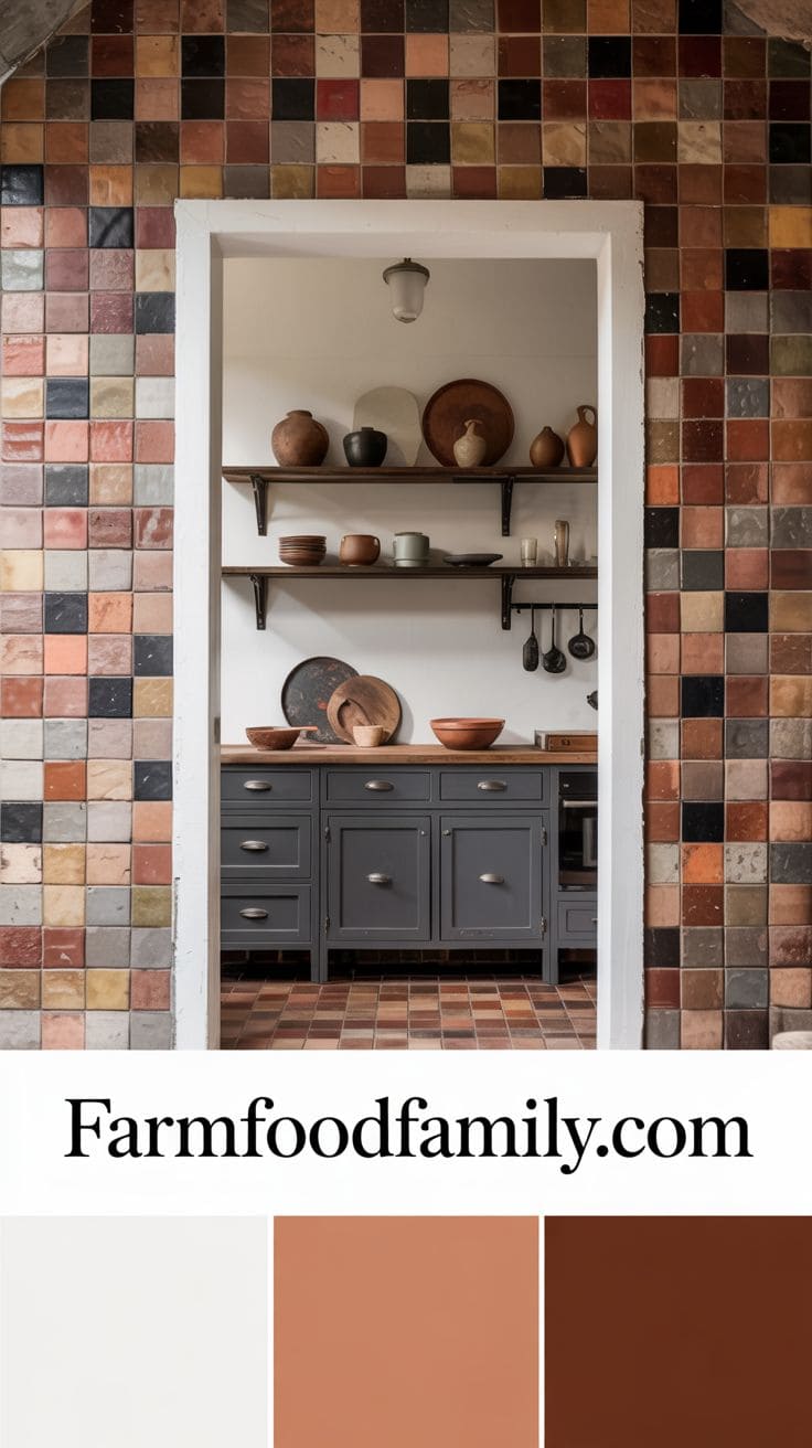
Combining terracotta floor tiles with creamy whites creates a subtle, delicate contrast that balances warmth and brightness.
Creamy whites have a tinge of yellow or beige, making them a better match with terracotta than harsh white.
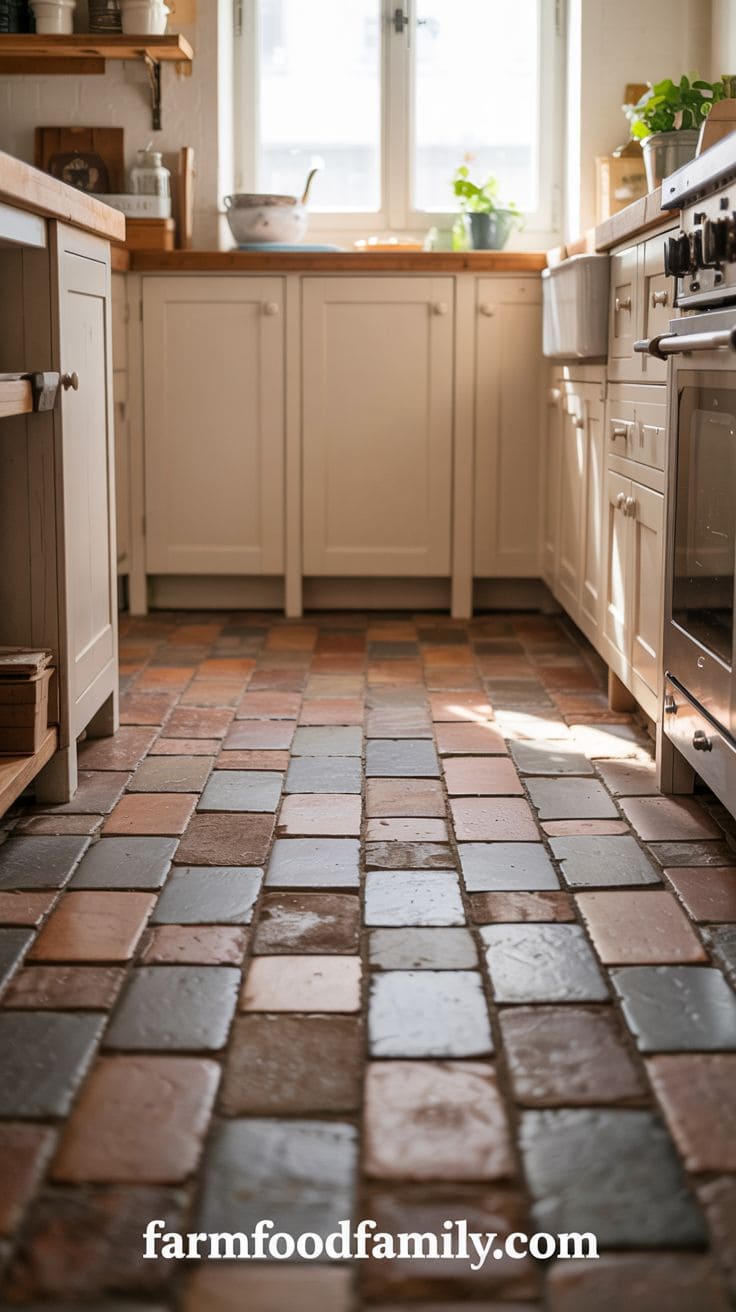
This combination is ideal for creating a Mediterranean, Spanish, or farmhouse feel. Use cream on the walls, cabinets, trim, or furniture to create the floor a strong focal point.
Cream-colored décor and terracotta tiles provide a warm and timeless feel.
Soft white drapes and linens open up living spaces and highlight the texture of the tile.
This combination offers comfort to a room without adding weight, and it works well with both modern rustic and historical styles.
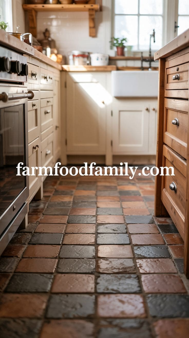
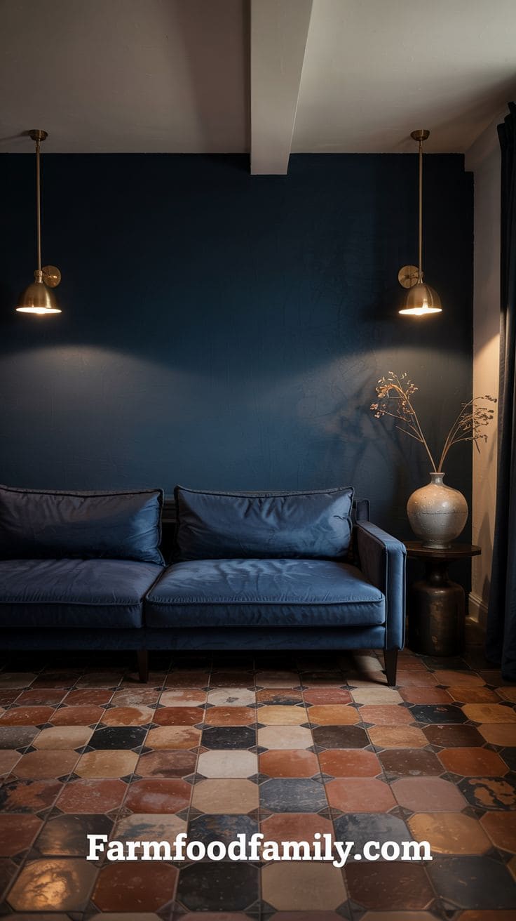
5. Deep Navy Blue
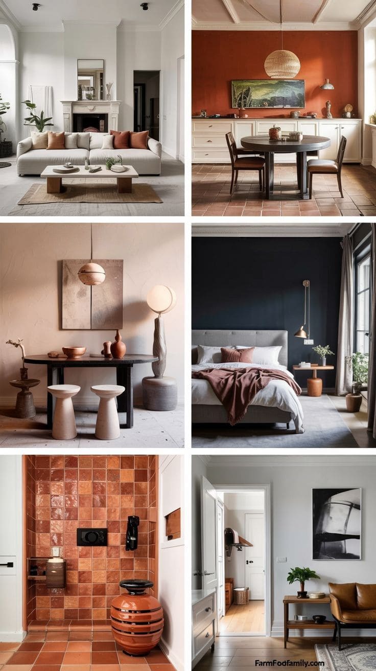
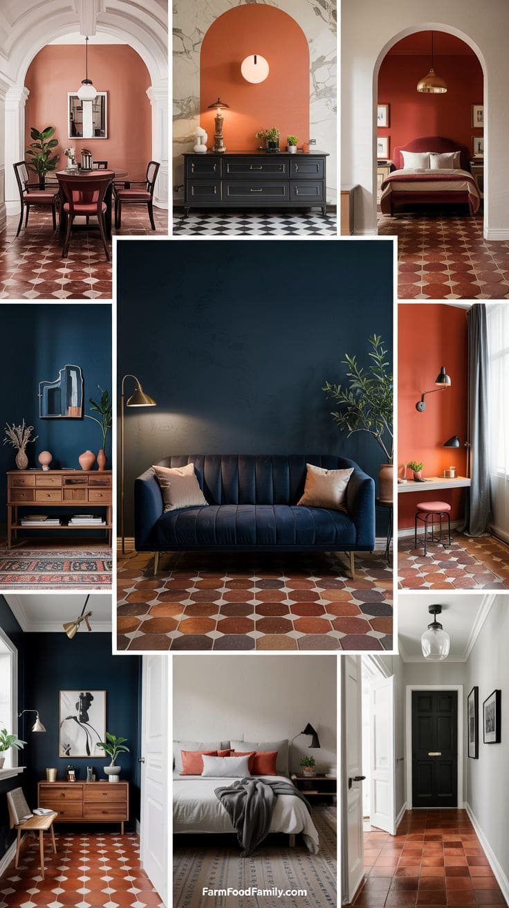
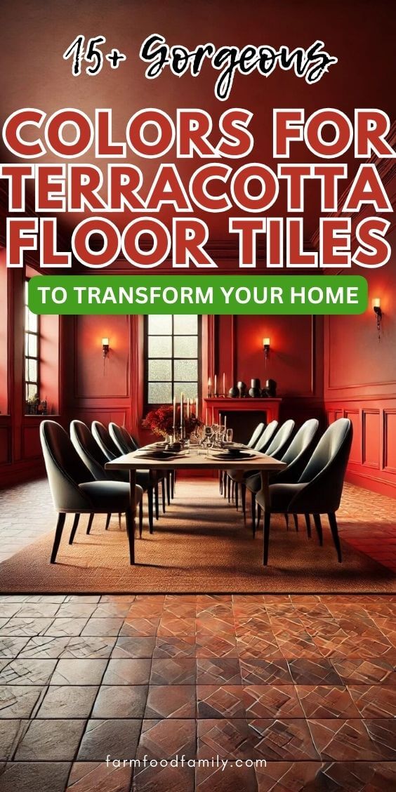
Terracotta and deep navy create a striking, high-contrast combination that adds elegance and a sense of daring to any area.
Navy’s cold, rich tone enhances the warmth of the tile, particularly in well-lit areas.
Navy works well for built-in bookshelves, accent walls, and textiles like velvet drapes or woven rugs.
The effect is dramatic, particularly in a setting with white or cream walls to balance the hues.
For a glamorous design, add gold or brass fixtures, or keep it earthy and grounded with white ceramics and natural wood.
This combination complements eclectic, Mediterranean, or contemporary styles that aren’t afraid to experiment with contrast.
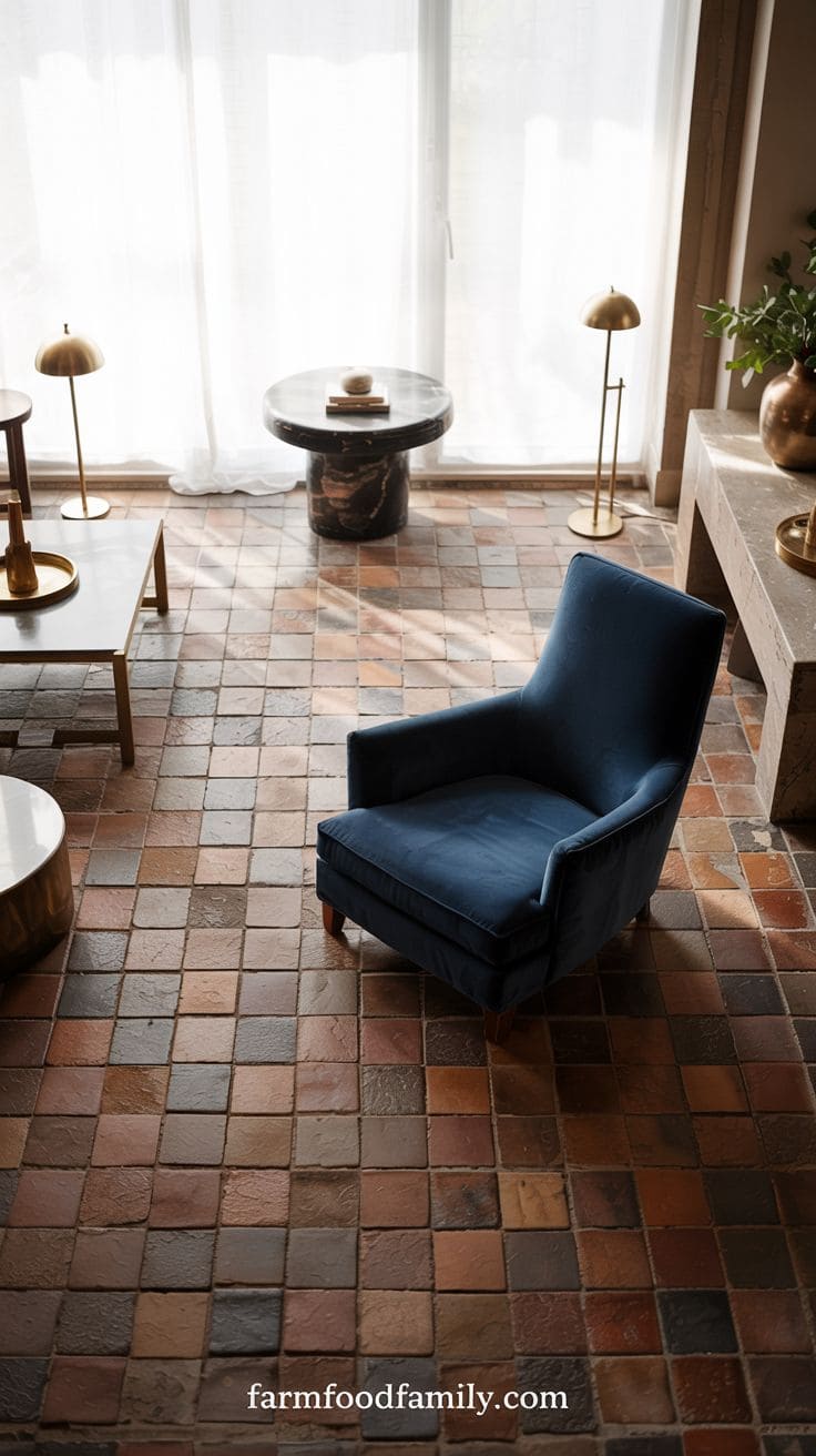
6. White
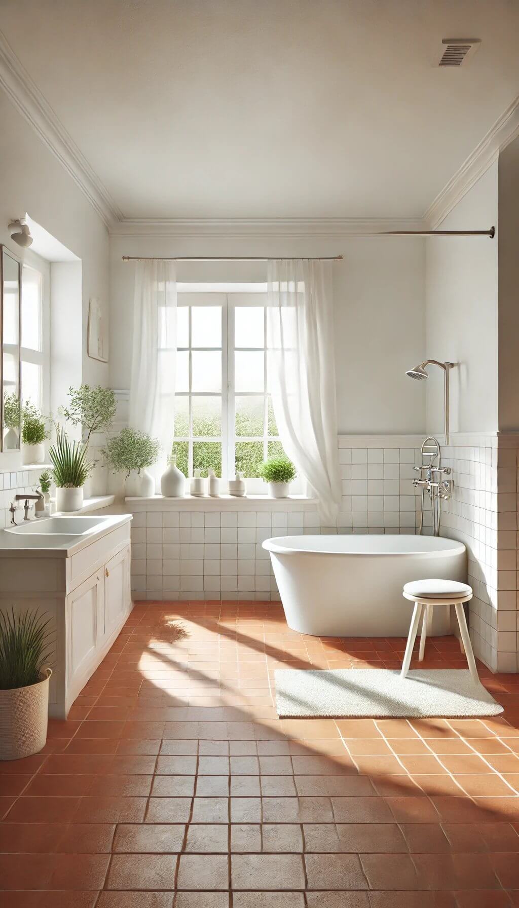
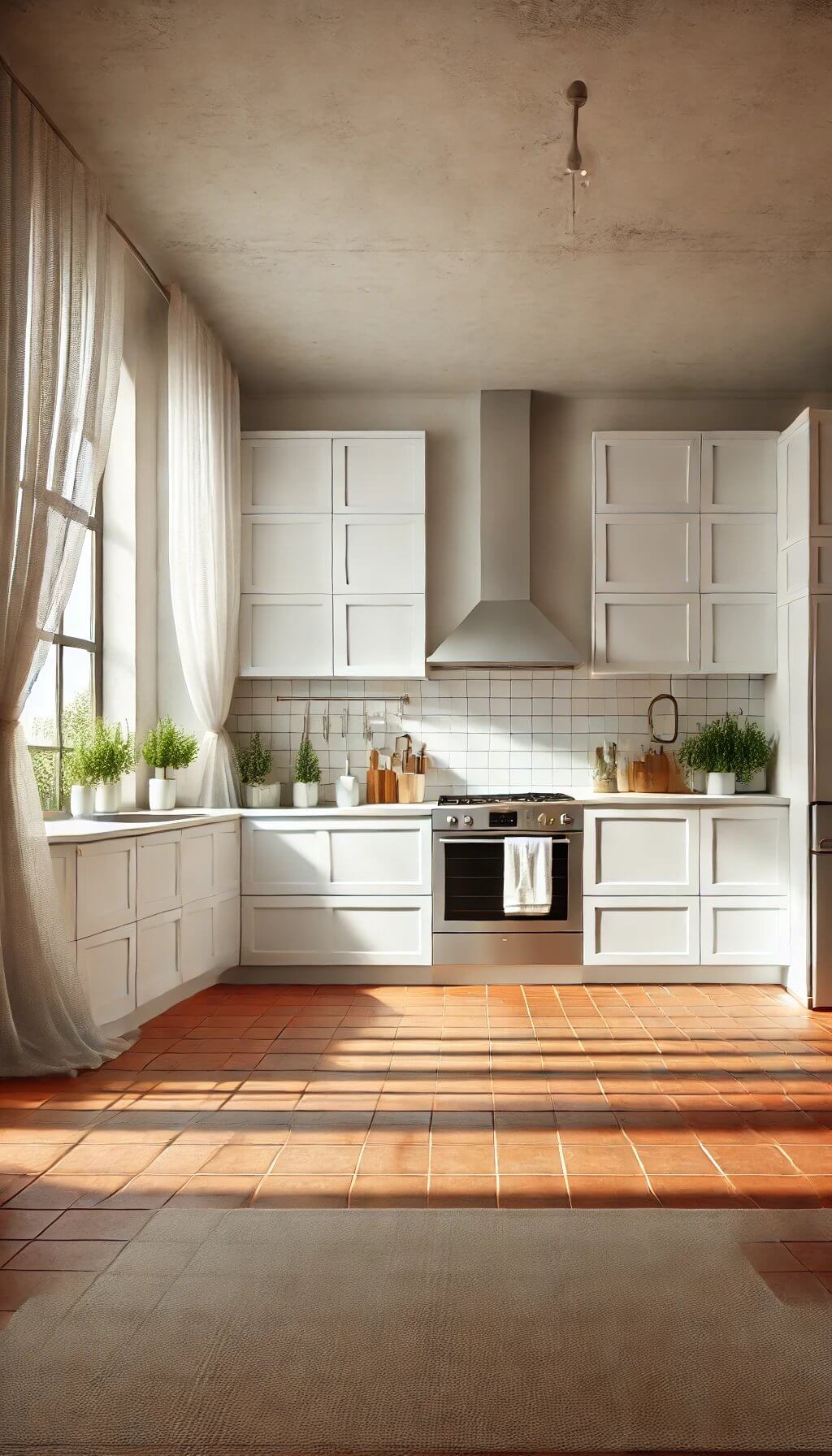
Different from creamy white above (#4): a stark, cool-undertone white gives terracotta a cleaner, more modern backdrop, though it needs to be handled carefully since cool white can visually clash with terracotta’s warmth if there’s nothing else in the room to bridge the two.
Adding a warm wood tone or a few terracotta-adjacent accent pieces helps a cool white and terracotta actually work together instead of pulling in opposite directions.
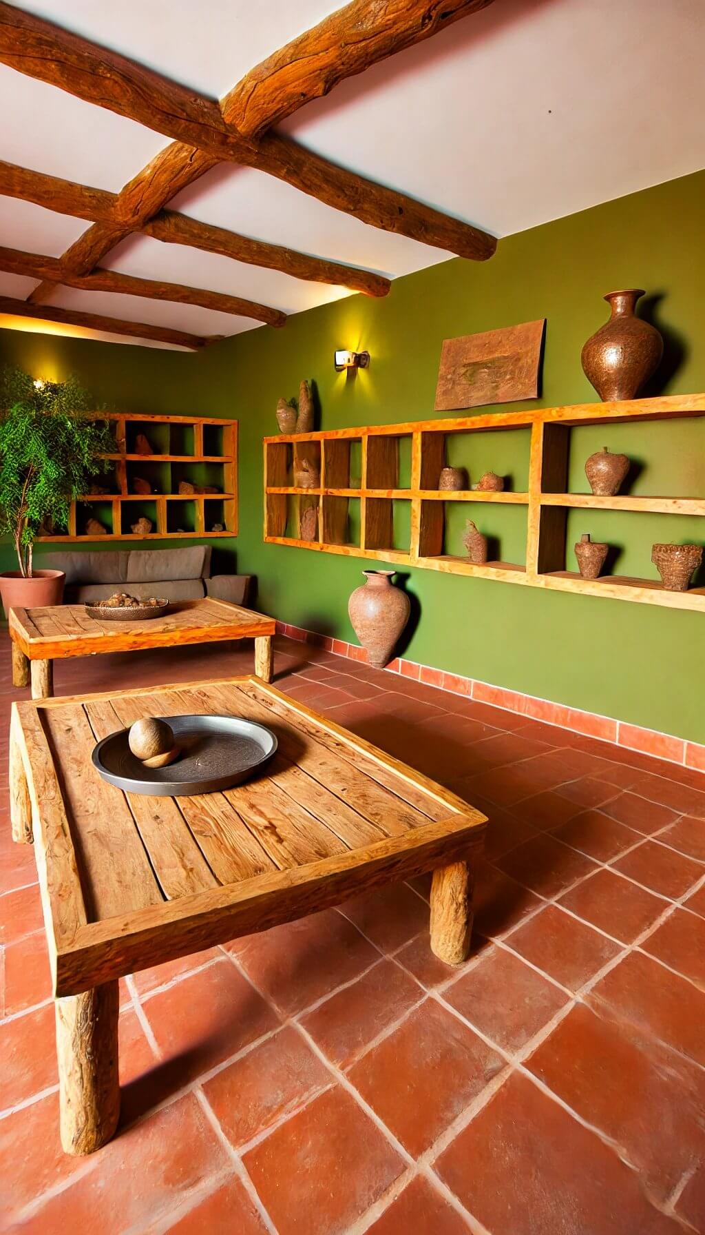
7. Olive Green
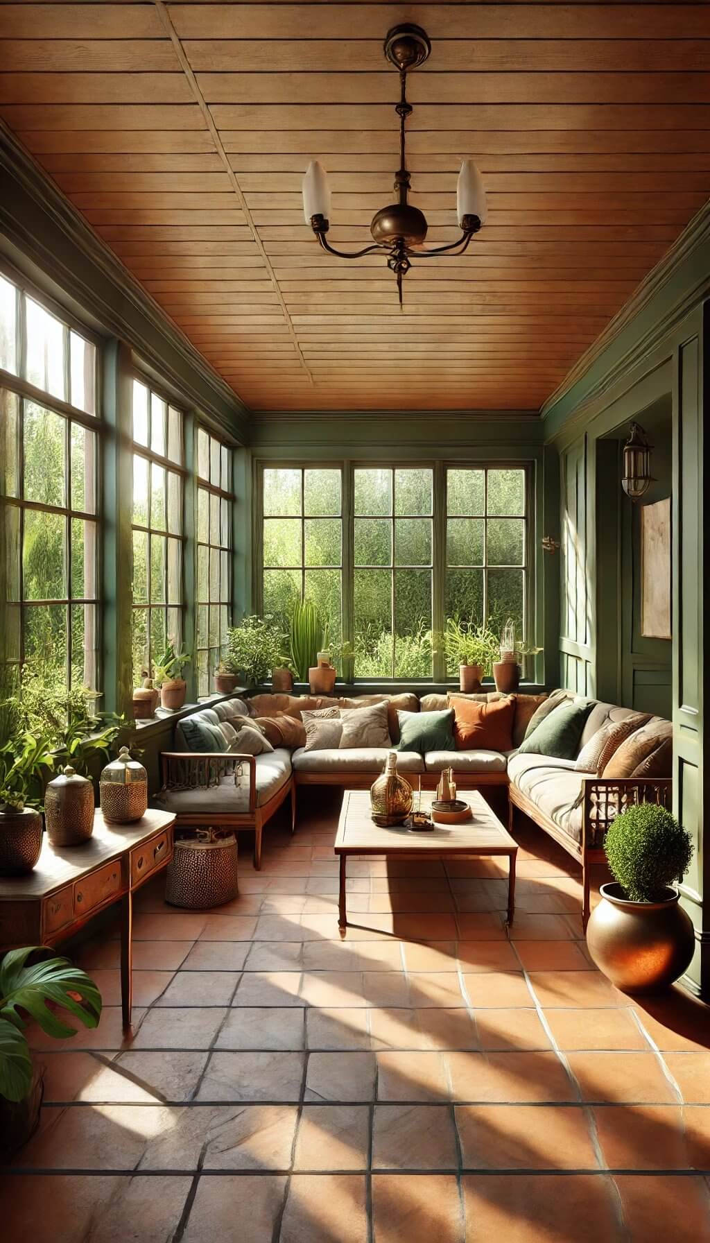
Olive green pairs with terracotta for the reason Cortney Bishop describes, both colors read as genuinely natural and earthy, like they came from the same landscape rather than a paint deck.
This combination works especially well with real greenery in the room, since olive-toned walls or furniture make actual plants look more intentional rather than randomly placed.
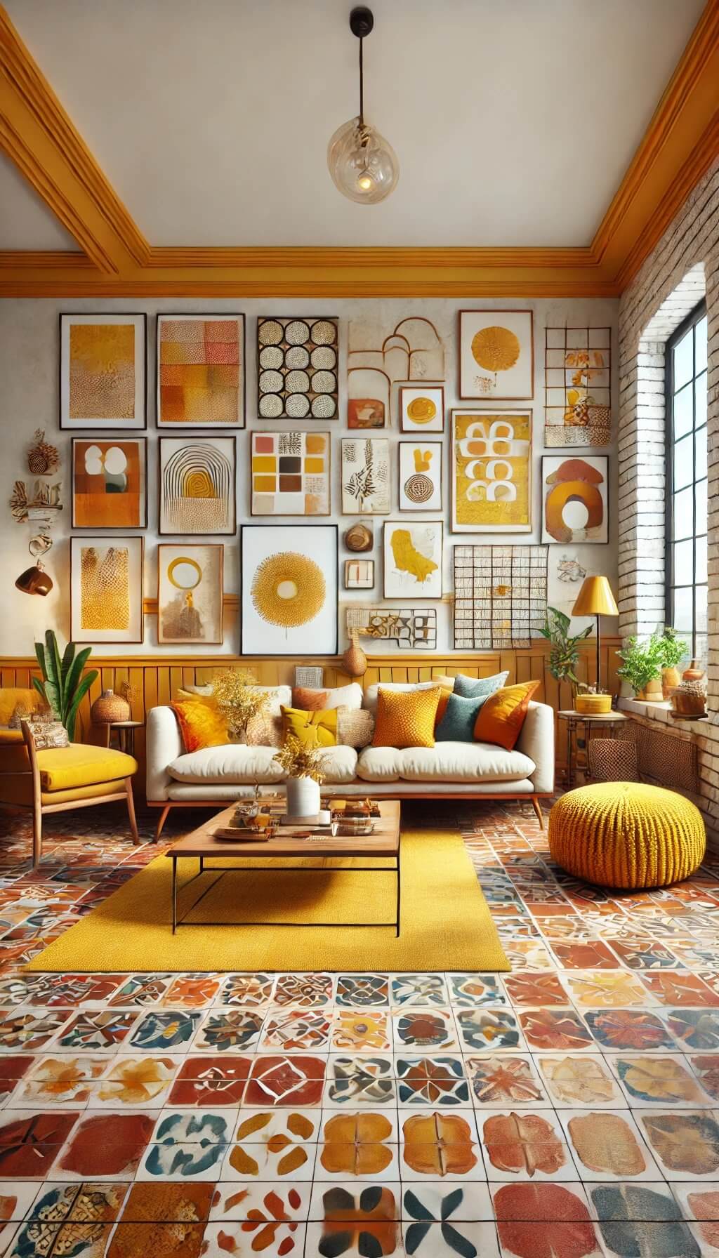
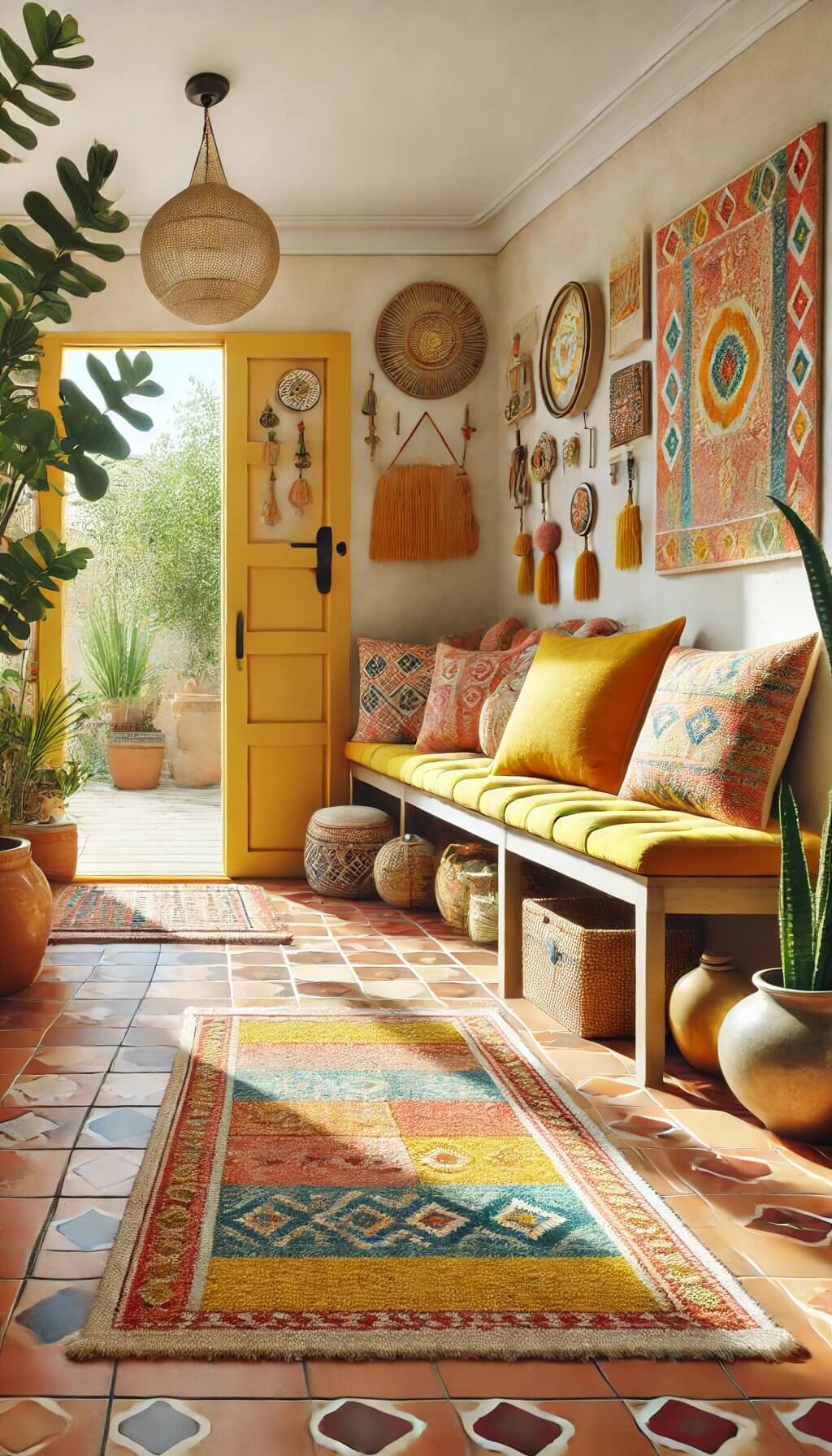
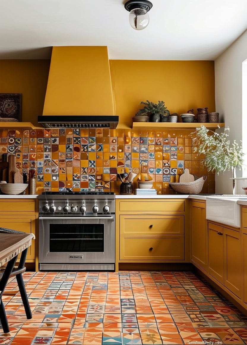
8. Mustard Yellow
Mustard yellow leans into terracotta’s warm side rather than contrasting it, creating a bold, sun-drenched palette that reads as confidently warm rather than trying to cool the space down.
Use it as a strong single accent, a piece of furniture or a feature wall, since mustard next to terracotta is intense enough that spreading it across multiple surfaces can start to feel busy.
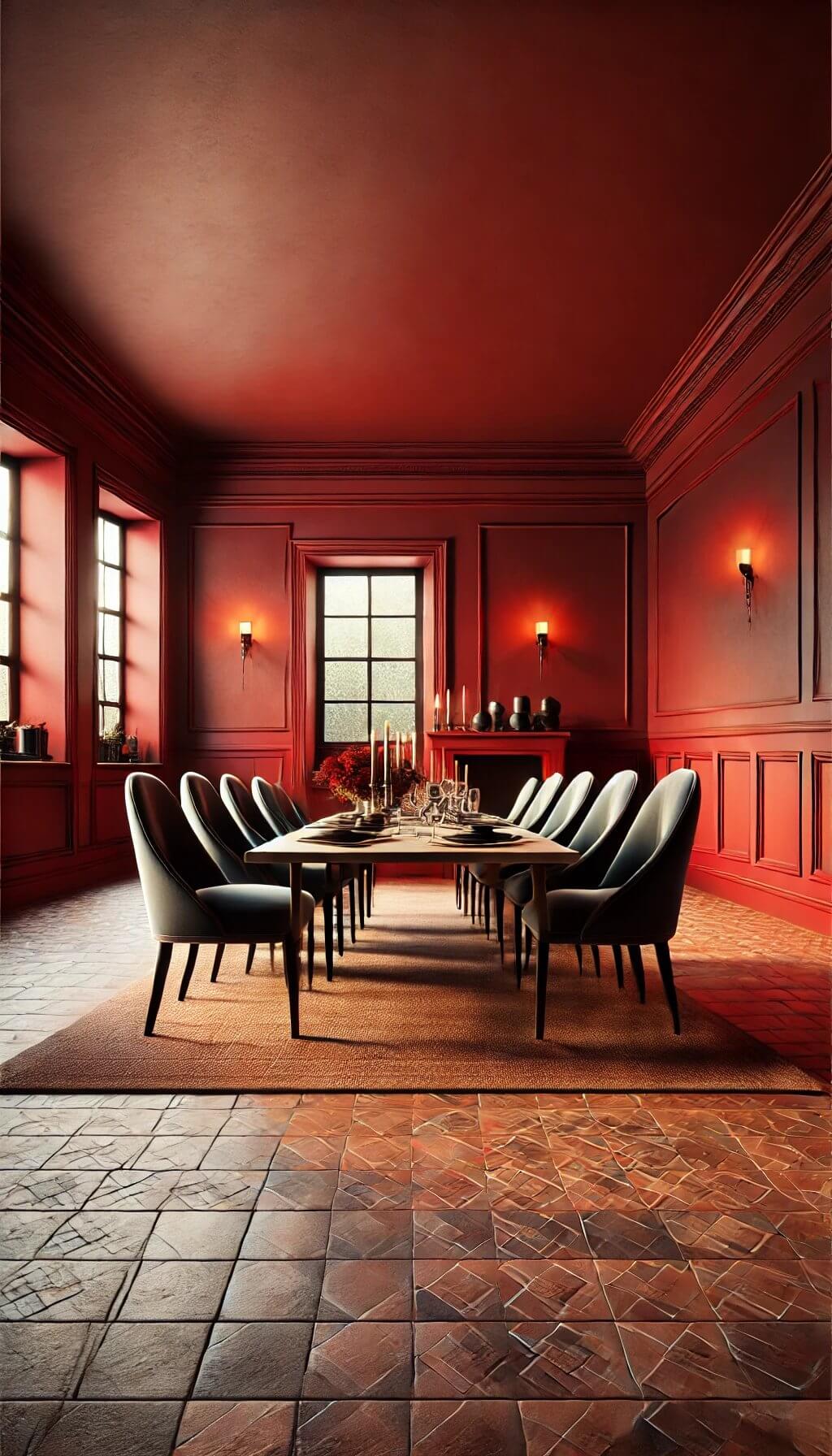
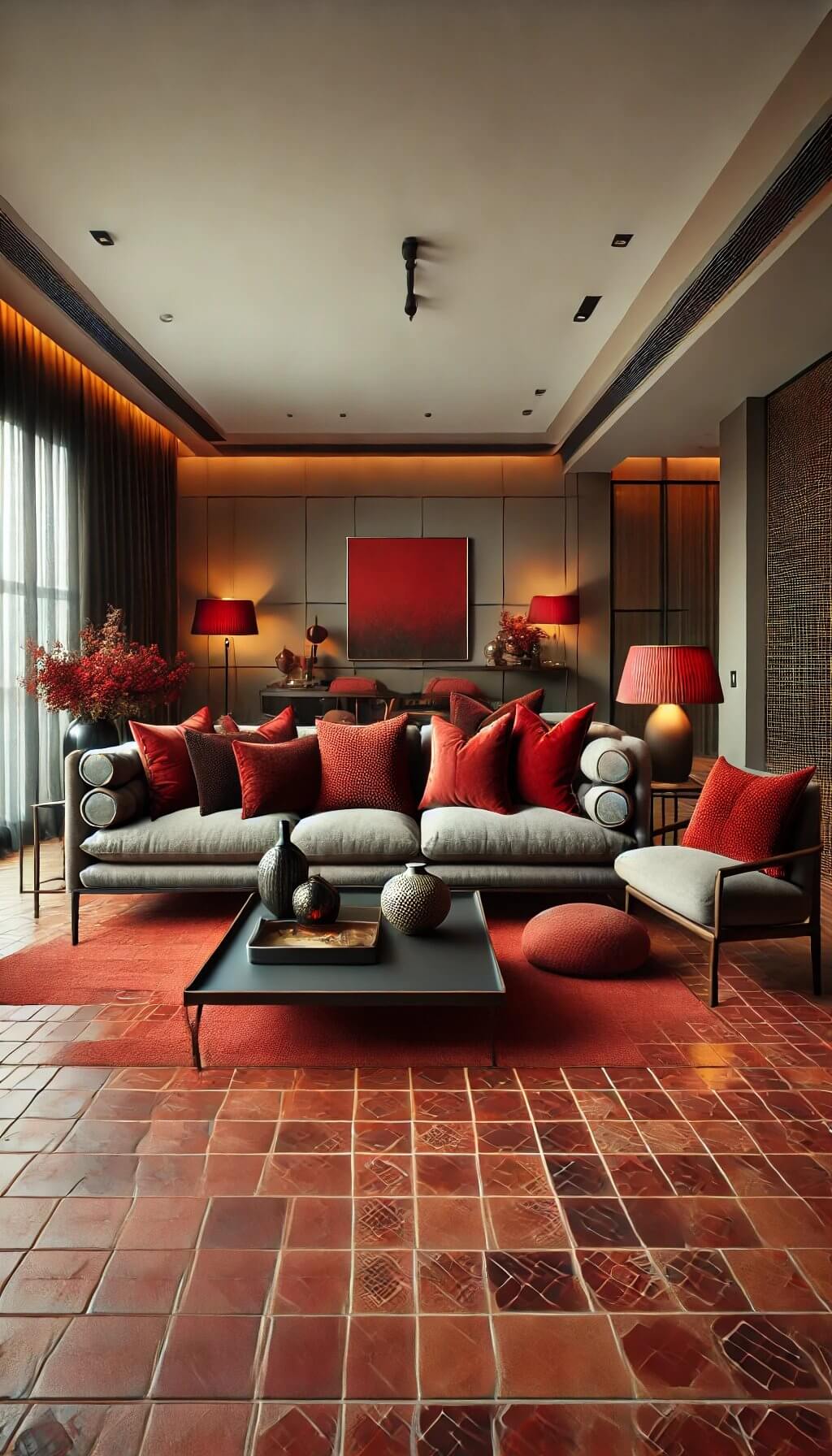
9. Deep Red
A deep, wine-toned red pushes the whole room further into terracotta’s own warm family rather than contrasting it, for a rich, saturated look that reads as intentional rather than clashing, since red and terracotta’s orange-red base share real pigment overlap.
Keep the rest of the room’s palette simple when using this pairing, two saturated warm colors together need breathing room from busy patterns or extra accent colors.
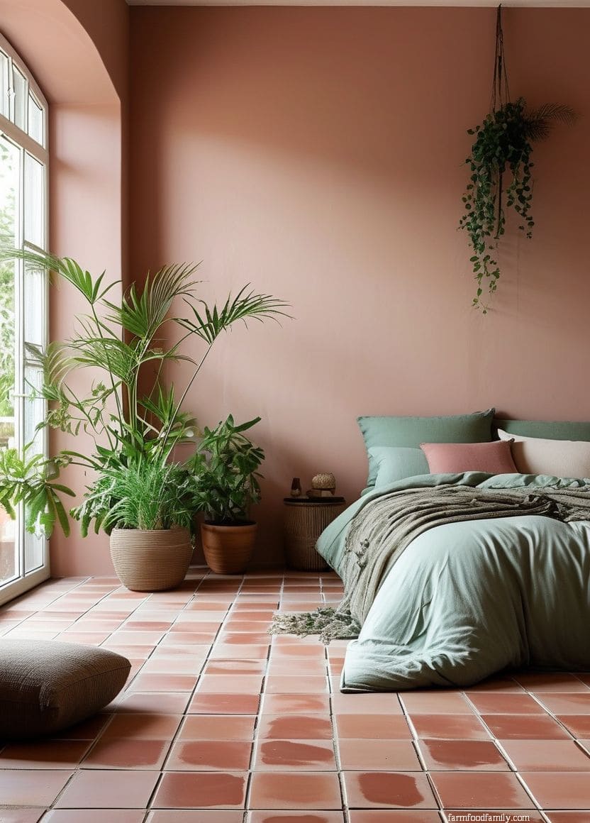
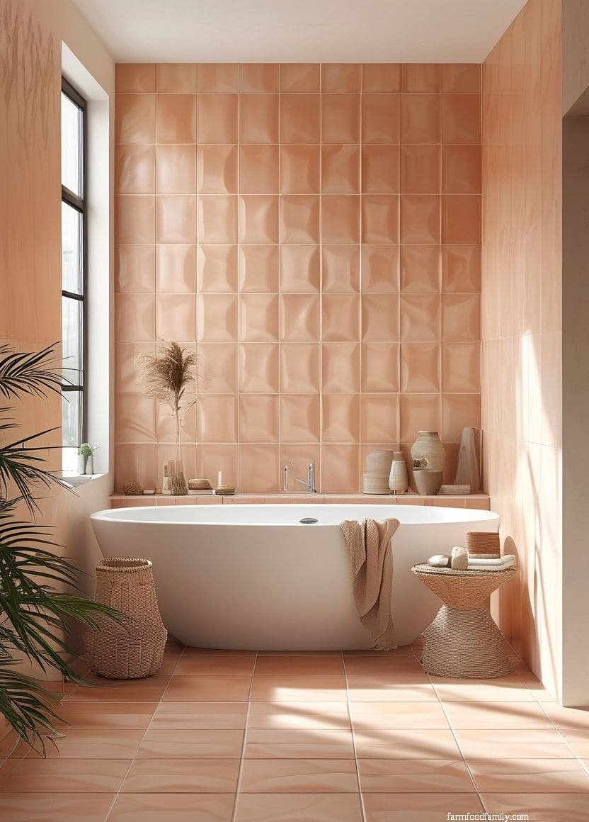
10. Soft Pink
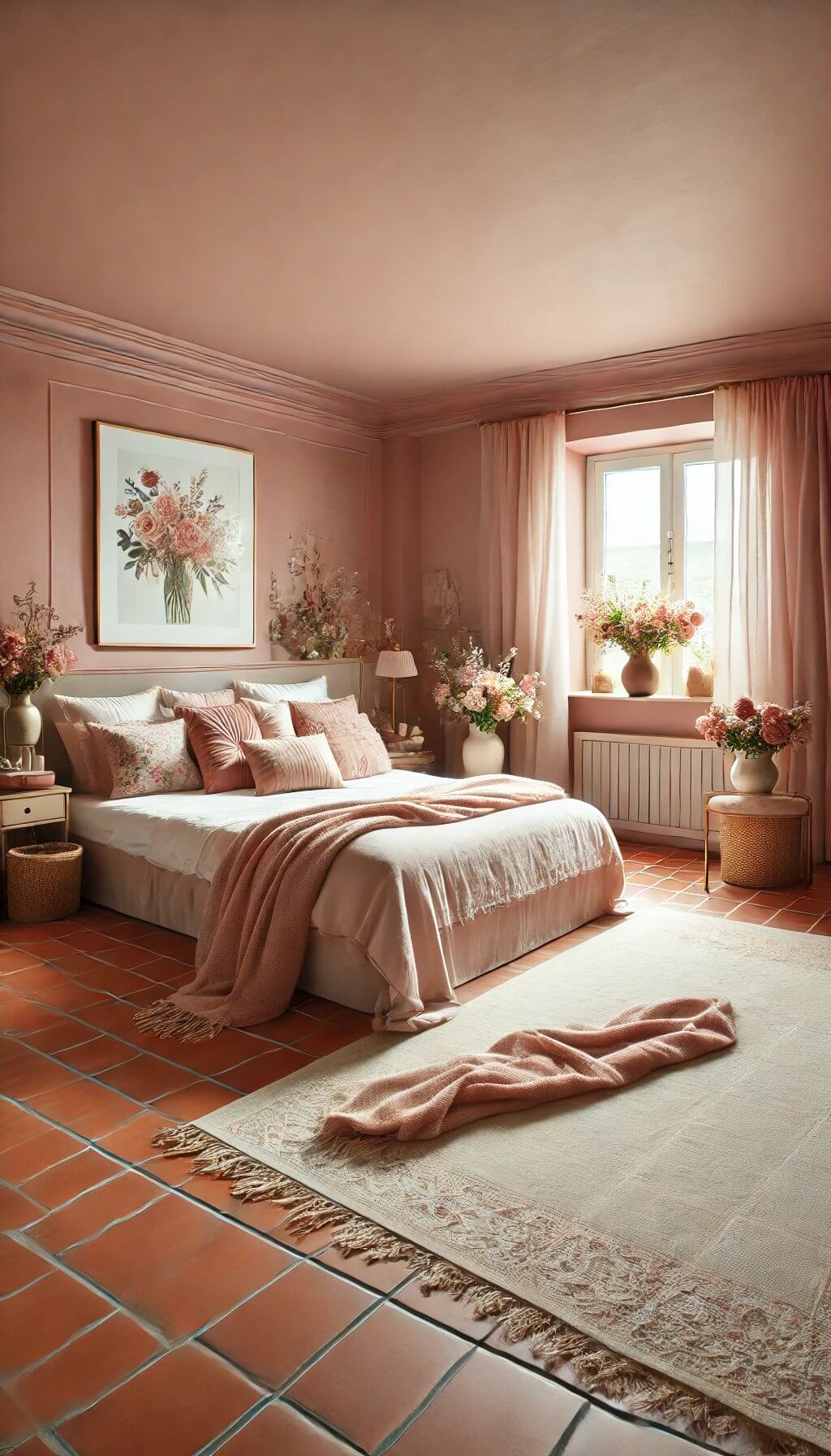
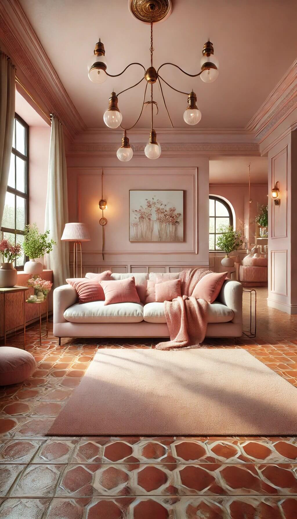
A muted, dusty pink softens terracotta’s intensity into something gentler and more romantic than the bolder pairings on this list, working especially well in a bedroom or a space meant to feel calm rather than dramatic.
Choose a pink with a slight brown or gray undertone rather than a bright, candy pink, which would read as a mismatch against terracotta’s earthy quality.
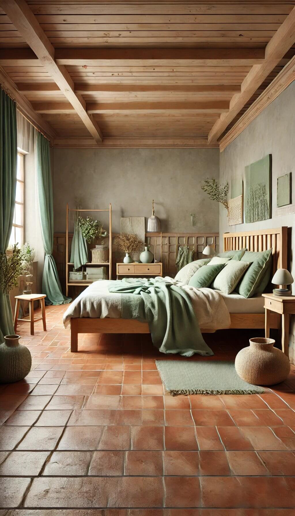
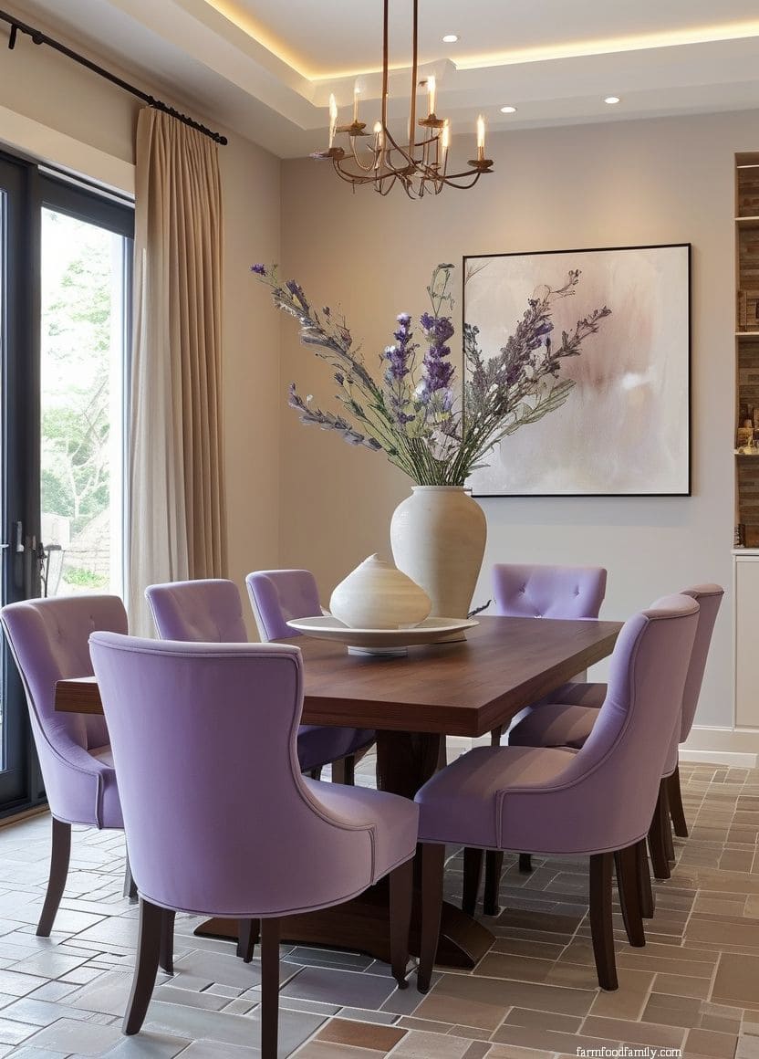
11. Sage Green
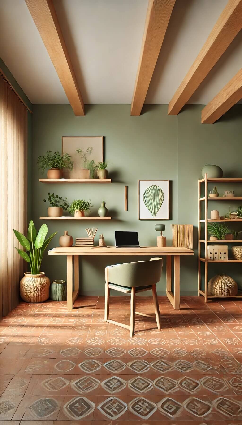
Sage’s cooler, grayer green tone gives a softer, more subdued contrast than olive’s warmer green, reading as calm and collected rather than boldly earthy.
This pairing suits a farmhouse or cottage-style room especially well, where the goal is gentle, layered neutrals rather than a strong color statement.
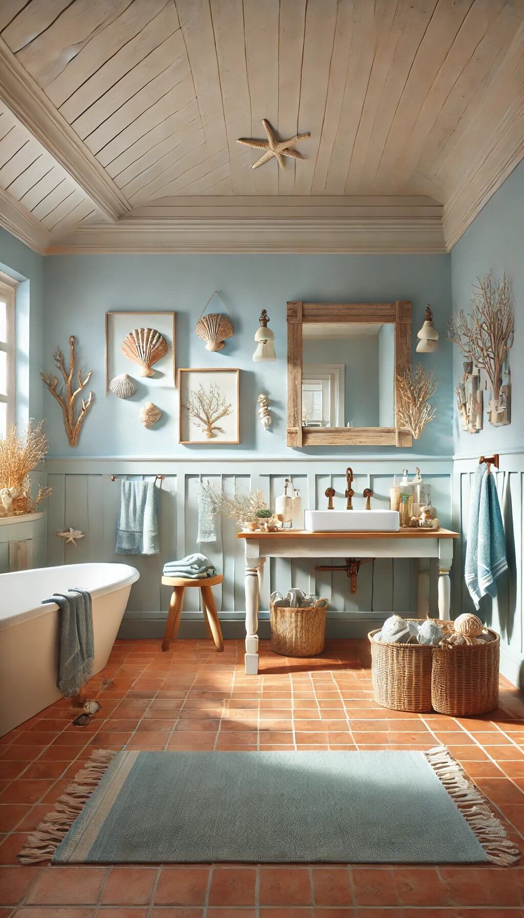
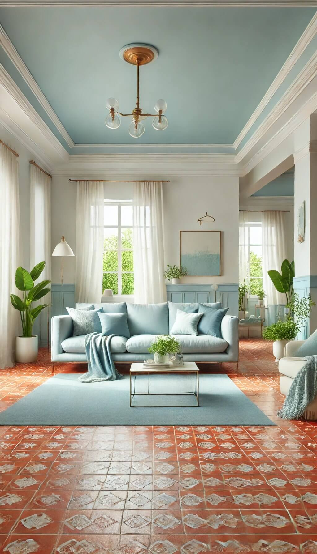
12. Light Blue
A paler, softer blue gives you the same complementary color-wheel logic as deep navy (#5) without the intensity, a gentler, airier contrast that works well in a room that gets a lot of natural light.
This combination reads as coastal or Mediterranean far more readily than navy does, since the paleness keeps things light rather than dramatic.
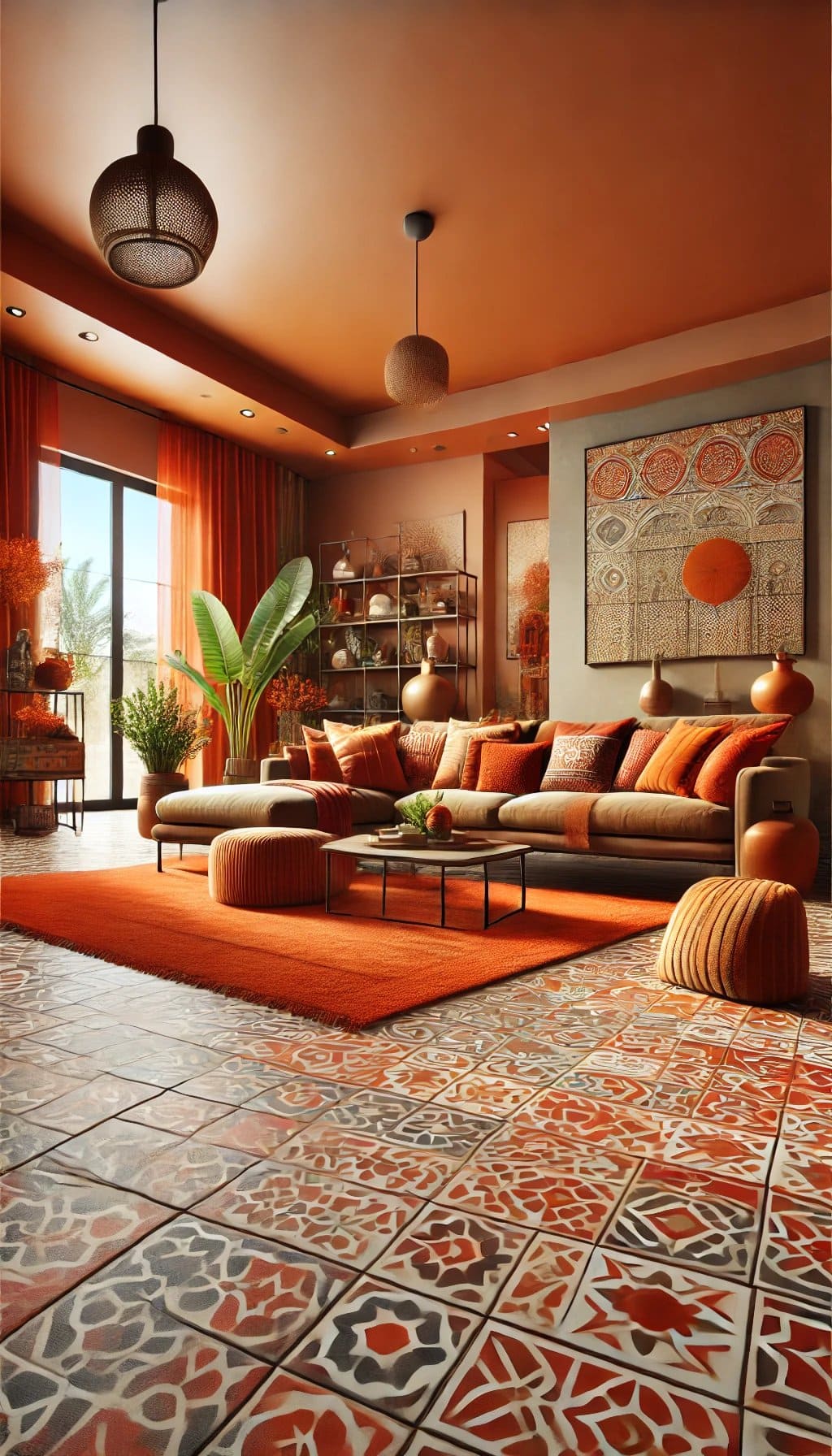
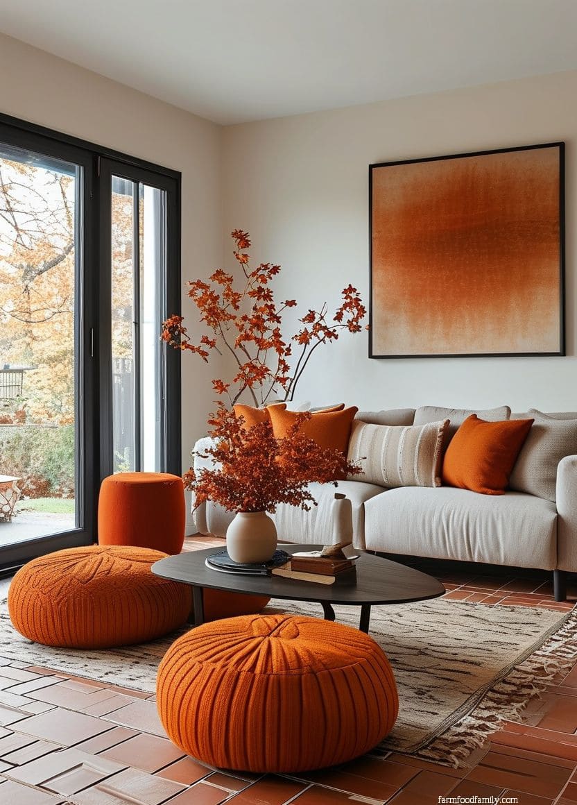
13. Burnt Orange
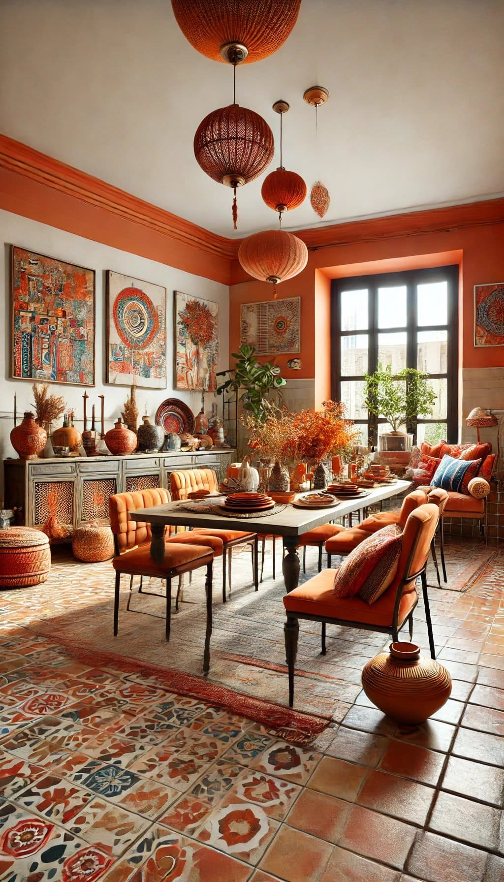
Leaning even further into terracotta’s own warm family than deep red does, burnt orange creates an intentionally monochromatic, sun-baked look best suited to a room that’s fully committing to a warm, saturated palette rather than looking for any contrast at all.
This isn’t a pairing for someone who wants a calm, neutral backdrop, it’s for someone who wants maximum warmth.
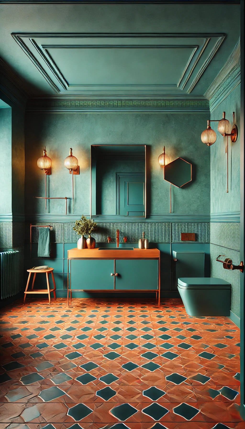
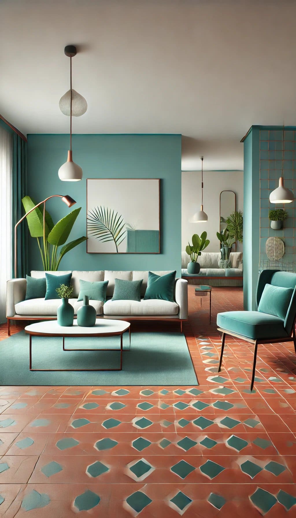
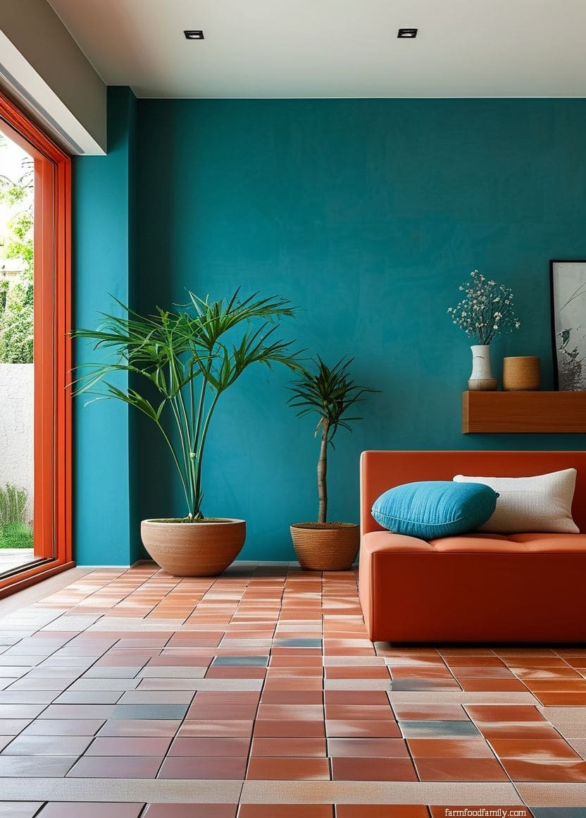
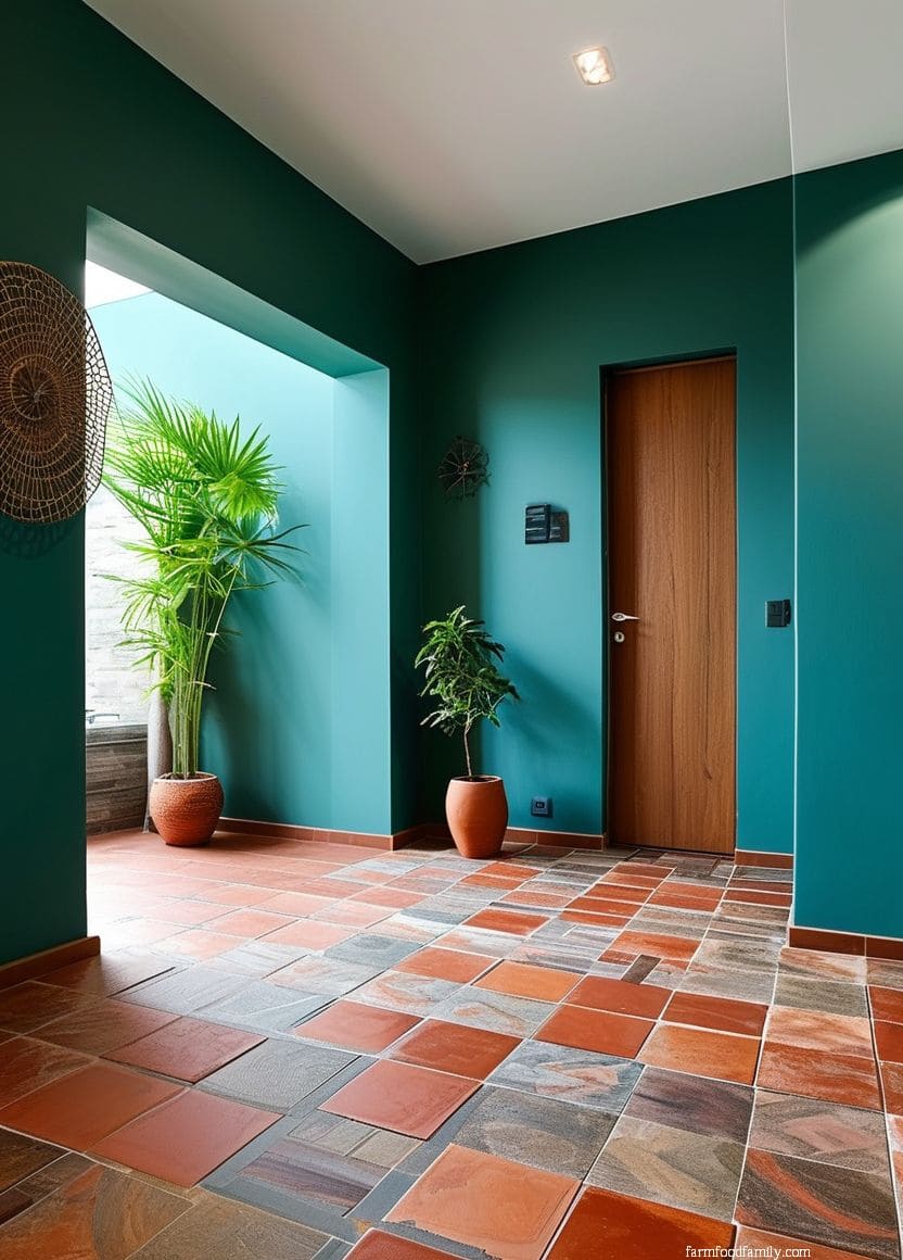
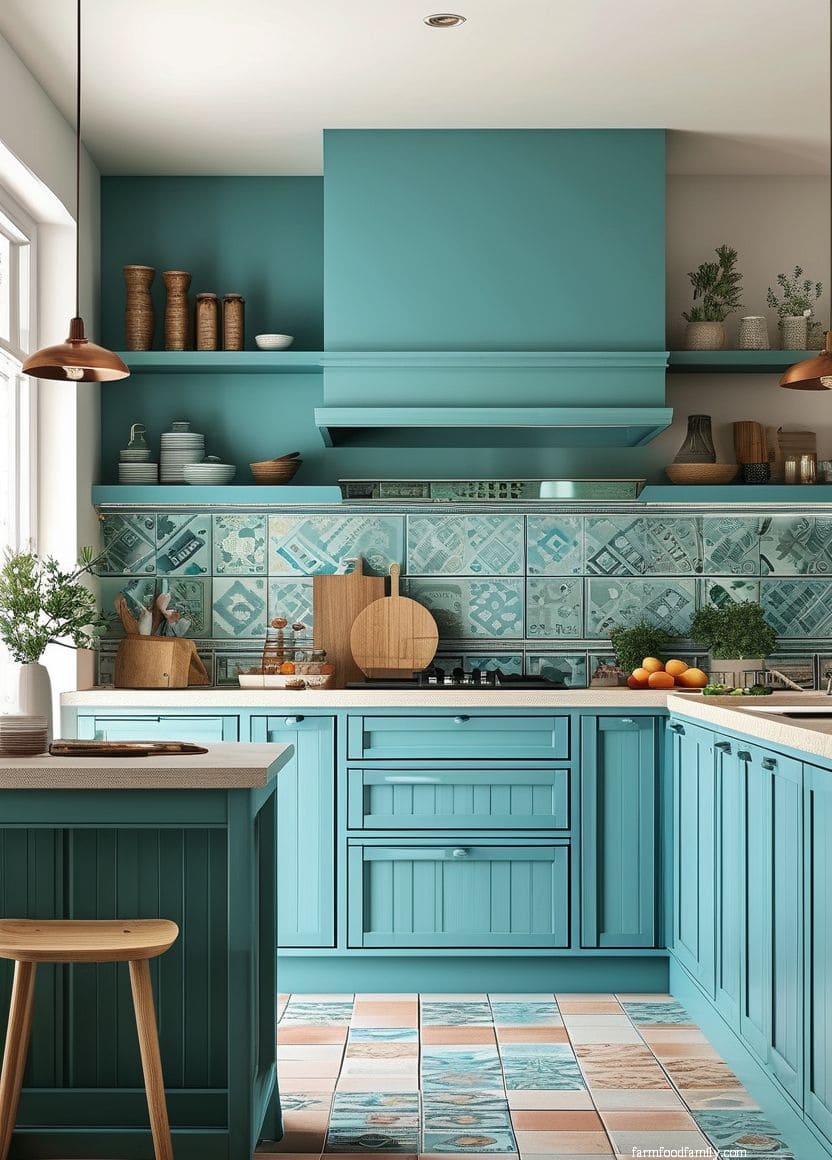
14. Teal
Teal gives you blue’s complementary color-wheel contrast (like navy and light blue above) with a green undercurrent that softens the effect slightly, reading as more playful and less formal than a pure navy pairing.
It’s a strong choice for a room that wants real personality without going as bold as burnt orange or deep red.
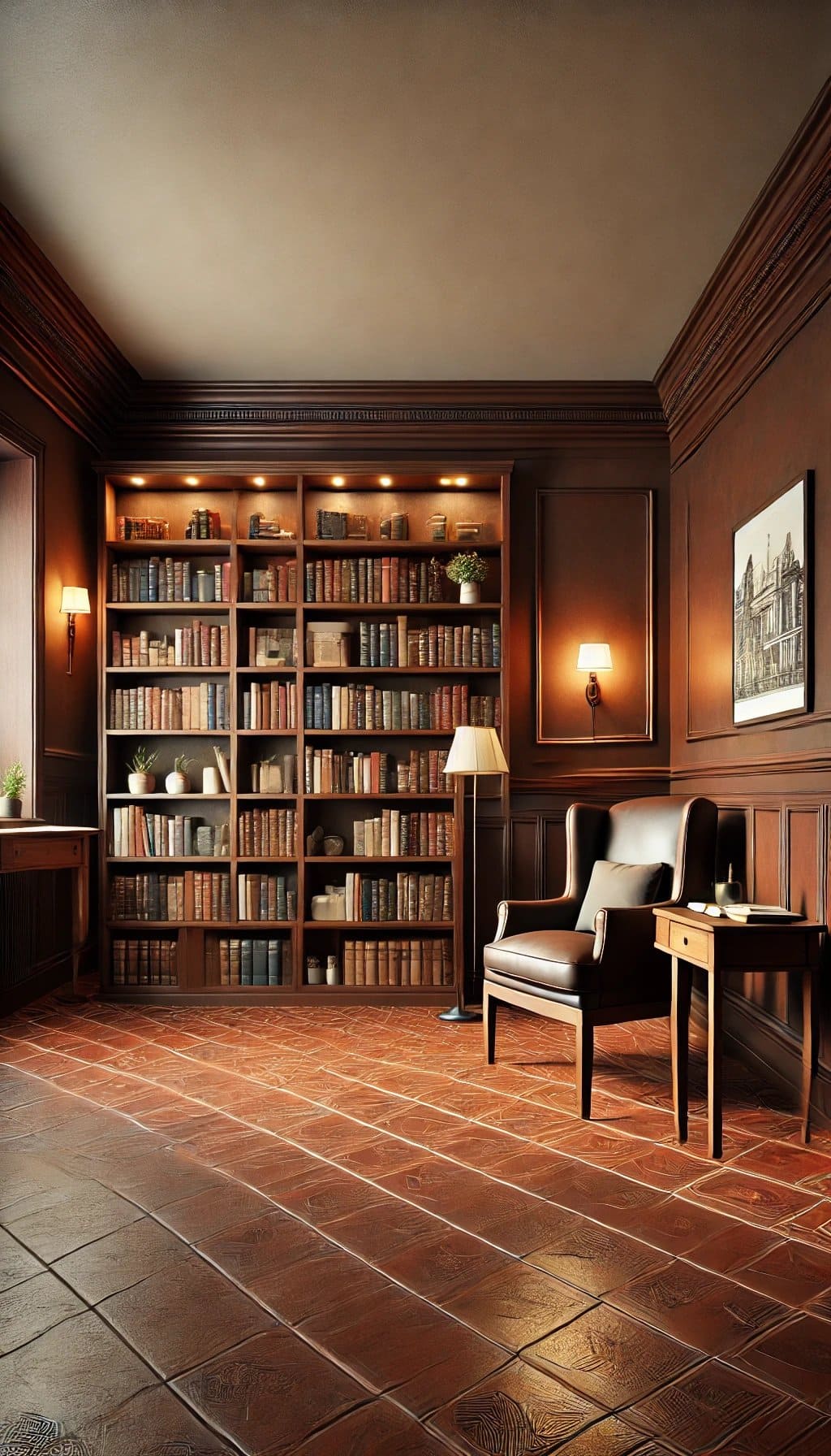
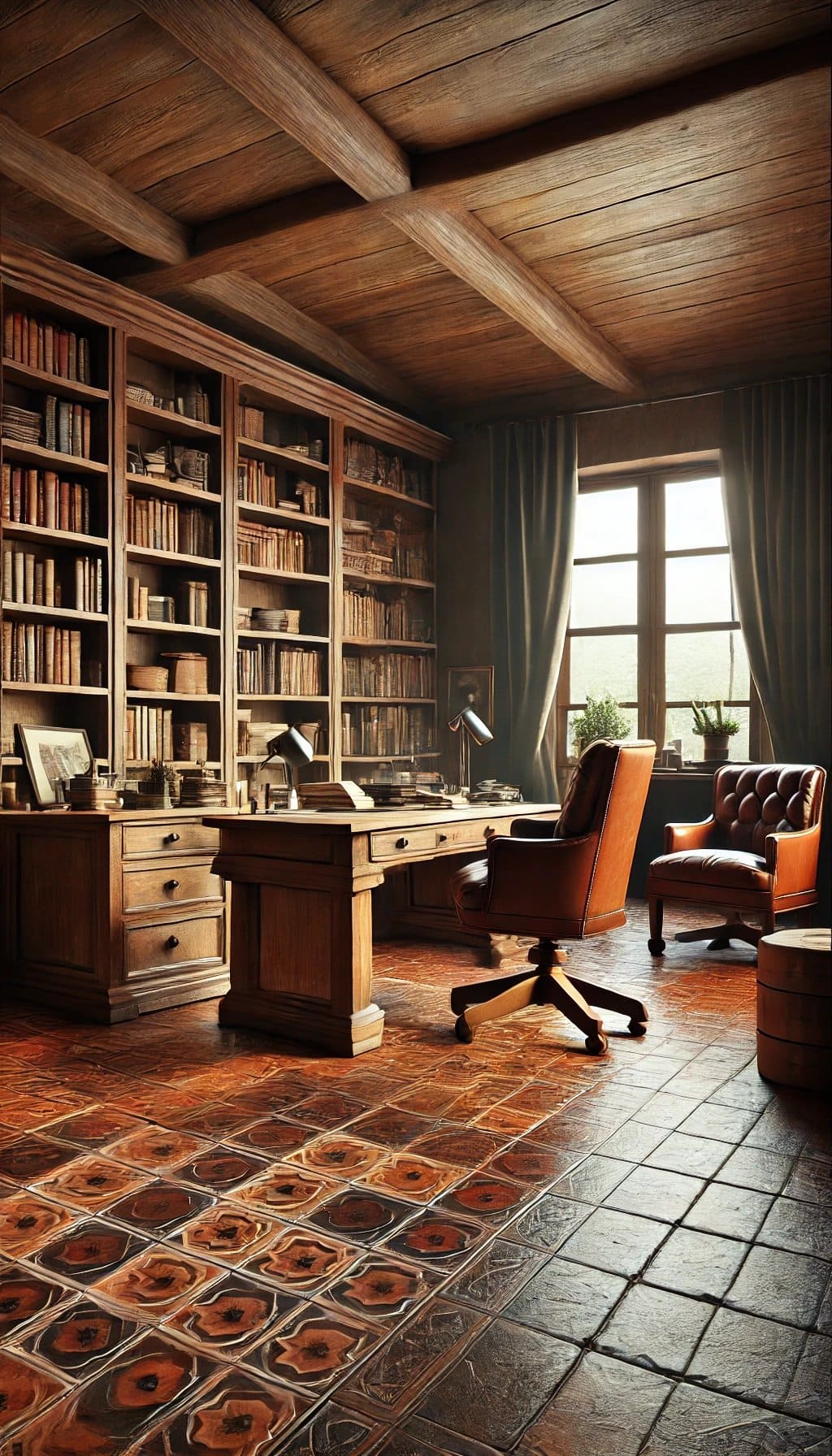
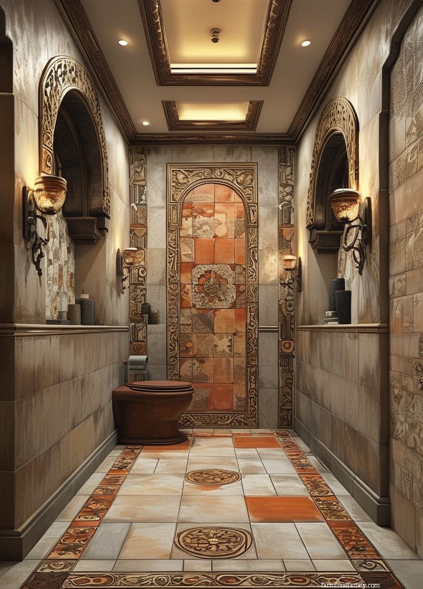
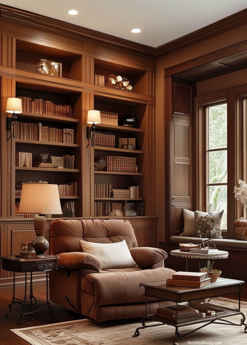
15. Chocolate Brown
Chocolate brown grounds a terracotta room in real depth, both colors share earthy undertones, so the pairing reads as rich and cohesive rather than competing for attention.
This works particularly well through furniture and wood tones rather than wall color, since a full chocolate-brown wall next to terracotta can start to feel heavy without enough lighter elements to balance it.
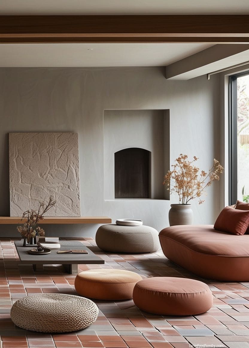
16. Taupe
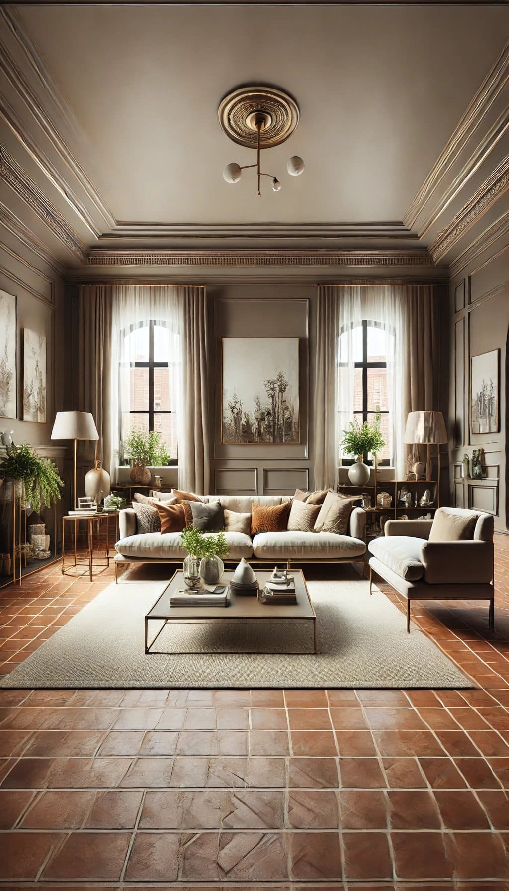
Taupe sits between beige and gray, giving you a genuinely versatile middle-ground neutral that works whether the rest of the room leans warm or cool.
It’s a safe, quiet backdrop choice if you’re not sure yet which direction (warm-cohesive or cool-contrast) you actually want to take the room.
Related reading: our cabinet colors for terracotta floors article goes deeper on kitchen-specific pairings if you’re working with terracotta flooring in that room specifically, our outdoor tile ideas piece covers terracotta and other tile options for patios and exterior spaces, and our hacienda bedroom ideas article shows the warm earth-tone aesthetic terracotta anchors applied to a full room.
FAQs on colors that pair with terracotta floor tiles
Why do blue and teal work so well with terracotta?
Terracotta’s reddish-orange hue sits on the warm side of the color wheel, nearly opposite blue. That real color-wheel relationship is why navy, light blue, and teal create such a strong, deliberate-feeling contrast rather than a random pairing. As Kristen Fiore, Principal Designer at Kristen Elizabeth Designs, puts it, “terracotta and blue is a natural combo.”
What white should you choose to pair with terracotta?
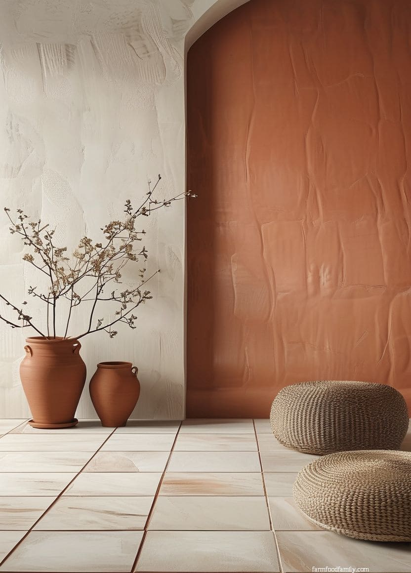
Look for a warm-undertone white specifically, paint or trim named “ivory,” “almond,” or “coconut milk” usually carries a hint of yellow or beige that connects seamlessly with terracotta’s earthy warmth. A stark, cool-undertone white can visually clash with terracotta unless you add warm wood tones or terracotta-adjacent accents to bridge the two. “Greige,” a gray-beige blend, is a real alternative that tones down terracotta’s intensity without reading as cold.
Is terracotta always one fixed color?
No. Depending on the clay and firing process, terracotta tile can lean more orange, more brick-red, or more pink-brown. Look at your specific tile in natural daylight before committing to a paint or accent color, since the exact same shade of navy, green, or white can read as a perfect match against one terracotta and slightly off against another.
Conclusion

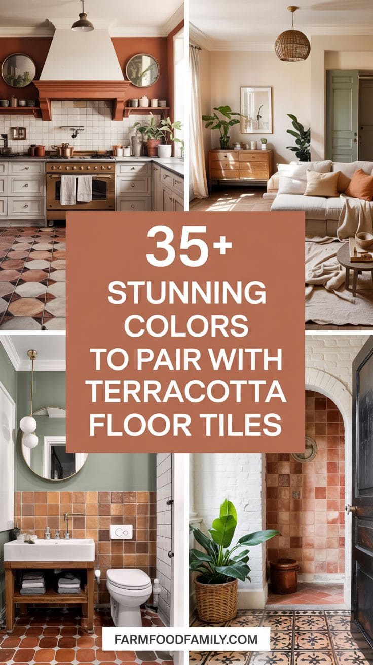
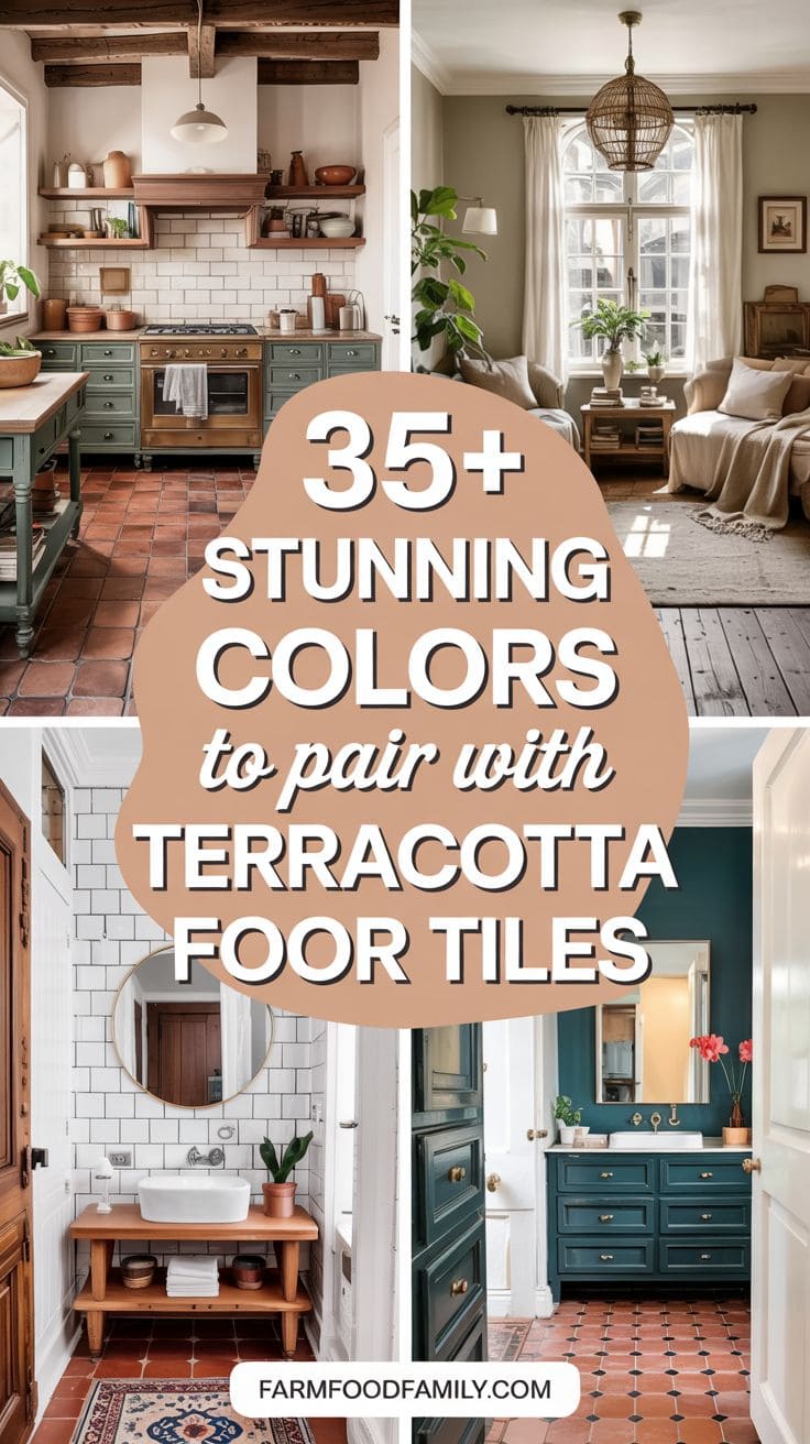
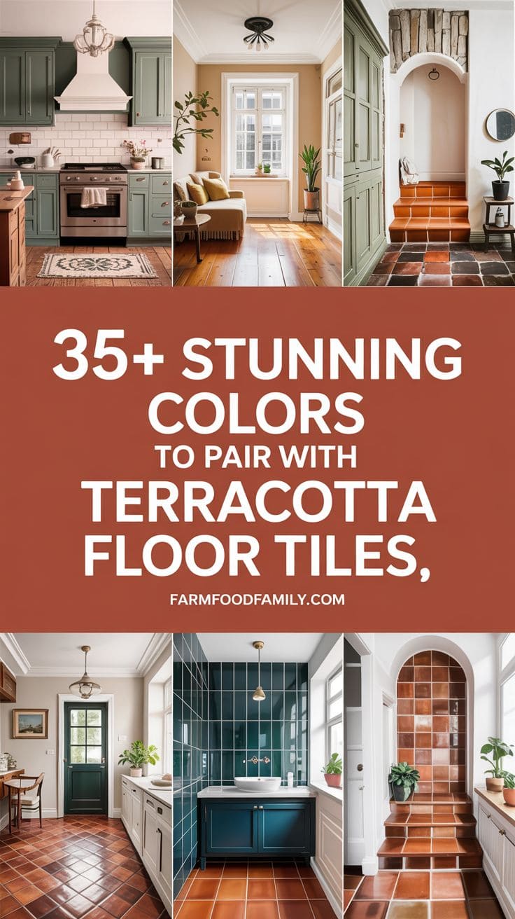
Terracotta floor tiles are timeless, versatile, and rich in character, making them an exceptional foundation for a wide range of design styles. The colors you choose to pair with them can dramatically shift the mood of the space.
Whether you want to highlight terracotta’s warmth or contrast it with cooler tones, there are countless ways to bring harmony and personality into your space.
If you liked this article, leave a comment below and please share it with your friends!
Never miss an update — choose FarmFoodFamily as your preferred source on Google.
How it works: Tap the button below to open Google's settings page, then check the box next to FarmFoodFamily.
Tap the checkbox to turn it blue — that's how you know it's set.