Front Door Colors to Avoid (And What Real Resale Data Says vs. Designer Opinion)
Every “front door colors to avoid” article out there is designer opinion with zero data behind it. That’s useful as far as it goes, but it’s not the whole picture. There’s also a real Zillow study of over 135,000 home-sale photos with actual dollar figures attached to different door colors, and it complicates the aesthetic…

Never miss an update — choose FarmFoodFamily as your preferred source on Google.
How it works: Tap the button below to open Google’s settings page, then check the box next to FarmFoodFamily.
Tap the checkbox to turn it blue — that’s how you know it’s set.
Every “front door colors to avoid” article out there is designer opinion with zero data behind it. That’s useful as far as it goes, but it’s not the whole picture.
There’s also a real Zillow study of over 135,000 home-sale photos with actual dollar figures attached to different door colors, and it complicates the aesthetic advice in a genuinely honest way: the color one real designer criticizes as too stark turns out to be the strongest performer in the real resale numbers.
Here’s both sides, the designer critique and the real data, so you can actually weigh them against each other instead of just taking one opinion at face value.
The 3 colors designers say to avoid
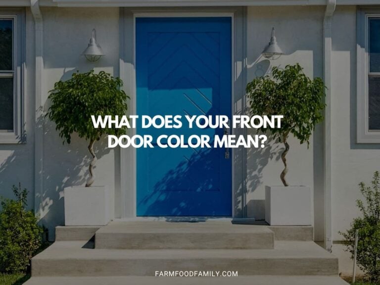
Bold, electric blues.
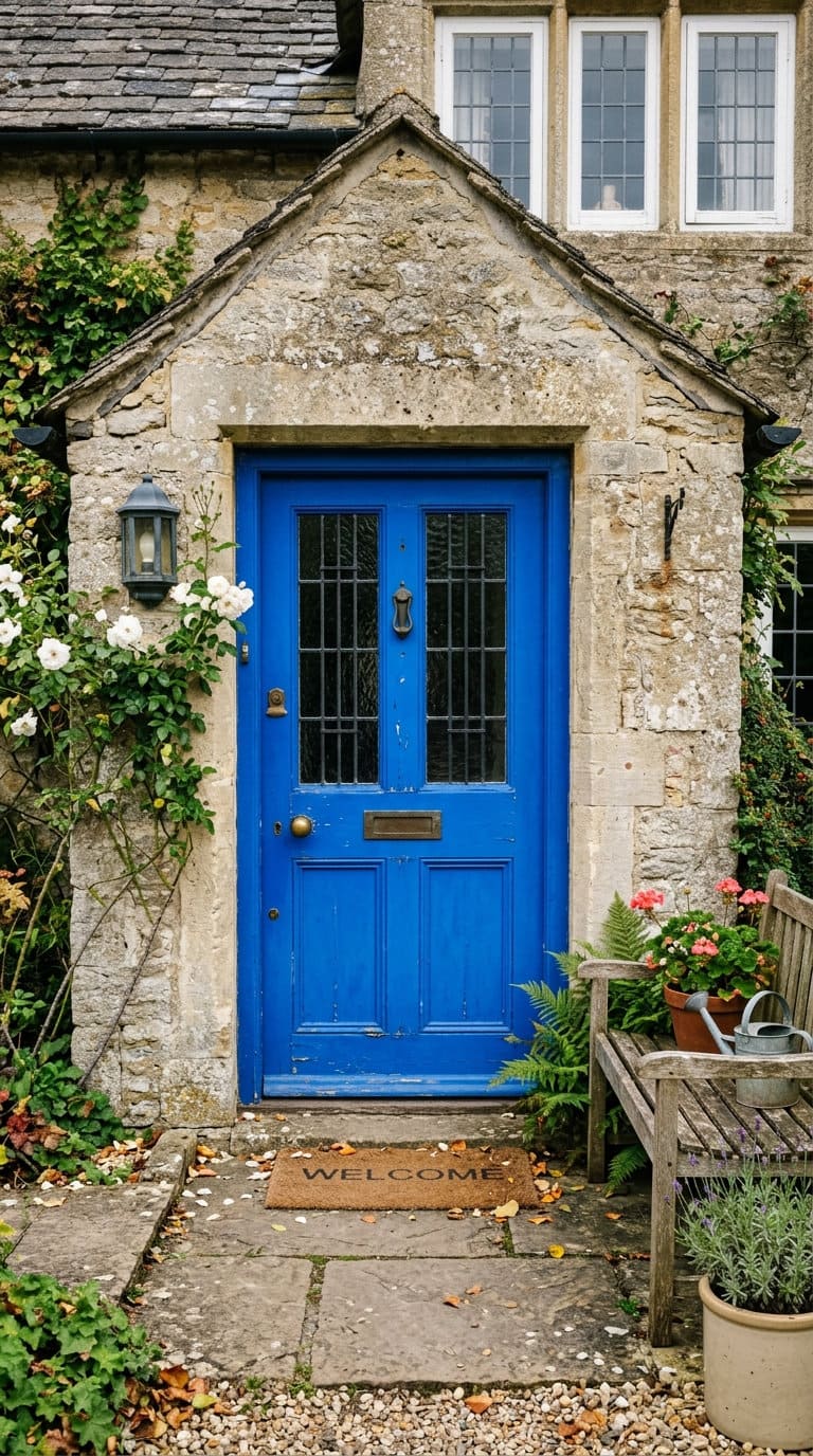
Dominic Myland, CEO of Mylands, a fifth-generation British paint company founded in 1884, points to high-contrast, electric blues as creating an abrasive first impression that pulls attention away from a home’s actual architecture rather than complementing it.
His suggested fix isn’t skipping blue entirely, it’s choosing a softer, more natural-leaning blue tone that sits with the house’s existing materials instead of fighting them.
Stark, one-tone black.
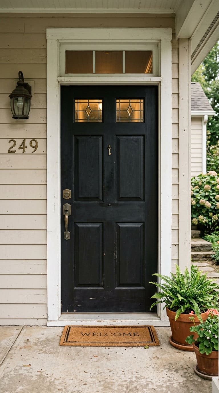
Ruth Mottershead, Creative Director at Little Greene, argues a flat, high-contrast black can read as a jarring, harsh contrast against a lot of home facades. Her suggested alternative is a deep, muted green or a warm neutral, something that still reads as a strong, confident color choice without the stark contrast.
Bright “letterbox” red
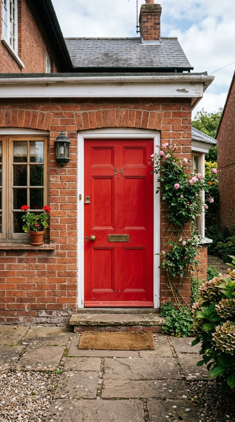
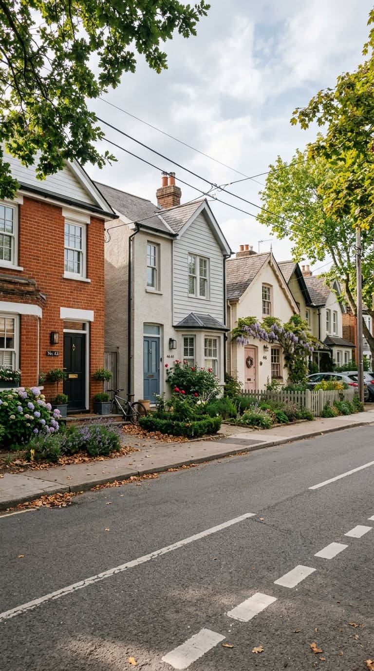
Both Myland and Mottershead point to true, bright red doors as feeling dated in a contemporary context. Suggested alternatives include deeper oxblood reds, warm orange-leaning reds, or even an elegant pink for a similar boldness without the dated read.
What the real data actually says
Here’s where it gets genuinely interesting. Zillow’s own research, based on showing buyers photos of homes with different door colors while holding everything else identical, found real, measurable differences in perceived home value:
- Black doors: associated with a $6,449 higher perceived value, the strongest performer in the whole study
- Slate blue: +$1,537
- Olive green: +$969
- Pale pink: associated with a $6,516 lower perceived value, the worst performer
- Cement gray: also scored lowest overall, though Zillow’s own release doesn’t attach a specific dollar figure to it
So black, the exact color Mottershead flags as potentially too stark, is also the single best-performing color in real market data. That’s not a contradiction to resolve, it’s worth sitting with honestly.
A flat black door might genuinely clash with a specific home’s proportions, trim, or architectural style, that critique is real and worth taking seriously on a case-by-case basis. And black also happens to perform best in aggregate resale data across thousands of real home sales.
Both things can be true at once. The takeaway isn’t “ignore the designers” or “ignore the data,” it’s that your specific house’s architecture matters more than either alone.
Pale pink is the one color where the data and the general aesthetic caution actually line up, it’s flagged as dated by nobody specifically in the sourcing here, but it’s the worst performer in the real numbers by a meaningful margin.
If you love pink, a more elegant, muted pink (as Myland and Mottershead suggest as a red alternative) is a genuinely different color from a true pale pastel pink, worth distinguishing between the two rather than avoiding pink as a category entirely.
Practical mistakes that have nothing to do with color choice itself
Too many colors on one elevation.
A house already has a body color, trim, a roof, sometimes shutters. One saturated door color is plenty on top of that. Adding a second bold color on the same facade usually reads as busy rather than intentional.
Ignoring trim temperature.
A warm cream trim paired with a cool-toned navy door clashes even if both colors are individually nice, match the door’s undertone temperature to the trim’s, not just pick a color you like in isolation.
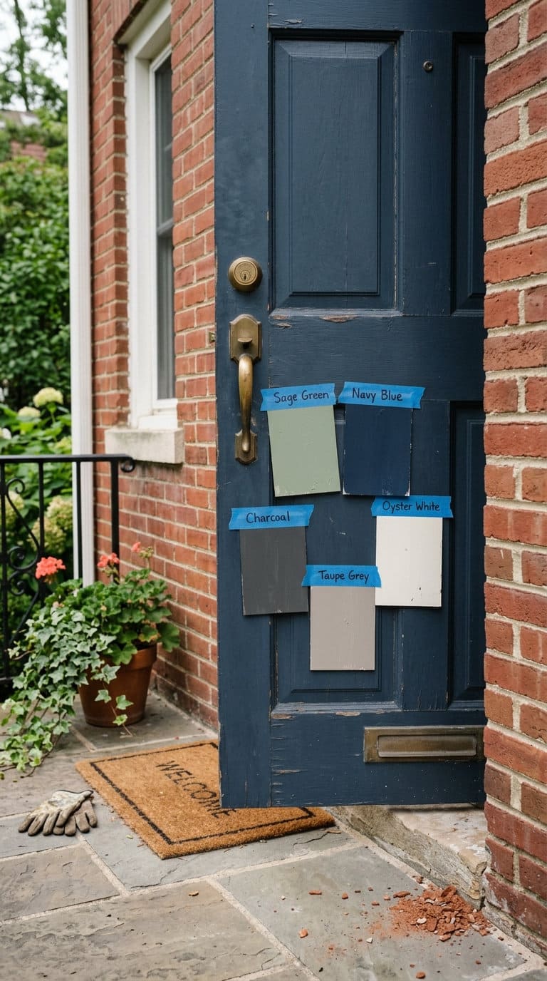
Testing color indoors under the wrong light.
North-facing indoor light reads paint 30 to 50% cooler than actual exterior daylight. Test a real sample board outdoors, morning shade, midday sun, evening light, and step back to the sidewalk to judge it at actual viewing distance, rather than deciding from a paint chip held up next to a window.
If you’re narrowing down options for a specific house type, this brick house door color guide and this white house door color guide both go deeper on undertone-matching for those specific exteriors. And if you’re curious what a color choice actually communicates beyond resale value, this front door color meaning guide covers the symbolic side.
FAQs
Does front door color really affect home value?
Yes, according to Zillow’s own research based on over 135,000 home-sale photos. Black doors are associated with the highest perceived value boost (+$6,449 in Zillow’s figures), while pale pink is associated with the biggest negative impact (-$6,516). The effect is real, though it’s one factor among many in an actual home sale, not a guarantee on its own.
If black is criticized by designers, why does it perform best in resale data?
Both things are genuinely true at the same time. A flat, high-contrast black door can clash with a specific home’s proportions or architectural style, that’s a real, case-by-case aesthetic concern. Separately, across thousands of real home sales, black performs best in aggregate. The right read for your specific house depends more on your home’s actual architecture than either the designer opinion or the data point alone.
What’s the biggest practical mistake people make choosing a front door color?
Testing the color indoors under the wrong light and never checking it against actual exterior conditions. North-facing indoor light reads noticeably cooler than daylight, so a color that looks right on a paint chip inside can look completely different once it’s actually on the door. Always test a real sample outdoors across a few different times of day before committing.
Your House, Not Just the Trend
Designer opinion and real resale data don’t always agree, and that’s fine, they’re answering slightly different questions. What actually matters is how a color sits against your specific home’s brick, siding, trim, and roofline. Use both the aesthetic guidance and the real numbers as inputs, then judge it against your own front door in actual daylight before you commit to a can of paint.

Never miss an update — choose FarmFoodFamily as your preferred source on Google.
How it works: Tap the button below to open Google's settings page, then check the box next to FarmFoodFamily.
Tap the checkbox to turn it blue — that's how you know it's set.