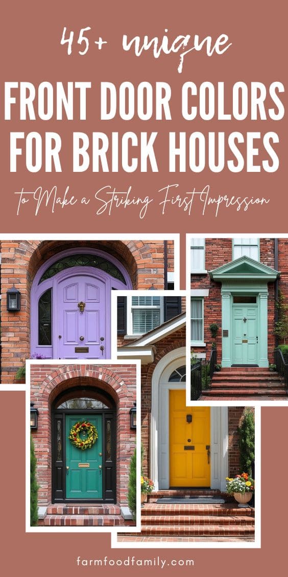
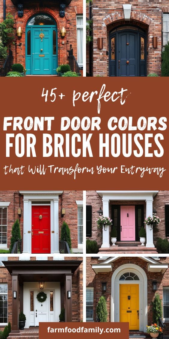
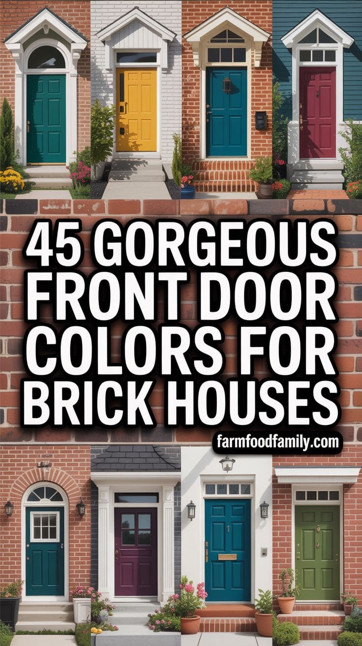
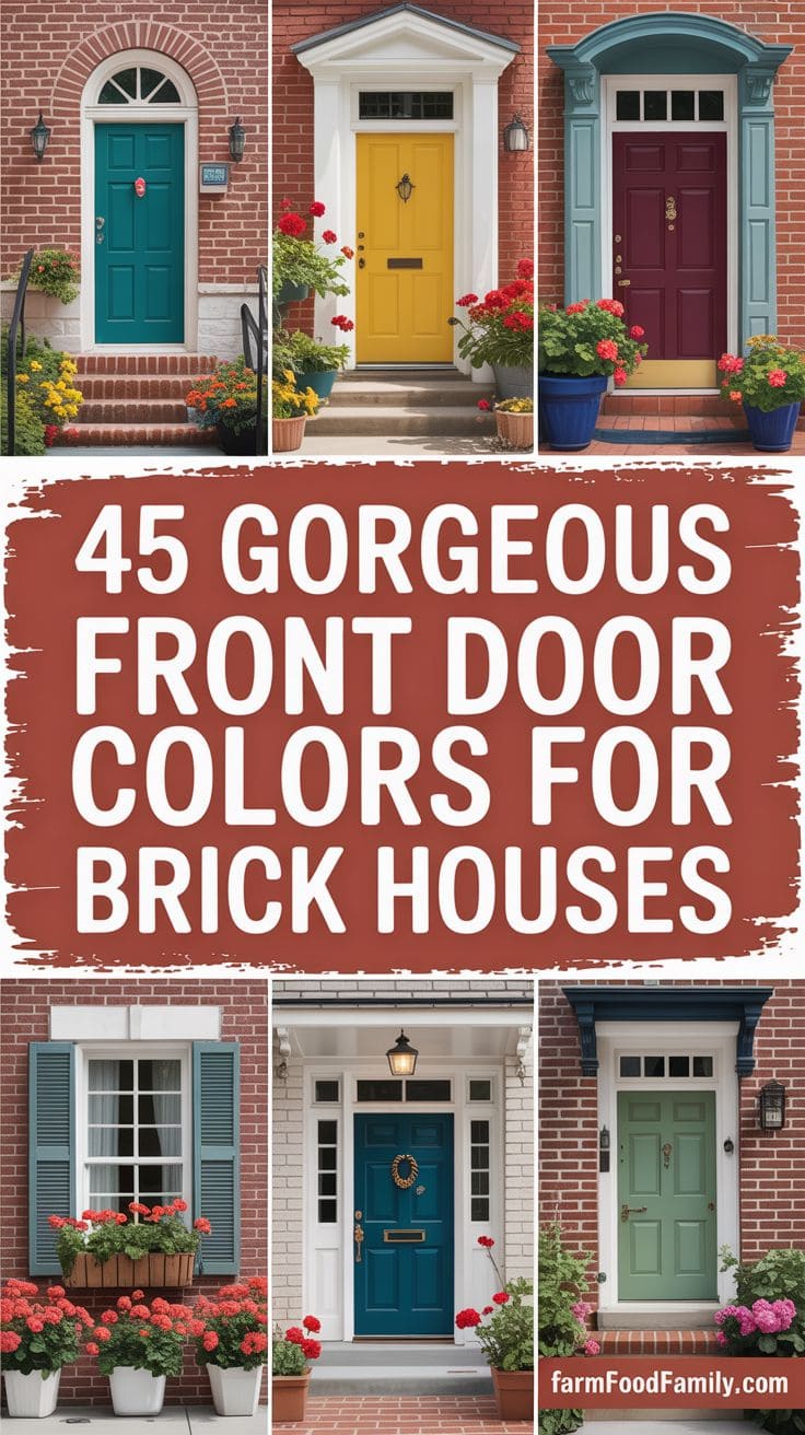
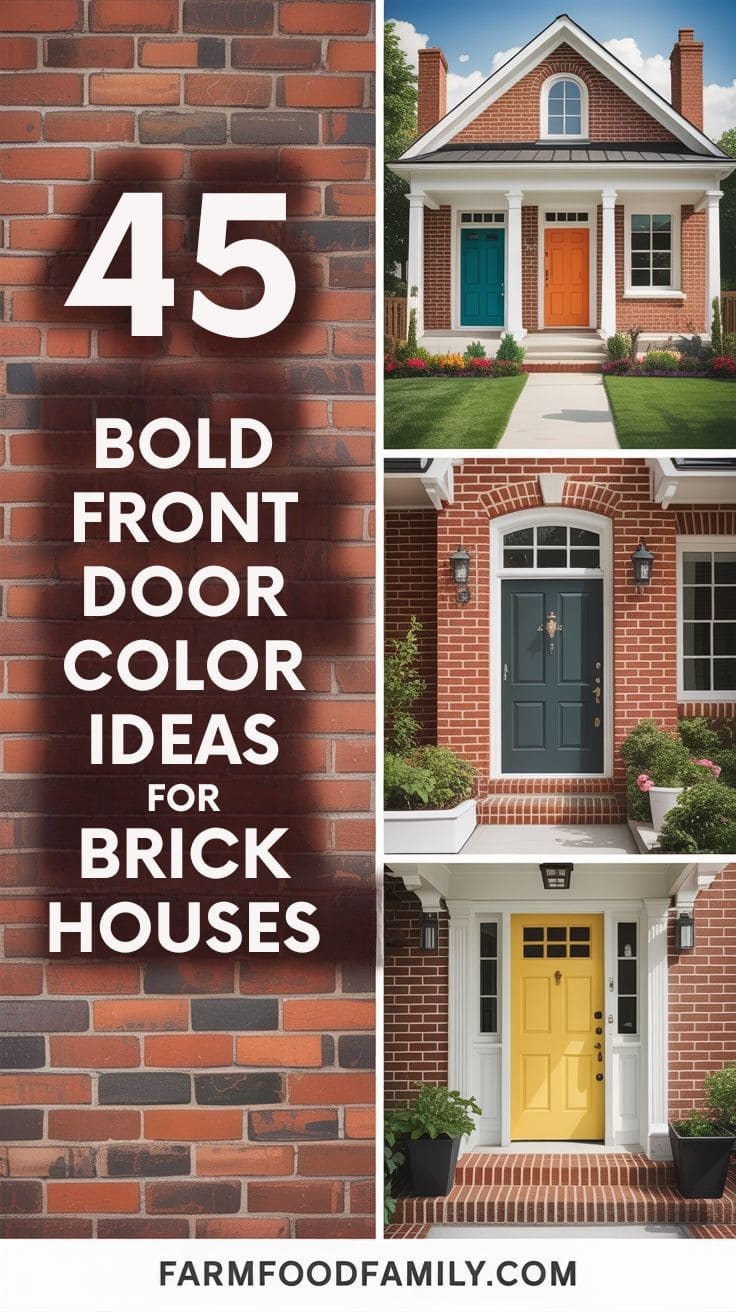
18 Front Door Colors That Won’t Clash With Your Brick
Brick isn’t one color. Ask ten people what “brick red” means and you’ll get ten different swatches, some leaning orange, some brown, some almost pink. That’s the part most “front door color ideas” articles skip, they show you a nice photo and never mention that the exact same door color can look sharp on one…

Never miss an update — choose FarmFoodFamily as your preferred source on Google.
How it works: Tap the button below to open Google’s settings page, then check the box next to FarmFoodFamily.
Tap the checkbox to turn it blue — that’s how you know it’s set.
Brick isn’t one color. Ask ten people what “brick red” means and you’ll get ten different swatches, some leaning orange, some brown, some almost pink.
That’s the part most “front door color ideas” articles skip, they show you a nice photo and never mention that the exact same door color can look sharp on one brick house and off on another, purely because of undertone.
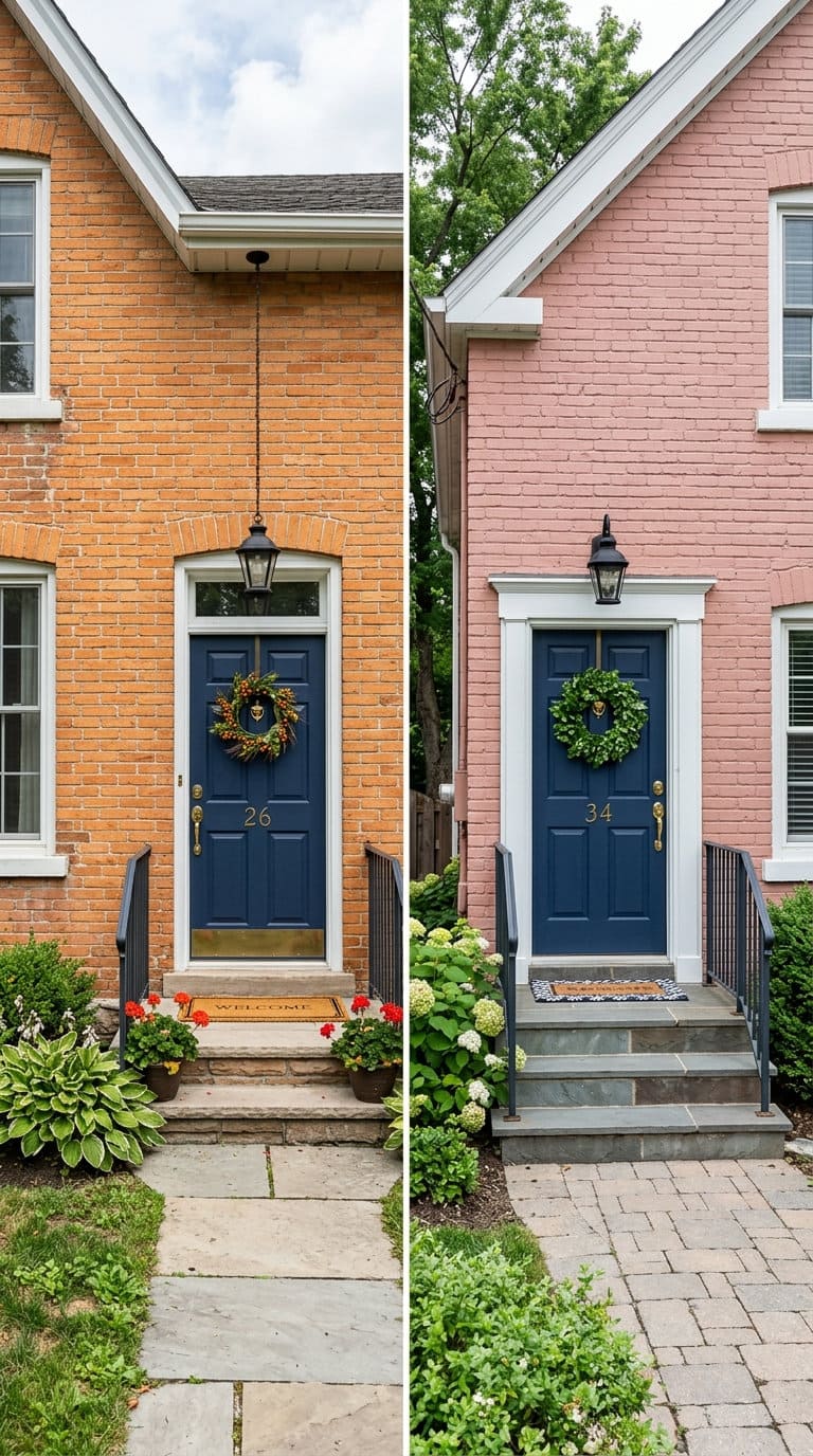
So before the 18 colors below, here’s the part that actually determines whether any of them work on your specific house.
1. Match your door to your brick’s actual undertone
Start by figuring out which undertone you’re actually working with, not “brick” generically, but orange-red, brown, pink, tan/yellow, gray, or a dark charcoal-toned brick, since the same door color reads completely differently against each.
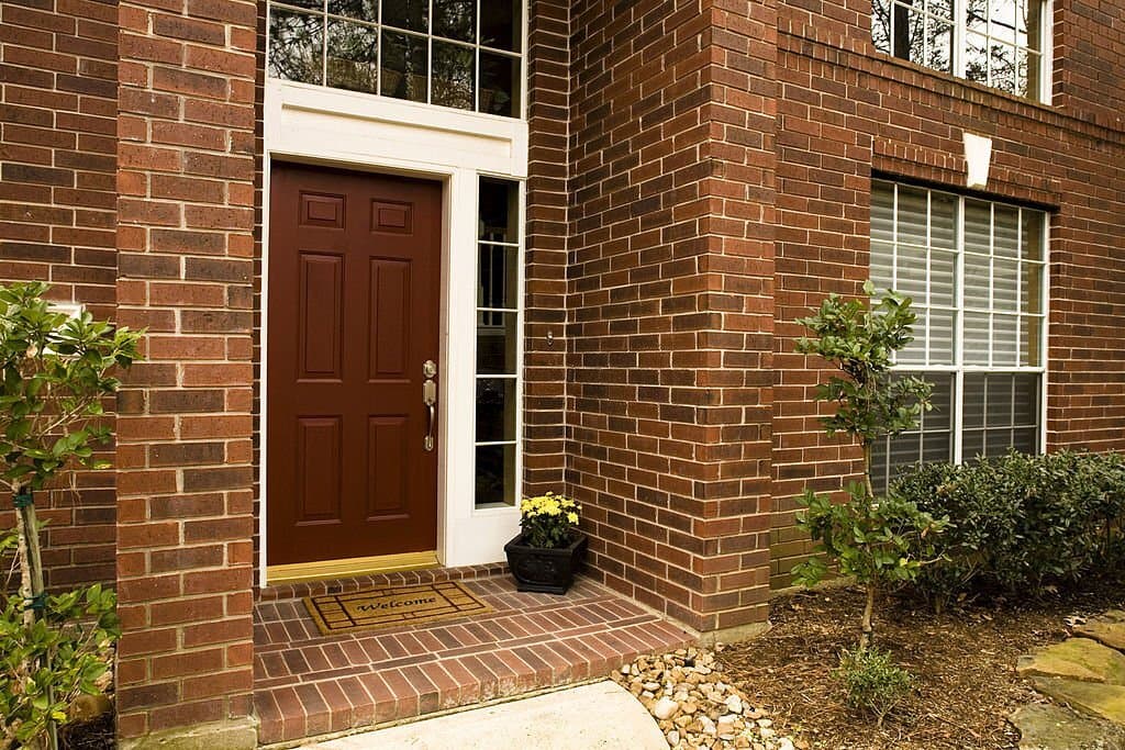
Orange or red brick
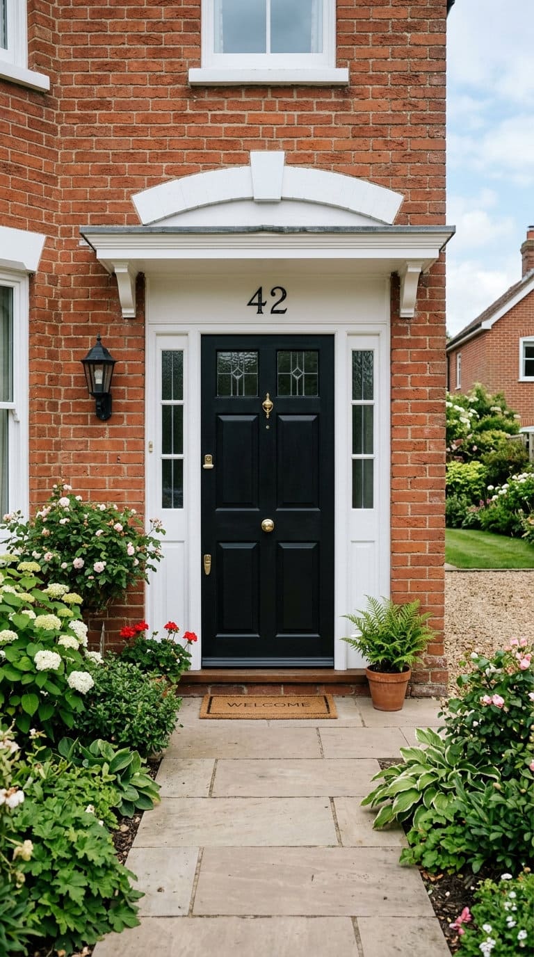
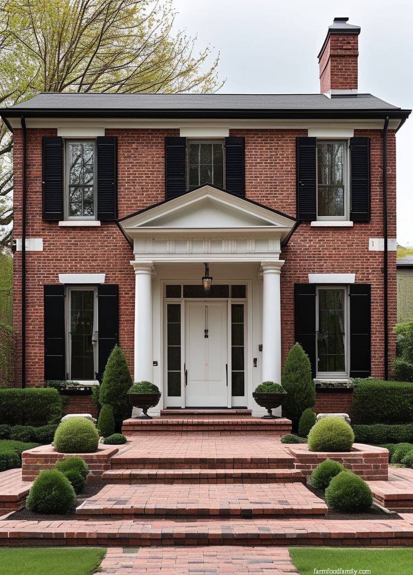
Sue Wadden, Director of Color Marketing at Sherwin-Williams, points to deep charcoals like Iron Ore or Sealskin as timeless choices here, they bring out the richness of dark red brick “not competing with it.” David Batty, a top-selling Philadelphia real estate agent, makes the case for black specifically on red brick: “what’s nice about a black front door on a red brick home is it really pops, especially if you have white trim.”



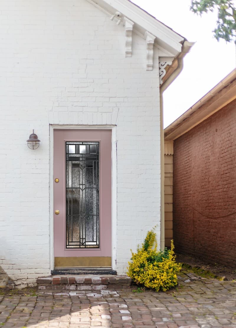
White-painted brick
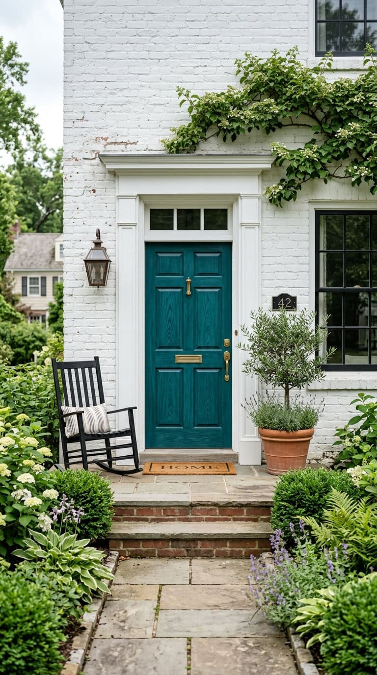
This is close to a blank canvas, almost any door color reads clearly against it since there’s no competing undertone to fight. It’s the one brick category where personal preference can lead more than color theory.
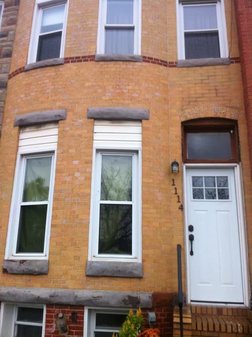
Yellow or tan brick
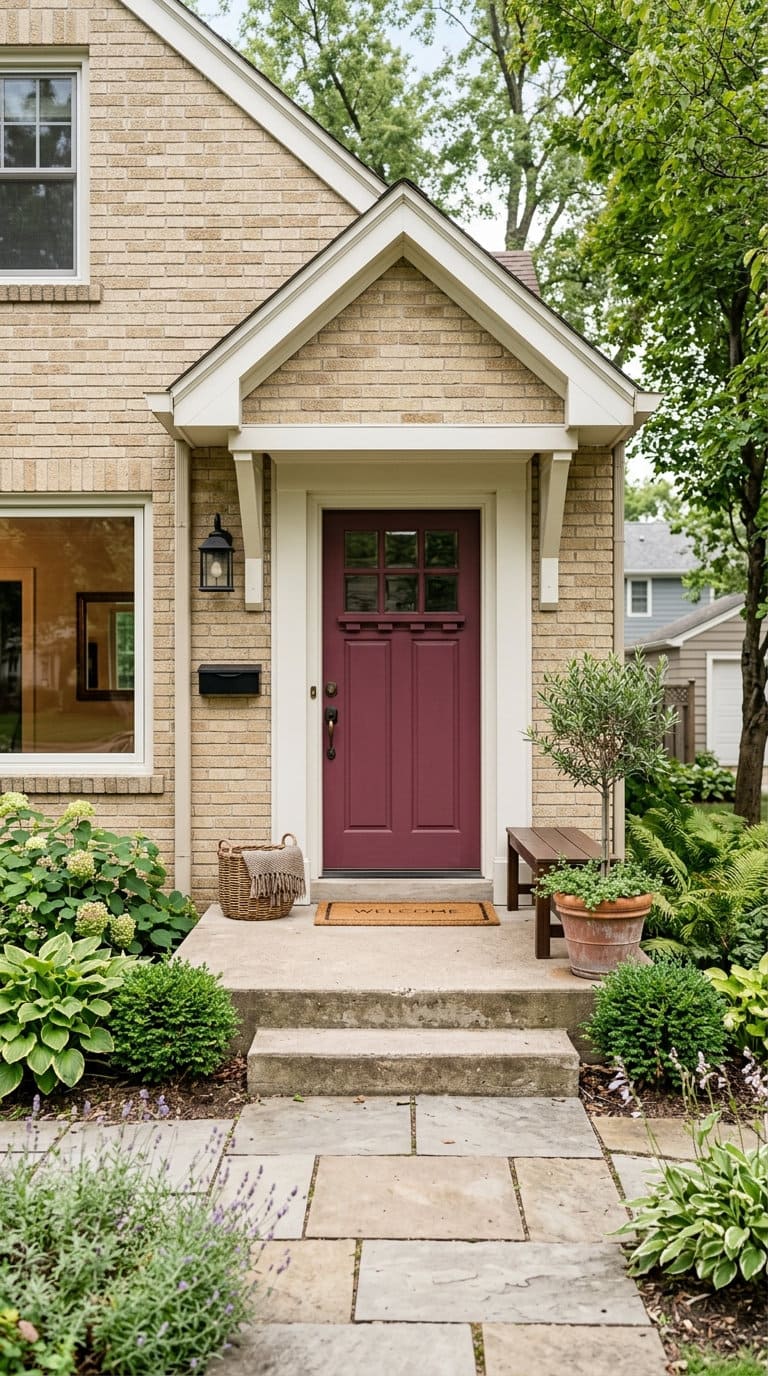
Wadden recommends colors with warm red-purple undertones here, since they “can balance out the yellow undertone that might be found within tan brick styles.” A door that leans too cool (icy gray, stark navy) tends to fight the brick instead of complementing it.
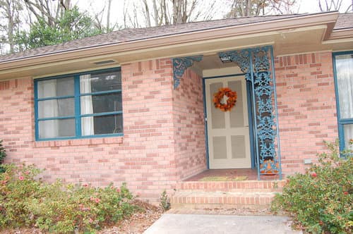
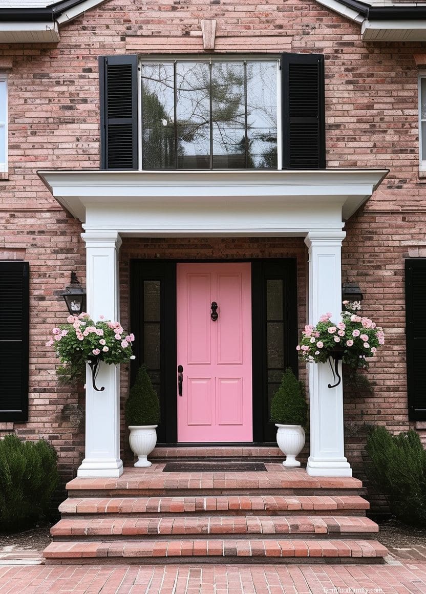
Pink brick
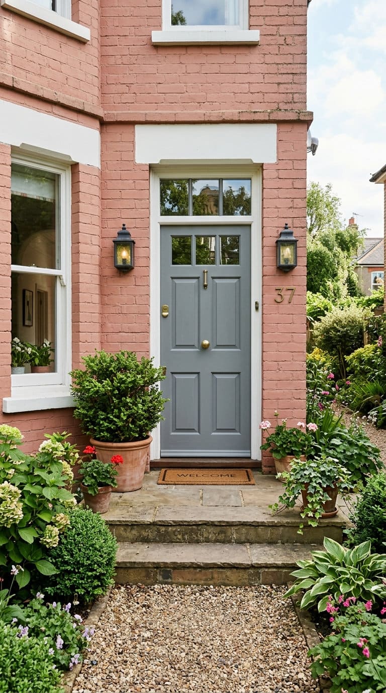
Gray tones “coordinate and balance out the warm tones of a pink brick exterior,” per Wadden, a genuinely counterintuitive pairing that works because it’s neutral enough not to compete with pink’s inherent warmth.
Gray brick
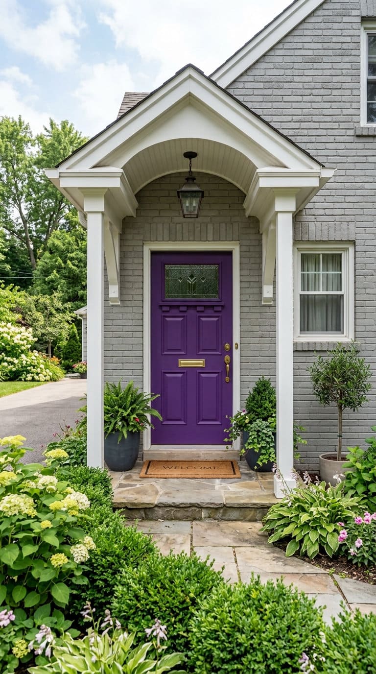
This is the one undertone that needs the opposite approach, Wadden recommends “brighter undertones like purple or green” specifically because gray brick can otherwise read as flat or lifeless without a door color bringing some actual warmth and dimension to the facade.
Dark or charcoal brick
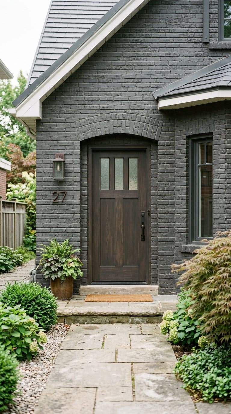
Batty cautions against black here for a different reason than you’d expect, on brown or earth-toned brick, black “can appear harsh,” reading as too stark a contrast rather than a complementary deep tone.
A warm charcoal or deep brown works better than true black in this specific case.
2. Beige
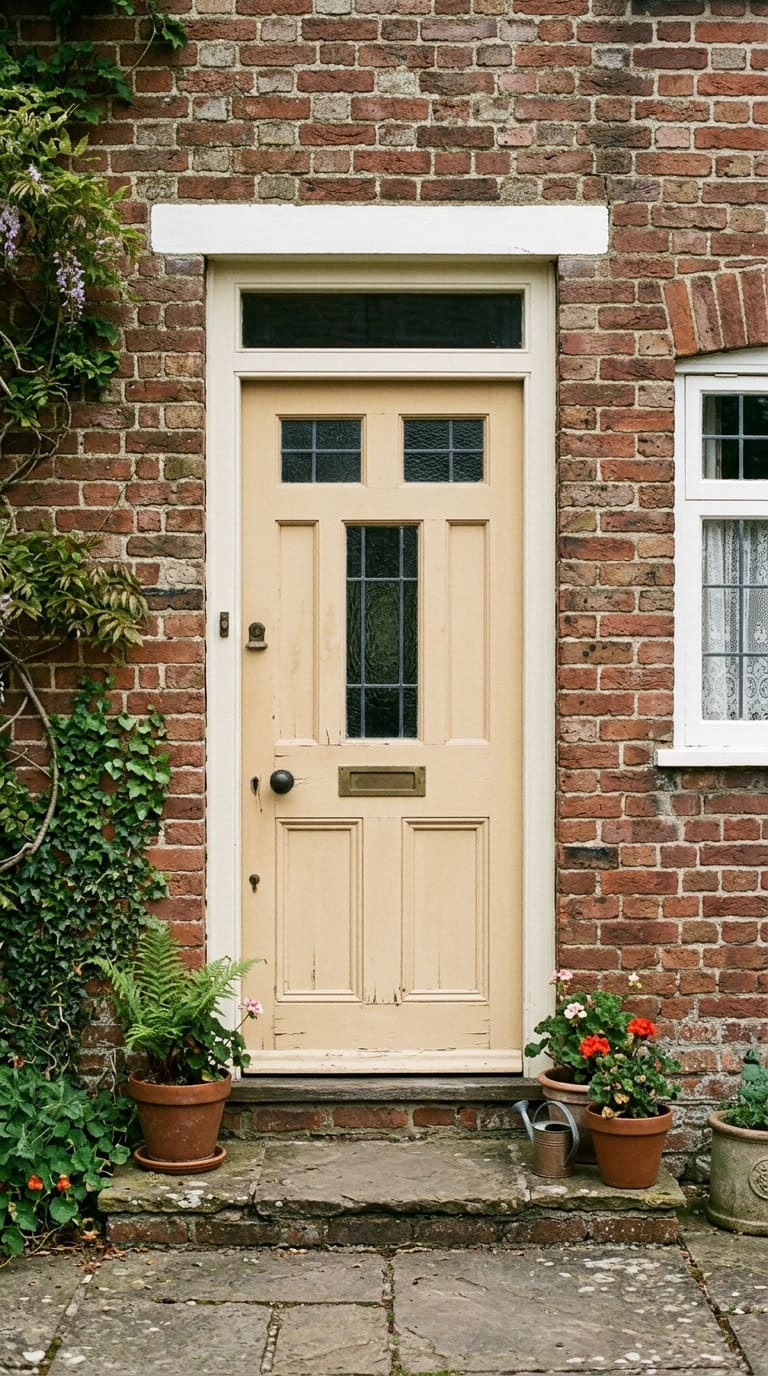
Beige is the low-contrast choice, a door that blends with the brick rather than standing apart from it. It works best on warm-toned brick where you want the entryway to feel cohesive with the whole facade rather than being a focal point in its own right.
The tradeoff is curb-appeal impact, a beige door won’t do much visual work on its own, so the rest of the entry (hardware, house numbers, a wreath) has to carry more of the personality if you go this route.

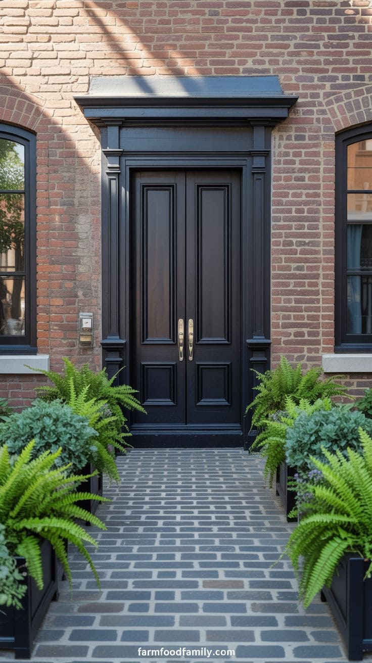
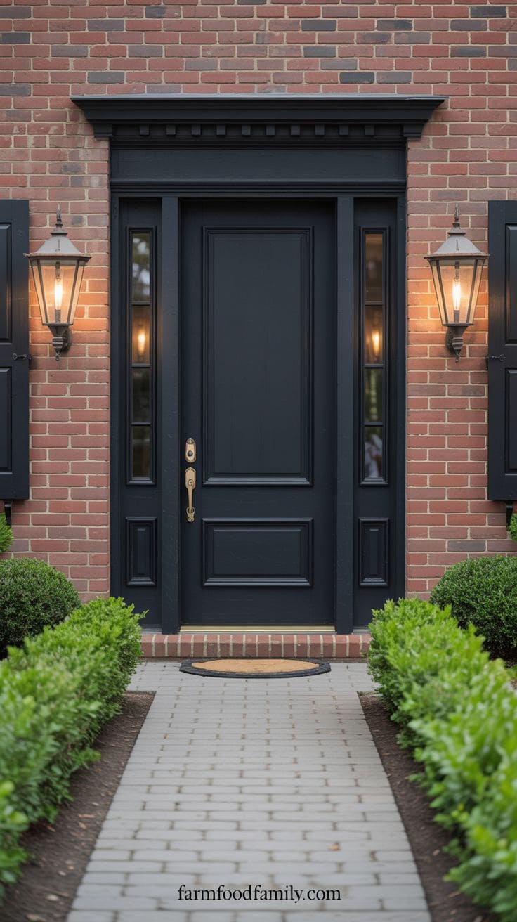
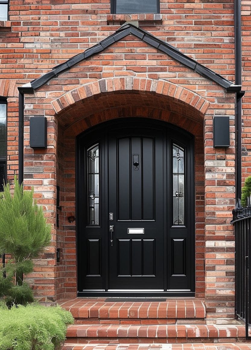
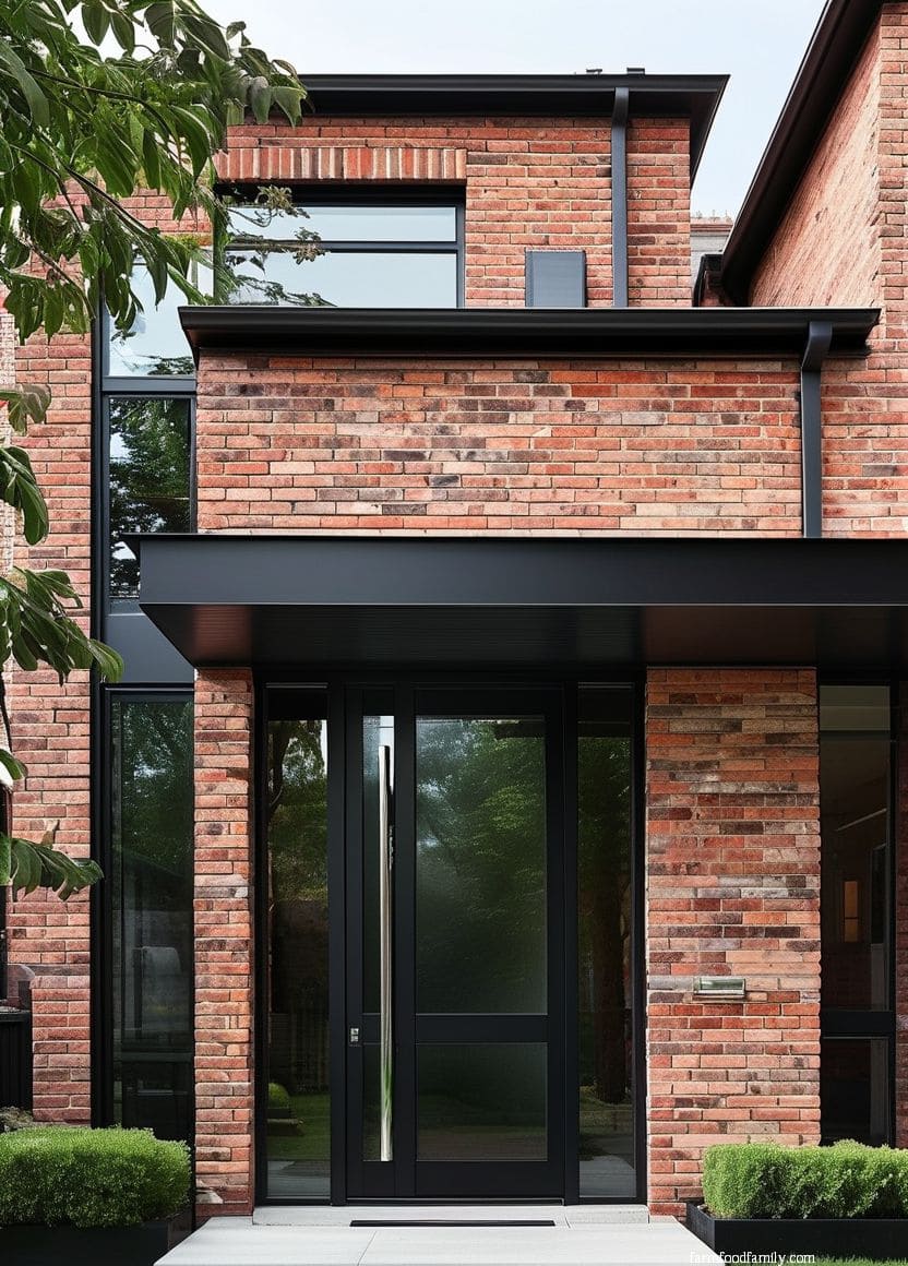
3. Black
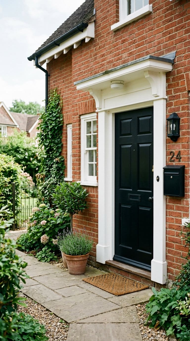
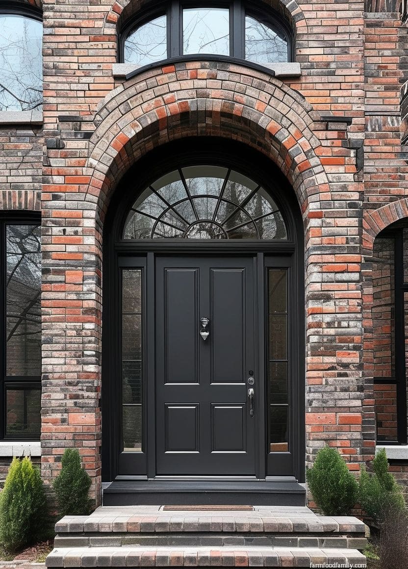
A black front door on brick “really pops,” in Batty’s words, especially paired with white trim on red brick specifically. It’s the most versatile color on this list precisely because it works as a near-neutral, dark enough to read as intentional and formal against nearly any brick undertone except the darkest brown or charcoal brick, where Batty’s harshness warning applies.
Black also holds up well against dirt and weathering, a practical bonus if the entry gets a lot of foot traffic or faces weather exposure.

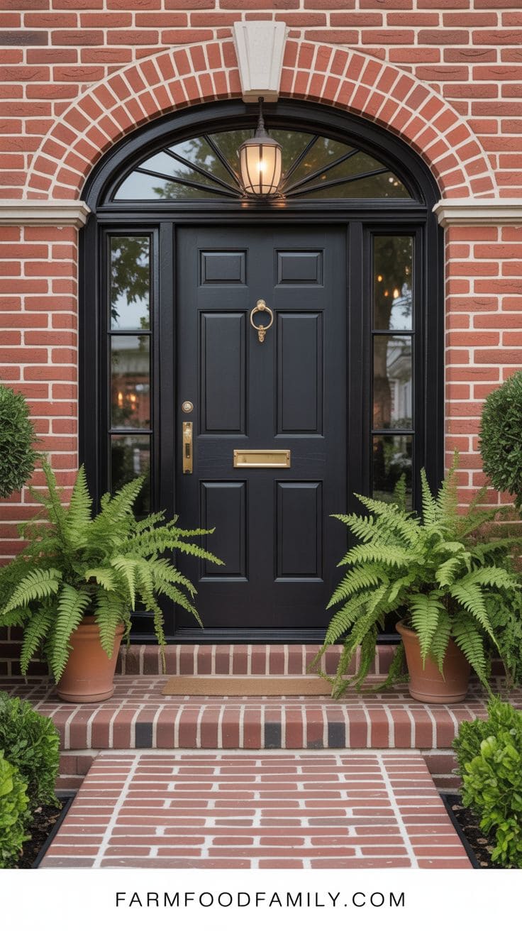
A black front door on a brick house exudes dramatic grandeur and sharp contrast.
It’s a versatile option that complements any brick hue, whether it’s red, brown, or gray, by adding clarity and formality.
This bold, classic color provides the entrance a grounded presence, bringing attention to the front of the house and increasing curb appeal.
Black also provides a timeless backdrop for baroque or minimalist hardware, highlighting finishes such as brass, chrome, or matte bronze.
A black door is resistant to dirt and weathering, making it both practical and elegant.
It’s a popular choice among homeowners looking for a strong yet elegant appearance that exudes permanence and prestige while integrating in with almost any design style or context.


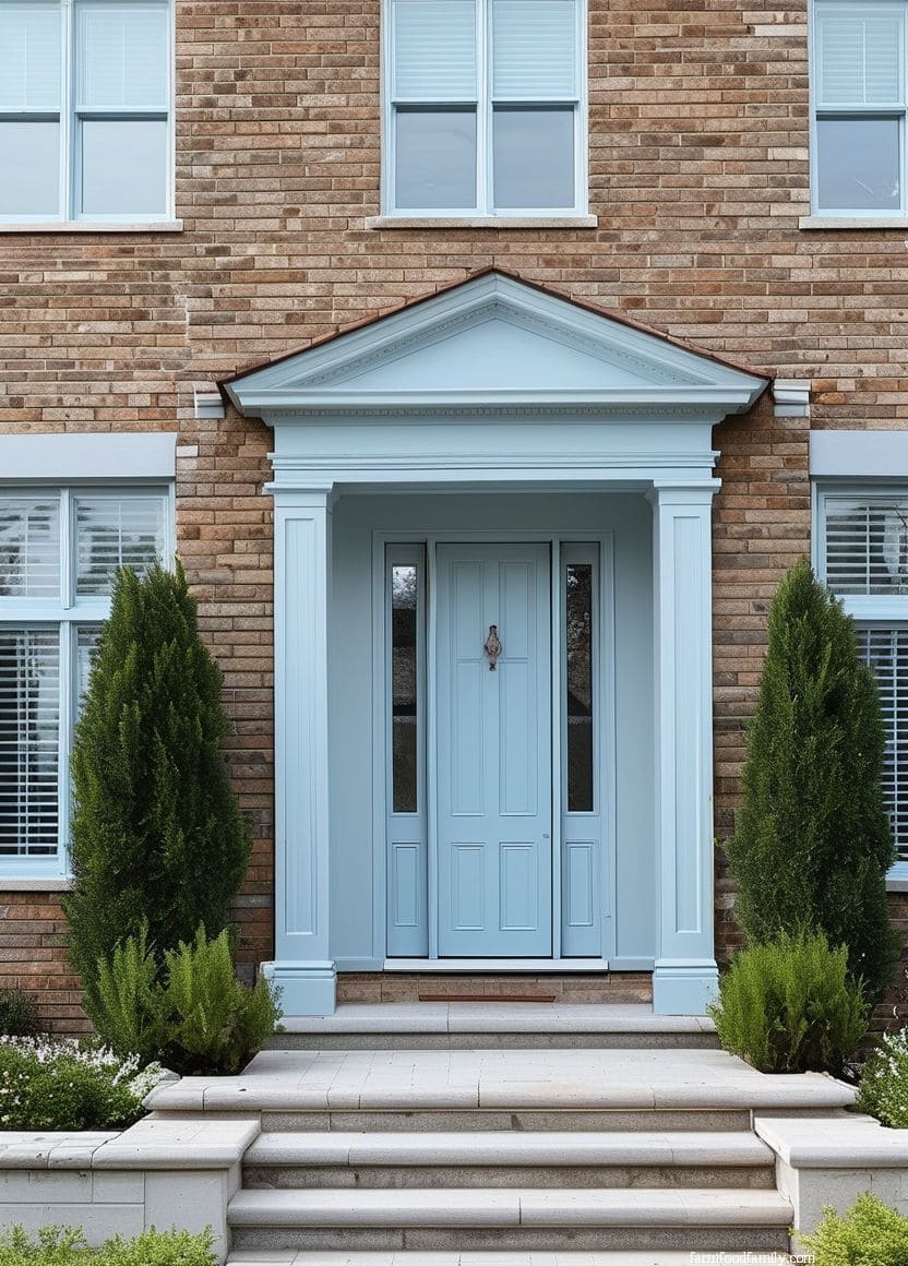
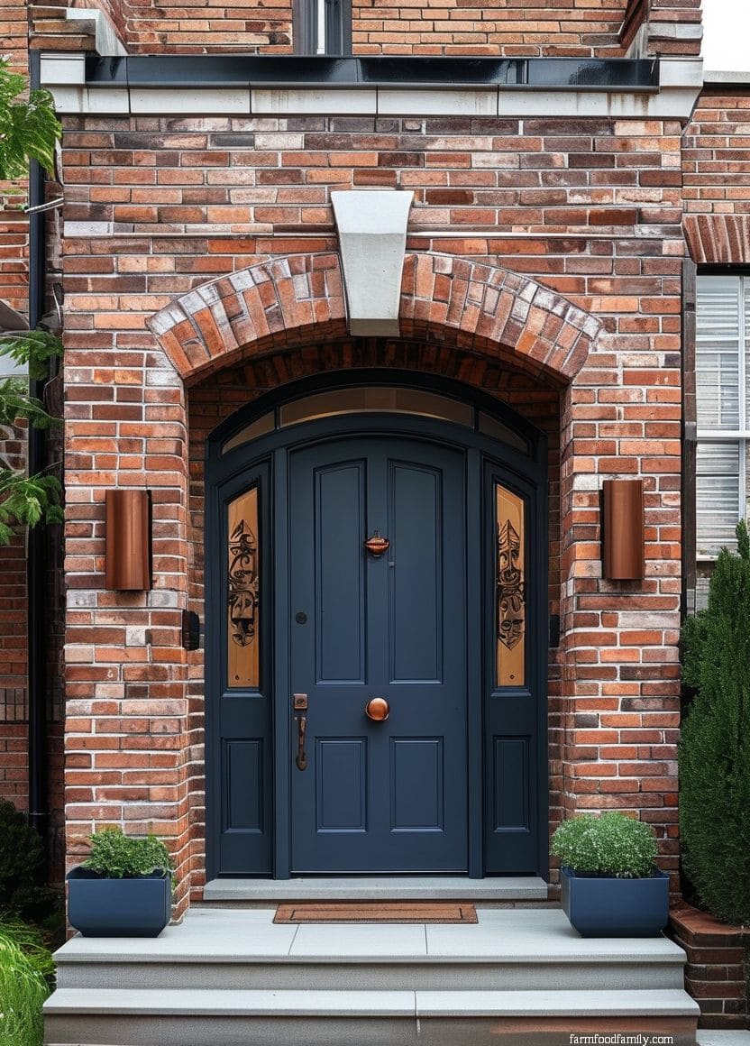
4. Blue
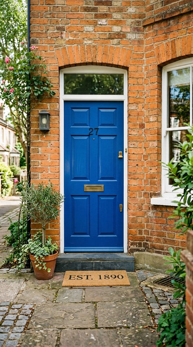
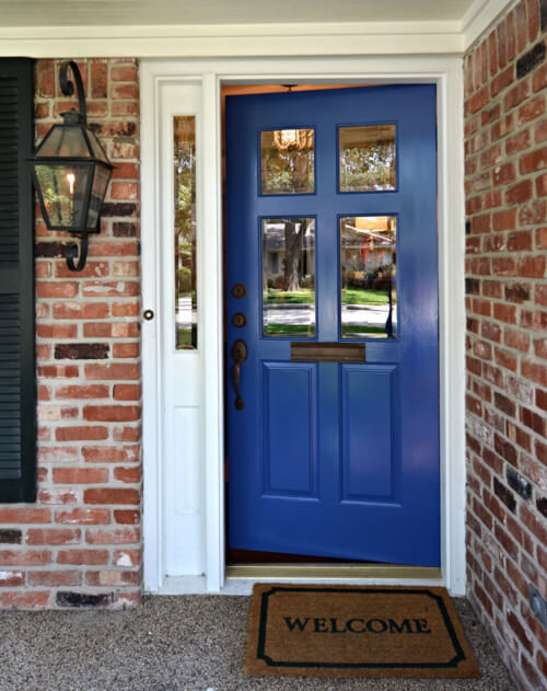
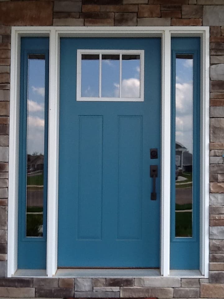
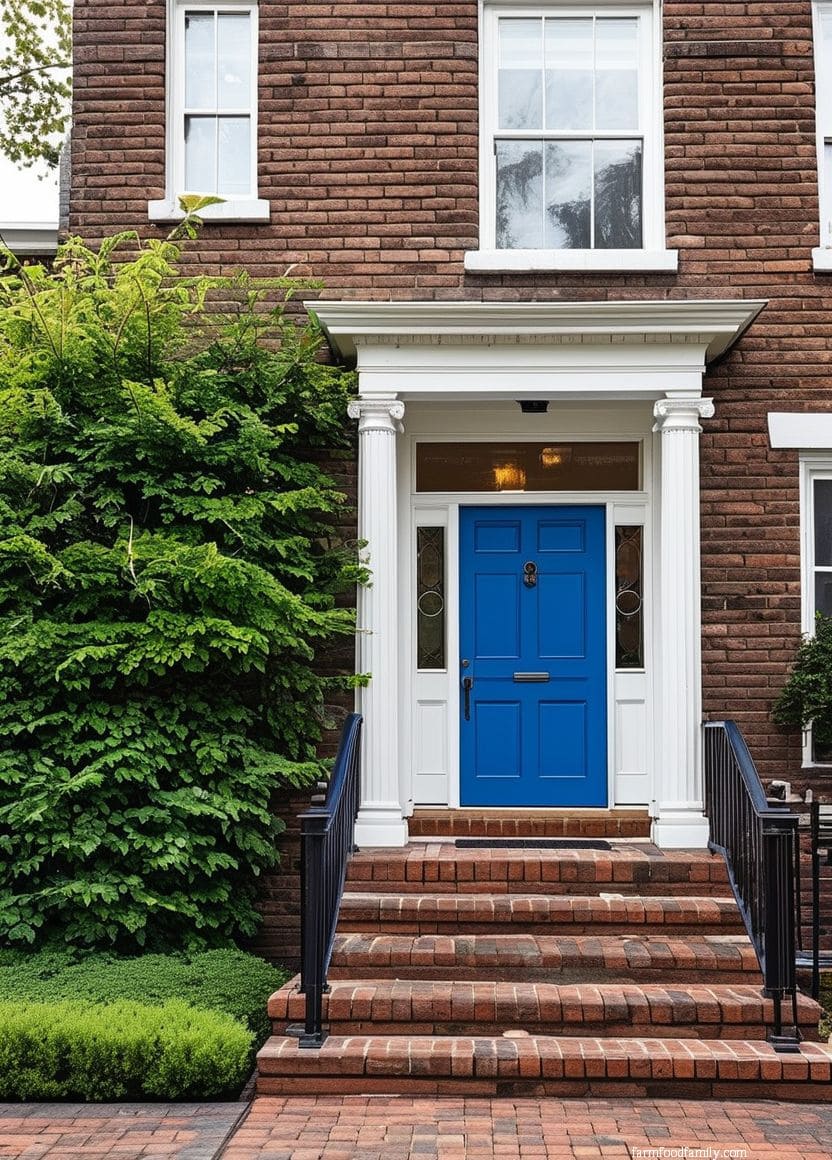
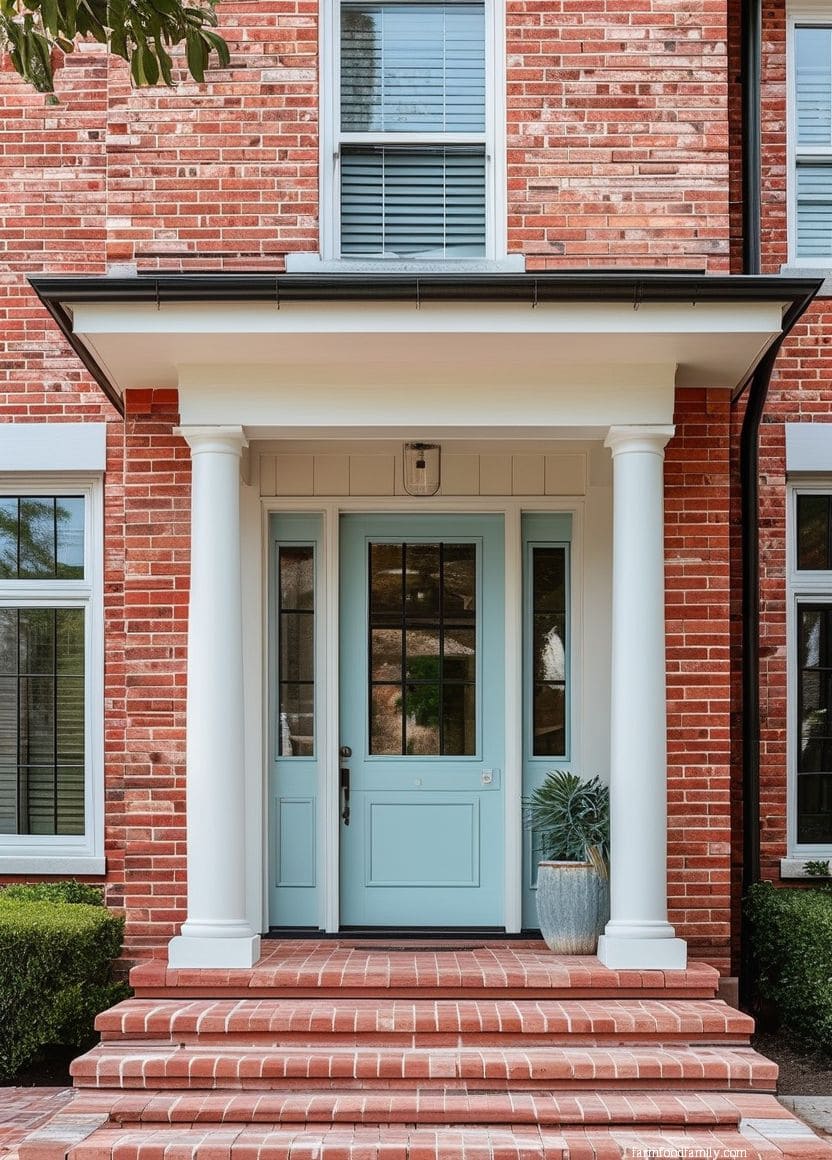
Blue works as a genuine contrast color against orange-toned brick specifically, since blue and orange sit close to opposite each other, the same logic that makes navy trim pop against terracotta roof tiles.
Lighter, dustier blues read more casual and cottage-like; deep navy reads more formal and traditional.
5. Brown
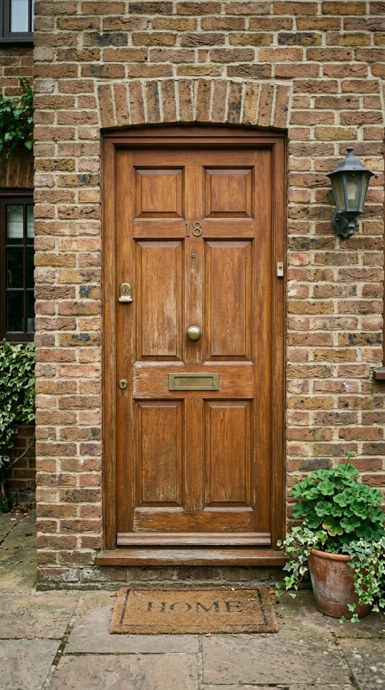
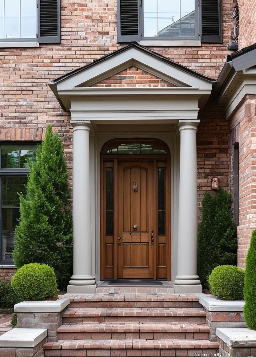
Brown on brick tends toward monochromatic harmony rather than contrast, especially on brown or dark-toned brick where the door essentially extends the house’s existing palette instead of introducing a new one. It’s a safe, resale-friendly choice precisely because it rarely clashes with anything.
The risk is the opposite of black’s, brown can read as visually flat rather than dramatic if the rest of the entry doesn’t add some contrast through trim color or hardware finish.
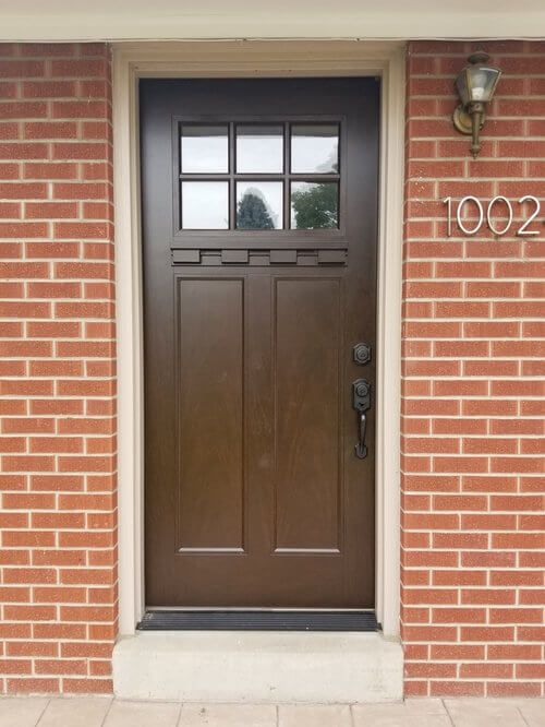
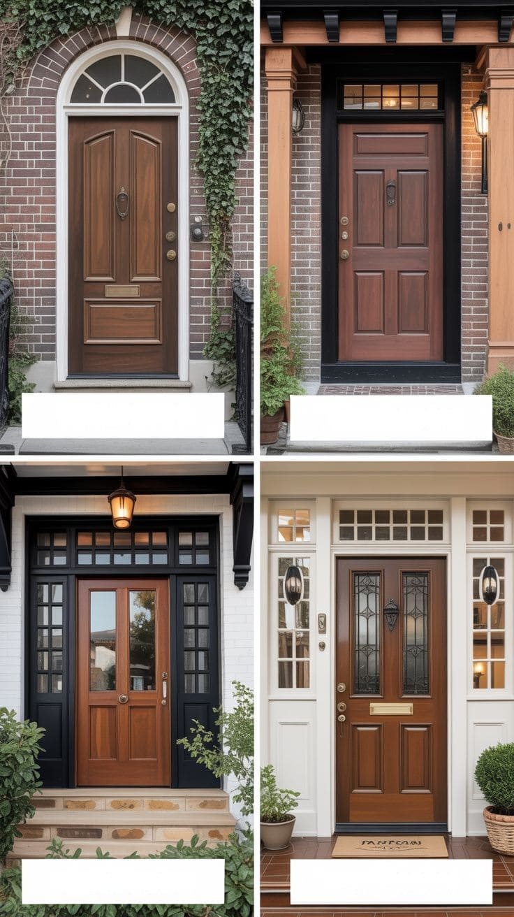
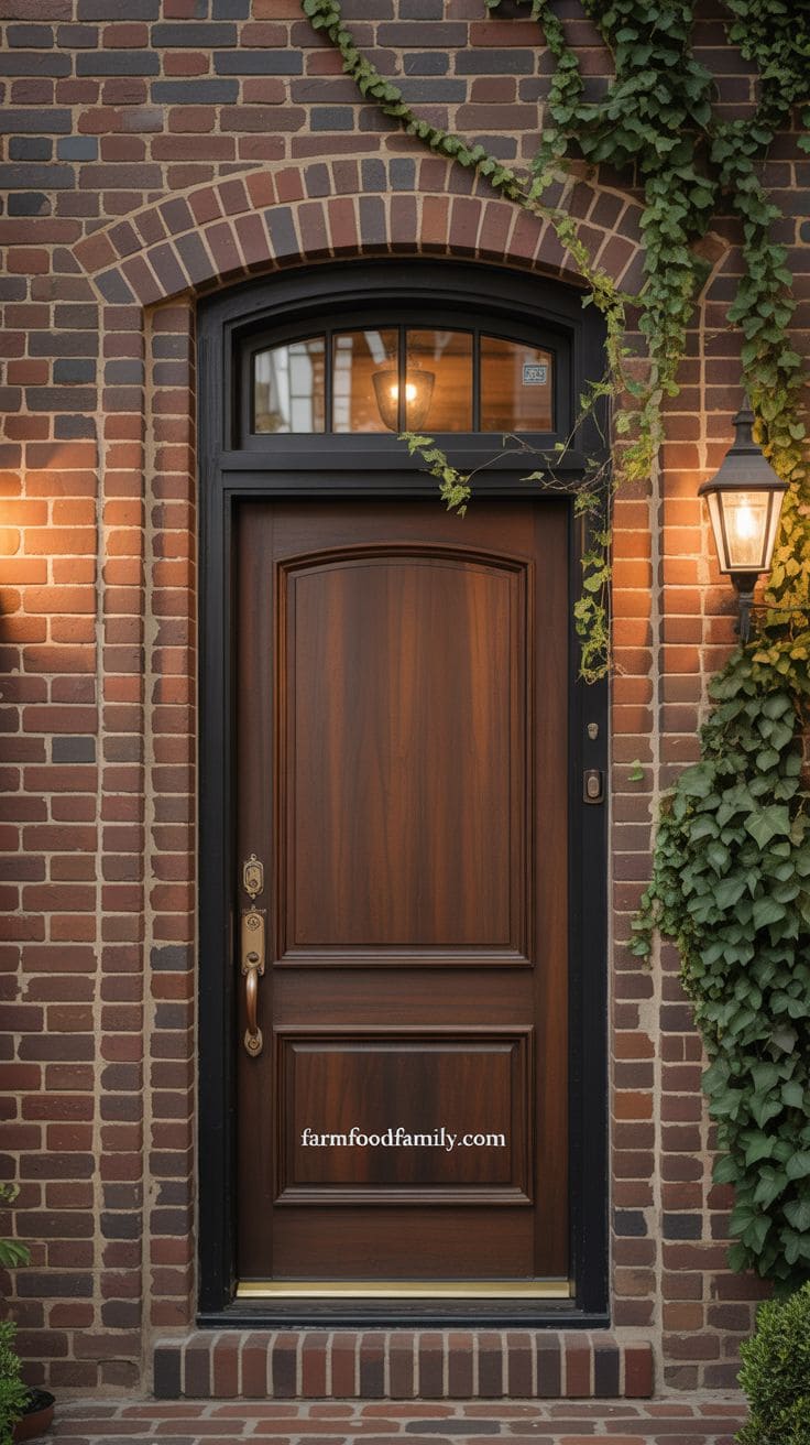
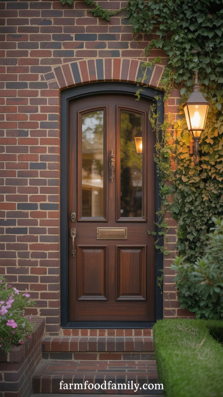
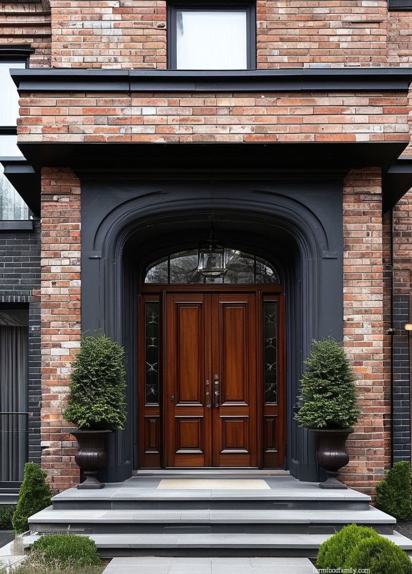
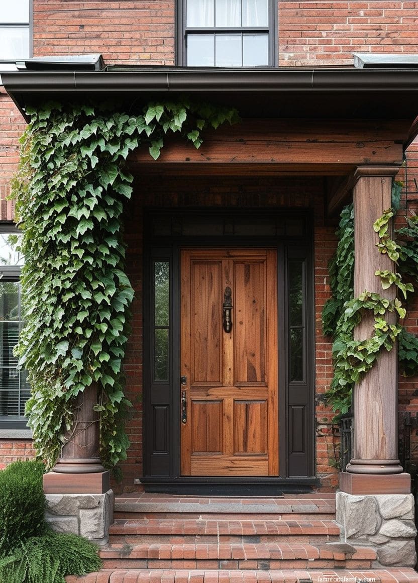
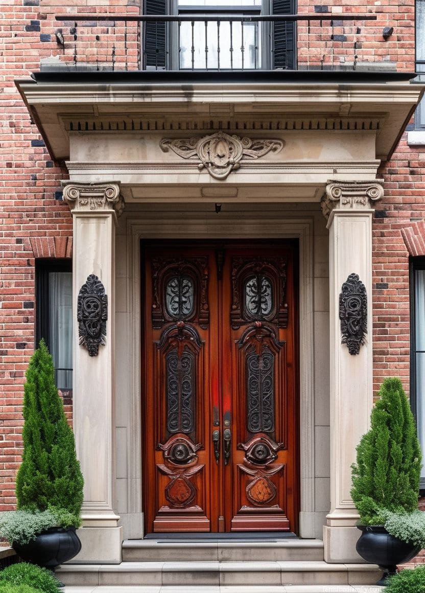
A brown front door, particularly one finished in walnut, espresso, or a dark chestnut stain, brings warmth, depth, and organic beauty to a brick home.
It complements the earthy tones of red, brown, or buff bricks, increasing the facade’s natural texture while avoiding sharp contrast.
Wood-stained brown doors provide a sense of durability and antiquity, making them great for Craftsman, farmhouse, or rustic-style homes.
A glossy or semi-gloss finish adds shine, whilst matte or distressed stains create a more vintage, grounded look.
This choice is suitable for those who prefer a warm, authentic style based on natural materials and classic design.
It’s both subtle and expressive, lending the entryway a sense of craftsmanship, depth, and enduring character that compliments brick’s eternal allure.
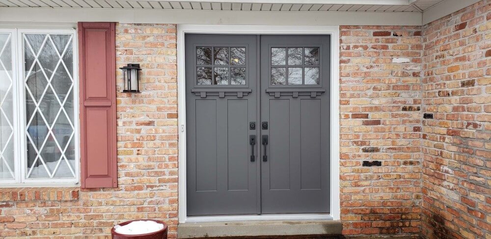
6. Dark Gray
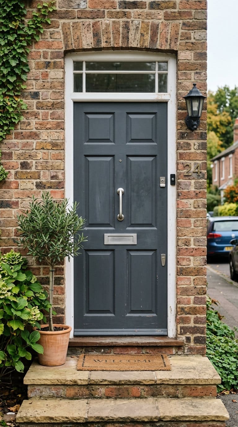
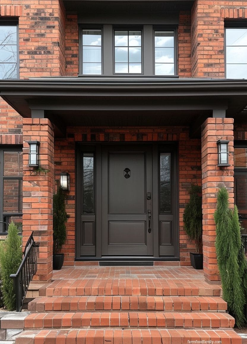
Dark gray splits the difference between black’s drama and brown’s blend-in safety. It reads as sophisticated without the starkness Batty warns about on brown-toned brick, making it a reasonable middle option when true black feels like too much contrast for a warmer brick tone.
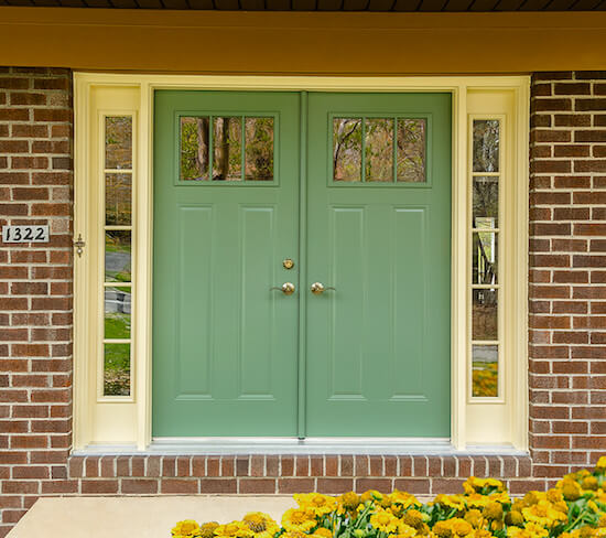
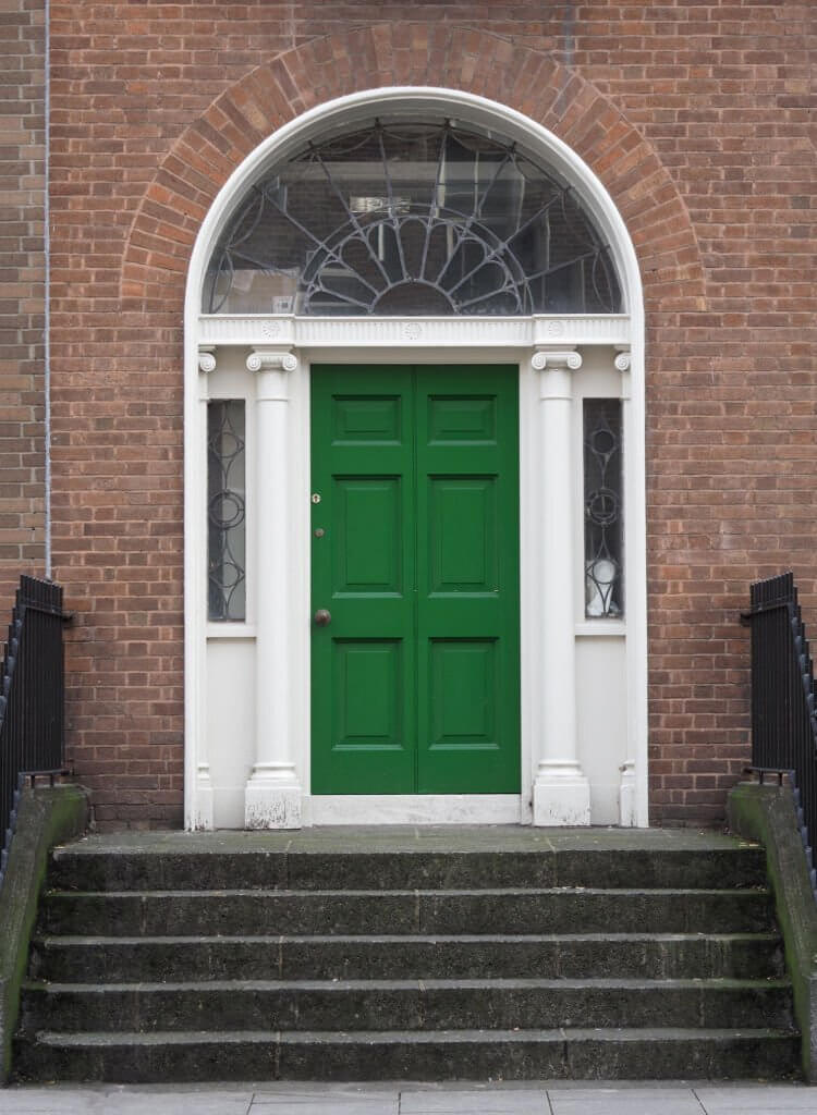
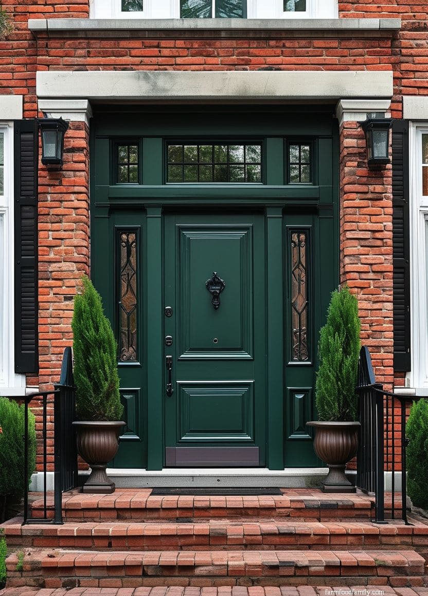
7. Emerald
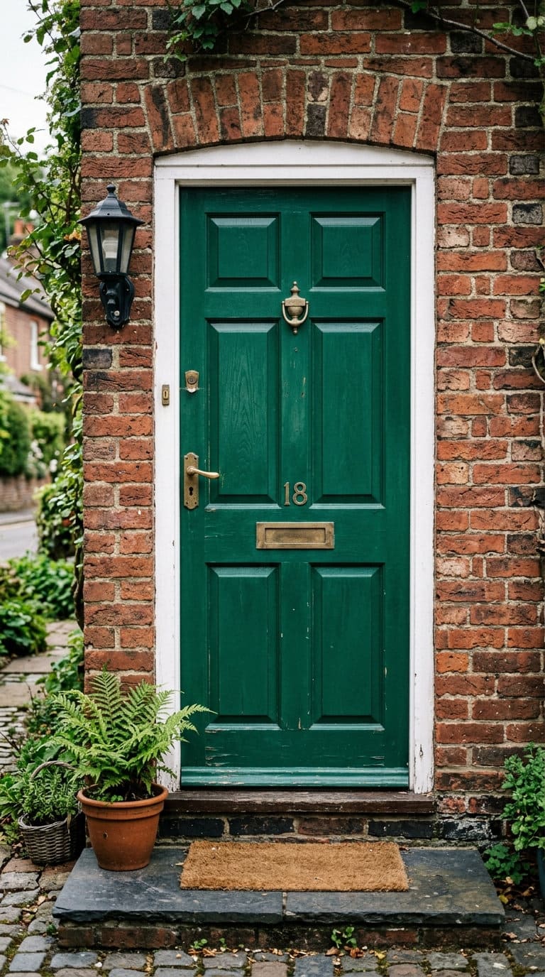
A deep emerald green door leans traditional and a little formal, closer to a hunter green than a bright kelly green.
It pairs particularly well with brass or aged-bronze hardware, the warm metal tone keeps the overall look from feeling too cool against red or orange brick.
8. Gray
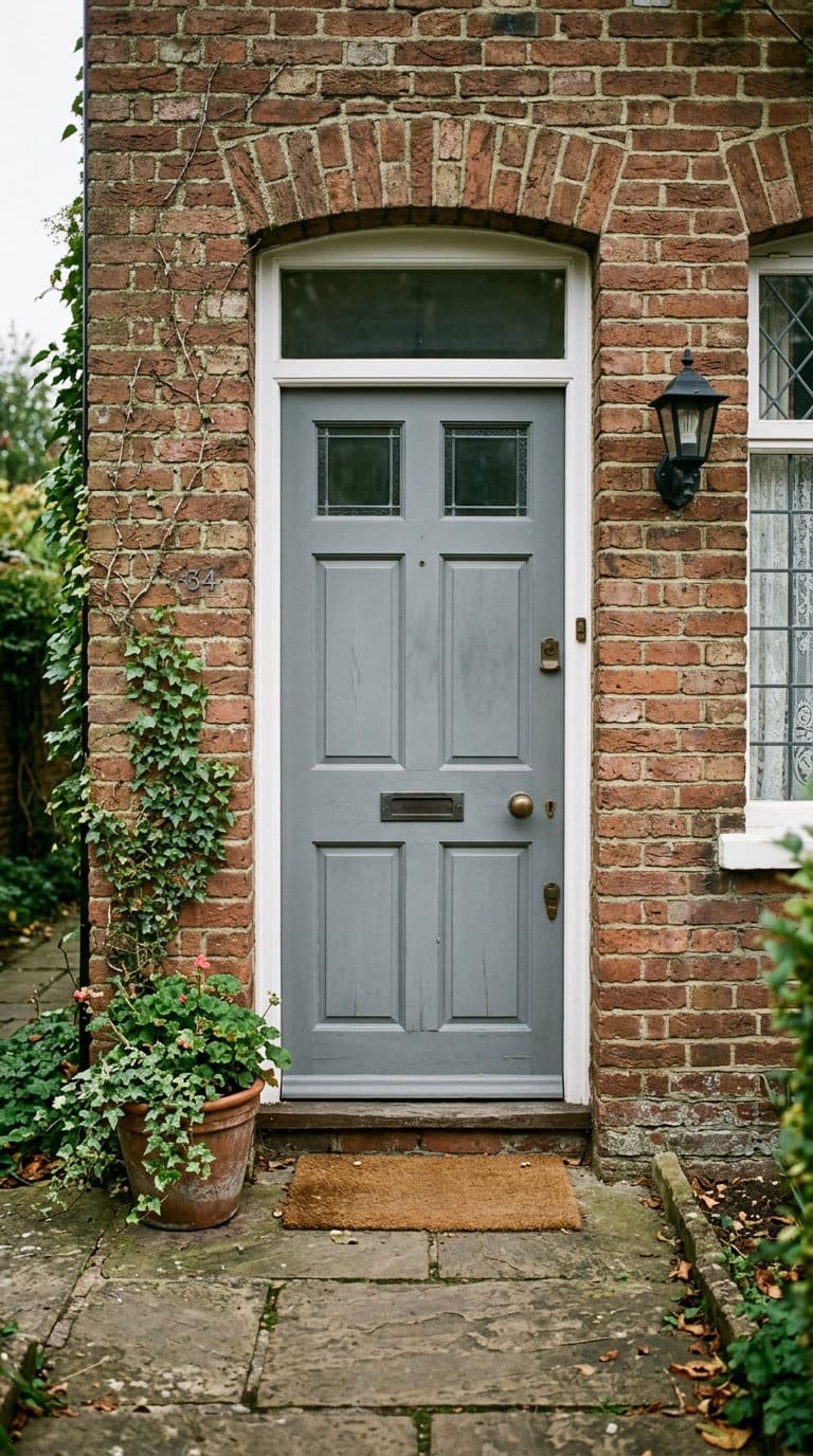
Standard mid-tone gray is the safest neutral contrast option after black, less dramatic, more universally workable across brick undertones, but also less of a statement. It’s the door color equivalent of “won’t offend anyone,” which is exactly the appeal for a lot of homeowners weighing resale value.
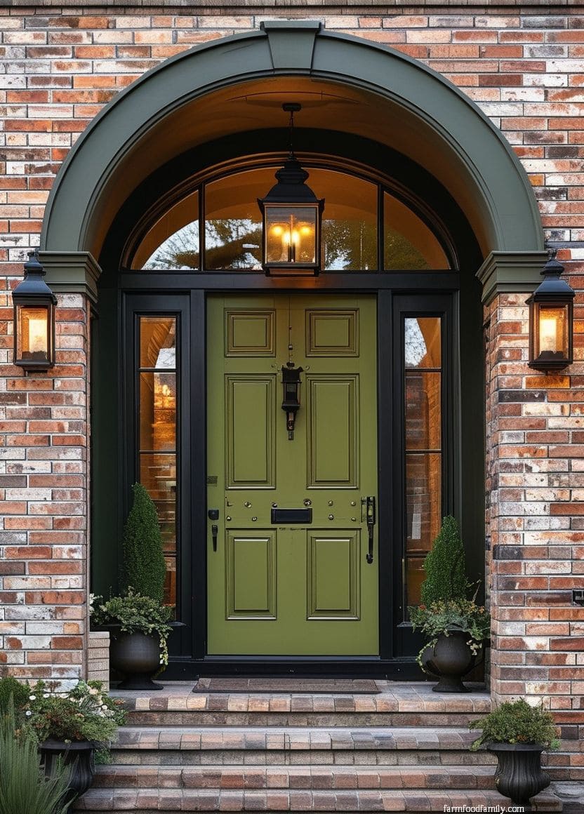
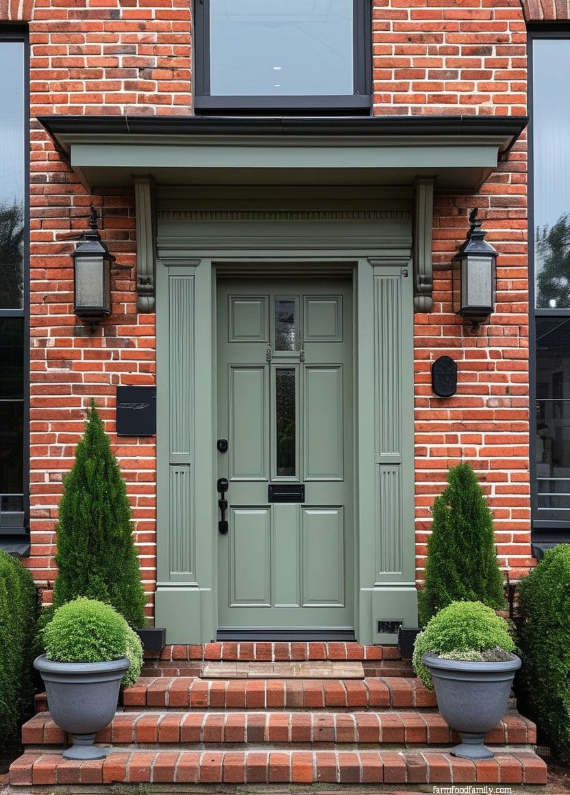
9. Green
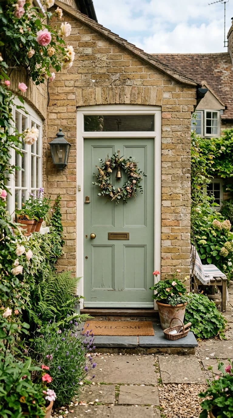
Sage or olive-leaning greens (distinct from the deeper emerald in section 7) read as more casual and cottage-influenced.
They work especially well on tan or beige brick, where the muted, earthy green tone doesn’t fight the brick’s own warm neutrality.
10. Maroon.
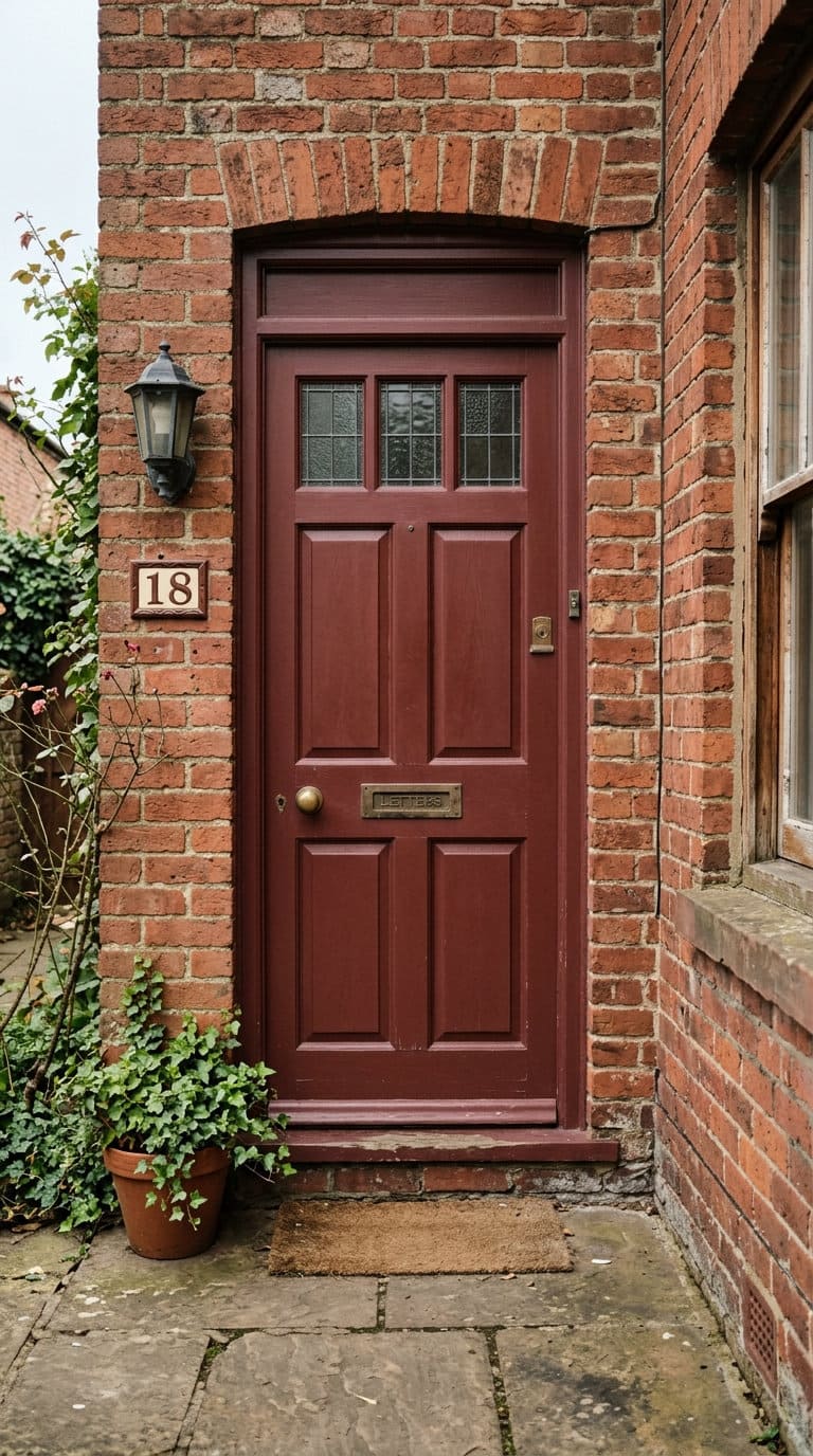
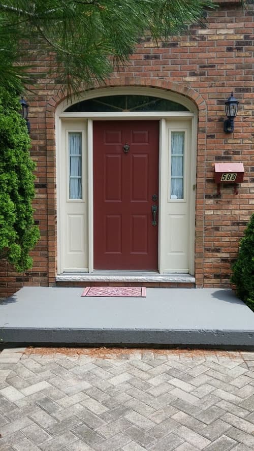
Maroon sits close enough to brick’s own red family that it can either blend seamlessly or clash depending on the specific undertones involved, this is one of the colors where checking your brick’s actual undertone (section 1) matters most before committing, since a maroon with the wrong underlying tone next to orange-leaning brick can look like a mismatch rather than a coordinated choice.
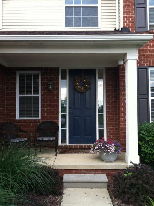
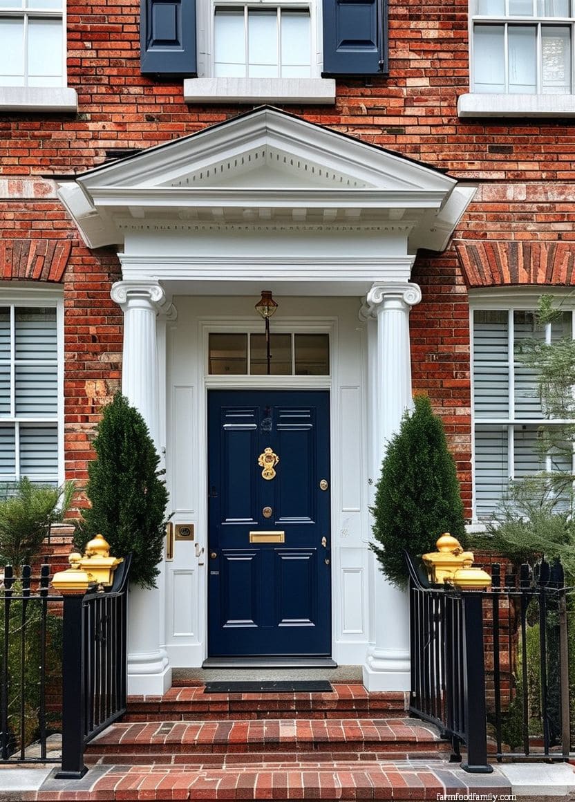
11. Navy
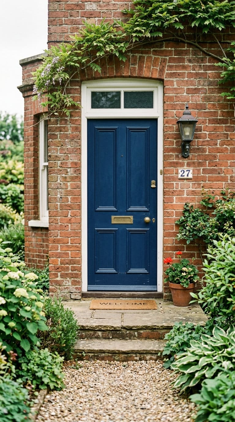
Navy is one of the more foolproof choices across brick types generally, dark enough to read as a near-neutral like black, but with just enough color to feel less severe than true black on warmer or earth-toned brick. It’s a common pick specifically because it hedges between drama and safety.
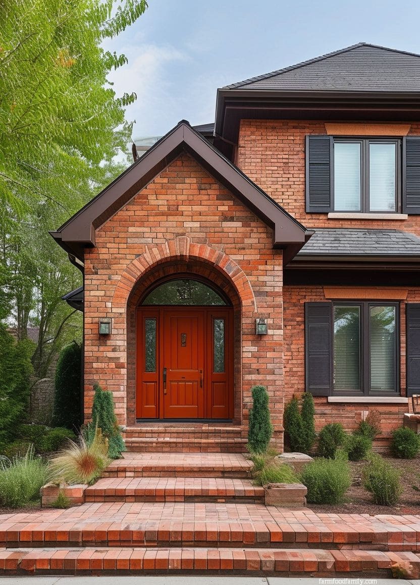
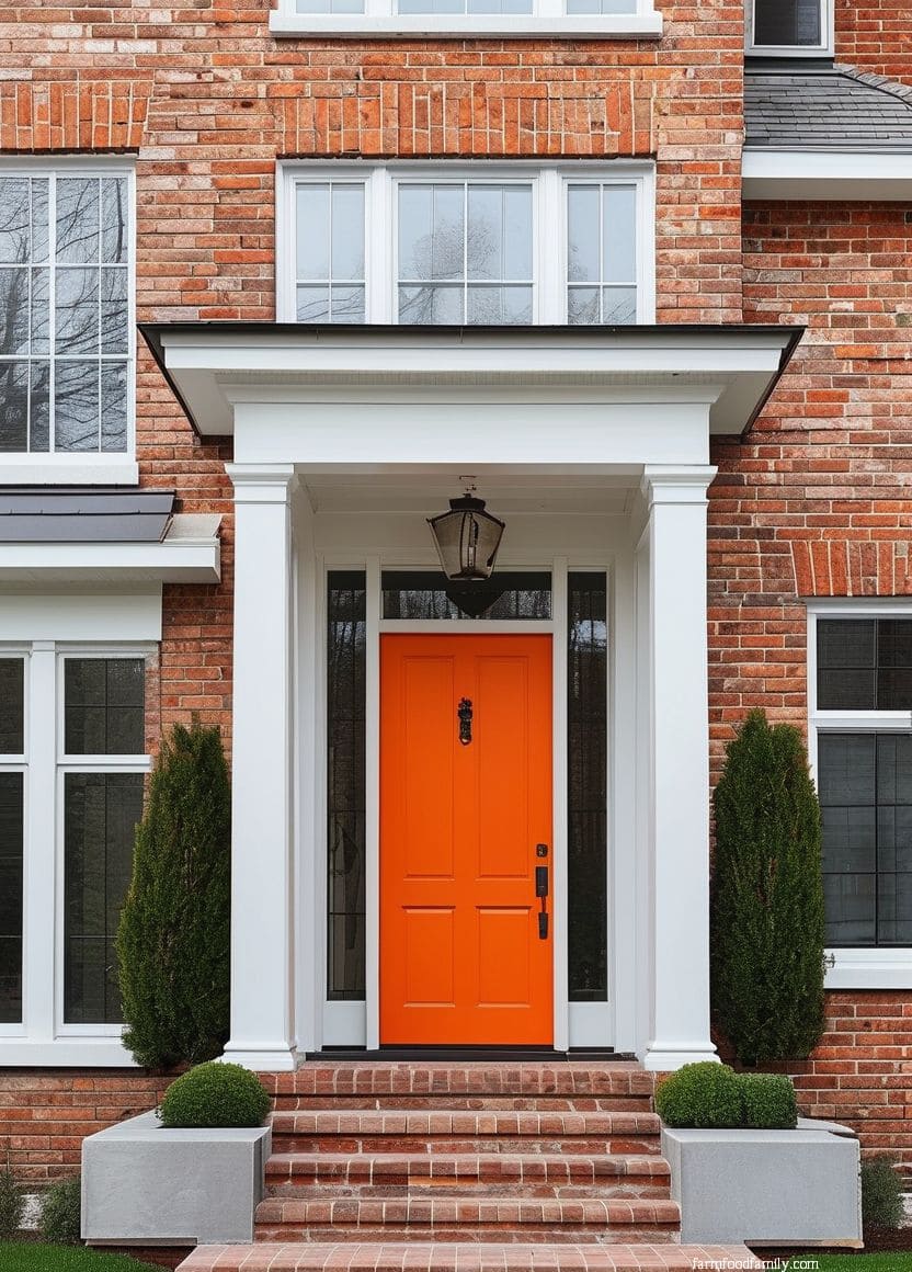
12. Orange
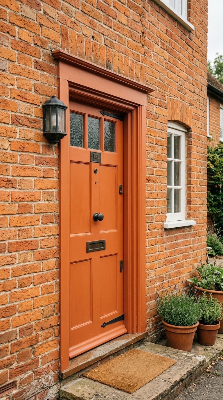
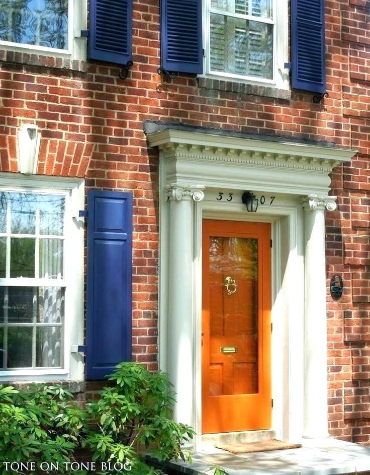
A true orange door on orange-toned brick is a monochromatic, high-commitment choice, it works, but only if the door’s specific orange is close enough to the brick’s own undertone to read as intentional rather than accidental.
Get the shade wrong and it looks like a mismatch rather than a coordinated palette.
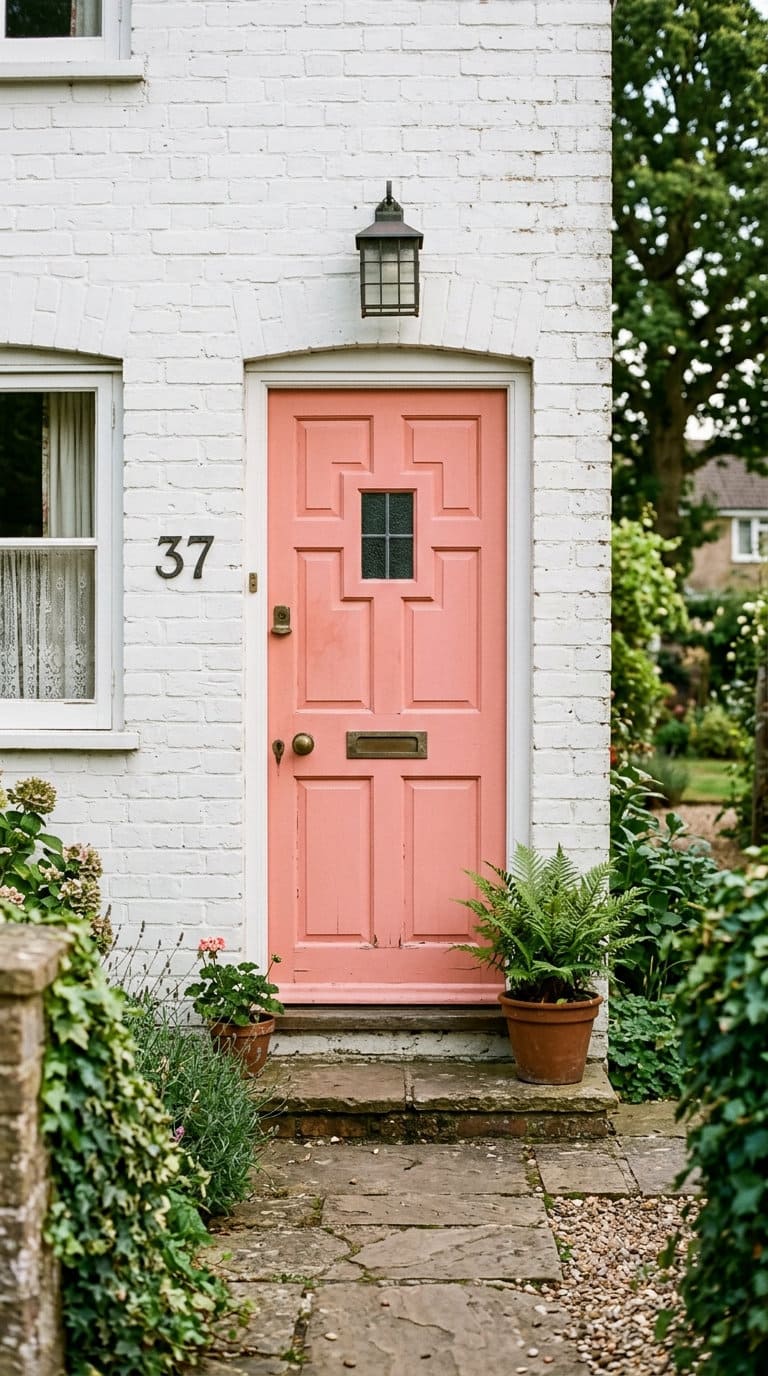
13. Peach
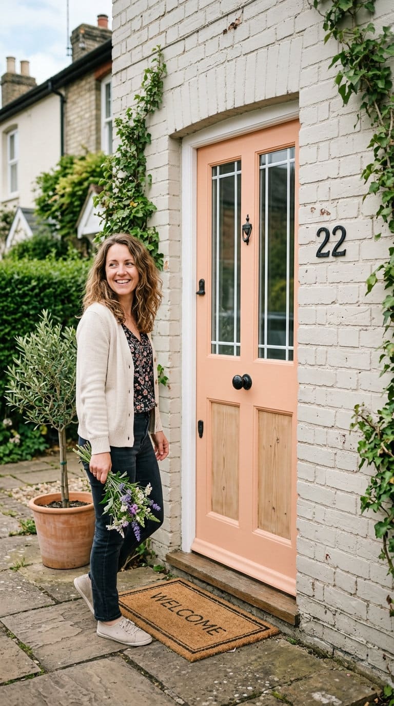
A soft peach door leans decorative and cottage-style rather than bold. It works best on lighter or white-painted brick where there’s enough contrast for the peach to read clearly instead of disappearing into a similarly warm-toned brick.

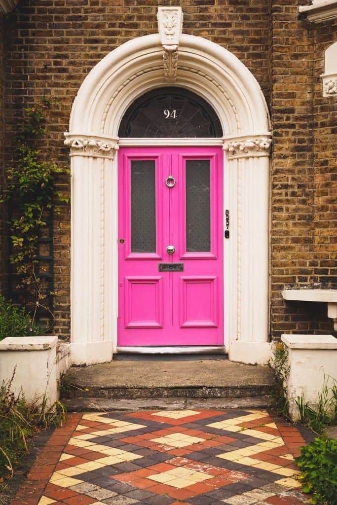
14. Pink
A genuinely pink front door is a statement choice, not a safe or resale-neutral one. It reads best on white-painted or light gray brick, where there’s enough contrast for the pink to feel deliberate rather than clashing with a brick that’s already warm-toned.
15. Purple
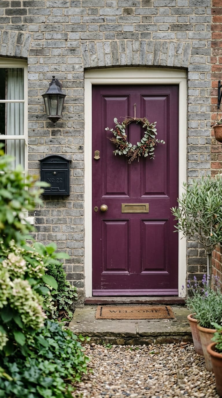
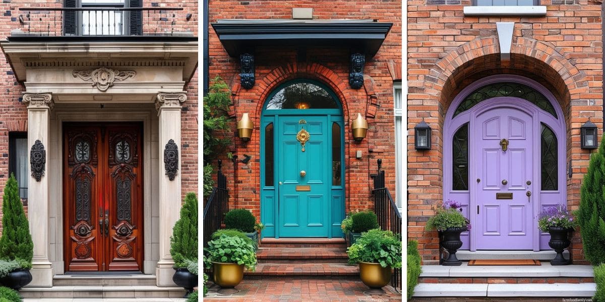
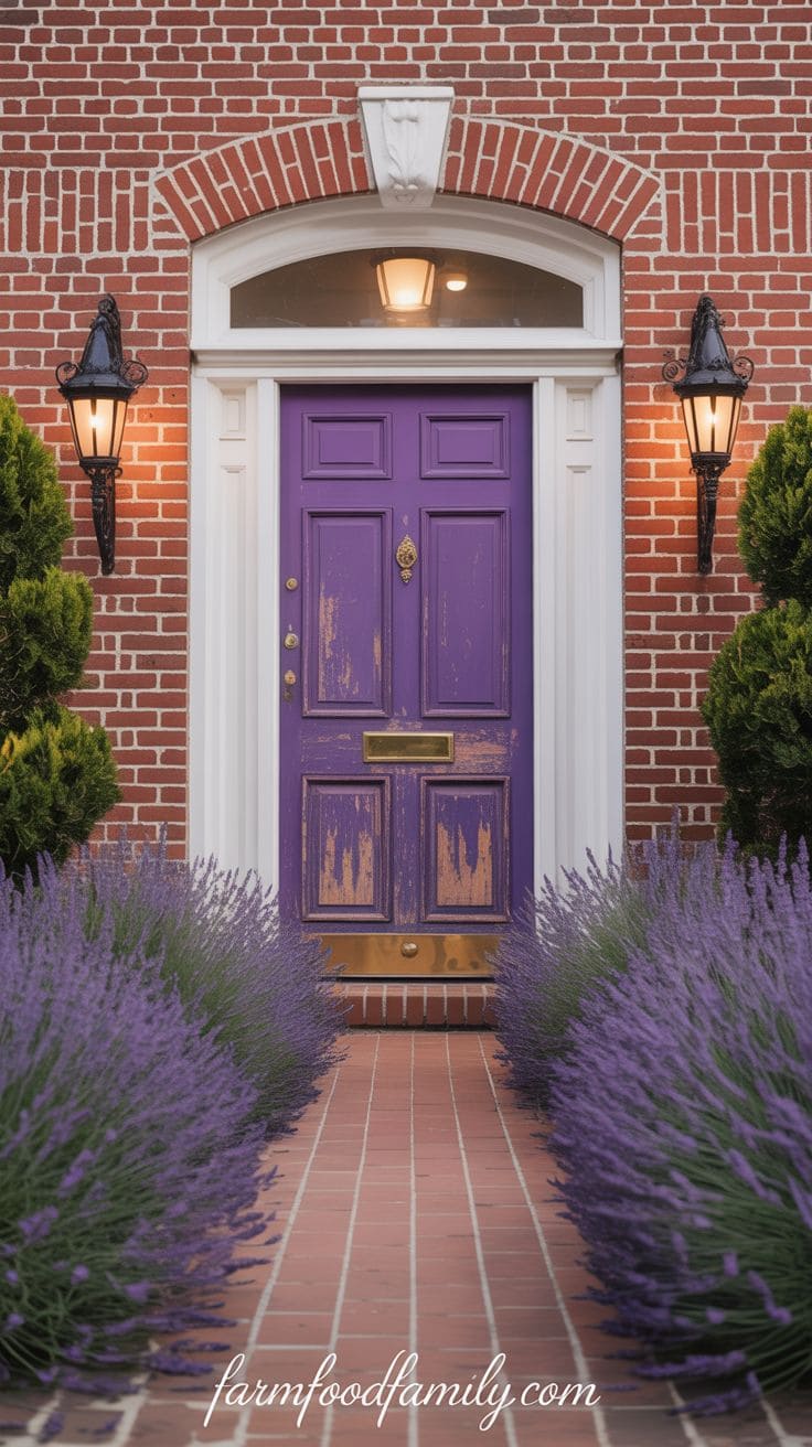
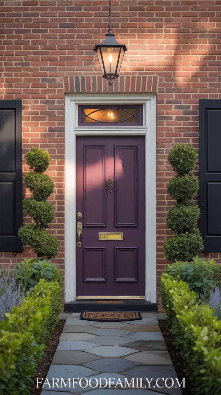
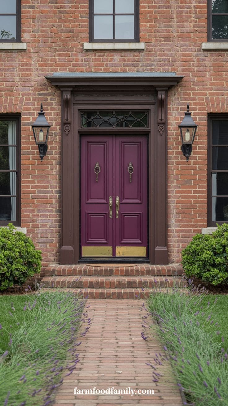
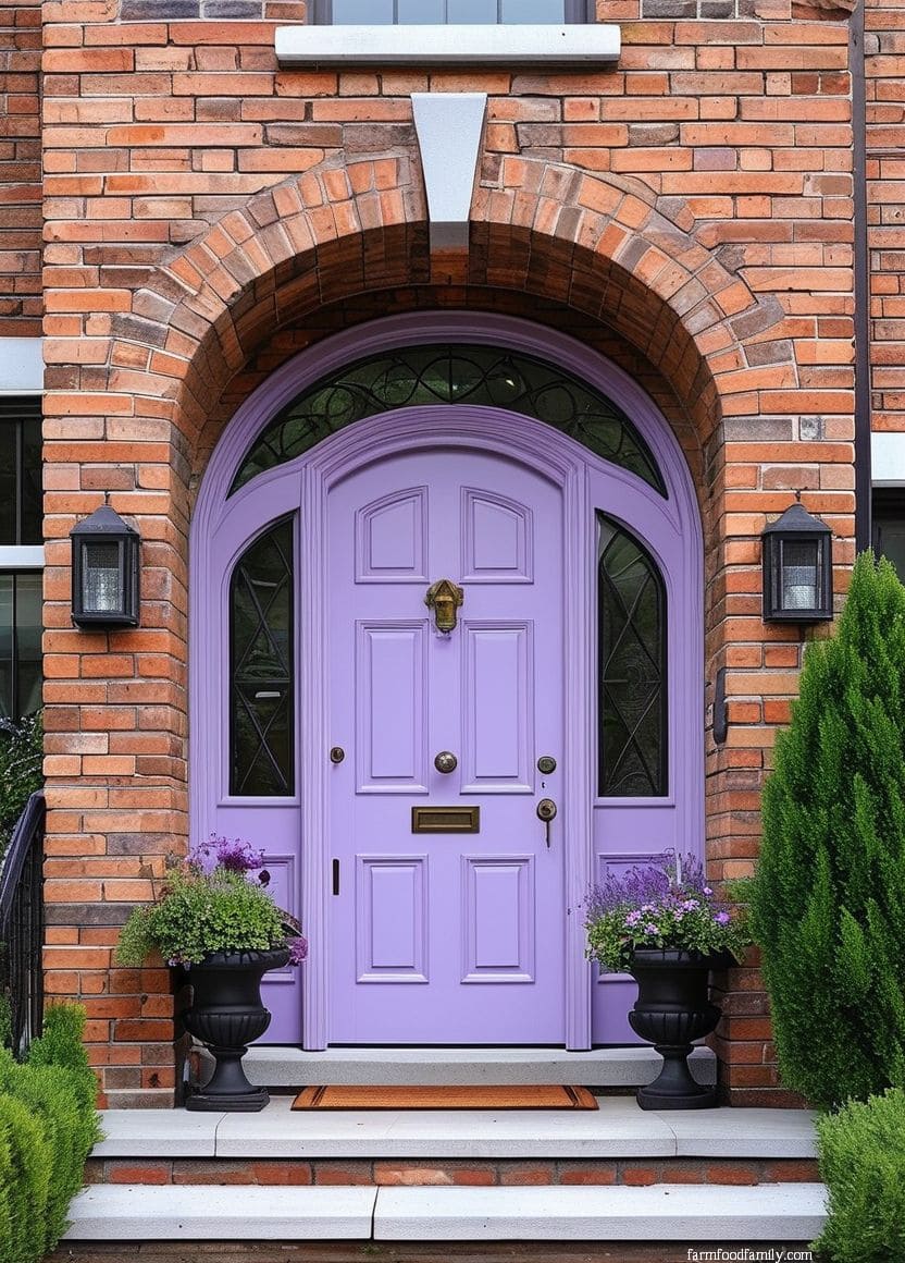
Purple, especially a deep plum or aubergine, gives brick a formal, slightly unexpected accent color.
On gray brick specifically, Wadden’s advice to bring in “brighter undertones like purple” applies directly, a purple door is one of the more literal ways to answer that recommendation.
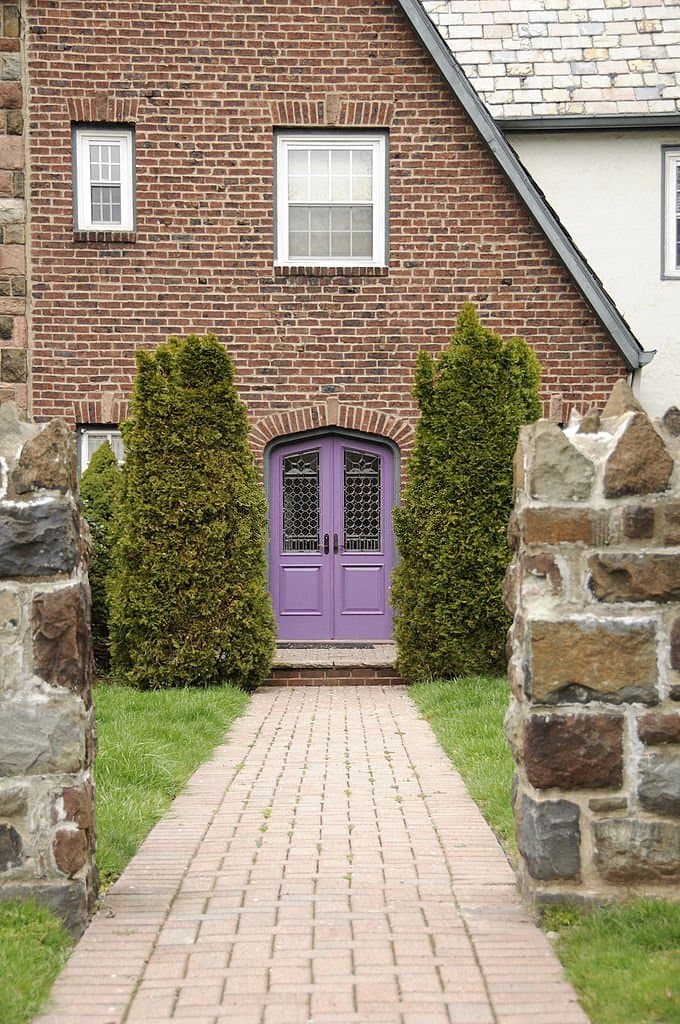
A purple front door adds an unexpected yet classy touch to a brick frontage.
This somber tone contrasts beautifully with red or gray brick, resulting in an elegant, slightly mysterious, and artistically bold doorway.
Purple represents innovation, luxury, and originality, making it ideal for homeowners who value fine details and want their home to be both distinctive and graceful.
This color looks great with old homes and garden-heavy settings.
A plum door evokes mystery while keeping a warm, welcoming presence, making it ideal for expressing refinement with a touch of whimsy on a solid brick basis.
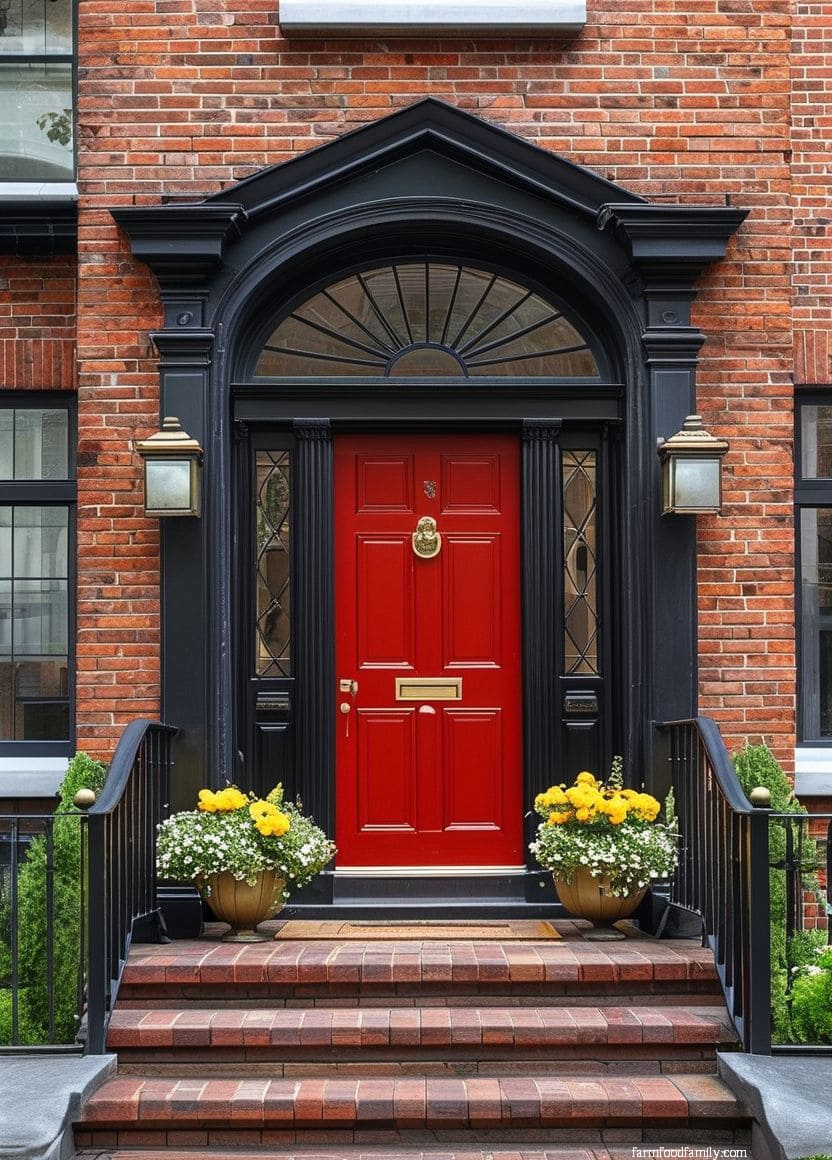
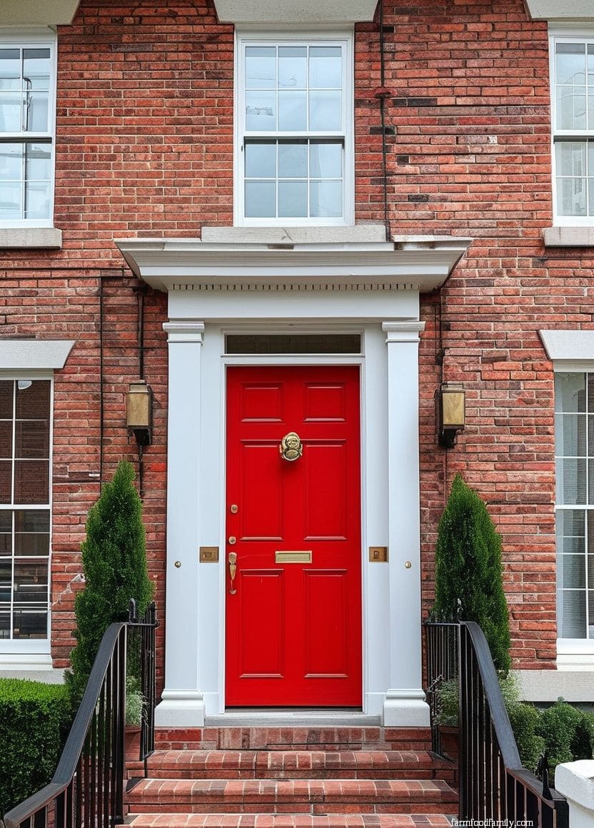
16. Red
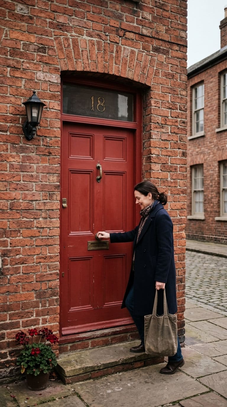
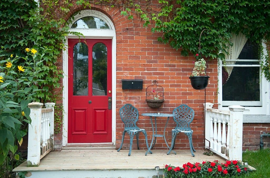
A red door on brick that’s already red-toned is a bold, monochromatic move, and one of the harder colors to get right precisely because it demands the closest possible undertone match.
Get it right and it reads as a deliberate design choice; get it slightly off and it reads as competing with the house instead of matching it.
17. Teal
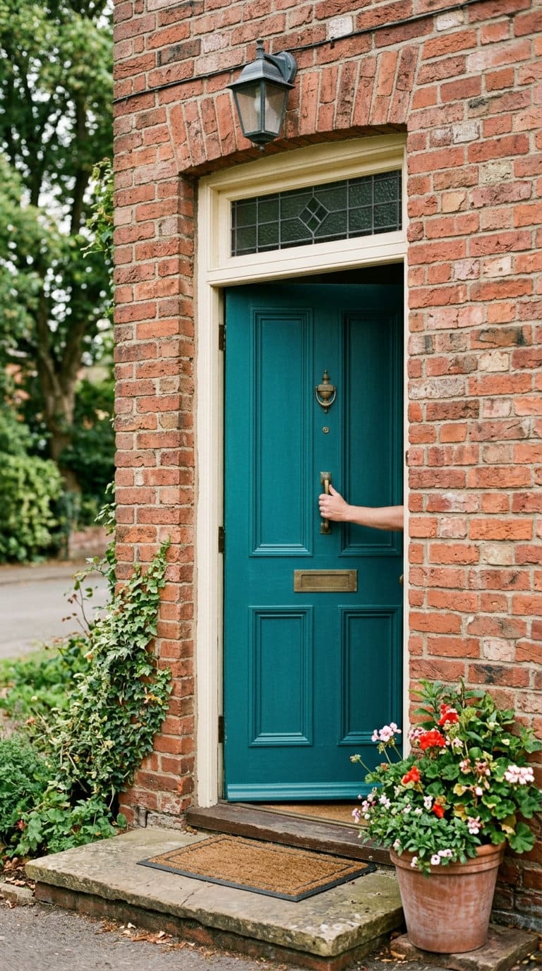
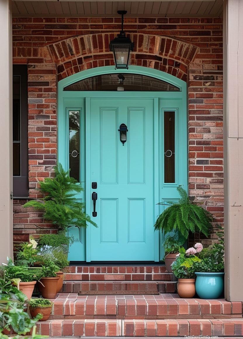
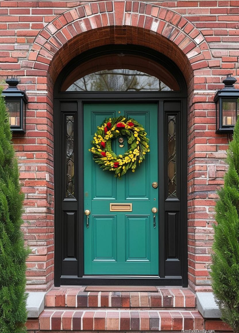
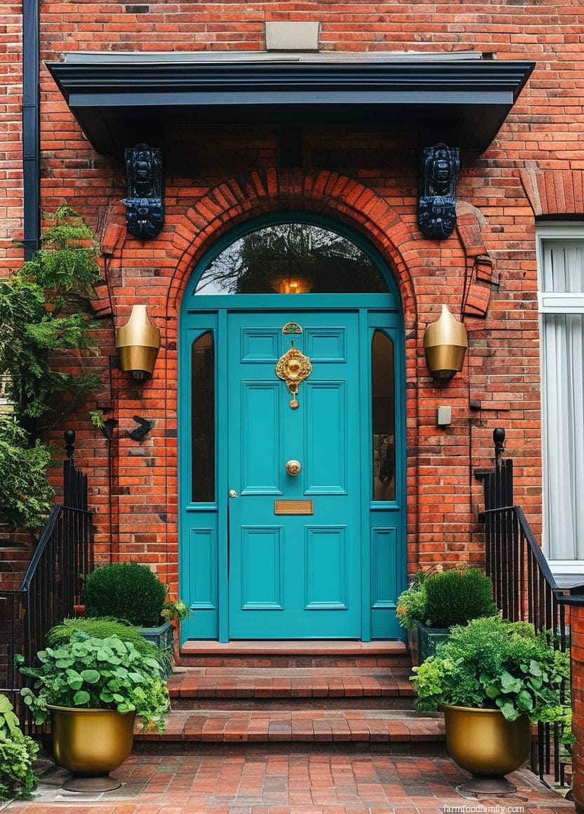
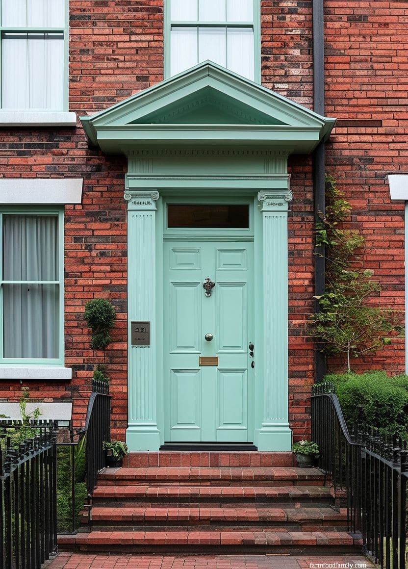
Teal splits the difference between blue’s contrast-friendly cool tone and green’s more casual warmth. It works particularly well as a contrast color against orange or red-toned brick, similar logic to the blue entry in section 4, just with a slightly more saturated, jewel-toned effect.
18. White
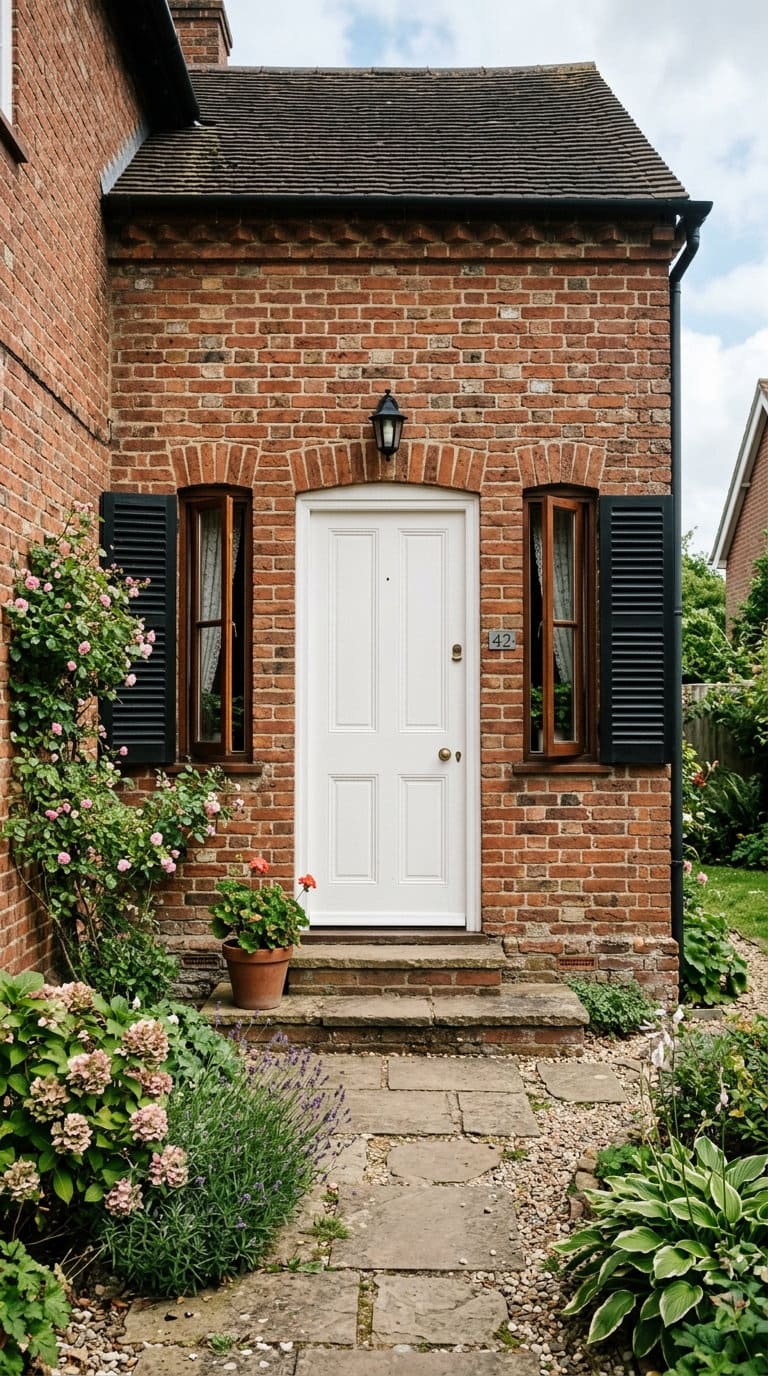
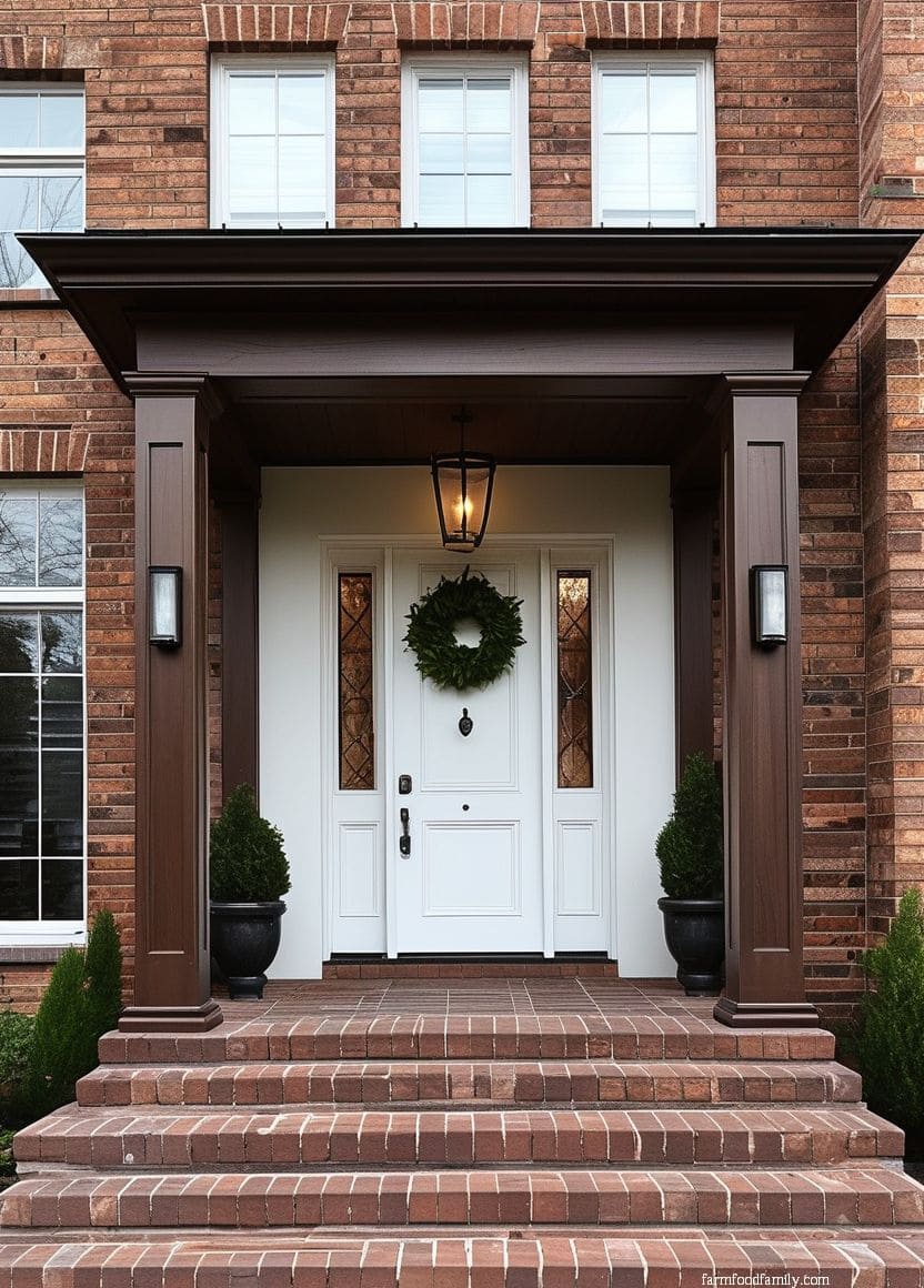
White is nearly as flexible as black but reads lighter, more coastal or farmhouse than formal. It works especially well paired with black shutters or trim, since the white door then anchors a clear light-dark contrast against the brick rather than getting lost in it.
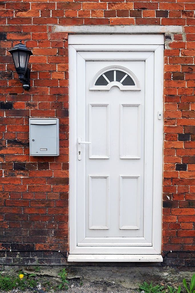
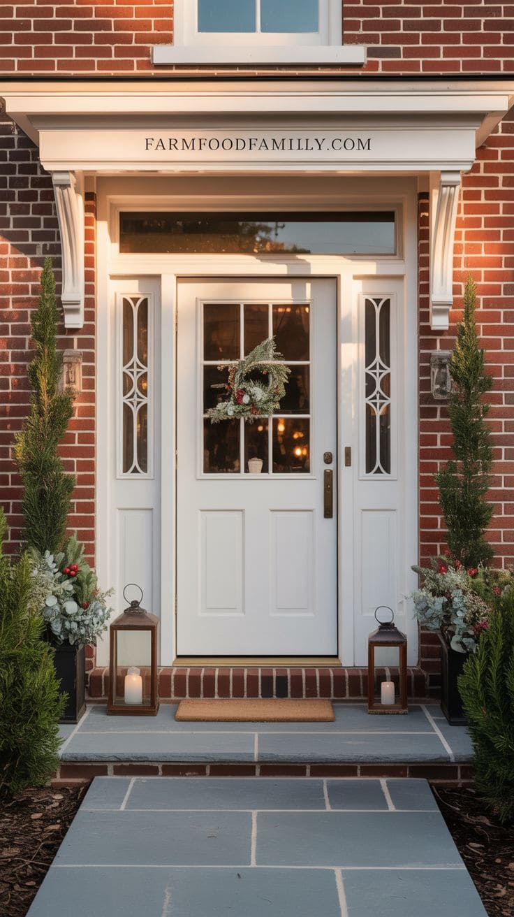
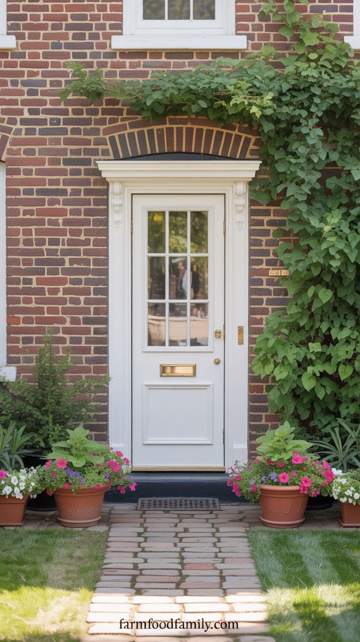
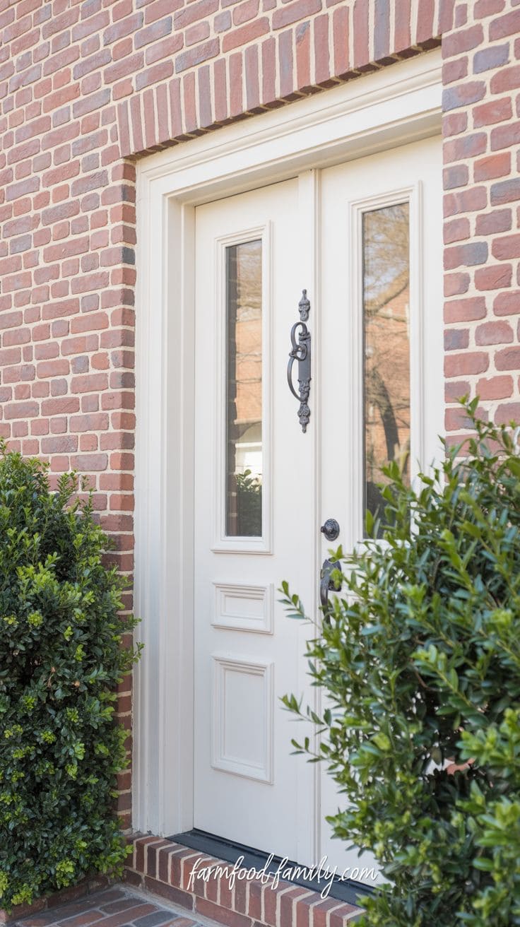
A white front door on a brick house creates a clean, classic, and bright look that brightens the exterior and improves architectural harmony.
It looks great with red or dark brown brick, especially on homes that already have white trim and details.
A white door exudes a sense of freshness and approachability, serving as a visual anchor that highlights form and proportion.
It reflects light effectively, making the entrance appear open and welcoming.
Seasonal decorations stand out against its blank canvas, making it great for people who like to change their decor throughout the year.
This option appeals to homeowners who value timeless charm, purity, and a bright, inviting entrance that never goes out of style.
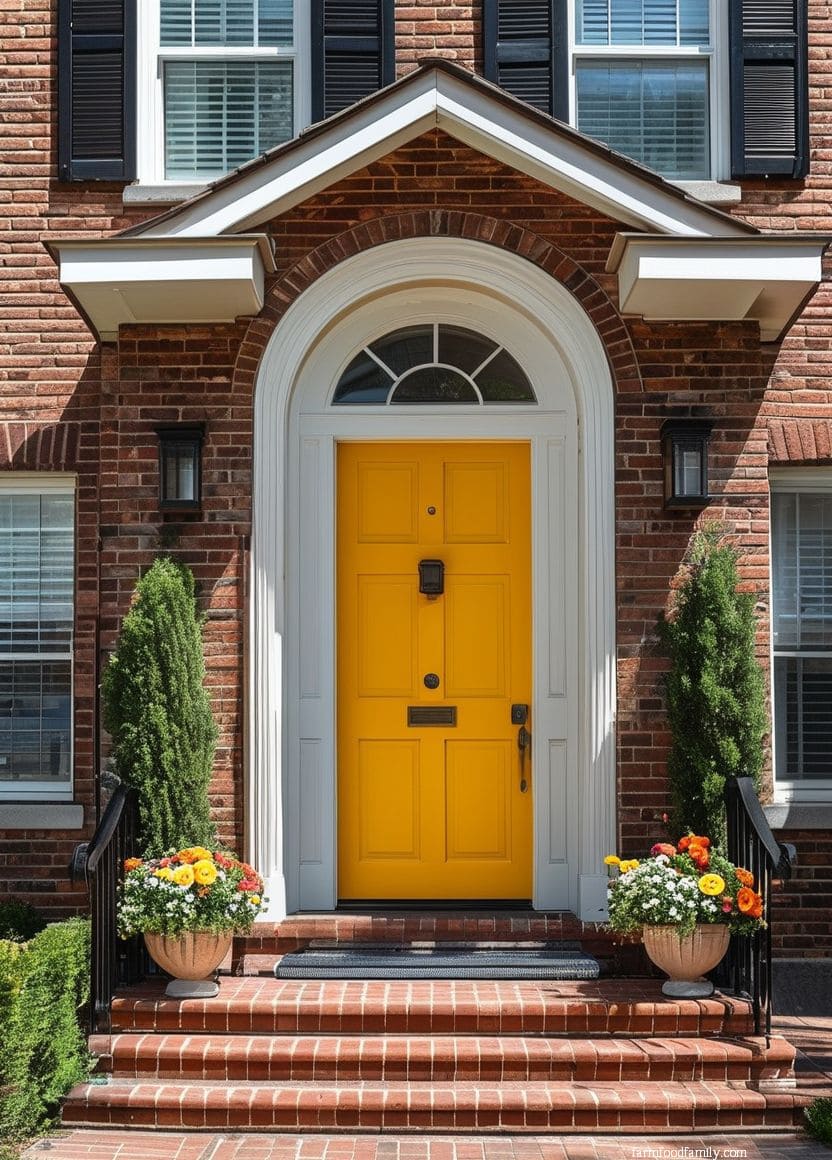
19. Sunshine Yellow
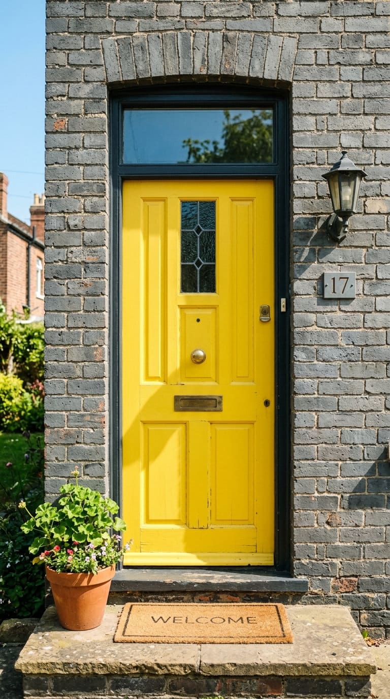
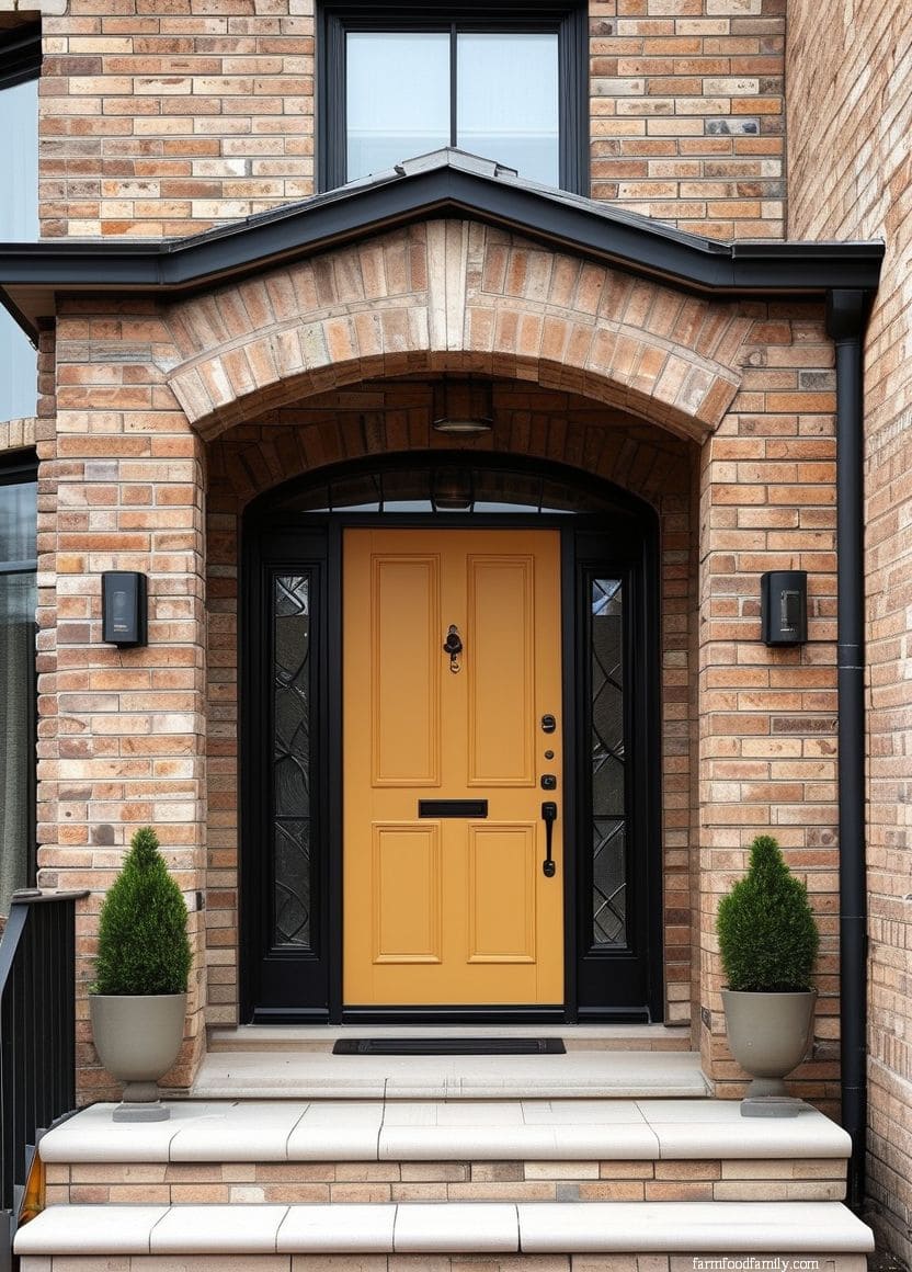
A bright yellow door is the highest-commitment, highest-personality choice on this list, cheerful, distinctive, and genuinely divisive in the best way.
It reads best against gray or white-painted brick, where there’s enough neutral backdrop for the yellow to feel intentional rather than fighting a competing warm undertone.

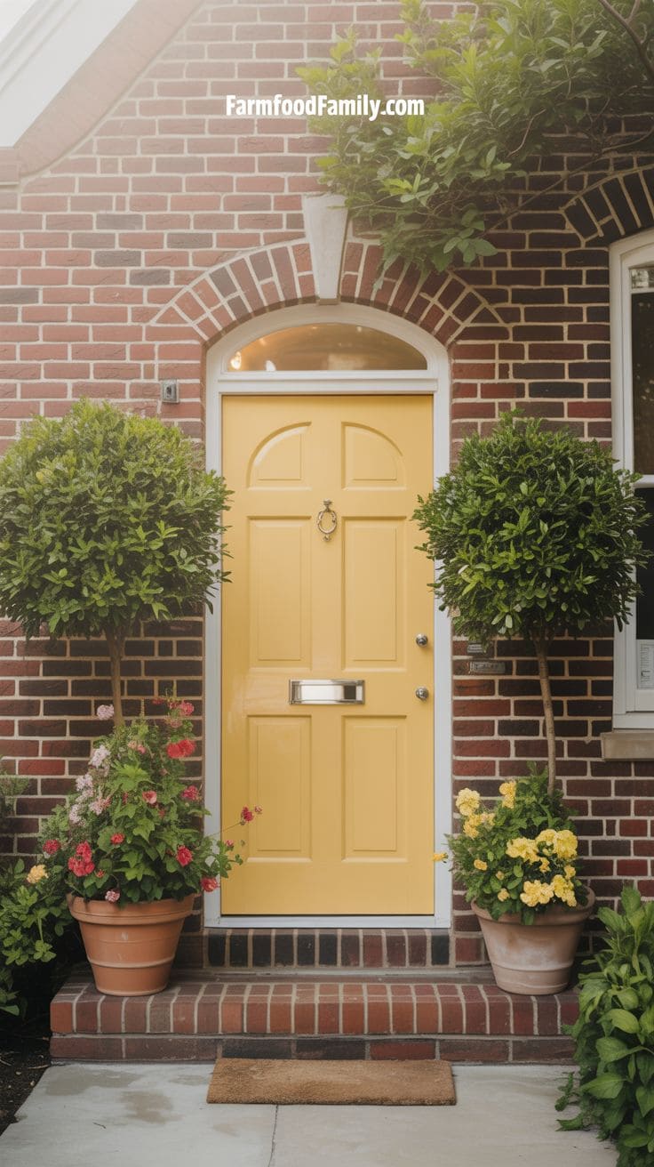
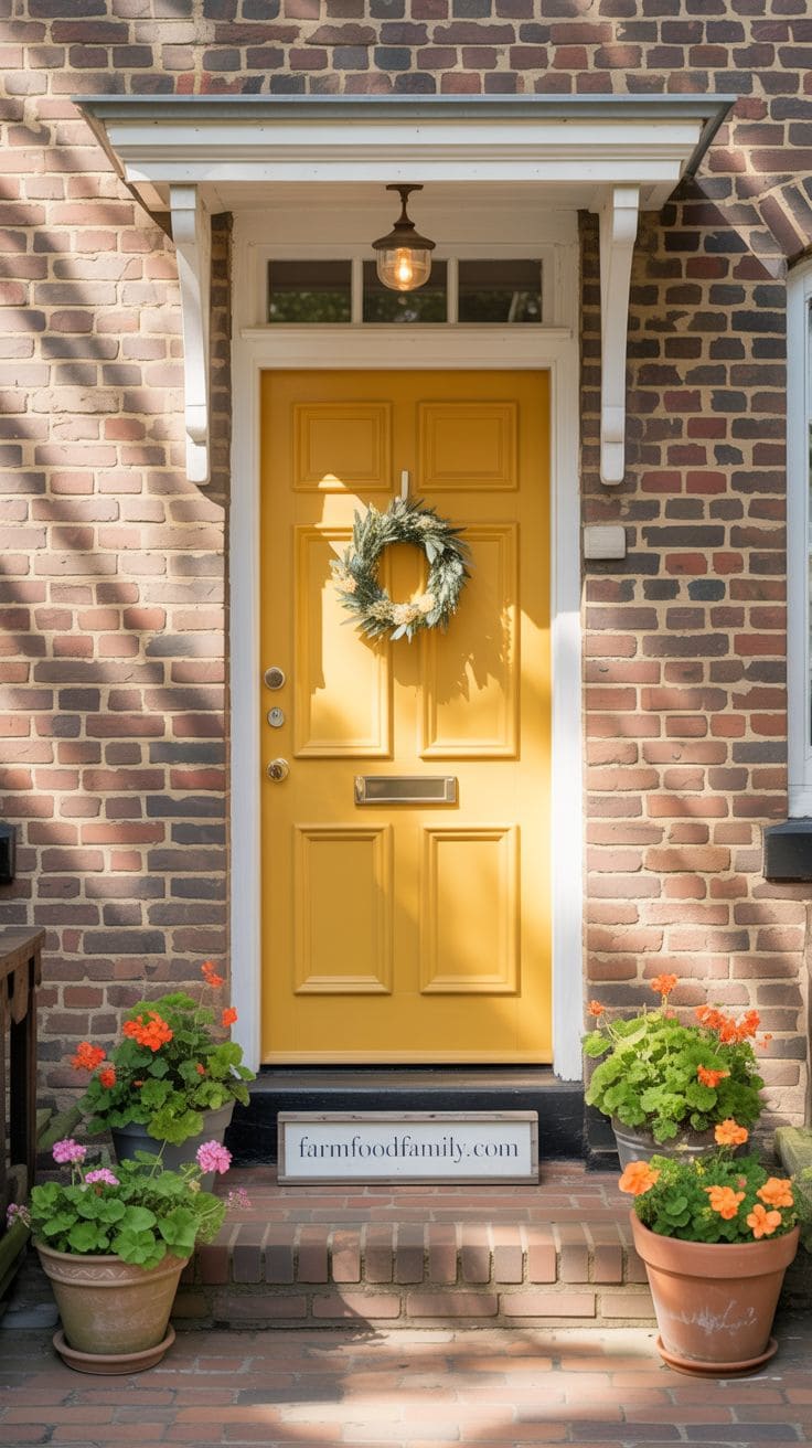
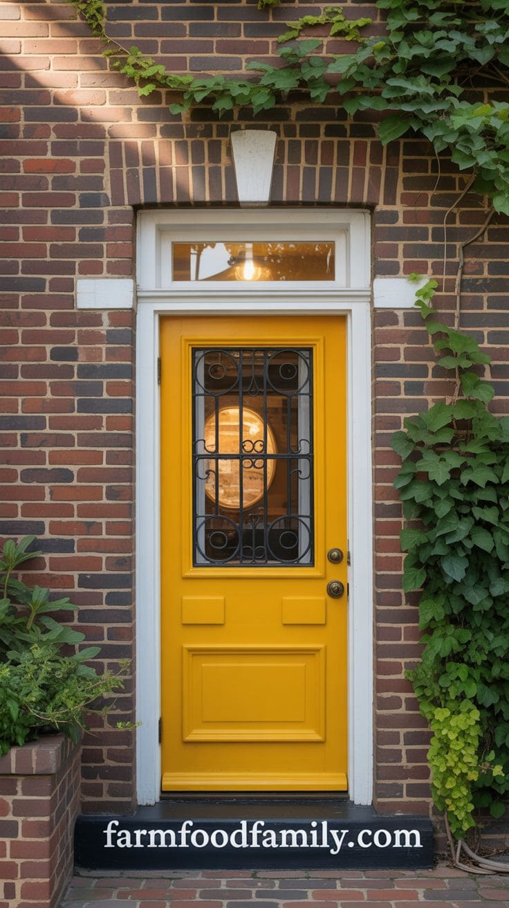
A yellow front door on a brick house exudes happiness, creativity, and pleasant hospitality.
The bright yellow contrasts with conventional red or brown bricks, giving the entrance a humorous character.
It’s great for homeowners looking to show their positivity and originality without going crazy.
To contrast the rich texture of the brick, choose a somewhat subdued mustard or sunflower tone and combine it with white or charcoal gray trim.
This color looks great with English cottage or bungalow-style homes and may be dressed up with potted flowers or bright seasonal decorations.
A yellow door represents creative energy and a welcome environment for everyone who passes by.
Best front door colors for orange brick houses.
Best front door colors for white brick houses.
Best front door colors for yellow brick houses.
Best front door colors for pink brick houses.
Best front door colors for gray brick houses.
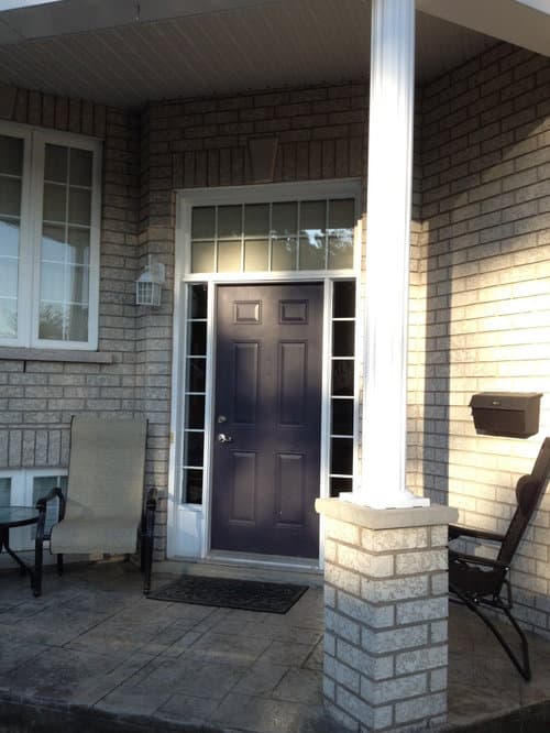
Best front door colors for dark brick houses.
A few more things worth planning around
If your brick leans a specific direction not fully covered here, front door colors for a blue house, front door colors for a tan house, and front door colors for gray houses cover the same undertone-matching logic for non-brick siding, useful if part of your home combines brick with another material. And if the meaning behind a color choice matters to you beyond the visual pairing, what a red front door means goes into the symbolism side of the decision.
FAQ
How do I know what undertone my brick actually is?
Look at your brick in natural daylight, not under artificial porch lighting, which can shift how a color reads. Hold a few paint swatches up against it: if warm tones (orange, red, yellow) make the brick look more vivid and cohesive, you likely have warm-toned brick; if cooler swatches (blue-gray, true gray) look more natural against it, your brick leans cooler than the classic “red brick” assumption most people start with.
Does front door color affect home resale value?
It can factor into curb appeal, which real estate agents like David Batty do consider part of a home’s first impression to buyers. That said, the underlying condition of the brick, trim, and entryway matters more than the specific color chosen, a well-matched, well-maintained door in nearly any of the colors above will read as more put-together than a poorly maintained door in a theoretically “perfect” color.
What door colors clash with brick?
The most common mismatch is a cool-toned door (icy gray, stark cool blue) against warm orange or red brick, the two undertones fight each other instead of complementing. The reverse also happens: an overly warm, orange-leaning door on cooler gray brick can look muddy rather than coordinated. Sue Wadden’s undertone-matching approach in section 1 above is the most reliable way to avoid both directions of clash.
Conclusion
The front door serves as both a focal point and a complement to the timeless texture and warmth of brick, so it’s important to consider the brick’s undertones, the surrounding trim, and the overall architectural style.
With the right choice, your front door becomes a statement of style and a welcoming invitation that completes your home’s unique expression.
If these ideas helped you out, leave a comment below and share the article with friends.
Never miss an update — choose FarmFoodFamily as your preferred source on Google.
How it works: Tap the button below to open Google's settings page, then check the box next to FarmFoodFamily.
Tap the checkbox to turn it blue — that's how you know it's set.