15 Timeless Cabinet Colors for White Tile Floors (And How to Paint Them So They Last)
White tile floors work with almost any cabinet color, as long as you skip neon-bright shades, add some warmth or contrast, and prep the doors so the paint doesn’t chip.

Never miss an update — choose FarmFoodFamily as your preferred source on Google.
How it works: Tap the button below to open Google's settings page, then check the box next to FarmFoodFamily.
Tap the checkbox to turn it blue — that's how you know it's set.
White tile floors work with almost any cabinet color, as long as you skip neon-bright shades, add some warmth or contrast, and prep the doors so the paint doesn't chip.
Products We Recommend
This post contains affiliate links. We may earn a commission on qualifying purchases at no extra cost to you.

homdiy 25 Pack Brushed Nickel Cabinet Pulls, 3 Inch
Our top pick. Enough pulls for a full kitchen. The finish works with almost every color here, and it has the most reviews in this guide.
Shop Now
Goldenwarm 10 Pack Matte Black Cabinet Pulls, 5 Inch
The crisp pick. Simple bar pulls that sharpen soft colors like sage, greige and dusty blue.
Shop Now
Nuvo Antique White Cabinet Makeover Kit
The paint pick. A kit in soft warm white, the safest color for white tile.
Shop NowWarm white, greige, natural wood, sage, navy and charcoal are the safest cabinet colors for white tile floors. White is a blank base, so the cabinet color sets the mood of the kitchen.
Pick a soft, muted shade, not a bright one. Designer Erika Dale warns that white tile can make loud colors look neon. A bit of gray in the paint keeps it calm.
Want an all-white kitchen? Add warmth so it doesn’t feel cold. Wood, cream or a stone with soft veins all help.
Paint needs prep to last. Clean off the grease, prime, and use a paint made for cabinets. Then let it cure for a few weeks before heavy use.
Each of these 15 colors comes with steps and a product we checked. Pick one, test it, and get going.
Why Do White Tile Floors Change How Cabinets Look?
White tile bounces light up onto the doors. So colors look brighter and bolder than on a paint chip.
Erika Dale runs her own design firm. She told House Digest that her top pick is contrast with the white tile.
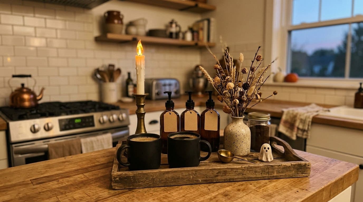


She likes mid-tone or dark doors for drama. For a soft look, she likes light woods and pastels.
She also warns against shades that are too bright. White makes them look neon. So hot pink, bright red and lime green are the risky ones.
| Approach | Cabinet colors | How the kitchen feels |
|---|---|---|
| Contrast | Navy, forest green, charcoal, black, walnut | Dramatic, elegant |
| Soft and airy | Warm white, greige, light wood, dusty blue | Bright, calm |
| Earthy | Sage, taupe, muted terracotta, medium wood | Warm, organic |
How Does Your Kitchen’s Light Change the Color?
Light matters more than most people think. Helen Shaw leads color marketing at Benjamin Moore. She told Homes and Gardens that daylight changes paint more than anything else.
The same piece quotes Ruth Mottershead of Little Greene. She says north light makes colors look flat and cool. South light is the warmest, so colors look more yellow.
Here’s how we’d use that:
- Paint a large sample card, at least the size of a sheet of paper.
- Tape it to a cabinet door, right above the white tile.
- Look at it in the morning, at noon and at night under your own bulbs.
- In a north-facing kitchen, lean toward warmer colors. In a south-facing one, cooler blues and greens stay true.
How Do You Paint Cabinets So They Last?
A fresh color looks great for a week. Then poor prep shows up as chips by the sink.
Karl Kardel is a contractor quoted in Apartment Therapy. He says to always clean off grease before you sand. He primes, then rolls on two coats with a light sand between.
He never trusts one coat. And he notes the doors dry to the touch in 24 hours but need 15 to 20 days to cure.
Our top pick. Enough pulls for a full kitchen. The finish works with almost every color here, and it has the most reviews in this guide.
Shop NowThis post contains affiliate links. We may earn a commission on qualifying purchases at no extra cost to you.
Our order of work:
- Take off the doors and pulls. Mark each door and hinge with tape.
- Clean off all grease. Grease is the top reason paint peels.
- Sand lightly to dull the shine, then wipe off the dust.
- Prime, then paint two thin coats with a light sand between.
- Hang the doors back and treat them gently for about three weeks.
Older homes: if your home was built before 1978, the old paint may have lead in it. The EPA says pros who disturb paint in those homes must be certified. Test before you sand.
1. Warm White Cabinets
Warm white is the safest pick. It feels clean but not cold. Dale says an all-white look needs some warmth, or it feels too plain.
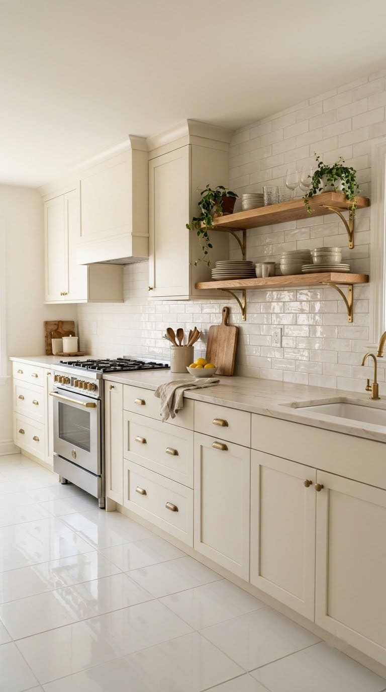
- Pick a white with a cream base, not a blue-white.
- Add a wood shelf, cutting boards or a wood counter for warmth.
- Use brass or bronze pulls.
- Pick a backsplash with cream or gray veining.
Best for: small kitchens and dark rooms.
Watch out: stark white on white tile can feel like a hospital.
👉 Shop the look: See the Nuvo Antique White paint kit on Amazon. A kit with a soft warm white. No separate primer needed.
2. Greige Cabinets
Greige is a mix of gray and beige. It.s calm and hides prints better than white. It looks soft against white tile.
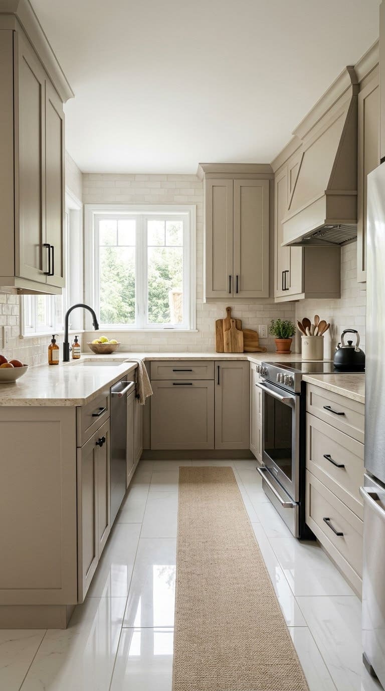
- Pick a greige with a warm base so it doesn’t look muddy.
- Pair with white or cream counters.
- Add black or bronze pulls for definition.
- Use warm bulbs to keep it cozy.
Best for: busy family kitchens.
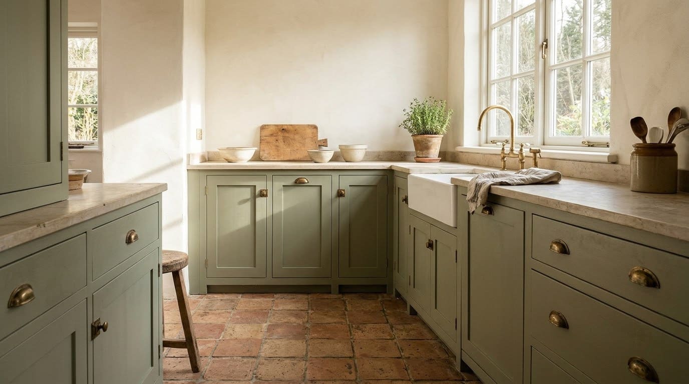

Watch out: greige can look flat in a north-facing kitchen. Sample first.
👉 Shop the look: See Heirloom Traditions All-in-One paint in Putty on Amazon. A soft greige quart. The top coat is built in.
3. Light Natural Wood Cabinets
Light wood brings warmth without darkness. Dale names birch and pine for simple, farmhouse and modern rooms. It’s the easiest way to warm up white tile.
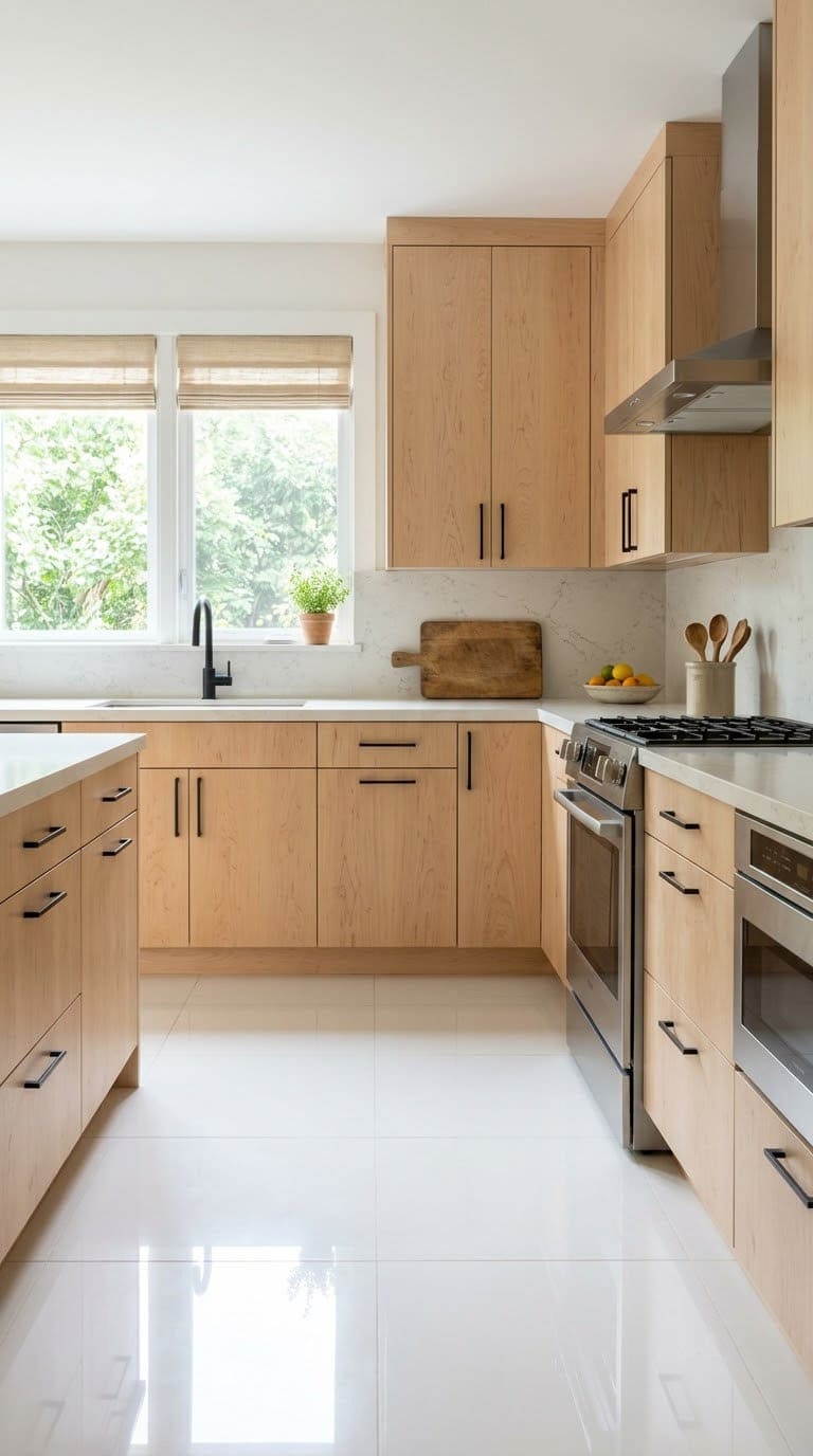
- Use real wood doors or a light gel stain on existing wood.
- Keep the grain visible. That texture is the point.
- Add matte black or brass pulls.
- Keep counters light.
Best for: Nordic, Japandi and farmhouse kitchens.
Watch out: orange-toned oak can look dated. Pick a soft, natural tone.
👉 Shop the look: See General Finishes gel stain in American Oak on Amazon. A gel stain that sits on top. Good for fresh wood doors.
4. Warm Walnut Wood Cabinets
Walnut adds richness. Dale likes a dark or medium wood stain for a warm, natural look. Against white tile, it looks high-end.
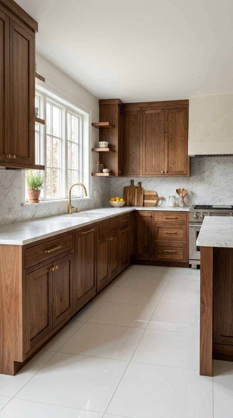
- Use a gel stain if you’re darkening existing wood.
- Test it on the back of a door first.
- Add brass pulls.
- Use white or marble counters for contrast.
Best for: mid-century and modern kitchens.
Watch out: all-dark wood can feel heavy in a small kitchen. Try it on lowers only.
👉 Shop the look: See General Finishes gel stain in Antique Walnut on Amazon. A rich walnut stain in a quart, enough for a set of doors.
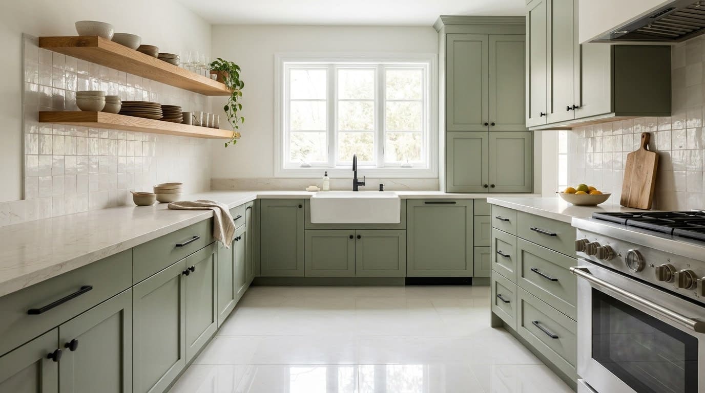
5. Sage Green Cabinets
Sage is calm and fresh. It has gray in it, which matches Dale’s tip to mute your colors. It looks great over white tile.
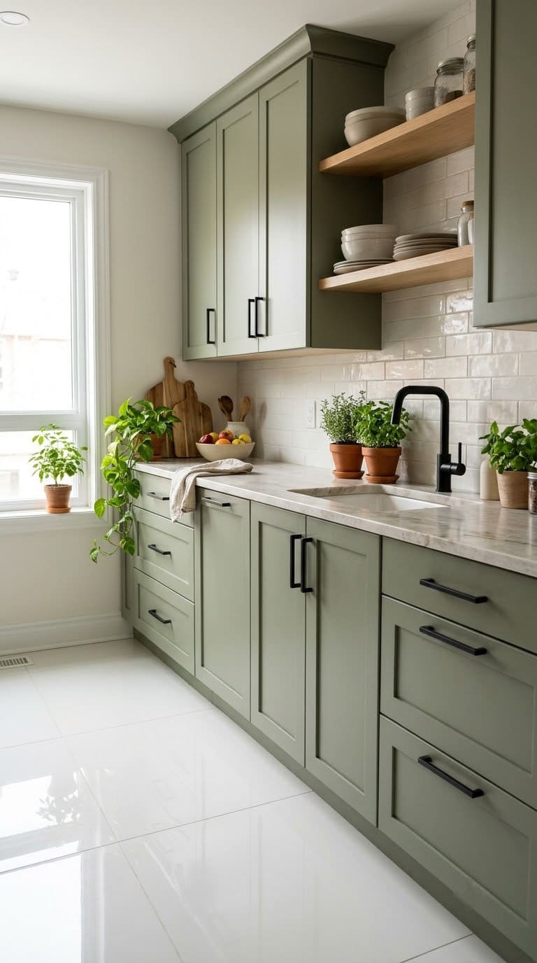
- Pick a sage with enough gray that it doesn’t look minty.
- Add matte black pulls for a crisp edge.
- Bring in wood and plants.
- Keep walls white or cream.
Best for: farmhouse and cottage kitchens.
Watch out: in north light, sage can look gray. Sample first.
👉 Shop the look: See these matte black 5 inch pulls on Amazon. A 10-pack of simple bar pulls that look sharp on sage.
6. Forest Green Cabinets
Deep green adds drama. Dale says mid to deep greens fit both old-style and modern rooms. It looks rich against white tile.
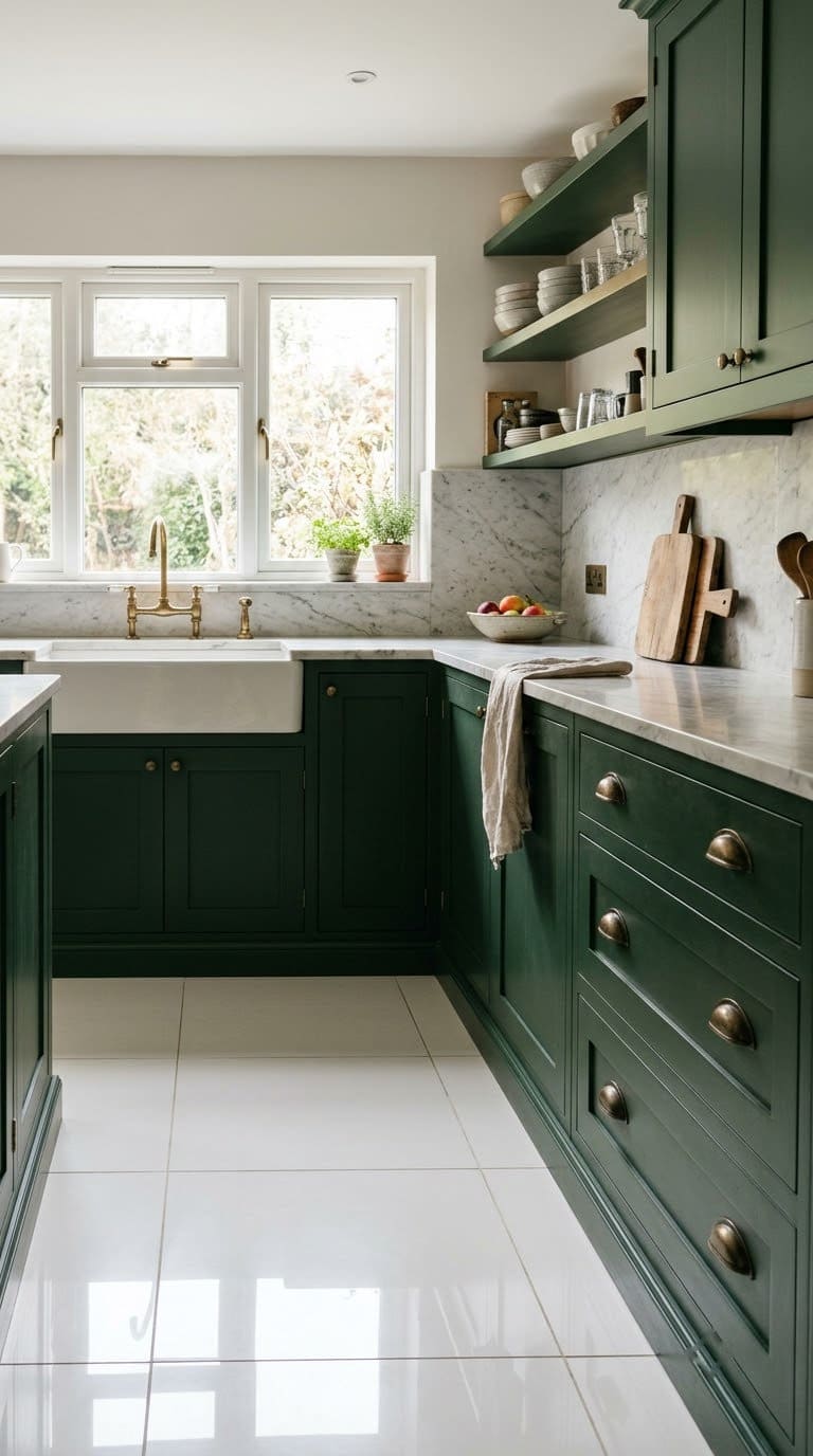
- Pick a deep, muted green, not an emerald.
- Add antique brass cup pulls for a classic look.
- Use marble or white quartz counters.
- Add warm lighting.
Best for: traditional and English-style kitchens.
Watch out: dark green shows dust and chips more. Use a durable enamel.
👉 Shop the look: See these antique brass cup pulls on Amazon. A 10-pack of bin pulls that look made for green cabinets.
7. Navy Blue Cabinets
Navy is a classic. It acts like a neutral but has depth. Against white tile, it looks crisp and fresh.
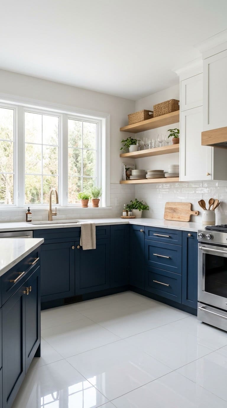
- Pick a navy with a hint of gray.
- Add champagne bronze or brass pulls.
- Keep upper doors or shelves light.
- Use white counters.
Best for: coastal and classic kitchens.
Watch out: navy can feel dark in small rooms. Try lowers only.
👉 Shop the look: See these champagne bronze pulls on Amazon. Soft gold handles from Franklin Brass that glow against navy.
8. Dusty French Blue Cabinets
Dusty blue is soft and airy. It.s lighter than navy and feels calm. With white tile, it looks fresh and gentle.
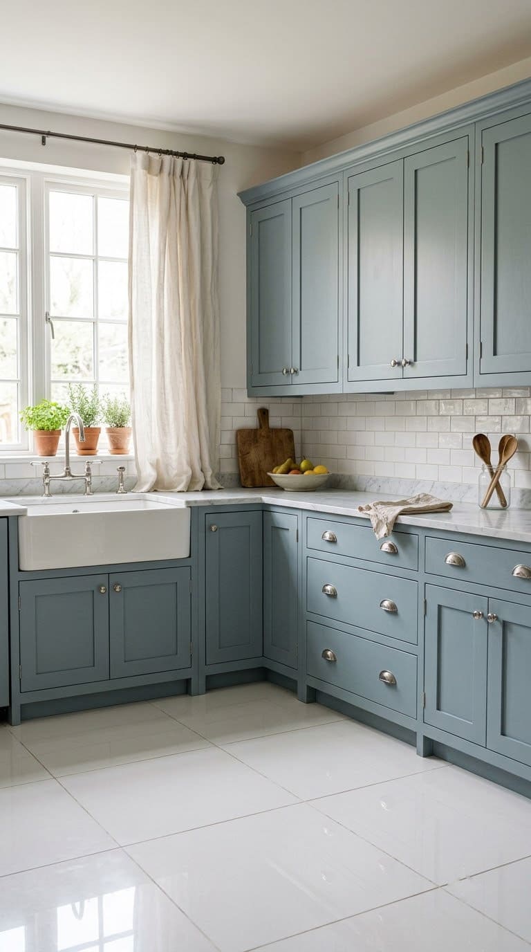
- Pick a blue with gray in it, not a baby blue.
- Add polished nickel pulls for a soft shine.
- Use white or light wood counters.
- Add a striped runner or linen curtain.
Best for: French country and cottage kitchens.
Watch out: bright blue turns cartoonish over white tile.
👉 Shop the look: See these polished nickel pulls on Amazon. A 10-pack of 5 inch handles with a soft silver shine.
9. Muted Teal Cabinets
Teal sits between blue and green. A soft teal is bold but calm. It pops nicely against white tile.
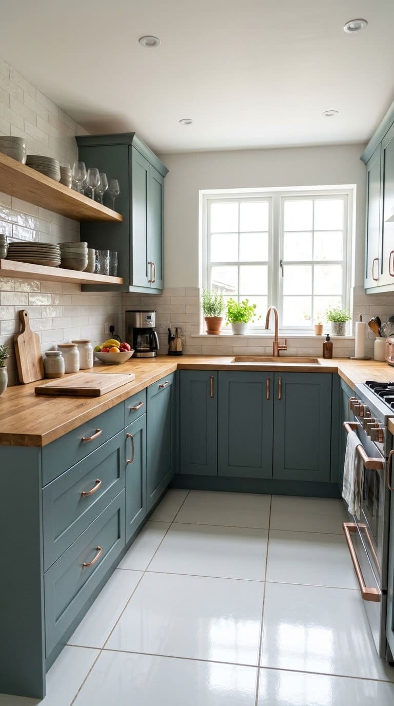
- Pick a teal with gray in it.
- Add copper pulls for a warm contrast.
- Use white or wood counters.
- Keep other colors simple.
Best for: eclectic and boho kitchens.
Watch out: bright teal can look neon over white tile.
👉 Shop the look: See these brushed copper pulls on Amazon. Warm copper pulls. They make teal glow.
10. Charcoal Gray Cabinets
Charcoal is moody and sleek. It.s softer than black but still bold. With white tile, it looks sharp.
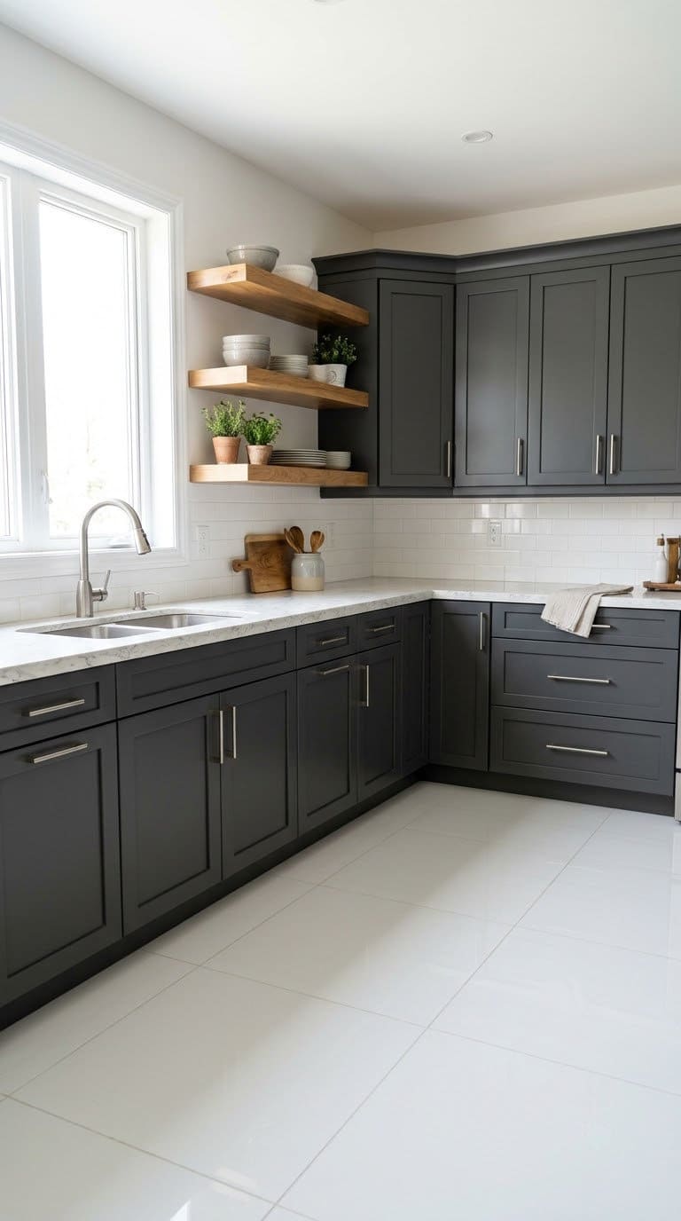
- Pick a charcoal with a warm base.
- Add brushed nickel or brass pulls.
- Use white counters.
- Add wood for warmth.
Best for: modern and loft kitchens.
Watch out: cool charcoal can feel cold. Add wood or warm bulbs.
👉 Shop the look: See this 25-pack of brushed nickel pulls on Amazon. Enough for a full kitchen. Tens of thousands of buyers rate them well.
11. Matte Black Cabinets
Black is the boldest contrast against white tile. It looks dramatic and modern. Dale’s contrast approach shines here.
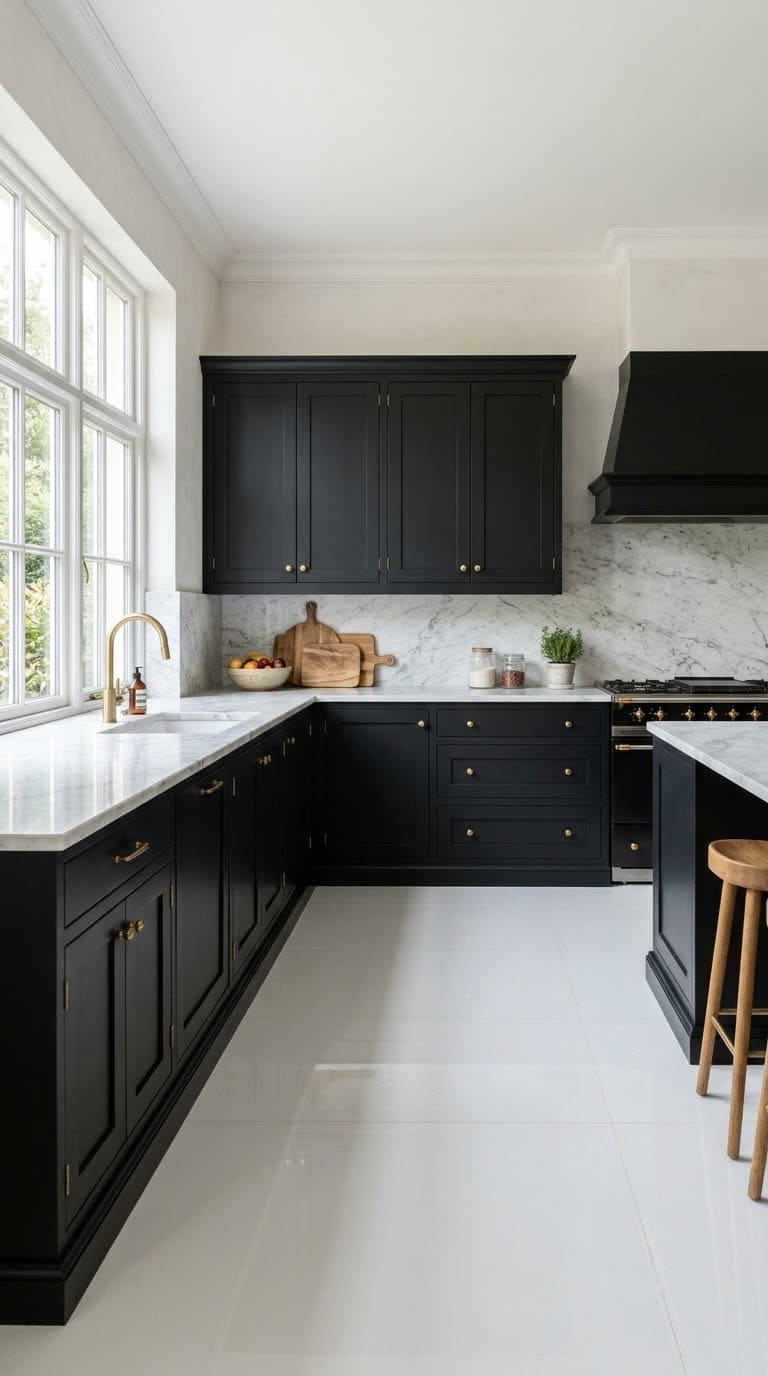
- Use a matte or satin finish to hide fingerprints.
- Add brushed brass knobs for warmth.
- Use white or marble counters.
- Keep the walls light.
Best for: modern and loft kitchens.
Watch out: black shows dust and water spots. Wipe it often.
👉 Shop the look: See these brushed brass knobs on Amazon. A 10-pack of gold knobs that warm up black doors.
12. Mushroom Taupe Cabinets
Taupe is a warm, earthy neutral. It’s softer than gray and warmer than white. It suits the earthy look Dale likes.
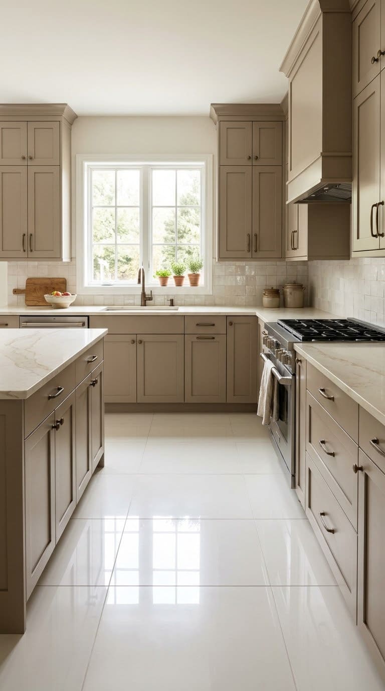
- Pick a taupe with a warm base.
- Add bronze or black pulls.
- Use cream counters.
- Add plants and wood.
Best for: organic and classic kitchens.
Watch out: taupe can look muddy in low light. Sample first.
👉 Shop the look: See the Nuvo Driftwood paint kit on Amazon. A warm taupe-gray kit with everything for one kitchen.
13. Muted Terracotta Cabinets
Terracotta brings warmth and a sunny, old-world feel. Keep it soft. Dale warns that strong reds and oranges go neon over white tile.
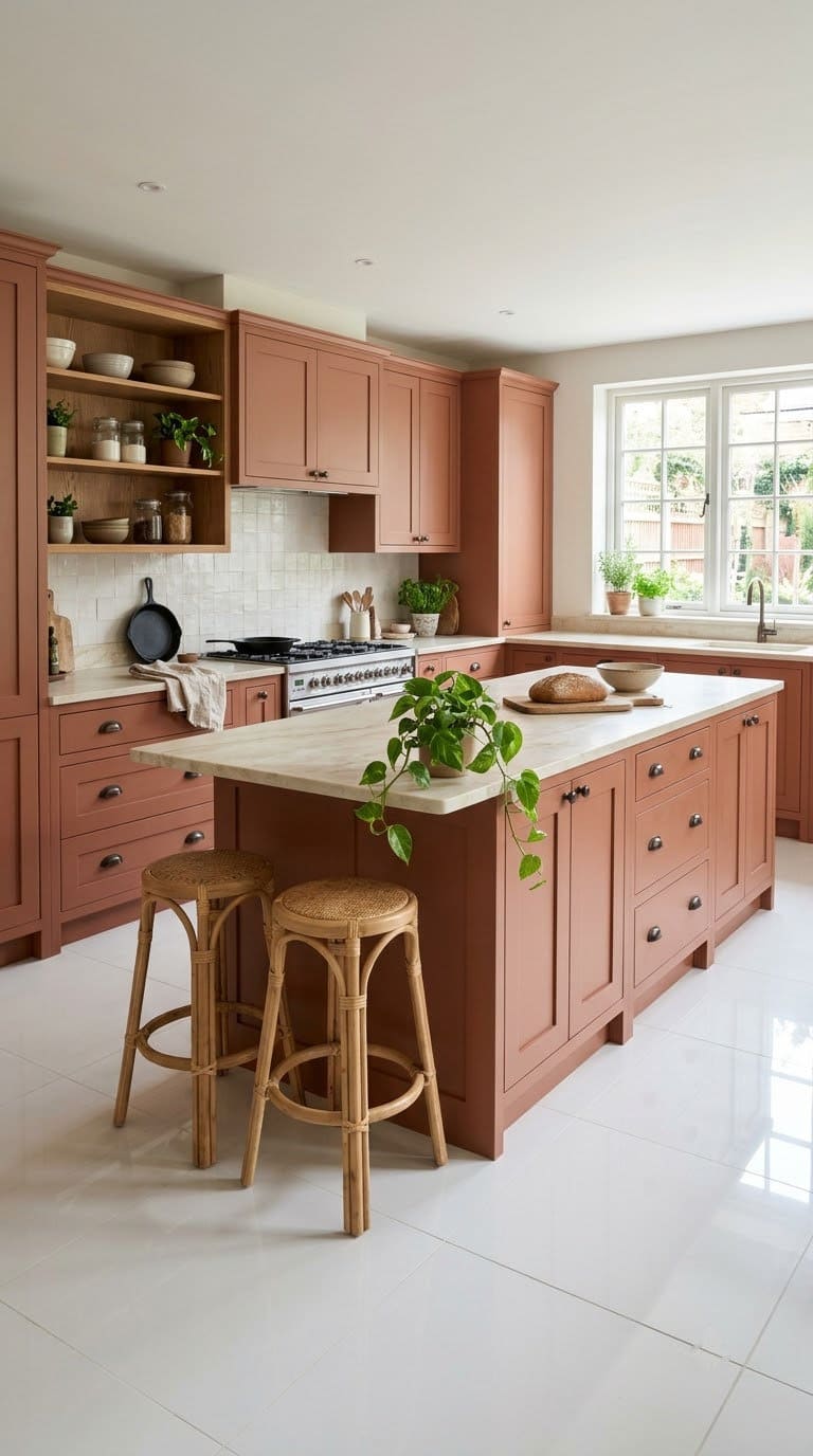
- Pick a dusty clay or rust, not a bright orange.
- Add oil-rubbed bronze knobs.
- Use cream counters.
- Add green plants for balance.
Best for: Spanish, Spanish and boho kitchens.
Watch out: too much orange feels loud. Try an island only.
👉 Shop the look: See these oil-rubbed bronze knobs on Amazon. A dark bronze that grounds warm clay tones.
14. Dusty Pink Cabinets
Dusty pink is soft and playful. Dale lists pastels for light, airy looks, but warns against hot pink. A muted blush works best.
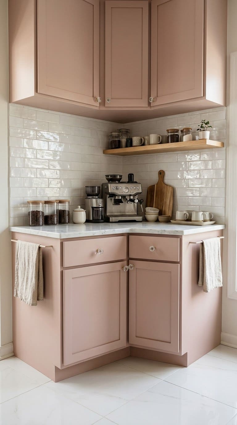
- Pick a pink with gray or beige in it.
- Add crystal or brass knobs.
- Use white counters.
- Keep other colors neutral.
Best for: small kitchens, coffee bars and retro rooms.
Watch out: bright pink turns neon over white tile.
👉 Shop the look: See these crystal glass knobs on Amazon. A 12-pack of glass knobs. They suit soft pink.
15. Two-Tone Cabinets
Two-tone puts a dark color low and a light one up top. It adds depth but keeps the room light. Against white tile, it looks balanced.
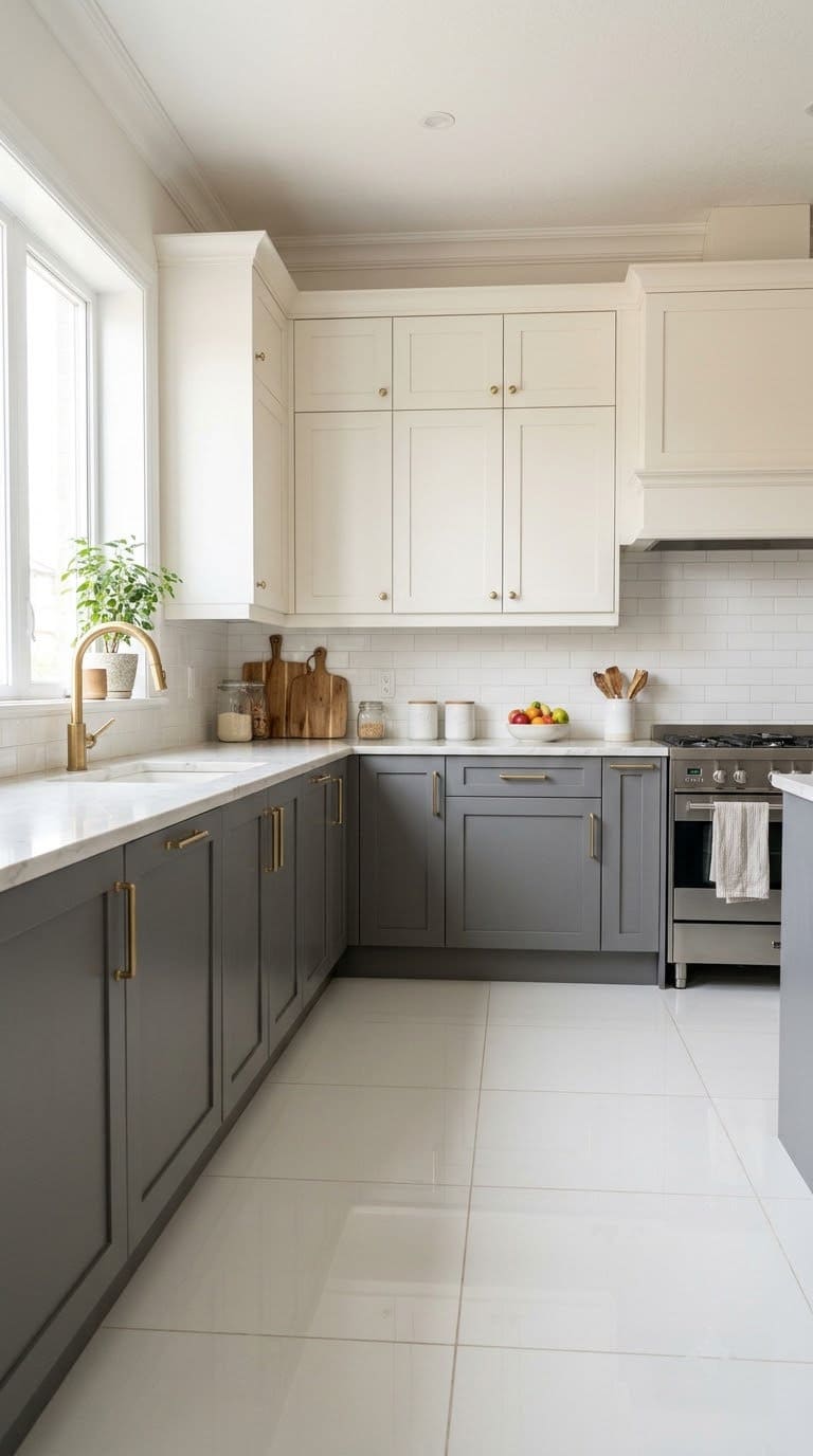
- Put the darker color on the lowers, near the tile.
- Keep the uppers light, like warm white.
- Use one metal finish across both.
- Repeat the dark color once more, like stools.
Best for: large kitchens and open plans.
Watch out: too many colors look busy. Stick to two.
👉 Shop the look: See the Nuvo Earl Grey paint kit on Amazon. A soft gray for the lowers, paired with idea 1’s white on the uppers.
Quick Look: Which Color Fits Your Kitchen?
| Color | Style | Mood | Best for |
|---|---|---|---|
| Warm white | Soft | Bright | Small rooms |
| Greige | Soft | Calm | Busy homes |
| Light wood | Soft | Warm | Nordic |
| Walnut | Bold | Rich | Retro |
| Sage | Earthy | Fresh | Farmhouse |
| Forest green | Bold | Classic | Old-style |
| Navy | Bold | Crisp | Beach homes |
| Dusty blue | Soft | Airy | Cottage |
| Muted teal | Bold | Lively | Boho |
| Charcoal | Bold | Moody | Modern |
| Matte black | Bold | Sharp | Loft |
| Taupe | Earthy | Warm | Classic |
| Terracotta | Earthy | Sunny | Spanish |
| Dusty pink | Soft | Playful | Coffee bars |
| Two-tone | Bold | Balanced | Large rooms |
How Do You Style the Rest of the Kitchen?
Pick one metal and repeat it. Brass, black or nickel all work. Mixing three looks messy.
Our guide to pulls and knobs goes deeper.
Keep the backsplash simple when the doors are bold. Dale says soft cream or gray veins add interest. See more backsplash ideas.
Like green or blue? Browse our sage green kitchens and blue kitchens.
Still picking a style? Start with the main types of cabinets.
Common Mistakes to Avoid
Picking a bright, saturated color. Dale warns that white tile pushes bold colors toward neon. Mute them with a little gray.
Going all white with no warmth. It can feel sterile. Add wood, cream or veined stone.
Skipping the grease clean. Kardel says to always clean off grease before you sand. Grease is the top reason paint peels.
Trusting one coat. He says never to believe one coat. Two thin coats last longer.
Using the kitchen too soon. Paint dries in a day but needs 15 to 20 days to cure, per Kardel.
Sanding old paint blind. In a home built before 1978, test for lead first.
Ignoring white tile upkeep. House Digest notes white tile shows stains easily. Seal the grout and wipe spills fast.
A Two-Weekend Cabinet Refresh
Here’s the order we’d follow.
Weekend 1, Saturday: Sample two or three colors on large cards. Check them at three times of day. Remove doors and label them.
Weekend 1, Sunday: Degrease, sand and prime everything.
Weekday evenings: Paint the first coat. Sand lightly once dry. Paint the second coat.
Weekend 2: Rehang doors and add new hardware. Then be gentle with the doors for about three weeks while the paint cures.
FAQ
What color cabinets go with white tile floors?
Warm white, greige, natural wood, sage, navy and charcoal are the safest picks. Choose muted shades over bright ones.
Should cabinets be lighter or darker than white tile?
Either works. Darker doors add drama. Lighter ones feel airy.
Dale’s top pick is contrast with the white tile.
What cabinet colors should I avoid with white tile?
Very bright colors like hot pink, red or lime green. White tile makes them look neon.
Do wood cabinets go with white tile?
Yes. Light woods like birch or pine feel airy. Medium or dark stains feel warm and rich.
How long does cabinet paint take to cure?
Kardel says cabinets dry to the touch in 24 hours but need 15 to 20 days to cure.
What pulls go with white tile and painted doors?
Brass and bronze warm up cool colors. Matte black sharpens soft ones. Pick one finish and repeat it.
Related Posts
- Cabinet Colors for Terracotta Floors
- What Color Kitchen Cabinets With Gray Floors
- Farmhouse Kitchen Cabinet Ideas
Never miss an update — choose FarmFoodFamily as your preferred source on Google.
How it works: Tap the button below to open Google's settings page, then check the box next to FarmFoodFamily.
Tap the checkbox to turn it blue — that's how you know it's set.