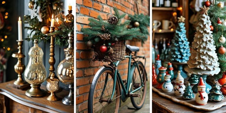
12 Red and Green Christmas Tree Ideas That Look Classic, Not Cliché
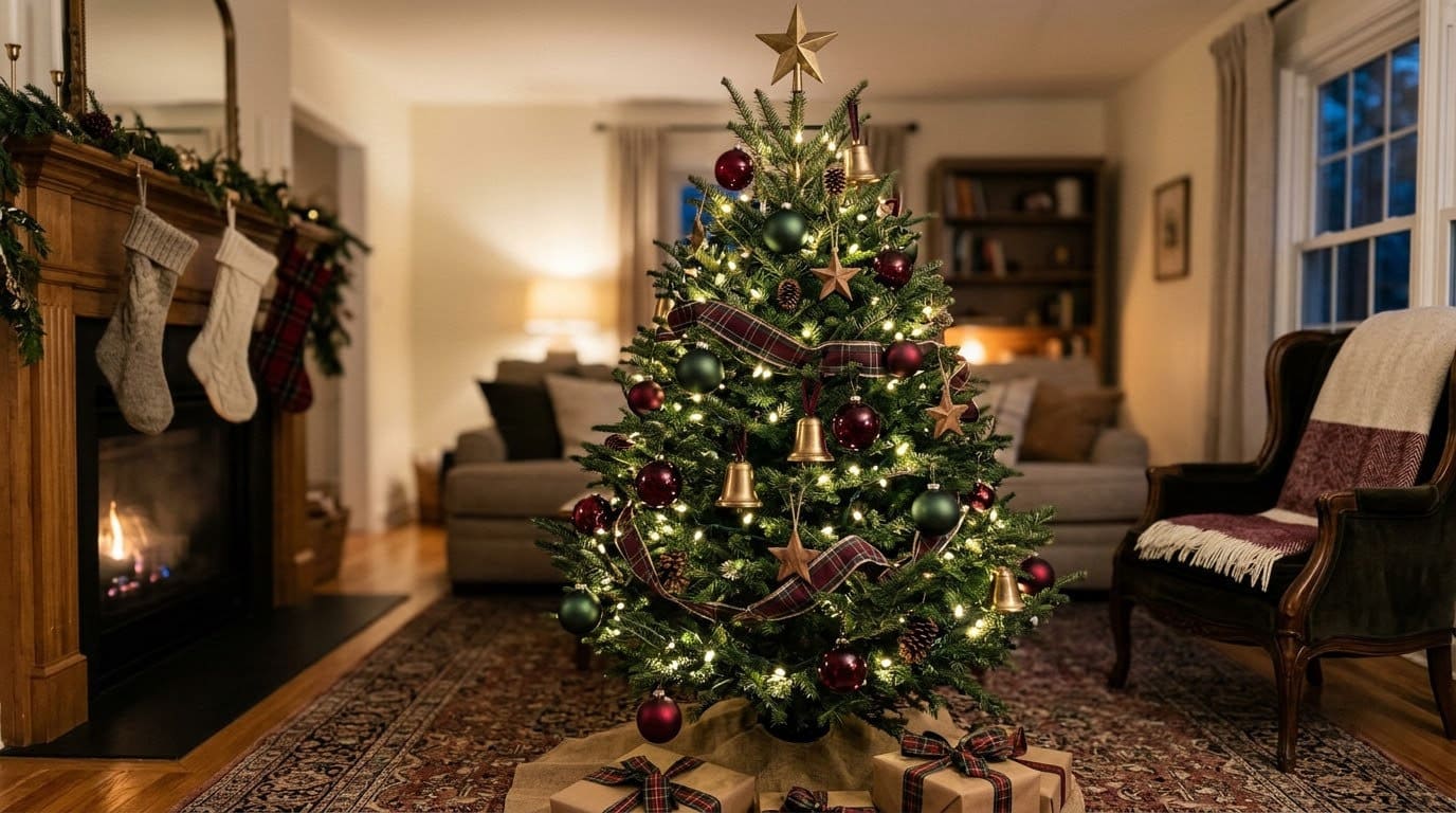
Red and green goes wrong for three fixable reasons. The shades are too bright, the split is too even, and no neutral steps in to referee them.

Never miss an update — choose FarmFoodFamily as your preferred source on Google.
How it works: Tap the button below to open Google’s settings page, then check the box next to FarmFoodFamily.
Tap the checkbox to turn it blue — that’s how you know it’s set.
Red and green is the palette everyone has an opinion about. Half the internet calls it timeless. The other half calls it a party aisle.
Both are right, and it depends on which red and which green you bought. The gap between classic and cliché is small, and it comes down to three things you can control.
Below are 12 red and green tree ideas with real shades, ratios and budget notes. We also cover where the palette came from, how to keep a real tree alive, and one safety problem nobody writes about.
If you want the wider menu of styles first, there is a much longer run of tree decorating tips for every theme on the site. This one sticks to red and green.
Quick Answer
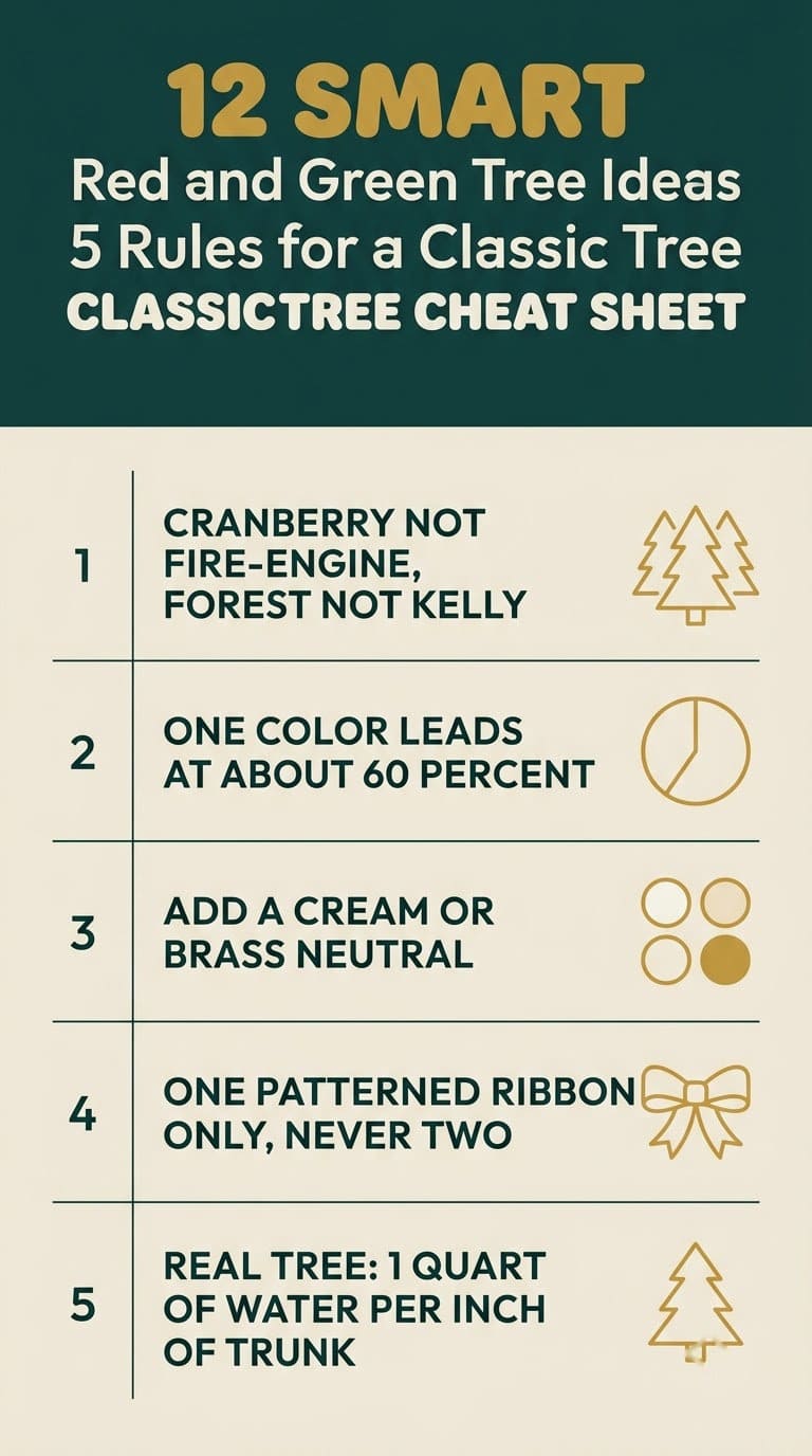
Red and green looks cliché when three things line up. Fire-engine red, kelly green, and an even split with nothing else in the mix. Fix any two of those and the tree changes.

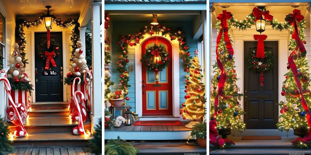
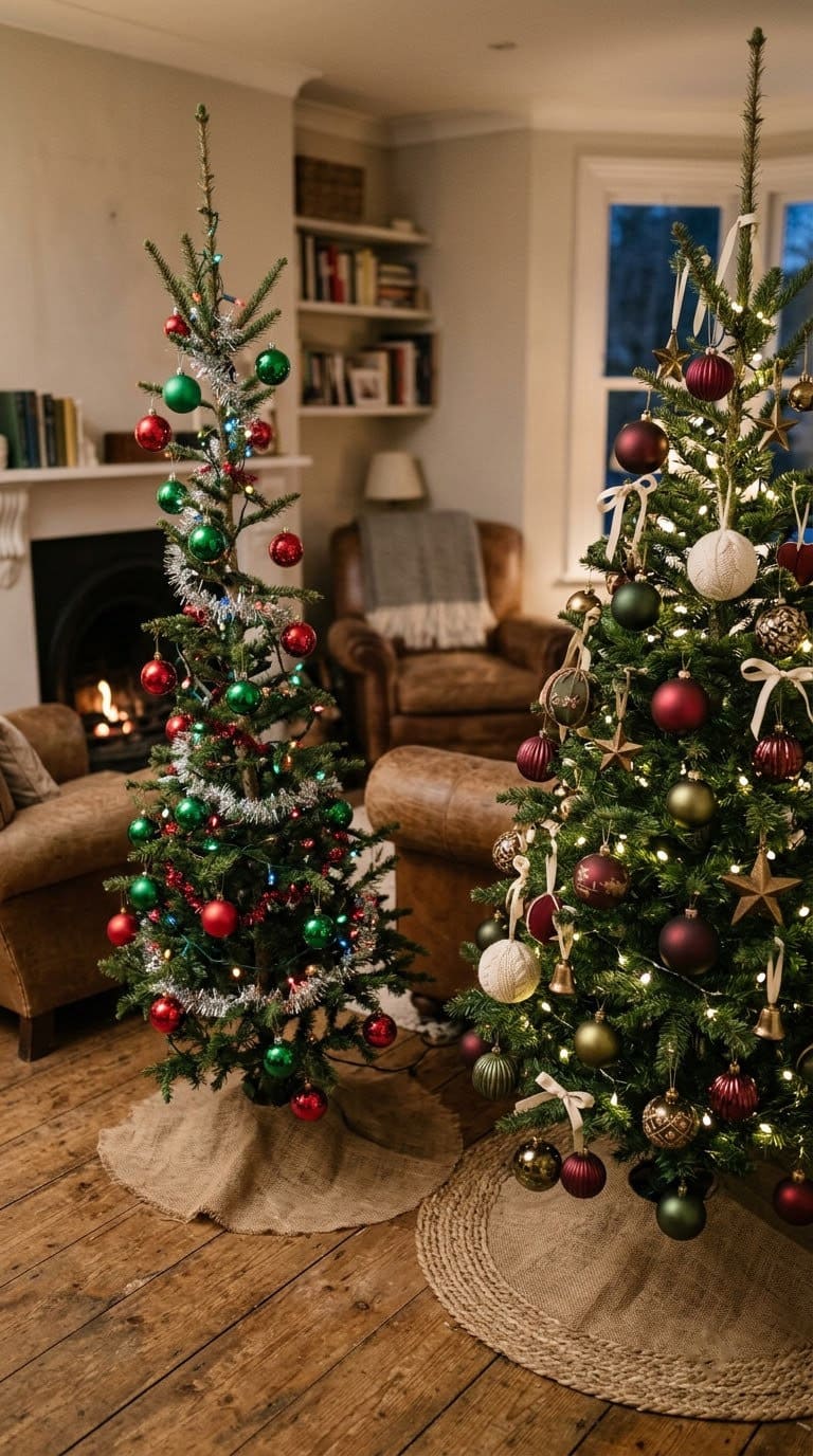
Drop the brightness first. Use cranberry, oxblood or burgundy instead of primary red, and forest, fir or olive instead of kelly green.
Then unbalance it. Let one color lead at about 60 percent, keep the second at 30, and give a neutral like cream, brass or wood the last 10.
Designer Marcelina Janiszewska of Project London keeps “the color palette refined and consistent” with burgundy and forest green repeating through it.
And know this palette is no marketing invention. Cambridge researcher Spike Bucklow traced red and green back to medieval church screens. That is centuries before the Victorians turned it into a Christmas thing, which is a fair answer to anyone who calls it tacky.
Why Does Red and Green Look Cliché?
Because red and green sit opposite each other on the color wheel. At full strength they fight, and your eye never settles anywhere.
Add an even split and no third color, and you get the look everyone knows. It reads as decoration rather than decor.
| Problem | What it looks like | The fix |
|---|---|---|
| Fire-engine red and kelly green | Party supply aisle | Cranberry with forest, or burgundy with olive |
| 50/50 split | Busy, nothing leads | One dominates, one supports |
| No neutral third | Loud, nowhere to rest | Add cream, brass, or wood |
| Everything glossy | Plastic-looking | Mix matte, velvet and glass |
| Tree buried in decor | You cannot see the tree | Leave real gaps between clusters |
None of these fixes cost more. Two of them mean putting things back in the box.

The deep-shade red this article argues for, in velvet rather than gloss, which covers two fixes at once. Shatterproof, so they survive being pushed deep near the trunk
Shop NowThis post contains affiliate links. We may earn a commission on qualifying purchases at no extra cost to you.
Where Did Red and Green Even Come From?
This is the part that lets you defend the palette at your own table.
Spike Bucklow is a Cambridge research scientist. He kept finding the same two colors while working on medieval rood screens, the painted barriers that once split a church in two.
Red and green turned up on screen after screen, right through the 1400s and 1500s.
He reads the pair as a marker for a boundary, here between the everyday and the sacred.
The Victorians who restored those screens borrowed it for a different boundary, the one between one year and the next.
“That red and green is in our psyche because of the Victorians, but it was in their psyche because of the medieval paint that we can still see on 15th- and 16th-century rood screens,” Bucklow told Mental Floss.
He traces it back further still. The red-green coding shows up in the Mabinogion, a set of Welsh stories from the 1200s, drawn from oral tales he says likely predate Christianity there.
So when someone calls your tree basic, the honest answer is that it has about six hundred years on them.

Which Shades of Red and Green Should You Use?
This one table is the whole article. Shade choice fixes more than any styling trick does.
| Instead of | Use | Why it works |
|---|---|---|
| Fire-engine red | Cranberry, oxblood, burgundy | Lower saturation stops the vibration |
| Kelly green | Forest, fir, hunter | Reads like real foliage, not plastic |
| Emerald with bright red | Olive or sage with burgundy | Muted pairs feel considered |
| Both at full strength | One muted, one saturated | Gives your eye somewhere to land |
Pick your pair, then buy one test ornament of each before you commit to a set. Hold them together in daylight, then again under your own tree lights at night.
That second test matters more than people expect. Warm bulbs push red toward orange and dull a cool green, so a pair that looked right in the store can look muddy at home.
What Ratio Should You Use?
Not half and half. That even split is what causes most of the trouble.
Our own working ratio is about 60 percent for the lead color, 30 for the second, and 10 for the accent. Pick red or green to lead, then stick to it.
The neutral third does the refereeing. Cream, ivory, brass, wood or antique gold all work. Without one, the two colors just argue.
If your tree is green already, remember that it counts. A green tree covered in green ornaments is closer to 80 percent green than you think. That is why red-heavy schemes usually look better on one.
How Do Designers Keep It From Looking Themed?
They treat the tree as part of the room, not as a project. Kailee Blalock of House of Hive Design Co says it best.
“Start with structure, layer in texture, and end with sparkle,” she says. Her lighting note is worth stealing: put the lights “deep inside the branches, not just on the surface, so it glows from within.”
Her test for cliché is the best one I have read. A good tree is “less ‘themed’ and more collected, like it could live in the house year-round if it wanted to.”
That is the whole difference in one line. A collected tree looks like it belongs to someone. A themed tree looks like one shopping trip.
For more on building an ornament mix over time, our Christmas ornament roundup has shapes worth collecting slowly.
Should You Use a Real Tree for This Palette?
Red and green goes on a real tree more than any other scheme, so this part earns its place. Real trees need real care, and most guides skip it.
Penn State Extension keeps it simple. Take “a disk of wood about ¼ inch thick from the base of the trunk” before the tree goes in the stand.
Then water it properly. The stand should hold “1 quart of water per inch of stem diameter.”
And check it daily, so the water level never drops below the base of the trunk.
Skip every home remedy you have heard. Penn State is blunt: do not use “floral preservatives, commercial tree preservatives, molasses, sugar, bleach, soft drinks, aspirin, honey.” Clean water is all a tree needs.
When you are buying, use their tug test. Look for “flexible needles that remain firmly attached when you tug on them.”
And keep it away from heat, which dries a tree out faster than anything else. If you would rather go artificial, our guide to the different types of Christmas trees compares the options.
Is Decorating a Tall Tree Actually Risky?
More than the decor blogs admit. Under one red and green tutorial, a viewer wrote that she was scared the decorator would fall off the small ladder he stood on.
Another viewer replied that she broke her back in a ladder fall and spent weeks in a cast. That comment stuck with me more than any styling tip in the thread.
The numbers back her up. The Consumer Product Safety Commission counts about 14,700 trips to the ER each November and December from holiday decorating.
That yearly average includes 3 deaths from falls off ladders.
So if your tree comes apart, dress the top section before it goes up. Otherwise use a step stool with a rail, not the top cap of a folding ladder.
And do the high work with someone else in the room.
12 Red and Green Christmas Tree Ideas
1. Cranberry and Forest Green
The default this whole article argues for. Use cranberry balls in 4 and 6 inch, about 20 of them, with forest green picks and ribbon.
Let red lead at about 60 percent, green back it at 30, and cream fill the last 10. Budget: mid.
Pairs well with idea 8’s brass if you want more warmth.
2. Burgundy and Olive
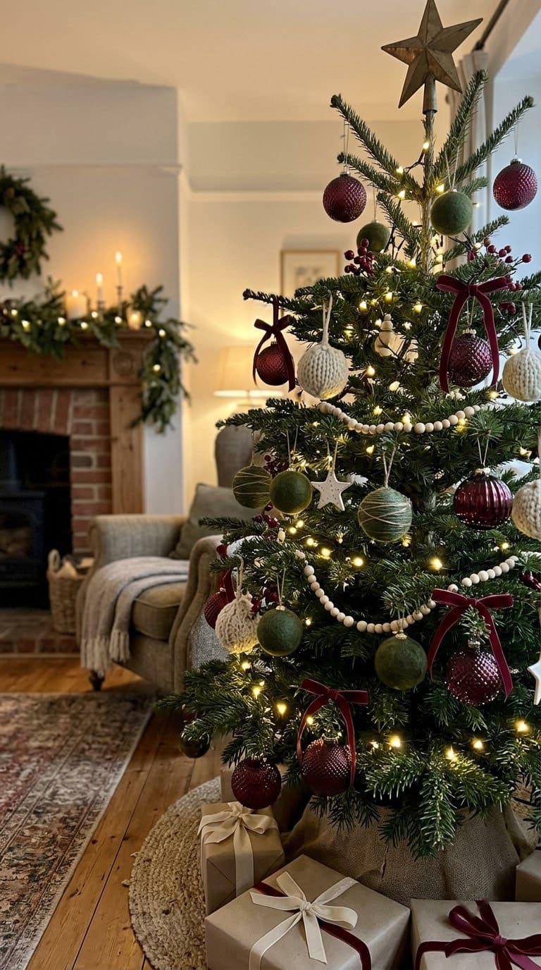
The quietest version, and the one that suits a modern room. Olive is a soft green that acts more like a neutral than a color.
Use burgundy in 4 inch matte, about 16 of them, plus olive velvet ribbon at 2.5 inches. Budget: mid to invest, since velvet costs more than satin.
Best in a room with leather, wood or antique furniture. Skip glitter here entirely.
3. Red and Green With a Neutral Referee
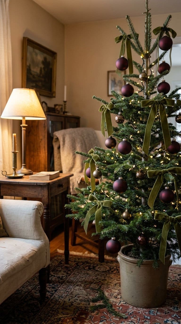
Less a palette than a rescue for the tree you already own. Add 15 to 20 cream or ivory pieces to whatever red and green you have.
That third color breaks up the fight between the other two. It is the cheapest fix here, and often the biggest change.
Budget: low. Works with every other idea here.
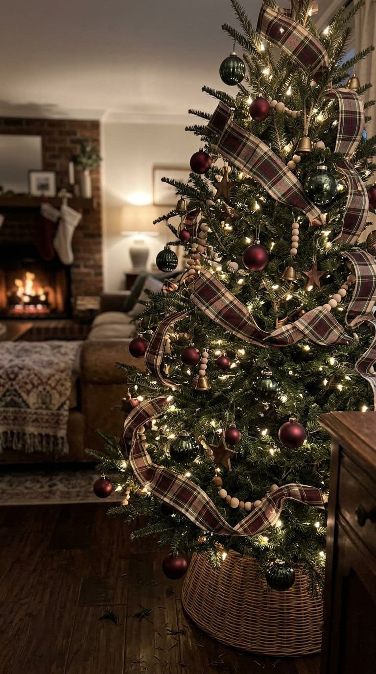
4. Tartan and Plaid Ribbon Done Right
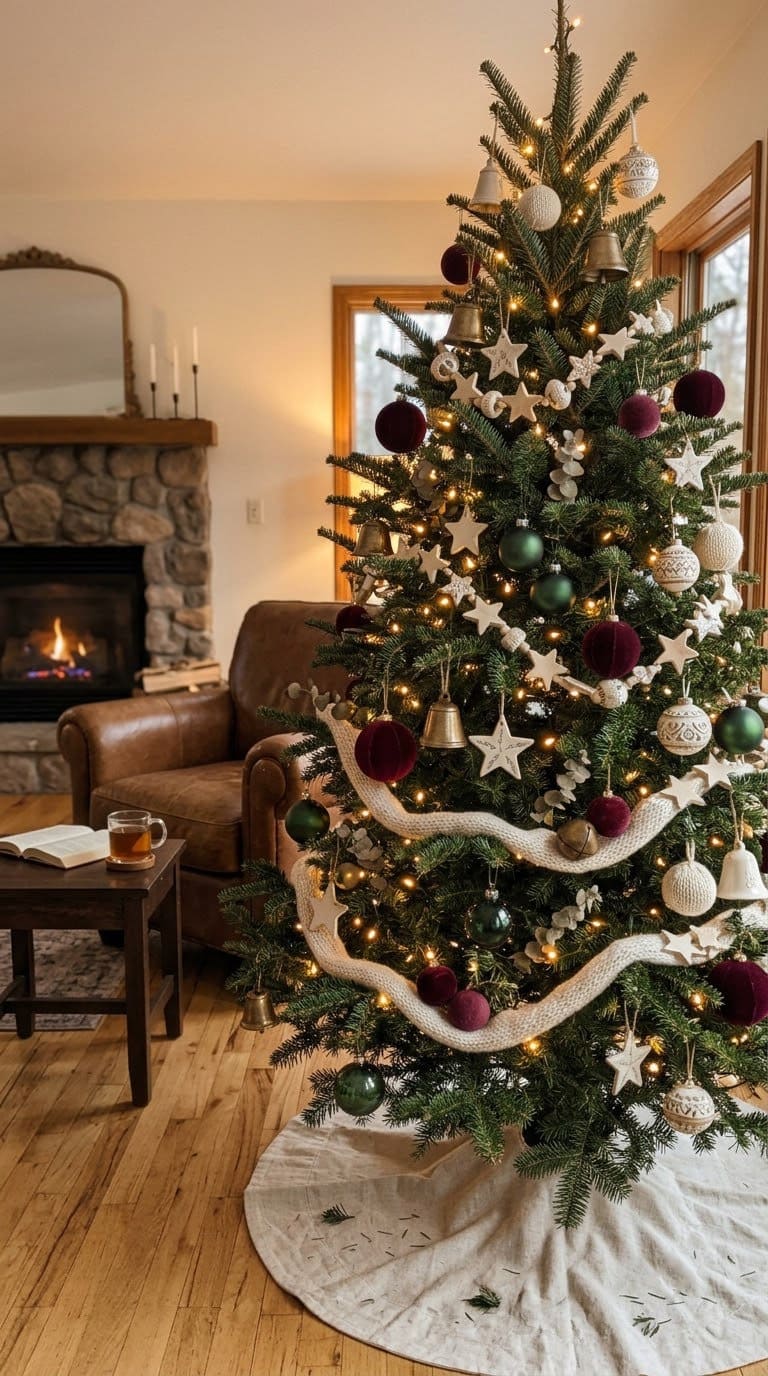
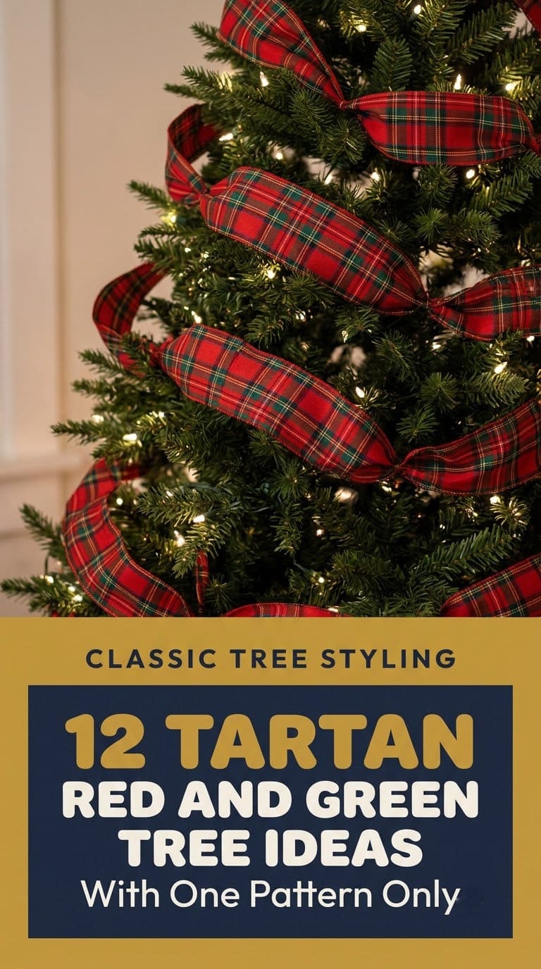
The classic that goes wrong most often. Use one 4 inch wired tartan as the main ribbon, and skip a second patterned ribbon entirely.
Cut it into 4 to 6 foot lengths and tuck the ends into the branches, rather than winding one long piece around. One pattern plus two solids is the rule.
Budget: mid. A 7 foot tree takes more ribbon than most people buy, so count your rolls before you check out.
5. Red With Lime or Chartreuse
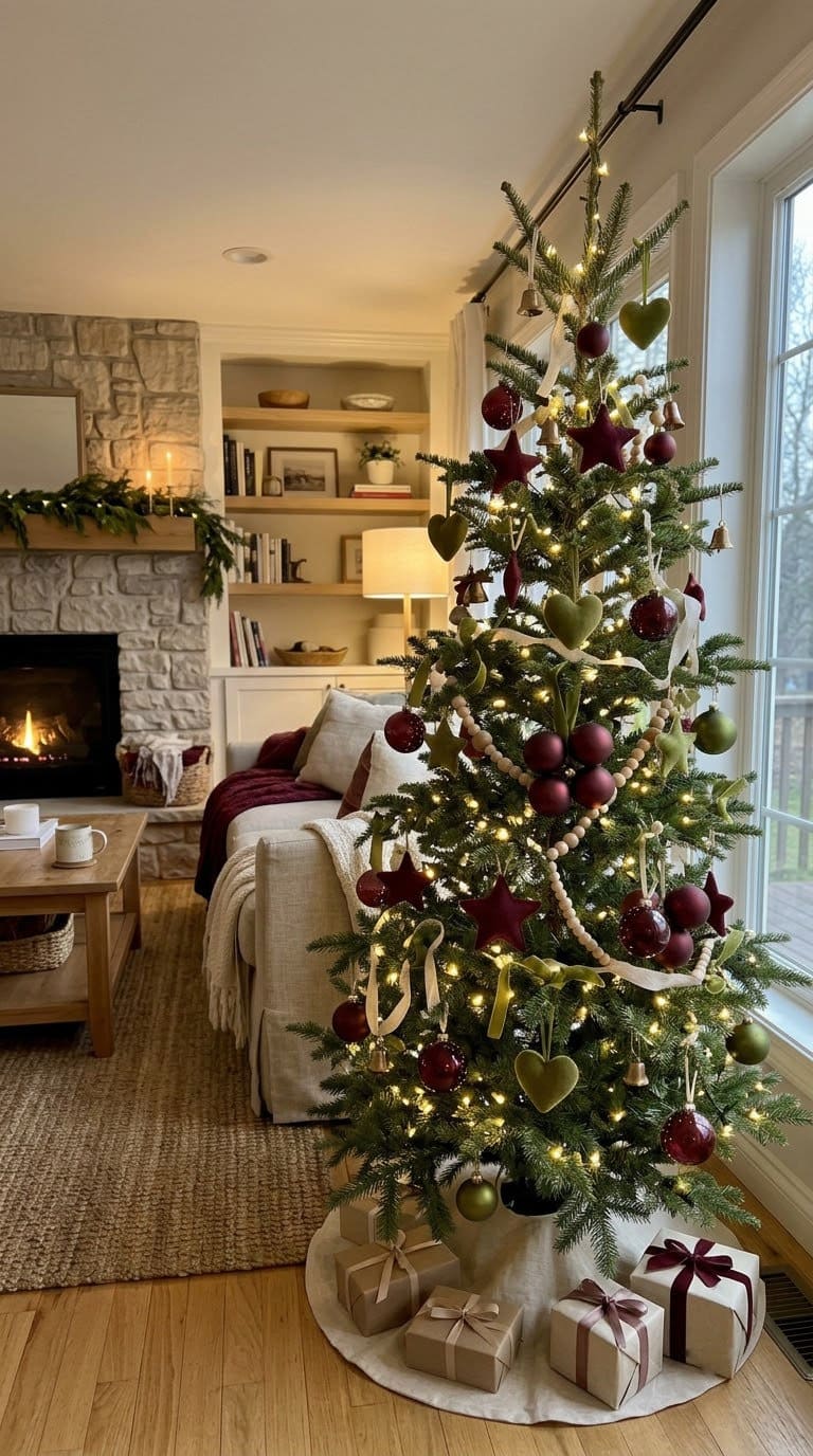
The twist, and viewers love it. Under one traditional tutorial, the top comment praised the lime green for making the look feel modern.
Use lime in small doses, 3 inch and under, at about 15 percent. Any more and it tips into novelty.
Budget: low to mid. Best in a room that already has some brightness.
It reads playful rather than formal, so it suits a family room better than a front hall.
6. Vintage Glass in Mixed Reds and Greens
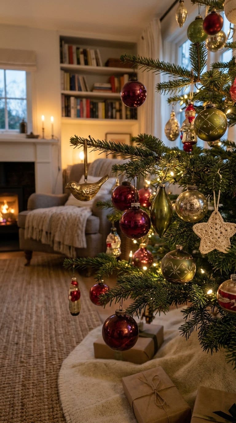
The collected look that Blalock’s test rewards. Use 20 to 25 vintage glass balls in varied reds and greens, on purpose unmatched.
Hang the oldest and oddest pieces deep, where they catch light. Mismatched is the point, so resist tidying it up.
Budget: invest if you buy them, free if you inherit them. There is more of this era in our vintage Christmas ideas.
7. Green Tree, Red Ornaments Only
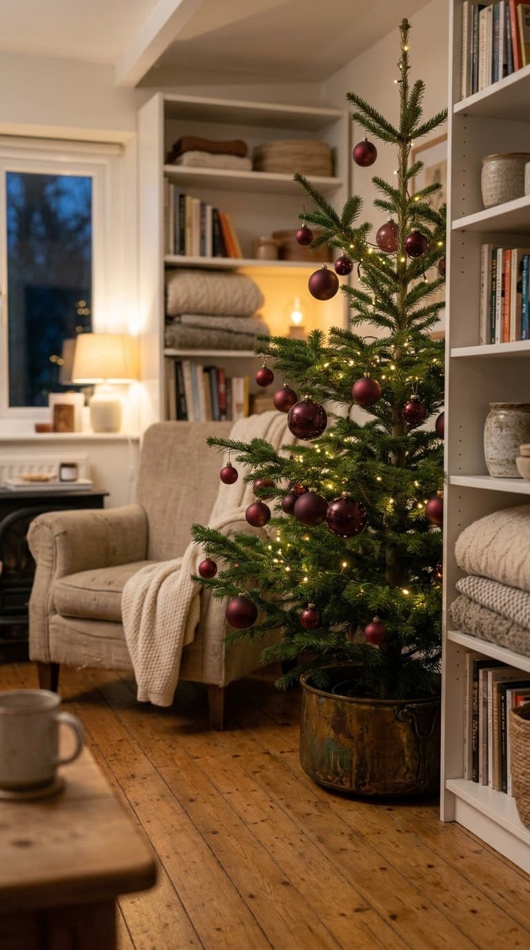
Restraint as a plan, and the answer to everyone who says they cannot see the tree. Use red only, about 25 pieces in three sizes, and let the tree supply the green.
Leave visible gaps between clusters. The branches are part of the design here, not something to cover.
Budget: low. This is the version to try if last year’s tree felt too busy.
8. Red and Green With Antique Brass
Brass warms both colors at once, which is why it beats silver here. Use 10 to 12 brass or antique gold pieces, plus a brass tree collar.
Keep the metal under 20 percent so it stays an accent. Antique finishes suit this palette better than bright shiny ones.
Budget: mid to invest. The collar is the piece people notice.
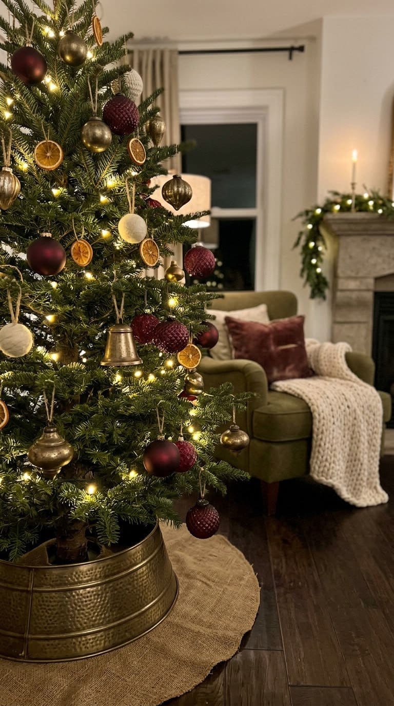
9. Velvet in Both Colors
Texture instead of more color. Use 12 to 15 velvet balls split between deep red and forest green, in 3 to 4 inch sizes.
Mix them with glass so the velvet has something to play against. Velvet absorbs light while glass throws it back, and that contrast does real work.
Budget: mid to invest. Pairs well with idea 2’s olive ribbon.
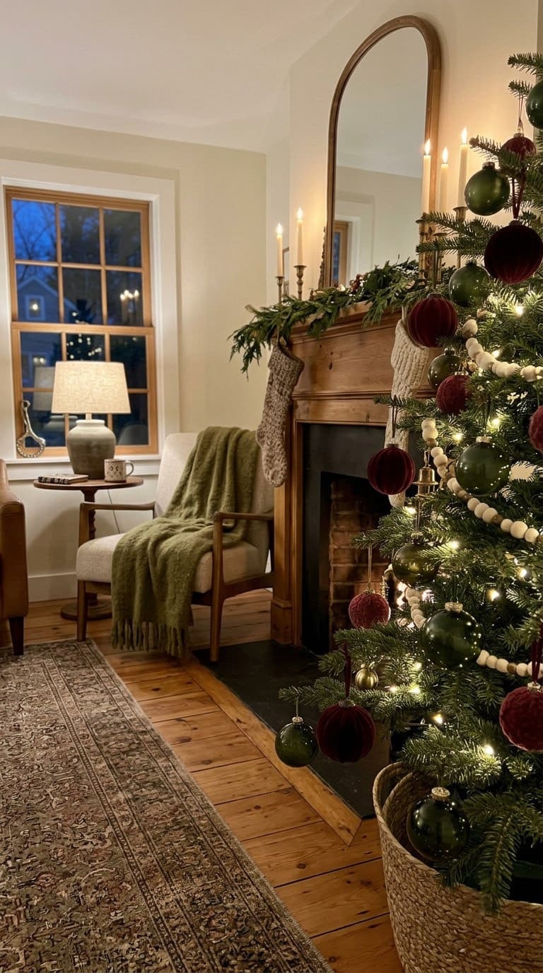
10. Fresh Greenery and Red Berry Stems
The version that smells like Christmas. Tuck 8 to 10 stems of cedar, fir or eucalyptus deep into the branches, then add 10 to 12 red berry picks.
Bend the wire stems back on themselves before you push them in, so they grip instead of sliding out. Budget: mid, less if you cut your own greenery.
Keep fresh greenery away from bulbs, and expect to swap it out partway through the season. Our guide to decorating with things you can forage has more.
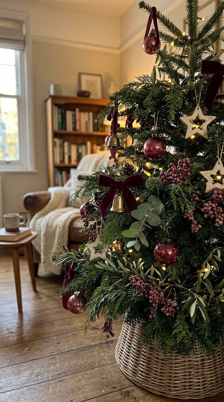
11. Red and Green on a White or Flocked Tree
The palette at its most modern. A white tree takes away the built-in green, so you control the ratio yourself.
Use deep red at about 50 percent and forest green at 30, and let the white tree be the neutral. About 30 balls in all on a 7 foot tree.
Budget: mid. It is also the easiest way to make red and green work in a gray or modern room.
If you want the opposite direction, our red and white Christmas ideas drop the green entirely.
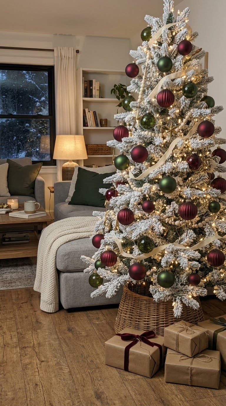
12. Tabletop Red and Green Tree
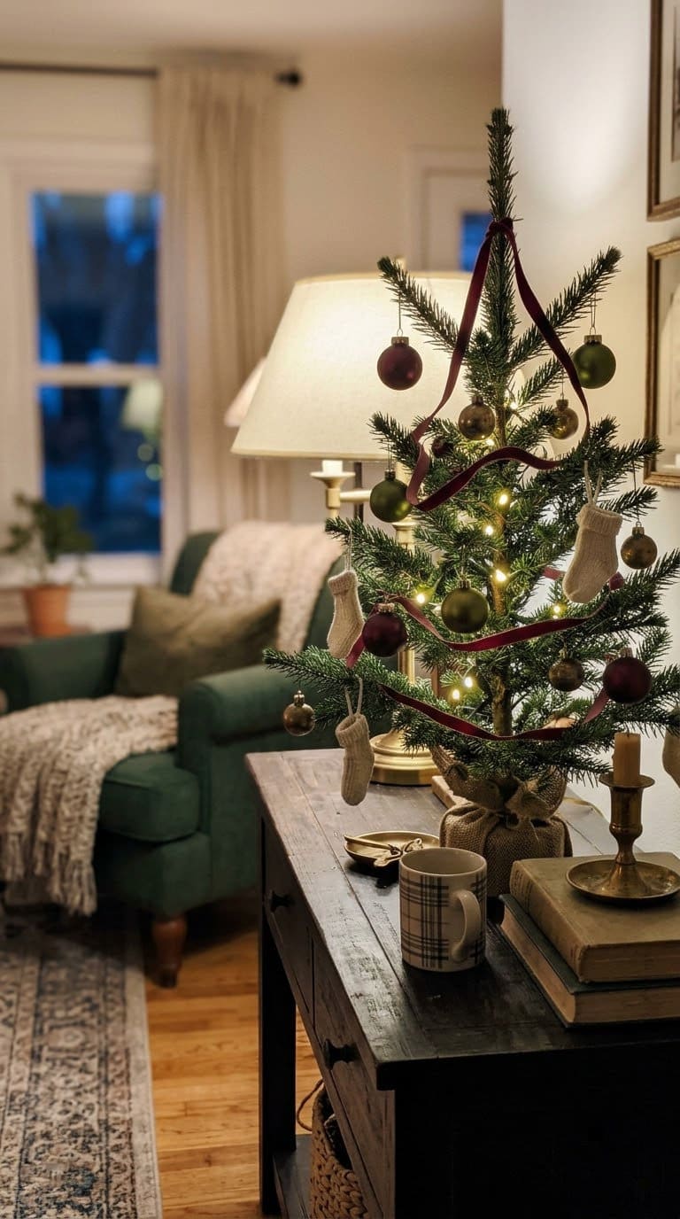
Everything above, at a quarter of the size. Use a 2 to 3 foot tree and 2 inch balls only, about 15 of them, plus one narrow ribbon.
Keep the ratio rule even at this size. A small tree with an even red-green split looks busier than a big one.
Budget: low. Good for renters, offices and mantels.
For more small-space holiday styling, our Christmas light ideas cover the rest of the room.
What Most People Get Wrong
The big one is buying at full strength. Primary red and kelly green are the loudest versions of these colors, and also the cheapest to buy. That is not a coincidence.
The second is burying the tree. Under one tutorial, two separate viewers wrote “wheres the tree” and “I can’t even see the tree.”
A third said half the trimmings would have been plenty. They were not being unkind. They were describing a real effect.
The third is skipping the neutral. Cream, brass or wood is what lets your eye rest, and without it even good shades feel loud.
And it is worth hearing the other side of this whole article. Nicole Yee of NY Interiors builds her tree from laminated kids’ drawings, dough ornaments and travel keepsakes.
“Our tree is a collage of memories,” she says. If that is your tree, no palette rule here is worth losing it over.
Your Two-Weekend Plan
Weekend one is deciding and testing. Pick your red and your green, buy one ornament of each, then look at them together in daylight and again at night under your own lights.
Then choose which color leads. Write it down if you have to, because the ratio slips the moment you are in a store aisle.
Weekend two is the build. Lights deep in the branches first, then the lead color, then the second, then the neutral accent.
Ribbon and picks go in last, filling whatever gaps are left.
Step back after each layer and take a photo. If you cannot tell which color leads in that photo, the ratio has drifted back toward half and half.
Frequently Asked Questions
Why does red and green look cheap sometimes?
Usually because the shades are at full strength and split evenly. Swap to cranberry and forest green, let one lead, then add a neutral.
What shade of green goes best with red at Christmas?
Forest, fir, hunter or olive. All of them read like real leaves. Kelly and emerald fight with bright red.
Is red and green outdated?
No, and it is far older than the Victorians. Cambridge researcher Spike Bucklow traced the pair back to medieval rood screens from the 1400s and 1500s.
What ratio of red to green should I use?
Our own working split is about 60 percent lead, 30 percent second, 10 percent accent. Skip the even split, since that is what makes the colors fight.
What neutral works with red and green?
Cream, ivory, brass, antique gold or bare wood. Any of them gives your eye a place to rest.
How much water does a real Christmas tree need?
Penn State Extension says a stand should hold 1 quart of water per inch of stem diameter. Check the level daily, so it never drops below the base of the trunk.
Should I add anything to my Christmas tree water?
No. Penn State Extension specifically warns against preservatives, sugar, bleach, soft drinks, aspirin and honey. Clean water is all it needs.
How do I check if a cut tree is fresh?
Tug gently on the needles. Penn State says to look for needles that bend and stay firmly attached.
Is it dangerous to decorate a tall tree?
It can be. The CPSC counts about 14,700 holiday decorating injuries treated in ER rooms each November and December, including 3 deaths a year from ladder falls. Use a stable step stool, and keep someone in the room.
Related Posts
Products We Recommend
This post contains affiliate links. We may earn a commission on qualifying purchases at no extra cost to you.
30 Pc Burgundy Velvet Shatterproof Christmas Ornaments, 2.3 Inch
The deep-shade red this article argues for, in velvet rather than gloss, which covers two fixes at once. Shatterproof, so they survive being pushed deep near the trunk
Shop Now
Meseey Red and Green Tartan Wired Ribbon With Gold Trim, 4 Inch x 10 Yards
The one patterned ribbon idea 4 allows, in the 4 inch width a full-size tree needs. The gold trim doubles as the neutral referee, so it earns its place twice
Shop Now
Suilung 24 Pc Neutral Textured Cream Ornaments, 2.36 Inch
The neutral third from idea 3, which is the cheapest fix on the whole list. Matte cream breaks up the fight between red and green without adding a fourth color
Shop NowNever miss an update — choose FarmFoodFamily as your preferred source on Google.
How it works: Tap the button below to open Google's settings page, then check the box next to FarmFoodFamily.
Tap the checkbox to turn it blue — that's how you know it's set.