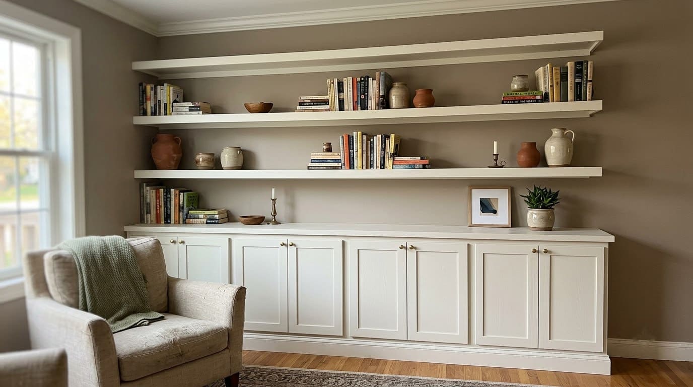
9 Sneaky Reasons Your Paint Color Looks Perfect in the Store and Wrong at Home
A paint chip is a poor stand-in for a painted wall, and these nine reasons explain exactly what changes between the store rack and your living room, plus how to test a color so it never surprises you again.


Never miss an update — choose FarmFoodFamily as your preferred source on Google.
How it works: Tap the button below to open Google’s settings page, then check the box next to FarmFoodFamily.
Tap the checkbox to turn it blue — that’s how you know it’s set.
You stood in the paint aisle and this color looked perfect. Clean, warm, exactly right.
Then you painted the wall. Now it looks darker, or greener, or just off, and you cannot explain why.
Here is why. A paint chip is a poor stand-in for a wall.
It is small, it is printed, and you looked at it under one kind of light. A wall is huge, it is real pigment, and it lives under your home’s light all day long.
Quick Answer
Why does paint look perfect in the store and wrong at home? Because a chip and a wall are not the same test.



A chip is small, printed with ink, and viewed under one light source. A wall is huge, painted with real pigment, and viewed under your home’s mixed light all day.
Undertones hidden on a tiny chip take over once a color covers a whole wall. Store fluorescent light and your home’s LED or lamp light can show the same paint as two different colors. There is a real name for that effect, metamerism.
Your room’s own light, the sheen you picked, and the colors already in the room, like your floor and trim, all shift what you see.
The fix is a large real-paint sample, not a chip, on two or three walls. Check it morning, midday, and evening under your own bulbs.
How to use this list
Most paint surprises come from two or three of these reasons stacked together, not all nine.
Skim for the ones that match your situation, then read the testing method near the end before you buy a gallon.
1. The chip is printed ink, not real paint

Look closely at a paint chip. It is printed with ink on coated cardstock, not brushed on with real paint.
Ink and pigment are different materials. They absorb and bounce back light in different ways, so even a well-made chip is only an approximation of the can.

A real test panel large enough to show the undertone and true saturation a small chip hides, movable to any wall in the room
Shop NowThis post contains affiliate links. We may earn a commission on qualifying purchases at no extra cost to you.
The tell is a chip that looks flat or slightly plastic next to a real painted sample of the same color. And it is why two different paint brands can print an almost identical chip and still dry to a noticeably different color.
Quick fix: Treat any printed chip as a starting point, never a final answer. Buy a small sample can and paint an actual swatch before you commit to a whole room.
2. The chip is too small to show the undertone

Every paint color, even white, is built from other colors mixed underneath it. Home stylist Allisa Jacobs puts it simply: “Every paint color, even white, is made up of other colors. Red, green, blue, they’re all in there, just in different amounts.”
On a 2-inch chip, that hidden color barely registers. Once the same pigment covers a whole wall, the undertone takes over.
It can read green, purple, or gray in a way the chip never hinted at. A soft sage or a warm greige is where this shows up the most.
Quick fix: Paint a sample at least 2 feet square, not a paint stick or a tiny square, so the undertone has room to show itself.
3. Store light isn’t your home’s light

Paint stores run bright, even fluorescent light designed to sell products, not to match your living room. That light has a different mix of colors in it than an LED bulb, a lamp, or daylight through a window.
There is a name for this. Metamerism is when the same paint looks like two different colors under two different light sources. Each light source carries its own mix of color, and the paint bounces each mix back differently.


It is the same reason two shirts that matched perfectly under the store’s lights can look mismatched the moment you step outside.
Quick fix: Never make a final call in the store. Bring a real sample home and look at it under the actual bulbs in the room. Check it at the time of day you will mostly use the room.
4. Your room’s orientation changes the color all day

A north-facing room gets flat, cool, slightly blue light all day, no matter the season. A south-facing room gets strong, warm light for most of the day.
East-facing rooms run warm in the morning and cooler by afternoon. West-facing rooms flip that, cool in the morning and warm, almost orange, at sunset.
But a tree, a covered porch, or a neighbor’s wall can block or bounce light too. That can change all of this for one specific room.
Color consultant Kylie M. of Kylie M Interiors calls this a room’s exposure. It is one of the factors her color system checks before she ever recommends a paint.
Quick fix: Look at your sample at three points in the day, morning, midday, and evening, in the actual room. A color that reads perfect at noon can go gray and flat by 8 p.m.
5. The color intensifies once it covers a whole wall

Paint professionals have a number for how much light a color bounces back. It is called Light Reflectance Value, or LRV, and it runs from 0 for black to 100 for white.
The number itself does not change. But a dim room needs a higher LRV to read the way a chip did under bright store light.
There is also a simple scale effect. The same paint, spread across 100 times more surface, pulls in more of the room’s light and bounces more of its own color back at your eyes.
Painters sometimes call this “the chip is a lie.” It is not a flaw in the paint, just a fact of how color behaves at different sizes.
Quick fix: Expect a color to look more intense on the wall than it did on the chip, and choose a shade lighter than your gut wants if you are between two options.
6. The sheen you picked changes how dark it reads

Flat and matte paint absorb light and stay close to the true chip color, sometimes reading a touch lighter. Semi-gloss and high-gloss reflect more light, which makes the same pigment look darker and more saturated on the wall.
Eggshell and satin sit in the middle and usually stay closest to the printed chip. But even they will look slightly different once you compare a small sample to a full wall in that sheen.
Quick fix: Test your sample in the actual sheen you plan to buy, not just the color. A gloss trim color and a flat wall color in the same paint line will never look identical.
7. The colors already in the room are shifting what you see

Your eye never judges a color alone. It reads it against everything nearby. Your floor, your trim, your furniture, even the wall in the next room you can see through a doorway.
This effect can make the exact same paint look warmer against cool gray tile and cooler against warm wood floors. Two rooms with the exact same paint, different floors, can read like two different colors.
A sample that looked perfect on a white foam board can shift the moment it sits next to real cherry wood furniture. It can shift again next to cherry floors instead.
Quick fix: Hold your sample directly against the fixed things in the room, floor, trim, cabinets, and any large furniture that is staying, not against a blank wall.
8. You only tested a tiny square, not a real sample

A common shortcut is painting one small square on the wall and calling it a test. That square is still too small to show undertone. And it usually sits in only one lighting spot, so it repeats the exact problem a store chip has.
Color expert Maria Killam, creator of the Killam Colour System, built her whole method around testing with large samples in the actual room. It is, in her framing, the only reliable way to judge a color before you commit, especially for a neutral.
Quick fix: Paint or stick a sample at least 2 feet square on two or three different walls, including the wall that gets the least light. Move it around before you decide.
9. You were chasing a photo, not a real paint color

A lot of people start from a photo on Pinterest or Instagram, not a chip at all. That photo has already passed through a camera sensor, an app filter, and your phone or monitor’s own color settings.
None of that is the actual pigment in the can. The photo you fell in love with may not even exist as a real, buyable paint color. Whoever posted it may have guessed at the name in the caption.
Quick fix: Use a photo for direction and mood only. Once you have a color name in mind, go back to steps 2 and 8 and test the real thing in your own room before you buy.
How to actually test a color so it doesn’t surprise you
This is the method, not a numbered sign, and it pulls the fixes above into one order.
Buy a large real-paint sample, either a peel-and-stick swatch or a sample pot you brush onto poster board with two real coats. Do not trust a paint stick or a card smaller than about 2 feet square.
Put it up in at least two spots, including the darkest wall in the room. A north wall and a south wall in the same room can read the color so differently that they barely look related.
Check it in the morning, at midday, and again in the evening, under the actual bulbs you use. Turn the lamps on for the evening check, since daylight fades faster than you expect.
Hold it against your real floor, trim, and any furniture that is staying. If you already have a rug, a sofa, or curtains you plan to keep, set the sample near those too.
Never make the final call under store light or on a phone screen. Both will lie to you in a slightly different way.
Chip vs. real test sample, a quick comparison
| What you’re checking | A store paint chip | A real large test sample |
|---|---|---|
| Size | About 2 by 3 inches | 2 feet square or bigger |
| Material | Printed ink on cardstock | Real pigment in your chosen sheen |
| Light source | Store fluorescent, one setting | Your home’s light, checked across the day |
| Undertone | Mostly hidden | Fully visible |
| Saturation | Reads lighter and calmer | Reads closer to the true wall color |
| Sheen shown | Usually none, flat card | The actual finish you will buy |
| How reliable | Rough starting point | Close to what you will actually get |
What we learned after repainting a room twice
A few things only became clear the hard way, and most of them were obvious in hindsight.
We picked a color from a chip under the store’s fluorescent lights. We painted the whole living room, and it came out two shades darker and noticeably greenish. Nothing like the chip.
The second time, we tested a poster-board sample on the darkest wall, at night, under our own lamps, before buying a drop of paint. We also tested it in the exact eggshell sheen we planned to use, not a flat sample card.
Holding that sample against our actual wood floor was the last piece. The color that looked neutral on white foam board read noticeably warmer next to the floor, in a way we were glad to catch before painting.
The whole process took an extra week compared to just grabbing a gallon and going. It cost far less than a second repaint, and this time the room actually looks like we pictured it.
What to fix first
| Priority | Fix | Effort | What it catches |
|---|---|---|---|
| Before you buy | Get a real large sample, not just a chip | A few dollars, a few minutes | Ink-vs-paint and undertone surprises |
| This weekend | Test it on 2 walls at 3 times of day | An afternoon of checking in | Lighting and orientation surprises |
| Before you paint the room | Hold the sample against your real floor and trim | 10 minutes | Simultaneous contrast surprises |
| Before you buy the gallon | Confirm the sheen matches what you tested | 5 minutes | Sheen-darkening surprises |
| If it’s already painted wrong | Get a fresh sample of a lighter or grayer version, test it the right way | A weekend to repaint | Fixing the mistake without repeating it |
Frequently asked questions
Why does my paint look darker on the wall than the swatch? A color intensifies once it covers a full wall instead of a small chip, because it reflects more of its own hue back at you. A darker sheen like satin or semi-gloss makes this even more noticeable than flat paint does.
Should I test paint on the wall or on poster board? Either works if the sample is at least 2 feet square and painted with real paint in your chosen sheen. Poster board lets you move the sample to different walls and rooms, which a wall test cannot do.
Why does the same paint look different in different rooms? Each room has its own mix of light, from its orientation, its bulbs, and the colors already in it, like the floor and trim. The same can of paint can read warm in one room and cool in another.
What is LRV and why does it matter? Light Reflectance Value measures how much light a color bounces back, from 0 for black to 100 for white. A low-light room usually needs a higher LRV to read the way a color did under bright store light.
I already painted and hate it, what now? Get a fresh large sample in a lighter or less saturated version of the color and test it properly this time, on the darkest wall, at different times of day, against your real floor and trim, before you buy the next gallon.
Related Posts

Products We Recommend
This post contains affiliate links. We may earn a commission on qualifying purchases at no extra cost to you.
Mighty Board Minis Paint Color Test Panels, 12" x 9", Set of 5
A real test panel large enough to show the undertone and true saturation a small chip hides, movable to any wall in the room
Shop Now
FoamPRO 120 Color Tester Sample Boards, 24-Pack
Portable boards for painting a proper test swatch in your actual chosen sheen before you commit to a full gallon
Shop Now
evelor A19 LED Bulbs, 2700K Soft White, 4-Pack
Puts a consistent, true warm light on your test samples so what you see at home matches what you will live with
Shop NowNever miss an update — choose FarmFoodFamily as your preferred source on Google.
How it works: Tap the button below to open Google's settings page, then check the box next to FarmFoodFamily.
Tap the checkbox to turn it blue — that's how you know it's set.