60+ Trendy Two-Tone Kitchen Cabinet Ideas That Make a Bold Statement
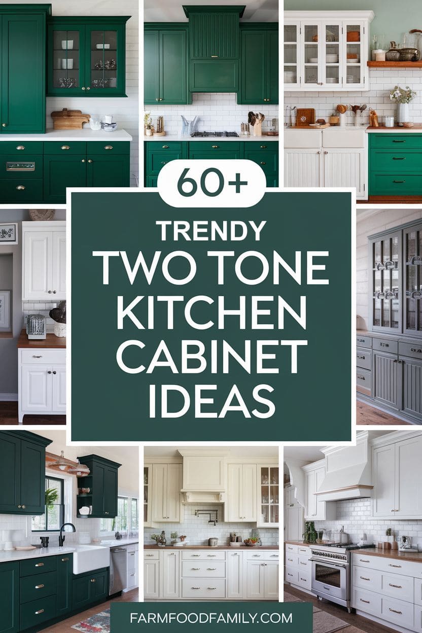
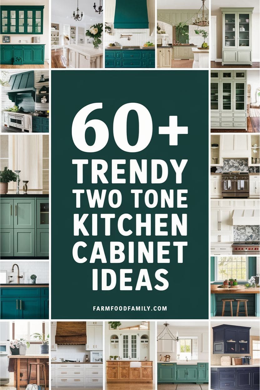
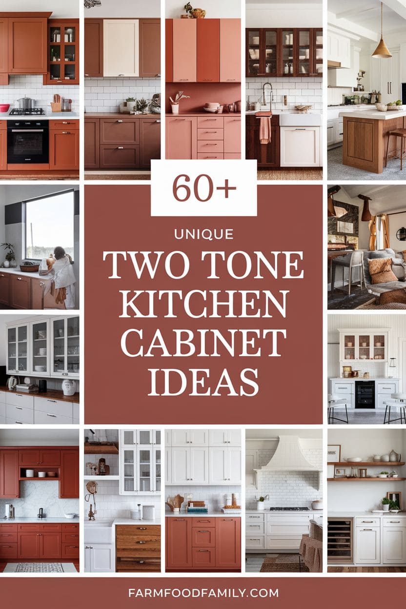
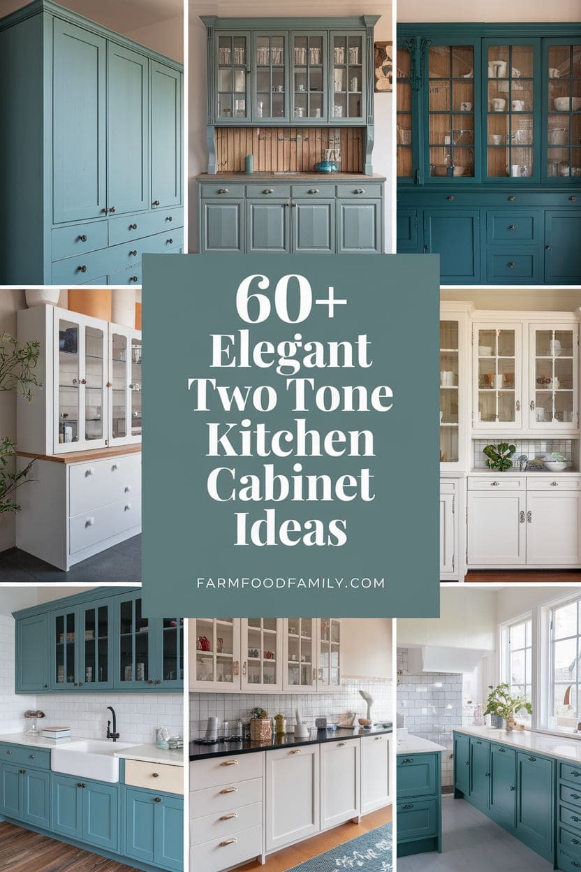
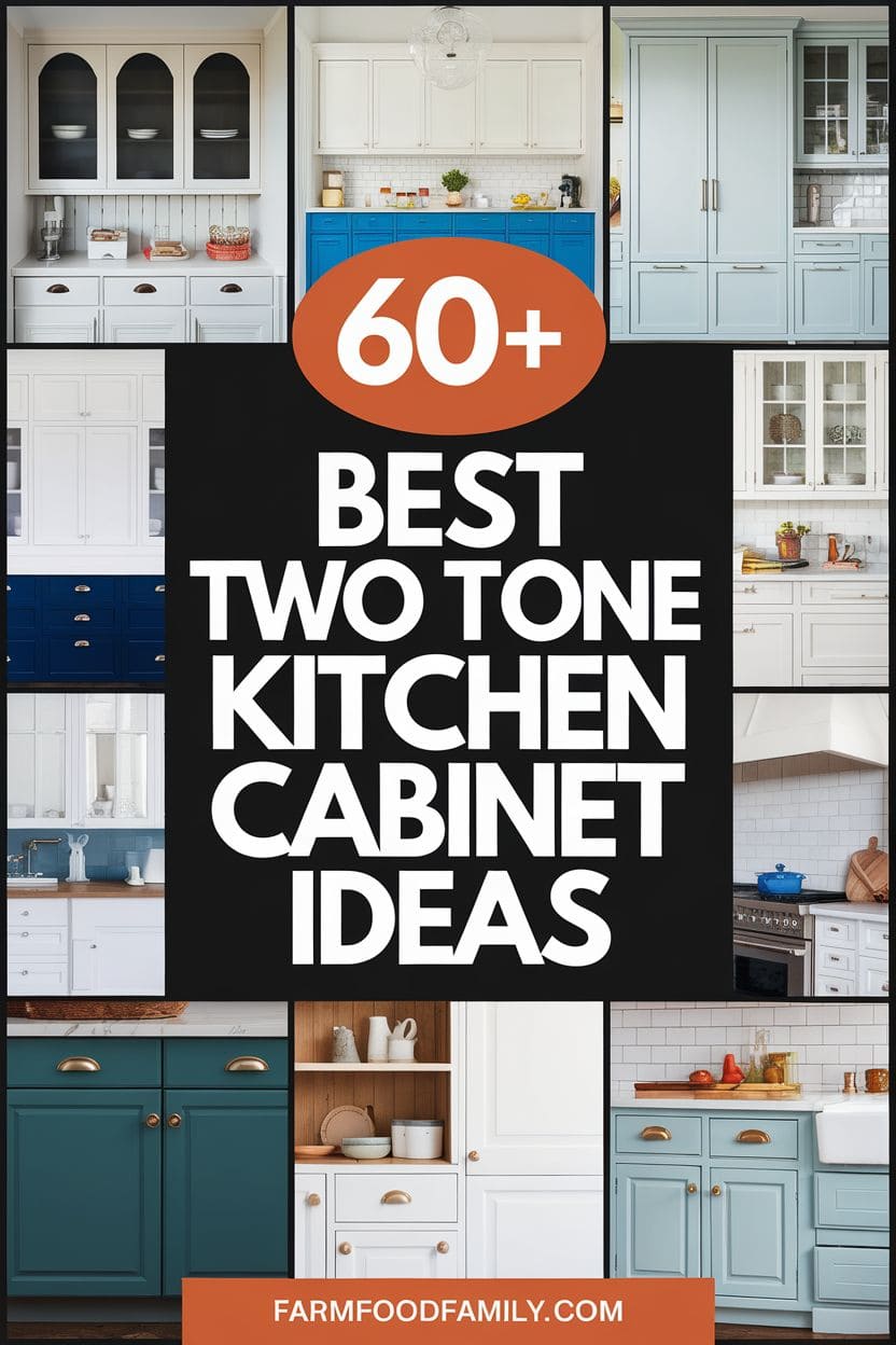
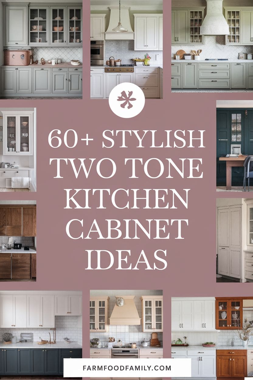
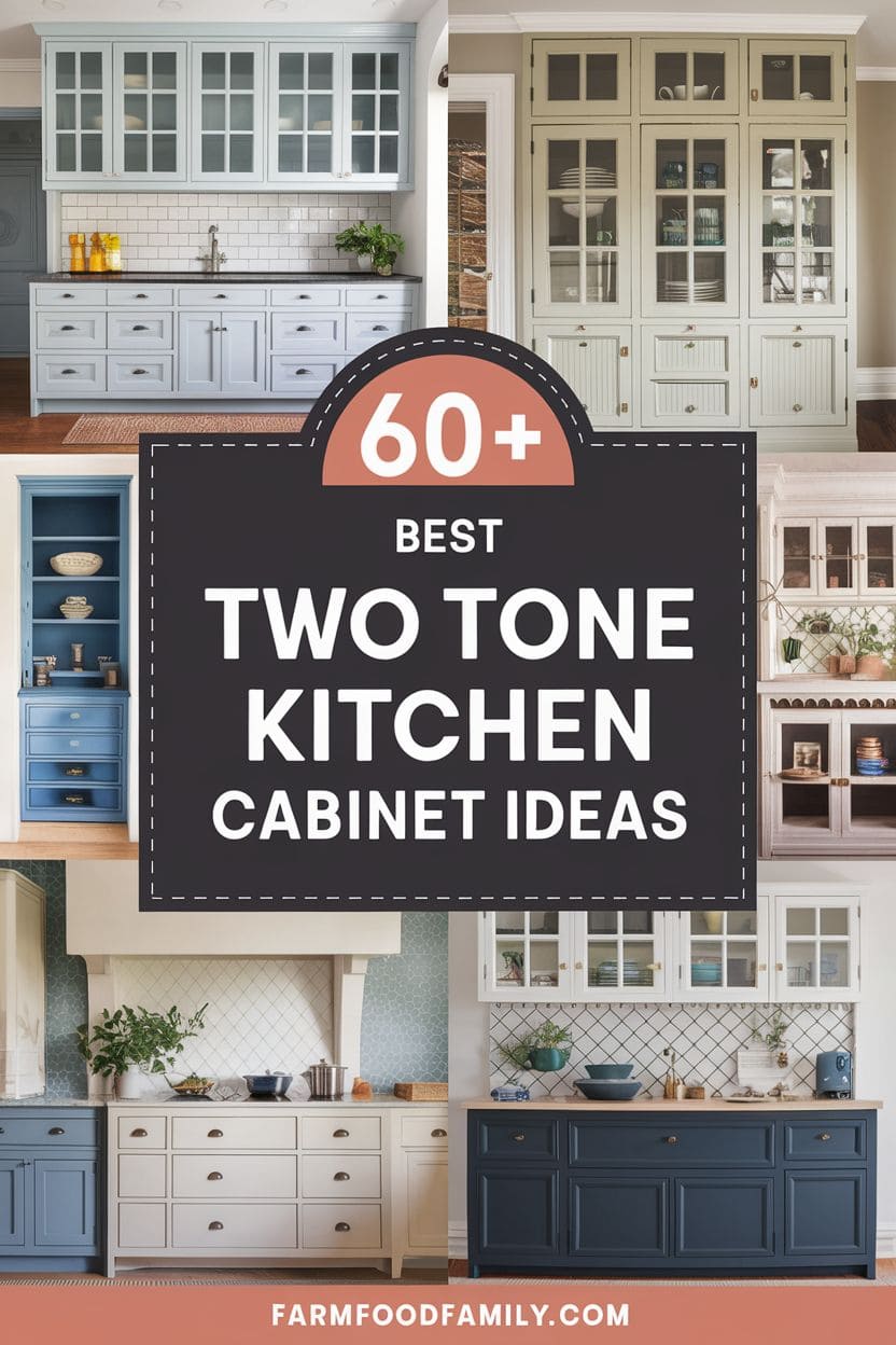
Two-tone kitchen cabinets are a visually appealing and contemporary way to add depth, contrast, and individuality to your kitchen. By combining two complementary or contrasting hues, you may add visual interest and designate separate zones in your area. Whether you favor strong hues or subtle neutrals, these two tone kitchen cabinet ideas can make your…

Never miss an update — choose FarmFoodFamily as your preferred source on Google.
How it works: Tap the button below to open Google’s settings page, then check the box next to FarmFoodFamily.
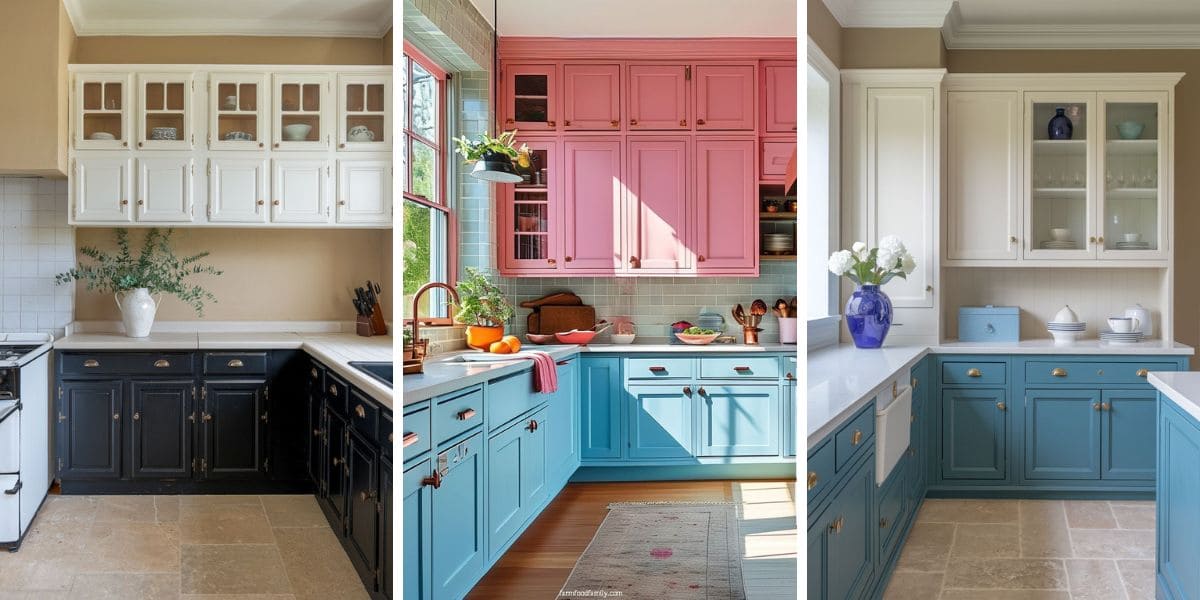
Tap the checkbox to turn it blue — that’s how you know it’s set.
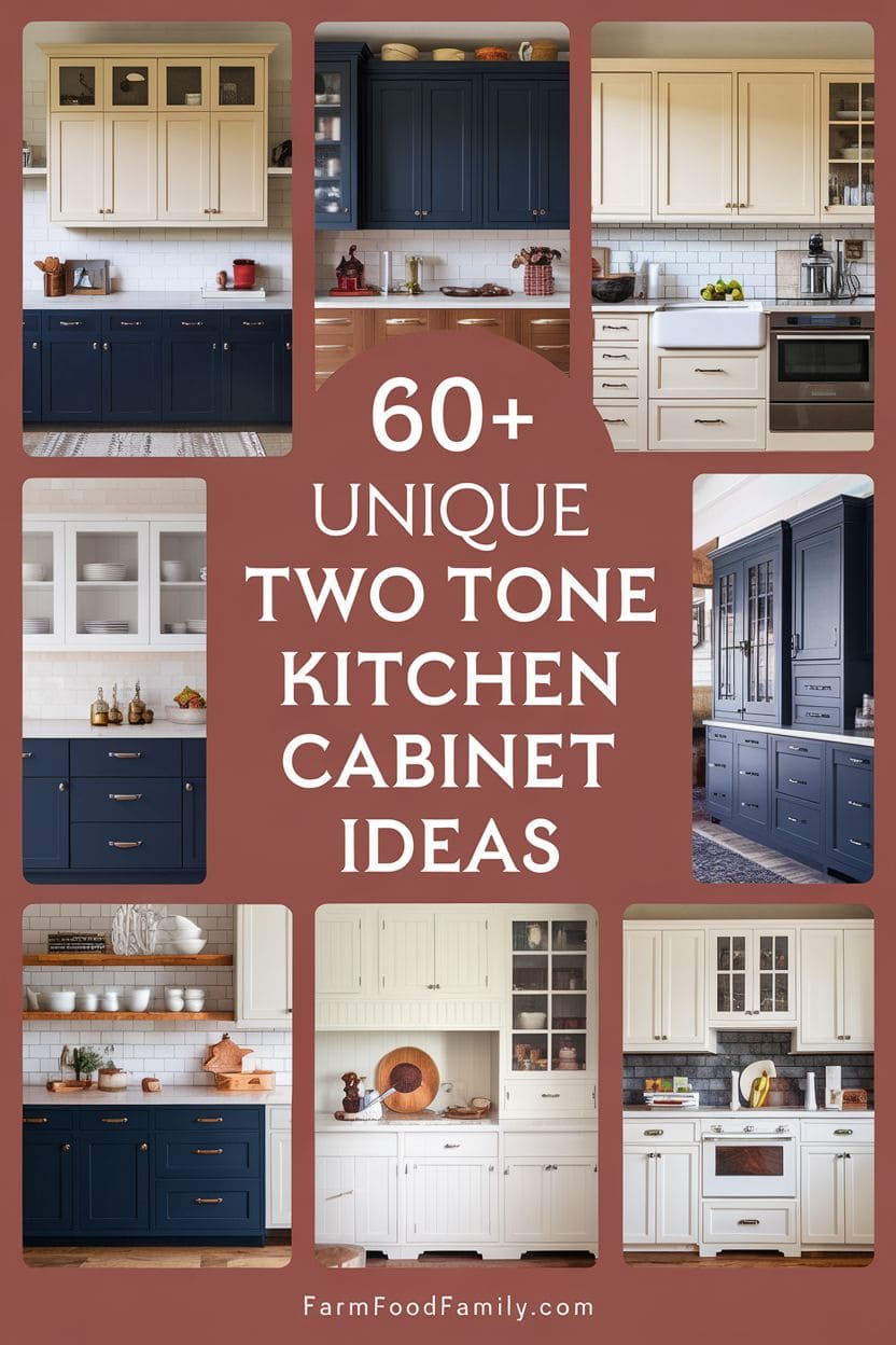
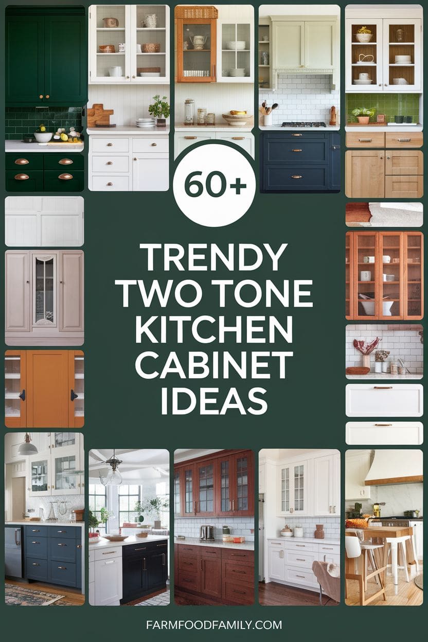
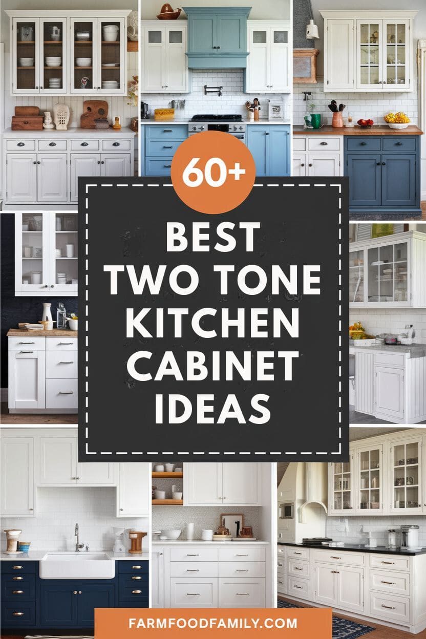
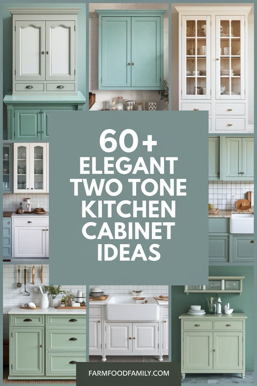
Two-tone kitchen cabinets are a visually appealing and contemporary way to add depth, contrast, and individuality to your kitchen. By combining two complementary or contrasting hues, you may add visual interest and designate separate zones in your area.
Whether you favor strong hues or subtle neutrals, these two tone kitchen cabinet ideas can make your kitchen design feel dynamic and distinctive to you.
Getting the pairing right
A few real principles show up again and again once you look past the inspiration photos.
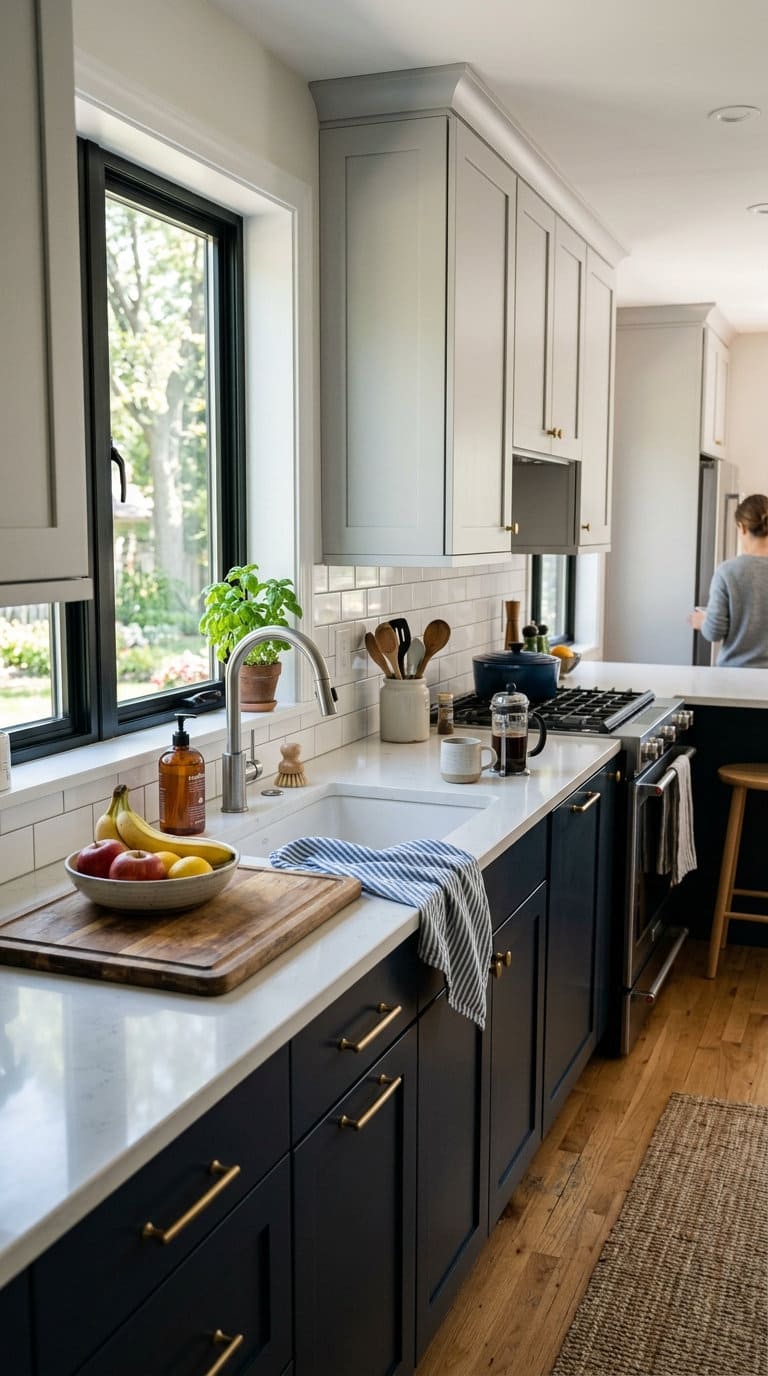
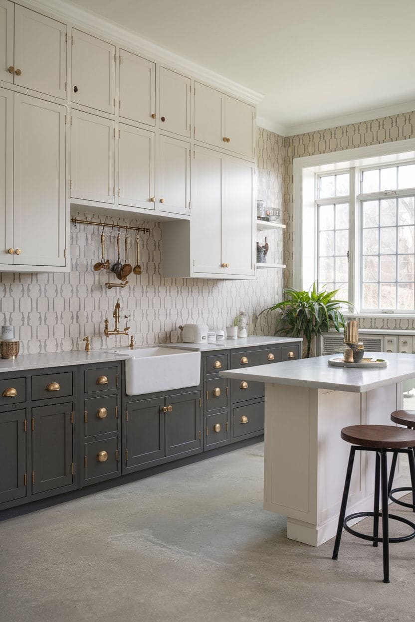
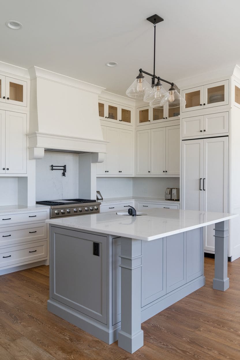
Lighter on top, darker on bottom is the dominant approach, and there’s a real reason for it. Graeme Smith, Head of Retail & Commercial Design at Life Kitchens, notes this split is the defining feature of a two-tone kitchen in the first place. A lighter upper reflects light and keeps the room feeling open, while a darker, grounding lower half draws the eye upward, makes the ceiling feel higher, and hides the everyday scuffs and fingerprints that show up at counter height far more than they do above eye level.
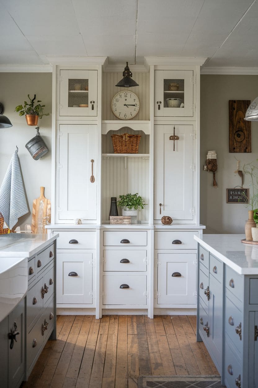
A two-tone split works as a middle ground, bold but not overwhelming. Ashleigh Hanwell, Senior Designer at Second Nature Kitchens, describes it as the option for homeowners who want to go bold with color without committing to it everywhere, pairing a striking hue with a neutral palette so the design still works in both a contemporary or a classic setting. Tie the two shades together with a small connecting detail, matching hardware, a shared countertop, a consistent faucet finish, or a high-contrast split can read as two unrelated kitchens instead of one intentional design.

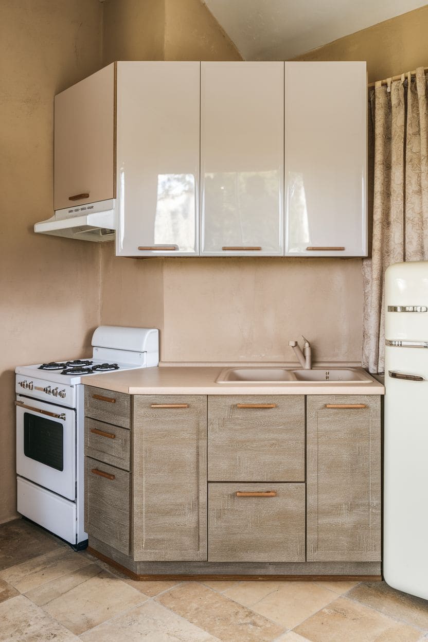
Mixing finishes is a real technique, not just a color choice. Tom Howley, the bespoke British kitchen company, points to pairing a matte finish on one tone with a glossy finish on the other as a way to add dynamic contrast even within a single color family, not just across two different colors.
Order sample doors before you commit. Kitchen lighting shifts a lot over the course of a day, natural light in the morning, warm bulbs at night, and a pairing that looks great on a screen or in a showroom can read completely differently on your actual wall. A physical sample under your kitchen’s real light is worth the wait.
On regret: most people who end up unhappy with a two-tone kitchen trace it back to layout, proportion, or material quality, not the color choice itself, an uneven split, a busy floor plan competing with a busy color scheme, or cheap cabinet material that shows wear fast. Get those three things right and a two-tone kitchen holds up as a long-term choice rather than a trend you’ll want to undo.
Cost, roughly. Repainting your existing cabinets in two colors is the cheapest way in, a realistic weekend-scale DIY project. Swapping just the doors and fronts (keeping the boxes) is a mid-range option. Replacing the cabinets entirely in two finishes is the highest-cost route. None of the ideas below repeat this, so keep it in mind as you read.
14 two-tone kitchen cabinet ideas
1. Using Gray and Yellow to Create a Modern Look
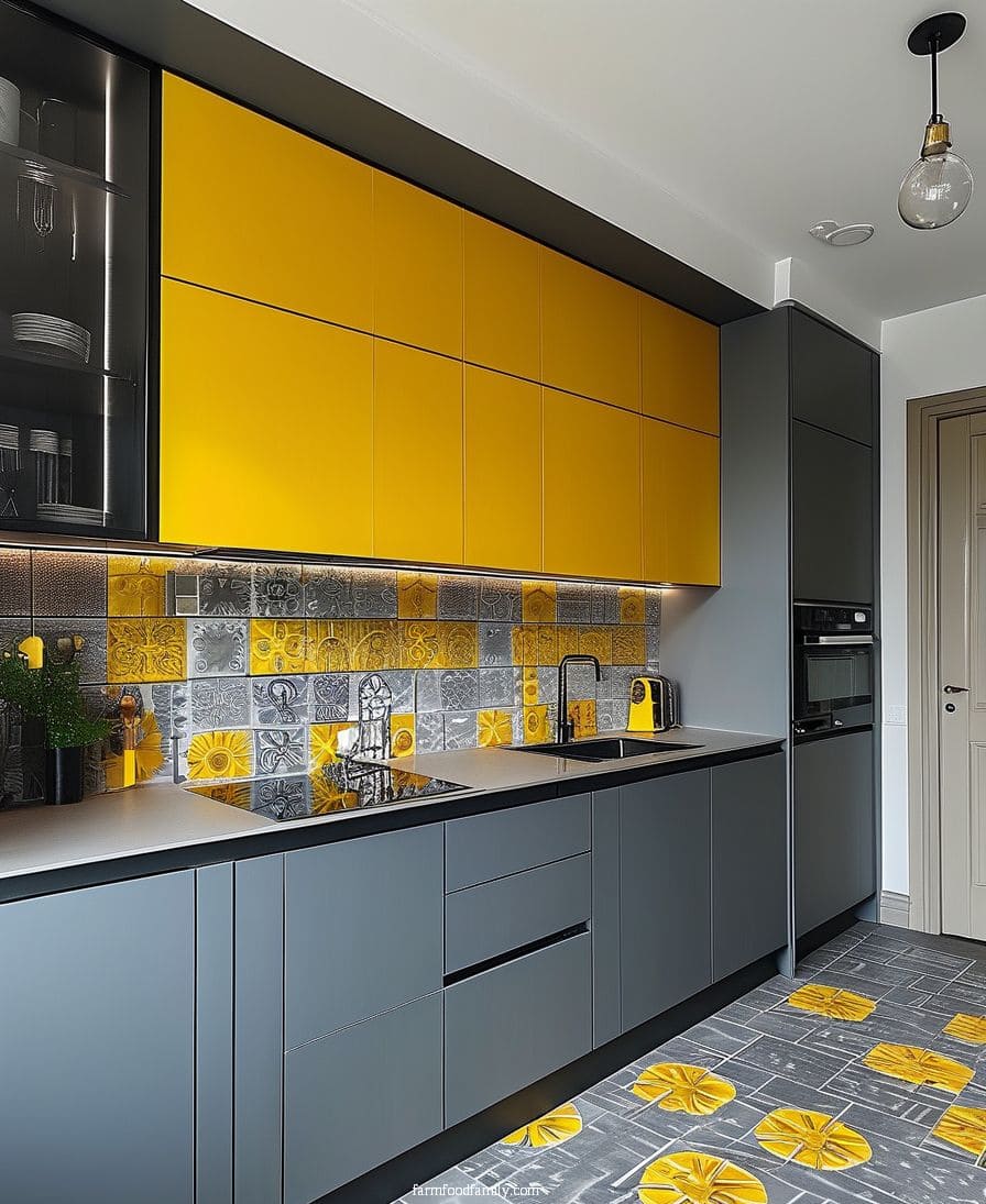
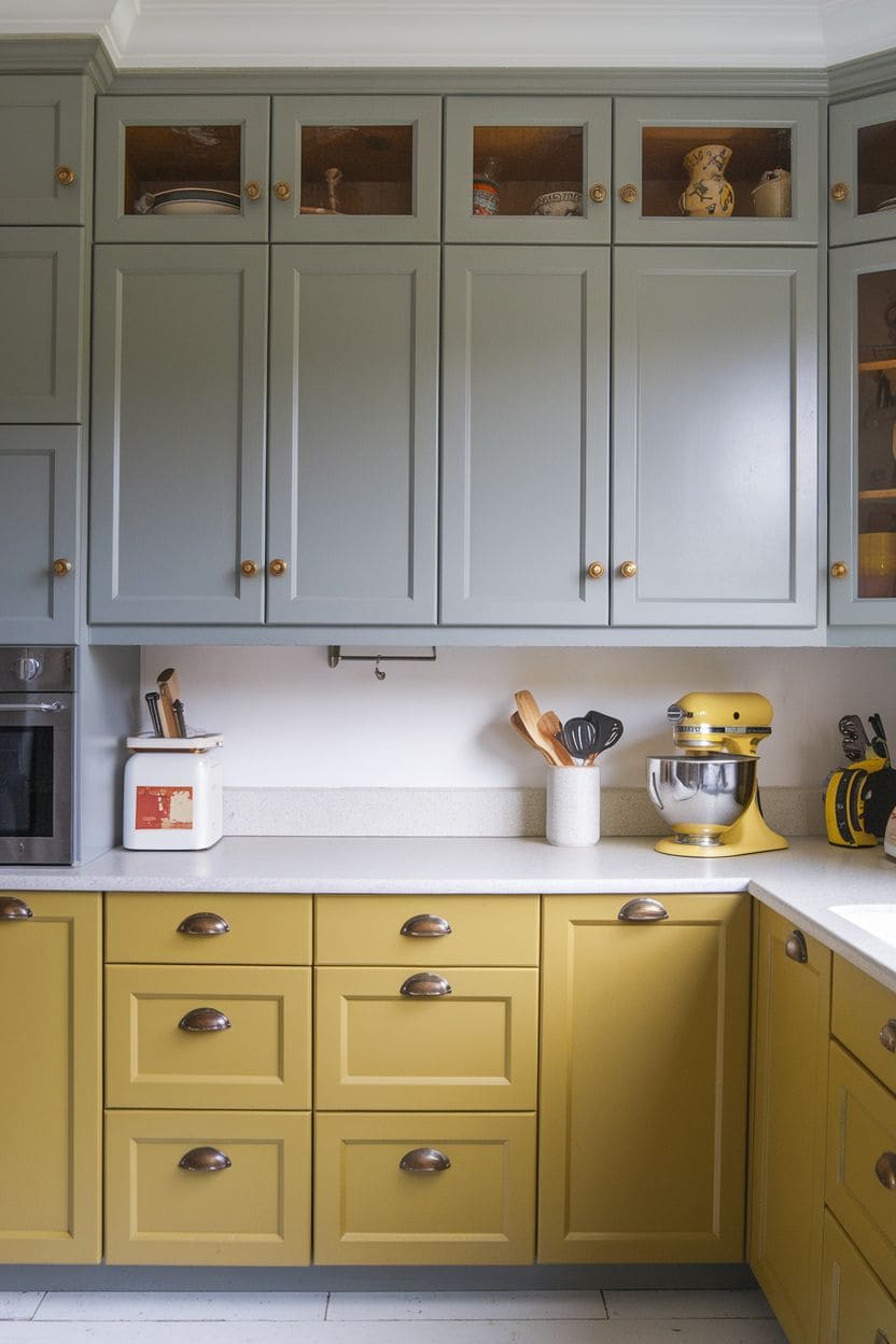
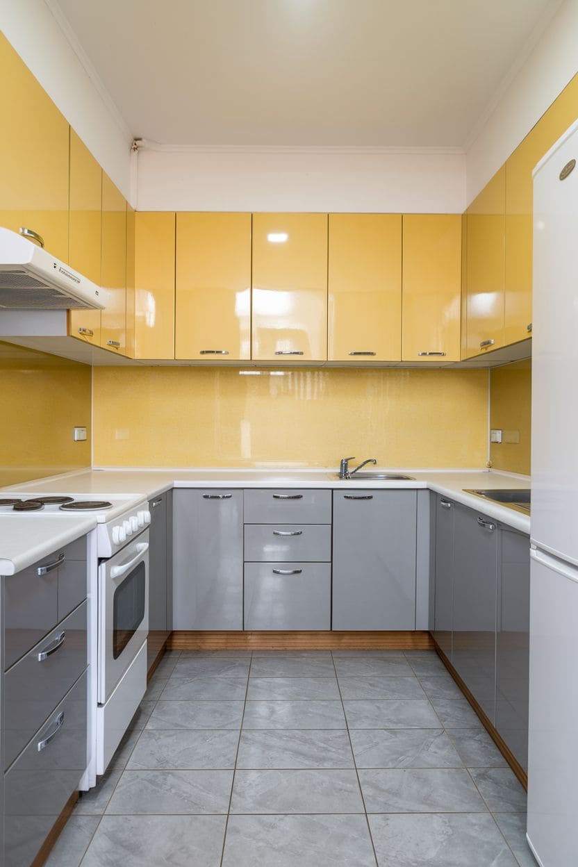

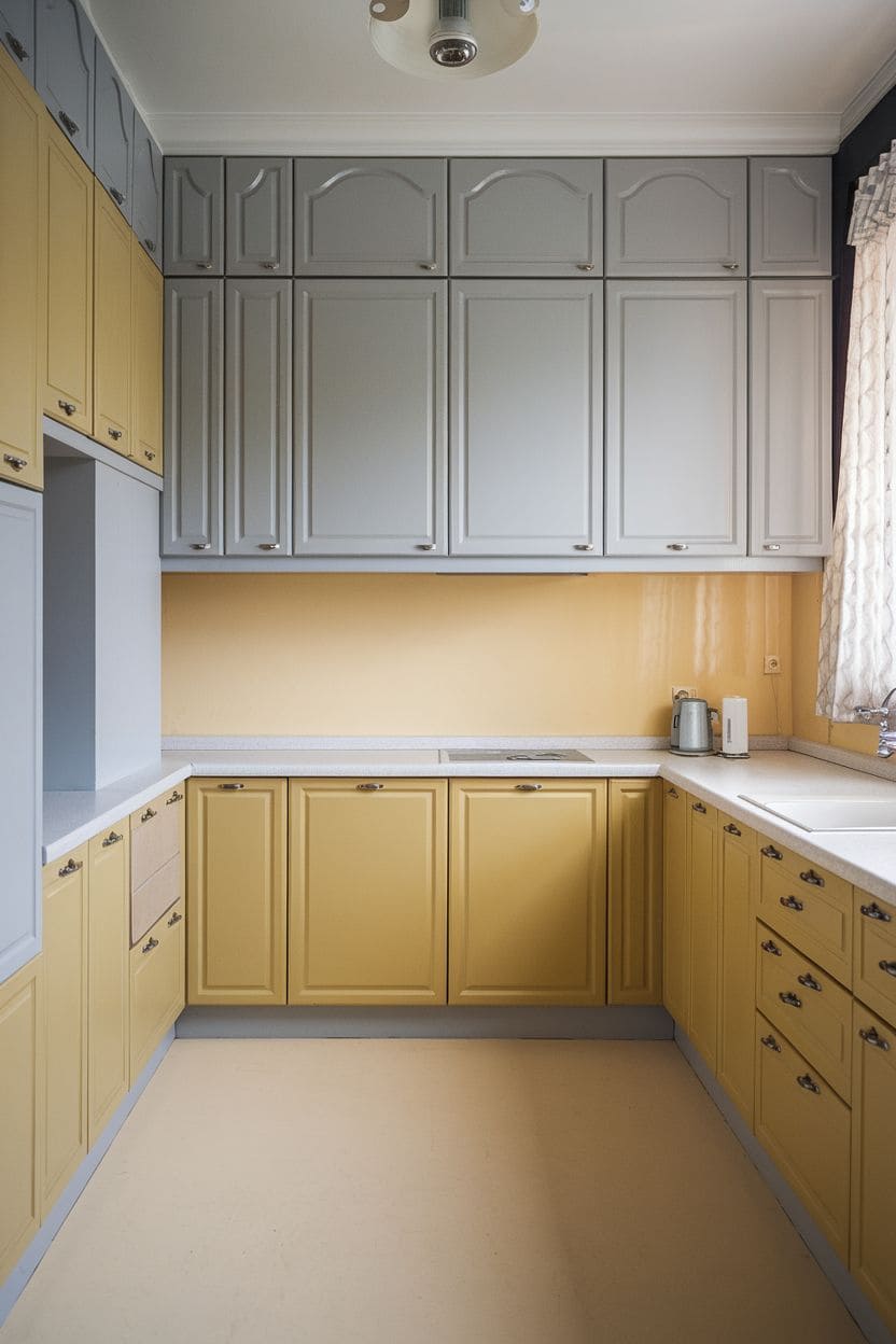
Cool gray base cabinets with sunny yellow uppers create a vibrant, modern kitchen. The gray acts as a neutral, grounding base so the yellow can shine without feeling overwhelming, a good fit for a modern or slightly quirky kitchen.
A backsplash that blends gray and yellow tones helps balance the intensity of the yellow rather than letting it dominate on its own.
2. Bold Contrast with Black and White
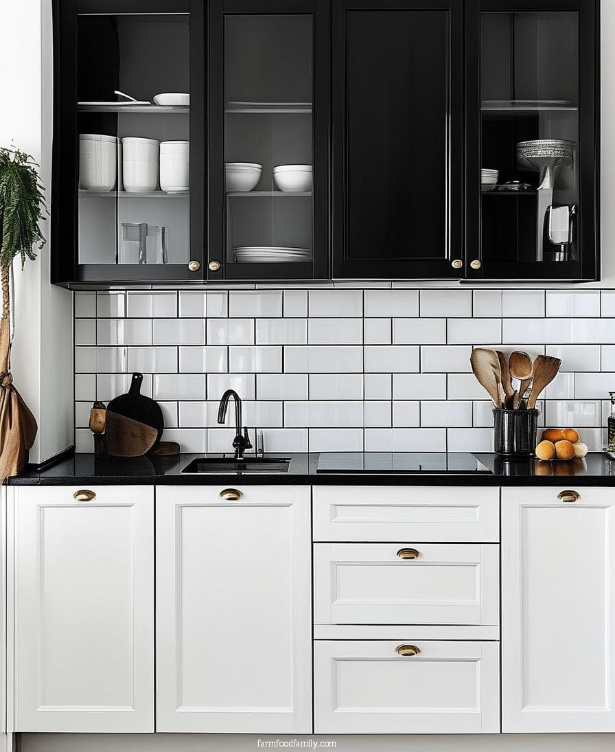
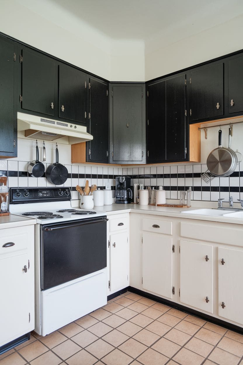
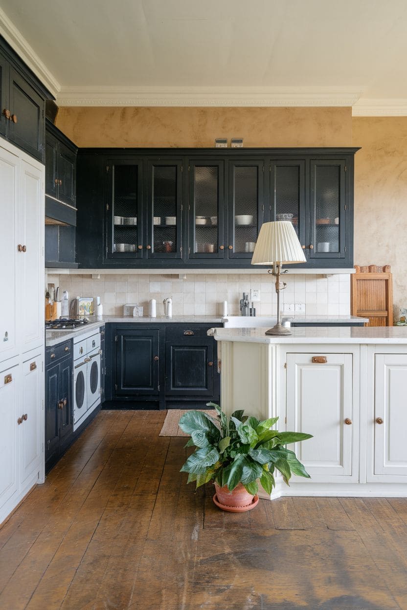
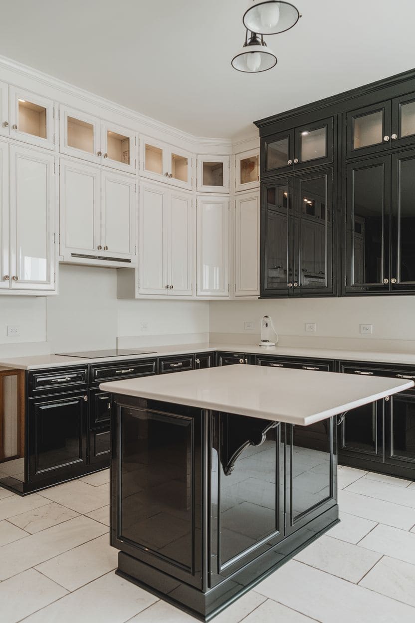
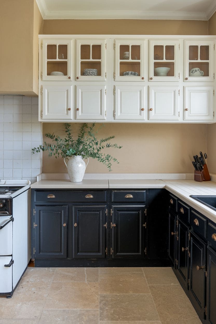
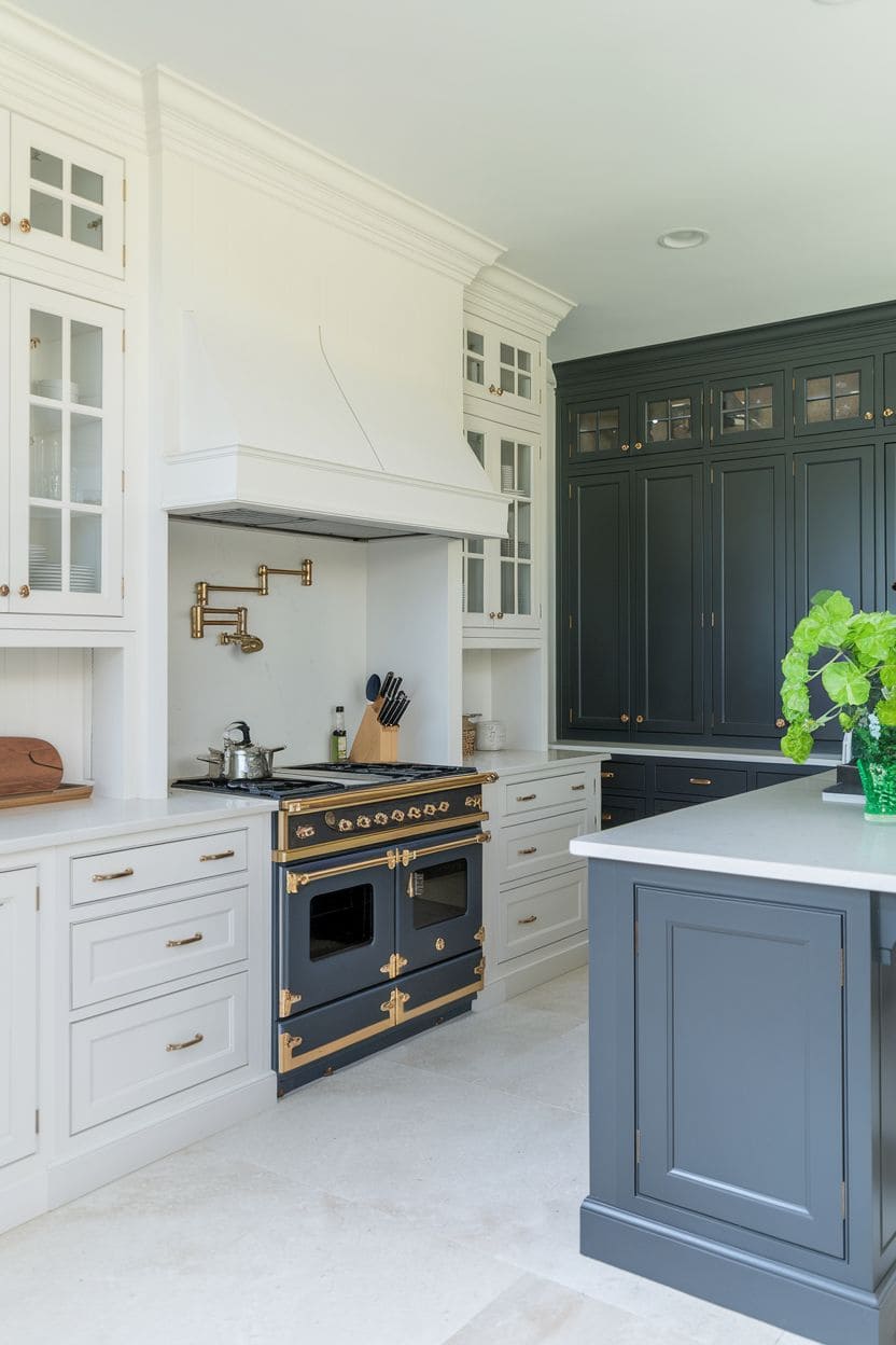
A black-and-white pairing is about as timeless as two-tone gets. Jet-black lower cabinets paired with stark white uppers create a high-contrast, contemporary look, the black grounds the space while the white keeps it feeling light and open.
Consistent hardware across both tones (per Hanwell’s tip above) keeps the strong contrast from feeling disjointed.
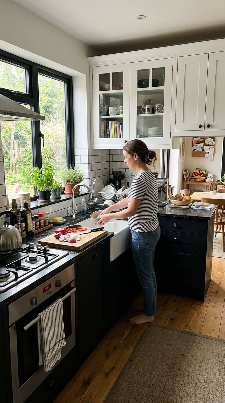
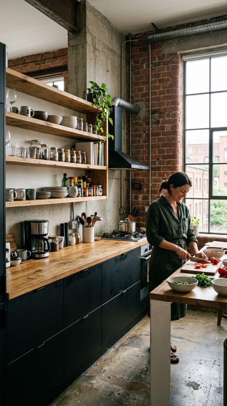
3. Black and Natural Wood with an Industrial Edge
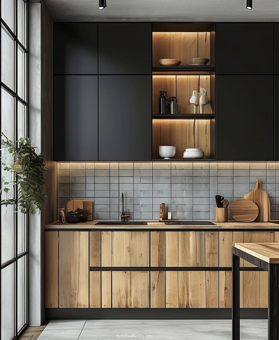
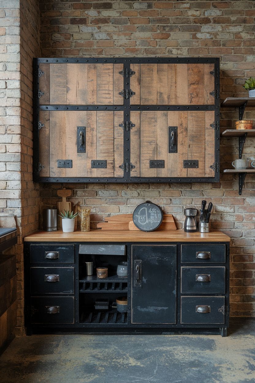
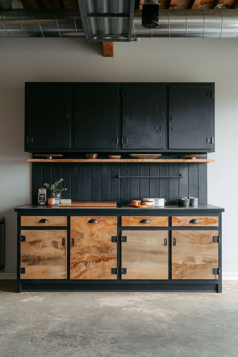
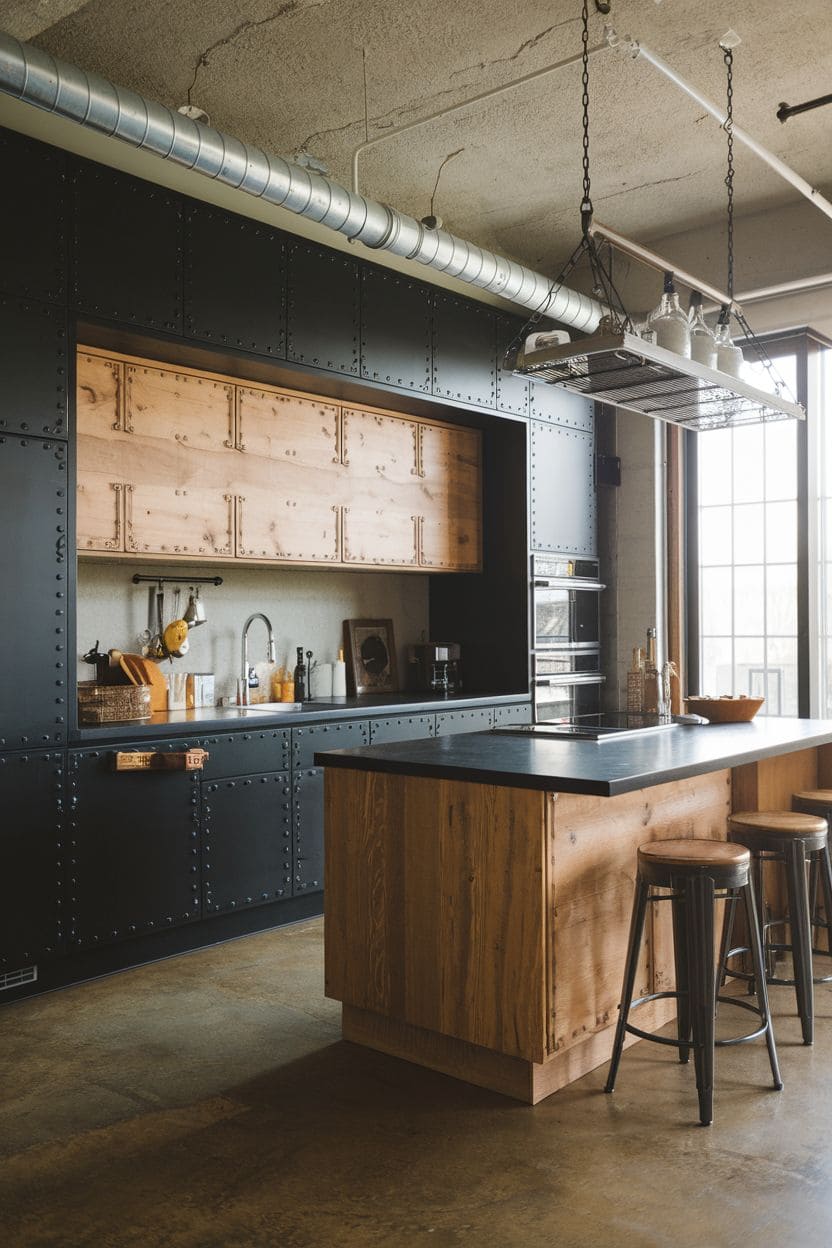
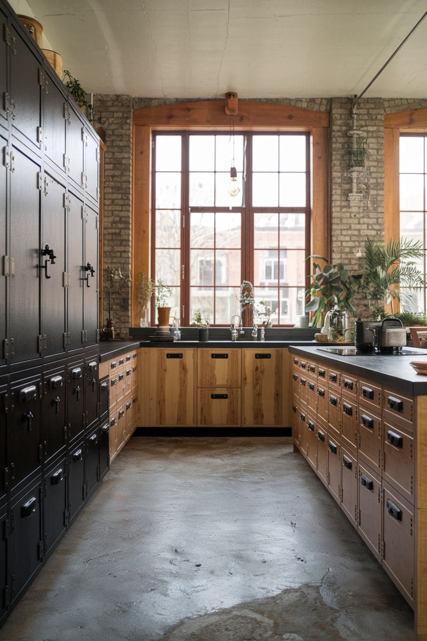
Matte black lower cabinets paired with natural wood uppers create an edgy, industrial-style kitchen, the black provides a sleek, dramatic base while the wood adds warmth and softens the overall look.
This combination works especially well in loft-style or open-plan homes with other industrial elements already in play, like concrete countertops or exposed brick.
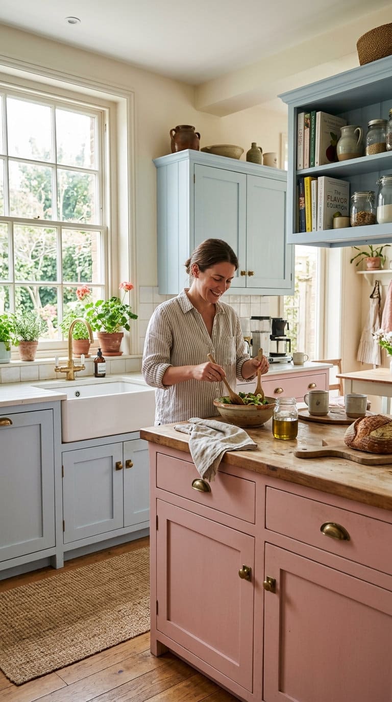
4. Dusty Pink and Blue for a Playful Punch
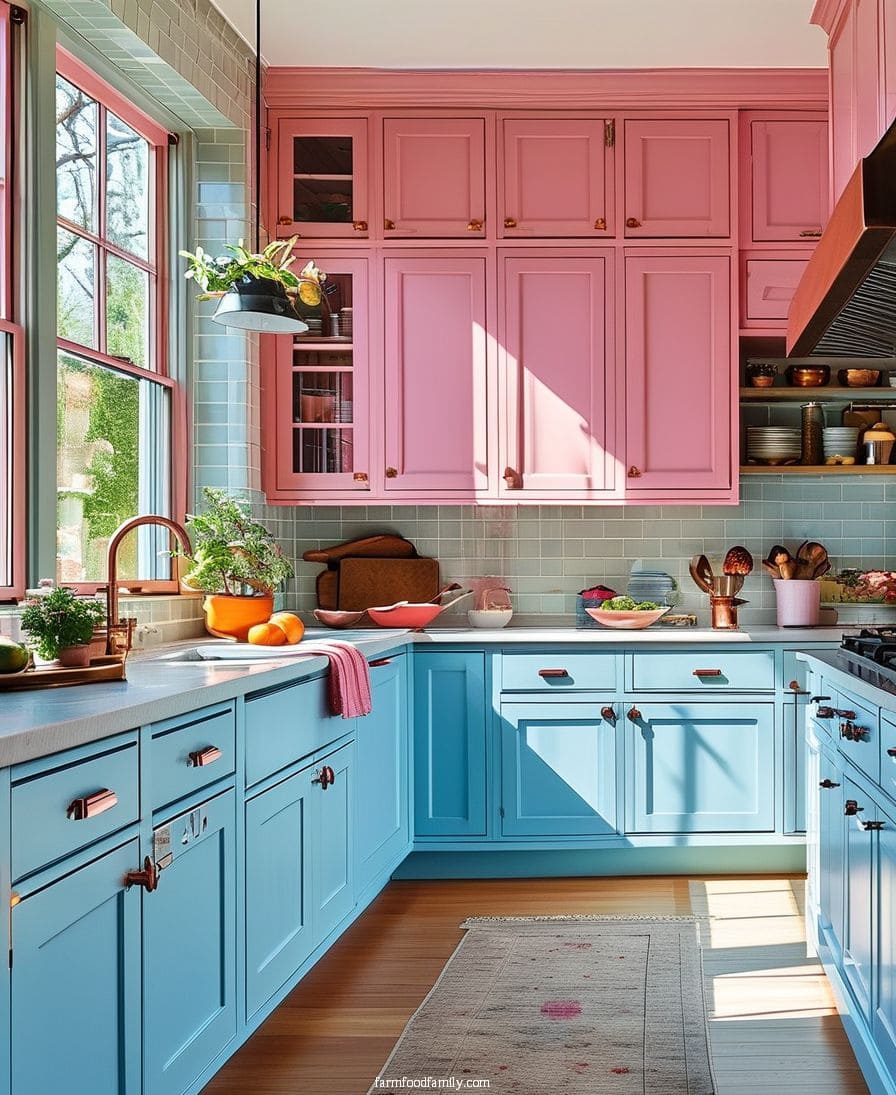
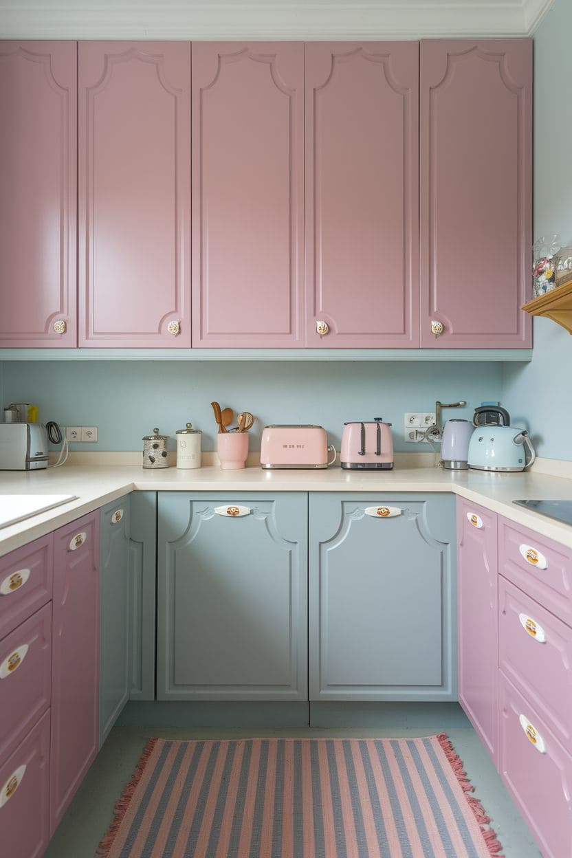
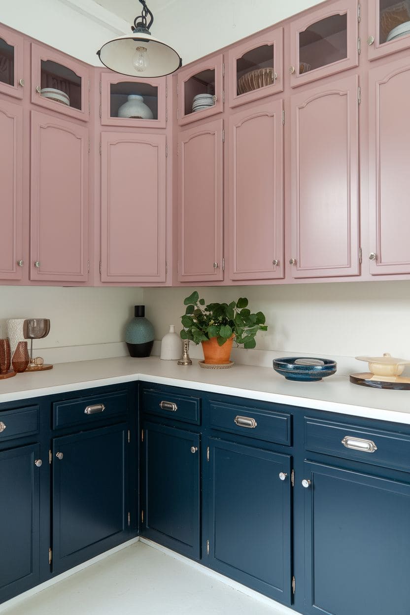
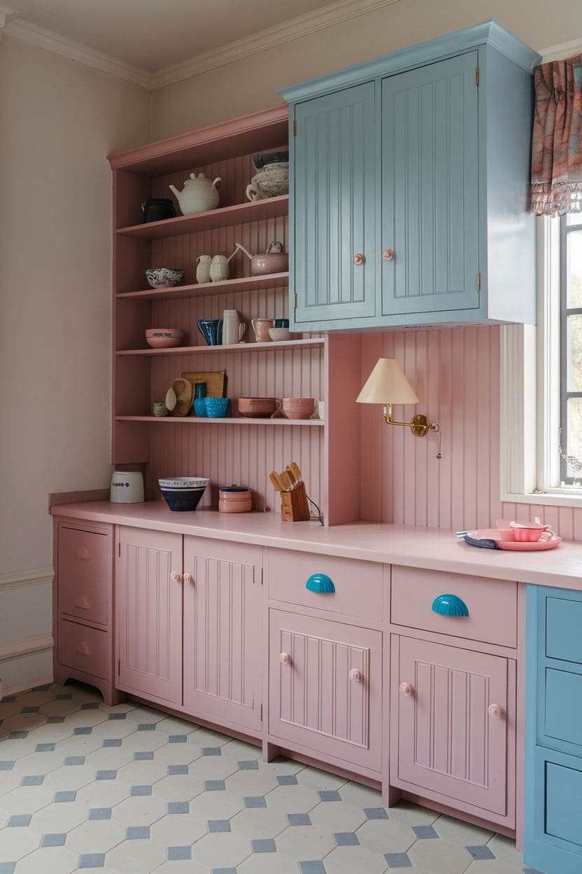
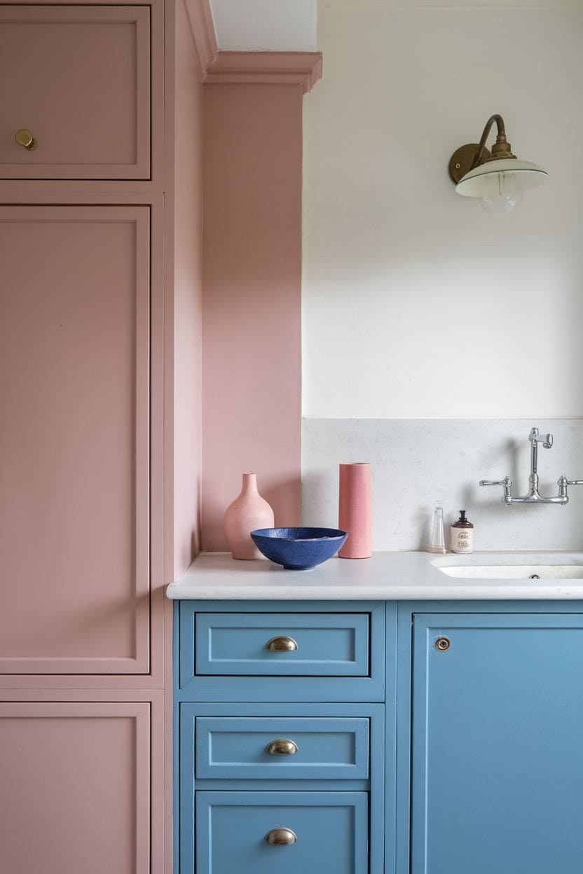
Dusty pink cabinets paired with pale blue create a charming, personality-forward kitchen without tipping into overly saturated color.
The pink stays delicate rather than dominating, and the blue keeps the whole look light and airy.
This pairing does especially well in kitchens with plenty of natural light, where the pink takes on a soft, luminous quality.
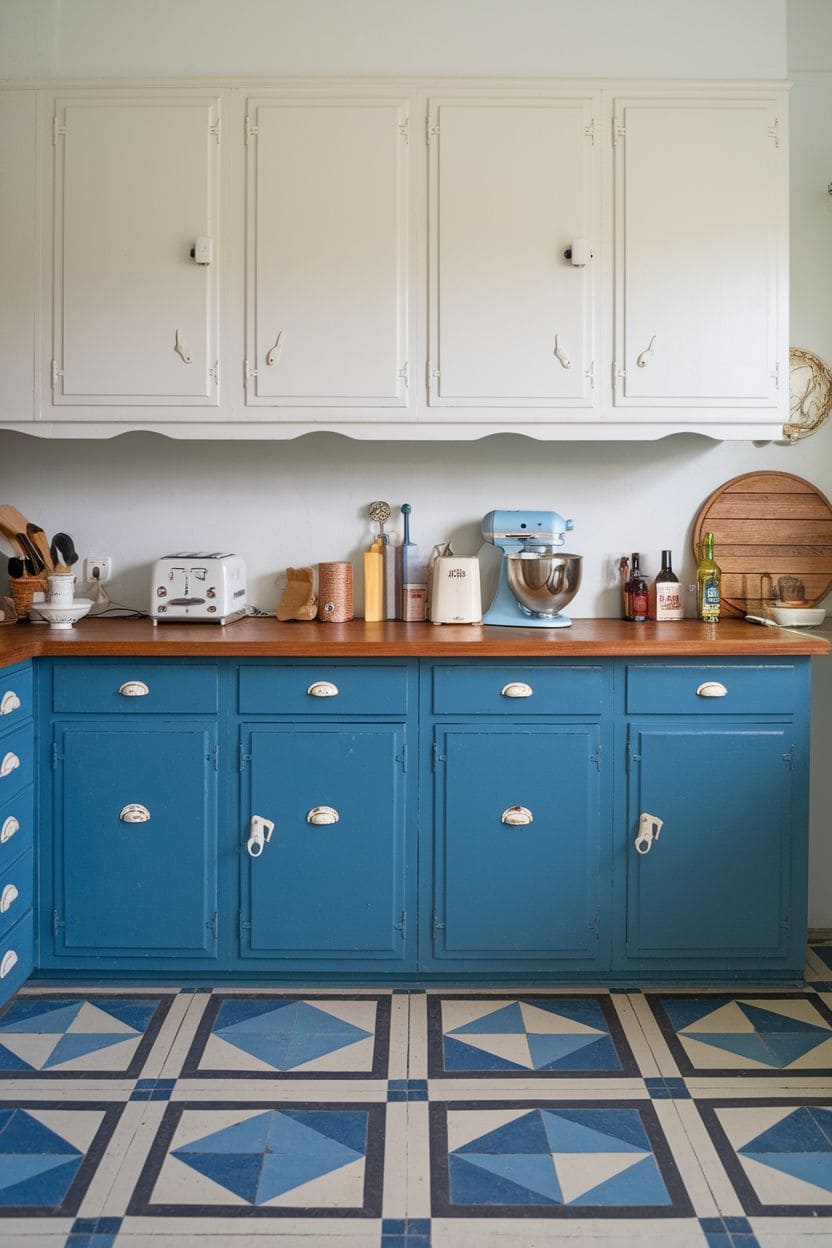
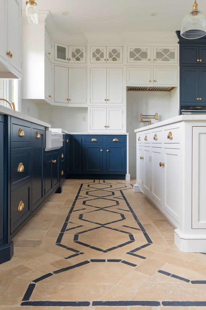
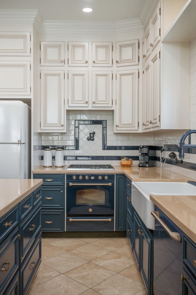
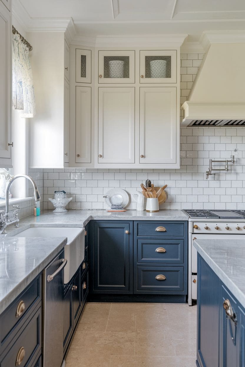
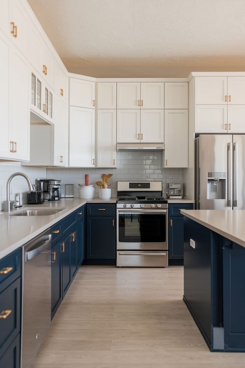
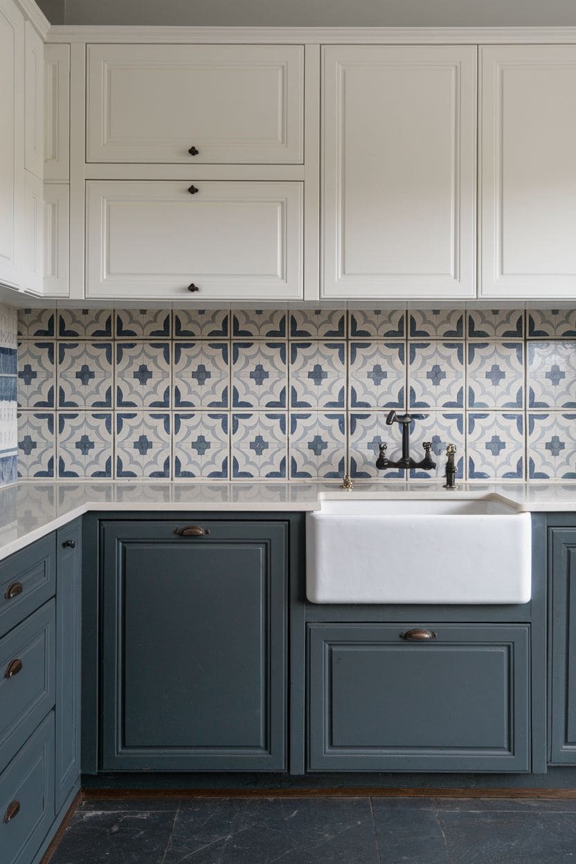
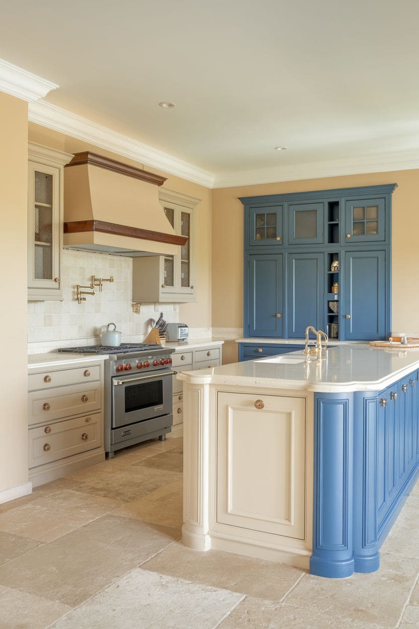
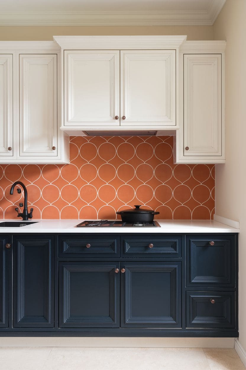
5. Classic white and navy
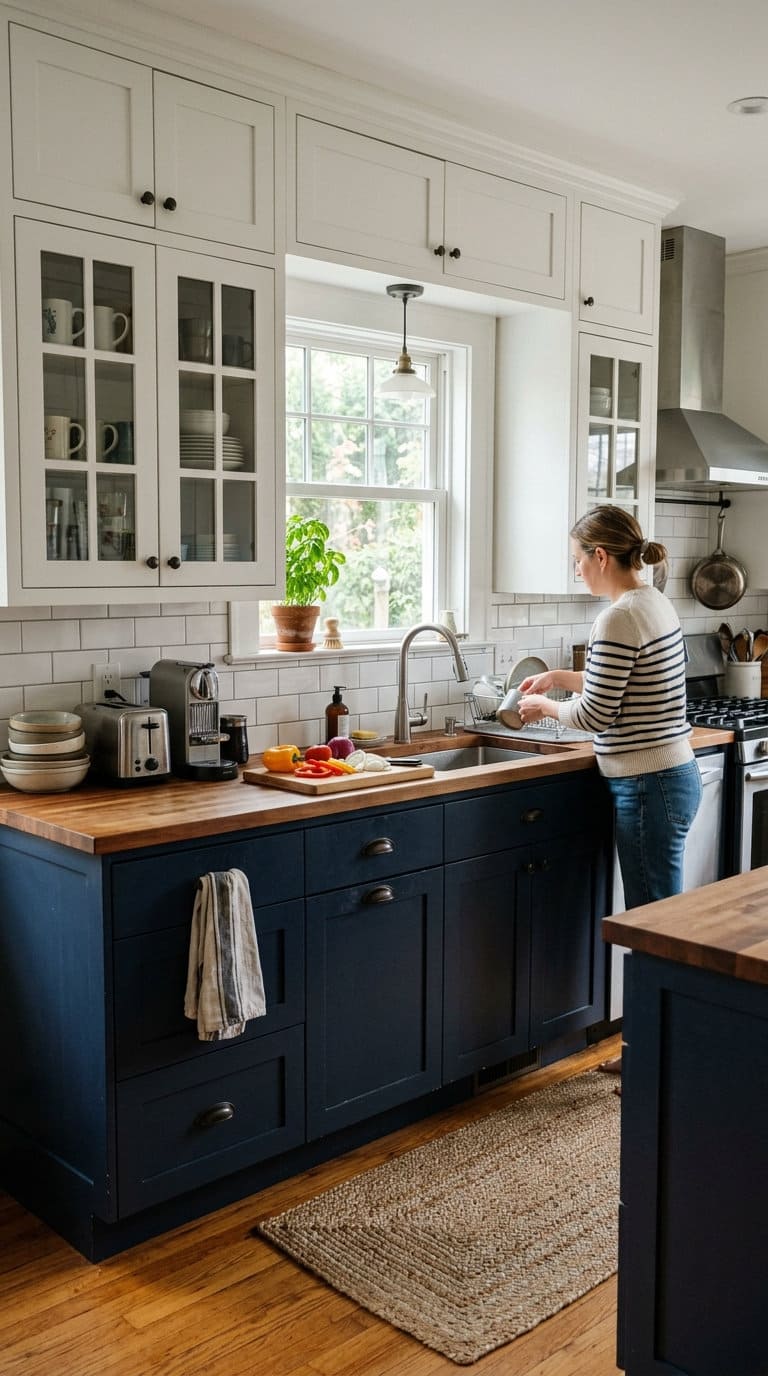
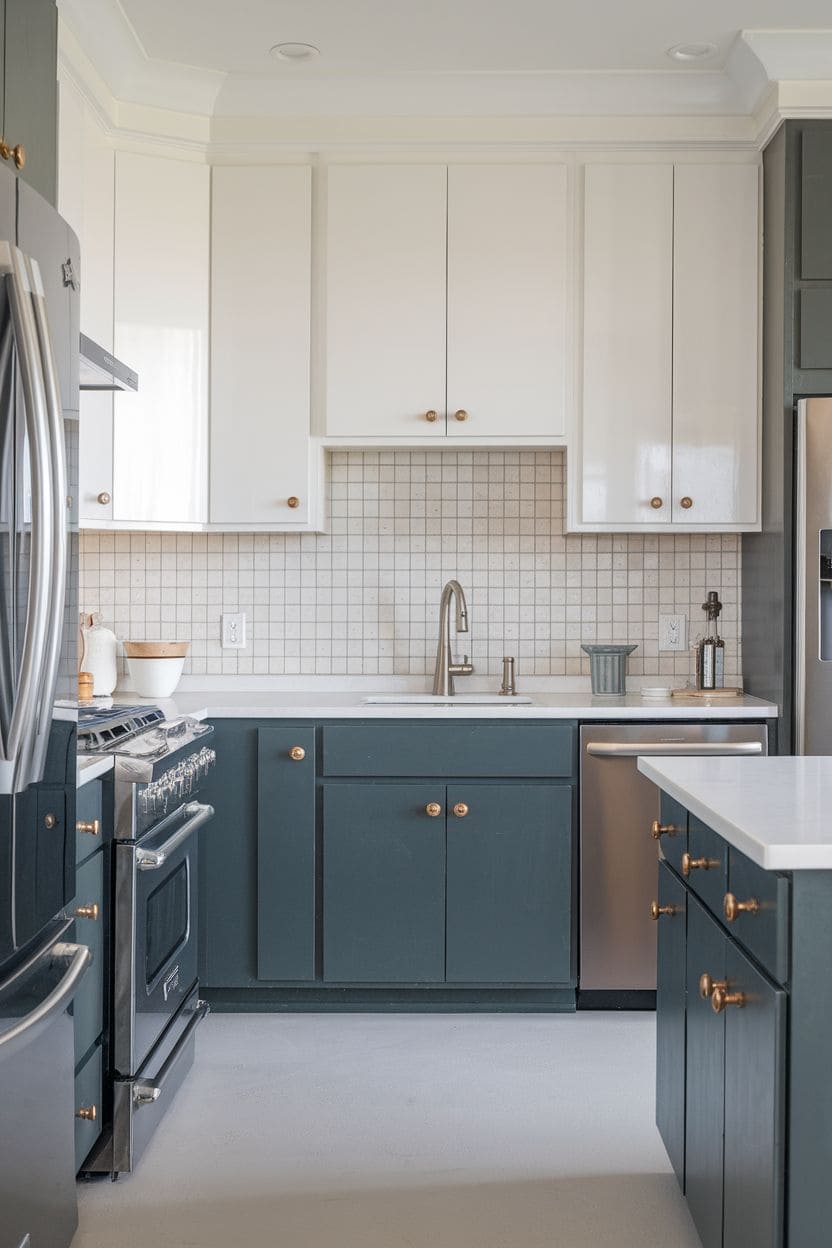
A white-and-navy kitchen is one of the most enduring two-tone pairings for a reason, crisp, high-contrast, and never really out of style.
Navy lowers ground the space with real depth without reading as heavy the way black sometimes can, while white uppers keep everything feeling fresh and bright.
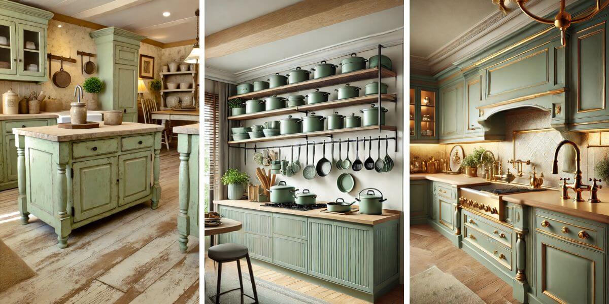
6. Sage green and oak
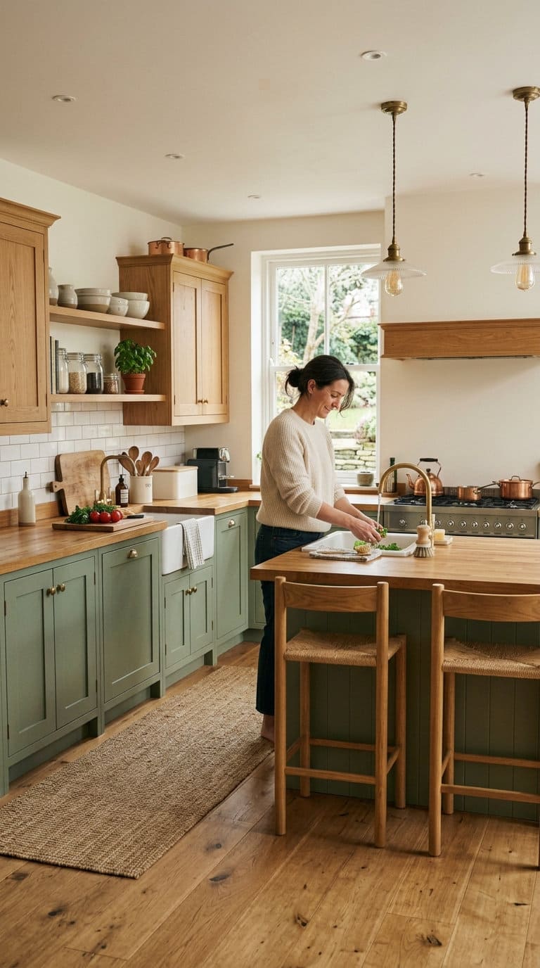
Sage green cabinets paired with natural oak bring a warm, earthy feel that suits farmhouse, cottage, and Scandinavian-style kitchens especially well.

The green stays soft and muted rather than punchy, and the oak grain adds texture that a flat painted finish alone can’t.
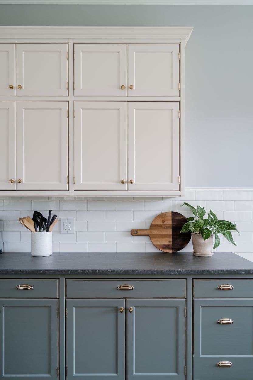
7. Soft grey and white
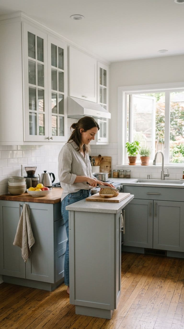
A gentler alternative to the black-and-white pairing above, soft grey lowers with white uppers keep the same light-on-top, grounded-on-bottom logic but in a lower-contrast, more relaxed palette.
This is a good option if the full black-and-white split feels like too much for your space.
8. White with a warm wood accent
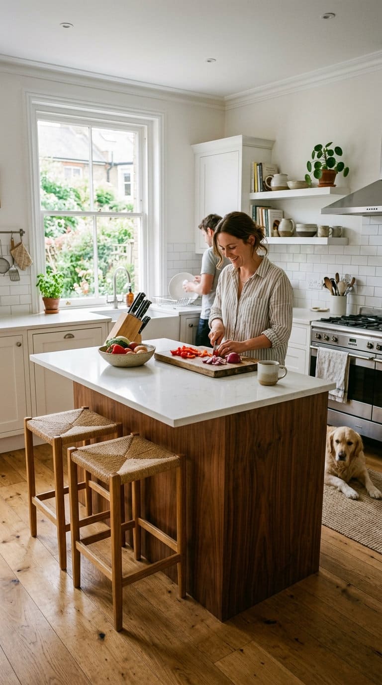
Rather than splitting upper and lower, this pairing uses white as the dominant cabinet color with warm wood reserved for an island, a run of lower cabinets, or open shelving.
White keeps the kitchen bright, while the wood adds the depth and warmth a fully white kitchen can sometimes lack.
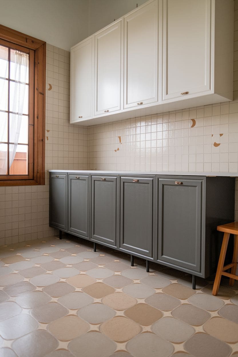
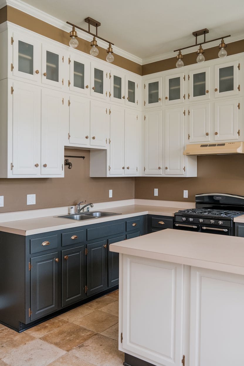
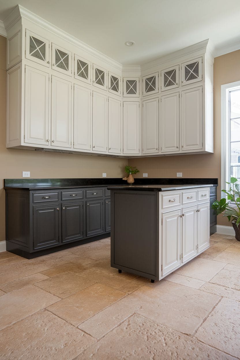
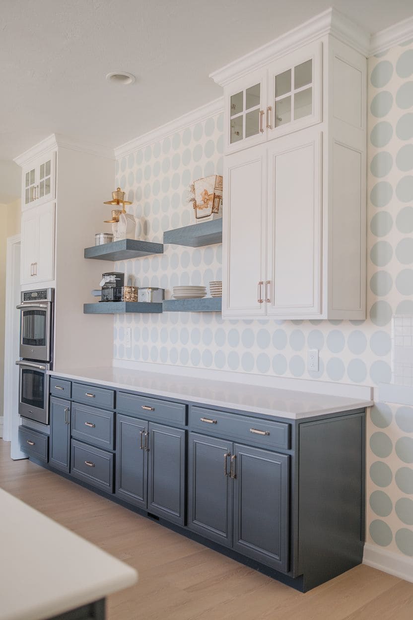
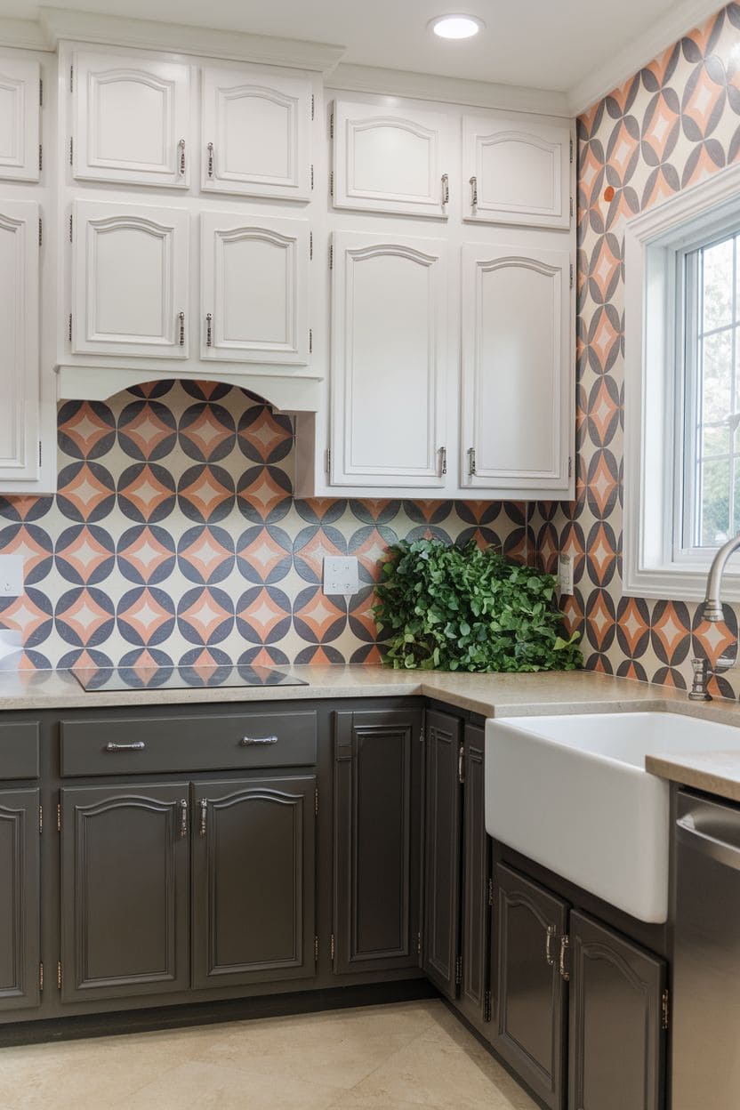
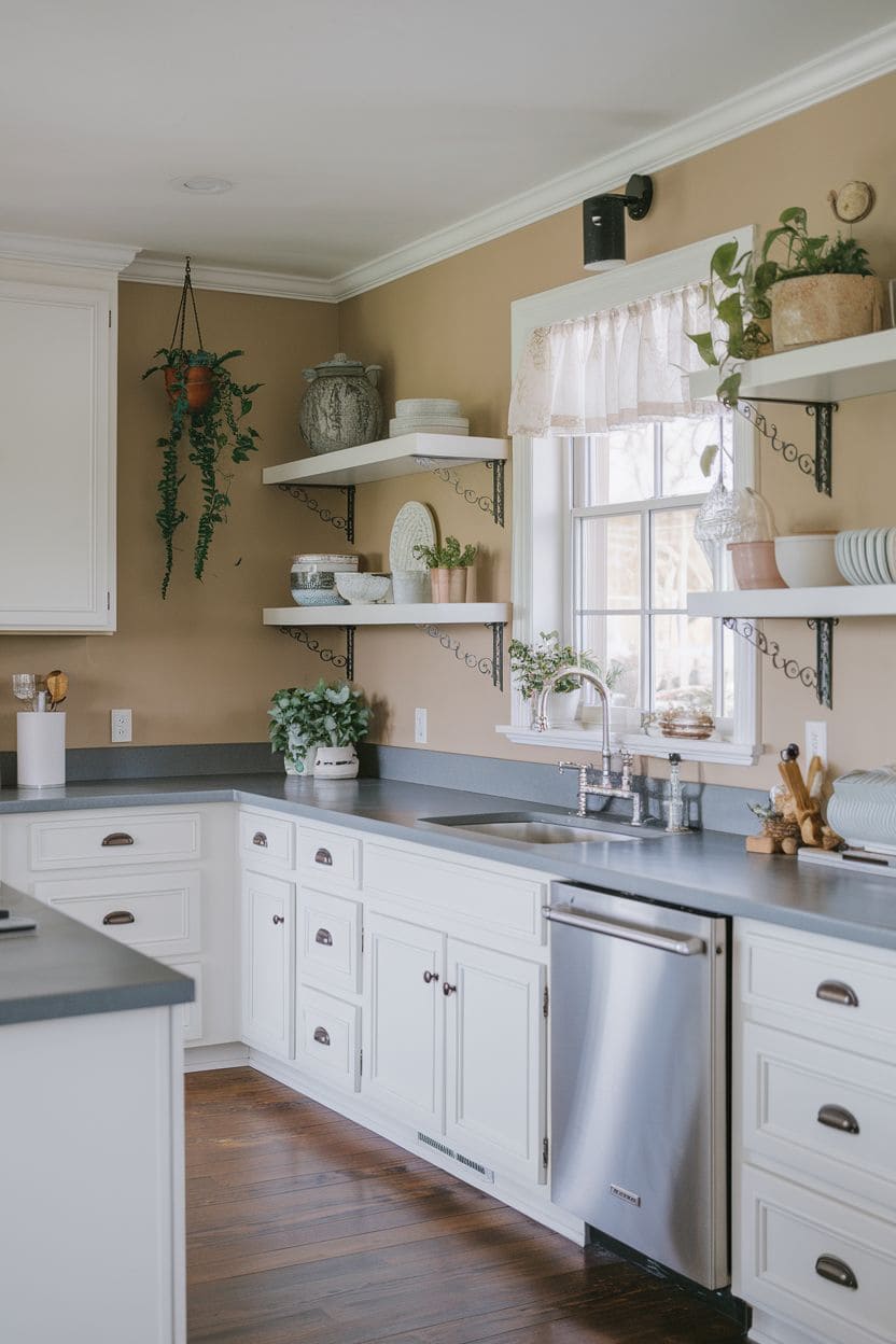
9. Dark grey and white
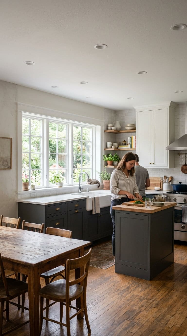
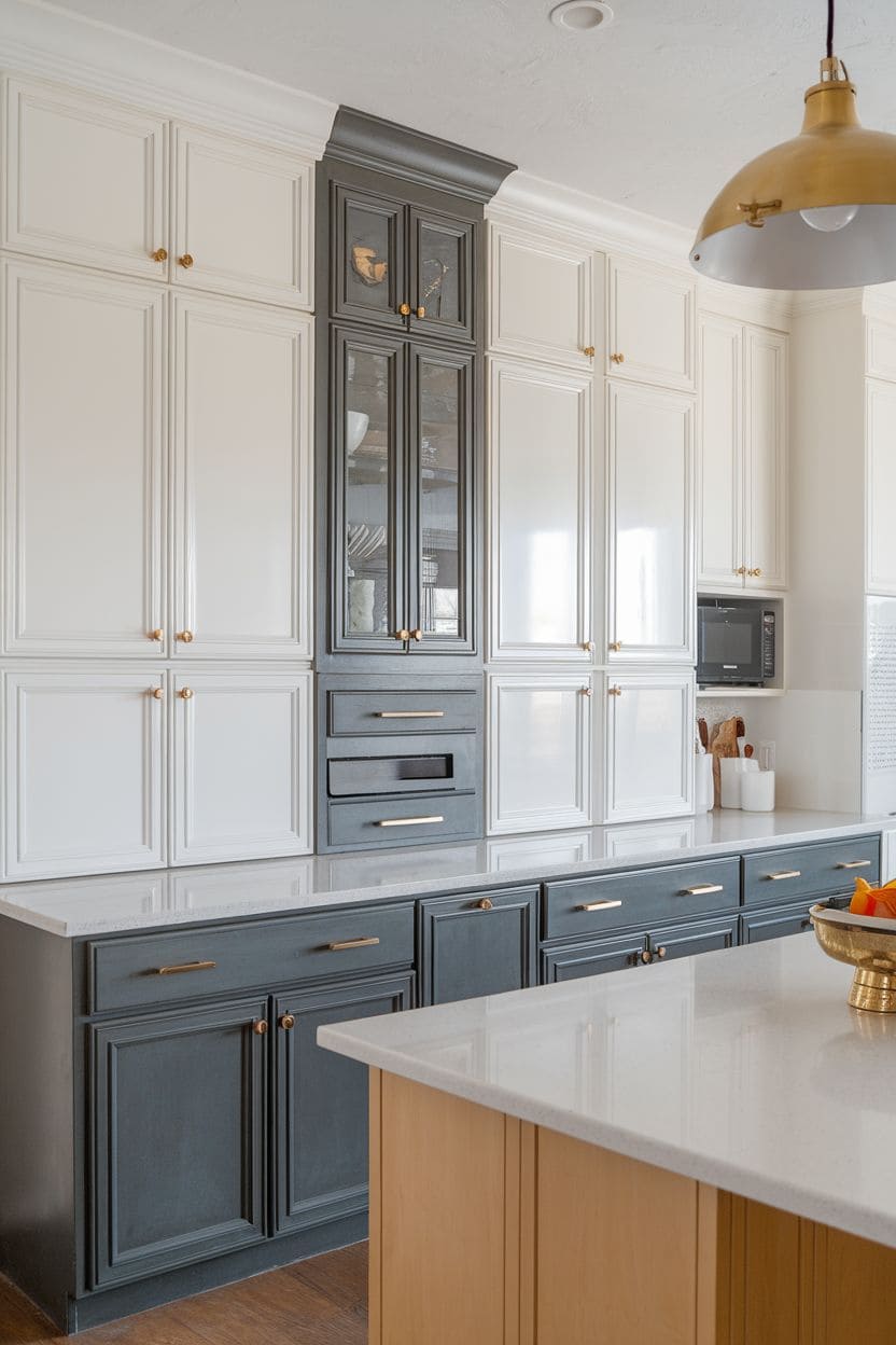
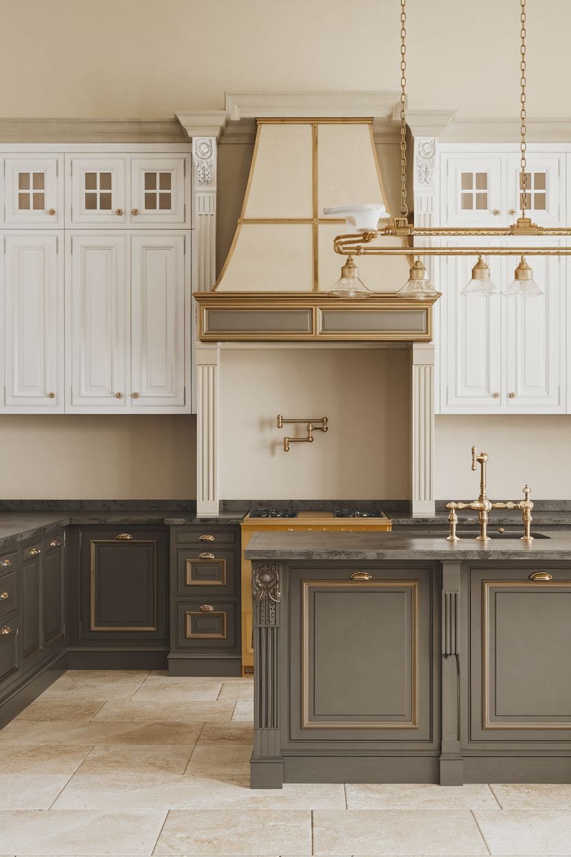
A slightly softer, more sophisticated cousin of black-and-white, dark grey lowers with white uppers read as elegant rather than stark.
The grey grounds the space with real weight while staying a touch more forgiving than true black for showing dust or water spots.
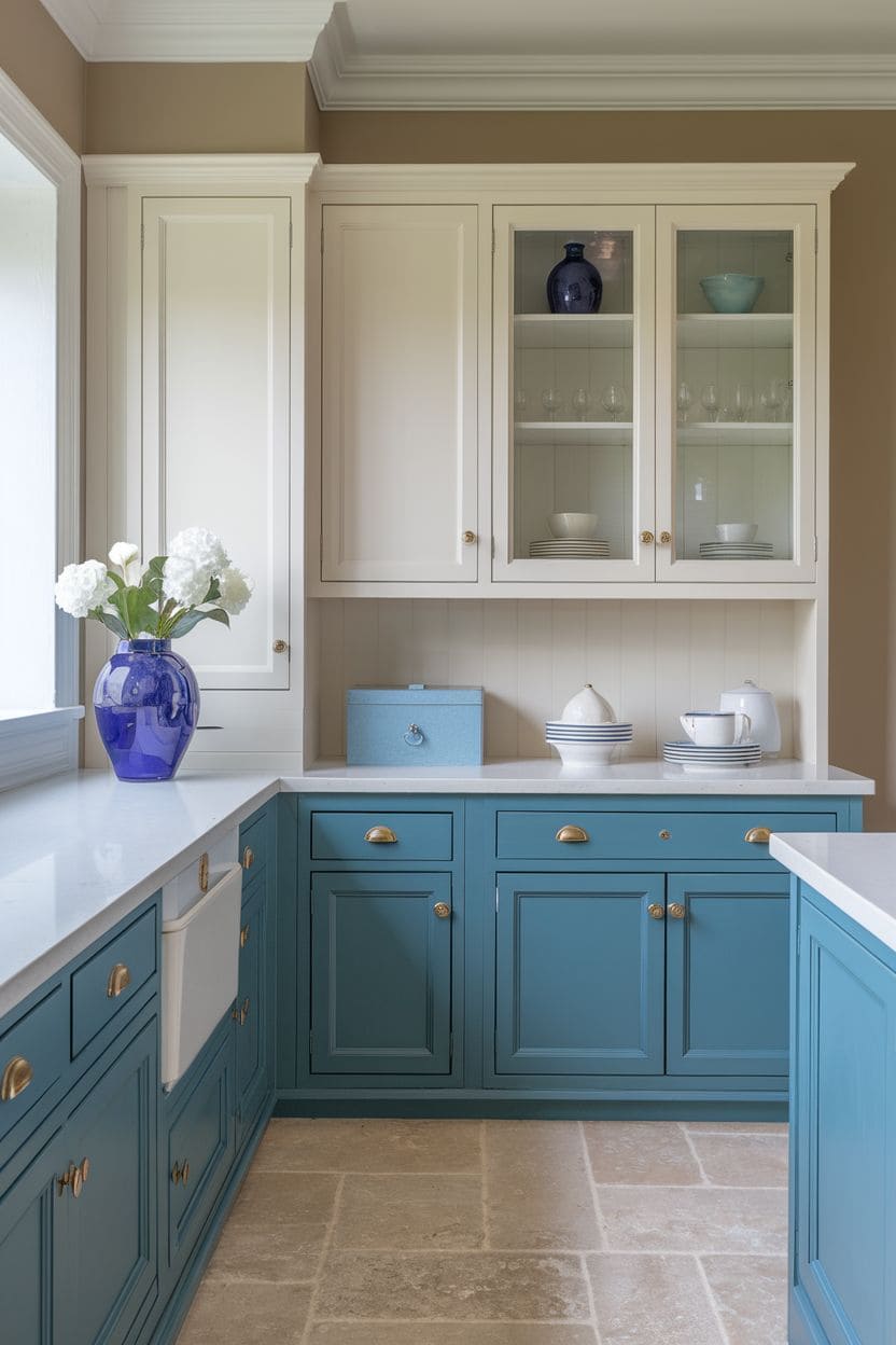
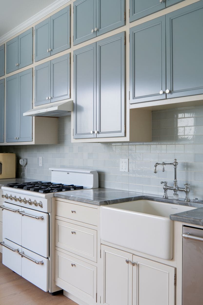
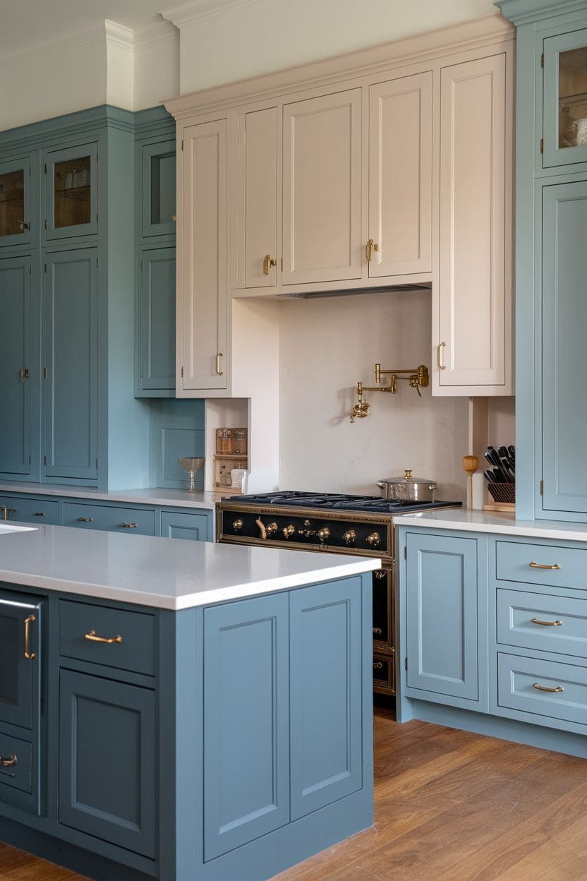
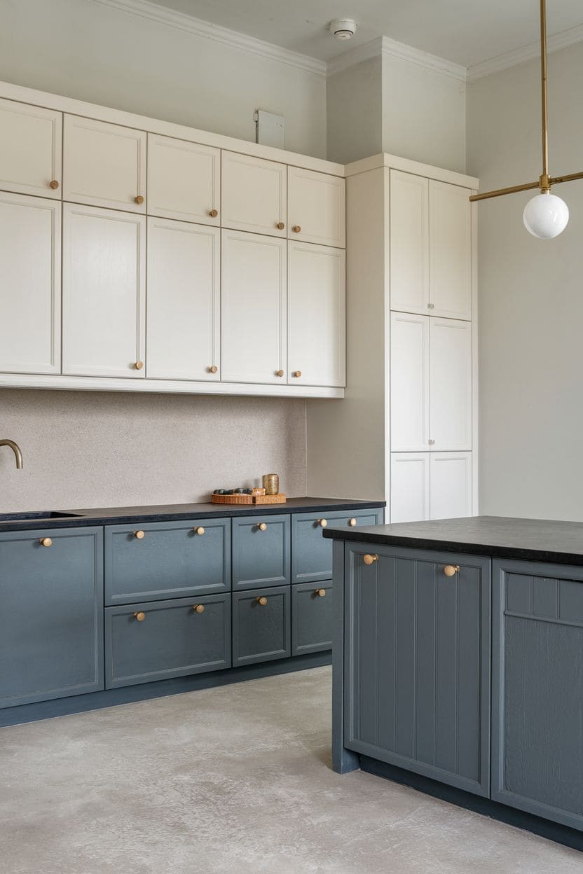
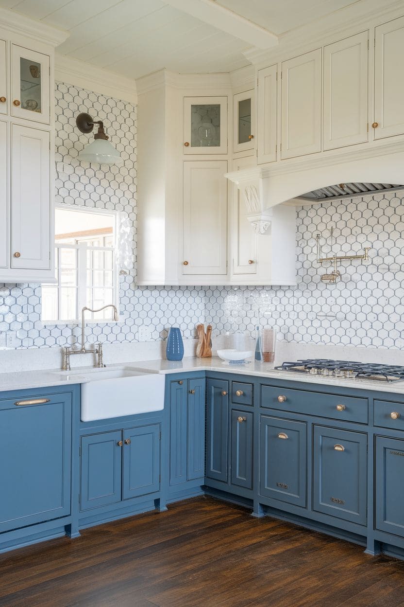
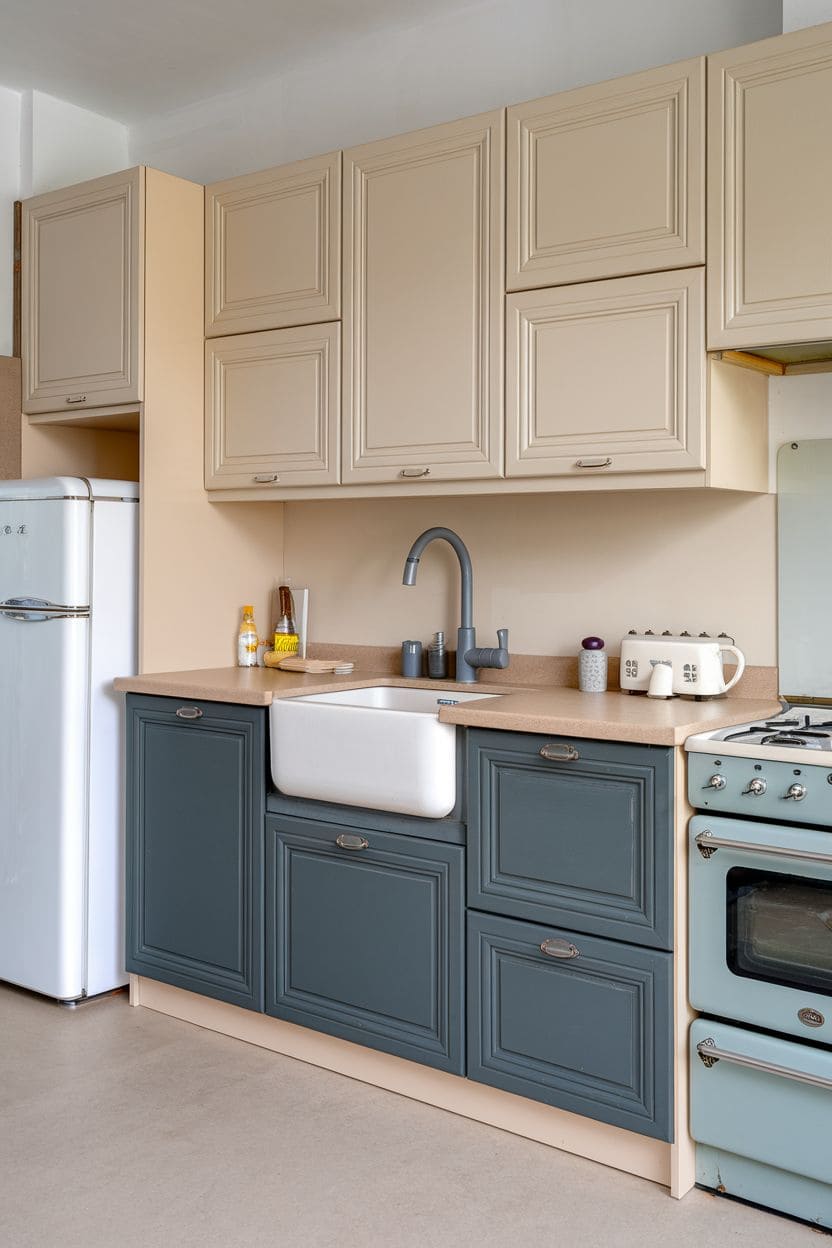
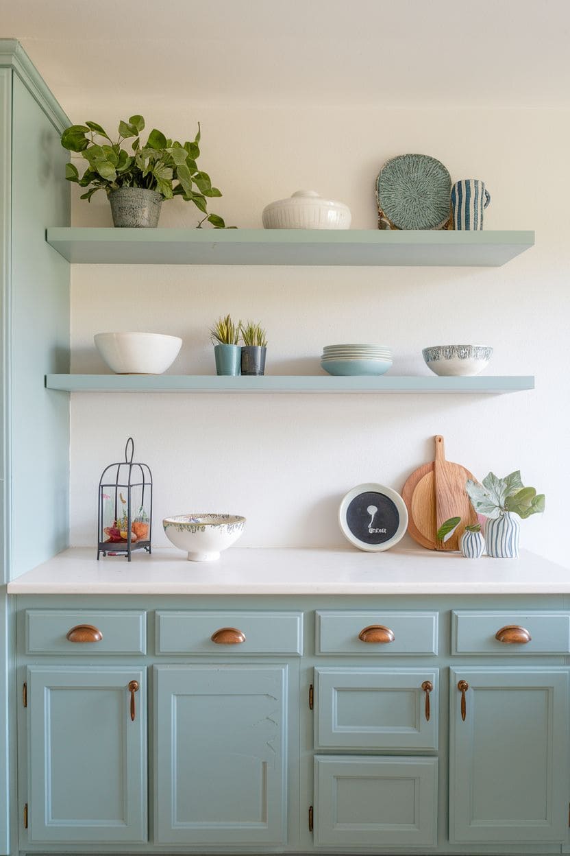
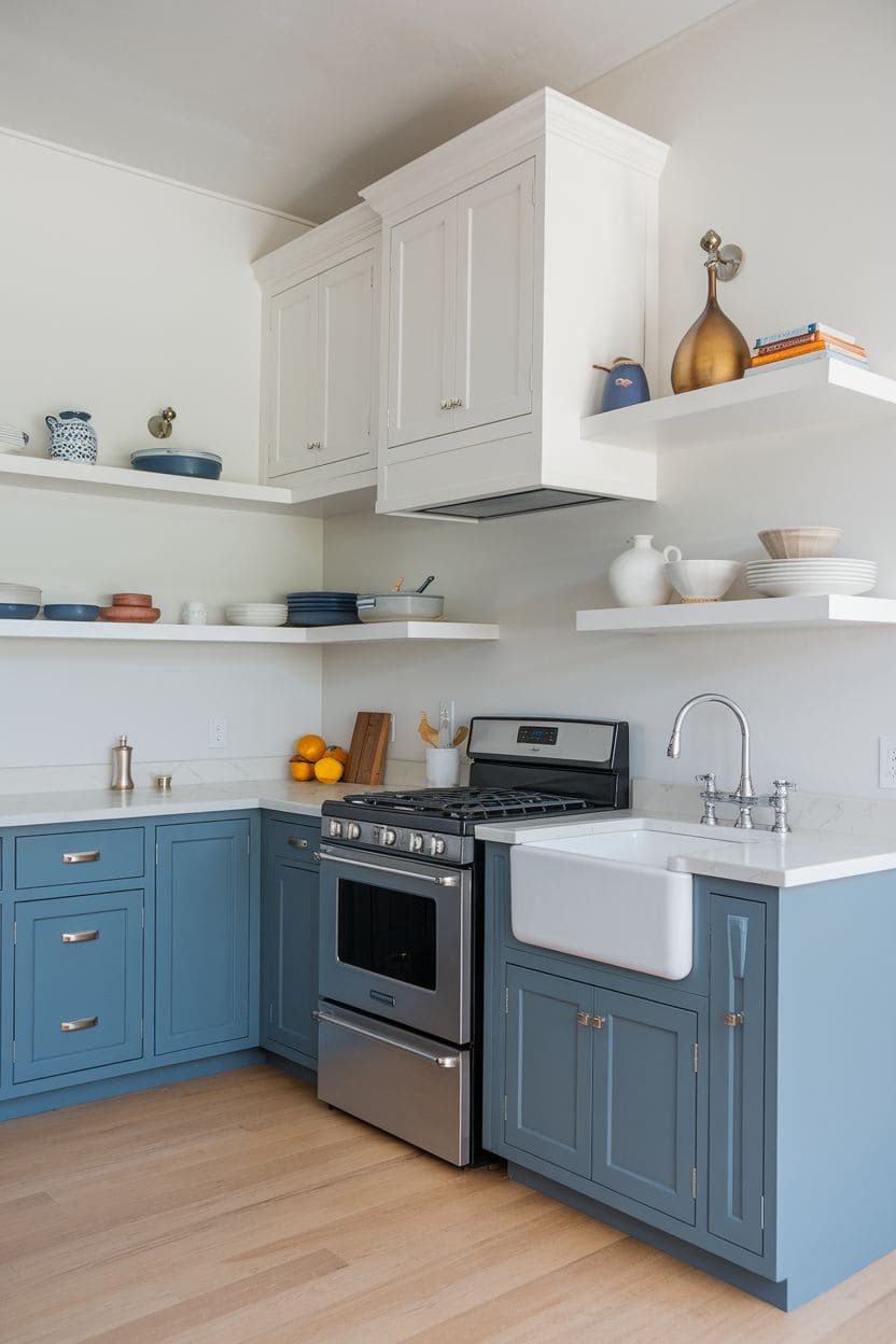
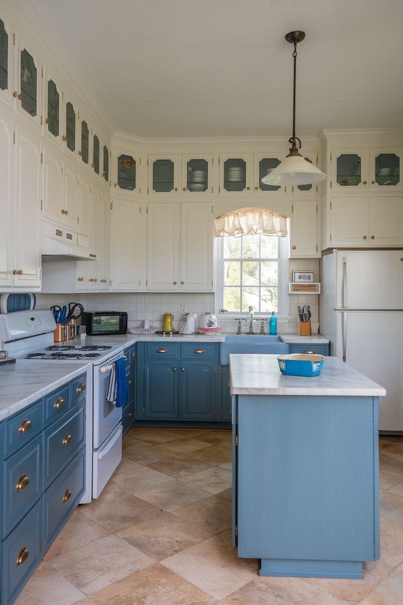
10. Pale tones with navy or pale blue lowers
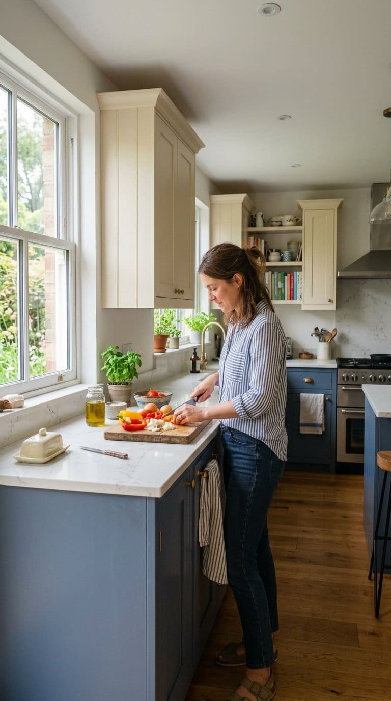
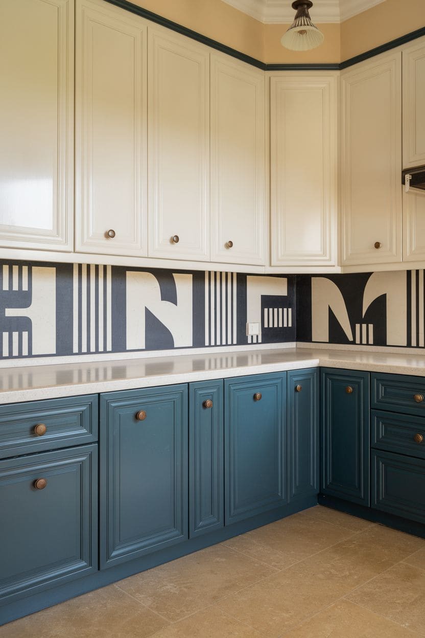
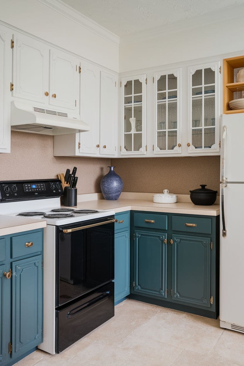
A softer variation on the navy pairing above, pale cream or off-white uppers with navy or pale blue lowers keeps the same depth-adding logic but in a gentler overall palette, a good option if a full white-and-navy split feels too crisp for your kitchen’s style.
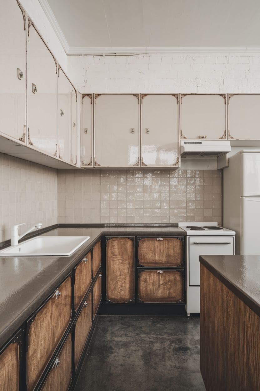
11. Earth tones with natural wood

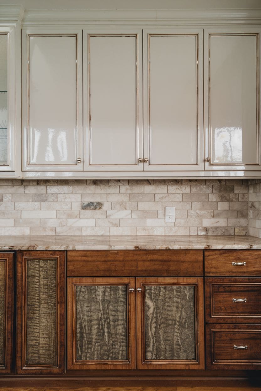
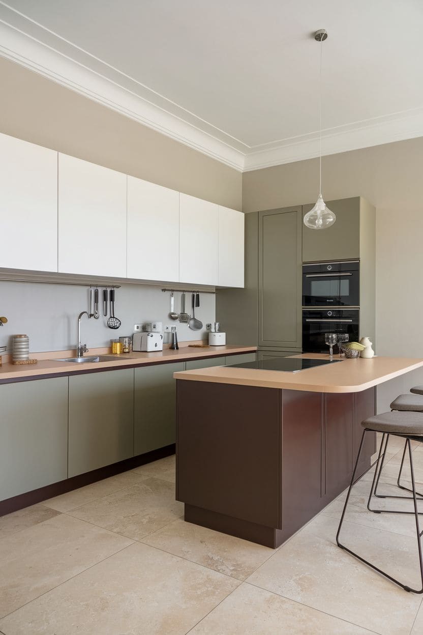
Gray, mocha, or muted green cabinets paired with natural wood finishes like oak, walnut, or maple create a genuinely timeless combination that works across both modern and traditional kitchen styles, a safer long-term bet if you’re wary of trend fatigue.
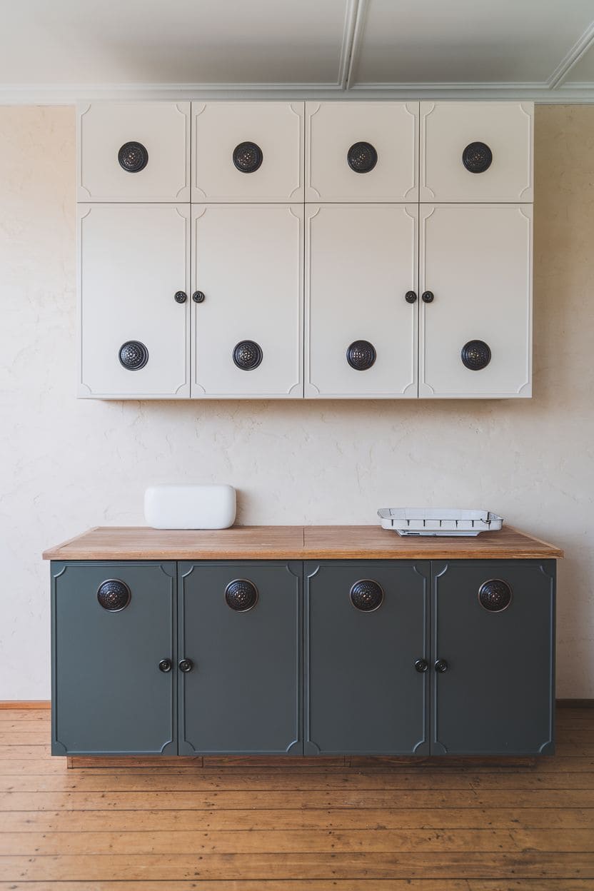
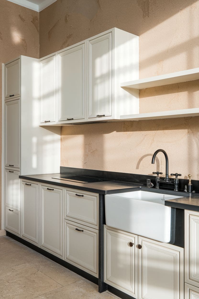
12. Warm white and soft black
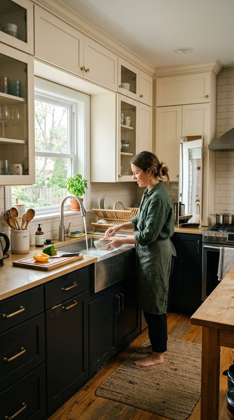
Rather than stark white and jet black, this pairing uses a warmer off-white or cream with a softer, slightly warmer black (sometimes called “soft black” in paint lines) for a two-tone look with less harsh contrast, part of the broader 2026 shift toward warmer neutrals in kitchen color trends.
13. Deep green and warm wood
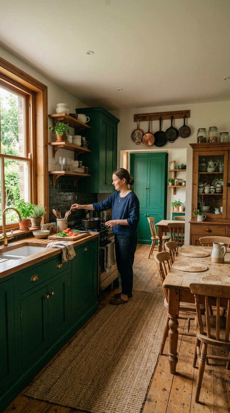
A deeper, more saturated green than the sage pairing above, paired with warm wood tones for a richer, more dramatic version of the earth-tone approach.
This suits a kitchen where you want real color impact without going as high-contrast as black-and-white.
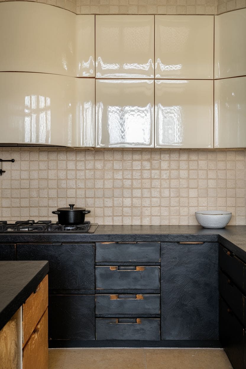
14. Same color, two finishes
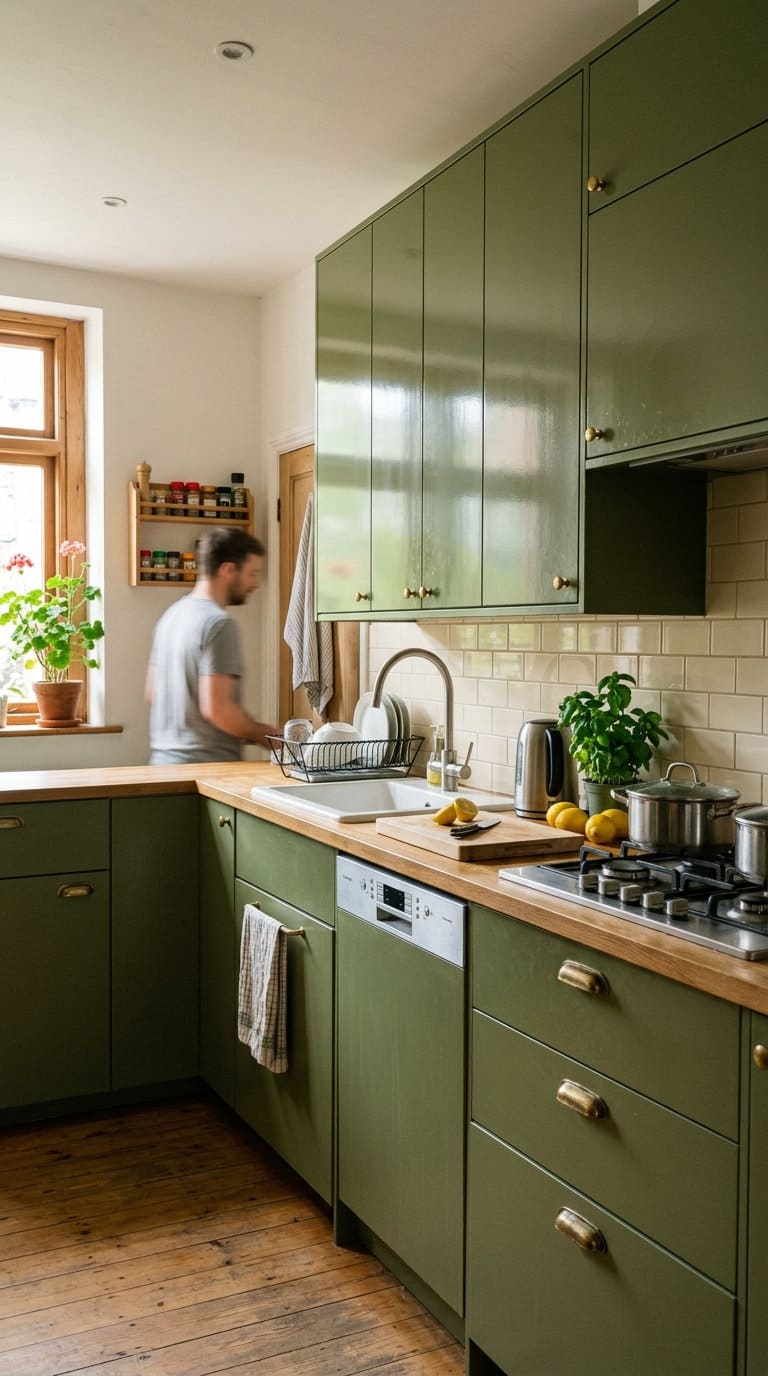
Skip the color split entirely and use one color throughout, but in two finishes, matte lowers with glossy uppers, or the reverse, per Tom Howley‘s point above.
It’s a subtler way to get the dynamic contrast of a two-tone kitchen without committing to two different colors, a good middle-ground option if you’re not ready for a full color split.
FAQs about two-tone kitchen cabinets
Is a two-tone kitchen a passing trend or a timeless choice?
It holds up better as a long-term choice than most trends do, as long as the layout, proportions, and material quality are handled well. Most regret people report tracing back to those three things, not the color pairing itself.
Which color should go on top and which on the bottom?
Lighter on top, darker on bottom is the dominant, most recommended approach, it keeps the room feeling open while grounding the space and hiding daily wear at counter height, per Graeme Smith of Life Kitchens. It’s not a hard rule, some kitchens flip it deliberately for a specific look, but it’s the safer default if you’re unsure.
Does two-tone work in a small kitchen?
Yes, often better than a single flat color. The light-on-top, dark-on-bottom split (see above) is specifically good at making a smaller room feel taller and less boxed-in, as long as the contrast isn’t so extreme it visually chops the room in half.
How do I avoid a mismatched, disjointed look?
Tie the two tones together with a shared detail, matching cabinet hardware, one consistent countertop material, or a backsplash that pulls from both colors, per Ashleigh Hanwell of Second Nature Kitchens. Without that connecting element, a high-contrast split can read as two unrelated kitchens rather than one intentional design.
Two-tone kitchen cabinets are versatile, allowing you to play with color, texture, and style to reflect your personality and preferences. By choosing the right combinations, you can create a space that feels unique, functional, and perfectly tailored to your home.
Are you a fan of any of these ideas? Let us know what you think in the comments and share this list with your friends!






Never miss an update — choose FarmFoodFamily as your preferred source on Google.
How it works: Tap the button below to open Google's settings page, then check the box next to FarmFoodFamily.
Tap the checkbox to turn it blue — that's how you know it's set.