The Lightbulb Color Mistake That Makes Your Home Look Cheap in Photos (9 Signs to Check)
It’s not your paint or your furniture. One number on your lightbulb box can make an expensive room photograph like a motel. Here’s how to check it.

Never miss an update — choose FarmFoodFamily as your preferred source on Google.
How it works: Tap the button below to open Google’s settings page, then check the box next to FarmFoodFamily.
Tap the checkbox to turn it blue — that’s how you know it’s set.
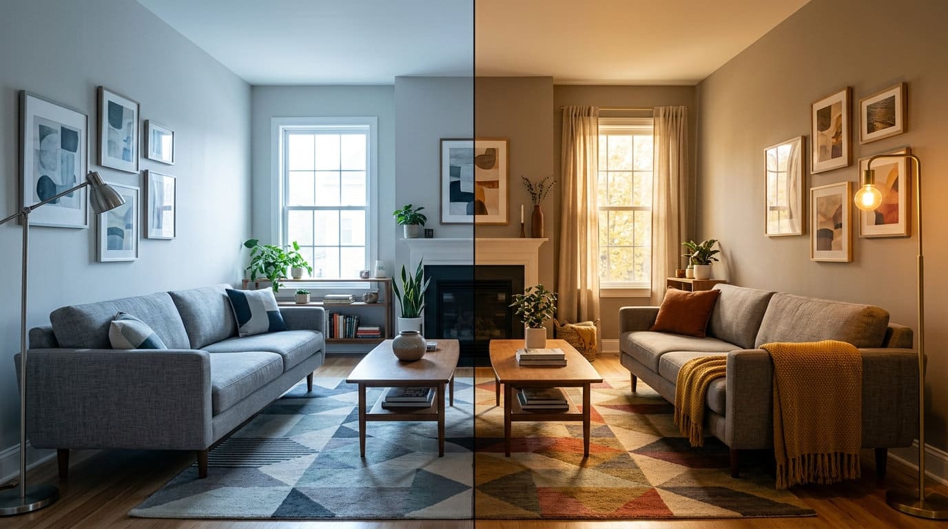
You style the room, you take the photo, and something looks wrong. The couch you love reads gray. The white walls look blue.
But the whole space felt warm and cozy standing right there in it, a little clinical only in the photo.
Here’s the part nobody tells you. That mismatch usually isn’t your paint, your furniture, or your phone camera. It’s a number printed right on your lightbulb box, and almost nobody checks it.
Below are nine signs your lightbulbs are the real problem. Each one comes with the exact number to look for instead.
Quick Answer
The lightbulb mistake that cheapens photos comes down to one thing: color temperature, measured in Kelvin. Bulbs above 4000K read as cool, blue, and clinical.


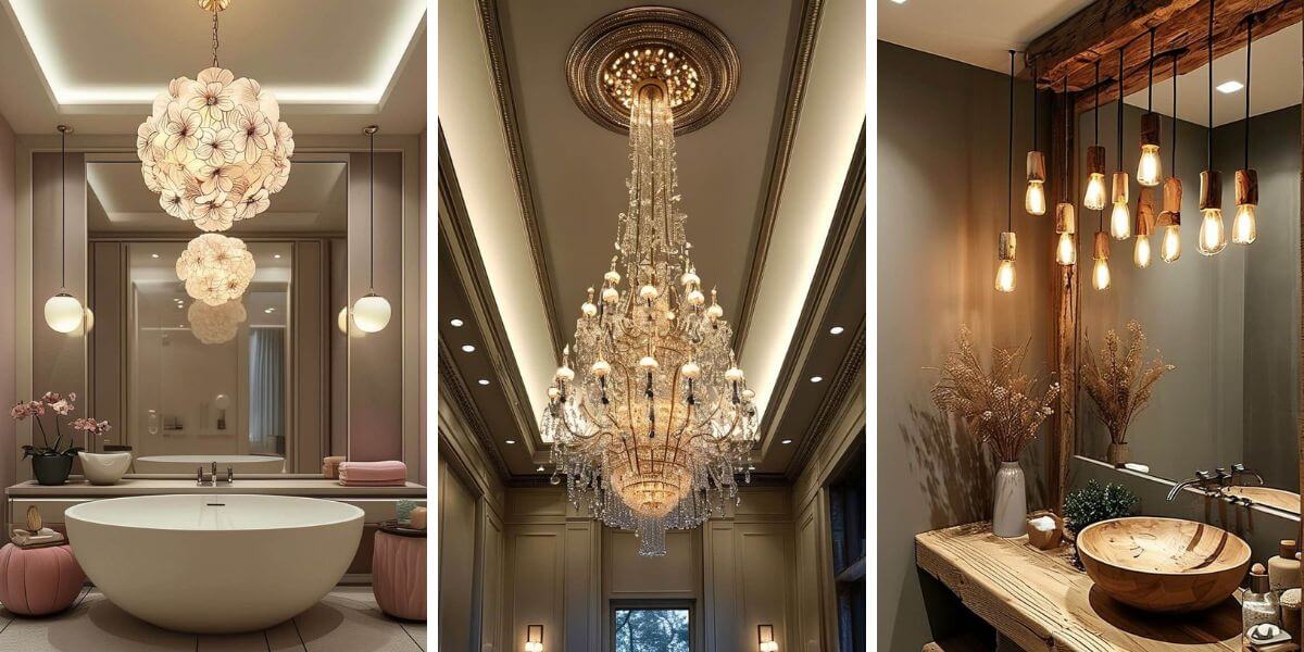
Bulbs between 2700K and 3000K read as warm and inviting. That’s the range most designers use in living spaces. Cameras react to the shift even more than the eye does.
Tara Coomer of Coomer & Co. puts it bluntly: “Lighting that is too cool in temperature can quickly cheapen the look of your home.” Anything cooler than that range, she adds, “can unintentionally sterilize a space and make it feel like a doctor’s office.”
Jennifer Jones of Niche Interiors agrees. Cool, blue-hued bulbs “kill the mood every time,” in her words.
The fix costs almost nothing. Check the Kelvin number on your bulb boxes. Swap anything above 3000K in your main living spaces for something closer to 2700K.
How to use this list
Go through the nine signs below and be honest about your own bulbs. Most homes show at least two or three of these at once. Kelvin mistakes tend to hide in plain sight until someone points them out.
1. You don’t know what Kelvin your bulbs even are
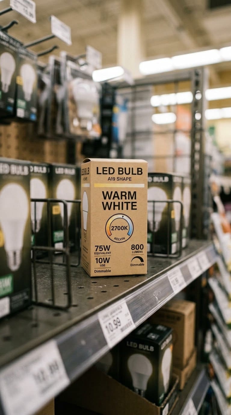
This is the starting point for almost everyone. Most people know their bulb’s wattage without thinking twice. Few people could tell you the Kelvin number of a single bulb in their house.
That gap matters more than wattage ever did. Wattage controls brightness. Kelvin controls color, and color is what your camera and your eye react to first.
Quick fix: Pull one bulb from your main living room. Check the box, or the bulb itself, for a number followed by a “K.” Most bulbs print the Kelvin number in tiny text right on the glass or base if the box is long gone.

The core fix, warm color temperature for living rooms and bedrooms
Shop NowThis post contains affiliate links. We may earn a commission on qualifying purchases at no extra cost to you.
A magnifying glass or your phone’s camera zoom helps here, since the print is genuinely tiny. Once you find one number, check a few more bulbs around the house. You’ll usually spot the mismatch right away.
2. Your bulbs say “daylight” or “cool white” anywhere in your main living spaces
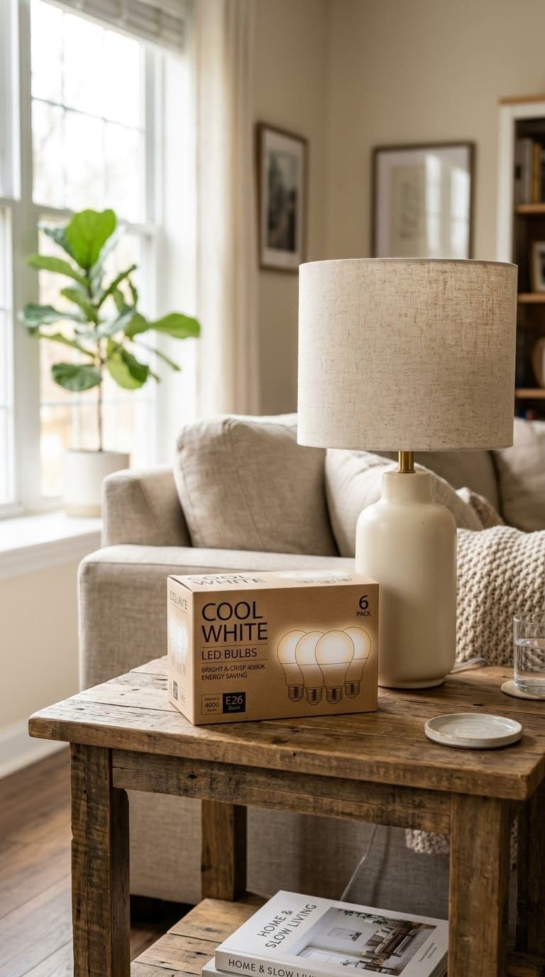
Bulb packaging uses friendly words instead of numbers, and “daylight” sounds like a good thing. It isn’t, not in a living room or bedroom.
“Daylight” bulbs run 5000K or higher, closer to a hospital hallway than a cozy evening. Tara Coomer’s read on this is direct. Cooler lighting can “unintentionally sterilize a space and make it feel like a doctor’s office.”
Quick fix: Replace any bulb labeled “daylight” or “cool white” in a living room, bedroom, or dining room with one labeled “soft white” or “warm white,” ideally printed at 2700K. Our living-room-lighting-ideas guide has more on layering warm light sources in that specific room.
3. Different fixtures in the same room use different Kelvin bulbs
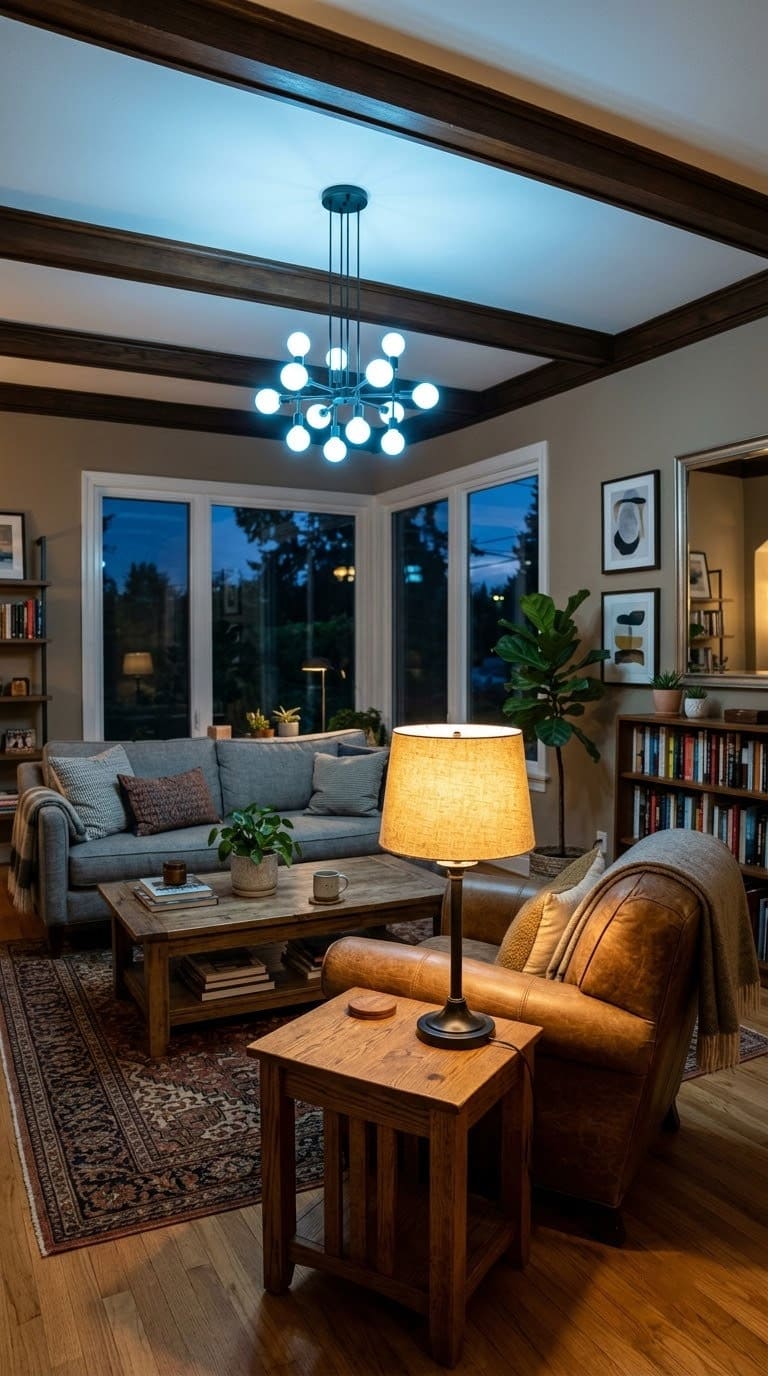
This is the mistake even careful homeowners miss. You buy warm bulbs for your lamps.
The overhead fixture still has whatever came with the house. It’s leftover from the builder or a previous owner.
The result is a room lit by two different color temperatures at once. Your eye adjusts for it in person, but a camera can’t. In photos, the room reads inconsistent and a little off, even if nobody can say exactly why.
Quick fix: Walk the room and check every single bulb, lamps, overheads, and sconces included. They should all match within a few hundred Kelvin of each other. Ideally, they’re all the exact same number.



4. Your bulbs are 5000K or higher outside a garage, office, or workspace
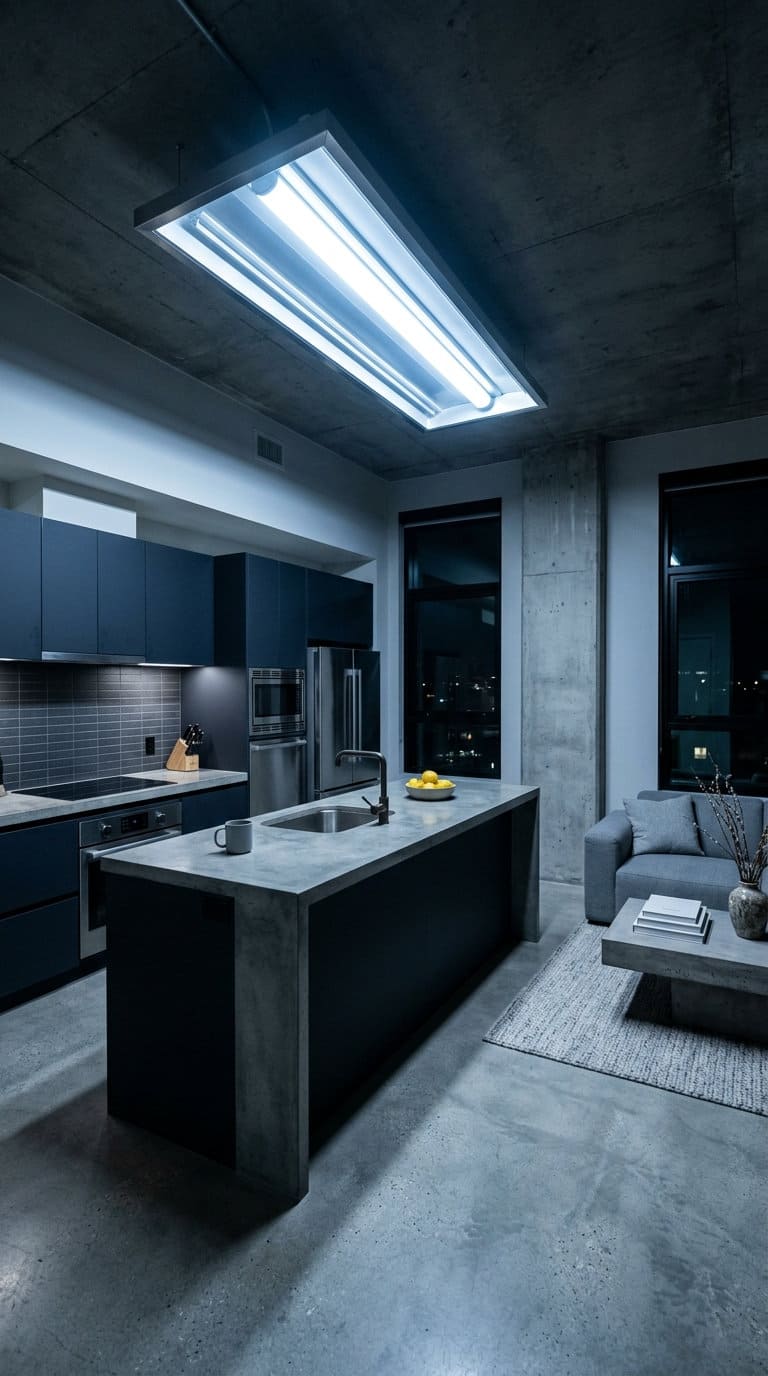
There’s a place for 5000K and up. It’s a garage, a workshop, a home office where you need sharp contrast for detail work. It is not a living room, bedroom, or dining room.
Jennifer Jones calls this kind of lighting a mood killer, plainly. Fluorescent-style cool bulbs, in her words, “can make any home feel like a corporate office.”
Quick fix: Reserve anything above 4000K for true workspaces only. Everywhere you actually relax or entertain should stay in the 2700K to 3000K range.
5. Your photos look blue or gray even though the room feels fine in person
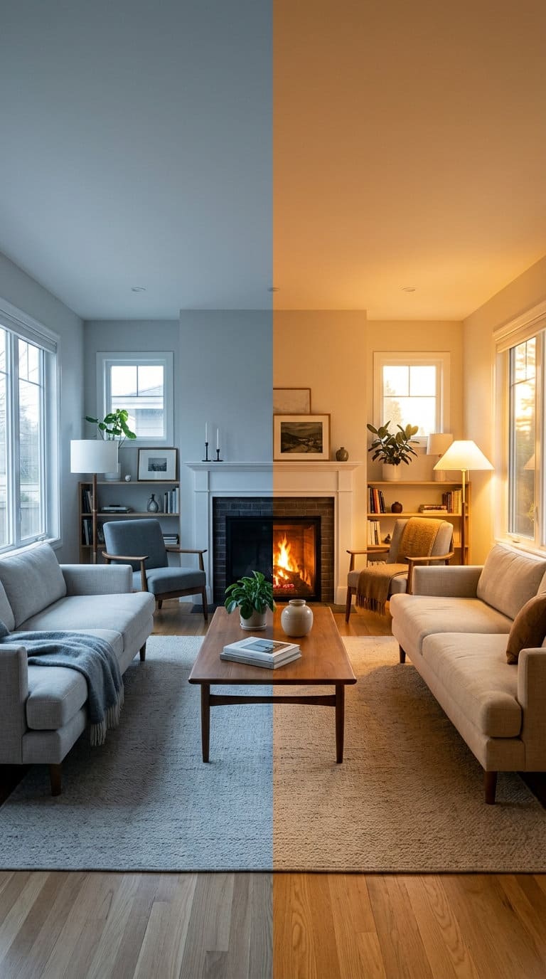
This is the single most confusing sign. The room genuinely doesn’t look wrong when you’re standing in it.
Your eyes adjust to color temperature on their own. Cameras can’t do that nearly as well.
A camera’s white balance can only guess at correcting for cool light. It often guesses wrong.
That’s why a room can feel perfectly normal in person. Then it turns out looking blue, gray, or sickly the moment you check the photo.
Quick fix: Before blaming your camera or your editing, swap the bulbs to 2700K and retake the same photo. The color shift alone usually fixes most of the problem. You won’t need to touch a single setting on your phone.
6. You’ve never checked the Kelvin number on the box, only the wattage
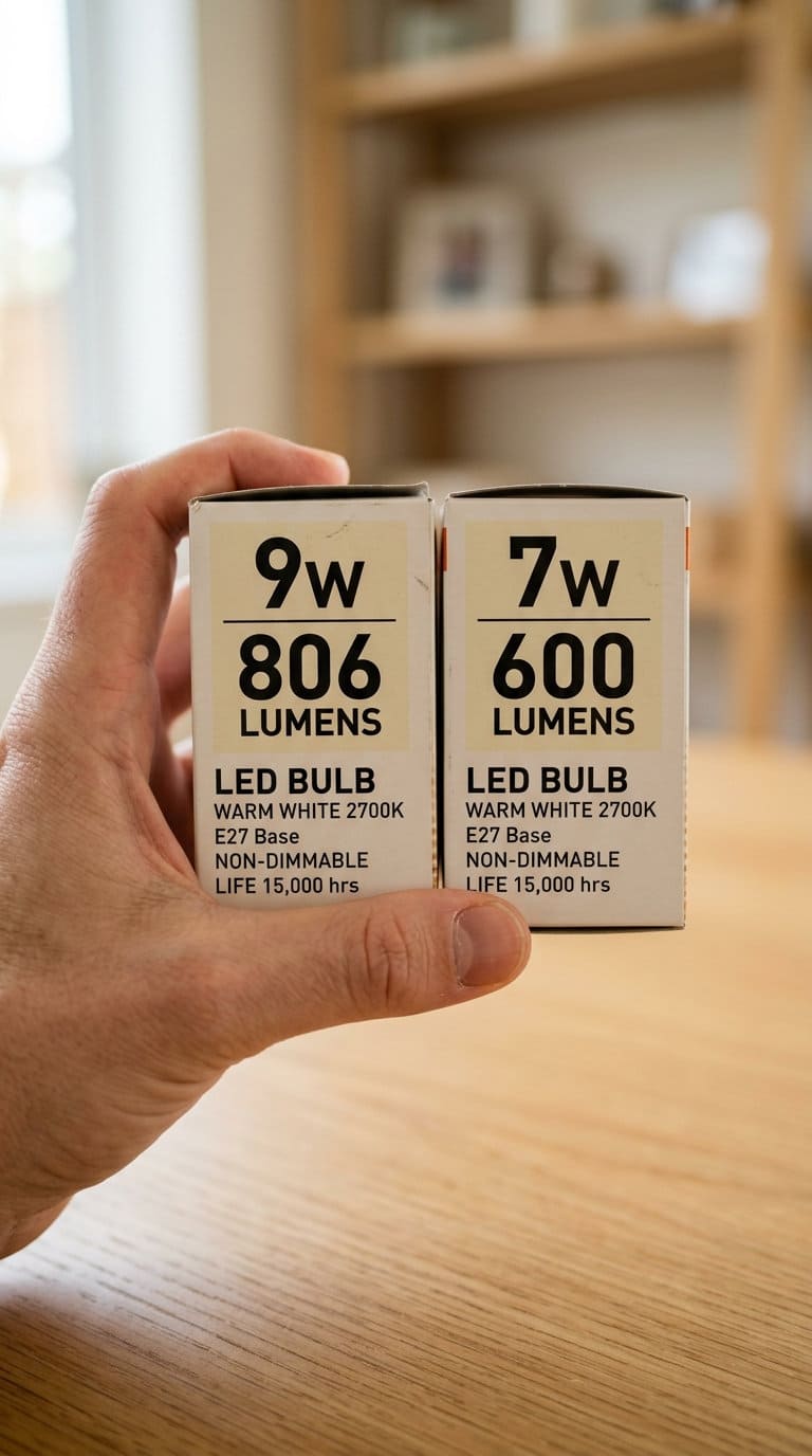
Most people shop for bulbs the same way they always have: check the wattage, check the price, done. Kelvin gets ignored because nobody explained why it matters.
That habit is exactly why so many homes end up with a mismatched mix of bulb temperatures. Nobody chose it on purpose. It just accumulated one replacement bulb at a time.
Quick fix: From now on, check Kelvin first and wattage second. Buy a few extra 2700K bulbs the next time you’re at the store. That way a burnt-out bulb never gets replaced with whatever’s closest on the shelf.
7. Your smart bulbs default to “daylight” mode instead of a warm preset
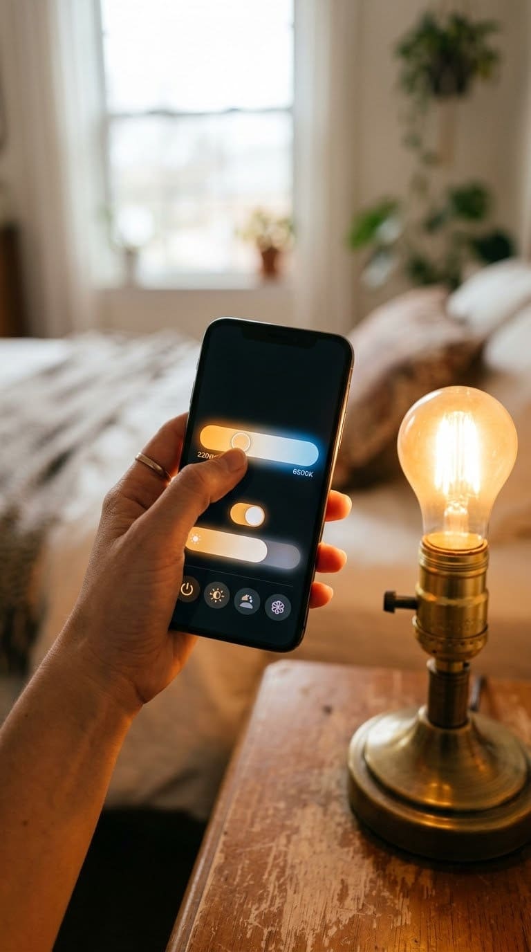
Smart bulbs make this mistake easy to fall into without noticing. Many ship set to a bright, cool default. Unless you open the app and change it, that’s what stays on every single day.
The convenience that makes smart bulbs appealing also makes the mistake invisible. You never touched a switch or bought a new box. It never occurred to you to check the setting.
Quick fix: Open your smart bulb app and set a saved warm-white preset around 2700K as the default for every living space. Save it once, and you won’t have to think about it again.
8. Your bathroom or kitchen bulbs are a different temperature than your living room
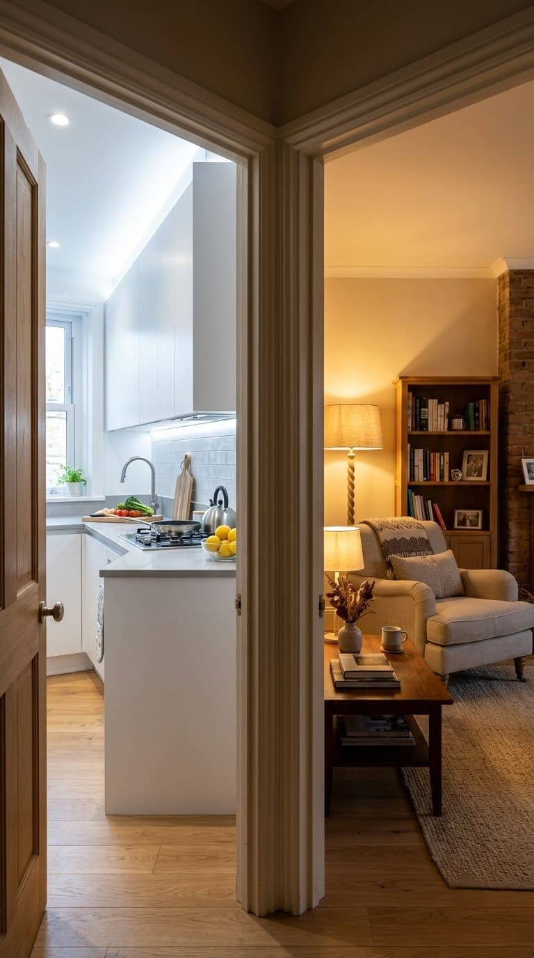
Kitchens and bathrooms can handle a slightly cooler temperature than living rooms, usually in the 3000K to 3500K range, since task lighting benefits from a bit more clarity.
The mistake is a jump that’s too large. Think a kitchen at 5000K next to a living room at 2700K. Walking between the two rooms feels like crossing into a different building entirely.
Quick fix: Keep kitchens and bathrooms in the 3000K to 3500K range. That’s close enough to your living spaces that the transition feels natural instead of jarring. Our kitchen island lighting ideas guide covers layering task and ambient light in that specific room.
9. You associate warm bulbs with “dim” and avoid them for that reason
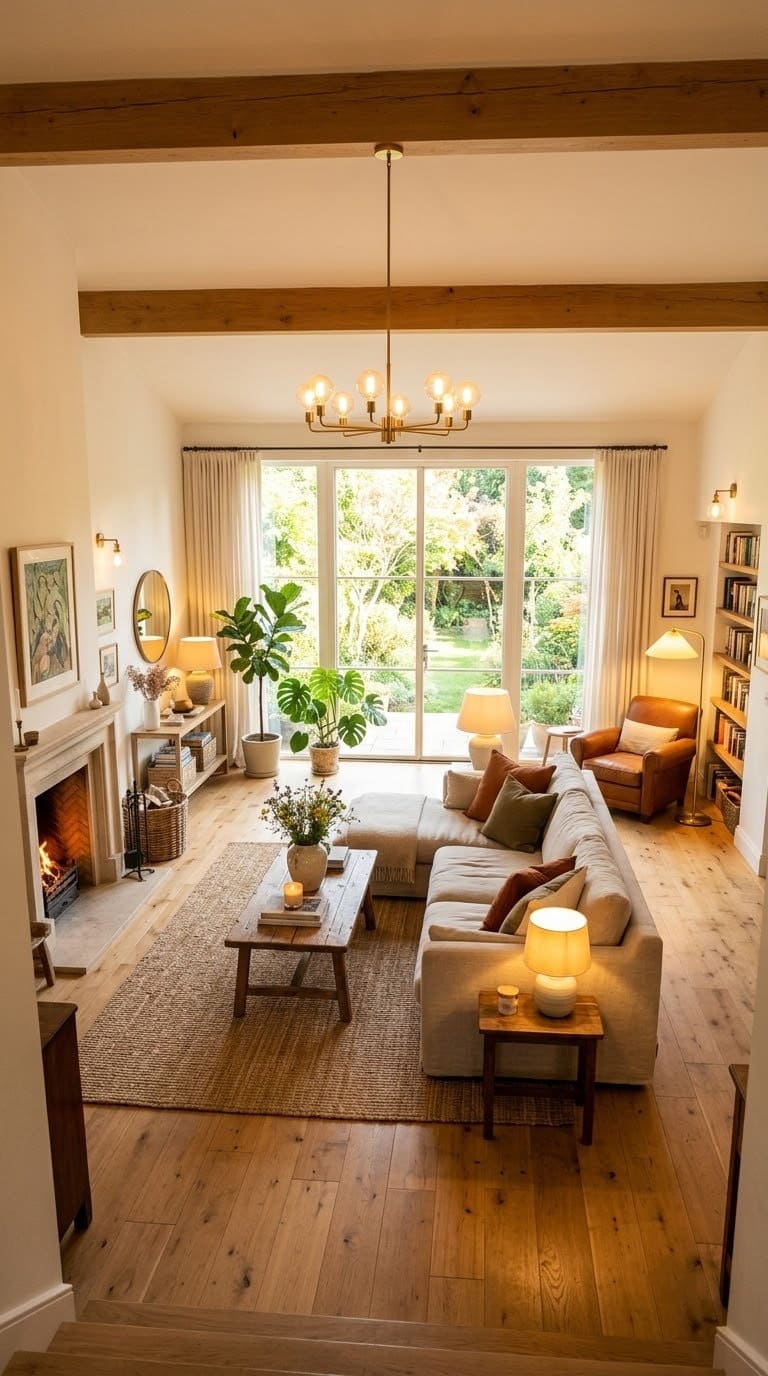
This is the belief that keeps people stuck on cool bulbs even after they’ve heard the advice. Warm and dim feel like the same thing.
People assume switching to 2700K means giving up brightness. That assumption keeps a lot of homes stuck under cold light.
They’re actually unrelated. Kelvin measures color, not brightness.
Lumens measure brightness. You can buy a bulb that’s both warm in color and plenty bright.
Quick fix: Check the lumens number, not just the Kelvin number, when shopping. A 2700K bulb rated at 800 lumens or higher gives you warm color and real brightness together.
Why color temperature affects photos more than the eye
Your eyes have a built-in trick called chromatic adaptation. Walk into a room lit by cool bulbs.
Within a few seconds, your brain quietly corrects for it. White still looks like white to you, even under lighting that’s technically blue-tinted.
Cameras don’t get that same automatic correction, or at least not a reliable one. A camera’s white balance has to guess what “true white” should look like based on the light hitting the sensor. Cool lighting is one of the situations it guesses wrong most often.
That’s the real reason a room can feel fine in person. It still photographs cheap, flat, or clinical.
Jennifer Jones’ read on cool bulbs applies to cameras too, not just people. They kill the mood, whether a human or a lens is doing the looking.
Once the Kelvin is right, the camera has far less correcting to do. Colors land closer to how they actually look. The room reads as warm in photos the same way it already felt in person.
The Kelvin cheat sheet by room
| Room | Recommended Kelvin | Why |
|---|---|---|
| Living room | 2700K-3000K | Warm, relaxing, photographs golden instead of blue |
| Bedroom | 2700K-3000K | Same warmth, supports winding down instead of alertness |
| Dining room | 2700K-3000K | Flatters food and skin tones, feels intimate |
| Kitchen | 3000K-3500K | Slightly cooler for task clarity, still close to living spaces |
| Bathroom | 3000K-3500K | Enough clarity for grooming tasks without feeling clinical |
| Home office | 3500K-4500K | Supports focus and alertness for work |
| Garage or workshop | 5000K+ | Maximum contrast and detail for tasks, not for lingering |
What we learned fixing rooms like this
We’ve seen the same pattern show up again and again in home design communities. Someone repaints a room, styles it carefully, and still feels like something’s off.
They blame the paint color. They blame the furniture. Almost nobody blames the bulbs first.
One thread summed it up well without meaning to. A homeowner asked why their freshly styled living room “doesn’t spark joy.” A commenter’s advice list buried the real fix near the bottom: swap the bulbs to 2700 or 3000K.
Everything else on their list, curtains, rugs, art, plants, was already right. The lighting was the missing piece.
We’ve watched the same thing happen with paint complaints. Someone regrets a wall color, convinced they picked the wrong shade.
The honest fix was changing the bulb temperature, not repainting anything. A 2700K bulb and a 3000K bulb can make the exact same paint color look like two different colors.
That’s the pattern worth remembering. Before assuming a room needs new furniture, new paint, or new decor, check the bulbs first. It’s the cheapest possible fix, and it’s the one most people skip.
What to fix first
| Priority | Fix | Why it’s first |
|---|---|---|
| 1 | Check the Kelvin number on your main living room bulbs | Takes two minutes, reveals the actual problem |
| 2 | Replace any 4000K+ bulbs in living spaces with 2700K | Biggest visible impact, cheapest fix on this list |
| 3 | Match every fixture in one room to the same Kelvin | Fixes the inconsistent, “off” look photos reveal |
| 4 | Reset smart bulb defaults to a warm preset | Prevents the mistake from creeping back in |
| 5 | Adjust kitchen and bathroom bulbs to bridge the gap | Smooths the transition between rooms |
Frequently asked questions
What Kelvin should I use in my living room? Between 2700K and 3000K, according to designer Tara Coomer, who specifically recommends shopping around 2700K. That range reads as warm and inviting rather than clinical.
Does Kelvin affect brightness? No. Kelvin measures color temperature, not brightness. Brightness is measured in lumens instead. Check that number separately. You can buy a bulb that’s both warm in color and very bright.
Why do my photos look blue even though the room looks fine to me? Your eyes adjust for cool lighting on their own. A camera can’t do that as well. Its white balance often can’t fully correct for bulbs above 4000K, so the blue tint shows up in photos even when it’s invisible to you in person.
Can I mix warm and cool bulbs in the same house? Yes, as long as you’re intentional about it. Kitchens and bathrooms can run slightly cooler, around 3000K to 3500K. Living rooms and bedrooms stay closer to 2700K. The mistake is mixing temperatures within the same room, not across different rooms.
Do smart bulbs fix this automatically? Not by default. Many smart bulbs ship set to a bright, cool temperature. You have to manually change it in the app, and most people never do. Set a warm-white preset once and save it so the mistake doesn’t quietly creep back in.
Related Posts

Products We Recommend
This post contains affiliate links. We may earn a commission on qualifying purchases at no extra cost to you.
PHILIPS LED Soft White 2700K, 4-Pack
The core fix, warm color temperature for living rooms and bedrooms
Shop Now
Kasa Multicolor Dimmable Wi-Fi Smart Bulb, 4-Pack
Lets you set and save a warm preset so the mistake doesn't creep back
Shop Now
TOPGREENER Plug-in Dimmer Switch for Lamps
Fine-tunes brightness separately from color temperature
Shop NowNever miss an update — choose FarmFoodFamily as your preferred source on Google.
How it works: Tap the button below to open Google's settings page, then check the box next to FarmFoodFamily.
Tap the checkbox to turn it blue — that's how you know it's set.