9 Signs Your Whole House Is Stuck in the Greige Era (and How to Warm It Back Up)
Your house photographs fine and feels like nobody’s home. Here’s why, and the fix that doesn’t start with a full repaint.

Never miss an update — choose FarmFoodFamily as your preferred source on Google.
How it works: Tap the button below to open Google’s settings page, then check the box next to FarmFoodFamily.
Tap the checkbox to turn it blue — that’s how you know it’s set.
You walk in, look around, and nothing is wrong. The walls are a soft gray-beige, the floors are a cool-toned wood look, and every cushion matches.
And still, it doesn’t feel like your house. It feels like a house.
That flat, showroom feeling has a name and a start date. Somewhere between 2012 and 2020, “greige” (part gray, part beige) took over new homes and flips all at once.
It was safe, it photographed well, and it sold houses fast. It also erased a lot of personality on its way through.
Maybe you’ve scrolled design accounts and wondered why your own living room looks like a stock photo. You’re not imagining it.
Below are nine signs your house is still living in that era. Each one comes with what to change first, and it isn’t “repaint everything.”



Quick Answer
A house stuck in the greige era shows a few clear signs: every room reads as one of three similar grays, hardware and wood tones lean cool everywhere, and most decor traces back to one shopping spree around 2016 to 2020. Guests call it “clean” or “nice,” because there’s nothing more specific to say.
Interior designer Will Brown puts it plainly: cooler tones “lack the vibrancy and warmth people seek these days.” Gray was chosen for resale, not because anyone loved it. Kylie M Interiors has guided many homeowners through this exact update. Their advice matches this guide: you don’t need to repaint the whole house.
The real fix starts small. Swap cool hardware for warm metals. Add a warm color through textiles or one wall.
Bring in decor that has a story instead of matching a set. Most homes need targeted warmth, not a gut renovation.
How to use this list
Go through the nine signs below. Be honest about how many apply to your house. Most homes stuck in the greige era show at least four or five.
Each sign comes with a quick fix. Once you know what’s going on, you’ll have a next step. That beats a vague itch to “do something” about the living room.
1. Every room reads as one of three grays
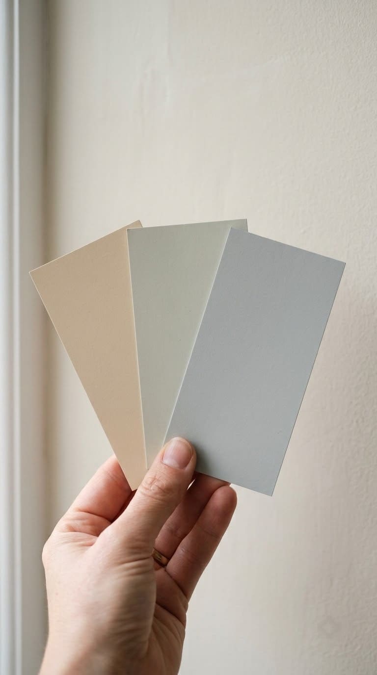
Walk from the entryway to the kitchen to the primary bedroom. Does the wall color barely change? If what does change is still some shade of “greige” or “agreeable gray,” your whole house runs on one palette.

The fastest, cheapest swap from cool nickel to warm metal across kitchen and bathroom hardware
Shop NowThis post contains affiliate links. We may earn a commission on qualifying purchases at no extra cost to you.
That’s not a style choice anymore. It’s a default that nobody revisited.
This happens because gray-beige became the safe answer to every paint decision for almost a decade. Builders used it because it appealed to the widest range of buyers.
Homeowners then kept using it. It was already there, and it matched everything else they’d bought.
One safe color, repeated in every room, stops reading as calm and starts reading as unfinished.
Quick fix: Pick the room you use most. Repaint it a truly warm neutral: a warm greige, a soft clay, or a warm white. You don’t need five new colors. You need one room that proves the rest of the house can be different. Our gray-and-white-living-room-ideas guide shows how to keep the calm without the flatness.
2. Every metal finish and wood tone leans the same cool direction
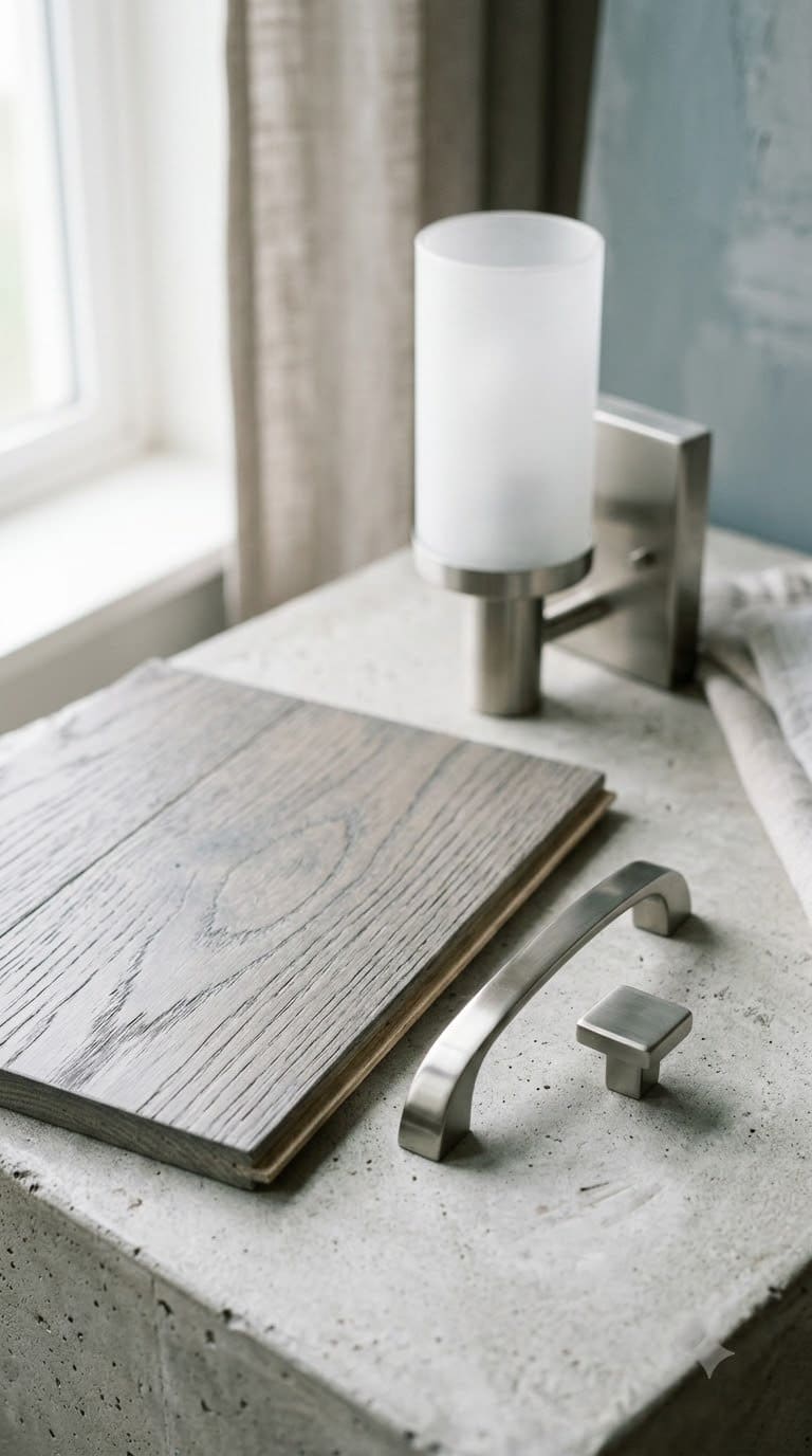
Brushed nickel pulls, a chrome or matte-black light fixture, and a gray-washed wood floor showing up in the same house isn’t luck. Builders used those finishes by default during the greige years. They read as neutral and modern at the time.
Cool metals and cool wood reflect light the same flat way gray walls do. Nothing in the room has a warm surface to bounce light off. So even a sunny room can feel a little cold.
Carla Bast Design, a design firm, points to warm metal swaps as one of the fastest fixes. No walls need to be touched.



Quick fix: Start with cabinet or door hardware. Swap cool nickel for warm brass, aged bronze, or champagne gold. It’s a weekend project, not a renovation. It changes how every other finish in the room reads.
3. Your decor traces back to one shopping spree, around 2016 to 2020
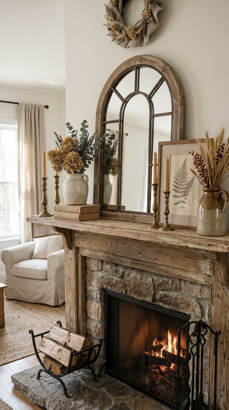
Look at your throw pillows, wall art, and accent pieces. Most of it might trace back to one big-box store run between 2016 and 2020. If so, you bought a look, not a home.
That’s normal. It’s also very visible once you notice it.
The farmhouse-gray wave sold matching sets. Think shiplap-style accents, mason-jar decor, and “live laugh love” sign fonts. All of it was built to match the greige walls around it.
When everything was bought to match one palette, nothing stands out. Nothing tells a visitor anything about the people who live there.
Quick fix: Replace one matched set with one piece that has a real story. A piece from a trip, something handmade, a family item. It doesn’t need to be expensive. It needs to be the only one of its kind in the room. If your walls still lean farmhouse gray, our shiplap-accent-wall-ideas guide keeps the texture and loses the flatness.
4. Guests describe your home as “clean” or “nice” and nothing else
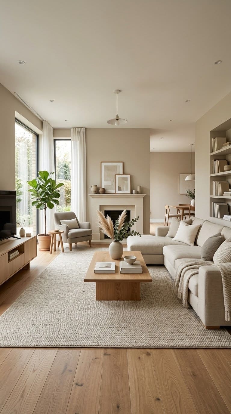
“Clean” and “nice” are compliments. They’re also the words people use when there’s nothing more specific to say.
Nobody walks into a truly warm, personal home and just says “nice.” They ask about the rug. They ask about the art. They ask about the color on the walls.
This sign is less about any single design choice and more about the overall effect. A house that’s all one safe palette gives a visitor nothing to comment on.
Nothing in the room is doing anything. It’s the interior design version of small talk.
Quick fix: Pick one wall or surface and make it the thing people ask about. Try a bold, warm paint color, a piece of real art, or a wood or woven-fiber texture. One point of interest is often enough to change the whole conversation.
5. You’ve searched “is gray still in style” more than once this year

If you’ve typed some version of that question into a search bar, part of you already knows the answer. People don’t search “is X still in style” about colors they still love. They search it when a color feels more like a chore than a choice.
That instinct is worth trusting. Trend cycles for whole-house neutrals tend to run 8 to 10 years before people want a change. Gray-beige has been the default for close to that long in a lot of homes.
Quick fix: Skip the search bar. Pick one small, low-risk spot to test a warmer color instead: a hallway, a powder room, or one accent wall. Testing in a small space answers the question faster than another search does.
6. Every surface avoids color, even where color would work
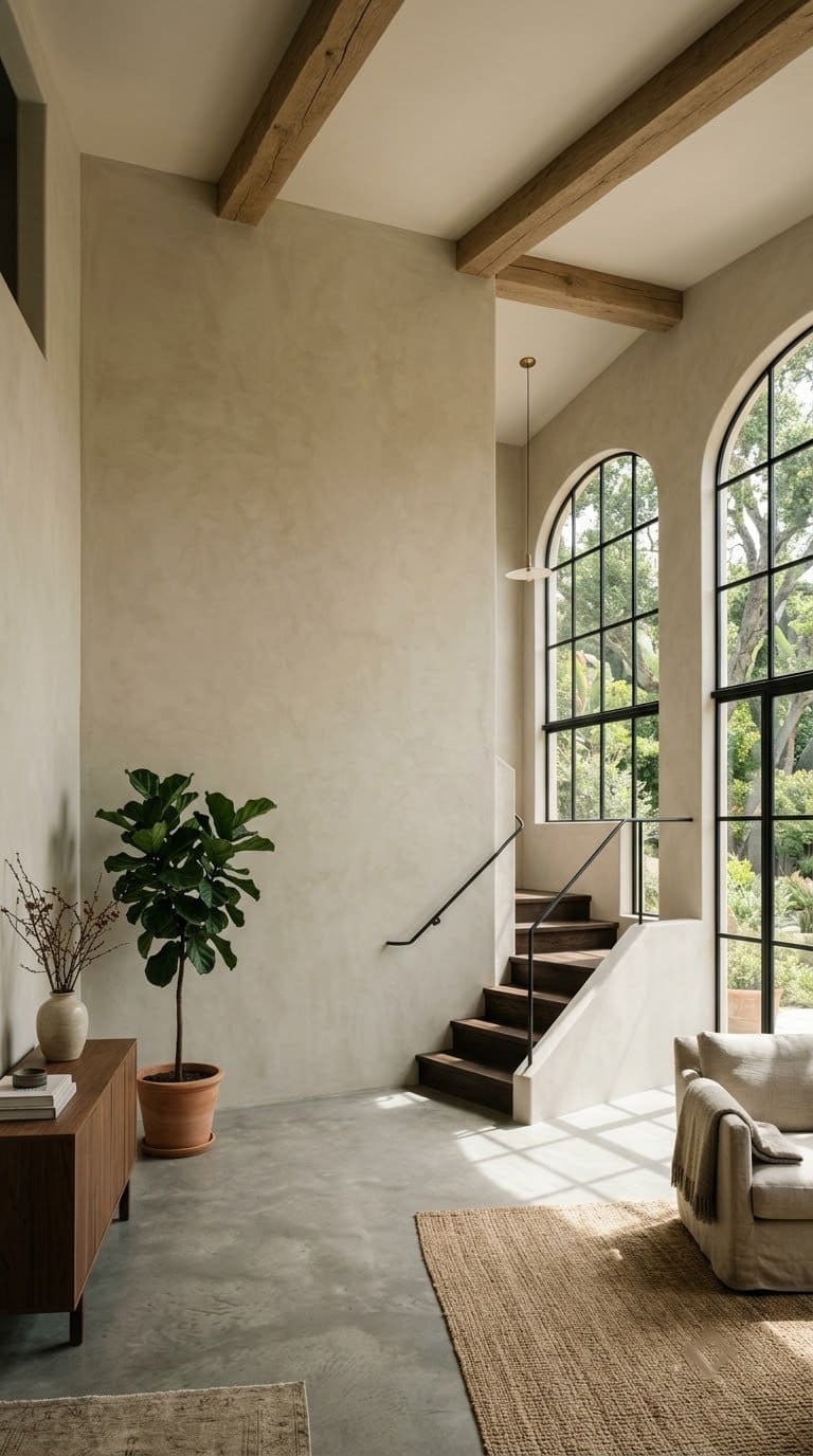
Some rooms really call for a quiet, neutral background: a home office, a small guest bath. But some rooms have great light or a bold feature wall.
If those rooms still default to the same muted gray-beige, color isn’t being chosen anymore. It’s being avoided.
Will Brown’s read on this is direct. Cool, muted tones can feel dreary, not calm, once they’re the only thing in the house. A house that never lets a wall be anything but safe ends up feeling cautious, not restful.
Quick fix: Find the one room with the best light or the most character. Let that be the room where you take a real color risk. It’s the room most likely to make a bold color work.
7. Your house photographs like a listing, not like it’s lived in
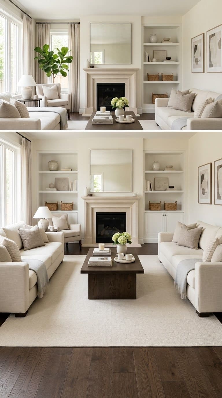
There’s a specific look real estate photography favors: neutral walls, minimal personal items, staged symmetry. It photographs well because it’s designed to appeal to as many buyers as possible. It’s not designed to feel like anyone’s actual life.
Maybe your day-to-day house still looks like that, even though you’re not selling. If so, you may still be decorating for a buyer instead of for yourself.
That’s an easy habit to fall into after a remodel or a move. It’s even easier if the house was staged when you bought it.
Quick fix: Add back the things a stager would remove. Family photos. A stack of real books. A plant that isn’t perfectly trimmed. Lived-in isn’t the opposite of nice. It’s the thing that was missing.
8. You’re afraid a warm color will feel dated the way gray now does
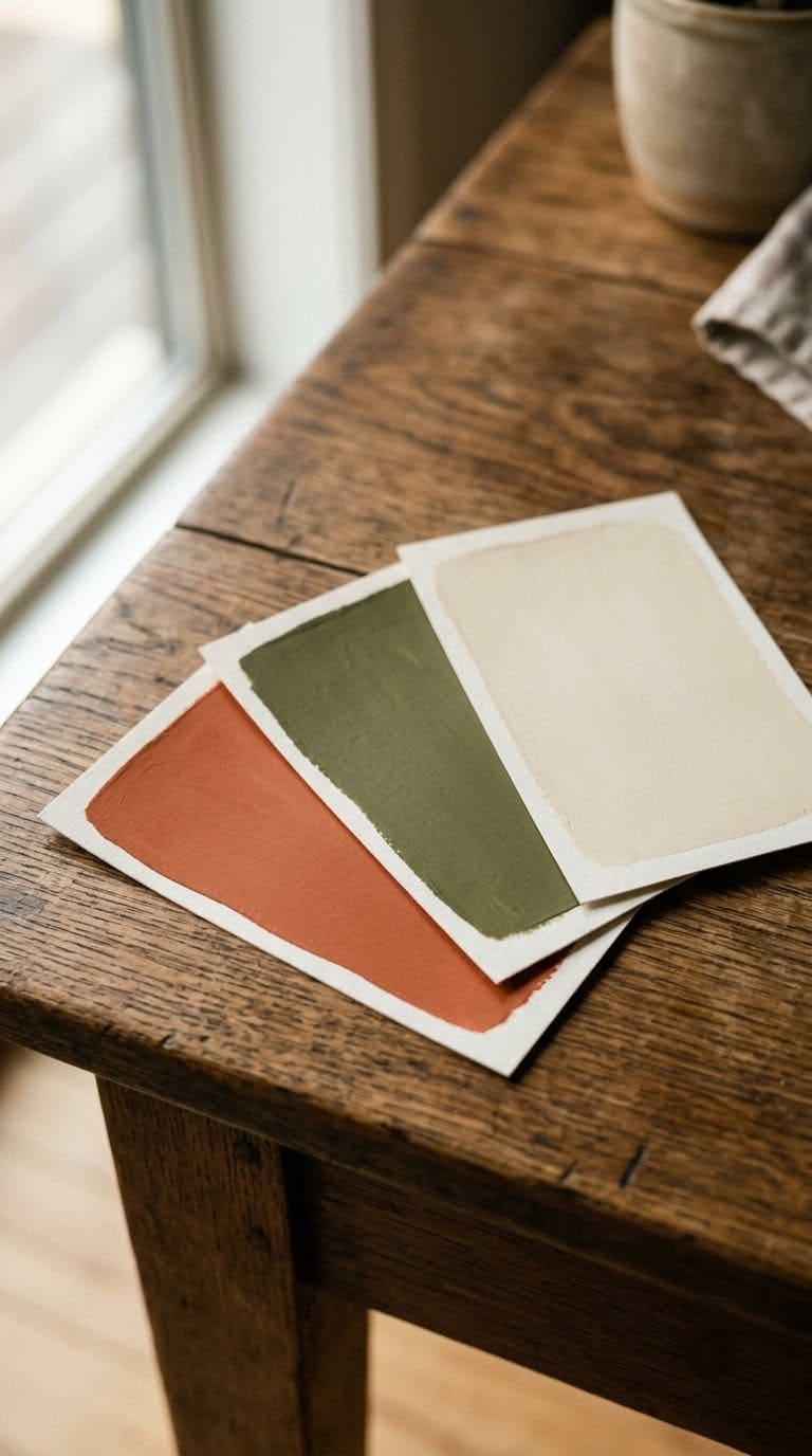
This one is less about your walls and more about what’s stopping you from changing them. A lot of homeowners avoid warm color for one reason. They remember when gray felt fresh, and they don’t want to repeat that mistake with a new trend.
That fear makes sense. But it mixes up two different things: trend colors and truly warm neutrals. A bright, of-the-moment shade can date fast.
A warm greige, a soft clay, or a warm cream behaves more like a classic neutral. Those never really left. They just got crowded out by gray for a while.
Quick fix: Choose warmth over trendiness. A warm neutral paired with wood, leather, and handmade pottery ages like a good pair of jeans does. A trendy viral paint color doesn’t. Our neutral-living-room-ideas guide leans into that kind of warm, lasting neutral.
9. You’ve been putting off a fix because it feels like it means repainting everything
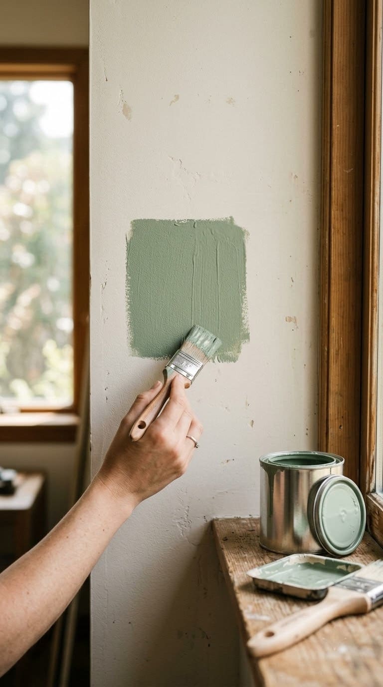
This is the sign that keeps people stuck the longest. Somewhere along the way, “update the house” turned into “repaint every room.” That’s a big project. Big projects never quite get scheduled.
But the actual fix rarely starts with paint. It starts with the smaller, faster changes: hardware, textiles, lighting, one accent wall.
Those changes are cheap enough to do this month. They’re visible enough that you’ll notice the difference. That makes the bigger project feel optional instead of mandatory.
Quick fix: Pick the smallest item on the list below and do that one thing first. Momentum matters more than a perfect plan here.
Why gray-and-beige took over every house at once
Gray-beige didn’t spread because everyone independently loved it. It spread because it solved a problem for builders, flippers, and real estate agents. It photographed well, appealed to almost any buyer, and covered up old finishes without extra work.
That palette became the safe default from 2012 to 2020. Paint brands and stores followed the demand. Gray-beige became the easiest option to find on a shelf.
Homeowners who weren’t tied to a specific style picked whatever was easiest, and easiest was gray-beige.
The result is a decade of houses decorated to sell, not to live in. Will Brown’s read on the current mood is simple. Cooler tones now feel dreary rather than calm, next to the warmer, more personal looks gaining ground in 2026.
What to update first if you’re not repainting the whole house
| Update | Typical cost/effort | Impact on the “greige feeling” |
|---|---|---|
| Cabinet or door hardware | Low ($50-$300, a weekend) | Medium: warms up kitchens and bathrooms fast |
| Textiles (throw, rug, curtains) | Low-medium ($100-$500) | Medium-high: adds color and texture without touching walls |
| Lighting (bulbs and fixtures) | Low-medium ($50-$400) | Medium: warmer bulb temperature changes how every color in the room reads |
| One accent wall | Medium ($100-$300 in paint, a weekend) | High: gives the eye one clear focal point |
| Full interior repaint | High (multiple weekends or a contractor) | Highest: resets the whole house, but only worth it once you know the direction you want |
What we learned walking rooms like this
We’ve walked through a lot of living rooms that look great in a listing photo and feel oddly cold in person, and the pattern is almost always the same. The room photographs fine because gray-beige photographs fine under good lighting. It’s only when you’re standing in it, on an overcast afternoon, that the flatness shows up.
People describe this exact thing on home design forums constantly. One recent thread was literally titled “healed from millennial grey.” That word choice says a lot.
This color era started to feel like something to recover from. Not just something to redecorate away from.
The other pattern we noticed: guests really can’t tell one greige living room from the next. Ask someone what your living room looks like a week after they visit. If the honest answer is “gray, I think, and clean,” that’s the flat-palette effect at work, not a compliment.
It’s also part of why so many buyers now link gray-and-white interiors with a rushed flip, not a real home. The look got so tied to quick resale. It stopped reading as a personal choice at all.
What to fix first
| Priority | Fix | Why it’s first |
|---|---|---|
| 1 | Swap cool hardware for warm metal | Fastest, cheapest, touches every room with cabinets |
| 2 | Add one warm textile (rug, throw, or curtains) | No paint or tools required, changes the room same-day |
| 3 | Repaint one high-traffic room in a warm neutral | Proves the concept before committing to the whole house |
| 4 | Replace one matched decor set with a piece that has a story | Adds personality, low cost |
| 5 | Full interior repaint | Only after the smaller changes confirm your direction |
Frequently asked questions
Is greige actually going out of style, or is this just a trend cycle? Both things are true at once. Greige isn’t disappearing, but its run as the automatic default choice is ending. Paint brands’ 2026 color-of-the-year picks lean warmer, like Benjamin Moore’s Silhouette AF-655 and Sherwin-Williams’ Universal Khaki. That’s a sign of where demand is headed.
Do I have to repaint my whole house to fix this? No. Most of the signs above can be fixed with hardware, textiles, lighting, and one or two accent choices. You can do all of that before you touch a paint roller anywhere else. A full repaint is the last item on the priority list, not the first.
What’s the fastest single change that makes the biggest difference? Swapping cool-toned cabinet and door hardware for warm metal. It’s a weekend project, and it’s cheap. Kitchens and bathrooms have the most hardware. That’s why the effect shows up in the rooms you use every day.
Will a warm color just look dated in a few years the way gray did? A trendy, of-the-moment shade might. A truly warm neutral, like a soft clay, warm cream, or warm greige, behaves like a classic. It doesn’t act like a trend. That’s true when it’s paired with natural materials like wood and leather.
How do I pick a warm color without getting it wrong? Test a large real sample, not a tiny chip. Test it on the actual wall. Look at it at different times of day before you commit. Our guide on why paint colors look different at home walks through how to test it right.
Related Posts
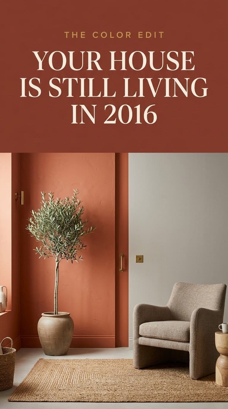
Products We Recommend
This post contains affiliate links. We may earn a commission on qualifying purchases at no extra cost to you.
Goldenwarm Brushed Brass Cabinet Knobs, 10 Pack
The fastest, cheapest swap from cool nickel to warm metal across kitchen and bathroom hardware
Shop Now
EVERGRACEHOME Chunky Chenille Knit Throw Blanket, Terracotta Clay
Adds instant warmth and texture to any sofa or bed without touching paint
Shop Now
FancyPlus Ceramic Vase Set of 3, Rustic Neutral
Brings in the "has a story" piece this guide recommends, in a warm neutral that pairs with any wall color
Shop NowNever miss an update — choose FarmFoodFamily as your preferred source on Google.
How it works: Tap the button below to open Google's settings page, then check the box next to FarmFoodFamily.
Tap the checkbox to turn it blue — that's how you know it's set.