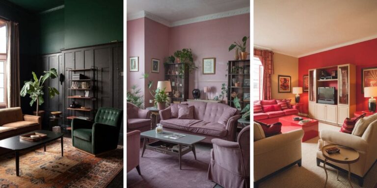
Why Your Living Room Feels Off Even Though Everything Matches
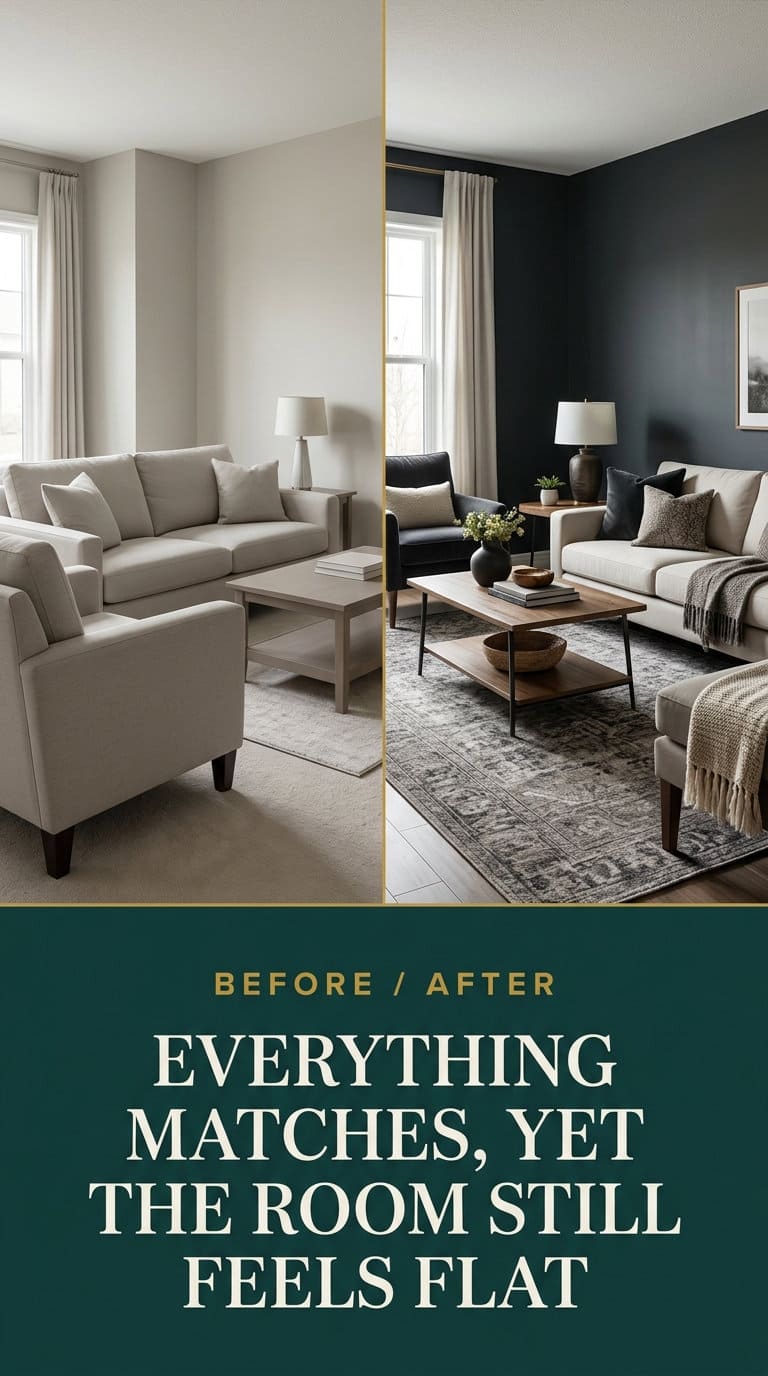
A matching room and a designed room are not the same thing, so before you buy anything else, check these nine quiet gaps that keep a coordinated living room feeling flat.

Never miss an update — choose FarmFoodFamily as your preferred source on Google.
How it works: Tap the button below to open Google’s settings page, then check the box next to FarmFoodFamily.
Tap the checkbox to turn it blue — that’s how you know it’s set.
You bought the sofa. You picked colors that go together, and maybe you bought the whole set at once so nothing would clash. And the room is still bland.
It reads like a hotel lobby, or a page from a catalog. It feels like a space nobody has quite moved into yet.
Here is the thing almost nobody tells you. Matching is not the same as designed.
A room holds together because of contrast, texture, scale, a clear focal point, and layered light. A matching furniture set and a one-note color scheme give you none of that.
This is the most common “I hate my living room but I can’t say why” problem there is. The good news is that most of the fixes below cost less than a new chair, and several are free.

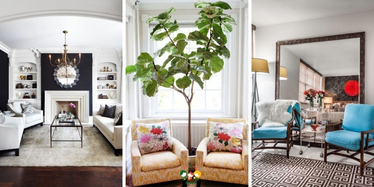
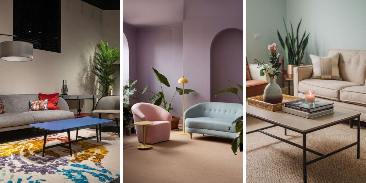
Quick Answer
Why does a matching living room still feel off? Because matching only solves color. It does nothing for the other layers your eye reads.
Those are contrast, meaning one dark note and one light one, and texture, meaning five or more materials near the seating. They are also scale, meaning one clear focal point and some real height.
The last two are a rug big enough to sit under the furniture, and warm layered light instead of one cool ceiling fixture.
A matching furniture set makes this worse. It repeats one wood tone, one leg style, and one visual weight around the whole room. Designer Nile Johnson says a room built from one collection “tends to feel like a showroom rather than personal.”
The three fastest fixes: add one near-black object and one crisp white one, put every seat’s front legs on a bigger rug, and swap one piece out of the set. None of this is a matter of taste.
How to use this list
You will not have all nine of these. Skim the list, find the two or three that describe your room, and fix those.
Skip the rest. The signs are roughly ordered from most common to least.
1. You bought a matching furniture set
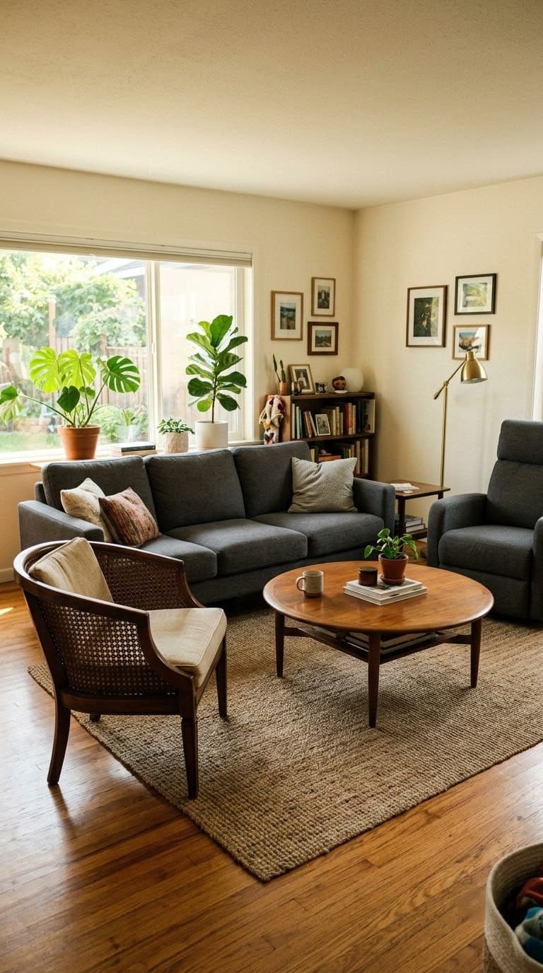
A matching set feels like the safe choice at the store. Nothing will clash. But once it is all in the room, the sameness is the problem.

A big, flat, washable rug that reaches the front legs of the sofa and both chairs, so the seating finally reads as one grounded zone instead of floating furniture
Shop NowThis post contains affiliate links. We may earn a commission on qualifying purchases at no extra cost to you.
The same wood finish, the same leg shape, and the same chunky visual weight repeat around the space until the eye has nothing to catch on.
Designer Vicky Floros describes the effect as repeating “the same wood finish, the same leg style, the same visual weight” until depth drains out of the room. Her fix is to pick one dominant tone as a base, then bring in pieces that vary in shape or era while keeping a quiet connection.
There is a practical problem too. Designer Debby Katz points out that a set forces you to compromise. The sofa might fit your room perfectly, but the matching chairs are the wrong size for your actual floor plan.
Quick fix: Keep the sofa as your anchor and change one supporting piece. Swap the matching coffee table for a round vintage wood one, or replace the set’s recliners with a pair of cane chairs.
Hold your dominant finishes to two or three, not one. If you have a big sectional that still feels like a store vignette, one non-matching accent seat helps, and arranging an L-shaped sofa well makes room to add it.
2. There is no real contrast, everything is one mid-tone
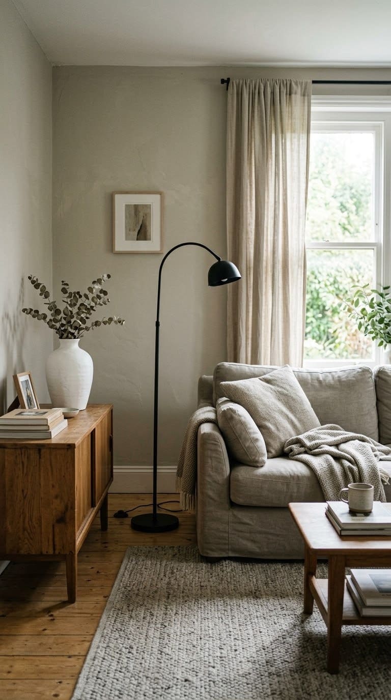
Walk into the room and ask yourself where the darkest thing is. If the answer is “a slightly darker beige,” that is the problem.
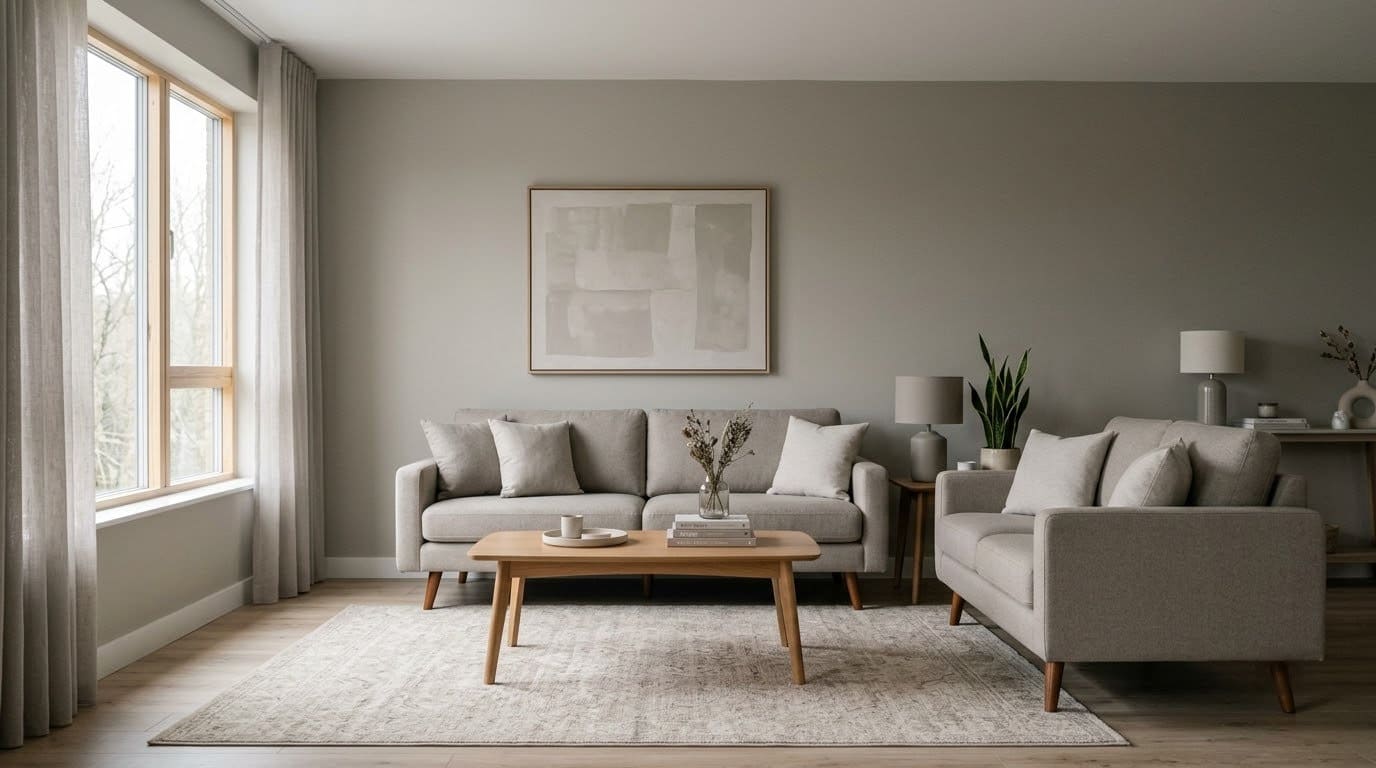
A room needs one truly dark value and one truly light value, or the whole thing goes flat. Greige on greige on greige has no anchor for your eye.
This is why so many careful neutral rooms feel cold, not calm. The palette goes together, but there is no depth in it.
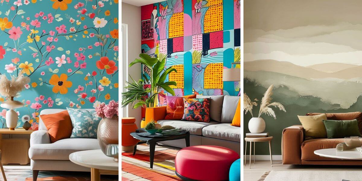
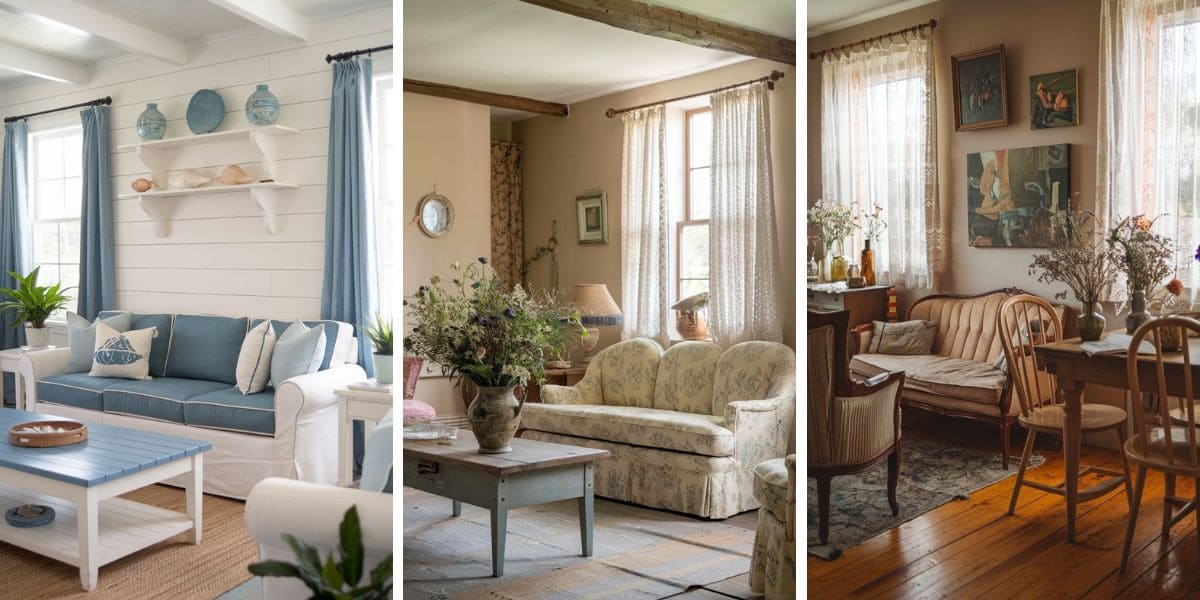

A common guideline is the 60-30-10 rule. About 60 percent of the room in a dominant color, 30 percent in a secondary, and 10 percent in an accent. Most matchy rooms are closer to 90-10-0.
Quick fix: Add one near-black element and one crisp white one. The black can be a floor lamp, a picture frame, a side table, or a couple of pillows. The white can be a matte ceramic piece or a clean cushion.
You do not need to repaint. To borrow one deep note without committing the whole room, a moodier accent corner does the job, and if you want to stay pale, neutral rooms still need contrast built in to work.
3. Every surface in the room is smooth
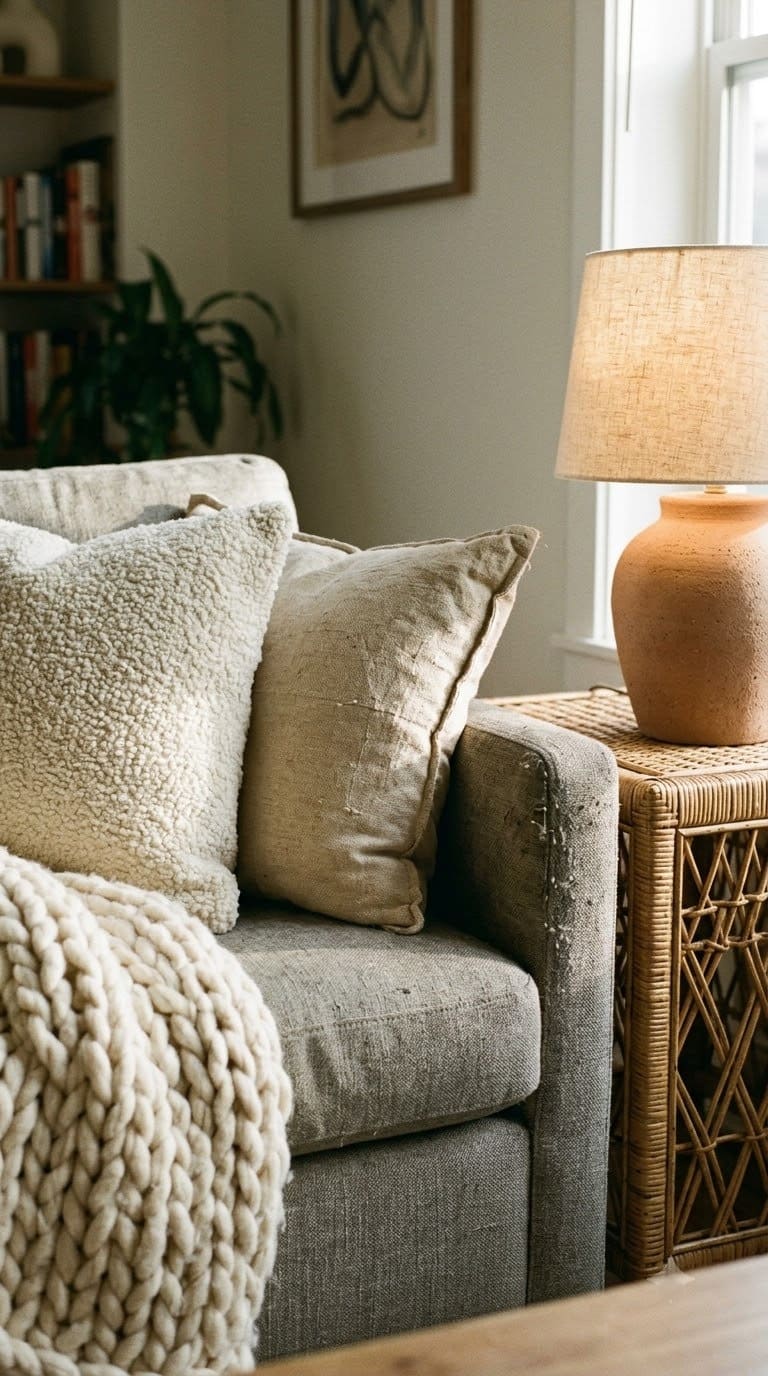
Here is a quiet one. Look at your room and count the different materials.
If it is mostly leather, glass, painted wood, and a low-pile rug, every surface is smooth. Smooth on smooth photographs as flat, and it feels flat in person too.
Texture contrast is a big part of what makes a room look expensive in pictures. Rough against smooth, matte against shiny, fine against chunky. That mix is what your eye reads as layered even when the colors are quiet.
Quick fix: Aim for five or more distinct materials near the seating. Think nubby wool, boucle, aged wood, rattan, ceramic, linen, blackened metal, jute.
A chunky knit throw, a jute rug layer, a rattan tray, and linen pillow covers cover most of that in one trip. Vary the pillows by feel and not just color, and mixing pillow textures on the sofa is the easiest place to start. For a bigger change, adding texture to the walls themselves with board and batten breaks up a flat box.
4. The rug is too small
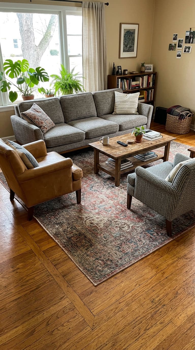
A rug that is too small makes the furniture look like it is floating with nowhere to land. It also makes the room feel smaller.
Design blogger Nadine Stay calls this “furniture float,” and it is one of the most common reasons an open-plan living area feels unsettled.
The test is simple. The front legs of every seating piece should sit on the rug. If your sofa and chairs all stand on bare floor around a small rug, that is the mistake.
For a standard living room, an 8 by 10 rug is the working minimum and a 9 by 12 is common. Leave roughly 8 to 18 inches of bare floor between the rug and the walls, so it reads as a defined zone. A 5 by 7 in a full living room usually looks like a bath mat by comparison.
Quick fix: Size up. If a bigger rug is not in the budget this month, layer a large jute or sisal rug under the small one so it reaches the furniture legs.
That buys you the right footprint for well under the cost of a new wool rug.
5. Everything is pushed flat against the walls
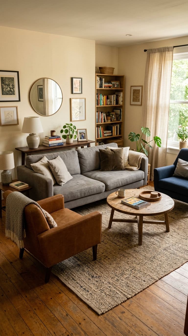
If every piece of furniture is shoved against a wall, the middle of the room becomes a dead zone. The seating never forms a real group, and people end up calling across the room to talk.
Designer Maggie Griffin puts it simply. “Furniture needs to breathe.” Pulling a sofa off the wall and drawing a pair of chairs in toward it creates a spot that actually invites people to sit.
A few numbers help here. Float the sofa at least a few inches off the wall, since even 3 or 4 inches reads as intentional. Keep facing seats within about 8 feet of each other, leave 14 to 18 inches between the coffee table and the sofa, and keep walkways around 30 to 36 inches.
Quick fix: Pull the sofa forward and angle a chair in toward it. If the back of a floated sofa bothers you, set a narrow console behind it so that side looks finished.
6. Nothing tells your eye where to look
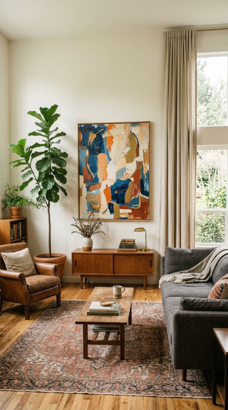
A room needs a focal point and a sense of order. When every piece is the same height and the same visual weight, your eye wanders and never settles.
That restless feeling reads as “off.” Nadine Stay calls it scale without a pecking order, and emphasis is one of the core principles of design that a matchy room skips.
Pick one focal point and let it win. That might be a fireplace, a large piece of art, the media wall, or a big window. Then add real height at two or three spots so the room is not all waist-high furniture.
There is a flip side worth naming. A room styled to showroom precision, with a matched set of decor objects and nothing out of place, reads as sterile. Nile Johnson’s advice to keep just one or two standout elements and let the rest feel collected is the balance to aim for.
Quick fix: Put one oversized piece of art or a large mirror on the main wall. Stand a 6-foot plant or a floor lamp in the emptiest corner.
If a single big piece feels like a lot to commit to, building one large gallery arrangement fills the wall with less risk, and a low arrangement on the coffee table gives the eye somewhere to rest at seating height.
7. The walls are bare, or the art is too small and hung too high
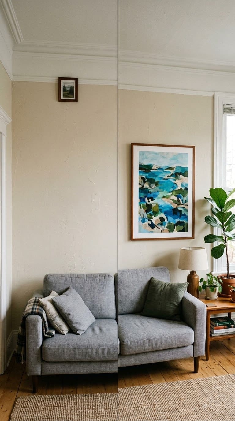
Designer Jennifer Morrell, who runs An Inspiring Home, says bare walls are the single biggest reason a living room reads as unfinished. A close second is art that is too small and floated up near the ceiling.
Up there it looks like a postage stamp, and it breaks the connection with the furniture below.
The rules of thumb are easy. Hang art so its center sits 57 to 60 inches from the floor. Art over a sofa should be roughly two-thirds the width of the sofa, with its bottom edge 6 to 10 inches above the sofa back.
Treat a group of frames as one big rectangle and center that the same way.
Quick fix: Go bigger. Use one large piece, or a gallery block that fills about two-thirds of the wall.
Then walk the room and lower anything hung too high. Getting the scale of a single piece right fixes more than adding three more small frames.
8. The windows are naked
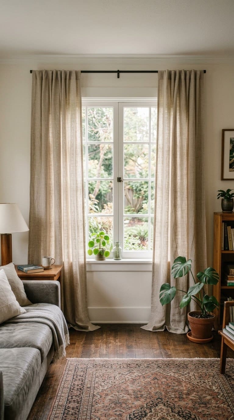
Bare blinds or an uncovered window frame keep a room from ever feeling soft. Morrell’s advice is to add drapery or Roman shades, or at least stationary side panels next to the blinds you already have.
Mounting matters as much as the fabric. Put the rod 4 to 6 inches below the ceiling, or just under the crown molding. Extend it 8 to 12 inches past the glass on each side so the panels stack off the window instead of covering it.
Hang the panels long enough to kiss the floor or break on it slightly.
Quick fix: If you rent, use a tension rod inside the frame or no-drill brackets, and hang light linen panels. Even panels that never close change how finished the room looks.
9. The lighting is one cool overhead, and the bulbs do not match
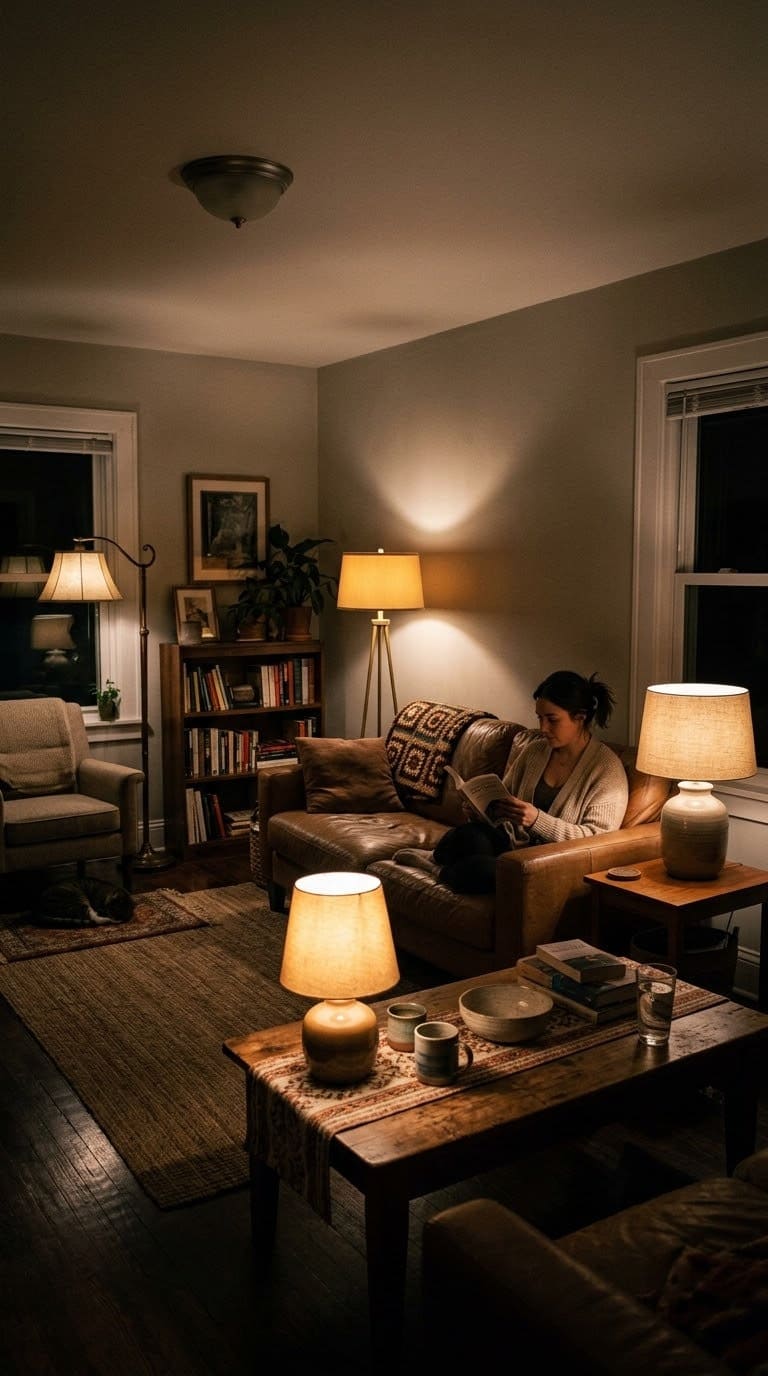
One cool ceiling light flattens everything under it. Worse, when you buy bulbs a few at a time over the years, the color temperatures stop matching from lamp to lamp.
The room then feels chaotic without you knowing why. Nadine Stay lists lighting temperature mismatch as its own reason a room feels wrong.
Quick fix: Put the whole room on one warm color temperature, 2700K, with a color rendering index of 90 or higher. Aim for at least five light sources at three heights, meaning ceiling, table, and floor.
Add a dimmer to the main seating area, or a plug-in dimmer if you rent. A lampshade’s material and shape change the quality of the light, and the right corner lamp kills the dark spot that makes a room feel neglected at night.
Matching vs. designed, what your eye is actually reading
If you want a quick check, use this table.
| Layer | A “matching” room | A room that reads as designed |
|---|---|---|
| Color | Everything in one safe mid-tone | 60-30-10, plus one dark note and one light note |
| Wood and metal finishes | One finish repeated everywhere | Two or three finishes, used on purpose |
| Texture | Mostly smooth, leather, glass, lacquer | Five or more materials, rough against smooth |
| Furniture | A bought set, one visual weight | A sofa anchor plus pieces of different era or shape |
| Rug | Small, floating in the center | Under the front legs of every seat, 8 by 10 or bigger |
| Layout | Pushed to the walls | Floated, seats within 8 feet, a real conversation group |
| Focal point | None, everything the same height | One clear focal point, height at two or three spots |
| Walls | Bare, or one small frame hung high | Art at 57 to 60 inches, two-thirds the sofa width |
| Light | One cool overhead | 2700K everywhere, five sources, a dimmer |
What we learned redoing our own living room
A few things only became clear after we actually did this to a room instead of reading about it.
We tried to style around the matching set for months. New pillows, a tray, a plant, and none of it landed.
Nothing worked until we physically removed the matching coffee table and put a round vintage one in its place. The set itself was the problem, not the stuff we kept piling on top of it.
Our palette was five shades of the same beige, and we were proud of how coordinated it looked. Then we added one black iron floor lamp. That single object did more for the room than a whole cart of throw pillows had.
Sizing the rug up from a 5 by 7 to an 8 by 10 was the biggest change of all. The nagging “why does this feel like a rental” feeling mostly left with the small rug.
We also bought a coordinated pillow set in the exact fabric of the sofa. It looked like a furniture showroom. Swapping in three different textures in a loose color range fixed it in an afternoon.
And we over-corrected once. In one weekend we added contrast, three patterns, and five new textures, and the room went from flat to busy.
We pulled back to one dark note, one pattern, and about four textures. That is roughly where Vicky Floros and Nile Johnson land too, one base with only two or three finishes doing the real work.
What to fix first
You do not have to do all of this at once. Here is a sane order.
| Priority | Fix | Rough cost | Effort |
|---|---|---|---|
| Do this first | Add one near-black object and one crisp white one | Under 50 dollars, or free from around the house | 10 minutes |
| This week | Rebulb the room to one 2700K set, add a lamp or two | 30 to 120 dollars | An afternoon |
| This month | Size the rug up so every front leg sits on it | 150 to 400 dollars | A shopping trip |
| This month | Swap one piece out of the matching set | 80 to 300 dollars | A weekend |
| When you can | Hang art at 57 to 60 inches, mount drapes high and wide | 60 to 250 dollars | A weekend |
| Ongoing | Add texture, float the furniture, kill the dark corners | As you go | As you go |
Frequently asked questions
Does living room furniture have to match? No. Coordinate instead of matching, keeping the sofa as your anchor and holding your dominant finishes to two or three. A bought set, where every piece shares one wood tone and one leg style, is usually what makes a room read as a showroom.
How do I add contrast without repainting? Swap one object for a near-black version, such as a lamp, a frame, a side table, or a couple of pillows. Then add one crisp white piece. That single dark-and-light pair gives your eye the anchor the mid-tone palette was missing.
What size rug does a living room need? An 8 by 10 is the working minimum for a standard room and a 9 by 12 is common. The simpler test is that the front legs of every seating piece should sit on the rug. If your furniture stands on bare floor around a small rug, size up or layer a larger natural-fiber rug underneath.
My living room is small, won’t contrast and layers make it feel more cramped? No. One bold dark note and light, varied textures actually add depth to a small room, while a flat, pale, matchy space reads as small and unfinished. What makes a small room feel tight is heavy matched furniture and an undersized rug, not color.
I rent and can’t do much, where do I start? Rug, pillow textures, warm 2700K bulbs, two lamps, tension-rod drapes, and one large piece of art. Every fix on that list comes with you when you move, and together they cover most of what makes a rental living room feel temporary.
Related Posts
Products We Recommend
This post contains affiliate links. We may earn a commission on qualifying purchases at no extra cost to you.
Washable 8x10 Low-Pile Area Rug, Moroccan Geometric, Beige
A big, flat, washable rug that reaches the front legs of the sofa and both chairs, so the seating finally reads as one grounded zone instead of floating furniture
Shop Now
VAKADO Corduroy Throw Pillow Covers, Cream White, 18x18, Set of 4
Adds a ribbed corduroy texture against a smooth sofa, an easy way to break up an all-smooth room without buying pillows in the exact sofa fabric
Shop Now
Feit Electric A19 LED Bulbs, 2700K, 90+ CRI, Dimmable, 8-Pack
One warm color temperature and a high color-rendering index for every lamp in the room, so the light stops looking mismatched from fixture to fixture
Shop NowNever miss an update — choose FarmFoodFamily as your preferred source on Google.
How it works: Tap the button below to open Google's settings page, then check the box next to FarmFoodFamily.
Tap the checkbox to turn it blue — that's how you know it's set.