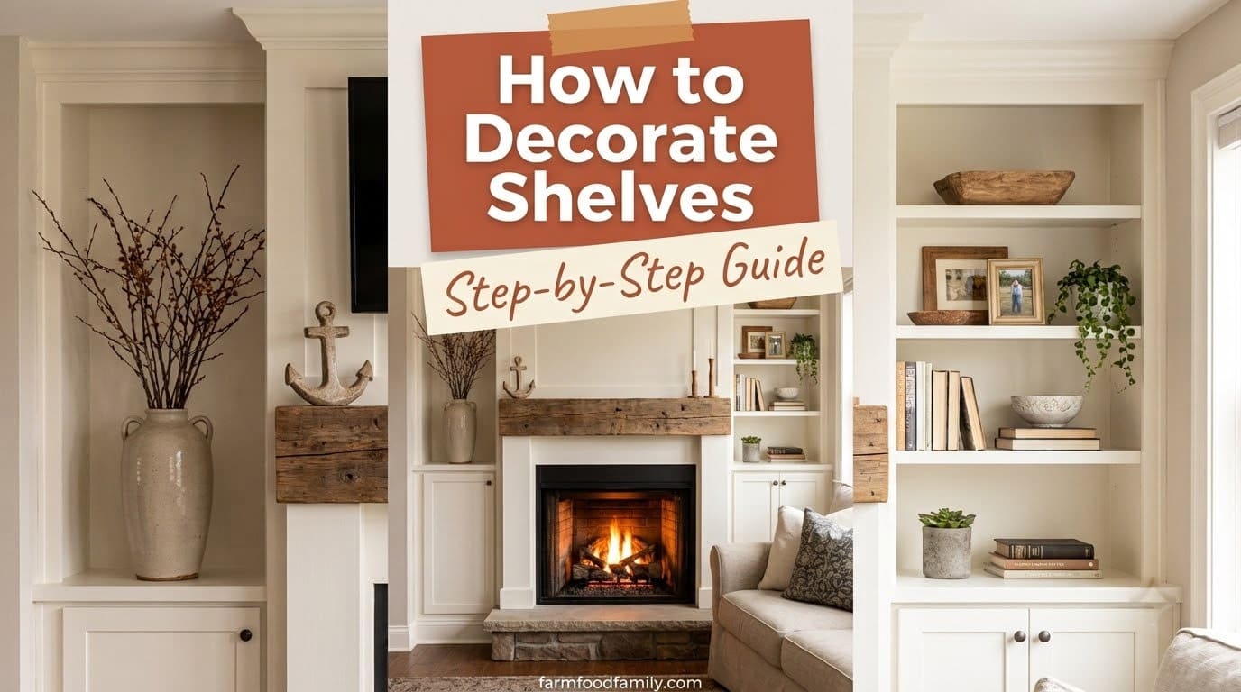
How to Decorate Shelves: A Curated Step-by-Step Guide
A shelf that’s either bare or crammed full is the same problem wearing two different faces. Here’s the actual system professional stylists use to fix both.

Never miss an update — choose FarmFoodFamily as your preferred source on Google.
How it works: Tap the button below to open Google’s settings page, then check the box next to FarmFoodFamily.
Tap the checkbox to turn it blue — that’s how you know it’s set.
Quick Answer: To decorate shelves, start by clearing everything off, then sort your items by color, height, and texture before you place a single thing back. Group objects in odd numbers (threes work best) using the triangle rule, a tall item flanked by two shorter ones at different heights, and pick 3 to 4 colors to keep the whole shelf cohesive. Interior designer Sarah Gibson of Room for Tuesday recommends layering books as risers and anchors rather than just standing them upright, while Sarah Schwuchow of Sarah Jacquelyn Interiors advises mixing something hard, something soft, and something natural within each grouping. The step most people skip is leaving real negative space, filling only about 60 to 70% of the shelf, since that empty space is what makes the arranged objects read as intentional instead of cluttered.
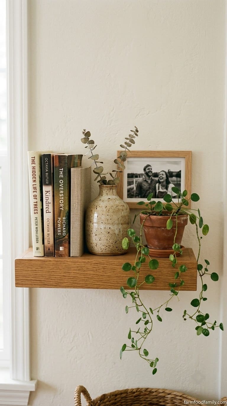
Why Your Shelves Look Either Empty or Cluttered (Never Right)
A shelf usually fails in one of two directions. It’s either bare and cold, with a few random objects spaced evenly like a store display, or it’s crammed edge to edge until nothing stands out anymore.
Both problems come from the same missing piece: a system. Professional stylists don’t place objects randomly and hope it looks good. They follow a repeatable process, and once you see it, you can’t unsee it on every well-styled shelf you scroll past.
The Step-by-Step Shelf Styling Process
Step 1: Clear the Shelf Completely
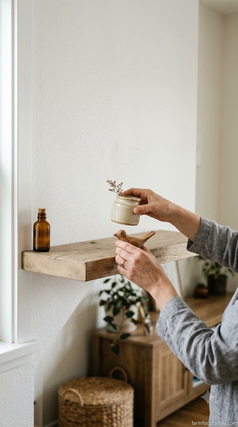
Take everything off before you style anything. Trying to rearrange around items that are already up there almost always locks you into the same cluttered layout you’re trying to fix, since your eye keeps defaulting to where things already sit instead of where they’d actually work best.
Lay everything out on a table or the floor where you can actually see it all at once, rather than working piece by piece straight from the shelf. Wipe down the empty shelf itself while you’re at it, since dust and old shelf-liner residue show up immediately once the surface is bare and well-lit.



Take a quick phone photo of the empty shelf and the room around it before you start. It’s a small step, but having the wall color, the nearby furniture, and the light source in frame makes the color-palette decision in Step 3 noticeably easier than trying to recall it from memory later.
Answer 4 quick questions and get matched to the exact fix for your yard — drainage, budget, layout, or something else entirely.
Take the Free QuizStep 2: Sort by Category, Then Edit Ruthlessly
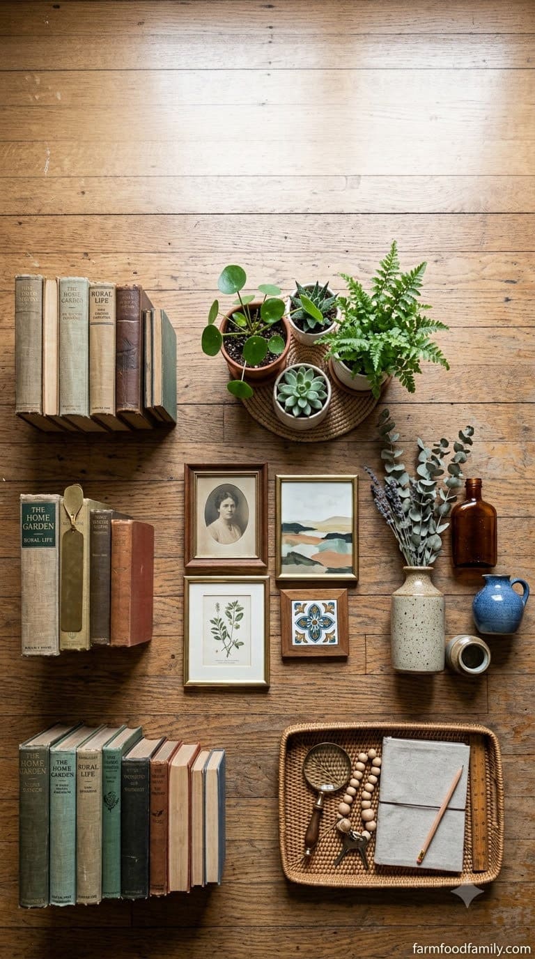
Group what you have into rough categories: books, plants (real or faux), framed pieces, boxes or trays, and purely decorative objects like vases, bowls, or small sculptures. Spreading these into separate piles rather than one big heap is what actually reveals what you own and what’s missing, usually more decorative objects and fewer “hard” anchor pieces than people expect.
Set aside anything that’s damaged, doesn’t match your color direction, or that you’re only keeping “just in case.” A rough starting target is 12 to 20 objects total for a standard 3 to 5-shelf bookcase, fewer for a single floating shelf, more than that and a shelf styled from too many options ends up looking busy no matter how carefully you arrange it.
Be honest about sentimental clutter specifically, since it’s the hardest category to edit. A single meaningful object displayed with room to breathe carries more visual and emotional weight than five crowded together, so pick the one or two pieces that matter most for this shelf and store the rest.
Step 3: Pick a Color Palette Before You Place Anything
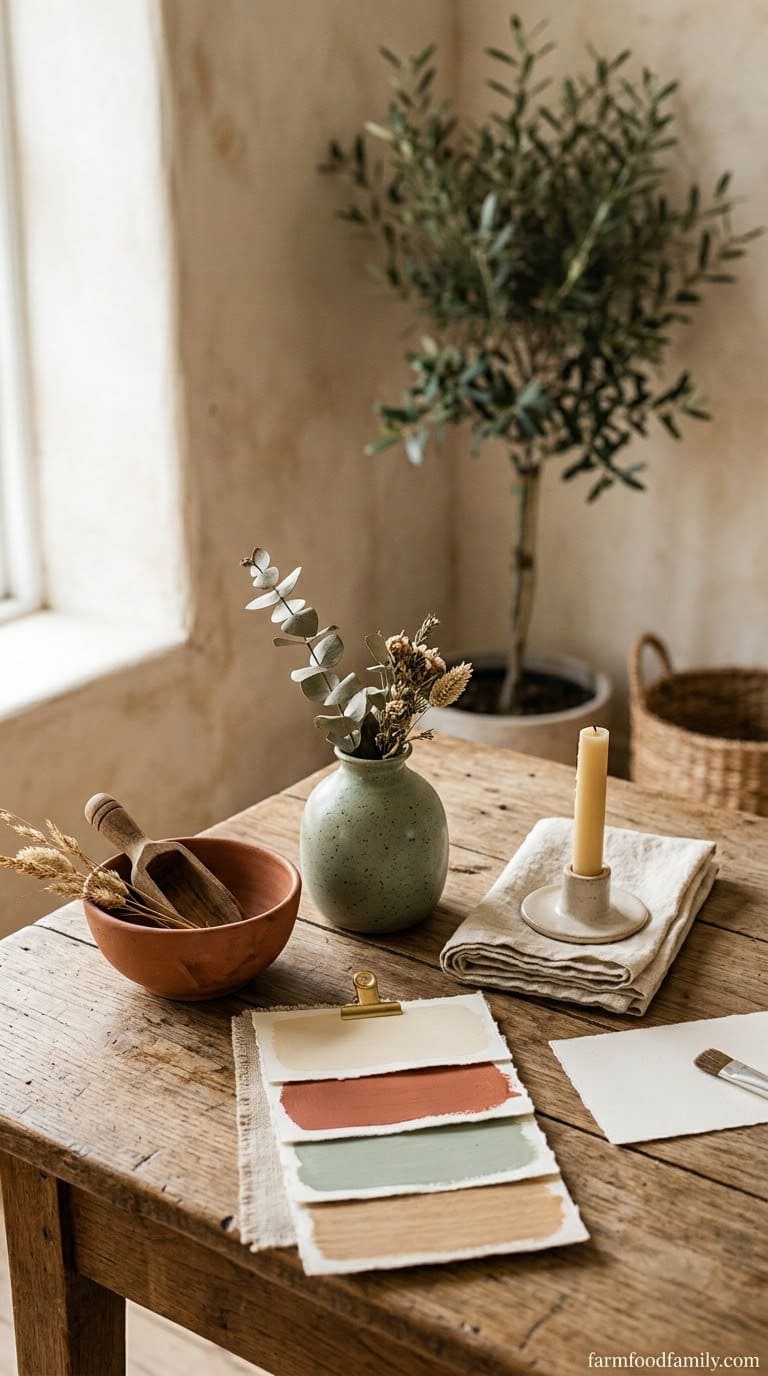
Choose 3 to 4 colors that already exist somewhere in the room, ideally pulled from something large and fixed like a rug, a piece of art, or upholstery rather than invented from scratch. Using the photo from Step 1, circle or note the colors you see repeating, then edit your sorted pile down to objects that genuinely fit that palette.
This single decision does more to make a shelf look cohesive than any specific arrangement trick that follows it. Skipping this step is the most common reason a shelf full of individually nice objects still reads as chaotic together, since the eye reacts to color clashing before it even registers shape or arrangement.
A simple starting formula: one neutral base color (white, cream, black, or a warm wood tone) that most objects share, one secondary color that repeats 2 to 3 times across the shelf, and one accent color used just once or twice for contrast. Objects that don’t fit any of the three go back in storage for this shelf, even if they’re genuinely nice pieces.
Step 4: Build Triangle Groupings (the Rule of Three)
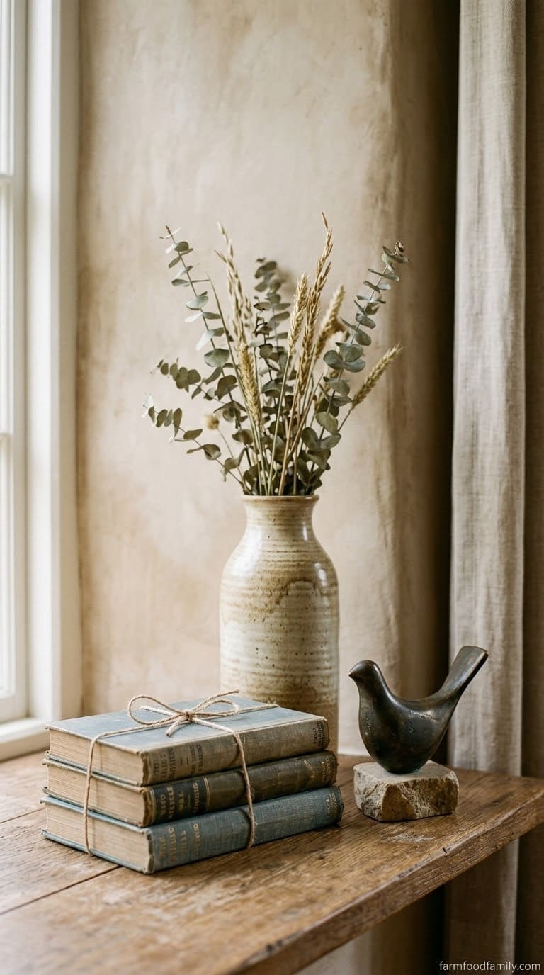
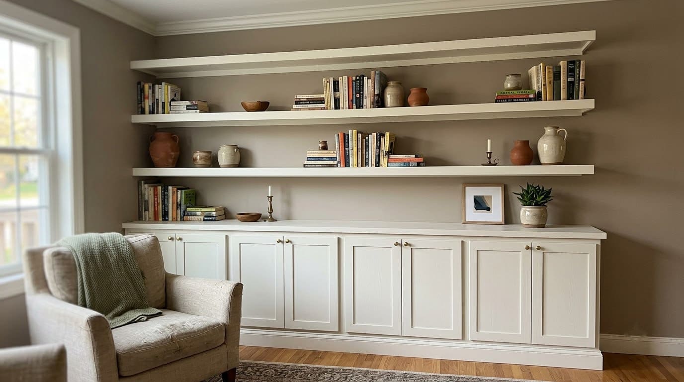
Work in small groups of three (or occasionally five) rather than treating the whole shelf as one continuous arrangement. Within each group, place a taller item, roughly 8 to 14 inches, in the middle or to one side, flanked by two shorter pieces at noticeably different heights (not just slightly shorter), so the tops form a rough triangle instead of a straight line.
Most yard problems trace back to one specific, fixable cause. Find yours in 4 quick questions.
Take the Free QuizSarah Schwuchow of Sarah Jacquelyn Interiors recommends mixing materials within each grouping specifically, something hard, something soft, and something natural, since that contrast is what keeps a group of three objects from reading as flat. A stack of books (hard), a woven basket or textile object (soft), and a small plant (natural) is a simple version of exactly that mix, and it’s a formula worth repeating with different specific objects in each grouping across the shelf.
Space groupings with real gaps between them, not shoulder to shoulder. A single continuous line of objects across the whole shelf, even a varied one, reads as one long cluttered row rather than several intentional vignettes.
Step 5: Use Books as More Than Just Books
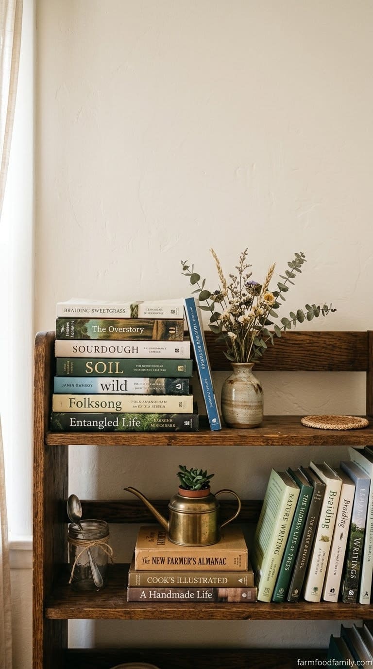
Books are the most useful styling tool on a shelf, and treating them only as things to read wastes their function. Sarah Gibson of Room for Tuesday styles them three ways: stacked horizontally as risers under other objects (3 to 6 books is a typical stack height), leaned vertically in a loose row of 4 to 8 for height, and grouped as an anchor that a smaller decorative piece leans directly against.
Mixing all three approaches on the same shelf, rather than lining every book upright in a row, is what creates the varied silhouette a styled shelf needs. A stack used as a riser, for instance, effectively becomes the “tall” point of a triangle grouping, with the object sitting on top doing double duty as the visual peak.
If your book covers are visually loud or mismatched, this is also the step to decide how much spine-out versus cover-out you want, since a few books turned cover-out (especially ones with a color that matches your palette) work as a decorative object in their own right, not just a stack.
Step 6: Vary Height, Texture, and Finish
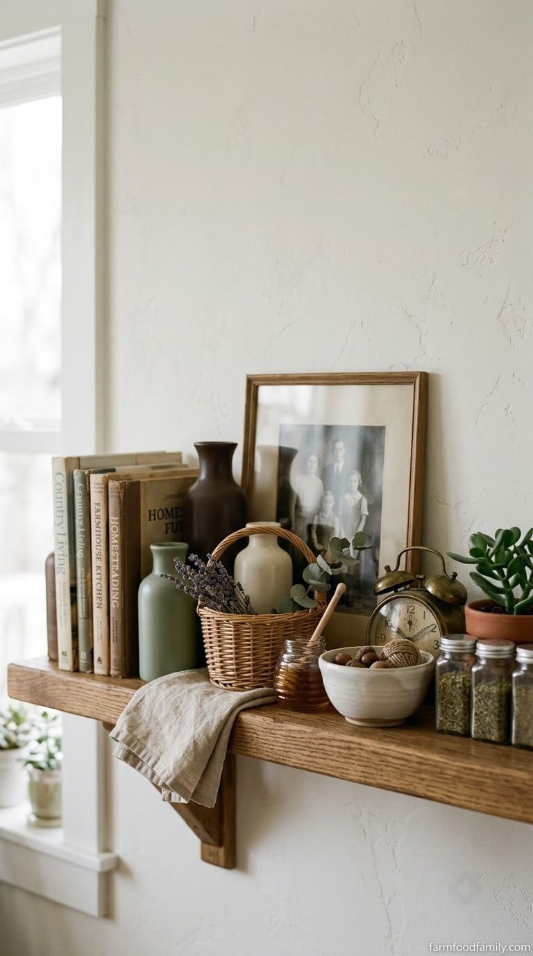
Within and across your triangle groupings, mix tall and short, matte and shiny, structured and soft. A shelf where everything is roughly the same height and material reads as flat even with a good color palette and careful grouping, since there’s nothing for the eye to catch on as it scans across.
Concretely, that means pairing a smooth ceramic vase with something woven or textured (a jute basket, a linen-covered box, a raw wood bowl), and pairing a hard-edged object (a geometric sculpture, a stack of books) with something organic in shape (a plant, an irregular stone or shell). Two smooth, glossy objects sitting next to each other is a common reason an otherwise well-planned grouping still feels slightly off.
Layering matters here too. Placing a smaller object 1 to 2 inches in front of a taller one, rather than lining everything up flush against the back of the shelf, adds genuine depth instead of a flat row of objects, and it’s a technique worth using in at least one grouping per shelf even if the rest stay in a single row.

Step 7: Leave Actual Negative Space
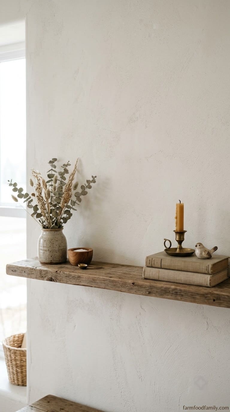
This is the step almost everyone skips, and it’s the one that separates a styled shelf from a cluttered one. Fill only about 60 to 70% of the shelf’s visible surface, leaving the rest genuinely empty rather than adding one more object to fill a gap that instinctively feels like it needs something.
A practical way to check this: after you think you’re done, look at the shelf and estimate what percentage is actually covered by objects versus visible shelf surface. If it’s closer to 85 or 90%, pull two or three objects off entirely rather than just shrinking or rearranging what’s there.
That empty space is what lets each triangle grouping actually register as a distinct grouping instead of blurring into the next one. If a shelf still feels busy after following every other step correctly, color palette, triangles, texture variation, this is almost always the missing piece, not a sign the arrangement itself is wrong.
The average homeowner spends $616/year on yard fixes that don't address the real problem. Find out what yours actually is — before you spend another dollar.
Take the Free QuizStep 8: Step Back, Then Edit Again
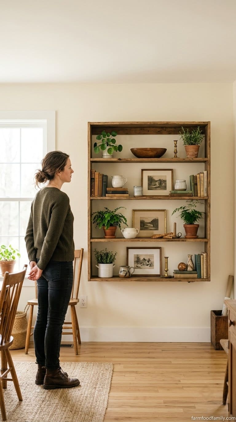
Walk 6 to 8 feet away, or as far back as the room allows, and look at the shelf as a whole, not object by object. Anything that draws your eye for the wrong reason, a mismatched color, a gap that feels accidental rather than intentional, an object that’s clearly just filler, gets removed or repositioned before you call it finished.
A useful trick here: take a photo on your phone from that distance and look at the small screen image rather than the real shelf. A photo flattens the arrangement the same way a passing glance does, and problems that don’t register standing directly in front of the shelf (an off-center grouping, one side noticeably heavier than the other) often jump out immediately in the photo.
Most stylists do this multiple times during one styling session, sometimes pulling everything apart and starting the triangle groupings over from Step 4. The first arrangement is rarely the final one, and that’s normal, not a sign you’re doing it wrong.
Styling Shelves by Room (What Changes)
The 8-step system above stays the same everywhere. What changes room to room is which objects belong on the shelf in the first place and how strict the negative-space rule needs to be.
| Room | What to prioritize | What to skip |
|---|---|---|
| Living room / open shelving | Books, art, a mix of sentimental and decorative objects | Anything too personal that a guest would find odd on display |
| Home office | Books, plants, one or two inspiring art pieces | Purely decorative clutter that competes with a work surface below |
| Bathroom | Rolled towels, apothecary jars, one plant that tolerates humidity | Paper items, unsealed wood, anything that can’t handle steam |
| Kitchen open shelving | Everyday dishware mixed with one or two decorative pieces | Rarely-used items, since kitchen shelves need to stay functional first |
How to Decorate Bookshelves in a Living Room
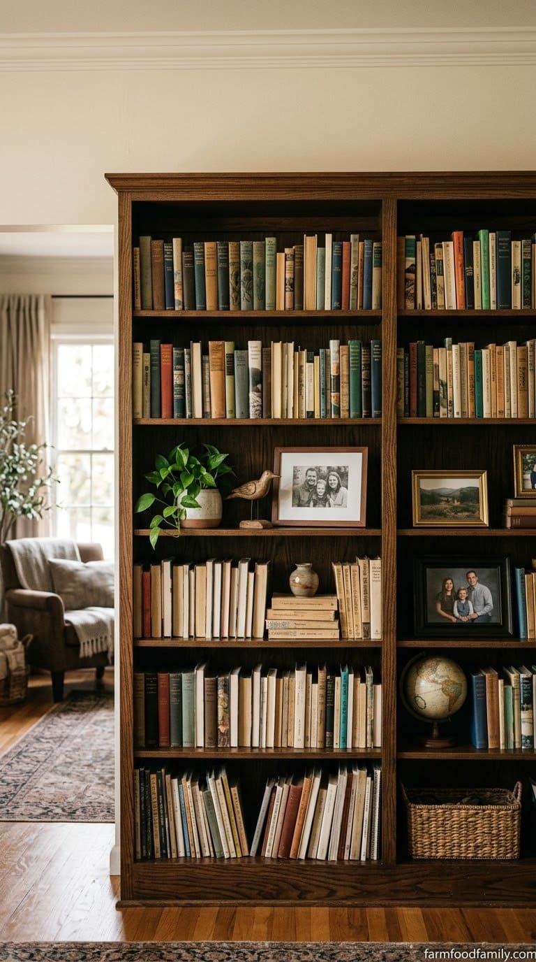
A living room bookshelf usually carries more weight than any other shelf in the house, since it’s often the largest piece in the room and the one guests actually look at while sitting down. That makes the 60-70% negative-space rule matter even more here than on a small floating shelf.
Mix genuinely-read books with a smaller number of display objects (roughly one object for every 8 to 10 books works as a starting ratio), and let a few shelves stay mostly books while others carry the triangle groupings. A living room bookshelf that alternates dense and open shelves reads as a real, lived-in library rather than a staged one.
Sentimental objects belong here more than almost anywhere else in the house, framed photos, travel souvenirs, a childhood item, since a living room bookshelf is meant to say something about the people who live there. Keep the color palette rule in place regardless of how personal the objects are, since even sentimental pieces benefit from being edited toward a consistent 3 to 4 color story.
How to Decorate Shelves Around a TV
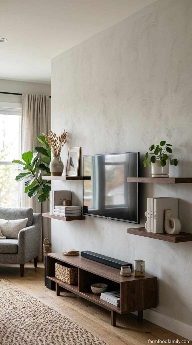
Shelves flanking a mounted TV usually go one of two directions: strict symmetry (matching objects, matching heights, matching shelf spacing on both sides) or intentional asymmetry (a tall stack of books on one side balanced by several smaller objects on the other). Both work. What doesn’t work is a layout that’s almost symmetrical but not quite, since a near-miss reads as a mistake rather than a style choice.
Placing two shelves above the TV and one below, all matching in length and spacing, is a common layout that keeps the TV from visually dominating the wall. Whichever layout you choose, stagger the objects so the eye moves (tall on one end, short on the other, alternating sides shelf to shelf) rather than lining every shelf up the same way, which starts to look like library stacks instead of a styled wall.
Keep the shelf closest to eye level, usually one just above or beside the screen, the most restrained of the group. That’s the shelf your eye lands on most often when the TV is off, and an overfilled one there competes with the screen itself when it’s on.
How to Style Open Shelves in the Kitchen
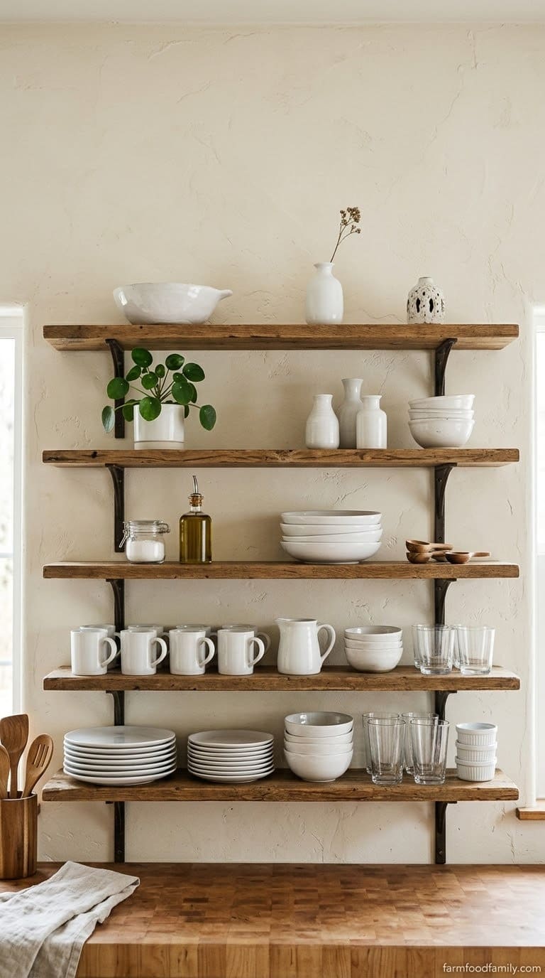
Kitchen shelves need to earn their negative space, since function has to come first here in a way it doesn’t in a living room. Put what you actually reach for daily, plates, bowls, everyday glassware, on the lower shelves within easy reach, and save the higher, harder-to-reach shelves for the decorative pieces and the items used less often.
A unified color story matters more in a kitchen than almost anywhere else, since open dishware in mismatched colors reads as cluttered fast. White or cream dishware on a light shelf, or one consistent glaze color across your everyday pieces, does most of the visual work before you’ve added a single decorative object.
Match similar items on a diagonal (a stack of bowls upper-left balanced by a cutting board lower-right, for instance) rather than lining plates up in a flat row, and mix a genuinely functional object into every grouping, a wooden spoon in a crock, a stack of everyday napkins, so the shelf still reads as a working kitchen and not a display case. One small plant or a trailing herb adds the natural texture element the triangle-rule groupings need elsewhere in the house.
How to Decorate Shelves Next to a Fireplace
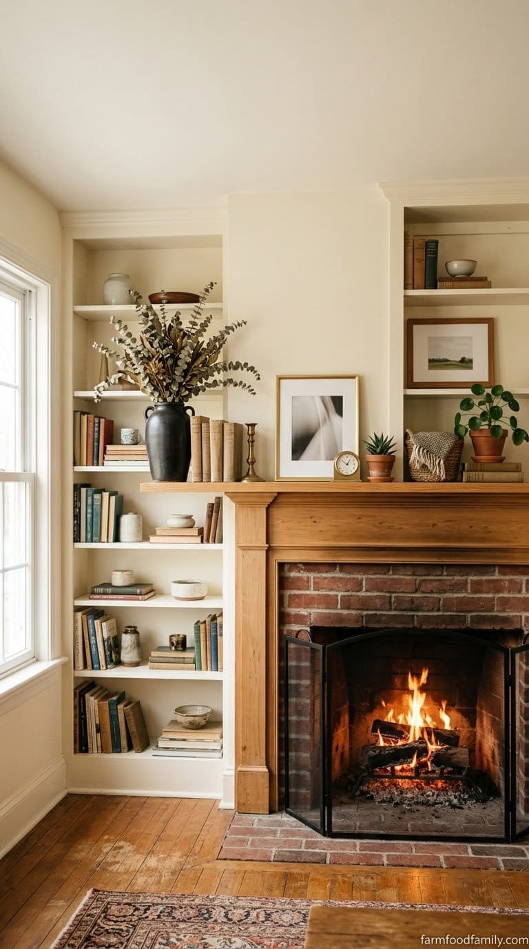
Shelves flanking a fireplace need to visually connect to the mantel above them, not just to each other, since the eye reads the whole wall as one composition. Repeat a color, material, or texture between the mantel styling and the flanking shelves (the same wood tone, a matching metal finish, an echoed color) so the three pieces feel like one arrangement rather than three separate ones.
Anchor one side with something tall and substantial, a sculptural vase, a large plant, a stack of oversized books, and balance the opposite side with a shorter grouping rather than mirroring the same objects on both sides. Perfect symmetry here can read as stiff next to the organic shape of a fire and mantel.
Material matters more near a fireplace than elsewhere in the house. Favor wood, ceramic, and metal over anything that can warp or discolor near heat, and keep paper items and unsealed wood a reasonable distance from the firebox itself, not just off the mantel.
How to Decorate a Shelf With Books Without It Looking Like a Library
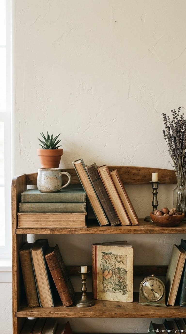
The line between “styled with books” and “just a bookshelf” comes down to ratio and negative space, not the books themselves. Keep books to roughly half to two-thirds of what’s on the shelf, with the rest given to the objects from your triangle groupings, rather than filling every remaining inch with more books.
Vary how the books sit rather than lining every spine the same direction. A stack of 3 to 5 books lying flat as a riser, one small vertical run of 4 to 6 books leaned at a slight angle rather than ramrod straight, and a single book turned cover-out as a color accent all read as intentional in a way a uniform row of upright spines doesn’t.
If the collection itself is visually loud (bright, mismatched paperback covers, for instance), turn the loudest ones spine-in and cover-out selectively, or group them by color rather than by author or genre, purely for the shelf’s sake. It’s a styling decision, not a reading-order decision, and it’s fine to keep your actual reading system somewhere else entirely.
Common Shelf-Styling Mistakes
Everything lined up in a straight row. This is the single most common mistake, and it’s what makes a shelf look like a store display instead of a curated space. Break up any straight line with height variation and slight overlap.
No color plan. A shelf can have beautiful individual objects and still look chaotic if the colors don’t relate to each other or the room. Fix this before you fix the arrangement.
Filling every inch. A shelf packed edge to edge, even with genuinely good objects, reads as cluttered because there’s no negative space for the eye to rest. Pull a third of the objects back off.
Symmetry across every shelf. Identical arrangements on every shelf of a bookcase can look stiff rather than curated. Balance the visual weight across the whole piece instead of repeating the same triangle on each level.
What I Learned Restyling the Same Shelf Four Times
The first pass at styling our living room shelf took maybe ten minutes and looked like a furniture showroom, everything the same height, spaced perfectly evenly, technically neat and genuinely boring. It took three more full re-dos, and honestly a fair amount of standing back and squinting at it, before pulling a third of the objects off entirely made it click. The version that finally looked right had less on it than any of the “too plain” early attempts I’d rejected for being too empty.
How to Decorate Shelves FAQ
What’s the fastest way to make a shelf look styled instead of cluttered? Remove about a third of what’s currently on it and leave that space empty rather than filling it with something else. Negative space, not more objects, is usually the missing ingredient.
How many colors should be on a styled shelf? Around 3 to 4 colors that already appear elsewhere in the room. More than that tends to read as visually busy no matter how well the objects are arranged.
What is the triangle rule for shelf styling? Group objects in threes, with one taller piece flanked by two shorter ones at different heights, so the tops form a rough triangle rather than a straight line. It’s a simple visual-balance trick used across interior design, not just for shelves.
Should every shelf in a bookcase look the same? No. Repeating an identical arrangement on every shelf can look stiff. Vary the groupings and balance the visual weight across the whole piece instead.
Do I need to buy new decor to style shelves well? Not necessarily. Sorting and editing what’s already in the house, then applying a color palette and the triangle rule, fixes most cluttered or bare shelves without a single new purchase.
How do you decorate shelves around a TV without it looking cluttered? Pick either strict symmetry or intentional asymmetry, never something in between, and keep the shelf closest to eye level the most restrained of the group since it’s the one competing with the screen. Stagger heights shelf to shelf so the layout doesn’t read as uniform library stacks.
How do you style open shelves in a kitchen? Put daily-use dishware on the lower shelves within easy reach, keep a unified color story across your everyday pieces, and mix at least one genuinely functional object into every grouping so the shelf still reads as a working kitchen, not just a display.
How do you decorate shelves next to a fireplace? Repeat a color, material, or texture between the mantel and the flanking shelves so all three read as one composition, and favor wood, ceramic, and metal over materials that can warp or discolor near heat.
Related Posts
- 64+ Best DIY Bookshelf Ideas & Plans For 2026 (With Pictures)
- 40+ Cube Storage Ideas That Will Instantly Declutter Your Space (2026)
- 23+ Clever Ways To Decorate Your Home With Brackets For 2026
Never miss an update — choose FarmFoodFamily as your preferred source on Google.
How it works: Tap the button below to open Google's settings page, then check the box next to FarmFoodFamily.
Tap the checkbox to turn it blue — that's how you know it's set.